Chapter 2. Fitts’s Law
The time to acquire a target is a function of the distance to and size of the target.

Overview
Usability is a key aspect of good design. It implies ease of use, which means the interface should be easy for users to understand and navigate. Interaction should be painless and straightforward, requiring minimal effort. The time it takes for users to move to and engage with an interactive object is a critical metric. It’s important that designers size and position interactive objects appropriately to ensure they are easily selectable and meet user expectations with regard to the selectable region—a challenge compounded by the differing precision of the range of input methods available today (mouse, finger, etc.).
To aid in this endeavor we can apply Fitts’s law, which states that the time it takes for a user to engage with an object is relative to its size and the distance to it. In other words, as the size of an object increases, the time to select it goes down. Additionally, the time to select an object decreases as the distance that a user must move to select it decreases. The opposite is true as well: the smaller and further away an object is, the more time it takes to accurately select it. This rather obvious concept has far-reaching implications, which we’ll unpack in this chapter. We’ll also take a look at some supporting examples.
Origins
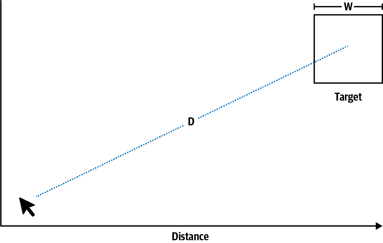
The origins of Fitts’s law can be traced back to 1954, when American psychologist Paul Fitts predicted that the time required to rapidly move to a target area is a function of the ratio between the distance to the target and the width of the target (Figure 2-1). Today, it’s regarded as one of the most successful and influential mathematical models of human motion, and it’s widely used in ergonomics and human–computer interaction to model the act of pointing, either physically or virtually.1

Figure 2-1. Diagram depicting Fitts’s law
Fitts also proposed an index of difficulty metric to quantify the difficulty of a target selection task in which the distance to the center of the target (D) is like a signal and the tolerance or width of the target (W) is like noise:
Examples
We’ll begin by looking at a common example of Fitts’s law: form text labels. By associating a text label element with an input, designers and developers can ensure that taps or clicks on the label will perform the same function as selecting the input (Figure 2-3). This native feature effectively expands the surface area of the form input, making it easier for users to focus on the input with less precision. The net effect is a better user experience for desktop and mobile users alike.

Figure 2-3. Touch target area on text label and form input
Continuing with forms, another common example of Fitts’s law can be found in the placement of form submission buttons. These buttons are usually positioned in close proximity to the last form input (Figure 2-4), because buttons that are intended to complete an action (such as filling out a form) should be close to the active element. This positioning not only ensures that the two types of input are visually related but also ensures that the distance the user must travel from the last form input to the submission button is minimal.

Figure 2-4. Form submission buttons are placed in close proximity to the last form input
The spacing between interactive elements is also an important consideration. Take, for example, the connection request confirmation screen in LinkedIn’s iOS app (Figure 2-5), which places the “accept” and “deny” actions together on the right side of a dialog. The actions are so close together that users must make a significant effort to focus on selecting the action they wish to perform without accidentally selecting the other. In fact, each time I see this screen I know it means I have to switch to using two hands to avoid misselecting “accept” with my thumb.
Smartphones, laptops, and desktop computers aren’t the only interfaces we interact with on a daily basis. Take, for example, infotainment systems, which can be found in the vehicles many use every day. The Tesla Model 3 features a 15ʺ display mounted directly on the dashboard. Most of the vehicle’s controls are located on this screen and do not provide haptic feedback when the user engages with them. This of course requires the driver to divert their attention from the road to the screen to access these controls, so Fitts’s law is of critical importance.

Figure 2-5. Lack of ample space between actions decreases usability (source: LinkedIn, 2019)
The Model 3 follows Fitts’s law, providing ample space between the items in the bottom navigation bar (Figure 2-6). This mitigates the risk of accidental selection of adjacent actions.

Figure 2-6. Providing sufficient space between items increases usability, minimizing the chances of selecting the wrong action (source: Tesla, 2019)
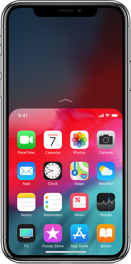
I mentioned thumb zones with regard to touch target positioning earlier, and how positioning touch targets in hard-to-reach areas of the interface makes them harder to select. With the arrival of the larger iPhone 6 and iPhone 6 Plus, Apple introduced a feature that aimed to mitigate the difficulty of one-handed use. The feature, called Reachability, enables users to quickly bring items at the top of the screen down to the lower half of the screen via a simple gesture (Figure 2-7). It effectively enables easy access to parts of the screen that would otherwise be difficult for one-handed users to interact with.

Figure 2-7. The iPhone’s Reachability feature enables easy access to the top half of the screen (source: Apple, 2019)
Conclusion
A key responsibility we have as designers is to ensure the interfaces we create augment human capabilities and experiences, and don’t distract from or deter them. Mobile interfaces are especially susceptible to Fitts’s law due to the limited screen real estate available. We can ensure interactive elements are easily selectable by making them large enough for users to both discern them and accurately select them, providing ample space between controls to avoid accidental selection of adjacent actions and placing them in areas of the interface that allow them to be easily selected.
1 Paul M. Fitts, “The Information Capacity of the Human Motor System in Controlling the Amplitude of Movement,” Journal of Experimental Psychology 47, no. 6 (1954): 381–91.
2 Kiran Dandekar, Balasundar I. Raju, and Mandayam A. Srinivasan, “3-D Finite-Element Models of Human and Monkey Fingertips to Investigate the Mechanics of Tactile Sense,” Journal of Biomechanical Engineering 125, no. 5 (2003): 682–91.
3 Steven Hoober, “Design for Fingers, Touch, and People, Part 1,” UXmatters, March 6, 2017, https://www.uxmatters.com/mt/archives/2017/03/design-for-fingers-touch-and-people-part-1.php.