Chapter 4. Miller’s Law
The average person can keep only 7 (± 2) items in their working memory.

Overview
It’s likely that many designers will have heard of Miller’s law, but there is also a high probability that their understanding of it is inaccurate. This commonly misunderstood heuristic has frequently been cited as justification for design decisions such as “the number of navigation items must be limited to no more than seven” and so forth. While there is value in limiting the number of options available to users (see Chapter 3), it is misleading and inaccurate to attribute such dogma to Miller’s law. In this chapter, we’ll explore the origins of Miller’s “magical number seven” and the real value Miller’s law has to provide UX designers.
Origins
Miller’s law originates from a paper published in 1956 by cognitive psychologist George Miller titled “The Magical Number Seven, Plus or Minus Two: Some Limits on Our Capacity for Processing Information.”1 Miller, a professor at Harvard University’s Department of Psychology, discussed in his paper the coincidence between the limits of one-dimensional absolute judgment and the limits of short-term memory. Miller observed that memory span in young adults was approximately limited to 7, regardless of the stimuli consisting of vastly different amounts of information. This led him to the conclusion that bits, the basic unit of information, don’t affect memory span as much as the number of information chunks being memorized. The term “chunks” in cognitive psychology refers to collections of basic familiar units that have been grouped together and stored in a person’s memory.
Miller’s paper is often interpreted as arguing that the number of objects an average human can hold in short-term memory is 7±2. Miller himself only used the expression “the magical number seven” rhetorically and was surprised by its frequent misinterpretation. Later research on short-term memory and working memory revealed that memory span is not a constant even when measured in “chunks.”
Examples
The simplest example of chunking can be found in how we format phone numbers. Without chunking, a phone number would just be a long string of digits—significantly more than seven—making it difficult to process and remember. A phone number that has been formatted (chunked) is much easier to both process and memorize (Figure 4-1).

Figure 4-1. A (US) phone number with and without chunking applied
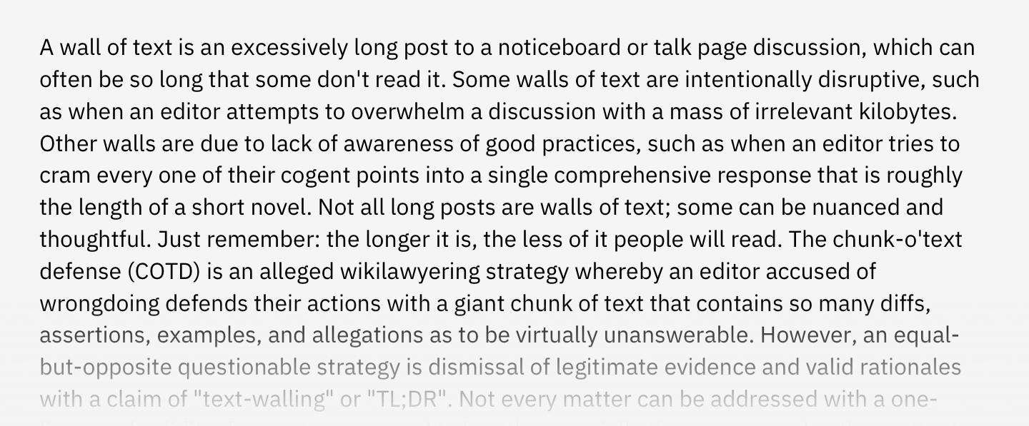
Let’s move on to a slightly more complex example. When browsing the web, you’ll inevitably be faced with the dreaded “wall of text” (Figure 4-2)—content that’s characterized by a lack of hierarchy or formatting and that exceeds the appropriate line length. It can be compared to the unformatted phone number example just given, but on a larger scale. This content is more difficult to scan and process, which has the effect of increasing the cognitive load on users.

Figure 4-2. “Wall of text” example (source: Wikipedia, 2019)
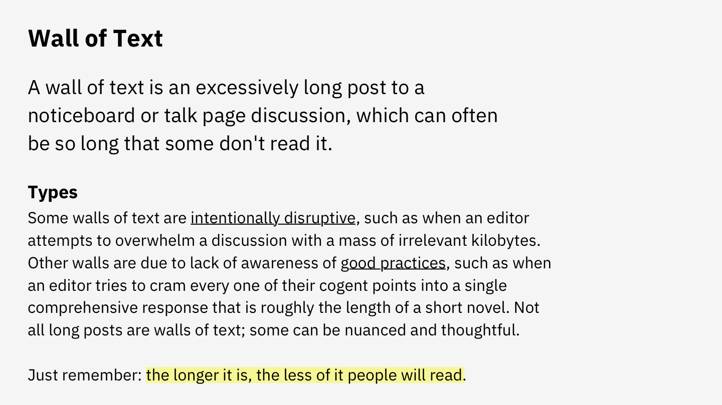
When we compare this example with content that has formatting, hierarchy, and appropriate line lengths applied, the contrast is significant. Figure 4-3 is an improved version of the same content. Headings and subheadings have been added to provide hierarchy, whitespace has been used to break the content into discernable sections, line length has been reduced to improve readability, text links have been underlined, and key words have been highlighted to provide contrast with the surrounding text.

Figure 4-3. “Wall of text” improved with hierarchy, formatting, and appropriate line lengths (source: Wikipedia, 2019)
Now let’s take a look at how chunking is applied in a broader context. Chunking can be used to help users understand underlying relationships by grouping content into distinctive modules, applying rules to separate content, and providing hierarchy (Figure 4-4). Especially in information-dense experiences, chunking can be leveraged to provide structure to the content. Not only is the result more visually pleasing, but it’s also more scannable. Users who are skimming the latest headlines to determine which is worthy of their attention can quickly scan the page and make a decision.

Figure 4-4. Example of chunking applied to dense information (source: Bloomberg, 2018)
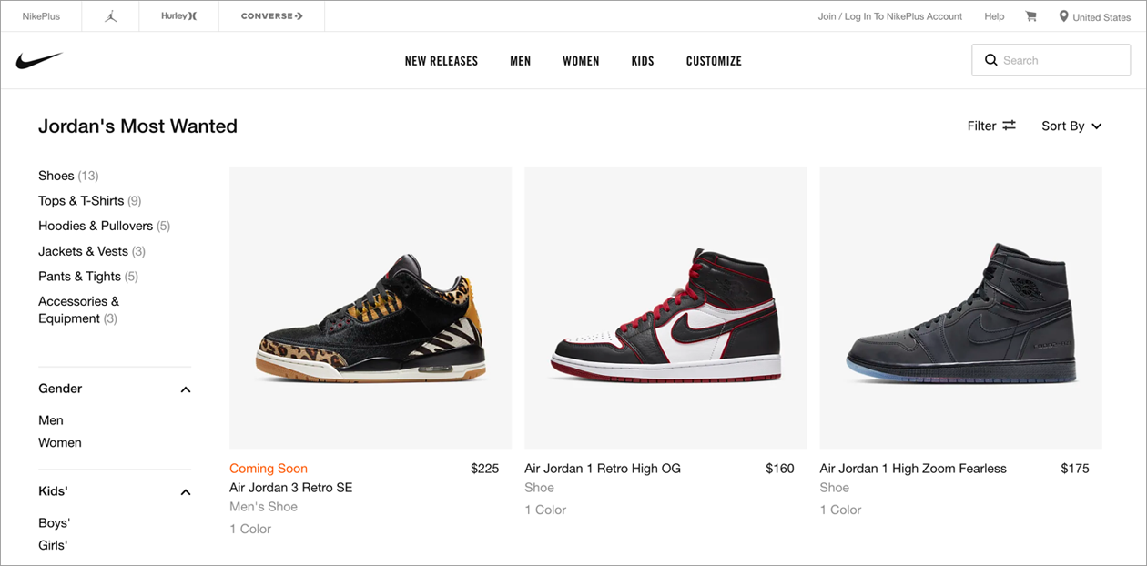
While chunking is incredibly useful for bringing order to information-dense experiences, it can be found in many other places as well. Take, for example, ecommerce websites such as Nike.com (Figure 4-5), which uses chunking to group information related to each product. While individual elements might not share a background or surrounding border, they are visually chunked by their proximity to one another (product image, title, price, type of product, and finally total colors available). Additionally, Nike.com leverages chunking to group related filters in the lefthand sidebar.

Figure 4-5. Chunking is commonly used to group products and filters on ecommerce websites (source: Nike.com, 2019)
These examples demonstrate how chunking can be used to visually organize any content for easier comprehension. It helps those who are consuming the content to understand the underlying relationships and information hierarchy. What chunking does not do is dictate a specific limit on the number of items that can be shown at a given time or within a group. Rather, it’s simply a method for organizing content that makes it easier to quickly identify important information.
Conclusion
The sheer volume of information around us is growing at an exponential rate—but we humans have a finite amount of mental resources available to process that information. The inevitable overload that can occur has a direct effect on our ability to complete tasks. Miller’s law teaches us to use chunking to organize content into smaller clusters to help users process, understand, and memorize easily.
1 George A. Miller, “The Magical Number Seven, Plus or Minus Two: Some Limits on Our Capacity for Processing Information,” Psychological Review 63, no. 2 (1956): 81–97.