Chapter 7
Creating and Using PivotTables
IN THIS CHAPTER
 Getting to know PivotTables
 Using an Excel table to build a PivotTable
 Building a PivotTable using external data
 Putting the “pivot” in PivotTable
 Grouping and filtering PivotTables
Excel tables and external databases can contain thousands of records. Let’s face it: Figuring out how to glean useful insights from that much data will either keep you awake at night or cause nightmares if you do sleep. Want to get some quality shut-eye? No need for sleeping pills when Excel offers a powerful and versatile data-analysis tool called a PivotTable, which enables you to take those thousands of records and summarize them in a concise tabular format. You can then manipulate the layout of — or pivot — the PivotTable to see different views of your data.
This chapter shows you everything you need to know to get started with what is arguably Excel’s most useful data-analysis tool. You learn how to create PivotTables, refresh them, pivot them, group them, filter them, and much more.
Understanding PivotTables
In a general sense, PivotTables take a large amount of information and condense that data into a report that tells you something useful or interesting. For example, take a look at the table shown in Figure 7-1. This table contains well over 100 records, each of which is an order from a sales promotion. That’s not a ton of data in the larger scheme of things, but trying to make sense of even this relatively small data set just by eyeballing the table’s contents is futile. For example, how many earbuds were sold via social media advertising? Who knows? Ah, but now look at Figure 7-2, which shows a PivotTable built from the order data. This report tabulates the number of units sold for each product based on each promotion. From here, you can quickly see that 322 earbuds were sold via social media advertising. That is what PivotTables do.
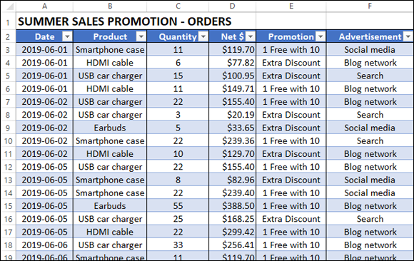
FIGURE 7-1: Some great data, but how do you make sense of it?
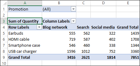
FIGURE 7-2: The PivotTable creates order out of data chaos.
PivotTables help you analyze large amounts of data by performing three operations: grouping the data into categories; summarizing the data using calculations; and filtering the data to show just the records you want to work with:
-
Grouping: A PivotTable is a powerful data-analysis tool in part because it automatically groups large amounts of data into smaller, more manageable chunks. For example, suppose you have a data source with a Region field in which each item contains one of four values: East, West, North, and South. The original data may contain thousands of records, but if you build your PivotTable using the Region field, the resulting table has just four rows — one each for the four unique Region values in your data.
You can also create your own grouping after you build your PivotTable. For example, if your data has a Country field, you can build the PivotTable to group all the records that have the same Country value. When you have done that, you can further group the unique Country values into continents: North America, South America, Europe, and so on.
-
Summarizing: In conjunction with grouping data according to the unique values in one or more fields, Excel also displays summary calculations for each group. The default calculation is Sum, which means that for each group, Excel totals all the values in some specified field. For example, if your data has a Region field and a Sales field, a PivotTable can group the unique Region values and display the total of the Sales values for each one. Excel has other summary calculations, including Count, Average, Maximum, Minimum, and Standard Deviation.
Even more powerful, a PivotTable can display summaries for one grouping broken down by another. For example, suppose your sales data also has a Product field. You can set up a PivotTable to show the total Sales for each Product, broken down by Region.
- Filtering: A PivotTable also enables you to view just a subset of the data. For example, by default, the PivotTable’s groupings show all the unique values in the field. However, you can manipulate each grouping to hide those that you do not want to view. Each PivotTable also comes with a report filter that enables you to apply a filter to the entire PivotTable. For example, suppose your sales data also includes a Customer field. By placing this field in the PivotTable’s report filter, you can filter the PivotTable report to show just the results for a single Customer.
Exploring PivotTable Features
You can get up to speed with PivotTables very quickly after you learn a few key concepts. You need to understand the features that make up a typical PivotTable, particularly the four areas — row, column, data, and filter — to which you add fields from your data. Figure 7-3 points out the following PivotTable features:
- Row area: Displays vertically the unique values from a field in your data.
- Column area: Displays horizontally the unique values from a field in your data.
- Value area: Displays the results of the calculation that Excel applied to a numeric field in your data.
- Row field header: Identifies the field contained in the row area. You also use the row field header to filter the field values that appear in the row area.
- Column field header: Identifies the field contained in the column area. You also use the column field header to filter the field values that appear in the column area.
- Value field header: Specifies both the calculation (such as Sum) and the field (such as Quantity) used in the value area.
- Filter area: Displays a drop-down list that contains the unique values from a field. When you select a value from the list, Excel filters the PivotTable results to include only the records that match the selected value.
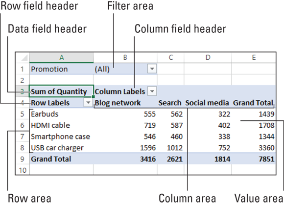
FIGURE 7-3: The features of a typical PivotTable.
Building a PivotTable from an Excel Table
If the data you want to analyze exists as an Excel table, you can use the Summarize with PivotTable command to quickly build a PivotTable report based on your data. You need only specify the location of your source data and then choose the location of the resulting PivotTable.
Here are the steps to follow:
- Select a cell in the table that you want to use as the source data.
-
Choose Design ⇒ Summarize with PivotTable.
If your data resides in a regular Excel range instead of a table, you can still do the PivotTable thing. Select any cell in the range and then choose Insert ⇒ PivotTable.
 While I have your attention, I should also point out the Insert tab’s Recommended PivotTables command. This command displays a dialog box that shows several predefined PivotTable layouts. These might not mean anything to you now if you’re new to PivotTables, but keep the Recommended PivotTables command in mind down the road; it might save you a bit of time.
The Create PivotTable dialog box appears with the Select a Table or Range radio button selected. The Table/Range box should show the name of your table (or the address of your range). If not, adjust the name or address as needed before moving on.
-
Select the New Worksheet radio button.
Alternatively, if you want to add the PivotTable to an existing location, select the Existing Worksheet radio button and then use the Location range box to select the worksheet and cell where you want the PivotTable to appear.
-
Click OK.
Excel creates a blank PivotTable and displays the PivotTable Fields pane, as shown in Figure 7-4. This pane contains two main areas:
- A list of the column headers from your table, each of which has a check box to its left. These are your PivotTable fields.
- Four boxes representing the four areas of the PivotTable: Filters, Columns, Rows, and Values. To complete the PivotTable, your job is to add one or more fields to some (or even all) of these areas.
-
Drag a text field and drop it inside the Rows area.
For example, using the fields shown in Figure 7-4, you could drop the Product field into the Rows area.
Excel adds the field’s unique values to the PivotTable’s row area.
-
Drag a numeric field and drop it inside the Values area.
For example, using the fields shown in Figure 7-4, you could drop the Quantity field into the Values area.
Excel sums the numeric values based on the row values.
-
If desired, drag fields and drop them in the Columns area and the Filters area.
For example, using the fields shown in Figure 7-4, you could drop the Advertisement field into the Columns area and the Promotion field into the Filters area.
Each time you drop a field in an area, Excel updates the PivotTable to include the new data.
 Excel offers a few shortcut techniques for building PivotTables:
 - Select the check box for a text or date field to add it to the Rows area.
- Select the check box for a numeric field to add it to the Values area.
- Right-click a field and then select the area that you want to use.
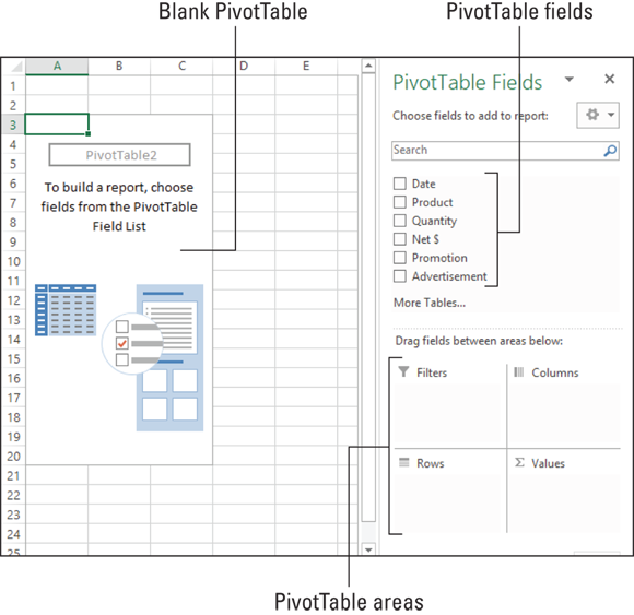
FIGURE 7-4: You start with a blank PivotTable and the PivotTable Fields pane.
Figure 7-5 shows a completed PivotTable, with fields in all four areas. Note, too, that when you select a cell inside the PivotTable, Excel displays the PivotTable Tools contextual tab, which includes two tabs — Analyze and Design — that offer lots of goodies for manipulating and formatting your PivotTable.
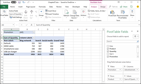
FIGURE 7-5: The features of a typical PivotTable.
To remove a field from a PivotTable area, you have two ways to proceed:
- Drag the field out of the PivotTable Fields pane.
- Click the field button in the PivotTable Fields pane to drop down the field menu, and then click Remove Field.
Creating a PivotTable from External Data
The data you’re analyzing might not exist in an Excel range or table but rather outside Excel, in a relational database management system (RDBMS) such as Microsoft Access or SQL Server. With these programs, you can set up a table, query, or other object that defines the data you want to work with. Then, instead of building a PivotTable from data within an Excel worksheet, you create the PivotTable using the external data source. This enables you to build reports from extremely large data sets and from relational database systems.
Here are the steps to follow to build a PivotTable based on an external data source:
-
Choose Data ⇒ Get Data ⇒ From Other Sources ⇒ From Microsoft Query.
The Choose Data Source dialog box appears. I talk about this dialog box, as well as the general topics of external data and defining data sources, in Chapter 4, “Grabbing Data from External Sources.” The steps that follow repeat those from the section about querying a data source in Chapter 4, so I leave out some of the details.
- Select the Use the Query Wizard to Create/Edit Queries check box.
-
On the Databases tab, select the database you want to query and then click OK.
If you choose one of the predefined database types, Excel displays the Select Database dialog box. In this dialog box, select the database that you want to query and then click OK.
Excel displays the Query Wizard - Choose Columns dialog box.
-
Add the columns you want to work with to the Columns in Your Query list and then select Next button.
Excel displays the Query Wizard - Filter Data dialog box.
-
(Optional) Filter your data based on multiple filters by selecting the And or Or radio buttons; then select Next.
Excel displays the Query Wizard - Sort Order dialog box.
-
(Optional) Choose a sort order for the query result data from the Query Wizard - Sort Order dialog box and then click Next.
Excel displays the Query Wizard - Finish dialog box.
-
Select the Return Data to Microsoft Excel radio button and then click the Finish button.
Excel displays the Import Data dialog box, shown in Figure 7-6.
-
Select the PivotTable Report radio button, select the New Worksheet radio button, and then click OK.
Excel creates a blank PivotTable and the PivotTable Fields pane.
-
Drag a text field and drop it inside the Rows area.
Excel adds the field’s unique values to the PivotTable’s row area.
-
Drag a numeric field and drop it inside the Values area.
Excel sums the numeric values based on the row values.
-
If desired, drag fields and drop them in the Columns area and the Filters area.
Each time you drop a field in an area, Excel updates the PivotTable to include the new data.
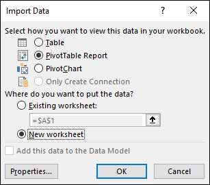
FIGURE 7-6: Import the external data to a PivotTable Report.
Alternatively, the problem might be that the database file has been moved or renamed. Click OK in the error message and then click Database in the Login dialog box. Next, in the Select Database dialog box, find and select the database file.
Refreshing PivotTable Data
Whether your PivotTable is based on financial results, survey responses, or a database of collectibles such as rare books or cubic zirconia jewelry, the underlying data is probably not static. That is, the data changes over time as new results come in, new surveys are undertaken, and new items are added to the collection. You can ensure that the data analysis represented by the PivotTable remains up to date by refreshing the PivotTable.
Excel offers two methods for refreshing a PivotTable: manual and automatic. A manual refresh is one that you perform, usually when you know that the source data has changed, or if you simply want to be sure that the latest data is reflected in your PivotTable report. An automatic refresh is one that Excel handles for you.
Refreshing PivotTable data manually
To refresh your PivotTable data manually, you have two choices:
- Update a single PivotTable: Select any cell inside the PivotTable and then choose Analyze ⇒ Refresh. You can also press Alt+F5.
- Update every PivotTable in the workbook: Select a cell inside any PivotTable and then choose Analyze ⇒ Refresh ⇒ Refresh All. You can also update all PivotTables by pressing Ctrl+Alt+F5.
Excel dutifully updates the PivotTable data.
Refreshing PivotTable data automatically
Here are the steps to follow to convince Excel to refresh your PivotTable data automatically:
- Select any cell inside the PivotTable.
-
Choose Analyze ⇒ PivotTable ⇒ Options.
 You can also right-click any cell in the PivotTable and then choose PivotTable Options.
The PivotTable Options dialog box appears.
- Click the Data tab.
-
Select the Refresh Data When Opening the File check box, as shown in Figure 7-7, and then click OK.
From now on, Excel will automatically refresh the PivotTable data each time you open the workbook.
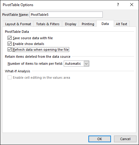
FIGURE 7-7: Import the external data to a PivotTable Report.
Adding Multiple Fields to a PivotTable Area
You can add two or more fields to any of the PivotTable areas. Having multiple fields is a powerful feature that enables you to perform further analysis of your data by viewing the data differently. For example, suppose you're analyzing the results of a sales campaign that ran different promotions in several types of advertisements. A basic PivotTable might show you the sales for each product (the row field) according to the advertisement used (the column field). You might also be interested in seeing, for each product, the breakdown in sales for each promotion. You can do that by adding the Promotion field to the row area.
Select a cell within the PivotTable and then use any of the following techniques to add another field to a PivotTable area:
- Add a field to the Rows area: In the PivotTable Fields pane, select the check box of the text or date field that you want to add.
- Add a field to the Value area: In the PivotTable Fields pane, select the check box of the numeric field that you want to add.
- Add a field to any area: In the PivotTable Fields pane, drag the field and drop it inside the box of the area where you want the field to appear.
When you add a second field to the value area, Excel moves the labels, such as Sum of Quantity and Sum of Net $, into the column area for easier reference. This is also reflected in the addition of a Values button in the Columns box section of the PivotTable Fields pane. This enables you to pivot the values within the report, as I describe in the next section.
Pivoting a Field to a Different Area
A PivotTable is a powerful data-analysis tool because it can take hundreds or even thousands of records and summarize them into a compact, comprehensible report. However, unlike most of the other data-analysis features in Excel, a PivotTable is not a static collection of worksheet cells. Instead, you can move a PivotTable’s fields from one area of the PivotTable to another. Moving fields to various areas enables you to view your data from different perspectives, which can greatly enhance the analysis of the data. Moving a field within a PivotTable is called pivoting the data.
The most common way to pivot the data is to move fields between the row and column areas. However, you can also pivot data by moving a row or column field to the filter area. Either way, you perform the pivot by dragging the field from its current box in the PivotTable Fields pane and then dropping it inside the area where you want it moved.
You can move any row, column, or filter field to the PivotTable’s value area. Moving a field to this location may seem strange because row, column, and page fields are almost always text values, and the default value area calculation is Sum. How can you sum text values? You can’t, of course. Instead, the default Excel PivotTable summary calculation for text values is Count. So, for example, if you drag the Promotion field and drop it inside the value area, Excel creates a second value field named Count of Promotion.
Grouping PivotTable Values
To make a PivotTable with a large number of row or column items easier to work with, you can group the items. For example, you can group months into quarters, thus reducing the number of items from twelve to four. Similarly, a report that lists dozens of countries can group those countries by continent, thus reducing the number of items to four or five, depending on where the countries are located. Finally, if you use a numeric field in the row or column area, you may have hundreds of items, one for each numeric value. You can improve the report by creating just a few numeric ranges.
Grouping numeric values
Grouping numeric values is useful when you use a numeric field in a row or column field. Excel enables you to specify numeric ranges into which the field items are grouped. For example, suppose you have a PivotTable of invoice data that shows the extended price (the row field) and the salesperson (the column field). It would be useful to group the extended prices into ranges and then count the number of invoices each salesperson processed in each range.
Follow these steps to group numeric values in a PivotTable field:
- Select any item in the numeric field you want to group.
-
Choose Analyze ⇒ Group ⇒ Group Field.
The Grouping dialog box appears, as shown in Figure 7-8.
-
Use the Starting At text box to enter the starting numeric value.
Alternatively, select the Starting At check box to have Excel extract the minimum value of the numeric items and place that value in the text box.
-
Use the Ending At text box to enter the ending numeric value.
Alternatively, select the Ending At check box to have Excel extract the maximum value of the numeric items and place that value in the text box.
- In the By text box, enter the size you want to use for each grouping.
-
Click OK.
Excel groups the numeric values.

FIGURE 7-8: The Grouping dialog box.
Grouping date and time values
If your PivotTable includes a field with date or time data, you can use Excel’s grouping feature to consolidate that data into more manageable or useful groups. Follow these steps:
- Select any item in the date or time field you want to group.
-
Choose Analyze ⇒ Group ⇒ Group Field.
The Grouping dialog box appears.
-
In the Starting At text box, enter the starting date or time.
Alternatively, select the Starting At check box to have Excel extract the earliest date or time and place that value in the text box.
-
Use the Ending At text box to enter the ending date or time.
Alternatively, select the Ending At check box to have Excel extract the latest date or time and place that value in the text box.
-
From the By list, select the grouping you want, such as Months for dates or Hours for times.
If you select Days, you can also use the Number of Days spin buttons to set the days you want to use for the grouping interval.
To use multiple groupings, select each type of grouping you want to use.
-
Click OK.
Excel groups the date or time values.
Grouping text values
One common problem that arises when you work with PivotTables is that you often need to consolidate items, but you have no corresponding field in the data. For example, the data may have a Country field, but what if you need to consolidate the PivotTable results by continent? Your source data isn't likely to include a Continent field. Similarly, your source data may include employee names, but you may need to consolidate the employees according to the people they report to. What happens if your source data does not include, say, a Supervisor field?
The solution in both cases is to use the Grouping feature to create custom groups. For the country data, you can create custom groups named North America, South America, Europe, and so on. For the employees, you can create a custom group for each supervisor.
Here are the steps to follow to create such a custom grouping for text values:
- Select the items that you want to include in the group.
-
Choose Analyze ⇒ Group ⇒ Group Selection.
Excel creates a new group named Groupn (where n means that this is the nth group you have created; the first group is Group1, the second is Group2, and so on) and restructures the PivotTable.
-
Select the cell that contains the group label, type a new name for the group, and then press Enter.
Excel renames the group.
- Repeat Steps 1 to 3 for the other items in the field until you have created all your groups.
Filtering PivotTable Values
By default, each PivotTable report displays a summary for all the records in your source data. This is usually what you want to see. However, you may have situations in which you need to focus more closely on some aspect of the data. You can focus on a specific item from one of the source data fields by taking advantage of the PivotTable’s report filter field.
Applying a report filter
Suppose you're dealing with a PivotTable that summarizes data from thousands of customer invoices over some period of time. A basic PivotTable might tell you the total amount sold for each product that you carry. That’s interesting, but what if you want to see the total amount sold for each product in a specific country? If the Product field is in the PivotTable’s row area, you can add the Country field to the column area. However, you may have dozens of countries, so adding the field to the column area isn't an efficient solution. Instead, you can add the Country field to the report filter and tell Excel to display the total sold for each product for the specific country that you’re interested in.
Follow these steps to apply a PivotTable report filter:
-
Select the filter field’s drop-down arrow.
Excel displays a list of the report filter field values.
-
Select the report filter you want to view.
In Figure 7-9, I use the report filter list to select Canada.
If you want to display data for two or more report filters, select the Select Multiple Items check box and then repeat Step 2 to select the other report filters.
To return later to showing all the items in the report field, select (All) from the filter field's drop-down list.
-
Select OK.
Excel filters the PivotTable to show only the data for the report filter you selected.
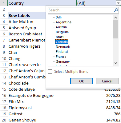
FIGURE 7-9: From the filter field’s drop-down list, select a report filter.
Filtering row or column items
By default, your PivotTable shows all the items in whatever row and column fields you added to the report layout. Seeing all the items is usually what you want because the point of a PivotTable is to summarize all the data in the original source. However, sometimes you may not want to see every item. For example, in a PivotTable report that includes items from the ProductName field in the row area, you might want to see only those products with names that begin with the letter G or that contain the word tofu.
When you modify a PivotTable report to show only a subset of the row or column items, you are applying a label filter to the report, which is different from a report filter, which filters the entire PivotTable, as described in the previous section. Excel offers a number of label filters for text, including Equals, Does Not Equal, Begins With, Ends With, Contains, Greater Than, and Less Than.
If your PivotTable report includes a date field in the row or column area, you can apply a date filter to that field. Excel offers many different date filters, including Before, After, Between, Today, Yesterday, Last Week, Last Month, Last Quarter, This Year, and Year to Date.
Follow these steps to apply a label filter to row or column items:
-
Click the drop-down arrow in the header of the field you want to filter.
The field’s Sorting & Filtering menu appears.
-
Select Label Filters and then select the filter type you want to apply, such as Begins With.
The Label Filter dialog box appears.
-
Type the filter criteria and then click OK.
Some filters, such as Between, require you to type two criteria values.
Excel filters the PivotTable report.
To remove a row or column label filter, click the drop-down arrow in the field’s header and then select Clear Filter from Field, where Field is the name of the filtered field.
Filtering PivotTable values
Excel enables you to apply value filters that restrict the values you see in the value area. For example, you may want to see only those values that are larger than some amount or that fall between two specified amounts. Excel offers several value filters, including Equals, Does Not Equal, Greater Than, Greater Than or Equal To, Less Than, Less Than or Equal To, Between, and Not Between.
Similarly, you may be interested in only the highest or lowest values that appear in the PivotTable. For example, you might want to see just the top ten values. You can generate such a report by using Excel’s Top 10 Filter, which filters the PivotTable to show just the top ten items based on the values in the value field.
For example, suppose you have a PivotTable report based on a database of invoices that shows the total sales for each product. The basic report shows all the products, but if you’re interested in only the top performers for the year, you can activate the Top 10 Filter feature to see the ten products that sold the most. Despite its name, the Top 10 Filter can display more than just the top ten data values. You can specify any number between 1 and 2,147,483,647, and you can ask Excel to show the bottommost values as well.
Follow these steps to apply a value filter to your PivotTable:
-
Click the drop-down arrow in the header of any row or column field.
The field’s Sorting & Filtering menu appears.
-
Select Value Filters and then select the filter type you want to apply, such as Top 10.
The dialog box for that value filter appears — for example, the Top 10 Filter dialog box.
-
Type the filter criteria and then click OK.
Excel filters the PivotTable report.
To remove a value filter, click the drop-down arrow in the header of the filtered field and then choose Value Filters ⇒ Clear Filter.
Filtering a PivotTable with a slicer
As mentioned earlier in this chapter, you can filter a PivotTable either by using the report filter, which applies to the entire PivotTable, or by using either a label filter or a value filter, which apply only to the filter field. Whether it applies to the entire PivotTable or just the filter field, the filter is usable only with the PivotTable in which it’s defined. However, requiring the same filter in multiple PivotTable reports is not unusual. For example, if you’re a sales manager responsible for sales in a particular set of countries, you might often need to filter a PivotTable to show data from just those countries. Similarly, if you work with a subset of your company’s product line, you might often have to filter PivotTable reports to show the results from just those products.
Applying these kinds of filters to one or two PivotTables is not difficult or time consuming, but if you have to apply the same filter over and over again, the process gets old in a hurry. To combat this repetition, Excel offers a PivotTable feature called the slicer. A slicer is very similar to a report filter, except that it’s independent of any PivotTable. This means that you can use a single slicer to filter multiple PivotTables. Nice!
First, here are the steps to follow to create a slicer to filter a PivotTable:
- Select a cell inside your PivotTable.
-
Choose Analyze ⇒ Insert Slicer.
The Insert Slicers dialog box appears and displays a check box for every field in your PivotTable report.
-
Select the check box beside each field for which you want to create a slicer; then click OK.
Excel displays one slicer for each field you selected. Each slicer is a box that contains a list of the items from its associated field. By default, all the items in the slicer are selected, so no filtering has yet been applied to the PivotTable. Your mission is to use the slicer to select just the field items you want to see in the PivotTable.
Also, the Slicer Tools contextual tab appears when a slicer has the focus, and you can use the controls in its Options tab to customize each slicer.
-
Select a field item that you want to include in your filter.
If you want to include multiple items in your filter, hold down Ctrl, select each item, and then release Ctrl. Alternatively, click the Multi-Select button (see Figure 7-10; you can also toggle Multi-Select by pressing Alt+S).
Excel filters the PivotTable based on the field items you selected in each slicer. Figure 7-10 shows an example.
 If a field contains lots of items, you may have to scroll a long way in the slicer to locate the item you want. In this case, configuring the slicer to display its items in multiple columns is often easier. Select the title of the slicer to select it, click the Options tab, and then click the Column spin buttons to set the number of columns.
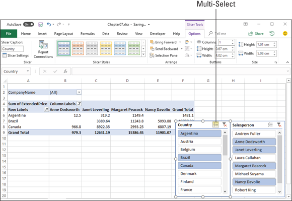
FIGURE 7-10: Excel filters the PivotTable to show just the selected items in each slicer.
If you find that you no longer need to use a slicer, you should remove it to avoid cluttering the PivotTable window. Either select the slicer and press Delete, or right-click the slicer and then select Remove Slicer, where Slicer is the name of the slicer (which is usually the field name). If you want only to temporarily hide the slicer, select any slicer, choose Options ⇒ Selection Pane to display the Selection task pane, and then click the eye icon beside the slicer to hide it.
 When you create a PivotTable from external data, you don’t need the external data to be imported to Excel. Rather, the external data resides only in the new PivotTable; you don’t see the actual data in your workbook.
 The most common drawback to using external data is that you often have no control over the data source. For example, if you attempt to refresh the PivotTable, as I describe in the next section, Excel might display an error message. If you suspect that the problem is a change to the database login data, click OK to display the Login dialog box and then find out the new login name and password from the database administrator.
 Note, however, that when you set up an automatic refresh, it might be best not to have the source data updated too frequently. Depending on where the data resides and how much data you’re working with, the refresh could take some time, which may slow down the rest of your work.