After Chapter 12.6, you will be able to:
Because your career will be filled with evidence-based medicine, it is important to be able to recognize and interpret data in multiple forms. We have already considered the mathematical side of statistics; now, let’s take a look at the visual side. On the MCAT, anticipate that most passages in the sciences will be accompanied by a visual aid in some way—frequently, this will be a chart, graph, or data table.
Charts present information in a visual format and are frequently used for categorical data.
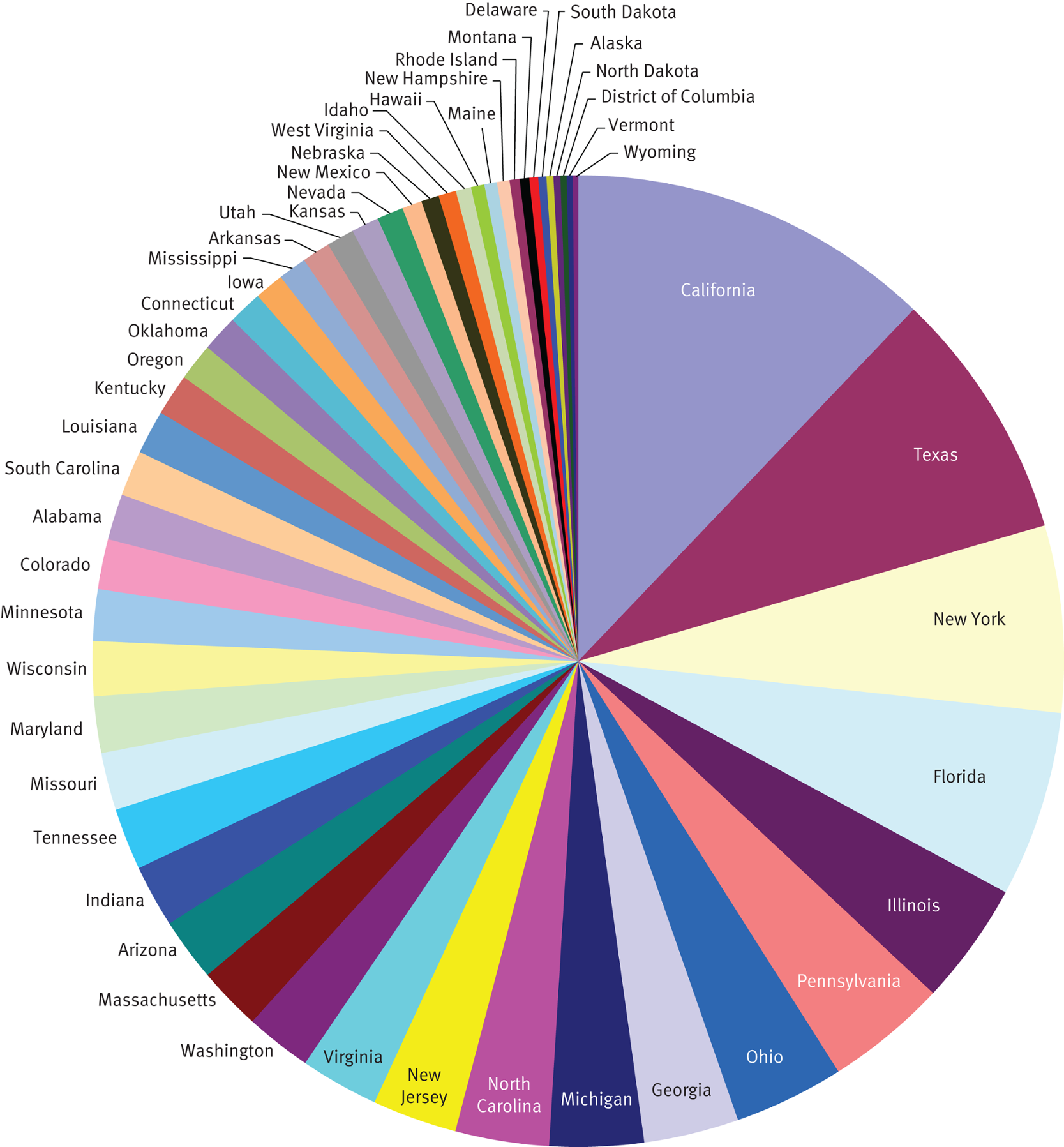
Pie or circle charts are used to represent relative amounts of entities and are especially popular in demographics. They may be labeled with raw numerical values or with percent values. The primary downside to pie charts is that as the number of represented categories increases, the visual representation loses impact and becomes confusing. For example, in Figure 12.5, the population of each of the 50 states and the District of Columbia is presented on a pie chart, but the large number of entities makes the graph incoherent.
Questions about pie charts are likely to be qualitative, asking for the smallest or largest group, or the percentage occupied by one or more groups combined. These questions are unlikely to require additional analysis because pie charts are not dense with information.
Pie charts are frequently used to present demographic information. Demographics is the statistical arm of sociology and is discussed in Chapter 11 of MCAT Behavioral Sciences Review.
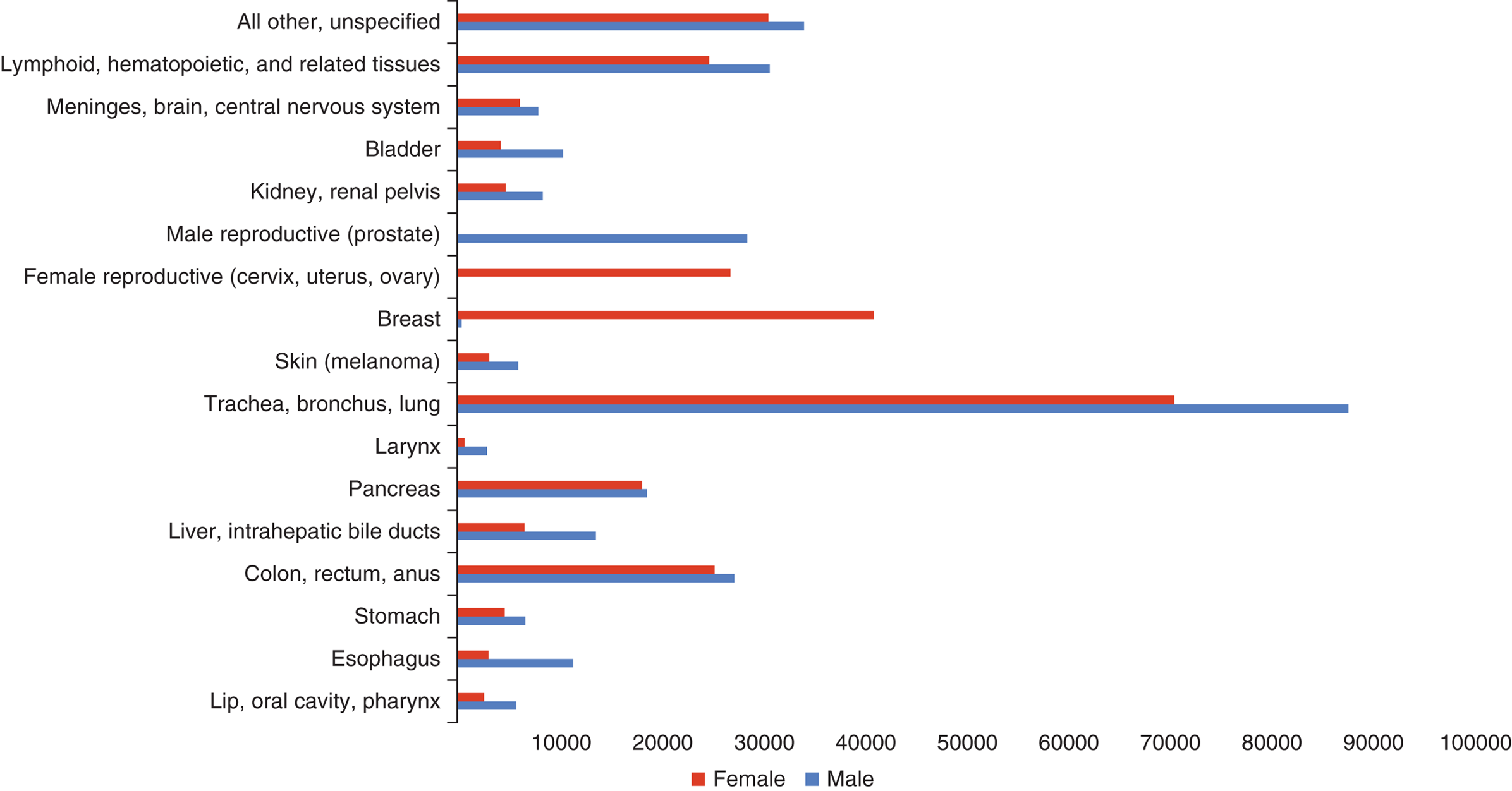
Bar charts and histograms are likely to contain significantly more information than a pie chart for the same amount of page space. Bar charts are used for categorical data, which sort data points based on predetermined categories. The bars may then be sorted by increasing or decreasing bar length. The length of a bar is generally proportional to the value it represents. Wherever possible, breaks should be avoided in the chart because of the potential to distort scale. To that end, be wary of graphs that contain breaks; they may be enlarging the difference between bars. Figure 12.6 shows a representative bar graph for causes of cancer death in the United States in 2010.
Histograms present numerical data rather than discrete categories. Histograms are particularly useful for determining the mode of a data set because they are used to display the distribution of a data set.
Box plots are used to show the range, median, quartiles and outliers for a set of data. A labeled box plot, also called a box-and-whisker, is shown in Figure 12.7.
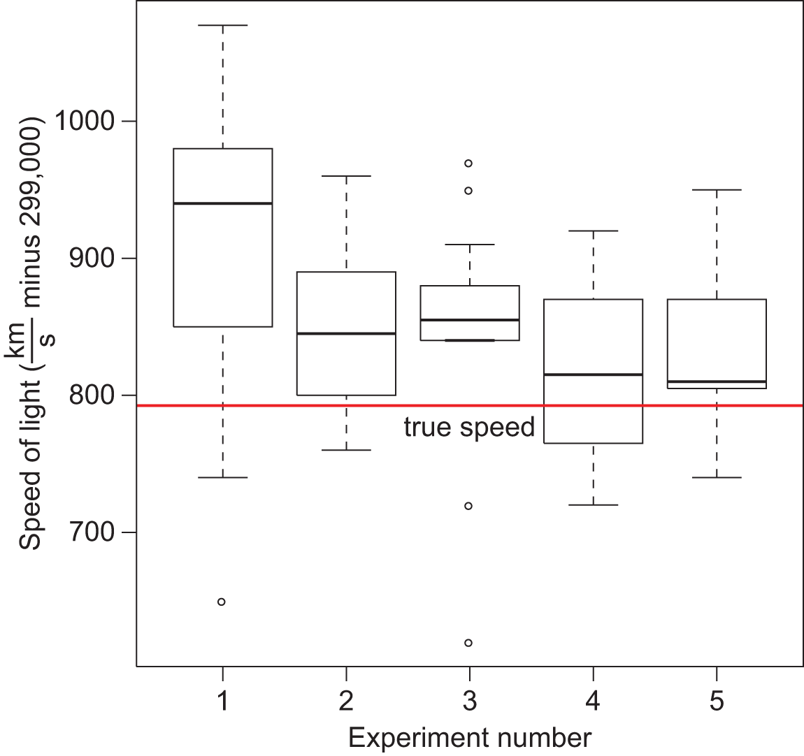
The box of a box-and-whisker plot is bounded by Q1 and Q3; Q2 (the median) is the line in the middle of the box. The ends of the whiskers correspond to maximum and minimum values of the data set. Alternatively, outliers can be presented as individual points, with the ends of the whiskers corresponding to the largest and smallest values in the data set that are still within 1.5 × IQR of the median. Box-and-whisker plots are especially useful for comparing data because they contain a large amount of data in a small amount of space, and multiple plots can be oriented on a single axis.
In addition to the other forms of charts, data can be illustrated geographically. Maps of health conditions, population density, political districts, and ethnicity are relatively easy to comprehend and may show geographic clustering for some data. The best map data will examine one or at most two pieces of information simultaneously. Any further data may inhibit clarity. A map of population density in each country of the world is shown in Figure 12.8.

While we’re all familiar with constructing graphs—especially scatter plots and line graphs—it is important to know some important features and potential stumbling blocks of graphs as we move toward Test Day. When presented with a graph, you should attempt to draw rough conclusions immediately but should not spend time analyzing all of the details of the graph unless asked to do so by a question. The first thing to do when you encounter a graph on Test Day is to look at the axes.
Linear graphs show the relationships between two variables. They generally involve two direct measurements and, strictly speaking, do not have to be a straight line. The shape of the curve on this type of graph may be linear, parabolic, exponential, or logarithmic. These are shown in Figure 12.9. On Test Day, you should be able to recognize at least these four shapes of graphs.
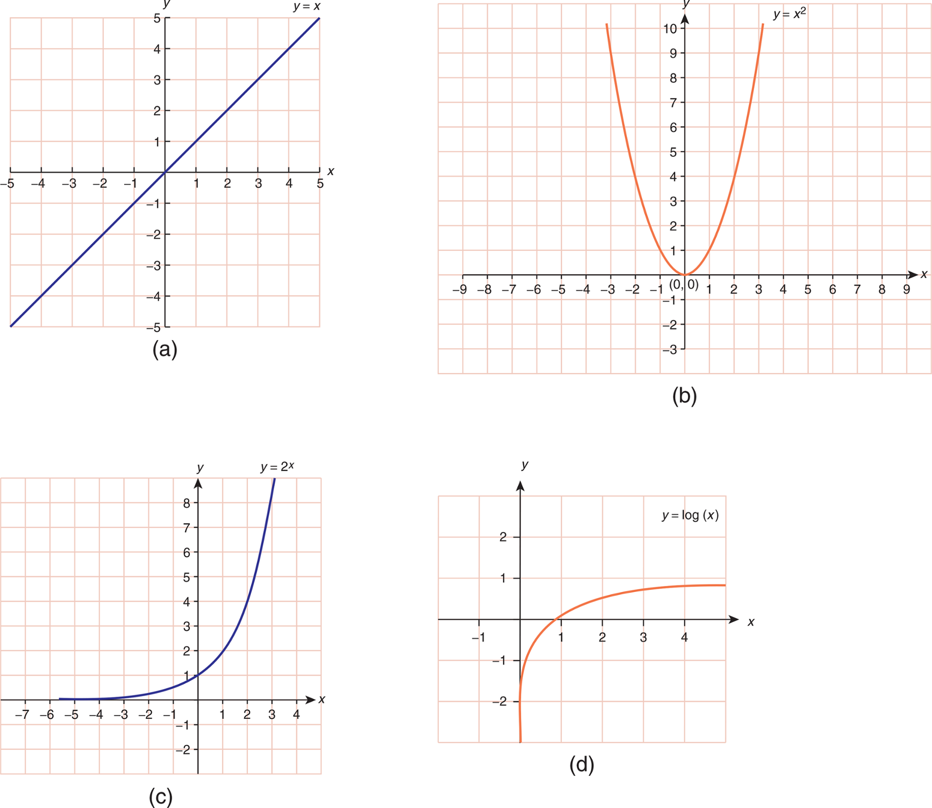
The axes of a linear graph will be consistent in the sense that each unit will occupy the same amount of space (the distance from 1 to 2 to 3 to 4 on each axis remains the same size). As with bar graphs, be wary of scale and breaks in axes. Where both the shape of the graph and the graph type are linear, we should be able to calculate the slope of the line. Slope (m) is the change in the y-direction divided by the change in the x-direction for any two points:
Slope is like waking up in the morning: Slope is always rise (vertical) over run (horizontal) because you have to get up from bed (rise) before you get moving (run).
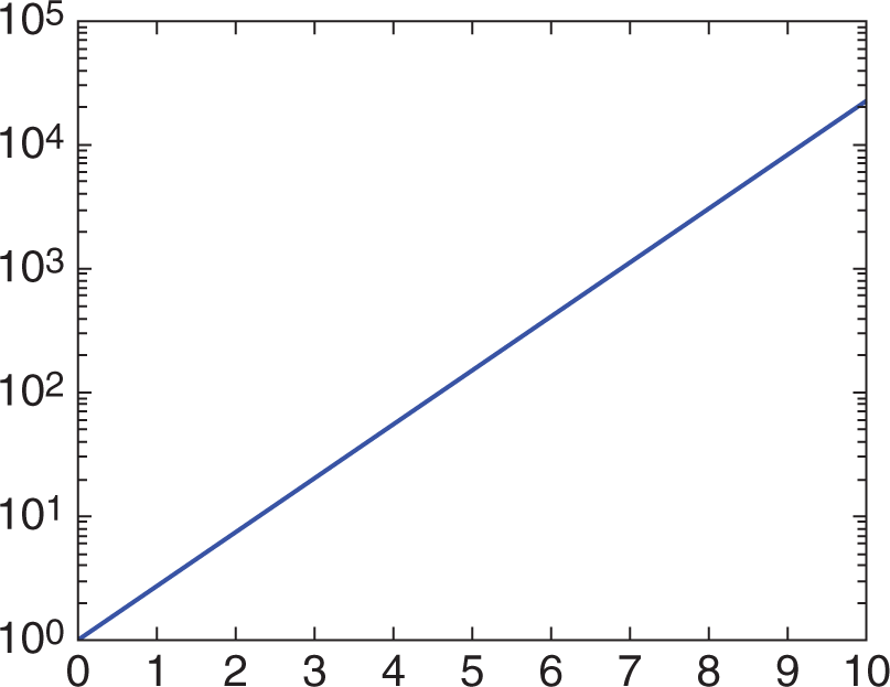
Semilog graphs are a specialized representation of a logarithmic data set. They can be easier to interpret because the otherwise curved nature of the logarithmic data is made linear by a change in the axis ratio. In semilog graphs, one axis (usually the x-axis) maintains the traditional unit spacing. The other axis assigns spacing based on a ratio, usually 10, 100, 1000, and so on. The multiples may be of any number as long as there is consistency in the ratio from one point on the axis to the next. Figure 12.10 shows an example of a semilog plot.
The axes on a graph will determine which type of plot is being used, and provide key information about the underlying relationship between the relevant variables.
In some cases, both axes can be given a different axis ratio to create a linear plot. When both axes use a constant ratio from point to point on the axis, this is termed a log–log graph. Note that the difference between these three plot types (linear, semilog, and log–log) is based on the labeling of the axes. Therefore, it is crucial to pay attention to the axes on Test Day to be able to interpret a graph correctly.
Unlike with graphs, you should only take a brief moment to glance at the title of a table before approaching Test Day questions. Tables are more likely to contain disjointed information than either charts or graphs because they often contain categorical data or experimental results. Tables that do not have unusual data values (zeroes, outliers, changes in a trend, and so on) should be approached especially briefly.
When a table does contain significant organization (for example, listing results progressively), this structure is likely to be relevant while answering questions. For example, a trend that suddenly appears or disappears will often require an explanation.
Additionally, when provided with data in the form of a table, you should be able to convert it to a rough graph or to a linear equation. The MCAT may test on the interpretation of slope without actually providing a graph.