CHAPTER 7
PREPARING DATA FOR STORYTELLING
This chapter covers the very beginning of the data storytelling process, providing the processing steps necessary to ready messy data for visual analysis and storytelling in Tableau. You will leverage the lessons learned thus far in the text as you work through preparing data for analysis, connecting to data, and beginning to visually explore it in Tableau. This chapter walks you through this process, from exporting raw data from survey platforms in order to discuss some important data preparation steps that matter in Tableau, through manually preparing it in Excel and using Tableau 10 and to get data just where it needs to begin building a compelling visual data story.
Knowing the basics of visual data storytelling from context, to charts, to curation, better prepares you to begin crafting a compelling data narrative to deliver to your intended audience and make an impact. However, before you can start working with real data in Tableau, you need to be sure it is in the right shape for analysis. Most, if not all, data needs a little bit of work before it’s ready to become a story. We’ll work through this process using messy survey data, a common experience for data storytellers.
note
Follow along with these steps by downloading the raw survey data exports from www.visualdatastorytelling.com.
Basic Data Prep in Tableau: Data Interpreter
Like its predecessor versions, Tableau 10.X includes built-in data prepping capabilities that help make reshaping data a smoother and less labor-intensive experience than doing it by hand (or using the no-longer-supported Tableau Excel add-in, which only worked for Windows-based licenses).
Before getting into a specific data prep exercise using survey data, let’s review some of the basic data preparation tools included in Tableau with Data Interpreter. Chapter 3, “Getting Started with Tableau,” covered this function superficially; however, this section takes a closer look at how it can be used with a real dataset.
This exercise uses a dataset titled “Significant Volcanic Eruptions.” This sampled dataset is available from the Tableau website and contains a global listing of more than 600 volcanic eruptions from 4360 BC to the present via the Significant Volcanic Eruptions Database. Within this data, a significant eruption is classified as one that meets at least one of the following criteria: caused fatalities, caused moderate damage (approximately $1 million or more), Volcanic Explosivity Index (VEI) of 6 or greater, generated a tsunami, or was associated with a significant earthquake.
note
While the Significant Volcanic Eruptions dataset is a relatively clean dataset, I have made some additions to it for the sake of exploring preparation tasks. You can download the modified version from visualdatastorytelling.com
note
Tableau has committed to more data prep in its product pipeline: plans for a new, upcoming native data prep tool—called Maestro—was introduced at TC16. As of this writing, Maestro is in beta testing. You should expect that the sections contained in this chapter may be significantly changed in later versions with the addition of Tableau Maestro.
Data Interpreter in Action
Although Tableau can easily connect to the sheet, you can see in the preview shown in Figure 7.1 that some issues exist. There are no column names, the headers from Excel have a lot of nulls, and so forth. Tableau has recognized these issues and suggests Data Interpreter to help prepare this data.
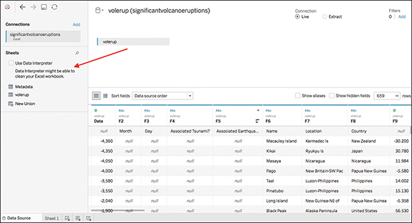
Figure 7.1 Although Tableau can connect to this messy data, some cleanup is still needed.
To “turn on” Data Interpreter, you need simply to click the check box. Tableau will run the interpreter tool and update the contents of the preview pane accordingly (see Figure 7.2). You can see that those headers have been stripped out, and the columns are now properly identified.
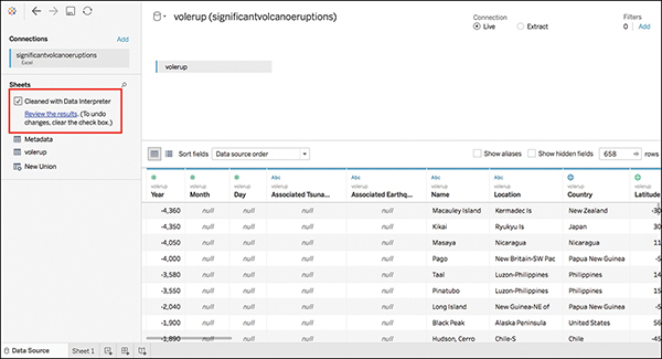
Figure 7.2 With one click, Data Interpreter has helped prepare data for analysis.
If you want to explore more specifics on what Data Interpreter did, you can click the Review the Results hyperlink. This opens an Excel file that describes the changes (see Figure 7.3).

Figure 7.3 Data Interpreter provides a “marked” Excel worksheet that details the changes made in the data.
If you click through the sheets, you can see which fields are being used as headers, in orange, and which are considered data, in green (see Figure 7.4).
note
Data Interpreter is not available if the data contains more than 2000 columns or more than 3000 rows and 150 columns.
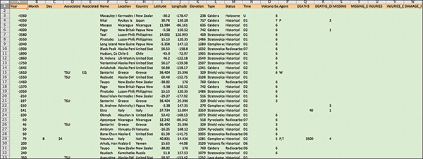
Figure 7.4 The data is color coded in the marked file.
Handling Nulls in Tableau
Before moving forward with this dataset, it is important to mention that the handling of nulls in Tableau is a dynamic and important step in the analysis process, because null values and how they are used or not used can have a significant effect on the quality of your analytical work and visual outputs.
When a measure contains null values, they are usually plotted as zero. However, sometimes that changes the view and you would rather just suppress null values altogether. A variety of functions in Tableau work with null values:
![]() IFNULL functions: Perform a true/false test on whether the value in the tested field is null. The first value in the function is used if the value is not null, and the second is used if it is null.
IFNULL functions: Perform a true/false test on whether the value in the tested field is null. The first value in the function is used if the value is not null, and the second is used if it is null.
![]() ISNULL functions: Tests whether an expression is null (TRUE) or not (FALSE).
ISNULL functions: Tests whether an expression is null (TRUE) or not (FALSE).
![]() IIF functions: Creates a shorthand function for an IF-THEN-ELSE statement with the added benefit of defining a value if the test yields an unknown result.
IIF functions: Creates a shorthand function for an IF-THEN-ELSE statement with the added benefit of defining a value if the test yields an unknown result.
![]() ZN function: A variation on the ISNULL and IFNULL function, ZN tests to see whether a function is null, and if it is, returns a value of zero.
ZN function: A variation on the ISNULL and IFNULL function, ZN tests to see whether a function is null, and if it is, returns a value of zero.
Table 7.1 displays some of the different ways you can handle null values in Tableau. More training on handling nulls is available on the Tableau website.
Table 7.1 Key of Tableau functions for handling nulls.
Function |
Explanation |
Formula |
Numeric Values |
|
|
ISNULL |
Tests the numerical columns, and then gives output as “True” or “False” |
IF ISNULL ([Measure]) THEN 0 ELSE [Measure] END |
IFNULL |
Tests the data, and then if a value is null, it is replaced by the desired value (in this example by 0) |
IFNULL ([Measure], 0) |
ZN |
Tests the data and replaces nulls with 0 |
ZN([Measure]) |
IIF |
Tests the data, and if null is found, it is replaced by the desired value (0). |
(IIF(IS NULL([Measure]), 0, [Measure])) |
String Data |
|
|
ISNULL |
Tests the data, and if nulls are found they are replaced by the desired string value. |
IF ISNULL([Dimension]) THEN “This is desired string value” ELSE [Dimension] |
IFNULL |
Test the data, and if nulls are found they are replaced by the desired string value. |
IFNULL([Dimension], “This record is null”) |
IIF |
Tests the data, and if nulls are found they are replaced by the desired string value. |
IIF(ISNULL([Dimension]), “This record is Null,” [Dimension]) |
Cleaning Messy Survey Data in Excel
Working with survey data is a common task in analytics, and it provides an opportunity to explore a more robust data preparation process as well as some additional data-shaping capabilities within Tableau to prepare data for analysis and visualization, like pivots and joins. This is because survey data is inherently messy and requires a bit more TLC than your average dataset, and this preparation extends beyond what Data Interpreter can handle on its own. Without some extensive cleanup, analyzing raw survey data exported from tools like SurveyMonkey or Qualtrics can be near impossible, both because of the usual formatting issues as well as the need to translate textual data to a format usable in analysis while preserving its metadata.
There are four elements of survey data you need to organize and fit together:
![]() Demographic information
Demographic information
![]() Responses in text form
Responses in text form
![]() Responses in numeric form
Responses in numeric form
![]() A “meta file” that acts as a legend to describe the survey
A “meta file” that acts as a legend to describe the survey
The goal is to combine all of these elements to see a comprehensive view of the data (see Figure 7.5). Another task is to reshape the data from “wide” to “tall” data, a concept explored further in a later section.
note
A word of caution is necessary here. There is truth to the old adage “garbage in, garbage out.” Before you begin preparing your data for analysis, you should spend time reviewing your data, even in its messiest raw form and tidy up errors or issues you see before you take further steps. In particular, look over and confirm date and geographic data formats, remove duplicate records, and change or correct any identifiers to a format that you need (like capitalization). Fields that allow for manual text entry are especially prone to these latter issues that might require your attention before you begin working with your data. This is also a perfect time to assess the presence of nulls in your data, and determining when a field should be a null or a zero.

Figure 7.5 After preparing the survey data, it looks like this.
note
Some survey platforms, like Qualtrics, provide the option to export raw data in many formats (including SPSS) and avoid some of the steps taken in the following sections. However, the assumption for this example is that the data has messy CSV files. This allows explanation through the entire process with as much detail as possible.
The first step in preparing data is to tackle some basic clean-up tasks. Let’s walk through a real dataset. This dataset includes 341 responses to a survey on perceptions of violence and aggression in the Harry Potter series.
note
This data was collected for a presentation at the 6th Annual Harry Potter Conference hosted by Chestnut Hill College in Philadelphia. You can view the presentation or learn more at HarryPotterConference.com.
Figure 7.6 shows a file of raw data export from Qualtrics

Figure 7.6 This Excel worksheet contains a dump of exported data.
Step 1: Surface Cleaning
This initial data export contains all survey data, including responses as well as data provided by the survey platform. It also includes respondent survey responses in their original text form (Step 2 is when you code these numerically).
The immediate first action to take to get this data in a usable format is to do some basic tidying up. Start by removing unnecessary columns (such as columns A–H, which do not contain usable information) and data not relevant to the analysis (such as rows 2–3). This step is an opportunity to make sure your column headers are in the first row of your spreadsheet and that no wacky formatting exists that would cause issues when bringing your data into Tableau. You also need to clearly identify your demographic data fields and make sure those immediately follow the ResponseID fields.
note
This section covers many survey data cleanup tasks; however, these tasks might differ depending on the survey platform (Qualtrics, SurveyMonkey, and so on) you are using. The ResponseID field is a critical field, because you will use it as a join in later steps. Any demographic questions should be noted as such in the column headers for use as pivot fields later.
After removing extraneous information and cleaning up headers, leave the remaining data as is. This now becomes worksheet 1 in your Excel workbook: Text (see Figure 7.7).
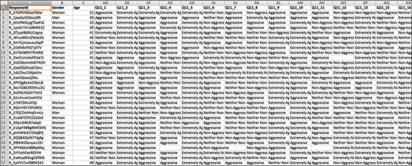
Figure 7.7 After an initial scrub of the exported data, the survey data is already looking cleaner.
note
The last step in Excel will be to create a metafile that lists the question ID and its corresponding wording, as well as other helpful information, like how respondents were asked to answer question (that is, Likert, rank, yes/no/maybe). This provides a key to the survey that will support your analysis in Tableau. You should remove the question wording contained in row 2 here, but let’s put this information aside for now and revisit in a later step.
Step 2: Creating a Numeric Copy
The next step is to create a copy of the Text worksheet with its numeric partner. To begin, copy and paste the entire Text worksheet into a new tab, and retitle the tab Numeric.
To encode text responses as numeric fields in Excel, you can use a simple find-and-replace operation. For example, in the survey, respondents were asked in Question 11 to rank each Harry Potter character on a scale of Extremely Non-Aggressive (1) to Extremely Aggressive (5). Using find and replace in Excel, you can replace the text answer in this field with its numerical equivalent (see Figure 7.8).

Figure 7.8 Use find and replace in Excel to swap text values for numeric.
Numerically coding demographic data fields is not necessary. As you complete this process, take care to be consistent in how you encode text as numeric responses. For example:
![]() No = 0
No = 0
![]() Yes = 1
Yes = 1
![]() Maybe = 2
Maybe = 2
![]() True = 1
True = 1
![]() False = 0
False = 0
In addition, survey questions that are “select all” or that otherwise group multiple responses (such as rankings) into one field must be separated so that each option is contained in its own column. This makes the visualization process much more efficient in later steps.
You use the numeric codes, along with the question and wording data, to compile the metafile in the final step.
note
Later, you use this metafile to replace the headers of your Question ID field by blending the two in a sheet by right-clicking on the value label and selecting Make Primary Label.
After you complete this process, your Numeric worksheet table should look similar to the one shown in Figure 7.9.
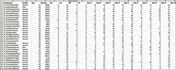
Figure 7.9 After being fully coded, the numeric file should only include text answers in the demographic fields.
TEXT AND NUMERIC?
You might wonder why you want both text and numeric responses. The answer is simple. Most surveys include questions that ask respondents to select a value for a question. Consider a Likert scale question, with a universe of possible values on a one-to-five (more common) or one-to-seven (less common) scale. For example, a common survey Likert scale question could be, “On a scale of 1–5, with 1 being “extremely dissatisfied” and 5 being “extremely satisfied,” how would you rank your dining experience?” These numeric values could also be a range of “strongly agree to strongly disagree” or “extremely unimportant to extremely important.” Without having both numeric and text results you will have to write a lot of IF/CASE statements and add unnecessary burden to the analytic process.
Step 3: Creating the Meta Helper File
The final step is to create a meta helper file that will help you understand the data and facilitate analysis in Tableau. Unfortunately, this file is not something that (most) survey tools provide, so its completion is a manual process. Use Figure 7.10 as a guide in building your meta helper file. You are looking for four key elements:
![]() QuestionID (Q1, Q2, Q3, and so on)
QuestionID (Q1, Q2, Q3, and so on)
![]() Question Wording (The original question’s text—what was asked.)
Question Wording (The original question’s text—what was asked.)
![]() Question Type (Rank, Likert, Select One, and so on)
Question Type (Rank, Likert, Select One, and so on)
![]() Coding (How the data was coded, i.e. 1=Strong Disagree, 2=Disagree, etc.)
Coding (How the data was coded, i.e. 1=Strong Disagree, 2=Disagree, etc.)

Figure 7.10 The metafile helps guide analysis by summarizing text and numerical worksheets.
note
Remember to code your Likert data in the same logical order as asked. The same applies to ranking questions—be sure to code them numerically in the order they were listed (that is, if you have a list of 25 items to rank, code them as 1–25 in order of their appearance on the list).
note
In the example, I have broken apart multi-select questions with an _ (underscore). However, this approach can introduce errors in Tableau because it might not recognize underscores. Another approach is to use a letter addendum; that is, Q10a instead.
After you begin working in Tableau, the metafile should be your first sheet (see Figure 7.11). You can “visualize” the column in your metafile to provide a quick-glance legend to your survey data, prevent toggling back and forth between Tableau and Excel to double-check the questions you want to explore and how responses were recorded.
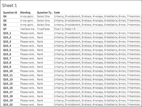
Figure 7.11 The metafile provides a handy first sheet in Tableau to guide analysis.
Pivoting Data from Wide to Tall
A very common data prep task is to transform data from “wide”—meaning many, many columns—to “tall” (or “narrow”)—meaning many, many rows. The difference lies in readability: Entering data into a spreadsheet in the wide form is generally easier, but computers prefer to read data in the tall form. In this regard, Tableau is similar. Reading “tall” data is preferable within the Tableau environment for use in visual analysis as well as building and sorting charts dynamically.
In plain terms, exported survey data is, by nature, very wide. Each respondent’s answers to each question are captured in one row. However, you are analyzing questions and their answers, not respondents. So, you need the survey data to be tall—you need to see every question’s answer from every respondent. Reshaping survey data to be tall enables you to look at each question, and distributes each respondent’s answers to each question over many rows.
To analyze the survey data, you need to reshape it from “wide” to “tall” before you can look at it meaningfully within Tableau. For these next preparation tasks, you need to bring the data into Tableau and continue from there.
Reshaping Survey Data with Tableau 10
Among its many additions and improvements, Tableau v10 brought about the ability for analysts to prepare survey data without having to either use external tools or spend countless hours engaged in a manual cleaning process.
Keeping this process bundled within Tableau provides many benefits:
![]() It lessens overhead costs to invest in additional tools.
It lessens overhead costs to invest in additional tools.
![]() It reduces the need to learn multiple pieces of software.
It reduces the need to learn multiple pieces of software.
![]() It enables you to join all three of the created data sources directly within Tableau.
It enables you to join all three of the created data sources directly within Tableau.
That said, there are also some drawbacks:
![]() The process is clunky and not intuitive.
The process is clunky and not intuitive.
![]() Tableau exhibits some strange behavior that necessitates users to repeat some steps.
Tableau exhibits some strange behavior that necessitates users to repeat some steps.
![]() Users might need to create and routinely extract data.
Users might need to create and routinely extract data.
Utilizing the three Excel worksheets created earlier (Numeric, Text, Meta), let’s continue this process in Tableau.
note
Tableau Zen Master and Iron Viz Champion Steve Wexler maintains an excellent blog on reshaping survey data for Tableau, including using Excel, Tableau v9 and v10, and Alteryx. His work includes many clearly delivered tutorials and presentations specifically on survey data and is an excellent resource. Visit Steve’s blog at http://www.datarevelations.com/surveyjustso.html.
Step 1: Creating Extracts
To create extracts, follow these steps:
1. Open Tableau and connect to your Excel workbook created in the previous step.
2. Drag the Text sheet into the “Drag Sheets Here” Connect to Data screen, as shown in Figure 7.12. (Ignore the Go To Worksheet prompt. It is not time yet.)
3. To select out the demographic data, leave the demographic fields alone (in this example, keep ResponseID, Gender, Age, and Zipcode) and select the remainder of the columns relating to survey question data. To select a column, click its column header. To select multiple columns, you can:
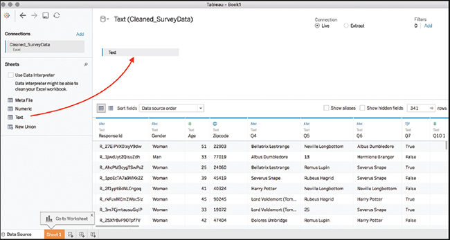
Figure 7.12 Drag your first sheet, Text, to the Connection window.
Hold the Shift key and click each individual column of interest, or
Hold the Shift key and use the scroll bar to scroll to click the last column.
4. Right-click (or click the drop-down arrow) on any of the selected columns and click Pivot from the context menu (see Figure 7.13).
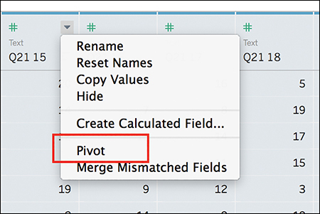
Figure 7.13 Select Pivot from the drop-down menu to pivot your fields.
Two new columns appear at the front of your data, named Pivot Field Names and Pivot Field Values (see Figure 7.14).
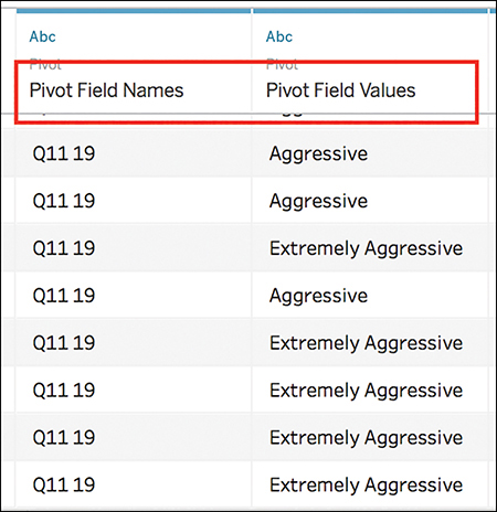
Figure 7.14 You have to rename these new fields.
5. Using the drop-down arrow on each column, rename them as follows:
Pivot Field Names to QuestionID
Pivot Field Values to Text
6. Create the first extract by choosing Extract as the Connection type (on the upper right of the screen). To save the extract, click the Sheet1 tab (see Figure 7.15).
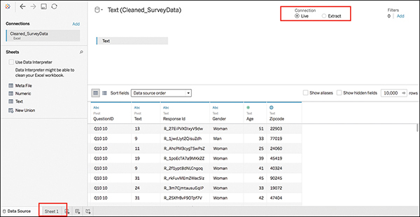
Figure 7.15 Click Sheet1 to generate the Extract dialog.
note
For more on Tableau extracts, visit http://onlinehelp.tableau.com/current/pro/desktop/en-us/extracting_data.html.
7. In the dialog box that appears, save your new extract as SurveyData_text. The file extension will be .tde. Be sure to note where you are saving your extract.
You need to repeat this step with the other two Excel sheets (Numeric and Meta); however, the steps are not quite identical.
8. From the Tableau menu at the top of your screen, select Data>New Data Source. Again, navigate to your Excel workbook and click Open.
9. This time, connect to the Numeric sheet by dragging it onto the Connection pane.
10. Because you already selected out the demographic data, you don’t need to do it again. However, you do need to leave a field for the join you will eventually do. In this example, ResponseID is the join field. Thus, you should:
a. Hide the additional demographic fields (in this example, this includes Gender, Age, and Zipcode) by selecting the unneeded demographic fields, right-clicking, and selecting Hide from the drop-down menu (see Figure 7.16).
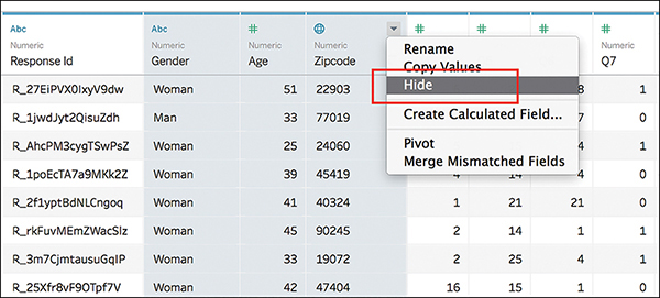
Figure 7.16 Hide unnecessary demographic fields.
b. Select the remaining columns, right-click, and select Pivot (for help, see steps 3 and 4).
11. Two new columns appear—Pivot Field Names and Pivot Field Values— but because Tableau does not automatically rename these fields, you must rename them. Using the drop-down arrow on each column, rename them as follows:
Pivot Field Names to QuestionID
Pivot Field Values to Numeric
12. Repeat steps 6 and 7 to create your second extract. This time, name the field SurveyData_numeric.
You are ready to create the third and final extract with the metafile.
13. Again, from the Tableau menu at the top of your screen, choose Data>New Data Source. Navigate to your Excel workbook and click Open.
14. This time, drag the Meta sheet to the Connection pane.
15. You do not need to pivot any fields within this sheet. You only need to create an extract. Repeat step 12, this last time naming the file SurveyData_meta.
Step 2: Joining Data Sources
At this point you have created three separate Tableau extracts, one for each of the three data sources. In the next step, you will use Tableau 10’s ability to join files from different data sources to bring these extracts together and create an extract from the joined files.
1. From the New Data Source menu, click the More option under the To a File header (see Figure 7.17).
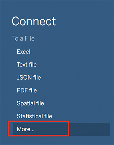
Figure 7.17 Select More to add a New Data Source.
2. Navigate to where you saved your exports earlier, and select your Text file (SurveyData_text). Click Open.
3. Add a connection, and select SurveyData_numeric following the same pathway described in step 1.
4. Tableau will automatically join these two data sources, but they are not joined correctly. By clicking the join icon, you will see that Tableau has created an inner join on the field Number of Records (see Figure 7.18). This is not the field you want to use to join these two data sources.
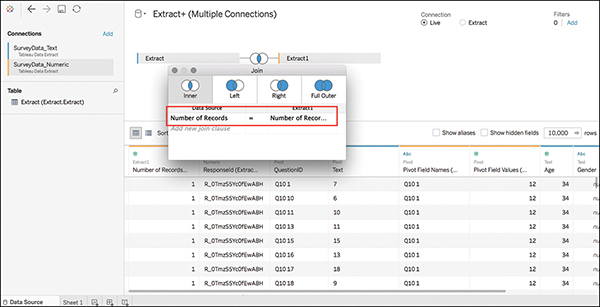
Figure 7.18 Bad join! You do not want to join on Number of Records. This is meaningless.
5. Click Number of Records on both sides of the join and change these fields to ResponseID (see Figure 7.19).
note
On the left join, this field will appear correctly as ResponseID. On the right join, this field will appear named ResponseID(Extract1). I have received reports from students that _ (underscore) titled fields are not recognized as expected when joining data in Tableau. This has been resolved by replacing underscores with hyphens (-) in field formats.
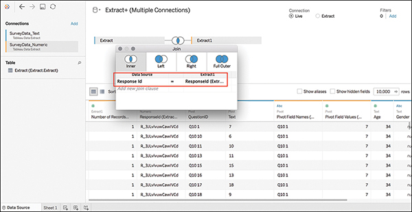
Figure 7.19 Good join! Joining on ResponseID connects a meaningful field.
6. You are not quite finished with the join. You also need to join the QuestionID field (see Figure 7.20):
a. From the left data source, select QuestionID.
b. From the right data source, select Pivot Field Names(Extract 1). (Although you previously renamed this column in your pivoting work, Tableau can only track the alias names for fields in the first .tde file, and reverts to the original field name in additional extract files. This will not affect your visualizations or analysis later.)
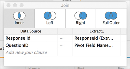
Figure 7.20 The Text and Numeric sheets, fully joined.
7. Click Add, then More, and select your metafile—SurveyData_meta.
8. Click on the new join and remove any fields that may be automatically joined.
9. Before joining the correct fields, you need to make one small adjustment in the field names. A current Tableau issue prevents using two instances of the same field name from the same table in multiple joins. To work around this issue, before editing any of the new join information, rename the field in question in the Data pane at the bottom of the screen so that the common field has a different name in each table. You can then complete the join (see Figure 7.21):
a. On the columns associated with the Meta sheet, rename QuestionID to QuestionIDNEW.
b. From the left data source, select QuestionID.
c. From the right data source, select QuestionIDNEW.
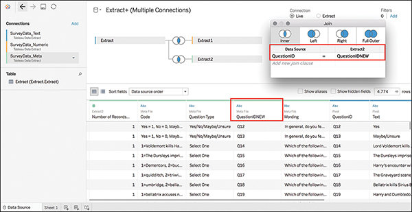
Figure 7.21 This last join takes a few extra steps to get right.
note
This behavior is related to Tableau known issue ID 651428, which is currently under investigation. After it has been resolved, you should simply be able to join using the QuestionID fields on both left and right.
10. The multiple connection join creates some superfluous fields in the data preview that you need to hide and/or rename:
Hide both Number of Records fields.
Hide the field ResponseID (Extract1).
Hide QuestionIDNEW (or the second QuestionID field).
Hide Pivot Field Names (Extract1).
Rename Pivot Field Values to Value (or Numeric Value).
11. You need to create one more extract. Change the Connection type in the upper right to Extract and click Sheet1 to generate the Extract dialog box.
12. Name this sheet SurveyData_joined.
13. You are almost ready to visually explore your data, but there is one more step to streamline how your field names are grouped. After creating the extract, Tableau automatically groups field names by data source. I find this confusing. Click the drop-down arrow on the Data pane and select Group by Folder to reorganize your field names in a more intuitive manner (see Figure 7.22).
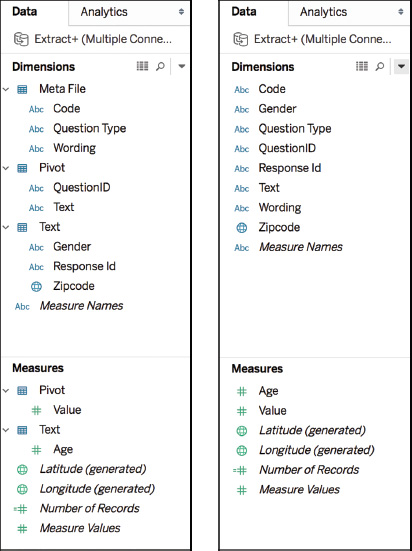
Figure 7.22 Sorting the Data pane by group: before and after.
RESHAPING SURVEY DATA WITH ALTERYX
While Tableau’s native functionality will work just fine with shorter surveys or with surveys where either labels or numeric values will work, Alteryx is a great fit for more complex surveys that have a good bit of data and where both text and numeric values are critical. A self-service data analytics platform, Alteryx was ranked as a Challenger in Gartner’s 2017 Magic Quadrant for Data Science Platforms. The tool allows analysts to connect to and cleanse data from data warehouses, cloud-based applications, spreadsheets, and other sources; prep, blend; and then prep, blend, and analyze data in a repeatable workflow. For more on Alteryx, visit www.alteryx.com.
One of the reasons I enjoy working with Alteryx is its visual, drag-and-drop workflow canvas. It may look a little complicated at first glance, but it works similar to flowcharting and decision tree-type tools (for example, Microsoft Visio): Actions are color coded and connect to each other by joining logic.
Although this text doesn’t cover the Alteryx workflow, Figure 7.23 provides a quick glance at the Alteryx workflow needed to finish the preparation of this data for analysis in Tableau. Notice that this workflow makes use of the three worksheets you created earlier.
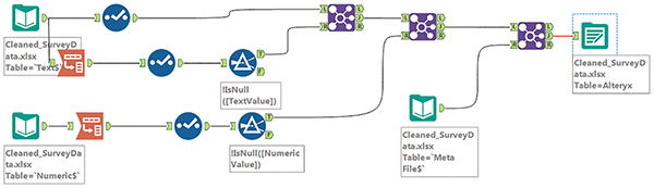
Figure 7.23 The Alteryx workflow we’ll be building later.
Summary
At this point, you’re ready to take your data into Tableau and begin visually exploring and building your data story. You’ll continue working with the reshaped Harry Potter data set in Chapter 8.