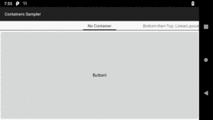
Figure 106: Sampler App, As Initially Launched
Containers — sometimes referred to as layout managers — organize widgets on the screen. Containers position and size widgets based upon rules that you supply along with key device characteristics, such as available screen size.
Three containers have dominated Android app development since Android’s
introduction in late 2007: LinearLayout, RelativeLayout, and TableLayout.
This chapter focuses on those. Later chapters will explore other container
classes, such as 2016’s ConstraintLayout.
The
Containers/Sampler
sample project has a bunch of layout resources that this chapter will
use to illustrate how these containers work.
If you were to run this sample app, you would see a series of tabs, with one layout displayed per tab:
Figure 106: Sampler App, As Initially Launched
We are not going to get into the Java code associated with this
sample app in this chapter. That code relies on other topics, like
fragments and
the ViewPager widget, that we
have not gotten to yet. We will come back to this sample app and
see how the tabs were implemented then. For now, the focus is on the
layout files showing specific techniques for using these classic containers.
Most of the world’s languages are written left-to-right. So, in this paragraph, you read the letters and words starting from the left edge of a line across to the right edge.
Arabic and Hebrew, among others, are written right-to-left. The abbreviation “RTL” refers to these languages.
Originally, Android was focused purely on left-to-right (LTR) languages.
As a result, you see attributes referring to things with respect to left
and right (e.g., android:paddingLeft).
Slowly, Android improved its RTL support. In particular, starting with
API Level 17 (Android 4.2), analogue attributes were added, replacing
“left” with “start” and “right” with “end”. When using “start”/“end”
attributes (e.g., android:paddingStart), “start” refers to where
you start reading a line of text, and “end” refers to where you end
reading a line of text:
| Language Direction | “Start” Means… | “End” Means… |
|---|---|---|
| LTR | Left | Right |
| RTL | Right | Left |
In general, we want the GUI to flow with the language direction. Things that you might have on the left with an LTR language usually go on the right with an RTL language, and so forth.
However, since these “start” and “end” attributes are new to API Level 17, you cannot use them on older devices. Sometimes, we will wind up either using the old “left”/“right” attributes or using both types of attributes, to cover all device versions.
We will revisit RTL language support a bit later in this chapter.
LinearLayout represents Android’s approach to a box model — widgets or child
containers are lined up in a column or row, one after the next.
To configure a LinearLayout, you have four main areas of control besides the
container’s contents: the orientation, the fill model, the weight, the gravity.
Orientation indicates whether the LinearLayout represents a row or a column.
Just add the android:orientation property to your LinearLayout element in
your XML layout, setting the value to be horizontal for a row or vertical
for a column.
The orientation can be modified at runtime by invoking setOrientation() on
the LinearLayout, supplying it either HORIZONTAL or VERTICAL.
The point behind a LinearLayout — or any of the Android container classes
– is to organize multiple widgets. Part of organizing those widgets is determining
how much space each gets.
LinearLayout takes an “eldest child wins” approach towards allocating space.
So, if we have a LinearLayout with three children, the first child will get
its requested space. The second child will get its requested space, if there
is enough room remaining, and likewise for the third child. So if the first
child asks for all the space (e.g., this is a horizontal LinearLayout and
the first child has android:layout_width="match_parent"), the second and
third children will wind up with zero width.
But, what happens if we have two or more widgets that should split the available free space? For example, suppose we have two multi-line fields in a column, and we want them to take up the remaining space in the column after all other widgets have been allocated their space.
To make this work, in addition to setting android:layout_width (for rows) or
android:layout_height (for columns), you must also set
android:layout_weight. This property indicates what proportion of the free
space should go to that widget. If you set android:layout_weight to be the
same non-zero value for a pair of widgets (e.g., 1), the free space will be
split evenly between them. If you set it to be 1 for one widget and 2 for
another widget, the second widget will use up twice the free space that the
first widget does. And so on.
The weight for a widget is zero by default.
Another pattern for using weights is if you want to allocate sizes on a percentage basis. To use this technique for, say, a horizontal layout:
android:layout_width values to be 0 for the widgets in the
layoutandroid:layout_weight values to be the desired percentage size for
each widget in the layout100
If you want to have space left over, not allocated to any widget, you can
add an android:weightSum attribute to the LinearLayout, and ensure that
the sum of the android:layout_weight attributes of the children are less than
that sum. The children will each get space allocated based upon the ratio
of their android:layout_weight compared to the android:weightSum, not
compared to the sum of the weights. And there will be empty space that takes
up the rest of the room not allocated to the children.
By default, everything in a LinearLayout is start- and top-aligned. So, if you
create a row of widgets via a horizontal LinearLayout, the row will be
flush on the start side of the screen (e.g., left in a LTR language).
If that is not what you want, you need to specify a gravity. Unlike the
physical world, Android has two types of gravity: the gravity of a widget
within a LinearLayout, and the gravity of the contents of a widget or
container.
The android:gravity property of some widgets and containers — which also
can be defined via setGravity() in Java — tells Android to slide the contents
of the widget or container in a particular direction. For example,
android:gravity="right" says to slide the contents of the widget to the
right; android:gravity="right|bottom" says to slide the contents of the
widget to the right and the bottom.
Here, “contents” varies. TextView supports android:gravity, and the
“contents” is the text held within the TextView. LinearLayout supports
android:gravity, and the “contents” are the widgets inside the container. And
so on.
Children of a LinearLayout also have the option of specifying
android:layout_gravity. Here, the child is telling the LinearLayout “if
there is room, please slide me (and me alone) in this direction”. However,
this only works in the direction opposite the orientation of the LinearLayout
– the children of a vertical LinearLayout can use android:layout_gravity
to control their positioning horizontally (start or end), but not
vertically.
For a row of widgets, the default is for them to be aligned so their texts are
aligned on the baseline (the invisible line that letters seem to “sit on”),
though you may wish to specify a gravity of center_vertical to center the
widgets along the row’s vertical midpoint.
The LinearLayout container can be found in the “Layouts” portion of the Palette
of the Android Studio graphical layout editor:
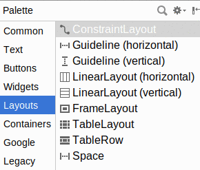
Figure 107: Layouts Palette in Android Studio Graphical Layout Editor
You can drag either the “LinearLayout (vertical)” or “LinearLayout (horizontal)” into a layout XML resource, then start dragging in children to go into the container.
When your LinearLayout is the selected widget, a few new toolbar buttons
will appear over the preview:

Figure 108: LinearLayout Toolbar Buttons
The only one of these that works is the left hand one, which
toggles the LinearLayout between vertical
and horizontal orientation.
When one of the children of the LinearLayout is the selected widget, the
toolbar changes:

Figure 109: LinearLayout Toolbar Buttons, For Selected Child
From left to right, the buttons:
LinearLayout between horizontal and vertical orientationsandroid:layout_weight attribute, if it has onematch_parent and wrap_content
match_parent and wrap_content
Those rules will make more sense once we work through some examples.
The first example is where we have two widgets. One widget should take up its “natural” amount of space, anchored to the bottom of the screen. The other widget should fill all the remaining space:
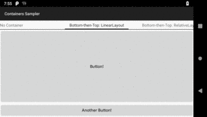
Figure 110: Bottom-then-Top Layout, Using LinearLayout
The layout XML that generated that screenshot consists of a vertical
LinearLayout and two Button widgets:
<?xml version="1.0" encoding="utf-8"?>
<LinearLayout xmlns:android="http://schemas.android.com/apk/res/android"
  android:layout_width="match_parent"
  android:layout_height="match_parent"
  android:orientation="vertical"
  android:baselineAligned="false">

  <Button
    android:layout_width="match_parent"
    android:layout_height="0dp"
    android:layout_weight="1"
    android:text="@string/button" />

  <Button
    android:layout_width="match_parent"
    android:layout_height="wrap_content"
    android:text="@string/another_button" />
</LinearLayout>The LinearLayout has its sizes (android:layout_width, android:layout_height)
set each to match_parent, so it will
fill up all space available to it. In this sample app, that will be everything
below the tabs.
Both Button widgets have their android:layout_width attributes
also set to match_parent, so they
will fill up all available space on the screen horizontally.
The bottom Button has its android:layout_height set to wrap_content,
so it will only take up as much space as is needed to render its caption
and background around it.
The top Button has android:layout_height set to 0dp. If we did not
do anything else, that would result in an impossibly-short button.
However, we also have android:layout_weight="1".
When this gets rendered on the screen, LinearLayout will make two
passes through its children. On the first pass, it asks for how much
space each child wants, based upon the android:layout_height values
(since this is a vertical LinearLayout). The first Button will ask for
0 pixels of space, while the bottom Button will ask for however much
it needs for its content. Then, the second pass of the LinearLayout
through its children asks for their weights. The first Button has a
weight of 1, while the bottom Button has the default weight of 0.
As a result, the top Button gets 1/1 = 100% of all pixels left over
from what the first pass used. This causes the top Button to become
tall, shoving the bottom Button to the bottom of the screen.
You can create a new layout resource by right-clicking over the res/layout/
directory and choosing “New > Layout resource file” from the right-mouse
context menu. You then get a dialog where you can give the new resource
a name and choose the root container for that layout:
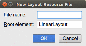
Figure 111: New Layout Resource Dialog
What you get by default depends a bit on your project:
ConstraintLayout available to it,
the default will be a ConstraintLayout
vertical LinearLayout
As you drag Button widgets into the layout, they are initially
given a width of match_parent and a height of wrap_content:
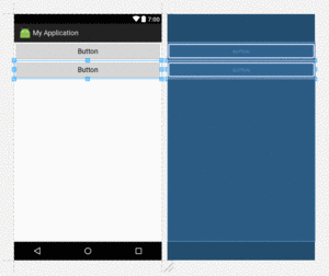
Figure 112: Vertical LinearLayout, with Two Button Widgets
Clicking the top button, then setting the layout_weight attribute
to 1 in the Attributes pane, gives the desired look:
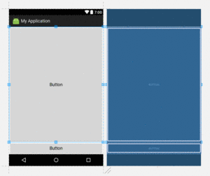
Figure 113: Vertical LinearLayout, with Weighted Button Widgets
Note that layout_weight may only appear for you in the “View all
attributes” perspective of the Attributes pane, rather than in the simplified list.
Weights can get more elaborate than just giving all extra room to one widget.
The stacked-percent scenario allocates space on a percentage basis
to all of the children of the LinearLayout. In the sample app,
we have a layout file with three buttons, taking up 50%, 30%, and 20%
of the space in a vertical LinearLayout:
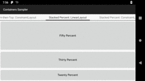
Figure 114: Stacked-Percent Layout, Using LinearLayout
This time, the layout resource XML has all three Button widgets
with heights of 0:
<?xml version="1.0" encoding="utf-8"?>
<LinearLayout xmlns:android="http://schemas.android.com/apk/res/android"
  android:layout_width="match_parent"
  android:layout_height="match_parent"
  android:orientation="vertical">

  <Button
    android:layout_width="match_parent"
    android:layout_height="0dp"
    android:layout_weight="50"
    android:text="@string/fifty_percent"/>

  <Button
    android:layout_width="match_parent"
    android:layout_height="0dp"
    android:layout_weight="30"
    android:text="@string/thirty_percent"/>

  <Button
    android:layout_width="match_parent"
    android:layout_height="0dp"
    android:layout_weight="20"
    android:text="@string/twenty_percent"/>

</LinearLayout>
So, the first pass that the LinearLayout makes through its children,
each child asks for 0 pixels of height, meaning that all of the LinearLayout
space is available for the second pass.
On the second pass, the children report weights of 50, 30, and 20, respectively.
50+30+20=100, so the top Button gets 50/100 (50%) of the space, the
middle Button gets 30/100 (30%) of the space, and the bottom Button
gets 20/100 (20%) of the space.
Note that you would get the same results with weights of 5, 3, and 2. Really, it is the ratios of the weights that matter. However, if you are used to thinking in terms of percentages — perhaps due to past experience with other GUI toolkits — you can use integer percentages if you want.
Constructing this using the graphical layout editor is similar to the previous example:
LinearLayout as the root
container.Button widgets into the LinearLayout.android:layout_height values on
the three Button widgets to 0dp
android:layout_weight values
to the three Button widgets.
Note, as before, that the weight may not be on the condensed attributes list.
You may need to view all attributes to have access to it:
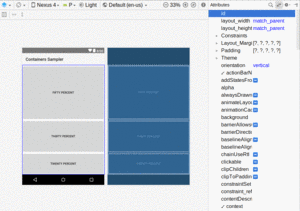
Figure 115: Vertical LinearLayout, with Full Attributes List
Of course, you are not limited to one axis. You can nest LinearLayout
widgets to structure things along both the X and the Y axis.
For example, you might be aiming for a dialog-style form like this:

Figure 116: URL-Dialog Layout, Using LinearLayout
This layout resource is a bit more complicated, as we are now up
to four widgets plus three LinearLayout containers:
<?xml version="1.0" encoding="utf-8"?>
<LinearLayout xmlns:android="http://schemas.android.com/apk/res/android"
  android:layout_width="match_parent"
  android:layout_height="wrap_content"
  android:orientation="vertical">

  <LinearLayout
    android:layout_width="match_parent"
    android:layout_height="wrap_content"
    android:orientation="horizontal">

    <TextView
      android:layout_width="wrap_content"
      android:layout_height="wrap_content"
      android:layout_marginLeft="4dp"
      android:layout_marginStart="4dp"
      android:text="@string/url" />

    <EditText
      android:id="@+id/entry"
      android:layout_width="match_parent"
      android:layout_height="wrap_content"
      android:inputType="text" />

  </LinearLayout>

  <LinearLayout
    android:layout_width="match_parent"
    android:layout_height="wrap_content"
    android:gravity="end"
    android:orientation="horizontal">

    <Button
      android:id="@+id/cancel"
      android:layout_width="wrap_content"
      android:layout_height="wrap_content"
      android:text="@string/cancel" />

    <Button
      android:id="@+id/ok"
      android:layout_width="wrap_content"
      android:layout_height="wrap_content"
      android:text="@string/ok" />
  </LinearLayout>

</LinearLayout>The outer LinearLayout is vertical, serving to stack the two horizontal
LinearLayout rows. Each of those horizontal LinearLayout containers
has a height of wrap_content and a width of match_parent, so they span
the width of the screen but only need as much height as is required to
render their widget contents.
The first of our four widgets is the TextView. Since it is in the first
horizontal LinearLayout, it will be flush on the one side (left in a
LTR language like English). However, we have 4dp of margin, using both
the older android:layout_marginLeft and the newer, RTL-capable
android:layout_marginStart attributes. So, the widget is inset a bit
from the edge.
The second widget is the EditText. It has a width of match_parent,
so it will take over all remaining space after the TextView.
The bottom LinearLayout has android:gravity="end", which will cause
its contents to slide towards the end side of the LinearLayout (right
in a LTR language like English). It contains the two Button widgets, and
that is why the two Button widgets are slid over to the opposite end
of the form.
Not surprisingly, the more complex the layout you want to create, the more work is required to create it. The IDE only helps to a point.
So, to construct this layout, you would need to:
LinearLayout as the root
container.vertical LinearLayout. This unfortunately results in the
new LinearLayout consuming all of the space of its parent, as its
height and width are both match_parent by default:
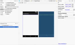
Figure 117: Vertical LinearLayout Holding Horizontal LinearLayout
8dp on all sides:
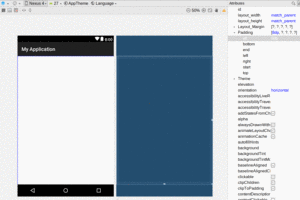
Figure 118: 8dp Padding on the Horizontal LinearLayout
TextView into the horizontal LinearLayout in the Component Tree,
and set its text to URL:, its width to wrap_content, and remove its
layout_weight value:
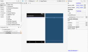
Figure 119: Horizontal LinearLayout with TextView
EditText into the horizontal LinearLayout,
setting its width to be match_parent, its text to be empty,
its inputType to be something appropriate (e.g., textUri, since
in theory this field should hold a URL), and remove its weight.
Note that you may find it
easier to drag the widget into its container via the Component Tree
tool, as you can better control the order of the children that way:
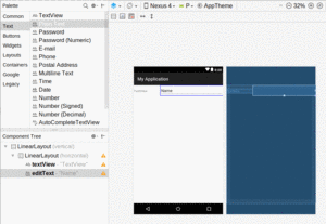
Figure 120: Horizontal LinearLayout with TextView and EditText
LinearLayout at the bottom:
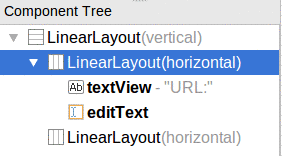
Figure 121: Component Tree with Two Horizontal LinearLayouts
LinearLayout widgets to be wrap_content.Button widgets into that lower LinearLayout in the
Component Tree:
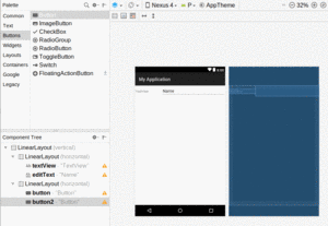
Figure 122: Two Buttons in Lower Horizontal LinearLayout
Button widgets via the Attributes pane:
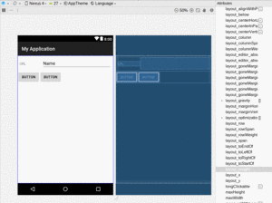
Figure 123: Two Smaller Buttons in Lower Horizontal LinearLayout
gravity of the lower horizontal LinearLayout to be
end, using the Attributes pane:
Figure 124: Two Smaller Right-Flush Buttons in Lower Horizontal LinearLayout
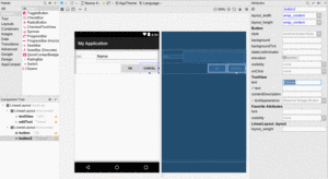
Figure 125: Buttons with Desired Captions
Now, having done all of that, the right-most toolbar button above the preview and blueprint will now be a yellow triangle, indicating some warnings about the layout that we built. Tapping that icon will display a pane with messages explaining what Android Studio does not like:
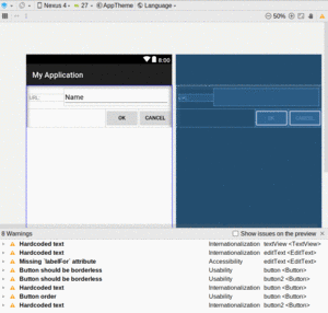
Figure 126: Layout Warning Messages
Each of the warnings in the list usually has an explanation, some suggested fixes, and other explanatory information. Clicking the button for a suggested fix will apply that fix and clear up that warning.
Some of the warnings may come from the captions for the TextView
and Button widgets. If you just type a string into the Attributes
pane, that fills in the literal string into the layout, and ideally
we use string resources. For those, the “Extract string resource”
suggested fix will allow you to define those as string resources.
Some of those warnings will be about certain things about styles (e.g., “Buttons in button bars should be borderless”). While in the long run you might care about those warnings, in the short term, while you are learning Android, ignoring the warnings using the suggested fix is a good idea.
One of those warnings will be about a missing android:labelFor attribute,
which is part of the accessibility support system in Android,
which we will explore later. Another is about the order of the buttons,
which Google disagrees with.
Not everything in a form has to be inside a horizontal
LinearLayout which is itself inside a vertical LinearLayout.
You only need a horizontal LinearLayout when you have a row that
contains two or more widgets. For single-widget rows, they can just
be simple children of vertical LinearLayout.
For example, perhaps you have a more elaborate form in mind, with several fields and other widgets, like this one:
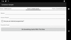
Figure 127: Form Layout, Using LinearLayout
The form’s layout resource resembles the URL-dialog scenario from earlier:
<?xml version="1.0" encoding="utf-8"?>
<LinearLayout xmlns:android="http://schemas.android.com/apk/res/android"
  android:layout_width="match_parent"
  android:layout_height="match_parent"
  android:orientation="vertical"
  android:padding="8dp">

  <LinearLayout
    android:layout_width="match_parent"
    android:layout_height="wrap_content"
    android:orientation="horizontal">
    <TextView
      android:layout_width="wrap_content"
      android:layout_height="wrap_content"
      android:text="@string/name" />
    <EditText
      android:layout_width="match_parent"
      android:layout_height="wrap_content"
      android:inputType="text" />
  </LinearLayout>

  <LinearLayout
    android:layout_width="match_parent"
    android:layout_height="wrap_content"
    android:orientation="horizontal">
    <TextView
      android:layout_width="wrap_content"
      android:layout_height="wrap_content"
      android:text="@string/home_planet" />
    <EditText
      android:layout_width="match_parent"
      android:layout_height="wrap_content"
      android:inputType="text" />
  </LinearLayout>

  <CheckBox
    android:layout_width="match_parent"
    android:layout_height="wrap_content"
    android:text="@string/android_programmer" />

  <LinearLayout
    android:layout_width="match_parent"
    android:layout_height="wrap_content"
    android:orientation="horizontal">
    <TextView
      android:layout_width="wrap_content"
      android:layout_height="wrap_content"
      android:text="@string/favorite_food" />
    <EditText
      android:layout_width="match_parent"
      android:layout_height="wrap_content"
      android:inputType="text" />
  </LinearLayout>

  <Button
    android:layout_width="match_parent"
    android:layout_height="wrap_content"
    android:text="@string/do_something" />

</LinearLayout>However, note that the CheckBox and the Button are not themselves
wrapped in horizontal LinearLayout containers. They are merely direct
children of the vertical LinearLayout. In this case, both are set to
have a width of match_parent, though that is not required — you could
have them set to wrap_content if you prefer.
We will look at CheckBox in greater detail in
an upcoming chapter.
Setting up this form follows the same basic recipe as was used for the simpler dialog form from earlier in this chapter:
vertical LinearLayout
horizontal LinearLayout into the vertical LinearLayout
TextView and an EditText into the horizontal LinearLayout
and configure as needed
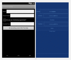
Figure 128: Bigger Form, As Seen in Android Studio
If you look back at the screenshot, you will notice that the labeled
EditText widgets are ragged, in terms of their layout. Each
EditText immediately follows the TextView label, without regard
to any sort of “columns”. That is because each LinearLayout is
largely independent. You cannot readily have one row depend upon
the other rows.
A TableLayout would be a better choice for this sort
of a form, as there we can have distinct columns of labels and fields.
We will see how TableLayout handles this structure later in this
chapter.
RelativeLayout, as the name suggests, lays out widgets based upon their
relationship to other widgets in the container and the parent container. You
can place Widget X below and to the left of Widget Y, or have Widget Z’s bottom
edge align with the bottom of the container, and so on.
To make all this work, we need ways to reference other widgets within an XML layout file, plus ways to indicate the relative positions of those widgets.
The easiest relations to set up are tying a widget’s position to that of its container:
android:layout_alignParentTop says the widget’s top should align with the
top of the containerandroid:layout_alignParentBottom says the widget’s bottom should align
with the bottom of the containerandroid:layout_alignParentStart says the widget’s start side should align
with the start side of the containerandroid:layout_alignParentEnd says the widget’s end side should align
with the end side of the containerandroid:layout_centerHorizontal says the widget should be positioned
horizontally at the center of the containerandroid:layout_centerVertical says the widget should be positioned
vertically at the center of the containerandroid:layout_centerInParent says the widget should be positioned both
horizontally and vertically at the center of the containerAll of these attributes take a simple boolean value (true or false).
Also, there are android:layout_alignParentLeft and android:layout_alignParentRight
attributes, for pre-Android 4.2 devices or for cases where you want to
position irrespective of language direction.
Note that the padding of the widget is taken into account when performing these various alignments. The alignments are based on the widget’s overall cell (combination of its natural space plus the padding).
The remaining attributes of relevance to RelativeLayout take as a value the
identity of a widget in the container. To do this:
android:id attributes) on all elements that you will need
to addressThe first occurrence of an id value should have the plus sign (@+id/widget_a);
the second and subsequent times that id value is used in the layout file should
drop the plus sign (@id/widget_a). This allows the build tools to better help
you catch typos in your widget id values — if you do not have a plus sign
for a widget id value that has not been seen before, that will be caught at
compile time.
For example, if Widget A appears in the RelativeLayout before Widget B, and
Widget A is identified as @+id/widget_a, Widget B can refer to Widget A in one
of its own attributes via the identifier @id/widget_a.
There are four attributes that control position of a widget vis-à-vis other widgets:
android:layout_above indicates that the widget should be placed above the
widget referenced in the propertyandroid:layout_below indicates that the widget should be placed below the
widget referenced in the propertyandroid:layout_toStartOf indicates that the widget should be placed to the
start of the widget referenced in the propertyandroid:layout_toEndOf indicates that the widget should be placed to the
end of the widget referenced in the propertyThere are also android:layout_toLeftOf and android:layout_toRightOf
attributes for use with older devices.
Beyond those four, there are five additional attributes that can control one widget’s alignment relative to another:
android:layout_alignTop indicates that the widget’s top should be aligned
with the top of the widget referenced in the propertyandroid:layout_alignBottom indicates that the widget’s bottom should be
aligned with the bottom of the widget referenced in the propertyandroid:layout_alignStart indicates that the widget’s starting edge should be
aligned with the starting edge of the widget referenced in the propertyandroid:layout_alignEnd indicates that the widget’s ending edge should be
aligned with the ending edge of the widget referenced in the propertyandroid:layout_alignBaseline indicates that the baselines of the two
widgets should be aligned (where the “baseline” is that invisible line that
text appears to sit on)The last one is useful for aligning labels and fields so that the text appears
“natural”. Since fields have a box around them and labels do not,
android:layout_alignTop would align the top of the field’s box with the top
of the label, which will cause the text of the label to be higher on-screen
than the text entered into the field.
You will find RelativeLayout in the “Legacy” section of the Palette in the Android Studio
Graphical Layout editor. You can drag that into your layout XML resource.
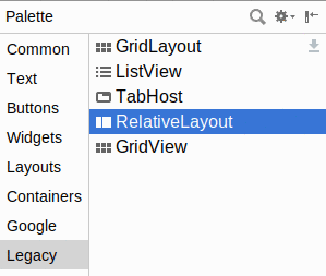
Figure 129: Legacy Section of Palette, RelativeLayout Highlighted
As you drag other widgets into your RelativeLayout, you will see arrows
hinting at the rules that will be applied if you drop the widget at the
current mouse location:
Figure 130: Dragging a Widget in a RelativeLayout
Getting the rules that you want may or may not be possible purely through
drag-and-drop. You may need to just drop the widget into the RelativeLayout
and manually adjust the rules, whether by using the Attributes pane or by
editing the XML directly.
Earlier in the chapter, we saw how to implement the bottom-then-top
pattern using a LinearLayout, where we had
a small button on the bottom and a large button on the top. The large
button was set to take up all space that was not required by the small
button.
We can achieve the same result using a RelativeLayout.
As with the LinearLayout scenario, we have one container plus the
two Button widgets. In this case, the container is a RelativeLayout:
<?xml version="1.0" encoding="utf-8"?>
<RelativeLayout xmlns:android="http://schemas.android.com/apk/res/android"
  android:layout_width="match_parent"
  android:layout_height="match_parent">

  <Button
    android:layout_width="match_parent"
    android:layout_height="match_parent"
    android:layout_above="@+id/another_button"
    android:layout_alignParentTop="true"
    android:text="@string/button" />

  <Button
    android:id="@id/another_button"
    android:layout_width="match_parent"
    android:layout_height="wrap_content"
    android:layout_alignParentBottom="true"
    android:text="@string/another_button" />
</RelativeLayout>The bottom Button has the same size as before, with android:layout_width
set to match_parent and android:layout_height set to wrap_content.
However, it also has android:layout_alignParentBottom="true", anchoring
it to the bottom of the RelativeLayout. Since the RelativeLayout fills
all available space, the bottom Button is anchored to the bottom of the
screen, in effect.
The top Button has two RelativeLayout positioning attributes:
android:layout_above="@+id/another_button", so it is placed above
the bottom Button
android:layout_alignParentTop="true", so it is anchored to the top
of the RelativeLayout
Given these rules, it does not matter what the android:layout_height
attribute value is. The Button will be stretched between those two
anchor points: the top of the RelativeLayout and the top of the bottom
Button.
By default, when creating a new layout resource file, you get either a
ConstraintLayout or a
vertical LinearLayout as the root element. You can change that by
replacing the “Root element” value with any other widget or container
class name, such as RelativeLayout:
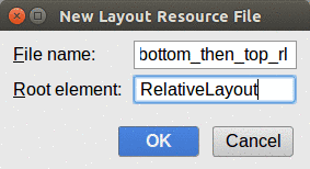
Figure 131: New Layout Resource with RelativeLayout
However, from there, using the drag-and-drop capabilities will start to be more of a pain than they are worth.
You can drag a Button into the RelativeLayout, for example:

Figure 132: RelativeLayout and Button
However, you get no visual feedback after you drop the widget of what
the rules are that the IDE chose, based on your drag-and-drop location.
If you rummage through the Attributes pane, you will see that the
rules are reflected in some checkbox attributes for the boolean
RelativeLayout android:layout_ attributes, plus margins based on how
far from the RelativeLayout edges you placed the widget:
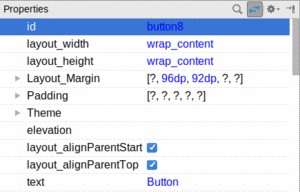
Figure 133: Button Attributes in RelativeLayout
Fixing those through the Attributes pane is no easier than is fixing them through the XML editor. Arguably, using the Attributes pane is slower.
We also used LinearLayout to create the “URL dialog” UI,
where we had the labeled field along with “OK” and “Cancel” buttons.
That same structure can also be built using a RelativeLayout.
With LinearLayout, we needed three containers: one vertical LinearLayout
wrapped around two horizontal LinearLayouts. RelativeLayout is simpler from
that standpoint, as we only need one RelativeLayout. The complexity moves
into the widgets instead:
<?xml version="1.0" encoding="utf-8"?>
<RelativeLayout
  xmlns:android="http://schemas.android.com/apk/res/android"
  android:layout_width="match_parent"
  android:layout_height="wrap_content">

  <TextView
    android:id="@+id/label"
    android:layout_width="wrap_content"
    android:layout_height="wrap_content"
    android:layout_alignBaseline="@+id/entry"
    android:layout_alignParentLeft="true"
    android:layout_alignParentStart="true"
    android:layout_marginLeft="4dp"
    android:layout_marginStart="4dp"
    android:text="@string/url"/>

  <EditText
    android:id="@id/entry"
    android:layout_width="match_parent"
    android:layout_height="wrap_content"
    android:layout_alignParentTop="true"
    android:layout_toRightOf="@id/label"
    android:layout_toEndOf="@id/label"
    android:inputType="text"/>

  <Button
    android:id="@+id/ok"
    android:layout_width="wrap_content"
    android:layout_height="wrap_content"
    android:layout_alignRight="@id/entry"
    android:layout_alignEnd="@id/entry"
    android:layout_below="@id/entry"
    android:text="@string/ok"/>

  <Button
    android:id="@+id/cancel"
    android:layout_width="wrap_content"
    android:layout_height="wrap_content"
    android:layout_alignTop="@id/ok"
    android:layout_toLeftOf="@id/ok"
    android:text="@string/cancel"/>

</RelativeLayout>
All the RelativeLayout itself needs is its size, set the same as with
vertical LinearLayout in the earlier version of this sample — a width
of match_parent and a height of wrap_content.
Other than android:layout_width and android:layout_height, all of the
widget attributes with layout_ are rules used by children of a RelativeLayout
for positioning. So, we have:
| Widget | Horizontal Anchor | Vertical Anchor |
|---|---|---|
TextView |
left/start side of the RelativeLayout, with 4dp of margin |
baseline of the EditText
|
EditText |
right/end side of the TextView
|
top of the RelativeLayout
|
“OK” Button
|
right/end edge of the EditText
|
bottom of the EditText
|
“Cancel” Button
|
left/start edge of the “OK” Button
|
top of the “OK” Button
|
Since the EditText width is set to match_parent, it will fill all
the space in the “row” after the TextView. Since the “OK” Button
horizontal position is tied to the EditText, the Button slides over
to the edge of the screen, dragging along the connected “Cancel” Button.
As a result, we get the same basic UI:
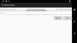
Figure 134: URL-Dialog Layout, Using RelativeLayout
RelativeLayout also has a feature that LinearLayout lacks — the
ability to have widgets overlap one another. Later children of a
RelativeLayout are “higher in the Z axis” than are earlier children, meaning
that later children will overlap earlier children if they are set up to occupy
the same space in the layout.
Here, we have two buttons, where the “I am small” button overlaps the “I am big” button:
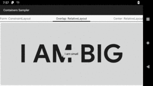
Figure 135: Overlap Layout, Using RelativeLayout
The layout is fairly simple:
<?xml version="1.0" encoding="utf-8"?>
<RelativeLayout xmlns:android="http://schemas.android.com/apk/res/android"
  android:layout_width="match_parent"
  android:layout_height="match_parent">

  <Button
    android:layout_width="match_parent"
    android:layout_height="match_parent"
    android:text="@string/big"
    android:textSize="120dip"
    android:textStyle="bold"/>

  <Button
    android:layout_width="wrap_content"
    android:layout_height="wrap_content"
    android:layout_centerInParent="true"
    android:text="@string/small"/>

</RelativeLayout>
The first Button is set to fill the screen. The second Button is set to be
centered inside the parent, but only take up as much space as is needed for its
caption. Hence, the second Button will appear to “float” over the first
Button.
Both Button widgets can still be clicked, though clicking on the smaller
Button does not also click the bigger Button. Your clicks will be handled
by the widget on top in the case of an overlap like this.
On Android 5.0 and higher, it is possible to achieve a similar effect
with LinearLayout by using the android:elevation attribute to control
the Z axis, where higher elevation values mean higher on the Z axis, floating
over those that are lower on the Z axis.
If you like HTML tables, you will like
Android’s TableLayout. It allows you to position your widgets in a grid
to your specifications. You control the number of rows and columns, which
columns might shrink or stretch to accommodate their contents, and so on.
TableLayout works in conjunction with TableRow. TableLayout controls the
overall behavior of the container, with the widgets themselves poured into one
or more TableRow containers, one per row in the grid.
For all this to work, we need to figure out how widgets work with rows and columns, plus how to handle widgets that live outside of rows.
Rows are declared by you, the developer, by putting widgets as children of a
TableRow inside the overall TableLayout. You, therefore, control directly
how many rows appear in the table.
The number of columns are determined by Android; you control the number of columns in an indirect fashion.
First, there will be at least one column per widget in your longest row. So if you have three rows, one with two widgets, one with three widgets, and one with four widgets, there will be at least four columns.
However, a widget can take up more than one column by including the
android:layout_span property, indicating the number of columns the widget
spans. This is akin to the colspan attribute one finds in table cells in HTML:
<TableRow>
  <TextView android:text="URL:" />
  <EditText
    android:id="@+id/entry"
    android:layout_span="3"/>
</TableRow>
In the above XML layout fragment, the field spans three columns.
Ordinarily, widgets are put into the first available column. In the above
fragment, the label would go in the first column (column 0, as columns are
counted starting from 0), and the field would go into a spanned set of three
columns (columns 1 through 3). However, you can put a widget into a
different column via the android:layout_column property, specifying the
0-based column the widget belongs to:
<TableRow>
  <Button
    android:id="@+id/cancel"
    android:layout_column="2"
    android:text="Cancel" />
  <Button android:id="@+id/ok" android:text="OK" />
</TableRow>
In the preceding XML layout fragment, the Cancel button goes in the third
column (column 2). The OK button then goes into the next available column,
which is the fourth column.
Normally, TableLayout contains only TableRow elements as immediate
children. However, it is possible to put other widgets in between rows. For
those widgets, TableLayout behaves a bit like LinearLayout with vertical
orientation. The widgets automatically have their width set to match_parent,
so they will fill the same space that the longest row does.
By default, each column will be sized according to the “natural” size of the widest widget in that column (taking spanned columns into account). Sometimes, though, that does not work out very well, and you need more control over column behavior.
You can place an android:stretchColumns property on the TableLayout.
This lists the column or columns that should absorb any extra space
on the row, if the natural width of the columns collectively is narrower
than the available horizontal space. You can:
android:stretchColumns="0"
to stretch the first column)android:stretchColumns="0,1"
to stretch the first two columns)* to indicate that all columns should be stretched, akin to
using equal android:layout_weight values in a horizontal
LinearLayout (e.g., android:stretchColumns="*")Conversely, you can place an android:shrinkColumns property on the
TableLayout. Again, this should be a single column number, a
comma-delimited list of column numbers, or * as shorthand for referring
to all columns. The columns listed in this property
will try to word-wrap their contents to reduce the effective width of the
column — by default, widgets are not word-wrapped. This helps if you have
columns with potentially wordy content that might cause some columns to be
pushed off the right side of the screen.
You can also leverage an android:collapseColumns property on the
TableLayout, again with a column number or comma-delimited list of column
numbers (* is not documented as an available option).
These columns will start out “collapsed”, meaning they will be part of
the table information but will be invisible. Programmatically, you can collapse
and un-collapse columns by calling setColumnCollapsed() on the TableLayout.
You might use this to allow users to control which columns are of importance to
them and should be shown versus which ones are less important and can be hidden.
You can also control stretching and shrinking at runtime via
setColumnStretchable() and setColumnShrinkable().
You will find TableLayout and TableRow
in the “Layouts” section of the Palette in the Android Studio
graphical layout editor:
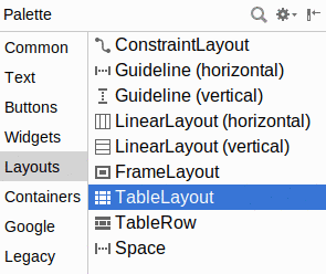
Figure 136: Layouts Section of Palette, TableLayout Highlighted
Given a TableLayout, you can drag one or more TableRow containers
into it, then start dragging widgets into the rows, much as you might
set up nested LinearLayout containers.
One area where TableLayout excels is with forms, particularly if you are
using the classic two-column “label and widget” structure for the form.
This is because TableLayout can give you real columns, whereas
LinearLayout and RelativeLayout cannot.
As with most TableLayout usages, the immediate children of ours
are mostly TableRow containers, each providing the contents for
the columns:
<?xml version="1.0" encoding="utf-8"?>
<TableLayout xmlns:android="http://schemas.android.com/apk/res/android"
  android:layout_width="match_parent"
  android:layout_height="match_parent"
  android:padding="8dp"
  android:stretchColumns="1">

  <TableRow>
    <TextView android:text="@string/name" />
    <EditText android:inputType="text" />
  </TableRow>

  <TableRow>
    <TextView android:text="@string/home_planet" />
    <EditText android:inputType="text" />
  </TableRow>

  <TableRow>
    <CheckBox
      android:layout_column="1"
      android:text="@string/android_programmer" />
  </TableRow>

  <TableRow>
    <TextView android:text="@string/favorite_food" />
    <EditText android:inputType="text" />
  </TableRow>

  <Button android:text="@string/do_something" />

</TableLayout>The TableLayout itself has android:stretchColumns="1", so all leftover
space in the rows will go to the second column (with the first column having
an index of 0).
The first, second, and fourth TableRow each have the same structure,
with a TextView label preceding the EditText where the user can fill
in the data. The third TableRow, though, has only one child:
the CheckBox. And, our Button lies outside of any TableRow, as
a direct child of the root TableLayout. Both the CheckBox and the
Button will exist on a row of their own. The difference is that
the CheckBox goes in the second column, courtesy of android:layout_column="1",
whereas the Button will span the entire row (the way TableRow containers
span the entire width of the TableLayout).
So, compared with
the original LinearLayout version of this sample,
our TableLayout columns are neat and aligned:
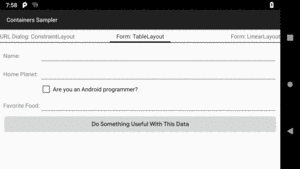
Figure 137: Form Layout, Using TableLayout
The “URL dialog” layout, previously seen implemented using
LinearLayout and
RelativeLayout,
can also be implemented using a TableLayout. This is not the most
natural use of a TableLayout, but you can do it if you wanted.
As with the form sample above, we start with a root TableLayout having
android:stretchColumns="1" to give all extra space to the second column…
even though we will wind up with a total of four columns this time:
<?xml version="1.0" encoding="utf-8"?>
<TableLayout xmlns:android="http://schemas.android.com/apk/res/android"
  android:layout_width="match_parent"
  android:layout_height="wrap_content"
  android:stretchColumns="1">

  <TableRow>

    <TextView
      android:layout_marginLeft="4dip"
      android:layout_marginStart="4dip"
      android:text="@string/url" />

    <EditText
      android:id="@+id/entry"
      android:layout_span="3"
      android:inputType="text" />
  </TableRow>

  <TableRow>

    <Button
      android:id="@+id/cancel"
      android:layout_column="2"
      android:text="@string/cancel" />

    <Button
      android:id="@+id/ok"
      android:text="@string/ok" />
  </TableRow>

</TableLayout>The EditText in the first TableRow has android:layout_span="3", indicating
that it should span to fill three columns. That, plus our one TextView,
means that the first row is set up for four columns in total.
The first Button in the second TableRow has android:layout_column="2",
indicating that it should go into the third column. The other Button
will go into the next column (the fourth column in this case), and the
first two columns are skipped. So, this row also is set up for four columns.
So, when android:stretchColumns="1" is applied, the extra space will
be given to the “contents” of the second column:
EditText in the first rowButton widgets in the second rowIn 2016, Google introduced ConstraintLayout, with a vision of it
becoming the fourth major container and perhaps the default one that
you would choose. ConstraintLayout has its benefits, to be certain.
However, it requires the use of a library, and we have not yet covered
how to attach libraries to an Android module.
So, we will discuss ConstraintLayout a bit later in the book.
In order for the “start”/“end” attributes to work, you need to have
android:supportsRtl="true" in your <application> element in your manifest.
Most newly-created projects will have this attribute already set for
you by the new-project wizard.
To see how your app behaves with RTL — without having to learn Arabic or Hebrew, if you are not literate in those languages — you can force Android to use RTL layout rules with any language on Android 4.2+ devices. To do this, go into the Settings app of the device or emulator and choose “Developer options”. In there, scroll down to the “Force RTL layout direction” item. By default, this is turned off, and so layout direction is determined by the user’s chosen language:
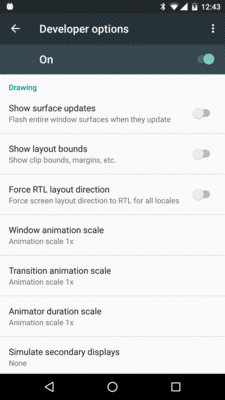
Figure 138: Developer Options in Settings, Normal Mode
Tapping that switch uses RTL layout rules — with “start” referring to the right and “end” referring to the left — for all languages:
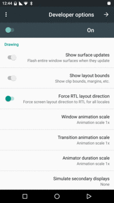
Figure 139: Developer Options in Settings, Forced-RTL Mode
As a reminder, if “Developer options” is not in the list of Settings categories, go into the “About device” category, find the build number item, and tap on it seven times. This will enable “Developer options” back on the main list of Settings categories.