Figure 250: Custom Material Theme for a Button
We have already been exposed to Theme.Material as part of this book, such as
with the action bar.
Android 5.0+, combined with Theme.Material, gives you a lot of capabilities
tied to Google’s Material Design aesthetic. In this chapter, we will cover some
basic Material Design capabilities that will affect your Theme.Material app
on Android 5.0+, starting with color.
Some developers want to change the colors used by their app to match some
specific color or color palette. In some cases, the colors in question are
tied to the app’s branding. In other cases, the developer simply wants something
different than the stock colors you get from something like Theme.Holo
or Theme.Holo.Light.
Affecting color changes in your Theme.Material-based Android app is
vastly simplified — both for the action bar and the widgets — courtesy
of Theme.Material’s tinting options.
In the chapter on the action bar, we saw how to set up
a custom theme based on Theme.Material that
had custom color tinting rules that affected the action bar:
<?xml version="1.0" encoding="utf-8"?>
<resources>
  <style name="AppTheme" parent="android:Theme.Material">
    <item name="android:colorPrimary">@color/primary</item>
    <item name="android:colorPrimaryDark">@color/primary_dark</item>
    <item name="android:colorAccent">@color/accent</item>
  </style>
</resources>At that time, we focused on the effects that these tints had on the
action bar itself. However, with Theme.Material, not only do the tints
affect the action bar, but they affect the widgets themselves.
The BasicMaterial
directory contains clones of some of the
basic widget samples
outlined earlier in this book, where each includes the custom theme
demonstrated for the action bar.
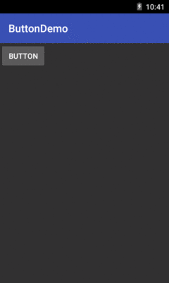
In some cases, the custom tints are not normally visible, such as with a button:
Figure 250: Custom Material Theme for a Button
In other cases, the accent color will show up,
such as in a checked CheckBox:
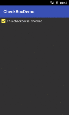
Figure 251: Custom Material Theme for a CheckBox
Similarly, your accent color shows up in things like:
EditText:
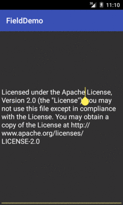
Figure 252: Custom Material Theme for an EditText
RadioButton:
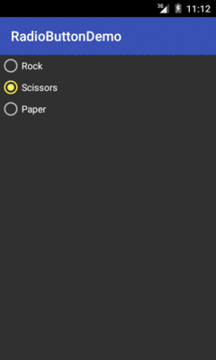
Figure 253: Custom Material Theme for a RadioButton
Switch:
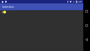
Figure 254: Custom Material Theme for a Switch
Of course, you are welcome to pick whatever colors you like for your theme.
Google has its opinion of what it thinks are good ideas.
As part of the Material Design documentation, you will find a “Color palette” page that outlines possible colors to use.
A Redditor has also published an Android color resource file that contains all of the colors outlined in the Material Design guide.
There is also the material palette site, which generates a color resource file based upon colors that you select from a large grid of color swatches.