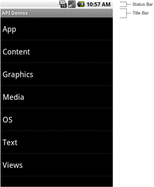
Figure 196: Status Bar and Title Bar
The action bar — that bar that runs across the top of your activity — is the backbone of your UI. Here, you can provide actions for the user to perform related to the current activity (e.g., “edit the contact that you are viewing”) or related to the application as a whole (e.g., “here is the documentation”). Sometimes, these actions will appear as toolbar buttons or other widgets in the action bar. Sometimes, these actions will appear in the “overflow”, which amounts to a menu.
This chapter introduces the concept of the action bar and how to add actions to it.
Android has had many patterns for various “bars” as part of its UI. So, to help explain what an action bar is, it helps if we review the history and role of Android’s various bars.
In the beginning, there was the status bar and the title bar.
The status bar was a thin strip across the top of the screen, used for things like the clock, signal strength, battery charge, and notification icons (for events like new unread email messages). This bar is technically part of the OS, not your app’s UI.
The title bar was a thin gray strip beneath the status bar that, by default, would hold the name of your application, much like the title bar of a browser might show the name of a Web site.
Figure 196: Status Bar and Title Bar
When official support for tablets arrived with Android 3.0 in February 2011, the story changed.
The status bar was replaced by the system bar, appearing at the bottom of the screen. This had all of the contents of the old status bar, but also had the soft keys for BACK, HOME, etc. Android 1.x and 2.x required that devices have off-screen affordances for those operations; now, device manufacturers could skip those and have the system bar offer them.
The action bar, by default, appears at the top of your activity, replacing the old title bar. You can define what goes in the action bar (icon, title, toolbar buttons, etc.).
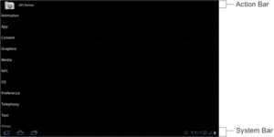
Figure 197: Action Bar and System Bar
The icon on the far left of the action bar also serves as a toolbar button, if you wish. A common pattern for using this is to take the user back to the “main” or “home” activity of your application.
Sometimes, the far right side of the action bar will contain a “…” affordance. This is known as the “action overflow” or “overflow menu”:
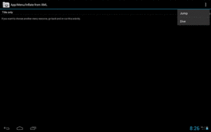
Figure 198: Action Bar with Open Overflow Menu
Tapping it will give the user access to actions that might have been toolbar buttons on a larger screen, but there was insufficient room. Also, low-priority actions may be tucked into the overflow, rather than clutter up the screen with too many toolbar buttons.
Phone-sized devices were not supported by Android 3.x. They jumped from Android 2.3 to 4.0, and along the way adopted some of the Android 3.x UI features:
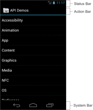
Figure 199: Status Bar, Action Bar, and System Bar
The Nexus 7, introduced in the summer of 2012, was a 7” tablet that did not follow the tablet UI structure that all other standard Android tablets used. Instead, it looked a bit like a really large phone, having a top status bar along with a bottom system bar solely for the navigation buttons (BACK, HOME, etc.). Apps, as before, could have an action bar as well.
Initially, it was thought that the Nexus 7 was going to be distinctive in that regard. Instead, with Android 4.2, Google switched all tablets to this model, restoring the status bar and relegating the system bar purely for navigation buttons.
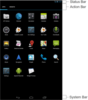
Figure 200: Status Bar, Action Bar, and System Bar, on Nexus 7 Emulator
Functionally, the action bar is much the same in Android 5.0 as it was in previous releases. However, aesthetically, it has dropped the icon and made other minor stylistic adjustments.
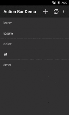
Figure 201: Action Bar on Android 5.0 Emulator
Back in the dawn of Android time, referred to by some as “the year 2007”, we had options menus. These would rise up from the bottom of the screen based on the user pressing a MENU key:
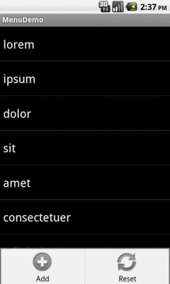
Figure 202: Legacy Options Menu
This is why you will see references to “options menu” scattered throughout the Android SDK.
The action bar pattern was first espoused by Google at the 2010 Google I|O conference. However, at the time, there was no actual implementation of this, except in scattered apps, and definitely not in the Android SDK.
Android 3.0 — a.k.a., API Level 11 — added the action bar to the SDK, and apps targeting that API level will get an action bar when running on such devices.
There are several implementations of the action bar floating about. You will probably be using the one that is part of Android itself, starting with API Level 11. However, there are a couple of backports of the action bar if you need them.
As mentioned above, devices running Android 3.0 and higher have support for
the action bar as part of their firmware, and that support is exposed through
the Android SDK. For example, there is an ActionBar class, and you can get
an instance of it for your activity’s action bar via getActionBar().
However, this only works on devices running Android 3.0 and higher. If you
try calling getActionBar() on an older device, you will crash with a
VerifyError runtime exception. VerifyError is Android’s way of telling
you “while you compiled fine, something your compiled code refers to does not
exist”.
If your minSdkVersion is 11 or higher, you will be able to use the native
action bar, and that approach will be used in most of this book.
If your minSdkVersion is lower than 11, you have two major choices:
appcompat-v7 backport of the action bar, published by Google in
the Android Support package in August 2013.This chapter assumes that your minSdkVersion is set to 11 or higher and you
will use the native action bar. A separate chapter in the trails cover the use
of appcompat-v7.
Note that the appcompat-v7 library not only backports
the action bar, but also attempts to backport part of Google’s Material
Design styling. Normally, Material Design only comes from Android 5.0
and the use of Theme.Material. The appcompat-v7 chapter
will cover the library’s effects both to the action bar and to other
aspects of your app’s UI.
In the sample app that follows, we use a Toast to let the user know some
work has been completed.
A Toast is a transient message, meaning that it displays and disappears on
its own without user interaction. Moreover, it does not take focus away
from the currently-active Activity, so if the user is busy writing the next
Great Programming Guide, they will not have keystrokes be “eaten” by the
message.
Since a Toast is transient, you have no way of knowing if the user even
notices it. You get no acknowledgment from them, nor does the message
stick around for a long time to pester the user. Hence, the Toast is mostly
for advisory messages, such as indicating a long-running background task is
completed, the battery has dropped to a low-but-not-too-low level, etc.
Making a Toast is fairly easy. The Toast class offers a static makeText()
method that accepts a String (or string resource ID) and returns a Toast
instance. The
makeText() method also needs the Activity (or other Context) plus a
duration. The duration is expressed in the form of the LENGTH_SHORT or
LENGTH_LONG constants to indicate, on a relative basis, how long the message
should remain visible. Once your Toast is configured, call its show()
method, and the message will be displayed.
If you want proper action bar support, you will want to target
API Level 14 or higher at runtime. That involves setting the
targetSdkVersion property in your build.gradle file (for Android Studio
users) or setting the android:targetSdkVersion attribute of the <uses-sdk>
element of your manifest (for legacy pre-Gradle projects).
We see this in the manifest of
the ActionBar/ActionBarDemoNative
sample project:
<?xml version="1.0" encoding="utf-8"?>
<manifest xmlns:android="http://schemas.android.com/apk/res/android"
  package="com.commonsware.android.inflation"
  android:versionCode="1"
  android:versionName="1.0">

  <supports-screens
    android:anyDensity="true"
    android:largeScreens="true"
    android:normalScreens="true"
    android:smallScreens="true"/>

  <uses-sdk
    android:minSdkVersion="10"
    android:targetSdkVersion="19"/>

  <application
    android:allowBackup="false"
    android:icon="@drawable/ic_launcher"
    android:label="@string/app_name">
    <activity
      android:name=".ActionBarDemoActivity"
      android:label="@string/app_name">
      <intent-filter>
        <action android:name="android.intent.action.MAIN"/>

        <category android:name="android.intent.category.LAUNCHER"/>
      </intent-filter>
    </activity>
  </application>

</manifest>Specifically, we have android:targetSdkVersion set to 19. While 11 or higher
will give you an action bar, 14 or higher will solve a particular UI quirk
related to menu choices. Some Android 4.0+ devices, but not all, will show two
ways of getting at overflow menu items if you have your android:targetSdkVersion
set to a value between 11 and 13. You will have the “…” item in the
action bar itself and a second one in the system bar, on devices that have
one. Setting android:targetSdkVersion to 14 or higher resolves this.
Doing nothing else but the preceding steps would give us an action bar, but one with no toolbar icons or action overflow menu. While perhaps visually appealing, this is not terribly useful for the user, so we need to do some more work to give the user actions to perform from the action bar.
Note that this manifest has a minSdkVersion of 10. This means that the
app can run on Android 2.3.3 devices. On those devices, though, the app
will not have an action bar, as the action bar did not exist then, and this
app is not using a backport like appcompat-v7. Instead, the app will have
an old-style options menu on API Level 10 devices. There is nothing intrinsically
wrong with this, though it does mean that your app will look different
on API Level 10 devices.
The easiest way to get toolbar icons and action overflow items into the action bar is by way of a menu XML resource. This is called a “menu” resource for historical reasons, as these resources originally were used for things like the options menu.
You can add a res/menu/ directory to your project and place in there menu
XML resources, such as res/menu/actions.xml from
ActionBar/ActionBarDemoNative:
<?xml version="1.0" encoding="utf-8"?>
<menu xmlns:android="http://schemas.android.com/apk/res/android">

  <item
    android:id="@+id/add"
    android:icon="@drawable/ic_action_new"
    android:showAsAction="always"
    android:title="@string/add"/>
  <item
    android:id="@+id/reset"
    android:icon="@drawable/ic_action_refresh"
    android:showAsAction="always|withText"
    android:title="@string/reset"/>
  <item
    android:id="@+id/about"
    android:icon="@drawable/ic_action_about"
    android:showAsAction="never"
    android:title="@string/about">
  </item>

</menu>There are four things you will want to configure on every menu item (<item>
element in the XML):
android:id attribute
in XML). This will create another R.id value, associated with this menu item,
much like the R.id values for our widgets in our layouts. We will use this
ID to determine when the user clicks on one of our toolbar buttons or action
overflow items.android:title
attribute in XML). If this item winds up in the action overflow menu, or optionally
as part of its toolbar button, this text will appear. Also, this title will appear
as a “tooltip” on the action item in the action bar itself, if the user long-presses
on the icon (something few users know to do). Typically, you will use
a string resource reference (e.g., @string/add), to better support
internationalization.android:icon
attribute in XML). If your item will appear as a toolbar button, this icon is
used with that button.android:showAsAction attribute in XML).
You will choose to have it be always a toolbar button, only be a toolbar
button ifRoom, or have it never be a toolbar button. You can also elect to
append |withText to either always or ifRoom, to indicate that you want
the toolbar button to be both the icon and the title, not just the icon. Note
that always is not guaranteed to be a toolbar button — if you ask for 100
always items, you will not have room for all of them. However, always items
get priority for space in the action bar over ifRoom items.Android Studio 2.2 introduced a new menu editor, modeled after the graphical layout editor. When you open a menu resource, you get two sub-tabs: a Text one with the XML, and a Design one to preview the menu and, in theory, edit it:

Figure 203: Android Studio Graphical Menu Editor
Unfortunately, the Design sub-tab suffers from this bug, making it annoying to use. For the time being, you are better off working with the XML directly.
From your activity, you teach Android about these action bar items by overriding
an onCreateOptionsMenu() method, such as this one from the
ActionBarDemoActivity of the ActionBar/ActionBarDemoNative sample project:
  @Override
  public boolean onCreateOptionsMenu(Menu menu) {
    getMenuInflater().inflate(R.menu.actions, menu);

    return(super.onCreateOptionsMenu(menu));
  }
Here, we create a MenuInflater and tell it to inflate our menu XML resource
(R.menu.actions) and pour them into the supplied Menu object. We then
chain to the superclass, returning its result.
To find out when the user taps on one of these things, you will need to override
onOptionsItemSelected(), such as the ActionBarDemoActivity implementation
shown below:
  @Override
  public boolean onOptionsItemSelected(MenuItem item) {
    switch(item.getItemId()) {
      case R.id.add:
        addWord();

        return(true);

      case R.id.reset:
        initAdapter();

        return(true);

      case R.id.about:
        Toast.makeText(this, R.string.about_toast, Toast.LENGTH_LONG)
             .show();

        return(true);
    }

    return(super.onOptionsItemSelected(item));
  }
You will be passed a MenuItem. You can call getItemId() on it and
compare that value to the ones from your menu XML resource (R.id.add and
R.id.reset). If you handle the event, return true; otherwise, return
the value of chaining to the superclass’ implementation of the method.
If you wish to respond to taps on your application icon, on the left of the
action bar, compare getItemId() to android.R.id.home, as that will be the
MenuItem used for that particular toolbar button. Note that if you have
your android:targetSdkVersion set to 14 or higher, you will also need to call
setHomeButtonEnabled(true) on the ActionBar (obtained via a call to getActionBar())
to enable this behavior. Note that this icon may not exist, particularly
if you are using Theme.Material on Android 5.0+.
So, what is it that we really are doing here in ActionBarDemoActivity?
In many respects, this is reminiscent of the ListActivity demos from
an earlier chapter. We have an array of 25 Latin words,
and we want to display these in a list.
However, in this case, we are only showing five words at the outset. An
“add” action bar item will add additional words out of the main roster of
25 words, until the ListView holds all 25. A “reset” action bar item
will return us to the original 5 words.
ActionBarDemoActivity is a ListActivity. However, rather than set up our ArrayAdapter
directly in the onCreate() method as some of the other samples have done,
we delegate that work to an initAdapter() method. Moreover, that initAdapter()
method does its work a bit differently than what those other samples did:
  private void initAdapter() {
    words=new ArrayList<String>();

    for (int i=0;i<5;i++) {
      words.add(items[i]);
    }

    adapter=
        new ArrayAdapter<String>(this,
                                 android.R.layout.simple_list_item_1,
                                 words);

    setListAdapter(adapter);
  }
Rather than create the ArrayAdapter straight out of the static items array,
we create a fresh ArrayList and pour the 5 elements from items into it, then create
the ArrayAdapter on the ArrayList. This may seem superfluous, but we will
take advantage of this approach with our action bar items.
When the user clicks the “reset” item in the action bar, we call
initAdapter() again, which gives our ListActivity a fresh set of 5 Latin
words to display:
  @Override
  public boolean onOptionsItemSelected(MenuItem item) {
    switch(item.getItemId()) {
      case R.id.add:
        addWord();

        return(true);

      case R.id.reset:
        initAdapter();

        return(true);

      case R.id.about:
        Toast.makeText(this, R.string.about_toast, Toast.LENGTH_LONG)
             .show();

        return(true);
    }

    return(super.onOptionsItemSelected(item));
  }
When the user clicks the “add” item in the action bar, we call an addWord()
private method, which adds the next word out of the items array and appends
it to the ListView:
  private void addWord() {
    if (adapter.getCount()<items.length) {
      adapter.add(items[adapter.getCount()]);
    }
  }
The net result of all of this is that we have an activity with our customized action bar:
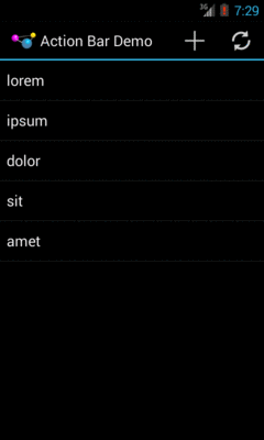
Figure 204: ActionBarDemo, As Initially Launched, on Android 4.3
Among our action bar items is an “about” one that will always be in the overflow menu. This will have three possible visual outcomes.
First, on devices without an off-screen MENU key, the overflow menu is represented by a “…” button, which displays the overflow menu when clicked:
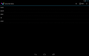
Figure 205: ActionBarDemo, on Android 4.3 Large Screen, with Overflow
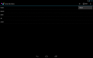
Figure 206: ActionBarDemo, on Android 4.3 Large Screen, with Overflow Open
On Android 4.x devices with an off-screen MENU key, pressing the MENU key will cause the overflow menu to rise up from the bottom of the screen:
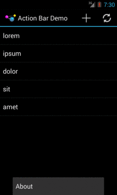
Figure 207: ActionBarDemo, on Android 4.3 Normal Screen, with Overflow
Android 4.4+ devices should always have the “…” button, as is described in the next section.
Android 2.3 devices that run this app will have no action bar:

Figure 208: ActionBarDemo, on Android 2.3.3 Normal Screen
However, pressing the MENU button will bring up the old-style options menu, where our action items appear:

Figure 209: ActionBarDemo, on Android 2.3.3 Normal Screen, Showing the Options Menu
To expand upon the history lessons from earlier in this chapter, all Android 1.x and 2.x devices had a MENU key, used to bring up the options menu. With Android 3.0 and the advent of the system/navigation bar, device manufacturers no longer needed keys for HOME, BACK, and MENU. And, the action bar incorporated a “…” affordance for accessing the overflow, for items that would have been in the options menu and were not promoted to be toolbar buttons in the action bar itself.
Confusion began when we started having devices that had a MENU key and Android 3.0+. A few Android 2.x devices were upgraded to Android 4.0, and hundreds of millions of Android devices, from manufacturers like Samsung and HTC, shipped with Android 4.x and a MENU key.
To accommodate this, the device would report whether it had a “permanent menu key”, and the action bar would choose whether to show the “…” affordance based upon the existence of this key. Devices with a MENU key would not get the “…”, but instead would use the MENU key to display the overflow.
This irritated many developers, for much the same reason as why the MENU key irritated those developers back in Android 1.x/2.x: the existence of a menu was not very discoverable. Many users would eventually realize that tapping the MENU key might uncover useful stuff, but not all users would make this connection. However, now developers could see an obvious alternative, in the form of the “…” affordance, and so they sought ways to trick the action bar into showing the “…” even on devices that had a MENU key.
And that was how the world worked… up until Android 4.4.
An unannounced change in Android 4.4 is that the “…” button should now always be shown in the action bar. The MENU key, if it exists, will still work, showing the overflow. Ideally, it shows the overflow as dropping down from the “…”, though that is not required. And the Compatibility Definition Document for Android 4.4 more forcefully suggests that the MENU key is obsolete.
None of this should directly affect your code. However:
On Android 4.0+, if you are using a Holo theme as a base, you may wish to
adjust the colors used by your action bar.
On Android 5.0+, if you are using a Material theme as a base, you will
want to adjust the colors used by your action bar. This is Google’s vision
for how branding should work, in lieu of having your icon be in the action bar.
The following sections outline some ways to affect the colors of your action bar.
Android 5.0 and Theme.Material make action bar colors easy to set
up, as part of an overall “tinting” approach.
The ActionBar/MaterialColor
sample project is a clone of the ActionBarDemoNative sample shown earlier
in this chapter, but one where:
minSdkVersion is set to 21, so the app will only run on Android 5.0+The theme will need to refer to colors, and the cleanest way to do that is
to set up color resources. Like all of our other resources, we give color
resources a name and a color value, usually in #RRGGBB or #AARRGGBB format.
Color resources are “value” resources, held by default in res/values/,
with the convention of using a colors.xml file for the actual colors.
For example, here is the res/values/colors.xml file from the MaterialColor
sample application:
<?xml version="1.0" encoding="utf-8"?>
<resources>
  <color name="primary">#3f51b5</color>
  <color name="primary_dark">#1a237e</color>
  <color name="accent">#ffee58</color>
</resources>It defines three colors, primary, primary_dark, and accent, with
different colors for each. In Android Studio, editing this file shows a
tiny color swatch to help you visualize the colors:
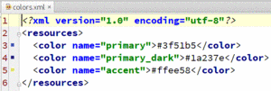
Figure 210: Color Resources in Android Studio
Then, given that we have definitions of our colors, we can apply those
colors to a custom theme, found in res/values/styles.xml:
<?xml version="1.0" encoding="utf-8"?>
<resources>
  <style name="AppTheme" parent="android:Theme.Material">
    <item name="android:colorPrimary">@color/primary</item>
    <item name="android:colorPrimaryDark">@color/primary_dark</item>
    <item name="android:colorAccent">@color/accent</item>
  </style>
</resources>Here, our AppTheme is inheriting from Theme.Material and is overriding
three tints: colorPrimary, colorPrimaryDark, and colorAccent, referring
to our three color resources in turn.
Note that we could have inherited from Theme.Material.Light had we wanted
a light “content area” (where our widgets go), or even
Theme.Material.Light.DarkActionBar for a light content area and a dark action
bar (before we start tailoring the action bar colors).
The application’s manifest declares that we will use AppTheme as the default
theme for our <application>, so all activities will use that theme unless
overridden at the activity level:
<?xml version="1.0" encoding="utf-8"?>
<manifest xmlns:android="http://schemas.android.com/apk/res/android"
  package="com.commonsware.android.abmatcolor"
  android:versionCode="1"
  android:versionName="1.0">

  <supports-screens
    android:anyDensity="true"
    android:largeScreens="true"
    android:normalScreens="true"
    android:smallScreens="true"/>

  <uses-sdk
    android:minSdkVersion="21"
    android:targetSdkVersion="21"/>

  <application
    android:allowBackup="false"
    android:icon="@drawable/ic_launcher"
    android:label="@string/app_name"
    android:theme="@style/AppTheme">
    <activity
      android:name="ActionBarDemoActivity"
      android:label="@string/app_name">
      <intent-filter>
        <action android:name="android.intent.action.MAIN"/>

        <category android:name="android.intent.category.LAUNCHER"/>
      </intent-filter>
    </activity>
  </application>

</manifest>
Also note that here is where we specify that minSdkVersion is 21. A new
Android Studio project would do that in build.gradle.
Everything else about the app is the same as the ActionBarDemoNative sample,
including our activity and the ListView that we are populating.
However, when we run this edition on an Android 5.0+ device or emulator, our
action bar takes on the requested colors, specifically the colorPrimary
value for the background color of the action bar:
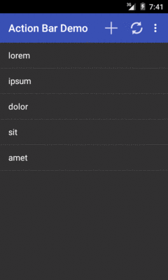
Figure 211: MaterialColor on Android 5.0 Emulator
The custom theme also affects the colors of certain widgets, as will be covered later in the book.
While the Material Design philosophy skips the application icon that we used
to have in the action bar, there is a way to add it back for a Theme.Material
application, though it requires a little bit of work, as seen in the
ActionBar/MaterialLogo
sample project.
The key thing that you need to do is to call setDisplayShowHomeEnabled(true)
on your ActionBar object, which you get by calling getActionBar() in
your Activity:
  @Override
  public void onCreate(Bundle state) {
    super.onCreate(state);

    getActionBar().setDisplayShowHomeEnabled(true);

    initAdapter();
  }
This will use whatever icon is set for the android:icon attribute
in your manifest as the “home” icon in your action bar:

Figure 212: MaterialLogo on Android 5.0 Emulator
If you would rather use a different icon, such as one that is scaled to fit the
action bar a bit better, you can call setIcon() on your ActionBar,
supplying the ID of a drawable resource (e.g., R.drawable.action_bar_icon)
that should be used instead of the drawable specified in the android:icon
attribute of your <activity> or <application> in the manifest.
For Theme.Holo and kin, the tinting rules from Theme.Material will
not apply. Instead, you will need to do a fair bit of tinkering to get
the color scheme set up the way you want.
Or, you can use Jeff Gilfelt’s Action Bar Style Generator.
This is a Web site that allows you to design an action bar color scheme, where the site will then generate for you everything that you need to implement that color scheme.
Note that Mr. Gilfelt has marked this site as deprecated, with an eye
towards people using Theme.Material or the appcompat-v7 edition of
the action bar. The site works, but in all likelihood it will be discontinued
at some future date.
Also note that the site works best with Google’s Chrome or Chromium browsers, though in testing, a recent edition of Firefox worked as well. As the site indicates, “your mileage may vary with other browsers”.
The site is dominated by a form for designing the color scheme and a preview area to show what the design will look like:
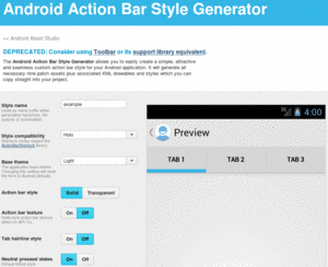
Figure 213: Action Bar Style Generator, As Originally Launched
In the “Style name” field, you can fill in the name you want to give
your custom theme. Whatever you fill in will be converted into all
lowercase with a leading capital letter, all following Theme.. So,
for example, filling in AppTheme will result in a style resource named
Theme.Apptheme.
For “Style compatibility”, choose “Holo”. For “Base theme”, choose the base style you want:
The next four options (“Action bar style”, “Action bar texture”, “Tab hairline style”, “Neutral pressed states”) are for advanced features and can be left at their defaults.
Scrolling further down the page, you will come to seven color pickers, allowing you to tailor the colors to be used in your action bar implementation. Each picker, when opened, allows you to choose a color based on a fixed palette, then refined using a gradient selector. Or, if you know specific colors (e.g., a graphic designer gave them to you), you can fill the color into the supplied field:
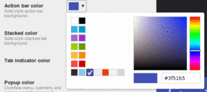
Figure 214: Action Bar Style Generator, Showing “Action bar color” Picker
As you change the colors, you will see what they impact on the preview.
At the bottom of the page is the “Output resources” frame:
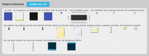
Figure 215: Action Bar Style Generator, Showing “Output resources” Frame
Here, you can click on the “DOWNLOAD .ZIP” button to download a ZIP archive containing your custom theme and all the associated resources required to implement it.
UnZIP the contents of that ZIP archive into your project’s res/
directory (e.g., in a traditional Android Studio project, unZIP into
src/main/res/ in your app module).
It will add
a bunch of files, notably including a file in res/values/ whose
name is based upon the name you filled into the Web form for the
theme name (e.g., styles_apptheme.xml).
If you look at that file, you will see that it defines a custom
theme for you, named Theme. plus whatever you provided to that
form (converted into a leading capital letter and the rest lowercase).
That file will be rather lengthy, as it designates specific styles
to use for various facets of the action bar (e.g., android:actionBarStyle).
Here is the theme’s primary <style> resource element, defining
the theme itself:
    <style name="Theme.Apptheme" parent="@android:style/Theme.Holo">
        <item name="android:actionBarItemBackground">@drawable/selectable_background_apptheme</item>
        <item name="android:popupMenuStyle">@style/PopupMenu.Apptheme</item>
        <item name="android:dropDownListViewStyle">@style/DropDownListView.Apptheme</item>
        <item name="android:actionBarTabStyle">@style/ActionBarTabStyle.Apptheme</item>
        <item name="android:actionDropDownStyle">@style/DropDownNav.Apptheme</item>
        <item name="android:actionBarStyle">@style/ActionBar.Solid.Apptheme</item>
        <item name="android:actionModeBackground">@drawable/cab_background_top_apptheme</item>
        <item name="android:actionModeSplitBackground">@drawable/cab_background_bottom_apptheme</item>
        <item name="android:actionModeCloseButtonStyle">@style/ActionButton.CloseMode.Apptheme</item>


    </style>
To use this theme, just add an android:theme attribute to your
<application> (or perhaps individual <activity> elements) in your
manifest:
  <application
    android:allowBackup="false"
    android:icon="@drawable/ic_launcher"
    android:label="@string/app_name"
    android:theme="@style/Theme.Apptheme">
    <activity
      android:name="ActionBarDemoActivity"
      android:label="@string/app_name">
      <intent-filter>
        <action android:name="android.intent.action.MAIN"/>

        <category android:name="android.intent.category.LAUNCHER"/>
      </intent-filter>
    </activity>
  </application>
The resulting app will have a color scheme mirroring what you defined on the form:
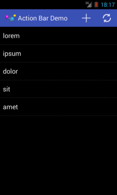
Figure 216: Results of the Action Bar Style Generator
This screenshot, and the code snippets, comes from the
ActionBar/HoloColor
sample project, which is the same as the base action bar sample app
from this chapter with the custom theme applied.
In addition to this chapter, you can learn more about advanced action bar techniques and learn about action modes, which temporarily replace the action bar with new items for use with contextual operations.