
Figure 478: SearchView Demo, Showing Collapsed Action View
The action bar offers a number of other features that developers can take advantage of, ones that do not necessarily fit into the other chapters. Hence, this chapter is a “catch all” for other things you may wish to do with your action bar. Note that this chapter is focused on the native action bar, not the AppCompat backport.
Understanding this chapter requires that you have read the core chapters, particularly the one on the action bar.
What happens if you want something other than a button to appear as an action bar item? Suppose you want a field instead?
Fortunately, this is supported. Otherwise, this would be a completely pointless section of the book.
You can specify android:actionLayout on an <item> element in a menu
resource. This
will point to a reference to a layout XML resource that you want to have inflated
into the action bar instead of a toolbar button. Then, in onCreateOptionsMenu(),
you can call findMenuItem() on the Menu to retrieve the MenuItem
associated with this <item> element, then call getActionView() to retrieve
the root of your inflated layout. At that point, you can hook up event listeners
to the widgets in that layout, as needed.
Obviously, since the action bar is only so big, you will need to be judicious about your use of space.
If all you need is a single widget to replace the toolbar button, rather
than a whole layout resource, you can use android:actionViewClass instead
of android:actionLayout. In android:actionViewClass, you provide the
fully-qualified class name of the widget that you wish to use to replace
the toolbar button. You still use getActionView() to retrieve a reference
to this at runtime.
If the widget you use implements the CollapsibleActionView interface,
then it has an additional behavior: the ability to collapse into a
standard toolbar button or expand into its normal mode. The only example
of this in the current Android SDK is SearchView, which can expand into
a field for searching or collapse into a simple search icon (magnifying glass)
as needed. We will see more about SearchView, and how it behaves as a
CollapsibleActionView, later in this chapter.
Yet another possible toolbar button replacement is an action provider.
Whereas an action view or action layout provide the UI, and your code
provides the handling of touch events, an action provider is an “all-in-one”
solution. It is designed to be configured, then used by the user without
any required additional intervention by the developer. That being said, an
action provider can have its own listener interfaces to let developers
know about various events that have occurred. The two primary implementations
of the ActionProvider base class are:
MediaRouteActionProvider, covered later elsewhere in the book,
is used to allow users to control the destination
for media, such as routing audio to Bluetooth headphones instead of the device
speaker or playing content back on a ChromecastShareActionProvider can simplify sharing content via ACTION_SEND,
as is covered elsewhere in the book
To use an ActionProvider, you add the android:actionProviderClass attribute
to an <item> in the <menu> resource, providing the fully-qualified
class name of the ActionProvider implementation. You can call
getActionProvider() on the MenuItem to retrieve the ActionProvider
instance, for configuration at runtime.
Many apps employ a SearchView in their action bar. The user typically sees
the search icon as a regular toolbar button:
Figure 478: SearchView Demo, Showing Collapsed Action View
Tapping that opens a search field, taking over more of the action bar:

Figure 479: SearchView Demo, Showing Expanded Action View
Typing something in initiates some sort of search, as defined by the activity
that is using the SearchView. BACK or the app icon in the action bar will
“collapse” the SearchView back into its iconified state.
The
ActionBar/SearchView
sample project, profiled in this section, shows how you can use
SearchView within your app. This sample is a clone of one
of the previous action bar samples, where we have the list of 25 words, hosted
in a ListFragment, with action bar items to add a word and reset the word
list. In this section, we will augment the sample with a SearchView and a
filtered ListView.
The project’s menu resource (res/menu/actions.xml) contains a regular
action item (reset), an action item employing an action layout (add),
and an action item containing our SearchView (search):
<?xml version="1.0" encoding="utf-8"?>
<menu xmlns:android="http://schemas.android.com/apk/res/android">

  <item
    android:id="@+id/search"
    android:actionViewClass="android.widget.SearchView"
    android:icon="@drawable/ic_action_search"
    android:showAsAction="ifRoom|collapseActionView"
    android:title="@string/filter">
  </item>

</menu>Note that the search item not only has
android:actionViewClass="android.widget.SearchView" to tie in our action view,
but it also has android:showAsAction="ifRoom|collapseActionView", to
indicate that this action view should support collapsing and expanding.
In onCreateOptionsMenu() of our ActionBarFragment, in addition to
inflating the menu resource
to configure the add action layout, we now also call a configureSearchView()
method to configure the SearchView:
  @Override
  public void onCreateOptionsMenu(Menu menu, MenuInflater inflater) {
    inflater.inflate(R.menu.actions, menu);

    configureSearchView(menu);

    super.onCreateOptionsMenu(menu, inflater);
  }
In configureSearchView(), surprisingly enough, we configure the SearchView:
  private void configureSearchView(Menu menu) {
    MenuItem search=menu.findItem(R.id.search);

    sv=(SearchView)search.getActionView();
    sv.setOnQueryTextListener(this);
    sv.setOnCloseListener(this);
    sv.setSubmitButtonEnabled(false);
    sv.setIconifiedByDefault(true);

    if (initialQuery != null) {
      sv.setIconified(false);
      search.expandActionView();
      sv.setQuery(initialQuery, true);
    }
  }
Specifically, we:
QueryTextListener and the OnCloseListener,
which will be covered in greater detail later in this chapter
SearchView for filtering
rather than queryingSearchView should be collapsed (“iconified”) as the default
stateAlso, our fragment has an initialQuery data member, and if that is not null,
we expand the SearchView and fill in initialQuery as the query to be shown
in the SearchView, also submitting it.
initialQuery comes from our configuration change logic, as if the user fills
in something in the SearchView in one configuration (e.g., portrait), we do not
want to lose it on a configuration change (e.g., to landscape). In our
onSaveInstanceState() method, we save both the query from the SearchView and
the words currently in our list:
  @Override
  public void onSaveInstanceState(Bundle state) {
    super.onSaveInstanceState(state);

    if (!sv.isIconified()) {
      state.putCharSequence(STATE_QUERY, sv.getQuery());
    }

    state.putStringArrayList(STATE_MODEL, words);
  }
In onViewCreated(), we use the savedInstanceState Bundle to populate
the adapter with the previous set of words, plus store the old SearchView’s query
in initialQuery:
  @Override
  public void onViewCreated(@NonNull View view,
                            @Nullable Bundle savedInstanceState) {
    if (savedInstanceState == null) {
      initAdapter(null);
    }
    else {
      initAdapter(savedInstanceState.getStringArrayList(STATE_MODEL));
      initialQuery=savedInstanceState.getCharSequence(STATE_QUERY);
    }
  }
Hence, on a configuration change, by the time configureSearchView() is called,
we will have our initialQuery, if there is one, and we can set up the UI to be
the same as it was in the old configuration.
The ActionBarFragment implements the SearchView.OnQueryTextListener and
SearchView.OnCloseListener interfaces, which is why we can pass this to
setOnQueryTextListener() and setOnCloseListener() in configureSearchView().
Those two interfaces require a total of three methods, described below.
The onQueryTextChange() method — required by SearchView.OnQueryTextListener –
will be called whenever the user has changed the contents of the expanded
SearchView, such as by typing a character. This is used when you want to
employ the SearchView for filtering, updating the filter as the user types,
rather than for searching, in which case you would wait until the user “submits”
the search request.
Our implementation takes advantage of ArrayAdapter’s built-in filtering capability:
  @Override
  public boolean onQueryTextChange(String newText) {
    if (TextUtils.isEmpty(newText)) {
      adapter.getFilter().filter("");
    }
    else {
      adapter.getFilter().filter(newText.toString());
    }

    return(true);
  }
Adapters that implement the Filterable interface can be filtered, automatically
restricting the displayed items to ones that match the filter. Calling getFilter()
on a Filterable returns a Filter. The default implementation of a Filter
filters on the leading characters of toString() of getItem() from the
Adapter. Hence, filtering an ArrayAdapter on our roster of 25 words, where
the filter string is 'm', would show morbi and molllis but skip amet, let
alone other words not beginning with m.
So, our onQueryTextChange() method simply updates the Filter with whatever
the user has typed into the SearchView, setting the filter to the empty string
if the SearchView is either empty or has null contents.
The onQueryTextSubmit() method — required by SearchView.OnQueryTextListener –
would be called if the user tapped on the submit button within the expanded
SearchView, to ask us to perform the search. In this sample, we have disabled
that button, as we are filtering our list on the fly, rather than performing
a query once the SearchView is filled out. Hence, ActionBarFragment has
a do-nothing implementation of onQueryTextSubmit(), simply returning false
to indicate that we have not consumed the event:
  @Override
  public boolean onQueryTextSubmit(String query) {
    return(false);
  }
The chapter on advanced database techniques has a section on full-text indexing,
and the sample app in that chapter demonstrates the use of the submit button
in a SearchView and onQueryTextSubmit().
The onClose() method — required by SearchView.OnCloseListener — in theory will be called
when the SearchView is collapsed. Here, we simply clear out the filter that we
are using to limit the contents of the ListView, plus return true to say that
we have handled the event:
  @Override
  public boolean onClose() {
    adapter.getFilter().filter("");

    return(true);
  }
According to the SearchView source code, it will only be called if:
SearchView is iconified by default (setIconifiedByDefault(true))In practice, not even that works very well.
Hence, if you really need to find out when the SearchView is collapsed,
you will probably need to use the more generic OnActionExpandListener
interface, attached to the SearchView via setOnActionExpandListener().
onMenuItemActionCollapse() should be called when the SearchView
is collapsed. This also works for other types of collapsible action views, not
just SearchView.
If the user taps on the search icon, then starts typing into the SearchView’s
editing area, the ListView is filtered based upon the typed-in prefix:

Figure 480: SearchView Demo, Showing Filtered Results
By default, your action bar will be separate from the main content area of your activity. Normally, that is what you want.
But, sometimes, you may want to have the action bar(s) float over the top of your activity, as can be seen in Google Maps:
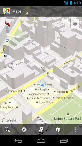
Figure 481: Google Maps, with Floating Action Bar (image courtesy of Google)
To accomplish this, you can use FEATURE_ACTION_BAR_OVERLAY, as is illustrated
in the ActionBar/OverlayNative
sample project.
This is nearly identical to the ActionBar/ActionBarDemoNative sample project, with
just a few changes, mostly in the onCreate() method of our activity:
  @Override
  public void onCreate(Bundle state) {
    super.onCreate(state);

    getWindow().requestFeature(Window.FEATURE_ACTION_BAR_OVERLAY);

    initAdapter();

    Drawable d=
        getResources().getDrawable(R.drawable.action_bar_background);

    getActionBar().setBackgroundDrawable(d);
  }
In addition to the original logic, we:
requestFeature() on our Window (obtained via a call to getWindow()),
asking for FEATURE_ACTION_BAR_OVERLAY
setBackgroundDrawable() on our ActionBar, supplying a reference
to a drawable resource to use for the background of the floating action barThe drawable resource is a ShapeDrawable, defined in XML:
<?xml version="1.0" encoding="utf-8"?>
<shape xmlns:android="http://schemas.android.com/apk/res/android"
  android:shape="rectangle">

  <solid android:color="#AAFFFFFF"/>

</shape>We will discuss ShapeDrawable in much greater detail
later in this book .
For the moment, take it on faith that our resource is defining a rectangle, with
a translucent white fill. The alpha channel (AA) for our translucence is important,
so the user can see a bit of our activity underneath the floating action bar.
The result is that our action bars float over the top of the list:
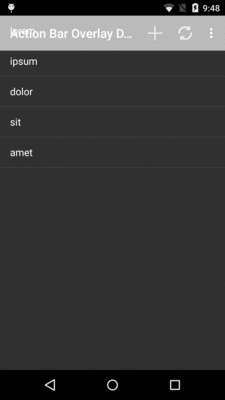
Figure 482: Floating Action Bar
In this case, the effect is not very good, as the words will blend in too strongly with the overlaid action bars. However, that is a question of organizing the screen content and using this overlay feature only in cases where you will see good results, such as in the Google Maps example shown above.