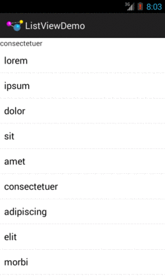
Figure 158: ListViewDemo, After User Taps on “consecteteur”
If you want the user to choose something out of a collection of somethings,
you could use a bunch of RadioButton widgets. However, Android has a series
of more flexible widgets than that, particularly for scenarios where the
collection is not knowable when you are writing your app: the results of a
Web service call, the results of a database query, etc.
Popular visual representations of collections include:
Android has two major solutions for this sort of problem. RecyclerView is
the newer solution. For lists, grids, and trees, you should start by considering
RecyclerView. However, RecyclerView comes in the form of a library, and you
often use other libraries to extend it (e.g., for supporting trees). Since we have
not covered libraries yet, we will hold off discussing RecyclerView until
a bit later in the book.
The classic solution involved subclasses of AdapterView, such as:
ListView, which is your typical “list box”Spinner, which (more or less) is a drop-down listGridView, offering a two-dimensional roster of choicesExpandableListView, a limited “tree” widget, supporting two levels in the
hierarchyand many more.
At their core, these are ordinary widgets. You will find them in your tool palette of your IDE’s graphical layout editor, and can drag them and position them as you see fit.
Their base AdapterView class is so named because it partners
with objects implementing the Adapter interface to determine what choices are
available for the user to choose from.
RecyclerView also uses adapters, though with a slightly different API than
what AdapterView uses. And there are some scenarios — such as drop-down list –
where RecyclerView is not really an option, and where AdapterView (particularly
Spinner) will be the best choice. So, in this chapter, we will examine
the AdapterView family, partly for historical reasons, partly for background
for learning about RecyclerView, and partly for ongoing use in specific
scenarios.
An Adapter is your bridge between your model data and that data’s visual
representation in the AdapterView:
Adapter might “adapt” an Invoice into a View that would serve
as a row in a ListView
Adapter might “adapt” a Book into a View that would serve as a
cell in a GridView
Android ships with several Adapter classes ready for your use, where
the different adapter classes are designed to “adapt” different sorts of
collections (e.g., arrays versus results of database queries). Android
also has a BaseAdapter class that can serve as the foundation for your
own Adapter implementation, if you need to “adapt” a collection of data
that does not fit any of the Adapter classes supplied by Android.
The easiest adapter to use is ArrayAdapter — all you need to do is wrap
one of these around a Java array or java.util.List instance, and you have a
fully-functioning adapter:
String[] items={"this", "is", "a", "really", "silly", "list"};
new ArrayAdapter<String>(this,
                         android.R.layout.simple_list_item_1,
                         items);
One flavor of the ArrayAdapter constructor takes three parameters:
Context to use (typically this will be your activity instance)By default, the ArrayAdapter will invoke toString() on the objects in the
list and wrap each of those strings in the view designated by the supplied
resource. android.R.layout.simple_list_item_1 simply turns those strings into
TextView objects. Those TextView widgets, in turn, will be shown in the
list or spinner or whatever widget uses this ArrayAdapter. If you want to see
what android.R.layout.simple_list_item_1 looks like, you can find a copy of
it in your SDK installation — just search for simple_list_item_1.xml.
We will see in a later section how to subclass an Adapter
and override row creation, to give you greater control over how rows and cells
appear.
The classic listbox widget in Android is known as ListView. Include one of
these in your layout, invoke setAdapter() to supply your data and child
views, and attach a listener via setOnItemSelectedListener() to find out when
the selection has changed. With that, you have a fully-functioning listbox.
However, if your activity is dominated by a single list, you might well
consider creating your activity as a subclass of ListActivity, rather than
the regular Activity base class. If your main view is just the list, you do
not even need to supply a layout — ListActivity will construct a full-screen
list for you. If you do want to customize the layout, you can, so long as you
identify your ListView as @android:id/list, so ListActivity knows which
widget is the main list for the activity.
For example, here is a layout pulled from
the Selection/List sample project:
<?xml version="1.0" encoding="utf-8"?>
<LinearLayout
  xmlns:android="http://schemas.android.com/apk/res/android"
  android:orientation="vertical"
  android:layout_width="match_parent"
  android:layout_height="match_parent" >
  <TextView
    android:id="@+id/selection"
    android:layout_width="match_parent"
    android:layout_height="wrap_content"/>
  <ListView
    android:id="@android:id/list"
    android:layout_width="match_parent"
    android:layout_height="match_parent"
    />
</LinearLayout>
It is just a list with a label on top to show the current selection.
The Java code to configure the list and connect the list with the label is:
package com.commonsware.android.list;

import android.app.ListActivity;
import android.os.Bundle;
import android.view.View;
import android.widget.ArrayAdapter;
import android.widget.ListView;
import android.widget.TextView;

public class ListViewDemo extends ListActivity {
  private TextView selection;
  private static final String[] items={"lorem", "ipsum", "dolor",
          "sit", "amet",
          "consectetuer", "adipiscing", "elit", "morbi", "vel",
          "ligula", "vitae", "arcu", "aliquet", "mollis",
          "etiam", "vel", "erat", "placerat", "ante",
          "porttitor", "sodales", "pellentesque", "augue", "purus"};

  @Override
  public void onCreate(Bundle state) {
    super.onCreate(state);
    setContentView(R.layout.main);
    setListAdapter(new ArrayAdapter<String>(this,
                        android.R.layout.simple_list_item_1,
                        items));
    selection=(TextView)findViewById(R.id.selection);
  }

  @Override
  public void onListItemClick(ListView parent, View v, int position,
                                long id) {
    selection.setText(items[position]);
  }
}
With ListActivity, you can set the list adapter via setListAdapter() —
in this case, providing an ArrayAdapter wrapping an array of Latin
strings. To find out when the list selection changes, override
onListItemClick() and take appropriate steps based on the supplied child view
and position (in this case, updating the label with the text for that position).
The results?
Figure 158: ListViewDemo, After User Taps on “consecteteur”
The second parameter to our ArrayAdapter —
android.R.layout.simple_list_item_1 — controls what the rows look like.
The value used in the preceding example provides the standard Android list row:
a big font with lots of padding to offer a large touch target for the user.
One thing that can confuse some Android developers is the distinction between clicks and selections. One might think that they are the same thing — after all, clicking on something selects it, right?
Well, no. At least, not in Android. At least not all of the time.
Android is designed to be used with touchscreen devices and non-touchscreen devices. Historically, Android has been dominated by devices that only offered touchscreens. However, there are various devices powered by Android and connected to TVs. Most TVs are not touchscreens, and so users of those TV-using Android devices will use some sort of remote control to drive Android. And some Android devices offer both touchscreens and some other sort of pointing device — D-pad, trackball, arrow keys, etc.
To accommodate both styles of device, Android sometimes makes a distinction
between selection events and click events. Widgets based on the “spinner”
paradigm — including Spinner — treat everything as
selection events. Other widgets — like ListView and GridView —
treat selection events and click events differently. For these widgets,
selection events are driven by the pointing device, such as using arrow keys to
move a highlight bar up and down a list. Click events are when the user either
“clicks” the pointing device (e.g., presses the center D-pad button) or taps
on something in the widget using the touchscreen.
By default, ListView is set up simply to collect clicks on list entries.
Sometimes, though, you want a list that tracks a user’s choice, or possibly
multiple choices. ListView can handle that as well, but it requires a few
changes.
First, you will need to call setChoiceMode() on the ListView in Java code
to set the choice mode, classically supplying either CHOICE_MODE_SINGLE or
CHOICE_MODE_MULTIPLE as the value. You can get your ListView from a
ListActivity via getListView(). You can also declare this via the
android:choiceMode attribute in your layout XML.
Then, rather than use android.R.layout.simple_list_item_1 as the layout for
the list rows in your ArrayAdapter constructor, you can use either
android.R.layout.simple_list_item_single_choice or
android.R.layout.simple_list_item_multiple_choice for single-choice or
multiple-choice lists, respectively.
For example, here is an activity layout from
the Selection/Checklist sample project:
<?xml version="1.0" encoding="utf-8"?>
<ListView
xmlns:android="http://schemas.android.com/apk/res/android"
  android:id="@android:id/list"
  android:layout_width="match_parent"
  android:layout_height="match_parent"
  android:drawSelectorOnTop="false"
  android:choiceMode="multipleChoice"
/>
It is a full-screen ListView, with the android:choiceMode="multipleChoice"
attribute to indicate that we want multiple choice support.
Our activity just uses a standard ArrayAdapter on our list of Latin words,
but uses android.R.layout.simple_list_item_multiple_choice as the row layout:
package com.commonsware.android.checklist;

import android.app.ListActivity;
import android.os.Bundle;
import android.widget.ArrayAdapter;

public class ChecklistDemo extends ListActivity {
  private static final String[] items={"lorem", "ipsum", "dolor",
          "sit", "amet",
          "consectetuer", "adipiscing", "elit", "morbi", "vel",
          "ligula", "vitae", "arcu", "aliquet", "mollis",
          "etiam", "vel", "erat", "placerat", "ante",
          "porttitor", "sodales", "pellentesque", "augue", "purus"};

  @Override
  public void onCreate(Bundle state) {
    super.onCreate(state);
    setContentView(R.layout.main);
    setListAdapter(new ArrayAdapter<String>(this,
                        android.R.layout.simple_list_item_multiple_choice,
                        items));
  }
}
What the user sees is the list of words with checkboxes down the right edge:
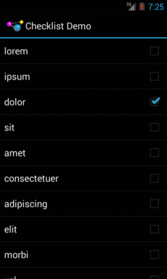
Figure 159: Multiple-Choice Mode
If we wanted, we could call methods like getCheckedItemPositions() on our
ListView to find out which items the user checked, or setItemChecked() if
we wanted to check (or un-check) a specific entry ourselves.
If the user clicks a row in a ListView, a click event is registered,
triggering things like onListItemClick() in an OnItemClickListener. If the
user uses a pointing device to change a selection (e.g., pressing up and down
arrows to move a highlight bar in the ListView), that triggers
onItemSelected() in an OnItemSelectedListener.
Many times, particularly if the ListView is the entire UI at present, you
only care about clicks. Sometimes, particularly if the ListView is adjacent
to something else (e.g., on a TV, where you have more screen space and do not
have a touchscreen), you will care more about selection events. Either way, you
can get the events you need.
In Android, the Spinner is the equivalent of the drop-down selector you might
find in other toolkits. Clicking the Spinner
drops down a list for the user to choose an item
from. You basically get the ability to choose an item from a list without taking up all
the screen space of a ListView, at the cost of an extra click
to make a change.
As with ListView, you provide the adapter for data and child views via
setAdapter() and hook in a listener object for selections via
setOnItemSelectedListener().
To tailor the view used when displaying the drop-down perspective,
you need to configure the adapter, not the Spinner widget. Use the
setDropDownViewResource() method to supply the resource ID of the view to use.
For example, culled from
the Selection/Spinner sample project,
here is an XML layout for a simple view with a Spinner:
<?xml version="1.0" encoding="utf-8"?>
<LinearLayout
  xmlns:android="http://schemas.android.com/apk/res/android"
  android:orientation="vertical"
  android:layout_width="match_parent"
  android:layout_height="match_parent"
  >
  <TextView
    android:id="@+id/selection"
    android:layout_width="match_parent"
    android:layout_height="wrap_content"
    />
  <Spinner android:id="@+id/spinner"
    android:layout_width="match_parent"
    android:layout_height="wrap_content"
  />
</LinearLayout>
This is the same view as shown in a previous section, just with a Spinner
instead of a ListView.
To populate and use the Spinner, we need some Java code:
public class SpinnerDemo extends Activity
  implements AdapterView.OnItemSelectedListener {
  private TextView selection;
  private static final String[] items={"lorem", "ipsum", "dolor",
          "sit", "amet",
          "consectetuer", "adipiscing", "elit", "morbi", "vel",
          "ligula", "vitae", "arcu", "aliquet", "mollis",
          "etiam", "vel", "erat", "placerat", "ante",
          "porttitor", "sodales", "pellentesque", "augue", "purus"};

  @Override
  public void onCreate(Bundle state) {
    super.onCreate(state);
    setContentView(R.layout.main);
    selection=(TextView)findViewById(R.id.selection);

    Spinner spin=(Spinner)findViewById(R.id.spinner);
    spin.setOnItemSelectedListener(this);

    ArrayAdapter<String> aa=new ArrayAdapter<String>(this,
                              android.R.layout.simple_spinner_item,
                              items);

    aa.setDropDownViewResource(
      android.R.layout.simple_spinner_dropdown_item);
    spin.setAdapter(aa);
  }

  @Override
  public void onItemSelected(AdapterView<?> parent,
                                View v, int position, long id) {
    selection.setText(items[position]);
  }

  @Override
  public void onNothingSelected(AdapterView<?> parent) {
    selection.setText("");
  }
}
Here, we attach the activity itself as the selection listener
(spin.setOnItemSelectedListener(this)), as Spinner widgets only support
selection events, not click events. This works because the activity implements
the OnItemSelectedListener interface. We configure the adapter not only with
the list of fake words, but also with a specific resource to use for the
drop-down view (via aa.setDropDownViewResource()). Also note the use of
android.R.layout.simple_spinner_item as the built-in View for showing items
in the spinner itself. Finally, we implement the callbacks required by
OnItemSelectedListener to adjust the selection label based on user input.
What we get is:

Figure 160: SpinnerDemo, as Initially Launched
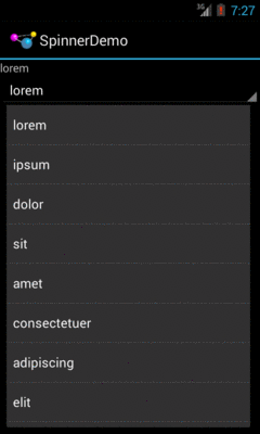
Figure 161: SpinnerDemo, with Spinner Drop-Down List Displayed
As the name suggests, GridView gives you a two-dimensional grid of items to
choose from. You have moderate control over the number and size of the columns;
the number of rows is dynamically determined based on the number of items the
supplied adapter says are available for viewing.
There are a few properties which, when combined, determine the number of columns and their sizes:
android:numColumns spells out how many columns there are, or, if you
supply a value of auto_fit, Android will compute the number of columns based
on available space and the properties listed below.android:verticalSpacing and android:horizontalSpacing indicate how much
whitespace there should be between items in the grid.android:columnWidth indicates how wide each column should be, in terms
of some dimension value (e.g., 40dp or @dimen/grid_column_width).android:stretchMode indicates, for grids with auto_fit for
android:numColumns, what should happen for any available space not taken up
by columns or spacing — this should be columnWidth to have the columns
take up available space or spacingWidth to have the whitespace between
columns absorb extra space.Otherwise, the GridView works much like any other selection widget — use
setAdapter() to provide the data and child views, invoke
setOnItemClickListener() to find out when somebody clicks on a cell in the
grid, etc.
For example, here is an XML layout from
the Selection/Grid sample project,
showing a GridView configuration:
<?xml version="1.0" encoding="utf-8"?>
<LinearLayout
  xmlns:android="http://schemas.android.com/apk/res/android"
  android:orientation="vertical"
  android:layout_width="match_parent"
  android:layout_height="match_parent"
  >
  <TextView
    android:id="@+id/selection"
    android:layout_width="match_parent"
    android:layout_height="wrap_content"
    />
  <GridView
    android:id="@+id/grid"
    android:layout_width="match_parent"
    android:layout_height="match_parent"
    android:verticalSpacing="40dip"
    android:horizontalSpacing="5dip"
    android:numColumns="auto_fit"
    android:columnWidth="100dip"
    android:stretchMode="columnWidth"
    android:gravity="center"
    />
</LinearLayout>
For this grid, we take up the entire screen except for what our selection label
requires. The number of columns is computed by Android
(android:numColumns = "auto_fit")
based on our horizontal spacing (android:horizontalSpacing = "5dip")
and columns width (android:columnWidth = "100dip"), with the columns
absorbing any “slop” width left over (android:stretchMode = "columnWidth").
The Java code to configure the GridView is:
package com.commonsware.android.grid;

import android.app.Activity;
import android.os.Bundle;
import android.view.View;
import android.widget.AdapterView;
import android.widget.ArrayAdapter;
import android.widget.GridView;
import android.widget.TextView;

public class GridDemo extends Activity
  implements AdapterView.OnItemClickListener {
  private TextView selection;
  private static final String[] items={"lorem", "ipsum", "dolor",
          "sit", "amet",
          "consectetuer", "adipiscing", "elit", "morbi", "vel",
          "ligula", "vitae", "arcu", "aliquet", "mollis",
          "etiam", "vel", "erat", "placerat", "ante",
          "porttitor", "sodales", "pellentesque", "augue", "purus"};

  @Override
  public void onCreate(Bundle state) {
    super.onCreate(state);
    setContentView(R.layout.main);
    selection=(TextView)findViewById(R.id.selection);

    GridView g=(GridView) findViewById(R.id.grid);
    g.setAdapter(new ArrayAdapter<String>(this,
                        R.layout.cell,
                        items));
    g.setOnItemClickListener(this);
  }

  @Override
  public void onItemClick(AdapterView<?> parent, View v,
                              int position, long id) {
    selection.setText(items[position]);
  }
}
The grid cells are defined by a separate res/layout/cell.xml file, referenced
in our ArrayAdapter as R.layout.cell:
<?xml version="1.0" encoding="utf-8"?>
<TextView
  xmlns:android="http://schemas.android.com/apk/res/android"
  android:layout_width="wrap_content"
  android:layout_height="wrap_content"
  android:textSize="14dip"
/>With the vertical spacing from the XML layout (android:verticalSpacing =
"40dip"), the grid overflows the boundaries of the emulator’s screen:
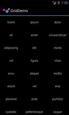
Figure 162: GridDemo, as Initially Launched
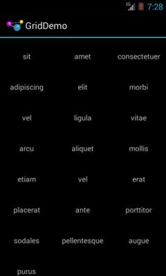
Figure 163: GridDemo, Scrolled to the Bottom of the Grid
GridView, like ListView, supports both click events and selection events.
In this sample, we register an OnItemClickListener to listen for click events.
The AutoCompleteTextView is sort of a hybrid between the EditText (field)
and the Spinner. With auto-completion, as the user types, the text is treated
as a prefix filter, comparing the entered text as a prefix against a list of
candidates. Matches are shown in a selection list that folds down from the
field. The user can either type out an entry (e.g., something not in the list)
or choose an entry from the list to be the value of the field.
AutoCompleteTextView subclasses EditText, so you can configure all the
standard look-and-feel aspects, such as font face and color.
In addition, AutoCompleteTextView has an android:completionThreshold
property, to indicate the minimum number of characters a user must enter before
the list filtering begins.
You can give AutoCompleteTextView an adapter containing the list of candidate
values via setAdapter(). However, since the user could type something not in
the list, AutoCompleteTextView does not support selection listeners. Instead,
you can register a TextWatcher, like you can with any EditText, to be
notified when the text changes. These events will occur either because of
manual typing or from a selection from the drop-down list.
Below we have a familiar-looking XML layout, this time containing an
AutoCompleteTextView (pulled from
the Selection/AutoComplete sample application):
<?xml version="1.0" encoding="utf-8"?>
<LinearLayout
  xmlns:android="http://schemas.android.com/apk/res/android"
  android:orientation="vertical"
  android:layout_width="match_parent"
  android:layout_height="match_parent"
  >
  <TextView
    android:id="@+id/selection"
    android:layout_width="match_parent"
    android:layout_height="wrap_content"
    />
  <AutoCompleteTextView android:id="@+id/edit"
      android:layout_width="match_parent"
      android:layout_height="wrap_content"
      android:completionThreshold="3"/>
</LinearLayout>
The corresponding Java code is:
package com.commonsware.android.auto;

import android.app.Activity;
import android.os.Bundle;
import android.text.Editable;
import android.text.TextWatcher;
import android.widget.ArrayAdapter;
import android.widget.AutoCompleteTextView;
import android.widget.TextView;

public class AutoCompleteDemo extends Activity
  implements TextWatcher {
  private TextView selection;
  private AutoCompleteTextView edit;
  private static final String[] items={"lorem", "ipsum", "dolor",
          "sit", "amet",
          "consectetuer", "adipiscing", "elit", "morbi", "vel",
          "ligula", "vitae", "arcu", "aliquet", "mollis",
          "etiam", "vel", "erat", "placerat", "ante",
          "porttitor", "sodales", "pellentesque", "augue", "purus"};

  @Override
  public void onCreate(Bundle state) {
    super.onCreate(state);
    setContentView(R.layout.main);
    selection=(TextView)findViewById(R.id.selection);
    edit=(AutoCompleteTextView)findViewById(R.id.edit);
    edit.addTextChangedListener(this);

    edit.setAdapter(new ArrayAdapter<String>(this,
                          android.R.layout.simple_dropdown_item_1line,
                          items));
  }

  @Override
  public void onTextChanged(CharSequence s, int start, int before,
                              int count) {
    selection.setText(edit.getText());
  }

  @Override
  public void beforeTextChanged(CharSequence s, int start,
                                  int count, int after) {
    // needed for interface, but not used
  }

  @Override
  public void afterTextChanged(Editable s) {
    // needed for interface, but not used
  }
}
This time, our activity implements TextWatcher, which means our callbacks are
onTextChanged(), beforeTextChanged(), and afterTextChanged(). In this
case, we are only interested in the first, and we update the selection label
to match the AutoCompleteTextView’s current contents.
Here we have the results:

Figure 164: AutoCompleteDemo, as Initially Launched

Figure 165: AutoCompleteDemo, After Entering a Few Matching Letters
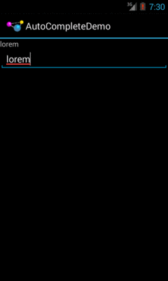
Figure 166: AutoCompleteDemo, After Auto-Complete Value Was Selected
Note that the red underline in the preceding screenshot is due to spelling correction.
Like EditText, AutoCompleteTextView supports hinting at spelling errors. The
emulator’s language is set to English, as there is no option in it for Latin.
The humble ListView is one of the most important widgets in all of Android,
simply because it is used so frequently. Whether choosing a contact to call or
an email message to forward or an ebook to read, ListView widgets are
employed in a wide range of activities.
Of course, it would be nice if they were more than just plain text.
The good news is that they can be as fancy as you want, within the limitations of a mobile device’s screen, of course. However, making them more elaborate takes some work.
Note that while this section will be using ListView as the AdapterView,
the same techniques hold for any AdapterView.
The simplest way of creating custom ListView rows (or GridView cells or
whatever) is when they all have the same basic structure and can be created
from the same layout XML resource. This does not mean they have to be strictly
identical, but that you can make whatever changes you need just by configuring
the widgets (e.g., make some things VISIBLE or GONE).
This is not especially difficult, though it does take a few more steps than what we have seen previously.
First, create your activity (e.g., ListActivity), get your data (e.g., array
of Java strings), and set up your AdapterView with a simple adapter following
the steps outlined in the preceding sections.
Here, we will examine
the Selection/Dynamic sample project.
We will use a simple ListActivity
(taking the default layout of a full-screen ListView) and use the same list
of 25 Latin words used in earlier samples. However, this time, we want to
have a more elaborate row, taking into account the length of the Latin word.
Next, create a layout XML resource that will represent one row in your ListView
(or cell in your GridView or whatever).
For example, our res/layout/row.xml resource will use a pair of nested
LinearLayout containers to organize two TextView widgets and an ImageView:
<?xml version="1.0" encoding="utf-8"?>
<LinearLayout xmlns:android="http://schemas.android.com/apk/res/android"
  android:layout_width="match_parent"
  android:layout_height="wrap_content"
  android:orientation="horizontal">

  <ImageView
    android:id="@+id/icon"
    android:layout_width="wrap_content"
    android:layout_height="wrap_content"
    android:layout_gravity="center_vertical"
    android:padding="2dip"
    android:src="@drawable/ok"
    android:contentDescription="@string/icon"/>

  <LinearLayout
    android:layout_width="match_parent"
    android:layout_height="wrap_content"
    android:orientation="vertical">

    <TextView
      android:id="@+id/label"
      android:layout_width="wrap_content"
      android:layout_height="wrap_content"
      android:textSize="25sp"
      android:textStyle="bold"/>

    <TextView
      android:id="@+id/size"
      android:layout_width="wrap_content"
      android:layout_height="wrap_content"
      android:textSize="15sp"/>
  </LinearLayout>

</LinearLayout>
The ImageView will use one of two drawable resources, one for short words, and
another for long words.
If you just used R.layout.row with a regular ArrayAdapter, it would work,
insofar as it would not crash. However, ArrayAdapter only knows how to update
a single TextView in a row, so it would ignore our other TextView, let alone
the ImageView.
So, we need to create our own ListAdapter, by creating our own subclass of
ArrayAdapter.
Since an Adapter is tightly coupled to the AdapterView that uses it, it
is typically simplest to make the custom ArrayAdapter subclass be an inner
class of whoever manages the AdapterView. Hence, in our sample, we will create an
IconicAdapter inner class of our ListActivity.
getView()
The IconicAdapter constructor can chain to the superclass and supply the
necessary data, such as our Java array of Latin words. The real fun comes
when we override getView():
package com.commonsware.android.fancylists.three;

import android.app.ListActivity;
import android.os.Bundle;
import android.view.View;
import android.view.ViewGroup;
import android.widget.ArrayAdapter;
import android.widget.ImageView;
import android.widget.TextView;

public class DynamicDemo extends ListActivity {
  private static final String[] items={"lorem", "ipsum", "dolor",
          "sit", "amet",
          "consectetuer", "adipiscing", "elit", "morbi", "vel",
          "ligula", "vitae", "arcu", "aliquet", "mollis",
          "etiam", "vel", "erat", "placerat", "ante",
          "porttitor", "sodales", "pellentesque", "augue", "purus"};

  @Override
  public void onCreate(Bundle state) {
    super.onCreate(state);
    setListAdapter(new IconicAdapter());
  }

  class IconicAdapter extends ArrayAdapter<String> {
    IconicAdapter() {
      super(DynamicDemo.this, R.layout.row, R.id.label, items);
    }

    @Override
    public View getView(int position, View convertView,
                        ViewGroup parent) {
      View row=super.getView(position, convertView, parent);
      ImageView icon=(ImageView)row.findViewById(R.id.icon);

      if (items[position].length()>4) {
        icon.setImageResource(R.drawable.delete);
      }
      else {
        icon.setImageResource(R.drawable.ok);
      }

      TextView size=(TextView)row.findViewById(R.id.size);

      size.setText(String.format(getString(R.string.size_template), items[position].length()));

      return(row);
    }
  }
}
Our getView() implementation does three things:
getView(), which returns to
us an instance of our row View, as prepared by ArrayAdapter. In particular,
our word has already been put into one TextView, since ArrayAdapter does
that normally.ImageView and applies a business rule to set which icon should
be used, referencing one of two drawable resources (R.drawable.ok and
R.drawable.delete).TextView and populates it as well, by pulling in the value
of a string resource and using String.format() to pour in our word length.Note that we call findViewById() not on the activity, but rather on the row
returned by the superclass’ implementation of getView().
Always call findViewById() on something that is guaranteed to give you a unique result.
In the case of an AdapterView, there will be many rows, cells, etc. — calling
findViewById() on the activity might return widgets with the right name but
from other rows or cells.
This gives us:
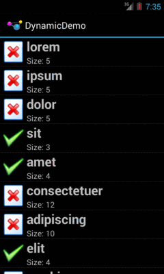
Figure 167: The Dynamic Sample Application
The approach of overriding getView() works for ArrayAdapter, but some other
types of adapters would have alternatives. We will see that mostly with
CursorAdapter, profiled in upcoming chapters.
A somewhat expensive operation we do a lot with more elaborate list rows is call
findViewById(). This dives into our row and pulls out widgets by
their assigned identifiers, so we can customize the widget contents (e.g.,
change the text of a TextView, change the icon in an ImageView). Since
findViewById() can find widgets anywhere in the tree of children of the row’s
root View, this could take a fair number of instructions to execute,
particularly if we keep having to re-find widgets we had found once before.
In some GUI toolkits, this problem is avoided by having the composite View
objects, like our rows, be declared totally in program code (in this case,
Java). Then, accessing individual widgets is merely the matter of calling a
getter or accessing a field. And you can certainly do that with Android, but
the code gets rather verbose. What would be nice is a way where we can still
use the layout XML yet cache our row’s key child widgets so we only have to
find them once.
That’s where the holder pattern comes into play, in a class we will call
ViewHolder.
All View objects have getTag() and setTag() methods. These allow you to
associate an arbitrary object with the widget. What the holder pattern does is
use that “tag” to hold an object that, in turn, holds each of the child widgets
of interest. By attaching that holder to the row View, every time we use the
row, we already have access to the child widgets we care about, without having
to call findViewById() again.
So, let’s take a look at one of these holder classes (taken from
the Selection/ViewHolder sample project,
a revised version of the Selection/Dynamic sample from before):
package com.commonsware.android.fancylists.five;

import android.view.View;
import android.widget.ImageView;
import android.widget.TextView;

class ViewHolder {
  ImageView icon=null;
  TextView size=null;

  ViewHolder(View row) {
    this.icon=(ImageView)row.findViewById(R.id.icon);
    this.size=(TextView)row.findViewById(R.id.size);
  }
}
ViewHolder holds onto the child widgets, initialized via findViewById() in
its constructor. The widgets are simply package-protected data members,
accessible from other classes in this project… such as a ViewHolderDemo
activity. In this case, we are only holding onto two widgets — the icon and
the second label –
since we will let ArrayAdapter handle our first label for us. In our case,
we are holding onto the TextView and ImageView widgets that we want to
populate in getView().
Using ViewHolder is a matter of creating an instance whenever we inflate a
row and attaching said instance to the row View via setTag(), as shown in
this rewrite of getView(), found in ViewHolderDemo:
    @Override
    public View getView(int position, View convertView,
                        ViewGroup parent) {
      View row=super.getView(position, convertView, parent);
      ViewHolder holder=(ViewHolder)row.getTag();

      if (holder==null) {
        holder=new ViewHolder(row);
        row.setTag(holder);
      }

      if (getModel(position).length()>4) {
        holder.icon.setImageResource(R.drawable.delete);
      }
      else {
        holder.icon.setImageResource(R.drawable.ok);
      }

      holder.size.setText(String.format(getString(R.string.size_template), items[position].length()));

      return(row);
    }
If the call to getTag() on the row returns null, we know we
need to create a new ViewHolder, which we then attach to the row via
setTag() for later reuse. Then, accessing the child widgets is merely a
matter of accessing the data members on the holder.
This takes advantage of the fact that rows in a ListView get recycled –
a 25,000-row list does not create 25,000 rows. The recycling itself is handled
for us by ArrayAdapter, so we simply have to create our ViewHolder when
needed and reuse the existing ViewHolder when a row gets recycled. The
first time the
ListView is displayed, all new rows need to be created, and we wind up
creating a ViewHolder for each. As the user scrolls, rows get recycled, and
we can reuse their corresponding ViewHolder widget caches. We will cover
this recycling process in greater detail in a later chapter.
Note that the getModel() method shown here retrieves our model String
for a given position, by using getListAdapter() (to retrieve our
IconicAdapter from the activity’s ListView) and getItem() (to retrieve
the data, held by the adapter, represented by the position):
  private String getModel(int position) {
    return(((IconicAdapter)getListAdapter()).getItem(position));
  }
The story gets significantly more complicated if our mix of rows is more complicated. For example, here is the Sound screen in the Settings application:
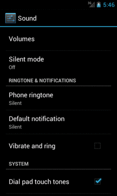
Figure 168: Sound Settings Screen
It may not look like it, but that is a ListView. However, not all the rows
look the same:
CheckBox (e.g., “Vibrate and ring”)This is handled by having more than one row layout XML resource used by the
adapter. The complexity comes not only in managing those different resources
and determining which to use when, but in just having more than one resource –
after all, we only teach ArrayAdapter how to use one. We will examine how
to handle this scenario in a later chapter.
To learn more about ListView, you can turn to Advanced ListViews,
which covers other tricks you can do with a ListView.