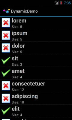
Figure 191: The Dynamic Sample Application
Visually representing collections of items is an important aspect of
many mobile apps. The classic Android implementation of this was
the AdapterView family of widgets: ListView, GridView, Spinner, and
so on. However, they had their limitations, particularly with respect to
advanced capabilities like animating changes in the list contents.
In 2014, Google released RecyclerView, via the Android Support package.
Developers can add the recyclerview-v7 artifact to their projects and use
RecyclerView as a replacement for most of the AdapterView family.
RecyclerView was written from the ground up to be a more flexible
container, with lots of hooks and delegation to allow behaviors to be
plugged in.
This had two major impacts:
RecyclerView is indeed much more powerful than its AdapterView
counterpartsRecyclerView, out of the box, is nearly useless, and wiring together
enough stuff to even replicate basic ListView/GridView functionality
takes quite a bit of codeIn this chapter, we will review the basic use of RecyclerView, as an alternative
to ListView. A later chapter gets into more complex scenarios,
such as replacing GridView with RecyclerView.
AdapterView, and particularly its ListView and GridView
subclasses, serve important roles in Android application development.
And, for basic scenarios, they work reasonably well.
However, there are issues.
Perhaps the biggest tactical issue is that updating an AdapterView tends to be an
all-or-nothing affair. If there is a change to the model data — new
rows added, existing rows removed, or data changes that might affect
the AdapterView presentation — the only well-supported solution is
to call notifyDataSetChanged() and have the AdapterView rebuild
itself. This is slow and can have impacts on things like choice states.
And, if you wanted to get really elaborate about your changes, and
use animated effects to show where rows got added or removed, that was
halfway to impossible.
Strategically, AdapterView, AbsListView (the immediate parent of
ListView and GridView), and ListView are large piles of code
that resemble pasta to
many outsiders. There are so many responsibilities piled into these
classes that maintainability was a challenge for Google and extensibility
was a dream more than a reality.
RecyclerView is designed to correct those sorts of flaws.
RecyclerView, on its own, does very little other than help manage
view recycling (e.g., row recycling of a vertical list). It delegates
almost everything else to other classes, such as:
This is on top of the adapters and view holders that were the hallmarks
of conventional AdapterView usage.
Because things like layout managers are handled via abstract classes and replaceable concrete implementations, third-party developers can contribute options for developers to use, just as Google does.
On the flip side, though, RecyclerView does much less “out of the box”
than does ListView or GridView. Not everything that is missing is
supplied anywhere in the recyclerview-v7 library, requiring that you
either roll a bunch of code yourself or rely upon those third-party
libraries to get anything much done.
Back in the original chapter on AdapterView and adapters,
we had the Selection/Dynamic sample app. This app would display a list
of 25 Latin words, each with the word’s length and an accompanying icon
(different for short and long words):
Figure 191: The Dynamic Sample Application
Here, we will review the
RecyclerView/SimpleList
sample project, which is a first pass at porting the Selection/Dynamic
demo over to use RecyclerView.
Any project that wishes to use RecyclerView needs to have access
to the recyclerview-v7 library from the Android Support package.
Android Studio users can simply have a reference to it in the
top-level dependencies closure:
apply plugin: 'com.android.application'

dependencies {
    implementation 'com.android.support:recyclerview-v7:27.1.1'
    implementation 'com.android.support:cardview-v7:27.1.1'
}

android {
    compileSdkVersion 27
    buildToolsVersion '27.0.3'

    defaultConfig {
      minSdkVersion 15
      targetSdkVersion 27
    }
}
However, if you are using recyclerview-v7, you want to use version 23 or higher
of that library. There are
changes to ART –
the Android runtime used on Android 5.0+ — that apparently will
break the older versions of recyclerview-v7 when running on Android
6.0+ devices.
With ListView, we could use ListActivity, to isolate some of the
ListView-management code. There is no RecyclerViewActivity in the
recyclerview-v7 library… but we can create one:
package com.commonsware.android.recyclerview.simplelist;

import android.app.Activity;
import android.support.v7.widget.RecyclerView;

public class RecyclerViewActivity extends Activity {
  private RecyclerView rv=null;

  public void setAdapter(RecyclerView.Adapter adapter) {
    getRecyclerView().setAdapter(adapter);
  }

  public RecyclerView.Adapter getAdapter() {
    return(getRecyclerView().getAdapter());
  }

  public void setLayoutManager(RecyclerView.LayoutManager mgr) {
    getRecyclerView().setLayoutManager(mgr);
  }

  public RecyclerView getRecyclerView() {
    if (rv==null) {
      rv=new RecyclerView(this);
      rv.setHasFixedSize(true);
      setContentView(rv);
    }

    return(rv);
  }
}
The important part is the getRecyclerView() method. Here, if we have
not already initialized the RecyclerView, we create an instance of it and
set it as the activity’s content view via setContentView(). Along the
way, we call setHasFixedSize(true) on the RecyclerView, to tell it
that its size should not be changing based upon the contents of the
adapter. This knowledge can help RecyclerView operate more efficiently.
The RecyclerViewActivity also has getAdapter() and setAdapter() analogues
for their ListActivity counterparts. We will explore the differences
in the adapter classes later in this section.
We also have a setLayoutManager() convenience method, that just calls
setLayoutManager() on the underlying RecyclerView — we will see what
a layout manager is in the context of RecyclerView
in the next section.
There are other features of ListActivity that are not mirrored here
in RecyclerViewActivity, just to keep RecyclerViewActivity short.
Notably, ListActivity supports either inflating a custom layout that
contains the ListView or creating its own. RecyclerViewActivity
does not support this, though it could with some minor extensions.
The “real” activity of the project is MainActivity, which consists
of a single method: onCreate()
  @Override
  public void onCreate(Bundle state) {
    super.onCreate(state);

    setLayoutManager(new LinearLayoutManager(this));
    setAdapter(new IconicAdapter());
  }
After chaining to the superclass, the first thing we do is call
setLayoutManager(), which will associate a RecyclerView.LayoutManager with
our RecyclerView. Specifically, we are using a LinearLayoutManager.
ListView has the notion of a vertically-scrolling list of
rows “baked into” its implementation. Similarly, GridView has the notion of
a two-dimensional vertically-scrolling grid “baked into” its implementation.
RecyclerView, on the other hand, knows absolutely nothing about how
to lay out its children. That work is delegated to a RecyclerView.LayoutManager, so that
different approaches can be plugged in as needed.
There are three concrete subclasses of the abstract RecyclerView.LayoutManager base
class that ship with recyclerview-v7:
LinearLayoutManager, which implements a vertically-scrolling list,
akin to ListView
GridLayoutManager, which implements a two-dimensional vertically-scrolling
list, akin to GridView
StaggeredGridLayoutManager, which implements a “staggered grid”, which
has columns of cells like a GridView, but where the cells do not have to
all have the same sizeIn addition, it is eminently possible to create your own RecyclerView.LayoutManager,
or use ones from third-party libraries.
In this example, though, we stick with a simple LinearLayoutManager, as
we are attempting to replicate the functionality of a ListView.
Our onCreate() method also calls setAdapter(), to associate an
RecyclerView.Adapter with our RecyclerView (specifically, a revised
version of our IconicAdapter from the original Selection/Dynamic
sample app). As with the AdapterView family,
RecyclerView uses an adapter to help convert our model data into
visual representations. However, the implementation of a RecyclerView.Adapter
is substantially different from a classic ListAdapter for use with
ListView or GridView.
Reminiscent of ArrayAdapter, a RecyclerView.Adapter uses generics,
and we declare what sort of stuff we are adapting. However, ArrayAdapter
uses the generic to describe the model data. RecyclerView.Adapter instead
uses the generic to identify a ViewHolder that will be responsible
for doing the work to actually tie model data to row widgets:
  class IconicAdapter extends RecyclerView.Adapter<RowHolder> {
    @Override
    public RowHolder onCreateViewHolder(ViewGroup parent, int viewType) {
      return(new RowHolder(getLayoutInflater()
                            .inflate(R.layout.row, parent, false)));
    }

    @Override
    public void onBindViewHolder(RowHolder holder, int position) {
      holder.bindModel(items[position]);
    }

    @Override
    public int getItemCount() {
      return(items.length);
    }
  }
In our case, IconicAdapter is using a RowHolder class that we will
examine in the next section.
A RecyclerView.Adapter has three abstract methods that need to be implemented.
One is getItemCount(), which fills the same role as does getCount()
with a ListAdapter, indicating how many items there will be in the
RecyclerView. In the case of IconicAdapter, this is based on the
length of the items static array of String objects, same as it was
with IconicAdapter in the Selection/Dynamic sample app:
  private static final String[] items={"lorem", "ipsum", "dolor",
          "sit", "amet",
          "consectetuer", "adipiscing", "elit", "morbi", "vel",
          "ligula", "vitae", "arcu", "aliquet", "mollis",
          "etiam", "vel", "erat", "placerat", "ante",
          "porttitor", "sodales", "pellentesque", "augue", "purus"};
The other two methods are onCreateViewHolder() and onBindViewHolder().
These are a bit reminiscent of the newView() and bindView() methods
that are used by a CursorAdapter. However, rather than working directly
with views, onCreateViewHolder() and onBindViewHolder() work with
ViewHolder objects, as a formalization of the view holder pattern
seen originally in the chapter on selection widgets.
onCreateViewHolder(), as the name suggests, needs to create, configure,
and return a ViewHolder for a particular row of our list. It is passed
two parameters:
ViewGroup that will hold the views managed by the holder, mostly
for use with layout inflation, andint that is the particular view type we are using, for cases where
we have multiple view types
The IconicAdapter implementation inflates our row view (R.layout.row)
and passes it to the RowHolder constructor, returning the resulting
RowHolder.
onBindViewHolder() is responsible for updating a ViewHolder based
upon the model data for a certain position. IconicAdapter
handles this by passing the model into a private bindModel() method
implemented on RowHolder.
There are many other methods you could override on RecyclerView.Adapter,
and we will see a few of those later in this chapter. But, for a simple
list, these three will suffice.
The RecyclerView.ViewHolder is responsible for binding data as needed
from our model into the widgets for a row in our list:
  static class RowHolder extends RecyclerView.ViewHolder {
    TextView label=null;
    TextView size=null;
    ImageView icon=null;
    String template=null;

    RowHolder(View row) {
      super(row);

      label=(TextView)row.findViewById(R.id.label);
      size=(TextView)row.findViewById(R.id.size);
      icon=(ImageView)row.findViewById(R.id.icon);

      template=size.getContext().getString(R.string.size_template);
    }

    void bindModel(String item) {
      label.setText(item);
      size.setText(String.format(template, item.length()));

      if (item.length()>4) {
        icon.setImageResource(R.drawable.delete);
      }
      else {
        icon.setImageResource(R.drawable.ok);
      }
    }
  }
However, other than needing to use the base class of RecyclerView.ViewHolder,
there is no other particular protocol that is mandated between the
adapter and the view holder. You can invent your own API. Here, we use
the RowHolder constructor to pass in the row View, where the constructor
retrieves the individual widgets and sets up our string resource template.
Then, a private bindModel() method takes our model object (a String)
and binds it to the row’s widgets, applying our business rules along
the way.
As the project name suggests, this gives us a simple list:
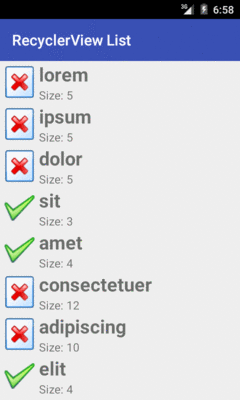
Figure 192: SimpleList RecyclerView Demo
As with ListView, RecyclerView (along with the RecyclerView.LayoutManager)
handles the vertical scrolling through our available rows.
However, we are lacking two things that we had in the Selection/Dynamic
edition of this sample that used a ListView.
First, there are no dividers between the rows. That may not be a huge issue for this particular row layout, but other layouts may need more assistance in visually separating one row from the next. We will explore ways of accomplishing this in the next section.
Second, we are missing click events. The user can tap on rows as much as
she wants. Not only will the user not get any visual feedback from those
taps, but we have no setOnItemClickListener() to find out about
those taps. We will explore how to fill in this gap
later in the chapter.
RecyclerView also lacks a variety of other things that we could get
from a ListView, that we happen to not be using in this sample, such
as:
We will explore some of those and how to address them in this chapter.
There are two main approaches for visually separating items in a
RecyclerView:
CardView
RecyclerView.ItemDecoration to apply a common divider
between itemsBoth of these techniques will be covered in this chapter.
Cards are a popular visual metaphor in mobile development. Dividing content collections (or aspects of a larger piece of content) into cards makes it clearer how you can reorganize that content to fit various screen sizes and orientations. In some cases, you might have a single column of cards, while in other cases, you have cards arranged more laterally.
In 2014, Google released cardview-v7, another library in the Android
Support package, that offers a CardView. CardView is a simple subclass
of FrameLayout, designed to provide a card UI, consisting of a rounded
rectangle and a drop shadow. In particular, CardView will use
Android 5.0’s default drop shadows based on widget elevation, while offering
emulated drop shadows on earlier Android releases. This way, you can get
a reasonably consistent look going back to API Level 7.
To use this, you will have to add the cardview-v7 library to your
app project. Android Studio users can just add a dependency on
the cardview-v7 artifact in the Android Support repository, as seen in the
RecyclerView/CardViewList
sample project:
dependencies {
    implementation 'com.android.support:recyclerview-v7:27.1.1'
    implementation 'com.android.support:cardview-v7:27.1.1'
}
Then, you can wrap your row layout in a CardView (or, more accurately,
in an android.support.v7.widget.CardView):
<?xml version="1.0" encoding="utf-8"?>
<android.support.v7.widget.CardView
  xmlns:android="http://schemas.android.com/apk/res/android"
  xmlns:cardview="http://schemas.android.com/apk/res-auto"
  android:layout_width="match_parent"
  android:layout_height="wrap_content"
  android:layout_margin="4dp"
  cardview:cardCornerRadius="4dp">

  <LinearLayout
    android:layout_width="match_parent"
    android:layout_height="wrap_content"
    android:orientation="horizontal">

    <ImageView
      android:id="@+id/icon"
      android:layout_width="wrap_content"
      android:layout_height="wrap_content"
      android:layout_gravity="center_vertical"
      android:padding="2dip"
      android:src="@drawable/ok"
      android:contentDescription="@string/icon"/>

    <LinearLayout
      android:layout_width="match_parent"
      android:layout_height="wrap_content"
      android:orientation="vertical">

      <TextView
        android:id="@+id/label"
        android:layout_width="wrap_content"
        android:layout_height="wrap_content"
        android:textSize="25sp"
        android:textStyle="bold"/>

      <TextView
        android:id="@+id/size"
        android:layout_width="wrap_content"
        android:layout_height="wrap_content"
        android:textSize="15sp"/>
    </LinearLayout>

  </LinearLayout>
</android.support.v7.widget.CardView>With no other code changes from the original RecyclerView/SimpleList sample,
we get this:
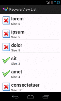
Figure 193: CardViewList RecyclerView Demo
Note that drop shadows from CardView may not show up on Android 5.0+
emulators, particularly if you have Host GPU mode disabled in the
emulator AVD. The CardView itself will work fine, just without the
drop shadow effect.
A CardView may not be an appropriate visual approach for your list.
Perhaps you want a regular divider, like we had with ListView.
While that is possible, it is not especially straightforward.
RecyclerView considers things like dividers to be “item decorations”.
There is a RecyclerView.ItemDecoration abstract class that you can
extend to handle item decoration, and you can attach such a decoration
to a RecyclerView via addItemDecoration(). As the name suggests,
you can have more than one decorator if needed.
Originally, Google did not bother to provide any concrete implementation
of such a decoration. However, they eventually added a DividerItemDecoration
class that you can use for a simple, “out of the box” divider.
The
RecyclerView/DividerList
sample project demonstrates the use of DividerItemDecoration… which consists
of a single call to addItemDecoration():
  @Override
  public void onCreate(Bundle state) {
    super.onCreate(state);

    setLayoutManager(new LinearLayoutManager(this));

    getRecyclerView()
      .addItemDecoration(new DividerItemDecoration(this, LinearLayoutManager.VERTICAL));
    setAdapter(new IconicAdapter());
  }
The DividerItemDecoration constructor just takes a Context and the orientation
to use. Here, though, the orientation refers to the orientation of the RecyclerView.
You might think that using LinearLayoutManager.VERTICAL here would mean that
the divider would be drawn vertically. Instead, it means that the RecyclerView
scrolls vertically, so dividers are drawn horizontally.
While DividerItemDecoration has a few configuration options — notably, a
setDrawable() method to override the default artwork to use for the divider –
the “out of the box” implementation largely matches the look of the ListView
divider:
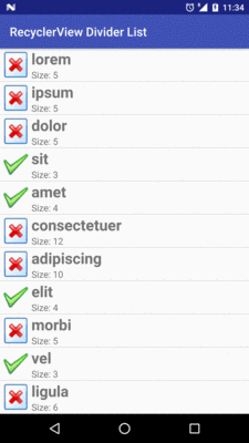
Figure 194: DividerItemDecoration, Applied to a RecyclerView
As noted above, originally recyclerview-v7 did not come with an actual
divider. A few enterprising developers experimented with this, leading to
solutions like
this one, published as a GitHub gist.
The
RecyclerView/ManualDividerList
sample project demonstrates the use of such a decoration. It may be that what
you want for a decorator is more complex than what DividerItemDecoration
can offer, and so implementing your own decorator may be necessary.
First, we will need a drawable resource for the divider itself:
<?xml version="1.0" encoding="utf-8"?>
<shape xmlns:android="http://schemas.android.com/apk/res/android"
       android:shape="rectangle">

  <size
    android:width="1dp"
    android:height="1dp" />

  <solid android:color="@color/divider" />

</shape>This is a ShapeDrawable, as is covered in the chapter on drawables.
The big thing is the solid fill, here pointing to a color resource for the
color to use for that fill:
<?xml version="1.0" encoding="utf-8"?>
<resources>
  <color name="divider">#ffaaaaaa</color>
</resources>The ShapeDrawable is given a size of 1dp square. In reality, it will be
resized on the fly by the decorator to fill the width of the RecyclerView.
Note that there is nothing especially magic about using this particular drawable.
You could have a gradient fill to have the divider taper off towards the ends
and be solid in the middle. Or, you could use a nine-patch PNG file,
a VectorDrawable on Android 5.0+, or anything else that will resize
well.
Next, we need a RecyclerView.ItemDecoration implementation, such as
the sample project’s HorizontalDividerItemDecoration:
package com.commonsware.android.recyclerview.manualdivider;

import android.graphics.Canvas;
import android.graphics.drawable.Drawable;
import android.support.v7.widget.RecyclerView;
import android.view.View;

// inspired by https://gist.github.com/polbins/e37206fbc444207c0e92

public class HorizontalDividerItemDecoration extends RecyclerView.ItemDecoration {
  private Drawable divider;

  public HorizontalDividerItemDecoration(Drawable divider) {
    this.divider=divider.mutate();
  }

  @Override
  public void onDrawOver(Canvas c, RecyclerView parent, RecyclerView.State state) {
    int left=parent.getPaddingLeft();
    int right=parent.getWidth()-parent.getPaddingRight();

    int childCount=parent.getChildCount();

    for (int i=0; i<childCount-1; i++) {
      View child=parent.getChildAt(i);
      RecyclerView.LayoutParams params=
          (RecyclerView.LayoutParams)child.getLayoutParams();

      int top=child.getBottom()+params.bottomMargin;
      int bottom=top+divider.getIntrinsicHeight();

      divider.setBounds(left, top, right, bottom);
      divider.draw(c);
    }
  }
}This class takes the Drawable that is the divider as input, so it
can be used for different dividers as needed.
HorizontalDividerItemDecoration calls mutate() on the Drawable
to get a Drawable that can be changed independently of any original
instance of the Drawable. This is important when using Drawable
resources, as the Drawable instances get reused for other references to
the same resource, so changing the core Drawable itself (e.g., via
a setBounds() call) is unsafe.
The main logic of HorizontalDividerItemDecoration resides in the
onDrawOver() method. This will be called to let us draw over top
of the items in the RecyclerView. Here we:
RecyclerView, but subtracting the padding, so
that we only draw inside of that paddingRecyclerView, find the vertical
location for that divider, resize the divider to fit the desired space,
and then draw the divider on the supplied Canvas, skipping the last
child so we do not draw a divider at the bottom of the listUsing that bit of magic, then, is merely a matter of attaching our
HorizontalDividerItemDecoration to our RecyclerView, done here
in onCreate() of MainActivity:
  @Override
  public void onCreate(Bundle state) {
    super.onCreate(state);

    setLayoutManager(new LinearLayoutManager(this));

    Drawable divider=getResources().getDrawable(R.drawable.item_divider);

    getRecyclerView().addItemDecoration(new HorizontalDividerItemDecoration(divider));
    setAdapter(new IconicAdapter());
  }
The rest of the sample project is a clone of the original SimpleList
sample project from the beginning of this chapter.
The result is that we have a divider drawn between the children:
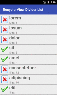
Figure 195: ManualDividerList RecyclerView Demo
However, having nice dividers does not address the larger problem: responding to input.
The RecyclerView vision, overall, is that RecyclerView itself has
nothing much to do with input, other than scrolling. Anything having
to do with users clicking things and triggering some sort of response
is the responsibility of the views inside the RecyclerView, such
as the rows in a list-style RecyclerView.
This has its benefits. Clickable widgets, like a RatingBar, in a
ListView row had long been in conflict with click events on rows
themselves. Getting rows that can be clicked, with row contents that
can also be clicked, gets a bit tricky at times. With RecyclerView,
you are in more explicit control over how this sort of thing gets
handled… because you are the one setting up all of the on-click
handling logic.
Of course, that does not help the users much. Users do not care what bit of code is responsible for input. Users simply want to provide the input. If you present them with a vertically-scrolling list-style UI, they will attempt to click on rows in the list and will expect some sort of outcome.
The RecyclerView approach, though, means that you are largely on your
own for handling that input. This requires yet more code that, in an
ideal world, would be offered as an “out of the box” option by
RecyclerView.
At its core, responding to clicks is a matter of setting an OnClickListener
on the appropriate Views.
So, for example, the
RecyclerView/CardClickList
sample project is a clone of the
CardViewList sample, where we call setOnClickListener() on the
row View in the RecyclerView.ViewHolder, now renamed RowController:
package com.commonsware.android.recyclerview.cardclicklist;

import android.support.v7.widget.RecyclerView;
import android.view.View;
import android.widget.ImageView;
import android.widget.TextView;
import android.widget.Toast;

class RowController extends RecyclerView.ViewHolder
    implements View.OnClickListener {
  TextView label=null;
  TextView size=null;
  ImageView icon=null;
  String template=null;

  RowController(View row) {
    super(row);

    label=(TextView)row.findViewById(R.id.label);
    size=(TextView)row.findViewById(R.id.size);
    icon=(ImageView)row.findViewById(R.id.icon);

    template=size.getContext().getString(R.string.size_template);

    row.setOnClickListener(this);
  }

  @Override
  public void onClick(View v) {
    Toast.makeText(v.getContext(),
        String.format("Clicked on position %d", getAdapterPosition()),
        Toast.LENGTH_SHORT).show();
  }

  void bindModel(String item) {
    label.setText(item);
    size.setText(String.format(template, item.length()));

    if (item.length()>4) {
      icon.setImageResource(R.drawable.delete);
    }
    else {
      icon.setImageResource(R.drawable.ok);
    }
  }
}
In this sample, all the onClick() method does is show a Toast. However,
you could:
RowController
constructor) to delegate the event to a higher-order controller, orIn this case, since none of the widgets in the row are interactive and might
consume click events themselves, the user can tap anywhere on the row,
and the Toast will appear. If you have more complex scenarios — such as
a checklist where you have a CheckBox in the rows — you can decide for yourself
how to handle click events on different parts of the row. We will see checklists
in action later in this chapter.
However, if you run the CardClickList sample, you will notice one major
remaining flaw: there is no visual feedback to the user about the click
event. Yes, the Toast appears, but users are used to seeing some sort of
transient state change in the row itself on a click, such as a flash of
color. Once again, we have the ability to control this as we see fit… by
having the responsibility to make it happen at all.
There are a few approaches to this problem, such as the ones outlined in this section.
An approach that Mark Allison suggested in
his Styling Android blog
mimics the drawSelectorOnTop approach available to ListView.
Using something like a FrameLayout, you layer a translucent selector
atop the rows, where the selector implements the click feedback.
The
RecyclerView/CardRippleList
sample project is a clone of CardClickList that takes
Mr. Allison’s approach. The revised row.xml takes advantage of the
fact that CardView is a subclass of FrameLayout, so it layers
a plain View atop the LinearLayout that is the core content of the
row:
<?xml version="1.0" encoding="utf-8"?>
<android.support.v7.widget.CardView
  xmlns:android="http://schemas.android.com/apk/res/android"
  xmlns:cardview="http://schemas.android.com/apk/res-auto"
  android:layout_width="match_parent"
  android:layout_height="wrap_content"
  android:layout_margin="4dp"
  cardview:cardCornerRadius="4dp">

  <LinearLayout
    android:layout_width="match_parent"
    android:layout_height="wrap_content"
    android:orientation="horizontal">

    <ImageView
      android:id="@+id/icon"
      android:layout_width="wrap_content"
      android:layout_height="wrap_content"
      android:layout_gravity="center_vertical"
      android:padding="2dip"
      android:src="@drawable/ok"
      android:contentDescription="@string/icon"/>

    <LinearLayout
      android:layout_width="match_parent"
      android:layout_height="wrap_content"
      android:orientation="vertical">

      <TextView
        android:id="@+id/label"
        android:layout_width="wrap_content"
        android:layout_height="wrap_content"
        android:textSize="25sp"
        android:textStyle="bold"/>

      <TextView
        android:id="@+id/size"
        android:layout_width="wrap_content"
        android:layout_height="wrap_content"
        android:textSize="15sp"/>
    </LinearLayout>

  </LinearLayout>

  <View
    android:layout_width="match_parent"
    android:layout_height="match_parent"
    android:background="?android:attr/selectableItemBackground" />

</android.support.v7.widget.CardView>The background of that View is the selectableItemBackground from
the current theme. On apps using Theme, this will give you an orange
flash. On apps using Theme.Holo, this will give you a blue flash. On
apps using Theme.Material, this will give you a ripple animation.
And, of course, you can supply your own override value for
selectableItemBackground to use your own StateListDrawable instead.
The downsize of this approach is that the View is higher on the Z
axis than is the rest of the row content. In this case, since the
rest of the row content is non-interactive, this is not a problem.
However, if we elect to put interactive widgets in the rows — such as
CheckBox widgets to implement a checklist — now our View will
prevent the user from interacting with those widgets.
Another approach would be to apply the selectableItemBackground
to our existing row content, rather than to some separate selector
widget that overlays the row content. This is the approach taken
in the
RecyclerView/CardRippleList2
sample project. Here, the selectableItemBackground is applied to the
LinearLayout inside of the CardView:
<?xml version="1.0" encoding="utf-8"?>
<android.support.v7.widget.CardView
  xmlns:android="http://schemas.android.com/apk/res/android"
  xmlns:cardview="http://schemas.android.com/apk/res-auto"
  android:layout_width="match_parent"
  android:layout_height="wrap_content"
  android:layout_margin="4dp"
  cardview:cardCornerRadius="4dp">

  <LinearLayout
    android:layout_width="match_parent"
    android:layout_height="wrap_content"
    android:orientation="horizontal"
    android:background="?android:attr/selectableItemBackground">

    <ImageView
      android:id="@+id/icon"
      android:layout_width="wrap_content"
      android:layout_height="wrap_content"
      android:layout_gravity="center_vertical"
      android:padding="2dip"
      android:src="@drawable/ok"
      android:contentDescription="@string/icon"/>

    <LinearLayout
      android:layout_width="match_parent"
      android:layout_height="wrap_content"
      android:orientation="vertical">

      <TextView
        android:id="@+id/label"
        android:layout_width="wrap_content"
        android:layout_height="wrap_content"
        android:textSize="25sp"
        android:textStyle="bold"/>

      <TextView
        android:id="@+id/size"
        android:layout_width="wrap_content"
        android:layout_height="wrap_content"
        android:textSize="15sp"/>
    </LinearLayout>

  </LinearLayout>

</android.support.v7.widget.CardView>For non-interactive widgets, like our TextViews and ImageView,
touch events will get propagated to the LinearLayout, which will
trigger the changes in the state of the StateListDrawable that
is the LinearLayout background. Yet, if we change the rows to have
interactive widgets, those widgets will still be able to process their
own touch events, as we will see
later in this chapter.
However, particularly for this sample app, the visual effect is largely
the same as with CardRippleList: the user will get click feedback
based upon the selectableItemBackground in use given the activity’s
theme.
There is one problem with both click event implementations, though: the ripples on Android 5.0 start in the center of each row. According to the Material Design rules, the ripples should start where the touch event occurs, so they seem to flow outward from the finger. This was addressed in Android 5.1, but was a bug in Android 5.0
To fix this, you need to use the setHotspot() method, added to
Drawable in API Level 21.
setHotspot() provides to the drawable a “hot spot”, and
RippleDrawable apparently uses this as the emanation point for the
ripple effect. setHotspot() takes a pair of float values, presumably
with an eye towards using setHotspot() inside of an OnTouchListener,
as the MotionEvent reports X/Y positions of the touch event with
float values.
The
RecyclerView/CardRippleList3
sample project is a clone of CardRipple2 that adds this feature.
The row layout is the same as before. However, in RowController,
when setting up the row, we register an OnTouchListener, to find out
the low-level MotionEvent of when the user touches our row:
  RowController(View row) {
    super(row);

    label=(TextView)row.findViewById(R.id.label);
    size=(TextView)row.findViewById(R.id.size);
    icon=(ImageView)row.findViewById(R.id.icon);

    template=size.getContext().getString(R.string.size_template);

    row.setOnClickListener(this);

    if (Build.VERSION.SDK_INT >= Build.VERSION_CODES.LOLLIPOP) {
      row.setOnTouchListener(new View.OnTouchListener() {
        @TargetApi(Build.VERSION_CODES.LOLLIPOP)
        @Override
        public boolean onTouch(View v, MotionEvent event) {
          v
            .findViewById(R.id.row_content)
            .getBackground()
            .setHotspot(event.getX(), event.getY());

          return(false);
        }
      });
    }
  }
We only bother registering this listener on API Level 21+, as
there is no setHotspot() method on prior versions of Android and
therefore no need for the listener. However, if we are on an Android
5.0+ device, we intercept the touch event, pass it along
to setHotspot() on the background Drawable, and return false to
ensure that regular touch event processing proceeds.
The effect is subtle and may be difficult for you to discern. But, if you look at the touch events in slow motion (e.g., screen record a session, then examine the resulting video frame-by-frame), you will see that the ripple effect appears to emanate from the touch point, rather than from the row’s center as before. And, since this logic is only used on API Level 21+, older devices are unaffected.
The chapter on advanced RecyclerView techniques covers a lot
of other scenarios, including:
RecyclerView content