Figure 492: Official Snackbar
In 2014, to much fanfare, Google released their first edition of the Material Design guidelines.
What was missing was an actual implementation of most of these guidelines.
Beyond the obvious question of “how do you know that it will work well if you have not tried it?”, it put Android developers in the unenviable position of being pressured to make their apps “look more material” without having anything really to do that.
In the months that followed Google I|O 2014, various developers took
this implementation gap as a challenge and created their own implementations
of many bits of Material Design. Much of this was released in the form
of open source components, easily added to an app via dependencies
added to a project’s build.gradle file (at least, for Android Studio
developers and other Gradle users).
In 2015, to a bit less fanfare, Google released the Android Design Support Library. The vision is that this would be the official implementation of many Material Design core components, like floating action buttons (FABs), snackbars, and the like.
This chapter explores some components from the Android Design Support Library. This chapter also explores some independent implementations of the same components, particularly ones that seem to be superior to what Google is offering at present.
Understanding this chapter requires that you have read the core chapters,
particularly the one on the action bar. You also
should read the chapter on
the appcompat-v7 action bar backport.
Note that the examples in this chapter are clones of a couple from the core chapters. This chapter’s prose was written assuming that you were familiar with those samples, so you may need to go back and review them as needed.
One of the book samples makes use of the animator framework.
Many developers think that the libraries in the Android Support Package
are purely backports. They then get confused when they realize that
certain classes, like ViewPager, are not part of the core Android
framework for any API level and exist only in the Android Support
Package.
In truth, a lot of what is in the Android Support Package consists of
backports: fragments, the action bar, NotificationCompat, and so on.
However, the Android Support Package really consists of code that
Google wants to make available to developers that can be used right
away, even on older devices.
Many pieces of the Android Support Package are GUI-related, yet are not backports:
support-v4 and support-v13 have the aforementioned ViewPager
cardview-v7 has CardView
recyclerview-v7 has RecyclerView
leanback-v17 has classes for “the ten-foot UI” approach used for
Android apps appearing on televisions, such as via Android TV boxesNow, we can add the Android Design Support Library to that list.
Right now, this library is focused on Material Design components,
and that is likely to remain its near-term focus. It remains to be
seen if other GUI components, not specifically tied to Material
Design, wind up in the Android Design Support Library, in
support-v4/support-v13, or in other libraries.
On the surface, Android Studio users can simply add
com.android.support:design:... (for some version number
for ..., such as 25.1.1) as a dependency:
implementation 'com.android.support:design:25.1.1'
However, this library has a transitive dependency that pulls
in appcompat-v7. Most pieces of the Android Design Support
Library do indeed seem to require that you use appcompat-v7,
using Theme.AppCompat, AppCompatActivity, and friends.
This is true even if you planned on using Theme.Material
itself, with a minSdkVersion of 21 or higher.
There are two ways to work around this appcompat-v7 requirement:
CWAC-CrossPort is a library,
published by the author of this book, that contains a subset of the GUI elements
from the Design Support library. All references to appcompat-v7 have been
removed, replaced with equivalents from Theme.Material. As such, you can use
CWAC-CrossPort on apps with a minSdkVersion of 21 or higher, to get the Material
Design elements from the Design Support library, but without the appcompat-v7
baggage.
CWAC-CrossPort does not include everything from the Design Support library, but it does include most of it.
As with the rest of the CWAC libraries, using it requires that you add the CWAC artifact repository to your Gradle configuration:
repositories {
    maven {
        url "https://s3.amazonaws.com/repo.commonsware.com"
    }
}
Then, add a dependency on the artifact itself, for some version:
dependencies {
    implementation 'com.commonsware.cwac:crossport:0.3.0'
}
The Toast has been in Android since the beginning. It allows you
to pop up a message to show the user, one that does not interfere with
the rest of your activity layout. And, it is fairly easy to use.
However, some people get burned by Toast:
Toast is modeless, so you cannot get user input via a Toast
Toast is modeless, it is time-limited, and therefore
the user might never see your message, because the user is not glancing
at the screen during the short window your Toast is visibleToast is a separate window from the window that is displaying your
activity, so your Toast will remain visible even if the user navigates
to some other activity, which can be annoying at timesThe Material Design guidelines instead call for the use of a “snackbar”,
and the Design Support Library offers a Snackbar implementation of this
UI pattern. In contrast to a Toast:
Snackbar is part of your activity’s UI, and so it can collect input
from the user, while it is around, usually in the form of some sort of
“action”Snackbar can be time-limited (for information notices) or durable
(for errors or getting user input)Snackbar is part of your activity (and will go away when
the user leaves your activity), you do not have to declare it in your
layout filesWith that in mind, let’s take a look at some use cases for a Snackbar
and how they can be implemented.
The quintessential reason to use a Toast was to display a simple
message to the user. You can use a Snackbar in the same role, with
most of the same code.
Snackbar has a static make() method, mirroring the makeText()
method on Toast. make() takes three parameters, only slightly
different from those on makeText():
View in the activity that wishes to show the Snackbar
CharSequence (e.g., a String)
or a string resource IDSnackbar, which is either Snackbar.LENGTH_SHORT,
Snackbar.LENGTH_LONG, or possibly something else (the documentation
is inconsistent on this point)As with makeText() on Toast, simply calling make() on Snackbar
creates a Snackbar object for you, but does not display anything. You
need to call show() on the Snackbar instance to get it to appear.
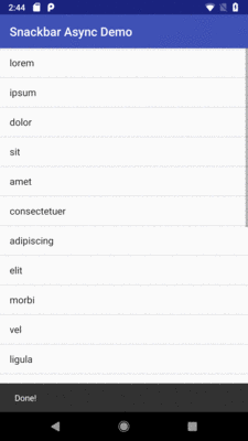
The DesignSupport/Snackbar
sample project is a clone of the Threads/AsyncDemo sample from earlier
in the book. The app shows a list of 25 Latin words, progressively
added to the list via an AsyncTask. When the list is fully populated,
the original sample would display a Toast, from onPostExecute()
of the AsyncTask.
The revised sample substitutes a Snackbar:
    @Override
    protected void onPostExecute(Void unused) {
      Snackbar.make(getListView(), R.string.done,
          Snackbar.LENGTH_LONG).show();

      task=null;
    }
The Snackbar will be centered along the bottom:
Figure 492: Official Snackbar
Unfortunately, there does not seem to be much support for styling
the look of the Snackbar. To do this manually, you can obtain
the actual View for the Snackbar via getView(). While you
should make few assumptions about what this View actually is,
you should be able to call setters on that View to change things
like background colors.
Also note that the user can get rid of a Snackbar via a swipe
gesture, in addition to allowing the Snackbar to time out on its own.
This is not possible with Toast, as a Toast is modeless.
We can expand upon the user interaction with a Snackbar by adding
an action to it. To do this, just call setAction() on the Snackbar
after creating it, passing in the display string for the action (what
the user will see on the Snackbar) and a View.OnClickListener
that will get control when the user taps on that action. The look and
feel of the action is up to the Snackbar implementation.
The DesignSupport/SnackbarAction sample project is a clone of the previous sample, adding one of these actions. Specifically, once the list is loaded, we want a “Restart” action to clear the list and load it again. Perhaps the user found loading the list to be exciting and wishes to see it happen all over again.
To that end, we should pull out the work of loading our list into
a loadModel() method that can be used from multiple places:
  private void loadModel() {
    task=new AddStringTask();
    task.execute();
  }
The onCreate() method now delegates to loadModel():
  @Override
  public void onCreate(Bundle savedInstanceState) {
    super.onCreate(savedInstanceState);

    setRetainInstance(true);

    adapter=
        new ArrayAdapter<String>(getActivity(),
            android.R.layout.simple_list_item_1,
            model);

    loadModel();
  }
And, more importantly for this section, we also call loadModel()
from the View.OnClickListener of the action that we add to our
Snackbar:
    @Override
    protected void onPostExecute(Void unused) {
      Snackbar munchie=Snackbar.make(getListView(), R.string.done,
          Snackbar.LENGTH_LONG);

      munchie.setAction(R.string.snackbar_action_restart,
        new View.OnClickListener() {
          @Override
          public void onClick(View view) {
            adapter.clear();
            loadModel();
          }
        });

      munchie.show();

      task=null;
    }
The action will appear on the Snackbar itself:
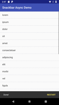
Figure 493: Official Snackbar, with an Action
Tapping the action triggers the listener, which in our case clears the list and starts the load all over again.
CWAC-CrossPort supports Snackbar, with all the same features as are in the
original Design Support implementation. The
DesignSupport/SnackbarActionCP
sample project is a clone of the previous sample, where we have migrated to
CWAC-CrossPort.
Our app/build.gradle file not only adds the CWAC-CrossPort dependency, but it
sets the minSdkVersion to 21:
apply plugin: 'com.android.application'

repositories {
  maven {
    url "https://s3.amazonaws.com/repo.commonsware.com"
  }
}

dependencies {
  implementation 'com.android.support:support-fragment:27.1.1'
  implementation 'com.commonsware.cwac:crossport:0.3.0'
}

android {
    compileSdkVersion 27
    buildToolsVersion '27.0.3'

    defaultConfig {
        minSdkVersion 21
        targetSdkVersion 27
        applicationId 'com.commonsware.android.snackbar.action.crossport'
    }
}
Removing appcompat-v7 has rippling effects across the rest of the code:
Theme.Material.Light.DarkActionBar in
Theme.Apptheme, replacing the former Theme.AppCompat themeandroid: prefix (e.g., android:colorPrimary),
instead of the bare names used by appcompat-v7
Activity, instead of AppCompatActivity
android.app.Fragment, instead of
android.support.v4.app.Fragment
Snackbar import is now for com.commonsware.cwac.crossport.design.widget.Snackbar
Otherwise, the code is identical, and we get identical results, though with an inverse theme and adjusted title bar, to help distinguish the original from the CWAC-CrossPort edition:
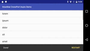
Figure 494: CWAC-CrossPort Snackbar
Perhaps no single element of the Material Design aesthetic has gotten more attention than has the floating action button, or FAB. These are round buttons, usually floating towards the bottom of the screen over top of the main UI:
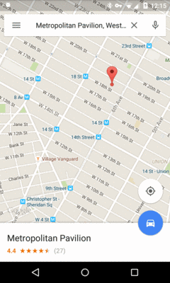
Figure 495: Google Maps, with a Pair of FABs, on a Nexus 4
The job of the FAB is to provide rapid access to the primary action that users might take on that particular screen. Typically, in a master/detail sort of UI, the FAB will allow creating a new item for the collection:
However, the FAB does not have to be an “add” operation. The only real limitation is that it should be a screen-level operation, not affecting only some selected item on that screen. So, for example, in the video recording app example, you would not use a FAB to play back one of the existing videos… at least on a screen listing those videos. If tapping a video in that list brings up some sort of detail screen, that screen could possibly have a FAB to play back the video.
The Design Support library has a rudimentary FAB implementation, and there are third-party alternatives that either add power or solve other FAB-related problems.
In many respects, setting up a FAB is not that different from setting
up any other widget: put it in your layout, positioned where you want
it, then access it in Java code to set up listeners. In particular,
Google’s FAB implementation supports a View.OnClickListener much like
a regular Button.
The DesignSupport/FAB
sample project is a clone of the first Snackbar sample from earlier
in this chapter. The second Snackbar sample added a “restart” action
to the Snackbar. In this sample, we instead have a “restart” action
on a FAB.
Before, we did not need a layout resource for the AsyncDemoFragment,
as it was an ordinary ListFragment and therefore would supply a
ListView automatically. However, this time, we want to have a FAB as
well, so we need our own layout file:
<?xml version="1.0" encoding="utf-8"?>
<RelativeLayout xmlns:android="http://schemas.android.com/apk/res/android"
  android:layout_width="match_parent"
  android:layout_height="match_parent">

  <ListView
    android:id="@android:id/list"
    android:layout_width="match_parent"
    android:layout_height="match_parent"
    android:drawSelectorOnTop="false" />

  <android.support.design.widget.FloatingActionButton
    android:id="@+id/refresh"
    android:layout_width="wrap_content"
    android:layout_height="wrap_content"
    android:layout_alignParentBottom="true"
    android:layout_alignParentEnd="true"
    android:layout_alignParentRight="true"
    android:layout_marginBottom="@dimen/fab_margin"
    android:layout_marginEnd="@dimen/fab_margin"
    android:layout_marginRight="@dimen/fab_margin"
    android:src="@drawable/ic_refresh_black_24dp" />

</RelativeLayout>Here, the FAB (a.k.a., android.support.design.widget.FloatingActionButton)
is later in a RelativeLayout than is the ListView, so the FAB will
have higher elevation and will appear to float over the ListView.
The android:src attribute points to a drawable resource, much like
how that attribute works on an ImageButton.
However, the interesting bit is the pair of margin attributes
(android:layout_marginRight and android:layout_marginBottom). They
point to a fab_margin dimension resource, one with some specific values
required due to bugs (or curious implementation choices) in Google’s FAB
implementation.
By default, the fab_margin in res/values/dimens.xml is used, which
has a dimension of 0dp:
<?xml version="1.0" encoding="utf-8"?>
<resources>
  <dimen name="fab_margin">0dp</dimen>
</resources>You might think that this would cause the FAB to be slammed up against
the side and bottom of the RelativeLayout. However, the FAB has built-in
margins… on older devices.
But, for whatever reason, on API Level 21+, that automatic margin vanishes.
So, we have another definition of fab_margin, in res/values-v21/dimens.xml,
setting it to 16dp:
<?xml version="1.0" encoding="utf-8"?>
<resources>
  <dimen name="fab_margin">16dp</dimen>
</resources>Furthermore, Google’s Material Design docs state that there should be
24dp margin on tablets, not 16dp. So, we have a third definition
of fab_margin, in res/values-sw720dp-v21, to set the margin to 24dp:
<?xml version="1.0" encoding="utf-8"?>
<resources>
  <dimen name="fab_margin">24dp</dimen>
</resources>It is possible that a full implementation of this would need a fourth
fab_margin value, for Android 4.x tablets, where fab_margin would
be set to something that gives a 24dp margin but takes into account
the automatic margin that the FAB seems to have prior to API Level 21.
This sample avoids this, going with the automatic margin on all
tablets, regardless of API level.
The Java code is fairly straightforward, retrieving the FAB in
onViewCreated() and hooking up a View.OnClickListener to the
FAB, where that listener is the AsyncDemoFragment itself:
  @Override
  public void onViewCreated(View v, Bundle savedInstanceState) {
    super.onViewCreated(v, savedInstanceState);

    getListView().setScrollbarFadingEnabled(false);
    setListAdapter(adapter);

    FloatingActionButton fab=v.findViewById(R.id.refresh);

    fab.setOnClickListener(this);
  }
In onClick(), if the AsyncTask is still running, we cancel()
it. Then, we clear the list and kick off a fresh task via the same
sort of loadModel() method as seen in the second Snackbar example:
  @Override
  public void onClick(View view) {
    if (task!=null) {
      task.cancel(false);
    }

    adapter.clear();
    loadModel();
  }

  void loadModel() {
    task=new AddStringTask();
    task.execute();
  }
This gives us our FAB:
However, what the above screenshots do not illustrate is what happens
when our Snackbar appears:
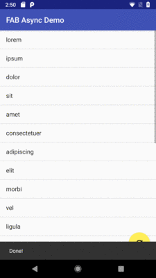
Figure 496: Official FAB, Conflicting with the Snackbar
The fact that the Snackbar overlaps the FAB should not be much of a
surprise. After all, the Snackbar overlaps the ListView as well. A
Toast would also overlap the list and FAB. Hence, to some extent, the
fact that there is this lack of coordination between the Snackbar and
the FAB seems to be fairly normal.
That being said, the Design Support library has a container designed for
coordinating between different children as those children animate and
scroll. This container — CoordinatorLayout — is a subclass of FrameLayout,
meaning other than Z-axis ordering (elevation) and gravity, it has no
other notable layout rules. It merely exists to perform this sort of
coordination.
As it turns out, CoordinatorLayout has special awareness of
Snackbar and the FAB, so simply using CoordinatorLayout will cause
the FAB to slide upwards to make room for the Snackbar.
The DesignSupport/CoordinatedFAB
sample project is a clone of the previous FAB example, except that
we switch from a RelativeLayout root container to a CoordinatorLayout:
<?xml version="1.0" encoding="utf-8"?>
<android.support.design.widget.CoordinatorLayout xmlns:android="http://schemas.android.com/apk/res/android"
  android:layout_width="match_parent"
  android:layout_height="match_parent">

  <ListView
    android:id="@android:id/list"
    android:layout_width="match_parent"
    android:layout_height="match_parent"
    android:drawSelectorOnTop="false" />

  <android.support.design.widget.FloatingActionButton
    android:id="@+id/refresh"
    android:layout_width="wrap_content"
    android:layout_height="wrap_content"
    android:layout_gravity="bottom|end"
    android:layout_marginBottom="@dimen/fab_margin"
    android:layout_marginEnd="@dimen/fab_margin"
    android:layout_marginRight="@dimen/fab_margin"
    android:src="@drawable/ic_refresh_black_24dp" />

</android.support.design.widget.CoordinatorLayout>Since CoordinatorLayout is based on FrameLayout, not RelativeLayout,
we have to adjust the layout rules on the FAB to match, using android:layout_gravity
to position the FAB towards the bottom right corner.
With no other changes, we now get coordinated movements of the FAB
and the Snackbar as the Snackbar appears and disappears:
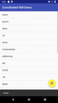
Figure 497: Official FAB, Coordinated with the Snackbar
CWAC-CrossPort also has ports of FloatingActionButton and CoordinatorLayout,
as can be seen in the
DesignSupport/CoordinatedFABCP
sample project.
In addition to the sorts of changes needed before (e.g., replace appcompat-v7
with crossport, change imports, change the theme), our layout now uses
crossport classes:
<?xml version="1.0" encoding="utf-8"?>
<android.support.design.widget.CoordinatorLayout
  xmlns:android="http://schemas.android.com/apk/res/android"
  android:layout_width="match_parent"
  android:layout_height="match_parent">

  <ListView
    android:id="@android:id/list"
    android:layout_width="match_parent"
    android:layout_height="match_parent"
    android:drawSelectorOnTop="false"
    />

  <com.commonsware.cwac.crossport.design.widget.FloatingActionButton
    android:id="@+id/refresh"
    android:layout_width="wrap_content"
    android:layout_height="wrap_content"
    android:layout_gravity="bottom|end"
    android:layout_marginBottom="@dimen/fab_margin"
    android:layout_marginEnd="@dimen/fab_margin"
    android:src="@drawable/ic_refresh_black_24dp"/>

</android.support.design.widget.CoordinatorLayout>And, as before, we get the same results as with the official implements, just
without the appcompat-v7 overhead:
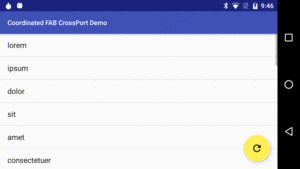
Figure 498: Coordinated FAB CrossPort Demo
The Design Support implementation of a FAB works, and it works nicely
“out of the box” with CoordinatorLayout. However, it implements only
a subset of the Material Design FAB capabilities, let alone related
structures like the floating action menu (FAM).
As a result, there are many FAB projects listed on the Android Arsenal, offering other implementations of a FAB.
In addition to complete FAB and FAM implementations, developers have been publishing libraries that add on other Material Design features to existing FAB implementations, such as:
Android has had a myriad of tab implementations over the years:
TabHost and TabWidget
FragmentTabHost and TabWidget
PagerTabStrip, used in conjunction with a ViewPager
The Design Support library adds yet another tab implementation: TabLayout.
Specifically, this implementation’s claim to fame is a faithful implementation
of a subset of Google’s Material Design guidelines for how tabs should
look and behave.
TabLayout can be used with or without a ViewPager. If you elect to skip
the ViewPager, TabLayout works in a form reminiscent of action bar
tabs, where it is responsible for the tab UI and you are responsible for
updating the rest of your UI based upon the chosen tab (e.g., commit a
FragmentTransaction). If you elect to use a ViewPager, TabLayout
can lightly integrate with the ViewPager, so navigating by one means
(e.g., swiping the pager) updates the other UI (e.g., changing the selected
tab).
From a layout standpoint, you use TabLayout much like you would use
TabWidget: put it where the tabs should go. Since Material Design
wants the tabs on top, that means that typically you would put TabLayout
inside a vertical LinearLayout, with the actual tabbed content
beneath the TabLayout.
This is illustrated in the
DesignSupport/TabLayout
sample project. It is based on the original ViewPager samples, showing
a set of editors in pages, this time using a TabLayout as the tab implementation
(as opposed to PagerTabStrip or the TabPagerIndicator from the ViewPagerIndicator
library).
The layout loaded by the activity has a setup much as described above:
a vertical LinearLayout wrapped around a TabLayout and our ViewPager:
<?xml version="1.0" encoding="utf-8"?>
<LinearLayout xmlns:android="http://schemas.android.com/apk/res/android"
              android:layout_width="match_parent"
              android:layout_height="match_parent"
              android:orientation="vertical">

  <android.support.design.widget.TabLayout
    android:id="@+id/tabs"
    android:layout_width="match_parent"
    android:layout_height="wrap_content"/>

  <android.support.v4.view.ViewPager
    android:id="@+id/pager"
    android:layout_width="match_parent"
    android:layout_height="match_parent">
  </android.support.v4.view.ViewPager>
</LinearLayout>
TabLayout can have its tabs operate in one of two modes: fixed and scrollable.
With fixed tabs, all tabs will be on the screen at all times, where they divide
the available horizontal space between them. This works fine for just a few
tabs. But for lots of tabs, each tab becomes very small, making it unlikely
that the user can read the tab caption. Scrollable tabs each take up as much
room as their caption requires, and if the roster of tabs becomes too wide
for the screen, the user can swipe the tabs.
The sample app demonstrates both of these approaches, using a checkable action bar item to toggle between three editors with fixed tabs or ten editors with scrollable tabs. The default state is to be in fixed-tab mode:
<?xml version="1.0" encoding="utf-8"?>
<menu xmlns:android="http://schemas.android.com/apk/res/android"
      xmlns:app="http://schemas.android.com/apk/res-auto">
  <item
    android:id="@+id/fixed"
    android:title="@string/menu_fixed"
    android:checkable="true"
    android:checked="true"
    app:showAsAction="never"/>
</menu>The entire app was switched over to use AppCompatActivity and the
fragment backport, as that is what the Design Support library requires.
Beyond that, the EditorFragment is pretty much unchanged from the
original implementations, just showing a large EditText widget with
a hint based on the page number.
Our PagerAdapter — SamplePagerAdapter — has one change beyond
the switch to the fragment backport. To accommodate switching between
fixed and scrollable tabs, rather than hard-coding the number of pages,
the adapter offers a setPageCount() method to stipulate the number
of pages. The page count defaults to 3.
package com.commonsware.android.tablayout;

import android.content.Context;
import android.support.v4.app.Fragment;
import android.support.v4.app.FragmentManager;
import android.support.v4.app.FragmentPagerAdapter;

public class SampleAdapter extends FragmentPagerAdapter {
  private final Context ctxt;
  private int pageCount=3;

  public SampleAdapter(Context ctxt, FragmentManager mgr) {
    super(mgr);

    this.ctxt=ctxt;
  }

  @Override
  public int getCount() {
    return(pageCount);
  }

  @Override
  public Fragment getItem(int position) {
    return(EditorFragment.newInstance(position));
  }

  @Override
  public String getPageTitle(int position) {
    return(EditorFragment.getTitle(ctxt, position));
  }

  void setPageCount(int pageCount) {
    this.pageCount=pageCount;
  }
}In MainActivity, in onCreate(), we set up the ViewPager and
the TabLayout:
  @Override
  public void onCreate(Bundle savedInstanceState) {
    super.onCreate(savedInstanceState);
    setContentView(R.layout.main);

    pager=(ViewPager)findViewById(R.id.pager);
    adapter=new SampleAdapter(this, getSupportFragmentManager());
    pager.setAdapter(adapter);

    tabs=(TabLayout)findViewById(R.id.tabs);
    tabs.setupWithViewPager(pager);
    tabs.setTabMode(TabLayout.MODE_FIXED);
  }
The bulk of the TabLayout setup work is handled with one call
to setupWithViewPager(). This:
PagerAdapter
in the ViewPager is reporting at the time of this callViewPager, and swipes between pages update the selected
tabWe also call setTabMode(TabLayout.MODE_FIXED), as we are going with
fixed tabs at the outset.
This gives us our three tabs:
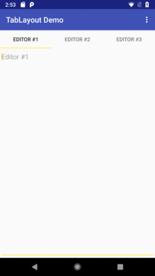
Figure 499: TabLayout Sample, As Initially Launched, Showing Three Fixed Tabs
But we also have that menu resource, to allow the user to switch between
fixed and scrollable tabs. We inflate() that resource in onCreateOptionsMenu()
as usual, and we handle the checked state change in onOptionsItemSelected():
  @Override
  public boolean onCreateOptionsMenu(Menu menu) {
    getMenuInflater().inflate(R.menu.actions, menu);

    return(super.onCreateOptionsMenu(menu));
  }

  @Override
  public boolean onOptionsItemSelected(MenuItem item) {
    if (item.getItemId()==R.id.fixed) {
      item.setChecked(!item.isChecked());

      if (item.isChecked()) {
        adapter.setPageCount(3);
        tabs.setTabMode(TabLayout.MODE_FIXED);
      }
      else {
        adapter.setPageCount(10);
        tabs.setTabMode(TabLayout.MODE_SCROLLABLE);
      }

      adapter.notifyDataSetChanged();

      if (pager.getCurrentItem()>=3) {
        pager.setCurrentItem(2);
      }

      return(true);
    }

    return(super.onOptionsItemSelected(item));
  }
If the user taps on our checkable overflow item, we invert the item’s
checked state (which, unfortunately, does not happen automatically).
Then, we call setPageCount() on the SampleAdapter and
setTabMode() on the TabLayout based on the now-current checked
state, to either have three fixed tabs or ten scrollable tabs.
Changing the page count of the SampleAdapter requires calling
notifyDataSetChanged() to alert the ViewPager that the data
set changed and it needs to repaint. However, while the associated TabLayout
repaints, the selected page is left alone. That is fine when going from
3 pages to 10, but it could be a problem when going from 10 pages to 3, if
the selected page is after those three. So, we use setCurrentItem() to
manually move the selection to the last valid page, if that situation
occurs.
Clicking on the “Fixed” checkable overflow item, and thereby unchecking it from its initial checked state, gives us ten scrollable tabs:
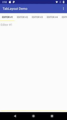
Figure 500: TabLayout Sample, Showing Scrollable Tabs
Note that while this particular sample app shows TabLayout working
with a ViewPager, a ViewPager is not required to be able to use
TabLayout. You can simply have the TabLayout plus your own system
for whatever the tabs switch in your UI. Then, you can use methods
like addTab() and setOnTabSelectedListener() to set up tabs and
find out when the user taps on them, so you can adjust your UI to match
the selected tab. That being said, many users may come to expect that
they can horizontally swipe to move between pages of content, and so
definitely consider using a ViewPager if practical.
CWAC-CrossPort has a port of TabLayout. The
DesignSupport/TabLayoutCP
sample project is identical to the DesignSupport/TabLayout sample app, except
that it uses CWAC-CrossPort. The same sorts of modifications as seen earlier
in this chapter are required, such as changing the layout to refer to the
appropriate package for the ported TabLayout:
<?xml version="1.0" encoding="utf-8"?>
<LinearLayout xmlns:android="http://schemas.android.com/apk/res/android"
              android:layout_width="match_parent"
              android:layout_height="match_parent"
              android:orientation="vertical">

  <com.commonsware.cwac.crossport.design.widget.TabLayout
    android:id="@+id/tabs"
    android:layout_width="match_parent"
    android:layout_height="wrap_content"/>

  <android.support.v4.view.ViewPager
    android:id="@+id/pager"
    android:layout_width="match_parent"
    android:layout_height="match_parent">
  </android.support.v4.view.ViewPager>
</LinearLayout>
In this particular sample, since we are using menu resources, we have one additional
change to make: switching from app:showAsAction to android:showAsAction, as
we are using the native action bar:
<?xml version="1.0" encoding="utf-8"?>
<menu xmlns:android="http://schemas.android.com/apk/res/android"
      xmlns:app="http://schemas.android.com/apk/res-auto">
  <item
    android:id="@+id/fixed"
    android:title="@string/menu_fixed"
    android:checkable="true"
    android:checked="true"
    android:showAsAction="never"/>
</menu>The EditText widget supports the android:hint attribute. The hint is
shown in the EditText when the EditText is otherwise empty. However,
if the EditText has actual text in it (whether typed by the user, loaded
from a database, or whatever), the hint is not shown. This saves screen
space compared to having a TextView label always visible; the hint
itself serves as the label.
However, the hint-as-label pattern has a major drawback: the hint is not
visible if there is text in the EditText. In the long term, as the user
learns your UI, this is not a big problem. However, particularly early
on, the user might look at a filled-in field and wonder what that field
is for. This is even more likely in cases where the user is not the one
who typed the text into the field in the first place, such as editing a
database entry pulled from a server, where somebody (or something) else
had created the entry in the first place.
The “floating label” pattern starts with a hint in the field. However, when the field is used, the hint animates out of the field itself and “floats” above the field in a shrunken form. This way, the label is always visible. However, in its smaller floating state, it takes up less screen space, yet while the field is otherwise empty, we can take advantage of that space to offer a “full-size” label instead.
The Design Support library offers TextInputLayout as a way of implementing
the floating label pattern. This is not a subclass of EditText,
but rather a ViewGroup that is wrapped around the EditText. This
is convenient, insofar as it allows developers to use other EditText
subclasses and still get the floating-label behavior.
TextInputLayout also supports an error state, where we can optionally
show an error message below the EditText, such as an indication of an
invalid bit of data entry.
The
DesignSupport/FloatingLabel
sample project is a clone of an earlier sample
where we allowed the user to enter in a URL and then, upon a button click,
would parse the URL into a Uri, wrap that in an ACTION_VIEW Intent,
then try to start an activity for that Intent.
The original sample’s layout looks like:
<?xml version="1.0" encoding="utf-8"?>
<LinearLayout xmlns:android="http://schemas.android.com/apk/res/android"
  android:layout_width="match_parent"
  android:layout_height="match_parent"
  android:orientation="vertical">

  <EditText
    android:id="@+id/url"
    android:layout_width="match_parent"
    android:layout_height="wrap_content"
    android:hint="@string/url"
    android:inputType="textUri"/>

  <Button
    android:id="@+id/browse"
    android:layout_width="match_parent"
    android:layout_height="wrap_content"
    android:onClick="showMe"
    android:text="@string/show_me"/>

</LinearLayout>In this revised sample,
the original EditText is augmented with a TextInputLayout:
<?xml version="1.0" encoding="utf-8"?>
<LinearLayout xmlns:android="http://schemas.android.com/apk/res/android"
              android:layout_width="match_parent"
              android:layout_height="match_parent"
              android:orientation="vertical">

  <Button
    android:id="@+id/browse"
    android:layout_width="match_parent"
    android:layout_height="wrap_content"
    android:onClick="showMe"
    android:text="@string/show_me">

    <requestFocus/>
  </Button>

  <android.support.design.widget.TextInputLayout
    android:id="@+id/til"
    android:layout_width="match_parent"
    android:layout_height="wrap_content">

    <EditText
      android:id="@+id/url"
      android:layout_width="match_parent"
      android:layout_height="wrap_content"
      android:hint="@string/url"
      android:inputType="textUri"/>
  </android.support.design.widget.TextInputLayout>

</LinearLayout>You will notice that there are a few changes here:
EditText is wrapped by an android.support.design.widget.TextInputLayout
container that provides the actual floating label itselfButton is moved ahead of the EditText, in terms of the top-down
organization of our vertical LinearLayout
Button has a [requestFocus/] child element, indicating to Android
that this widget should get the focus firstThose latter two changes are due to one major limitation with
TextInputLayout: the hint moves out of the EditText into the floating
position when either there is text in the EditText or the EditText
gains the focus. Strangely, simply putting the Button before the
EditText is insufficient, as is simply adding [requestFocus/] on
the Button. Both have to be implemented to cause the TextInputLayout
to show the hint in its default location at the outset.
The Java code is also augmented a bit from the original sample, to
take advantage of the error-reporting feature of TextInputLayout:
package com.commonsware.android.design.til;

import android.content.Intent;
import android.net.Uri;
import android.os.Bundle;
import android.support.design.widget.TextInputLayout;
import android.support.v7.app.AppCompatActivity;
import android.util.Patterns;
import android.view.View;
import android.widget.EditText;

public class LaunchDemo extends AppCompatActivity {
  private TextInputLayout til;

  @Override
  public void onCreate(Bundle state) {
    super.onCreate(state);
    setContentView(R.layout.main);

    til=(TextInputLayout)findViewById(R.id.til);
    til.setErrorEnabled(true);
  }

  public void showMe(View v) {
    EditText urlField=(EditText)findViewById(R.id.url);
    String url=urlField.getText().toString();

    if (Patterns.WEB_URL.matcher(url).matches()) {
      startActivity(new Intent(Intent.ACTION_VIEW, Uri.parse(url)));
    }
    else {
      til.setError(getString(R.string.til_error));
    }
  }
}
The Patterns class in Android contains a series of stock regular
expressions. One, WEB_URL, is designed to see if the URL that was
entered looks like a Web URL. When the user taps the button, if the
pattern matches what the user entered in the field, we go ahead
and try to start the activity. If not, we show an error.
To show the error, we need to do two things:
setErrorEnabled(), to tell TextInputLayout to
reserve some space for an error messagesetError()
on the TextInputLayout
When we run the app, the TextInputLayout leaves the hint in the EditText
itself, as the EditText is empty and does not have the focus:
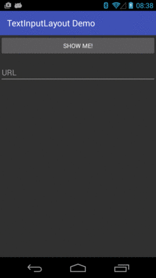
Figure 501: FloatingLabel Sample, As Initially Launched
Once the user taps on the field, though, the hint “floats” above the
EditText:
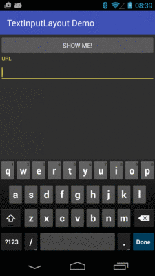
Figure 502: FloatingLabel Sample, After Focus Change
And, if the user tries entering an invalid URL, the error message appears when the user taps the button to try to visit the invalid URL:
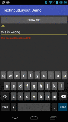
Figure 503: FloatingLabel Sample, After Erroneous Data Entry
CWAC-CrossPort has a port of TextInputLayout and TextInputEditText, the latter
being the EditText subclass that actually winds up being used with a
TextInputLayout.
The
DesignSupport/FloatingLabelCP
sample project is a port of the FloatingLabel sample, converted to using
CWAC-CrossPort. The standard sorts of changes seen earlier in this chapter,
such as artifact dependencies and themes, are needed. In addition, the layout
needs to change to use the CWAC-CrossPort editions of the classes:
<?xml version="1.0" encoding="utf-8"?>
<LinearLayout xmlns:android="http://schemas.android.com/apk/res/android"
  android:layout_width="match_parent"
  android:layout_height="match_parent"
  android:orientation="vertical">

  <Button
    android:id="@+id/browse"
    android:layout_width="match_parent"
    android:layout_height="wrap_content"
    android:onClick="showMe"
    android:text="@string/show_me">

    <requestFocus />
  </Button>

  <com.commonsware.cwac.crossport.design.widget.TextInputLayout
    android:id="@+id/til"
    android:layout_width="match_parent"
    android:layout_height="wrap_content">

    <com.commonsware.cwac.crossport.design.widget.TextInputEditText
      android:id="@+id/url"
      android:layout_width="match_parent"
      android:layout_height="wrap_content"
      android:hint="@string/url"
      android:inputType="textUri" />
  </com.commonsware.cwac.crossport.design.widget.TextInputLayout>

</LinearLayout>As with the rest of the Design Support library, TextInputLayout
requires appcompat-v7. There are
other implementations of the floating label pattern
that do not require appcompat-v7, or perhaps offer additional features
that you may want.
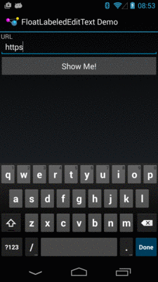
FloatLabeledEditText
is one such implementation. It lacks the error message capability of
TextInputLayout. However:
EditText widget,
not when the EditText gets the focus, andappcompat-v7
The
DesignSupport/FloatingLabelNative
sample project is a clone of the previous sample, where the
TextInputLayout is replaced by a FloatLabeledEditText:
<?xml version="1.0" encoding="utf-8"?>
<LinearLayout xmlns:android="http://schemas.android.com/apk/res/android"
              android:layout_width="match_parent"
              android:layout_height="match_parent"
              android:orientation="vertical">

  <com.wrapp.floatlabelededittext.FloatLabeledEditText
    android:id="@+id/til"
    android:layout_width="match_parent"
    android:layout_height="wrap_content">

    <EditText
      android:id="@+id/url"
      android:layout_width="match_parent"
      android:layout_height="wrap_content"
      android:hint="@string/url"
      android:inputType="textUri"/>
  </com.wrapp.floatlabelededittext.FloatLabeledEditText>

  <Button
    android:id="@+id/browse"
    android:layout_width="match_parent"
    android:layout_height="wrap_content"
    android:onClick="showMe"
    android:text="@string/show_me"/>

</LinearLayout>As with TextInputLayout, FloatLabeledEditText is a decorating
container around a regular EditText. Here, since the hint is left
alone when the EditText gets focus, we have it back in its original
position at the top of the form.
Visually, it is fairly similar to TextInputLayout, albeit with the
native action bar:
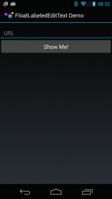
Figure 504: FloatingLabelNative Sample, As Initially Launched