THE PLATES
Sir Eduardo Paolozzi, Real Gold, 1949. Collage on paper, 28.2 x 41 cm. Tate Gallery, London, presented by the artist 1995.
Eduardo Paolozzi was born in Edinburgh, Scotland, in 1924. After attending Edinburgh College of Art and St Martin’s School of Art in London between 1943 and 1945, he studied sculpture at the Slade School of Art (which was then temporarily based in Oxford). He first exhibited at the Mayor Gallery in London in 1947. That same year he moved to Paris where he met Brancusi, Arp, Giacometti, Hélion, Tzara, Braque and Léger, among others. Following his return to London in 1949 he taught at the Central School of Art and Design until 1955, and at St Martin’s School of Art between 1955 and 1958.
In 1952 he was one of the founding members of the Independent Group at the Institute of Contemporary Arts (ICA) in London which was a forum for debate about the relationship of art and mass-culture. This interest found expression in Paolozzi’s organisational contribution to the ‘Parallel of Life and Art’ exhibition mounted at the ICA in 1953, as well as his participation in the ‘This is Tomorrow’ show put on at the Whitechapel Art Gallery in 1956.
After 1960 he taught in Hamburg, Berkeley, London, Berlin, Cologne and Munich. He exhibited at the Venice Biennale in 1952 and again in 1960, in which year he also displayed work at the Betty Parsons Gallery in New York. Four years later his work was exhibited at the Museum of Modern Art, New York. In 1967 he received the First Prize for Sculpture at the Carnegie International exhibition in Pittsburgh. A major retrospective of his output was mounted at the Tate Gallery, London in 1971. He was knighted in 1989, and died in 2005.
Although Paolozzi was primarily a sculptor, his prints and works on paper always formed an integral part of his output. In Paris in 1947 he began creating a series of ten collages, using images taken from magazines he had been given by American ex-servicemen who were also studying in the city. He called this series ‘Bunk’, a title taken from the famous dictum by Henry Ford that “History is more or less bunk…we want to live in the present.” At the early-1952 inaugural meeting of the Young Group within the Institute of Contemporary Arts in London (a circle that led to the creation of the Independent Group the following autumn), Paolozzi employed an epidiascope to project the Bunk series images on to a screen, as part of a talk he gave on the possible iconography of the future.
Real Gold is one of the most startling and prescient works in the Bunk series, for it anticipates the imagery of artists such as James Rosenquist, Tom Wesselmann and Peter Phillips by well over a decade. Given Paolozzi’s true artistic interests, the collage was doubtless intended to look surrealistic but it certainly projects the banal over-glamorisation of people and objects that is central to mass-culture.
Larry Rivers, Washington Crossing the Delaware, 1953. Oil, graphite and charcoal on canvas, 212.4 x 283.5 cm. The Museum of Modern Art, New York. Art © 2006 Estate of Larry Rivers/ Licensed by VAGA, New York, NY
Larry Rivers was born in the Bronx, New York in 1923, under the name Larry Grossberg. He began his professional life as a jazz saxophonist, during which time he changed his name. He took up painting in 1945, studying between 1947 and 1948 at the Hans Hofmann School in New York, and then under William Baziotes at New York University. Because of these contacts, during the late 1940s he became acquainted with some of the leading Abstract Expressionists, including Jackson Pollock and Willem de Kooning. He died in 2002.
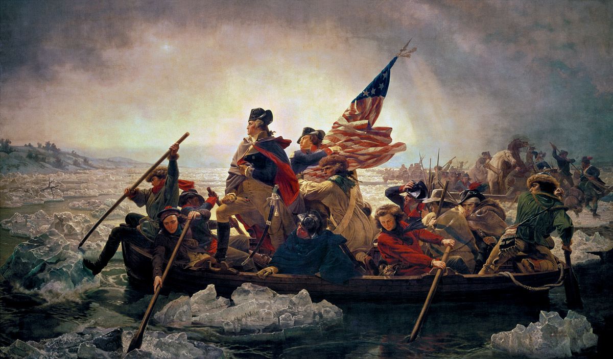
By the early 1950s Rivers was already beginning to resent the conformist thinking that advocates of Abstract Expressionism were attempting to impose upon all American artists who harboured modernist aspirations. This painting was the result, for as Rivers commented, “I was…cocky and angry enough to want to do something no one in the New York art world would doubt was disgusting, dead and absurd.” On a direct level the picture was a response to one of the principal American national icons, namely Emanuel Leutze’s Washington Crossing the Delaware of 1851. National familiarity with this canvas was very widespread due to its frequent reproduction in school history-books and the like. Because of this awareness, the Leutze therefore acted as a fitting vehicle for an attack on accepted thinking.
George Washington and his ragtag revolutionary army crossed the Delaware River on Christmas Day 1776, during a ferocious blizzard. By doing so they were then able to fall upon unsuspecting Hessian forces at nearby Trenton and defeat them. Rivers determined to re-conceive the entire subject of the river-crossing, substituting a messy, quasi-Abstract Expressionist paint-handling and somewhat disorganised composition for the perfect facture, bombastic poses and artificial pictorial organisation of Leutze’s image. As he commented:
What I saw in the crossing [of the Delaware] was quite different [from what Leutze saw there]. I saw the moment as nerve-wracking and uncomfortable. I couldn’t picture anyone getting into a chilly river around Christmas time with anything resembling hand-on-chest heroics.
To that end the employment of painterly and structural freedom served admirably. But Rivers not only re-thought the subject and simultaneously spat in the eye of accepted modernist orthodoxy – he also subtly attacked political orthodoxy as well, for in 1953 the anti-communist political witch-hunt being led in the US Congress by Senator Joseph McCarthy was greatly intensifying. By showing up the pomposity and dramatic falsity of Leutze’s propagandistic image, Rivers alluded to the self-righteousness and intellectual dishonesty of McCarthyism.
Understandably, the work was frostily received by both Abstract Expressionists and right-wing American patriots, the former because it compromised their artistic vocabulary, the latter because it demeaned a revered national image.
Emanuel Leutze, Washington Crossing the Delaware, 1851. Oil on canvas, 378.4 x 647.7 cm. The Metropolitan Museum of Art, New York.
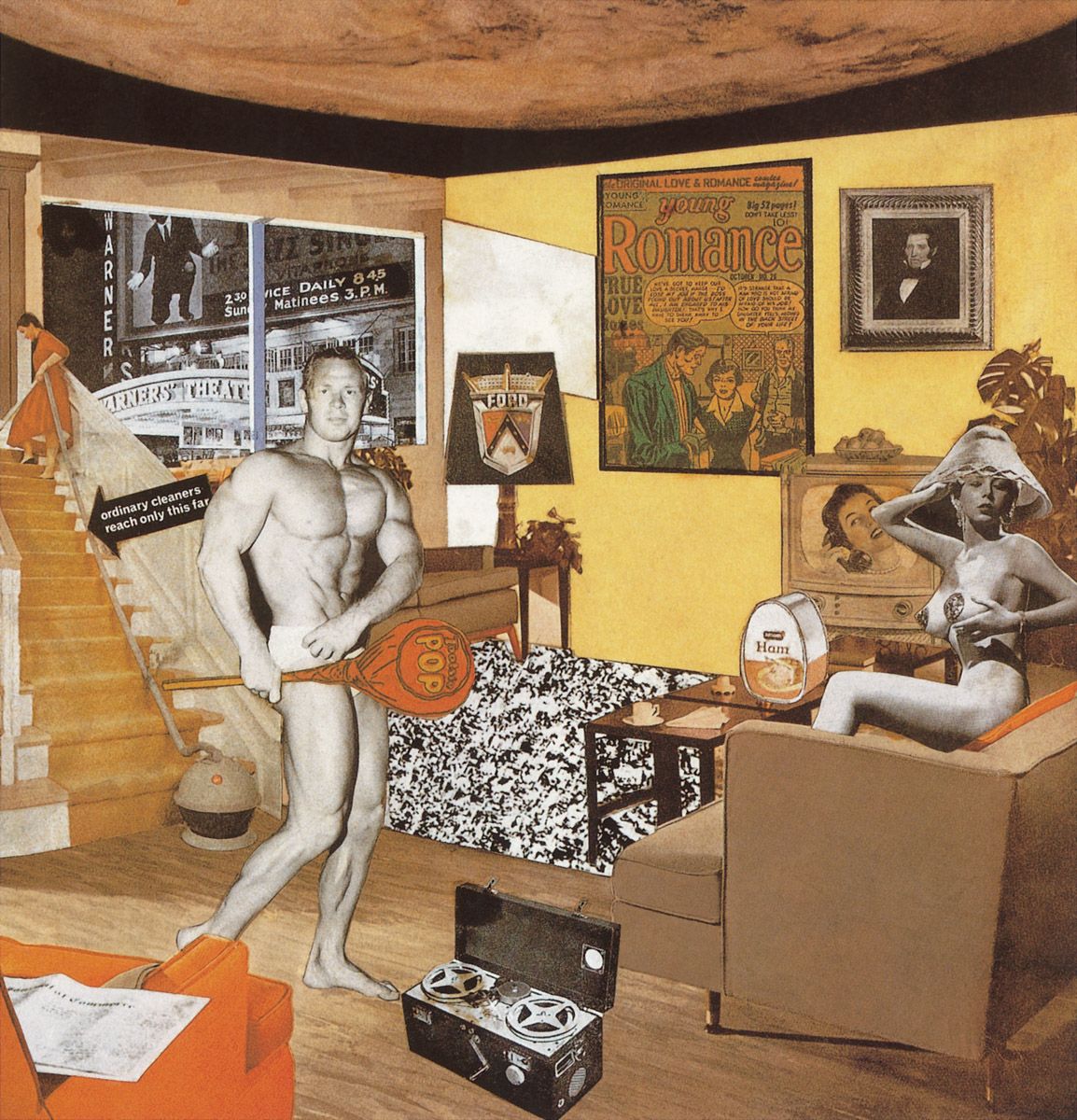
Richard Hamilton, Just what is it that makes today’s homes so different, so appealing ? 1956. Collage on paper, 26 x 25 cm. Kunsthalle, Tübingen, Prof. Dr. Georg Zundel collection.
Richard Hamilton was born in London in 1922. After taking evening classes in art he studied at the Royal Academy Schools between 1938 and 1940. During the Second World War he put his drawing skills to good use in industry and then briefly returned to his old art school before attending the Slade School of Art at London University, from where he graduated in 1951. After 1952 he taught at both art school and university, as well as at the Royal College of Art. He held his first one-man show at the Gimpel Fils Gallery in London in 1950. Throughout the 1950s he was highly active in the organisation of exhibitions that explored the relationship between mass-culture and art. His interest in the work of Marcel Duchamp culminated in his creation of a simulacrum of Duchamp’s Large Glass, and he organised a Duchamp retrospective for the Tate Gallery in 1966. By the end of that decade he was widely recognised as one of the most important pioneers of Pop/Mass-Culture Art, in Britain at least.
This small collage was a design for the monochrome poster advertising the very first Pop/Mass-Culture Art exhibition ever to be held, namely the ‘This is Tomorrow’ show mounted at the Whitechapel Art Gallery in London in 1956 by the Independent Group, of which Hamilton was a member. The design demonstrates exactly why its creator is deemed so important to the tradition of Pop/Mass-Culture Art, for it is almost a lexicon of all the themes that would soon be touched upon by both Hamilton and others. Thus the Young Romance comic strip image hanging on the wall points towards things to come from Roy Lichtenstein; the nude on the right coupled with the adjacent tin of ham, bowl of fruit and television set suggests future images by Tom Wesselmann; the word-bearing pointer on the stairs would be paralleled in works by Andy Warhol, just as that selfsame artist would devote a major part of his art to ‘superstars’, as seen here in the form of Al Jolson in The Jazz Singer of 1929; the word ‘POP’ carried on a paddle by the semi-nude male points the way to the future employment of words by Ed Ruscha, Robert Indiana, Allan D’Arcangelo and by Hamilton himself; and the corporate logo appearing on the lampshade anticipates the work of Ashley Bickerton by several decades.
Peter Blake was born in Dartford, Kent, England in 1932. He studied at art school in nearby Gravesend and then, following compulsory military service, at the Royal College of Art in London between 1953 and 1956. After graduating with a first-class diploma he was the recipient of a research grant to travel through the Lowlands, France, Italy and Spain studying folk art. In 1958 he was also accorded a Guggenheim Painting Award. After 1960 he taught at a number of art schools, including the Royal College. In 1961 he won First Prize in the Junior Section of the prestigious John Moores Exhibition of contemporary painting in Liverpool. His first one-man exhibition was mounted at the Portal Gallery in London in 1963. Since then he has shown all over the world. He was knighted in 2002.
Blake painted this canvas while he was a student at the Royal College of Art, its subject being set as part of his course work. As he recently commented in an interview with Natalie Rudd:
My version of ‘on the balcony’ is a continuation of my earlier pictures of children. I started by collecting references to ‘on the balcony’ and soon realised there were many. I wanted to get them all in and so borrowed a device from a painting called Workers and Paintings by the American artist, Honoré Sharrer. She painted a row of manual workers holding up their favourite paintings… I suppose my interest in the world of children came from the fact that I had such a complicated childhood. In a way I wanted to bring it back to make it better. The children in On the Balcony are like tiny adults. They are certainly odd: almost everyone I paint has an oddness — there is a subtext usually. I based the figures on family photos of my sister and brother, but although they are from people they are not portraits — they are ‘children’.
Because reliance upon photographs and postcards was discouraged at the Royal College of Art, Blake was forced to use such material surreptitiously when making this work. As well as replicating a well-known photograph of Winston Churchill standing alongside the Royal Family on the balcony of Buckingham Palace on Victory in Europe Day 1945 (seen towards the upper right), Blake also imitated a photo of one of his former teachers at the Royal College, the then recently-deceased British painter John Minton (1917-1957). His image hangs from a neckband strung around the figure on the right, and it supports a small placard also memorialising the late painter. A youth standing in a corresponding position on the left holds a framed reproduction of Manet’s renowned picture of people on a balcony of 1868-9 (Musée d’Orsay, Paris). Such a commentary upon art, plus all the observations concerning photography, would prove integral to much Pop/Mass-Culture Art.
The flattening of pictorial space throughout the image induces associations of notice boards, and that link is strengthened by the green of the overall ground which parallels the colour of the baize frequently used on such supports. In general, the picture looks as unsophisticated as so-called ‘folk art’ created by amateur, untrained painters but of course this is deceptive, for Blake brings to bear an enormous painterly sophistication in pursuit of an untrammelled sense of vision.
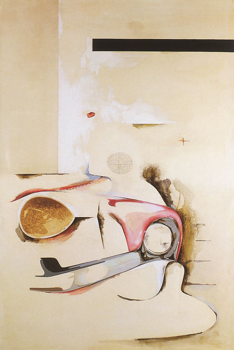
Richard Hamilton, Hommage à Chrysler Corp., 1957. Oil, metal foil and collage on panel, 122 x 81 cm. Private collection.
This is one of a number of paintings created in the second half of the 1950s in which Hamilton took his starting point from the shapes of mass-produced objects. Here he balanced his attraction to non-representational painting with his thinking that ‘automobile body stylists have absorbed the symbolism of the space age more successfully than any artist’. As well as subtly accentuating the somewhat sexual curves inherent to the glamorous American automobiles which were then setting the stylistic tone for popular car design in Britain, Hamilton also pasted red lips on to the panel (slightly up from the left of centre), thereby further alluding to the sexuality that frequently motivates our attraction to cars.
Jasper Johns, Flag on Orange Field II, 1958. Encaustic on canvas, 92.7 x 37.2 cm. Private collection, courtesy of Castelli archives. Art © 2006 Jasper Johns/ Licensed by VAGA, New York, NY
Jasper Johns was born in 1930 in Augusta, Georgia, although he grew up in Allendale, South Carolina. After spending a short time at the University of South Carolina in 1947-8, he moved to New York where he took classes in commercial art. Following his military service he returned to New York, where he supported himself by painting window displays and working in a bookshop. In 1954 he met Robert Rauschenberg who was living in the same building in lower Manhattan. He started painting the American flag in 1954, and his sequences of Target and Numbers images were begun during the following year. His 1958 debut exhibition at the Leo Castelli Gallery in New York put him very much on the artistic map, a position he has never lost.
Given the ostensible subject of his Flags paintings, Johns could hardly avoid the nationalistic and cultural associations of the Stars and Stripes. However, because he represented the flag in a wholly objective way, as simply constituting an arrangement of shapes and colours on a flat surface, to a certain degree he divorced the banner from what it symbolises. The isolation of the flag within the overall composition makes it look disembodied and emotionally neutral, and Johns certainly separated himself from any overly emotional entanglement with what he was painting by creating the work with a quick-drying wax medium, which necessitated patiently building up the surface in layers. Paradoxically, the apparent animation of the final painting parallels the surface dynamism of Abstract Expressionist pictures, and Johns surely welcomed such a difference between means and ends.
Naturally, portrayals of the American flag and banner-waving had been highly topical at the height of the Cold War in 1954 when Johns began the series to which this later image belongs, for Soviet Russia had recently acquired the atomic bomb, Red China had shown its true expansionist colours by intervening in the Korean War, and Senator McCarthy and his political henchmen were ostensibly finding communists under every bed. By painting the national flag, Johns was therefore apparently affirming his American identity, although by treating it merely as a coloured and formally-varied shape he made clear his lack of passion about its nationalistic meaning. He furthered such a lack of jingoism in other paintings of the series by making the flag difficult or almost impossible to see, sometimes by painting it in silver or in white-on-white, and occasionally by radically altering its colours and proportions. All of these interventions and changes served to stress the freedom of the artist and to make it clear that nothing is visually sacred, not even the most hallowed of American icons.
Sir Peter Blake, Tattooed Lady, 1958. Ink and collage, 68.6 x 53.3 cm. Victoria and Albert Museum, London.
Here Blake took an even closer step towards the complete encompassing of popular imagery. The drawing incorporates material taken from a number of sources ranging from old postcards (including one of the ‘saucy’ variety), passport photos and children’s book illustrations, to comic-strips, tickets, advertising sticky-labels, magazine photos and other such images. A particularly witty note is struck by the lady’s cantilevered brassiere.
Robert Rauschenberg, Monogram, 1955-59. Combine painting, 106.7 x 160.7 x 163.8 cm. Moderna Museet, Stockholm. Art © 2006 Robert Rauschenberg/ Licensed by VAGA, New York, NY
Robert Rauschenberg was born in Port Arthur, Texas in 1925. Following military service in the Second World War, he studied art at the Kansas City Art Institute in 1946-7, at the Académie Julien in Paris in 1947, under Josef Albers at Black Mountain College in North Carolina in 1948-9, and at the Art Students League in New York City in 1949-50. He held his first solo show at the Betty Parsons Gallery, New York, in 1951, and subsequently his work has been exhibited all over the globe. In 1964 he won the Grand Prix at the Venice Biennale. Retrospectives were held in Paris and New York in 1963, with another such show touring the USA in 1976-8, while a further retrospective toured Berlin, Düsseldorf, Copenhagen, Frankfurt, Munich and London in 1980.
Even by the time of his first exhibition in 1951, Rauschenberg was already in the forefront of American artistic experimentation. Among other images he made from the mid-1950s onwards were a series of all-white paintings in which the only visual activity was provided by the viewer when casting shadows across the surfaces; all-black paintings, in which crushed and torn pasted newspapers were overworked with black enamel paint; and ‘combine’ paintings, or painted supports to which were added real objects, including photographs, sections of comic-strips, Coca-Cola bottles, stuffed birds and the like.
This is another of the combines, although its spatiality makes it function equally as a sculpture, and a manoeuvrable one at that, for the platform supporting the goat is mounted on wheels. As a youth Rauschenberg had owned a goat, so the work might well contain an autobiographical element. The artist first saw the stuffed animal he used here in a pawnshop window and eventually purchased it, which went against his normal practice of gleaning his materials from the streets. Because the head was damaged, the affected section was camouflaged with paint.
The combine passed through two stages before its final form was reached. In the first, the goat stood on a platform extending from a vertically-orientated panel, while in the second it was lowered onto the floor. The encirclement of the animal with the tyre occurred at this time. Rauschenberg was certainly aware of the dynamic role of tyres in modern life, for in 1953 he had created a monoprint by getting his friend, the composer John Cage, to drive a car across twenty sheets of mounted paper, leaving the imprint of a tyre along its entire length. Also included on the wheeled platform of the third and final version of Monogram is a photo of people inside a building; a tennis ball which is painted brown and located at the goat’s rear to suggest excreta; a broken street barricade; a signboard bearing lettering; the heel of a shoe; and a man’s shirtsleeves. All these objects serve to remind us of the detritus of urban life.
The wheeled platform introduces associations of the dollies employed to transport heavy objects such as pianos through the streets, precisely the kind of supports that had inspired Rauschenberg to create his wheeled base in the first place. The stuffed animal is an Angora goat and therefore the most valuable commercial breed of the species. Rauschenberg was surely aware of this from his home state of Texas, where Angora goats are bred on a large scale to supply America with most of its mohair.
Given all these factors, it does not seem fanciful to interpret the goat encircled by the tyre as making a statement about the encirclement of nature by industrialisation, just as the mobile support might paradoxically allude to the freedom provided by such development.
Robert Indiana, The American Sweetheart, signed and dated ‘R INDIANA COENTIES SLIP NYC 1959’. Oil on homasote, 243.8 x 122 cm. Private collection.
Robert Indiana was born in New Castle, Indiana in 1928, under the name Robert Clark. After taking classes in art and then serving in the US Army Air Force in 1946, Indiana studied in Indianapolis, Utica, Chicago, Edinburgh and London between 1947 and 1954. By the mid-1950s he was making abstract paintings using strong geometrical shapes.
With the present work and another painting, The American Dream of 1960, Indiana began incorporating into his pictures words and symbols, such as the stars that appear here. By the mid-1960s this exploration of the role of words and cultural signifiers had taken over his work completely. Because words and signs are integral to mass-culture, independent of any messages they might convey, Indiana’s art necessarily comments upon a vital aspect of our age.
The ‘COENTIES SLIP’ cited in the signature of the painting is a waterfront neighbourhood in lower Manhattan where Indiana was living when he created the work. All the names appearing above the legend ‘THE AMERICAN SWEETHEART’ on the image bear personal connotations. Thus ‘MAY’ denotes the actress Mae West; ‘LIL’ links to the early twentieth century beauty, Lillian Russell; ‘IDA’ refers to the actress Ida Lupino; ‘FLO’ commemorates Indiana’s next-door neighbour when he was four, a ‘sweetheart’ who introduced him to the use of gold paint, which he would often employ when mature; ‘AMY’ tempted him before he was six; ‘BEE’ was one of his mother’s friends; ‘SUE’ beat him to first place when graduating from high school; ‘LIZ’ signifies Elizabeth Taylor, who starred in a film, Raintree County, which was based on a novel set in Indiana’s hometown; ‘PAT’ was a youthful crush; ‘INA’ was a famous lady of the tabloid press in the 1930s; ‘ANN’ was a New York neighbour who had pushed Andy Warhol around when they had been children together in Pittsburgh; ‘NAN’ applies to the Nancy of a famous cartoon series of the 1940s; ‘SAL’ invokes an infamous fan dancer of the 1930s, Sally Rand; ‘MIN’ links to a character actress of old; ‘PET’ was Indiana’s grandmother’s ‘pet’ name; ‘MEG’ once broke his heart; ‘FAY’ alludes to the actress Fay Wray of King Kong fame; ‘UNA’ denotes the actress Una Merkel; ‘IVY’ was someone buried deep in Indiana’s family history; and ‘EVA’ was another friend of the painter’s mother.
Jasper Johns, Two Beer Cans, 1960. Oil on bronze, 14 x 20.3 x 12.1 cm. Offentliche Kunstsammlung, Basel. Art © 2006 Jasper Johns/ Licensed by VAGA, New York, NY
Johns created this sculpture in response to a remark by Willem de Kooning that the art dealer Leo Castelli could sell anything, even two beer cans. It therefore primarily enacts a comment upon art-capitalism, the way that artefacts made by artists can harbour (and even accrue) financial value when placed in the right hands.
Because of its very subject the work equally comments upon the inherent aesthetic values of mass-produced objects. It necessarily addresses the wider question of artistic validity too; if it was legitimate for, say, Cézanne to portray apples, then why would the representation of beer cans not prove equally acceptable, especially as Johns did not cast the work from such receptacles but used all his powers to shape and paint likenesses of them?
Arman, Home, Sweet Home, 1960. Group of gasmasks in wooden box with plexiglass cover, 160 x 140.5 x 20.3 cm. Musée national d’art moderne, Centre Georges Pompidou, Paris.
Arman was born Armand Fernandez in Nice, France, in 1928; a printer’s error led him to drop the last letter of his forename in 1958 and later, in 1967, he abandoned his surname altogether. Between 1946 and 1951 he studied art in Nice and Paris, and in 1960 he became a founding member of the Nouveaux Réalistes group of artists in Paris. Some members of this group shared his interest in mass-culture and its artefacts and, like him, they exhibited in the ‘New Realists’ exhibition held in New York in 1962, the show that provided the ultimate breakthrough for Pop/Mass-Culture Art. Arman settled in New York in 1963 and in the following year he held his first museum exhibition, at the Walker Art Center in Minneapolis. He has shown widely ever since, and a major retrospective of his work was mounted in Paris in 1998. He died in 2005.
Initially, Arman employed rubber stamps to make abstract pictures, to which end he also dipped functional objects in paint. In 1959 he began creating a series of works known as Accumulations, to which this sculpture belongs. Further such objects are discussed below. Another series of sculptures placed in boxes under plexiglass covers followed in 1960. These were the Poubelle or Wastebin works, in which Arman brought together random collections of rubbish, to typify the wastefulness of our throwaway society. Occasionally this would include the garbage generated by artists, as happened with Rauschenberg and Dine in 1961, to make good-natured points about those iconoclastic figures. In that same year Arman also embarked upon a set of Destructions in which he smashed objects, partially to denote a break with the past but also frequently to bring those objects together again in new formulations. Thus a long series of musical instruments was first smashed and then reconstituted visually, to act as effective metaphors for the rhythm, harmony or dissonance of music itself. And in a series of Robot works, Arman collected the belongings of specific individuals, which he then presented under plexiglass in boxes. Because we are what we consume, these gatherings of objects all function effectively as indirect forms of portraiture.
Naturally, the Accumulations cannot but comment upon the vast aggregations of objects that form within modern industrialised society, while often the constituent artefacts set other chains of associations in motion. Thus we might read this dense jungle of gasmasks as forming a parallel to the density of a gas attack itself. Certainly gasmasks bear particularly tragic connotations for all historically-aware Frenchmen, as France is one of the few countries that has suffered from the use of gas in a military conflict (as it did between 1914 and 1918). That Arman may have had such memories in mind when creating this work seems supported by the somewhat ironic title he gave it. Certainly the dense throng of masks might aptly remind us of both the vast numbers of men and objects involved in modern warfare, and of one of the most disgusting and destructive methods of creating human carnage.
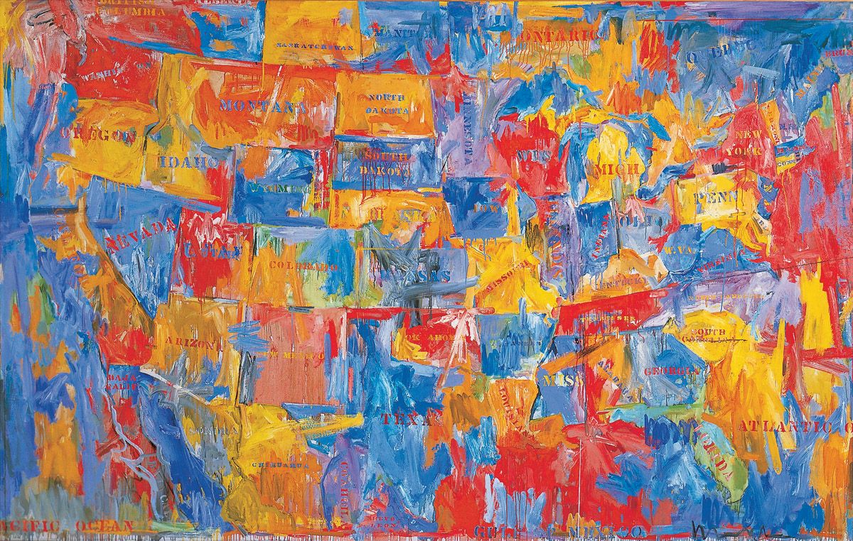
Jasper Johns, Map, 1961. Oil on canvas, 198.2 x 307.7 cm. The Museum of Modern Art, New York. Art © 2006 Jasper Johns/ Licensed by VAGA, New York, NY
In his Flags, Targets and Numbers series of paintings, Johns employed encaustic paint in order to build up the surfaces patiently, and thus prevent any excess emotionalism entering the images. For the Maps paintings, however, he moved in the opposite direction and used oil paint for its dynamism, a gesturality normally associated with Abstract Expressionism. This enacted a clever paradox, for the flurried surfaces go against the grain of most true maps, which are almost always pictorially flattened, diagrammatic affairs, totally devoid of any expression whatsoever.
Naturally, the emphatic marks used by Johns often blur or totally obliterate the boundaries of individual states, thereby possibly commenting upon the increasing political irrelevance of such divisions within an America that had grown enormously in political coherence and wealth since the Second World War. At a time of growing transcontinental air and road travel, national television coverage, the countrywide distribution of mass-produced goods, and nationwide advertising campaigns for those products, such a breakdown or disregard of local boundaries seems highly relevant.
Johns’s use of stencilled lettering invokes exactly the same associations of mass-production it had when employed after 1911 by Picasso and Braque, for it is very ‘low culture’ indeed, being primarily found on the sides of packing crates and the like where identifications need to be effected quickly and without any refinement. As employed by Johns, the use of such a uniform type of lettering says much about the blurring of local individuality, the increasing homogeneity of national identity, and the growth of consumerism everywhere.
James Rosenquist, President Elect, 1960-61. Oil on masonite, 213.3 x 365.7 cm. Musée national d’art moderne, Centre Georges Pompidou, Paris. Art © 2006 James Rosenquist/ Licensed by VAGA, New York, NY
James Rosenquist was born in Grand Forks, North Dakota in 1933, although he grew up mainly in Minneapolis. Between 1952 and 1955 he studied art at the University of Minnesota in Minneapolis, while simultaneously working as a billboard artist throughout Minnesota and Wisconsin. In 1955 he received a scholarship to study at the Art Students League in New York. Between 1957 and 1960 he worked almost full-time as a commercial billboard painter, creating his own works in his spare time. By this time he had built up a network of artistic friends and acquaintances which included Jasper Johns, Robert Rauschenberg, Claes Oldenburg and Robert Indiana. His first one-man show was held at the Green Gallery in New York in February 1962, and completely sold out. Many exhibitions followed, including retrospectives in Ottawa in 1968, in Cologne and New York in 1972, in 1985-7 in Denver, Houston and Des Moines, in 1991 in Moscow and Valencia, and in 2003-4 in New York and Bilbao.
John F. Kennedy was elected President of the United States on 8 November 1960, and this painting was begun very soon afterwards. It was one of two pictures created in 1960-1 that proved to be Rosenquist’s breakthrough works in artistic terms. The other painting is entitled 47, 48, 50, 61 and it shows three men’s ties above the dates 1947, 1948 and 1950, thereby implicitly commenting upon fashion and history. The present painting seems no less meaningful, given the happy visage of one of America’s most famous, youthful and handsome presidents, from whose head emerges two perfect female hands holding some pieces of appetising cake placed in front of a shining car. With merely a hint of irony – for everything is just a little too faultless – Rosenquist alludes to the perfect consumer society as projected by its ever-optimistic politicians.
The work was developed from a three-part collage Rosenquist had made using an old magazine photo of Kennedy and ads for cake and a 1949 Chevrolet. The study reveals more of the vehicle than seen here, and includes two figures standing behind the car, looking at it admiringly.
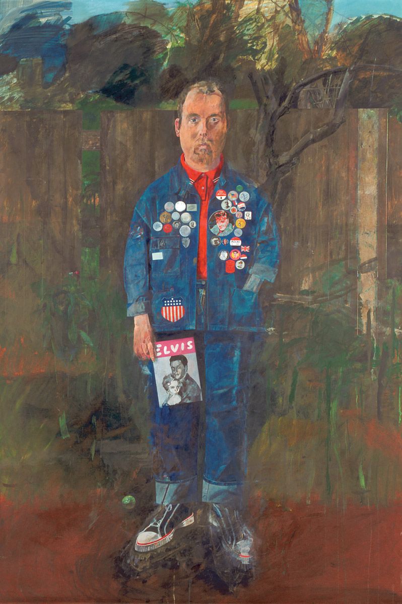
Sir Peter Blake, Self-Portrait with Badges, 1961. Oil on hardboard, 172.7 x 120.6 cm. Tate Gallery, London.
When creating this image, Blake may well have had a portrait by the French artist Watteau in mind, a depiction dating from 1718-19 (Musée du Louvre, Paris). It represents the actor Gilles standing in a similarly gawky pose and identically positioned looking straight out at us. Moreover, by representing himself in blue, Blake may also have been building upon memories of Thomas Gainsborough’s The Blue Boy (Huntington Library, San Marino, California) although the eighteenth-century painter placed his subject in open countryside, rather than some suburban back garden. He also dressed him in silk rather than the blue denim that was equally fashionable in some quarters in 1961.
This uncompleted self-portrait won Blake the Junior Prize of the 1961 John Moores’ Liverpool exhibition of contemporary painting. As we have already seen, a favourite device of the artist was to spread painted or pasted images across notice boards and walls. Here he used himself as that kind of support, somewhat flattening his body in the process and using the background fence to reinforce the sense of flatness.
Blake posed before a mirror for the likeness, although he also draped his jacket over a dummy. He had always been a fan of denim clothing, which was still difficult to obtain in Britain by 1961; he had only been able to purchase his first-ever set of jeans when visiting the Continent in 1956. In reality Blake never wore badges but merely collected them, along with all other kinds of ephemera. The images on the badges range from the American and British flags, to an American presidential candidate’s voting exhortation ‘ADLAI [Stevenson] is OK’. A Pepsi-Cola bottle-top and several coins can also be made out. Elvis Presley figures twice, on a badge and on the cover of his fanzine.
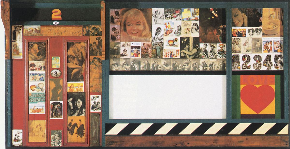
Sir Peter Blake, Love Wall, 1961. Collage construction in mixed media, 125.7 x 205.7 cm. Fundaçao Calouste Gulbenkian, Modern Art Centre, Lisbon.
This was one of the first works in which Blake fashioned a low-relief support for the ephemera he collected. The many differing levels of sophistication to human relationships are wittily indicated by a rich and tightly-structured web of popular imagery. Among the pointers to love is the word itself placed above the heart-shaped symbol commonly used to denote such feelings. A picture of Marilyn Monroe symbolises physical pulchritude, while a postcard of Millais’ Order of Release of 1852-3 (Tate Britain, London) shows a wounded clansman of the 1745-6 Scottish rebellion being freed from prison by his wife, who exemplifies faithfulness. A large array of kitsch and ‘naughty’ postcards of young lovers in varying degrees of physical entanglement also indicates love.
On the left, a real door and porch typify the domestic entranceways that are often acquired through love and marriage. On and above the door the number 2 appears several times, both to signify street numbers and to remind us of the pairing necessary to build liaisons. On the far side of the wall images of children and related low numbers taken from birthday cards suggest the offspring of such relationships.
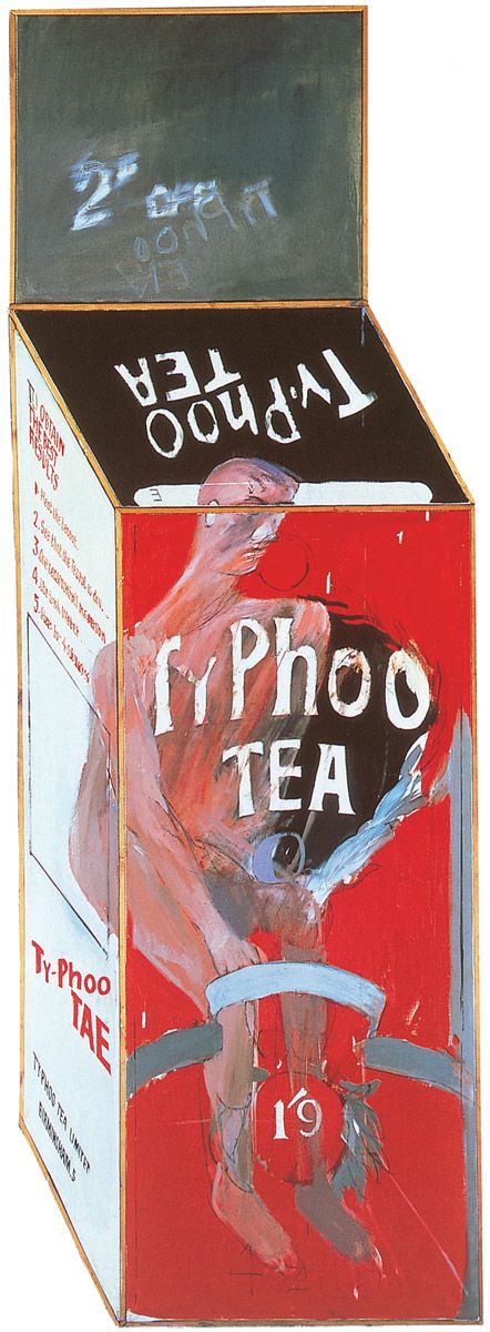
David Hockney, Tea Painting in an Illusionistic Style, 1961. Oil on canvas, 185 x 76 cm. Private collection.
David Hockney was born in Bradford, Lancashire in 1937. After studying at the local art college between 1953 and 1957 he served as a conscientious objector rather than perform military service. In 1959 he began attending the Royal College of Art in London, from where he graduated in 1962. In the previous year he had been awarded the institution’s Gold Medal and various other important prizes. His first one-man show was held at the Kasmin Gallery in London in 1963 and proved a huge critical and commercial triumph. Since then he has held a multitude of exhibitions, including retrospectives in London in 1970 and 1989, the latter show also being mounted in Los Angeles and New York. In addition to being a painter and printmaker, Hockney has also enjoyed great success as a photographer, stage-designer and writer on art.
Hockney has always firmly maintained that he has never been a pop-painter. That assertion is correct, for he has only occasionally shown any interest in mass-culture, the visual vocabulary of advertising and mass-communications, and the glamorous lifestyle of modern consumerism. But in the present work he did pay regard to a particular consumer product, using a Typhoo Tea packet to explore the ambiguities inherent to two-dimensional surfaces, which has always been one of his overriding preoccupations. To that end he painted the picture on a shaped canvas which makes it look inescapably three-dimensional. The figure is mostly contained within the box, with only a small part of his head protruding, and he is represented in an intentionally crude manner which derives from the influence of Jean Dubuffet, who developed his own style from the influence of graffiti, child art and pictures by the mentally disabled.
Clearly the representation of a man within a box stems from Francis Bacon who often placed his figures within similarly defined spaces. However, Hockney sends up that inspiration by seating his character on the toilet.
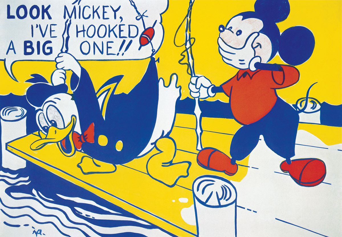
Roy Lichtenstein, Look Mickey, 1961. Oil on canvas, 122 x 175 cm. The National Gallery of Art, Washington, D.C.
Roy Lichtenstein was born in New York in 1923. In 1939-40 he studied under Reginald Marsh at the Art Students League in New York. He then attended Ohio State University in Columbus, Ohio from 1940 to 1943, and from 1946 to 1949, completing his military service between those two periods of study. Upon graduation he taught at Ohio State University. He held his first one-man exhibition at the Carlebach Gallery, New York in 1951, showing assemblages made from metal, wood and found objects. Between 1951 and 1957 he worked as a freelance designer and commercial artist in Cleveland, Ohio, and in New York, following which he taught at New York State University in Oswego, New York between 1957 and 1960, and at Douglass College, Rutgers University, New Jersey, between 1960 and 1963. After his breakthrough into a new pictorial idiom in 1961, he exhibited in New York and around the world, including several times at the Venice Biennale. Major retrospectives of his mature paintings and prints have been held in Cleveland, Minneapolis, Amsterdam, London, Berne, Hanover, New York, Paris and Berlin, while a retrospective organised by the St Louis Art Museum in 1981 then toured the USA, Europe and Japan. Lichtenstein died of pneumonia in 1997.
Although Lichtenstein painted in an Abstract Expressionist idiom up until 1961, he had occasionally incorporated printed advertisements, words and comic-strip figures into his pictures before that date. However, in mid-to-late June 1961 he discovered his true metier with the painting reproduced here. By then he had tired of abstraction, realising it held no artistic or professional future for him. So he took a gamble. As he told Milton Esterow many years later:
The idea of doing [a cartoon painting] without apparent alteration just occurred to me…and I did one really almost half seriously to get an idea of what it might look like. And as I was painting this painting I kind of got interested in organizing it as a painting and brought it to some kind of conclusion as an aesthetic statement, which I hadn’t really intended to do to begin with. And then I really went back to my other kind of painting, which was pretty abstract. Or tried to. But I had this cartoon painting in my studio, and it was a little too formidable. I couldn’t keep my eyes off it, and it sort of prevented me from painting in any other way, and then I decided this stuff was really serious….I would say I had it on my easel for a week. I would just want to see what it looked like. I tried to make it a work of art. I wasn’t trying just to copy. I realized that this was just so much more compelling.
In relation to the comic-strip image that inspired this seminal work, the key phrase in the above quotation is ‘brought it to some kind of conclusion as an aesthetic statement’, for Lichtenstein made subtle alterations to the image that greatly increased its pictorial impact, especially where linear clarity and colour are concerned. Of course by vastly expanding the original he also moved an insignificant image onto another aesthetic plane altogether.
Roy Lichtenstein, Mr Bellamy, 1961. Oil on canvas, 143.5 x 107.9 cm. Fort Worth Art Museum, Fort Worth, Texas.
By the time Lichtenstein created this painting later in 1961 he had come to realise that he could not only draw his imagery from popular mass-culture; he could also emulate the means by which such images were customarily disseminated through mass-media reproduction, thereby making a broader cultural point. He attained this by emulating the Benday dot technique of mechanical halftone printing, as discussed on page.
To imitate those dots Lichtenstein obtained thin metal sheets which contained regular rows of circular holes, across which paint could be spread with a roller and then pushed through the apertures with a stiff scrubbing brush on to taped-off sections of the canvas. When combined with dark outlines and areas of the support left bare or flatly coloured, this technique allowed Lichtenstein to replicate the printing technique used by the comics and magazines from which he sourced his material.
The picture not only projects an all-American, clean-cut officer on his way to an important meeting, but also acts as an in-joke, for the ‘Mr Bellamy’ referred to clearly alludes to the important New York art dealer Richard Bellamy of the Green Gallery, one of the coterie of art world figures who took Lichtenstein and his Pop/Mass-Culture Art contemporaries seriously.
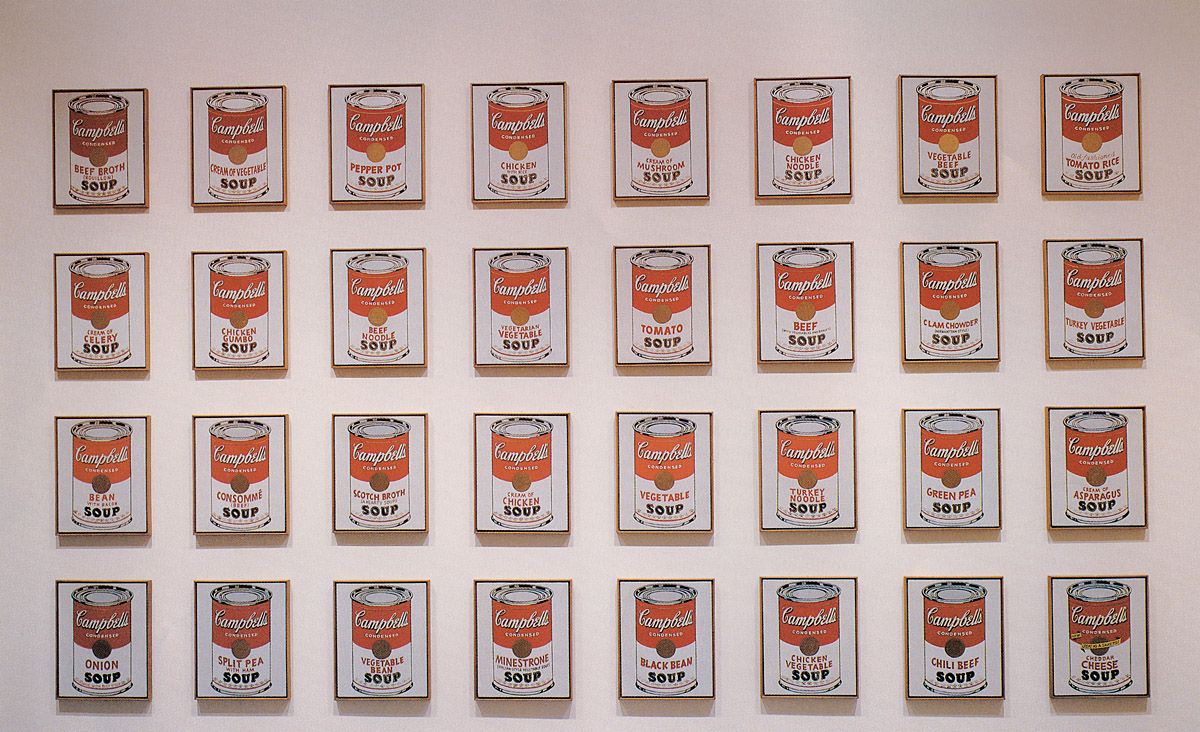
Andy Warhol, 32 Soup Cans, 1961-62. Synthetic polymer paint on thirty-two canvases, each 50.8 x 40.6 cm. The National Gallery of Art, Washington, D.C.
Andy Warhol was born Andrew Warhola in Pittsburgh in 1928. After studying art at the Carnegie Institute of Technology there, in 1949 he moved to New York City where he rapidly built up a highly successful practise as a commercial illustrator, winning many top awards in the process (and dropping the final letter of his surname when doing so).
By 1960 Warhol wanted to be a famous painter, and he spent a couple of years desperately trying out different approaches, none of which proved successful.
As a result, he became very depressed. Finally, one evening in December 1961 he made his aesthetic breakthrough when an interior decorator friend, Muriel Latow, sold him just what he needed:
…Andy said, “I’ve got to do something that really will have a lot of impact, that will be different enough from Lichtenstein and Rosenquist, that will be very personal, that won’t look like I’m doing exactly what they’re doing….I don’t know what to do. So, Muriel, you’ve got fabulous ideas. Can’t you give me an idea?” And Muriel said, “Yes, but it’s going to cost you money.” So Andy said, “How much?” She said, “Fifty dollars….get your checkbook and write me a check for fifty dollars.” And Andy ran and got his checkbook, like, you know, he was really crazy and he wrote out the check. He said, “All right, give me a fabulous idea.” And so Muriel said, “…you’ve got to find something that’s recognizable to almost everybody. Something that you see every day that everybody would recognize. Something like a can of Campbell’s Soup.” So Andy said, “Oh, that sounds fabulous.” So, the next day Andy went out to the supermarket (because we all went by the next day), and we came in, and he had a case of… all the soups. So that’s how [he obtained] the idea of the…Soup paintings.
As Latow was well aware, Warhol had lunched on soup and crackers every day for over twenty years, and her idea therefore took root in extremely fertile ground. Warhol immediately set to work upon this set of 32 small canvases featuring all the different varieties of Campbell’s Soup, and it proved to be the seminal work in his oeuvre. With their flat, frontal presentation and devotion to a single object the pictures owe much to Jasper Johns’s Flag paintings, which Warhol had greatly admired in 1958.
The deadpan arrangement of the images enforces a rigid disconnection from emotion, whilst their number and machine-like appearance parallels the industrial processes that had brought the original cans into existence. Ultimately the set of canvases addresses mass-culture, for as Warhol would state more generally about his works in 1962:
I adore America and these are some comments on it. My [images are] a statement of the symbols of the harsh, impersonal products and brash materialistic objects on which America is built today. [They are] a projection of everything that can be bought and sold, the practical but impermanent symbols that sustain us.
Marisol, Love, 1962. Plaster and Coca-Cola bottle, 15.8 x 10.5 x 20.6 cm. The Museum of Modern Art, New York.
Marisol was born Marisol Escobar of Venezuelan parents in Paris in 1930. After studying at the École des Beaux-Arts and the Académie Julien in Paris, in 1960 she moved to New York where she continued her studies at the Hans Hofmann School and the Art Students League. Influenced by folk art, she began making sculptures in metal and wood, and first exhibited at the Leo Castelli Gallery in New York in 1958. From about 1960 onwards her work became more straightforwardly figurative, often representing people with sharply defined heads and other parts of the body; these effigies were frequently arranged in groups. In 1961 her work was shown in the influential ‘Art of Assemblage’ exhibition held at the Museum of Modern Art in New York, and important one-person shows later followed in New York, London, Rotterdam, Venice (the 1968 Biennale), Philadelphia and Worcester, Massachusetts. A show dedicated to her many portrait sculptures was held in Washington DC in 1991.
For all its simplicity this is one of the most immediate and wittiest sculptures of the entire Pop/Mass-Culture Art tradition. As well as commenting upon the enthusiastic intake of a beverage that has come to symbolise consumer culture, it also tellingly points up the inherent sexuality of objects and the fetishisation of those artefacts that underlies our society.
Roy Lichtenstein, Blam, 1962. Oil on canvas, 170 x 200 cm. Yale University Art Gallery, gift of Richard Brown Baker, Yale, New Haven.
When this picture was painted the Cold War was still in full flow, with the conflict in Indochina just beginning to brew up again. The red star on one wing of this MIG-15 fighter identifies it as a communist airplane, and thus for many Americans an eminently sensible target for destruction. Lichtenstein was certainly not undermining any prevailing political attitudes here.
The detailing and modelling of the aircraft, the curvilinear shape made by the ejecting pilot, the path of the rocket and the forms created by the explosion are immensely more sophisticated than they would be in any comic-strip rendering. Flat-patterned shapes and steady rows of imitation Benday dots divest the proceedings of any emotionalism, and that distancing seems ironically at odds with the explosive nature of the subject.
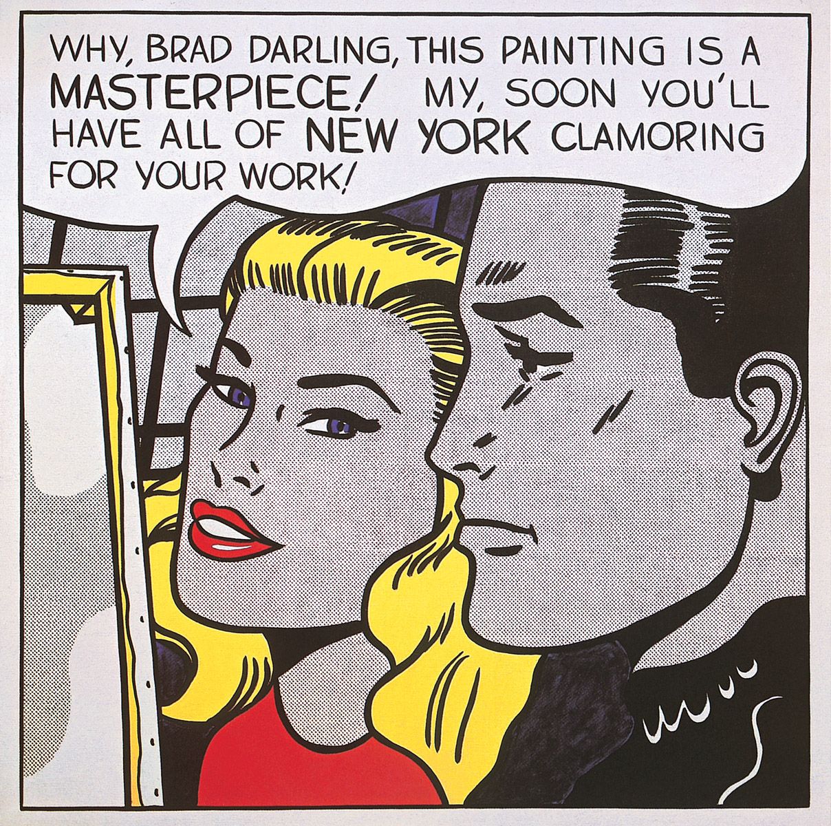
Roy Lichtenstein, Masterpiece, 1962. Oil and magna on canvas, 137.2 x 137.2 cm. Agnes Gund collection, New York.
Stereotypical male and female glamour goes hand-in-hand with art and fame here, as Lichtenstein wittily sends up the preoccupations of the glitzy New York art world. He could, of course, afford to be sardonic, for his career was on the ascendant by 1962. Again, clean design and ordered rows of replicated Benday dots add greatly to the sophistication of the image.
Mimmo Rotella was born in Catanzaro, Calabria, Italy, in 1918. After studying art in Naples during the Second World War he moved to Rome, where he held his first one-man show at the Galleria Chiurazzi in 1951. In 1951-2 he studied at the University of Kansas City. He was one of the founding members of the Nouveaux Réalistes group in Paris in 1961. With Alain Jacquet (whose work is discussed below), Rotella was also one of the founders of ‘MEC Art’ in 1963. This involved the projection of images originally reproduced in newspapers on to photo-sensitised canvases, and incorporations of mass-media typography. In the 1980s Rotella returned to painting.
Among Rotella’s various explorations of material drawn from popular mass-culture are assemblages of junk, created in 1961-2. However, his most original contribution to the Pop/Mass-Culture Art tradition has been his décollages or posters torn down and mounted on canvas, of which the work seen here is a good example. As Rotella has commented, ‘Tearing posters down from the walls is the only recourse, the only protest against a society that has lost its taste for change and shocking transformations’.
In Marilyn, of course, Rotella both mounted such an attack and obtained the maximum mileage out of what he purported to vilify, for whatever else Marilyn Monroe may have signified, she never symbolised a hidebound society.
Jim Dine, Five Feet of Colorful Tools, 1962. Oil on unprimed canvas surmounted by board with 32 painted tools on hooks, overall 141.2 x 152.9 x 11 cm. The Museum of Modern Art, New York.
Jim Dine was born in Cincinnati, Ohio, in 1935. Between 1951 and 1958 he studied successively at the Art Academy of Cincinnati, the Boston Museum School, and Ohio University. He held his first one-man show at the Reuben Gallery in New York in 1960. Along with Claes Oldenburg and others, Dine was in the forefront of the Happenings events of the late-1950s. He incorporated real objects in his works from the late-1950s onwards.
When presented with a wall of familiar household tools, all painted or sprayed with bright colours, as seen here, it is easy to comprehend why Dine initially became identified with Pop Art. A picture like this readily suggests an affinity with the industrial culture that produced such artefacts. However, that identification did not exist, as Dine emphasised in 1966 when he characterised two of the essential traits of Pop/Mass-Culture Art:
I’m not a Pop artist. I’m not part of the movement because I’m too subjective. Pop is concerned with exteriors. I’m concerned with interiors. When I use objects, I see them as a vocabulary of feelings. I can spend a lot of time with objects, and they leave me as satisfied as a good meal. I don’t think Pop artists feel that way. Their work just isn’t autobiographical enough. I think it’s important to be autobiographical. What I try to do in my work is explore myself in physical terms – to explain something in terms of my own sensibilities.
To the latter end Dine would utilise objects that would include men’s suits, dressing-gowns and artists’ palettes, often enhancing them with the gestural brushwork normally encountered in Abstract Expressionist painting. The results can seem very contemporary in feeling but they have nothing to do with Pop/Mass-Culture Art.
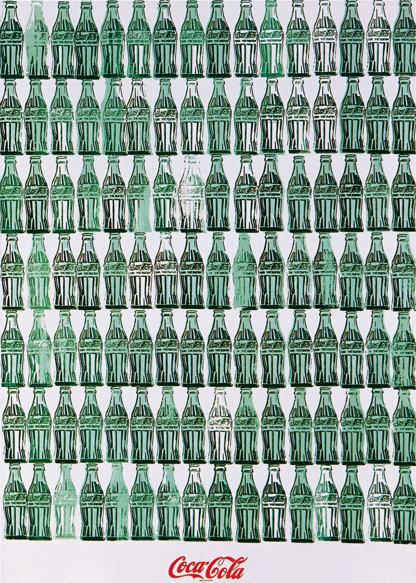
Andy Warhol, Green Coca-Cola Bottles, 1962. Silkscreen ink on synthetic polymer paint on canvas, 211 x 144.8 cm. Whitney Museum of American Art, New York.
Another icon of mass-culture, American identity and industrial production was here represented dispassionately and in strict ranks in order to emphasise the mechanical repetitiousness that had originally created the bottles. Moreover, the picture simultaneously touches upon democratic access, for as Warhol would explain in 1975:
…America started the tradition where the richest consumers buy essentially the same things as the poorest. You can be watching TV and see Coca-Cola, and you can know that the President drinks Coke, Liz Taylor drinks Coke, and just think, you can drink Coke, too. A Coke is a Coke and no amount of money can get you a better Coke than the one the bum on the corner is drinking. All the Cokes are the same and all the Cokes are good.
This was one of Warhol’s first silkscreened canvases, employing a process that removed much of the laboriousness of painting repetitious imagery (details of the procedure are given in the introductory essay). When producing images in this way, Warhol would actually build things up in reverse: first he would underpaint the background and individual colour areas constituting, say, the green of the bottles, before finally overprinting the silkscreened image of the Coke bottle itself. (Sheets of transparent acetate printed with the final image of a Coke bottle were temporarily laid down over the painting at each stage of its creation as an interim means of ensuring the precise alignment of the various levels of the picture.) In this instance Warhol first underpainted areas of green to denote the drink within the bottles, while leaving other areas blank so as to make the subsequently overpainted bottles appear empty. These variations create a subtle visual rhythm.
Rather than use photographs of Coke bottles for the present canvas, Warhol employed a graphic style to draw a few bottles on to a silkscreen by hand. He then moved the silkscreen along the constituent rows. The graphic shorthand employed for the bottles imbues them with a subjectivity that slightly offsets the sterile mechanisation projected by so much repetition.
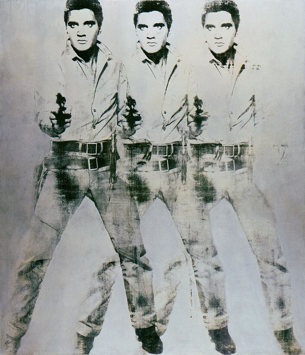
Andy Warhol, Triple Elvis, 1962. Silkscreen ink on aluminium paint on canvas, 208.3 x 152.4 cm. Virginia Museum of Fine Arts, Richmond, Virginia.
A publicity still made for the 1960 film Flaming Star provided Warhol with this image of Elvis Presley. Originally the painter created a large number of the Elvises on a single roll of canvas which he took with him to Los Angeles in September 1963 for his second one-man show there. On his arrival at the Ferus Gallery he asked its director, Irving Blum, to cut the roll into conventional sizes for stretching on to wooden supports, and told him, “The only thing I really want is that they should be hung edge to edge, densely – around the gallery. So long as you can manage that, do the best you can.” In the event Blum left space around each painting, although the hang still looked fairly crowded. It was complemented by twelve pictures of Liz Taylor hung in an adjacent room.
Gerard Malanga was Warhol’s painting assistant when the Elvises were created, and he claimed to have been responsible for the overlapping, multiple imaging in these paintings, saying that he “…deliberately moved the image over to create a jump effect”, which Warhol liked. By heightening the inherent abstraction of the forms, such multiplicity prevents the images from merely operating on an informational level. Naturally that multiplicity also calls forth associations of the inherent repetitiousness of cinematography, with its twenty-four frames per second. Moreover, the aluminium paint employed for the background looks silvery, and thereby introduces equally appropriate reminders of the silver screen.
Andy Warhol, Gold Marilyn, 1962. Silkscreen ink on synthetic polymer paint on canvas, 211.4 x 144.7 cm. The Museum of Modern Art, New York.
Warhol was prompted to embark upon his series of paintings of Marilyn Monroe by news of her suicide on 4 August 1962. For his representations of the actress he used a photograph taken in 1953 by Gene Kornman to publicise the film Niagara. In Warhol’s images of Marilyn Monroe, Elvis Presley and similar ‘superstars’ (a word he invented), he made apparent his realisation that more and more people today now live in a globalised culture in which traditional icons – of the Virgin Mary, the saints, great kings and dictators – are all being gradually replaced by icons of mass-media fame, especially by the young.
If in recent times Marilyn Monroe perhaps represented the supreme symbol of western male notions of womanhood and sexuality, then Andy Warhol’s Gold Marilyn is surely the supreme artistic icon of that mythology, for because of its golden background, this picture comes closer to looking like a religious icon than most of the painter’s other iconic images. Ultimately, Warhol developed the picture from the Flags paintings of Jasper Johns, although he engaged different ideas and associations in the work. The canvas was included in Warhol’s first New York exhibition mounted in November 1962.
Marilyn Monroe’s peroxide hairdo, coloured eyelids, lips, facial-skin area and shirt collar are each separately and luridly heightened in colour in order to stress the garishness of glamour. By surrounding the actress’s head with a large area of gold paint, Warhol introduced unmistakeable associations of wealth and economic value that remind us most appropriately that Marilyn Monroe was at the cutting edge of a vast and highly exploitative financial operation, as are all successful media superstars.
Andy Warhol, Marilyn Diptych, 1962. Silkscreen ink on synthetic polymer paint on two canvases, each 208.3 x 144.8 cm. Tate Gallery, London.
This is perhaps the most commemorative of all Warhol’s Marilyn pictures, and it too was included in the artist’s New York debut exhibition in 1962.
The areas of bright colour on the left effectively stress the garishness of Marilyn Monroe’s media personality. Any slight tonal variations in the heads lend variety to the proceedings without diminishing the sense of general repetitiveness that bears its usual implications of mass-communications-media repetition. However, the profoundly commemorative meaning of this painting resides in the contrast between its two halves.
On the left, clean colours and the accurate registration of the individual silkscreened images project the late Marilyn Monroe’s bright and attractive public persona. On the right, uneven inking, smeariness and tones that diminish in intensity clearly denote the unstable, emotionally messy and waning powers of an actress whose life tragically ended in suicide. Marilyn seems to fade before our very eyes. The notion that Warhol was not a serious artist, with a profound sense of metaphor, is utterly belied by this marvellous work.
Wayne Thiebaud, Salads, Sandwiches and Desserts, 1962. Oil on canvas, 139.7 x 182.9 cm. Nebraska Art Association, Thomas C. Woods Fund, Lincoln, Nebraska. Art © 2006 Wayne Thiebaud/ Licensed by VAGA, New York, NY
Wayne Thiebaud was born in Mesa, Arizona in 1920. Initially he worked as a commercial artist, illustrator, designer, cartoonist and publicity manager in New York and Hollywood. Between 1942 and 1945 he served in the US Army Air Force, following which he studied between 1949 and 1953 at various art schools in California. He held his first one-man show in Sacramento, California, in 1953.
Over the next three years he made educational films, for which he won a prize in 1961. Between 1951 and 1976 he taught at art schools in California. A major survey of his work was mounted at the Walker Art Center, Minneapolis in 1981.
Like Warhol, Thiebaud also responded to the banality, replication and repetition inherent to mass-culture, although unlike the former he devoted his attention mostly to commonplace objects and food, as here. The multiplicity of what is projected both comments culturally and pushes the imagery towards abstraction through the sheer repetitiousness of shapes and colours, just as it does in Warhol’s work. Until fairly recently Thiebaud employed strident colours, quite evidently to bring out the falsity inherent to his subjects, especially artificial food colourings. All the objects depicted are located within a traditional recessional space, and they are invariably painted with a thick, creamy pigment whose sensuality transfers associatively to the subjects, making them seem truly tempting and luscious.
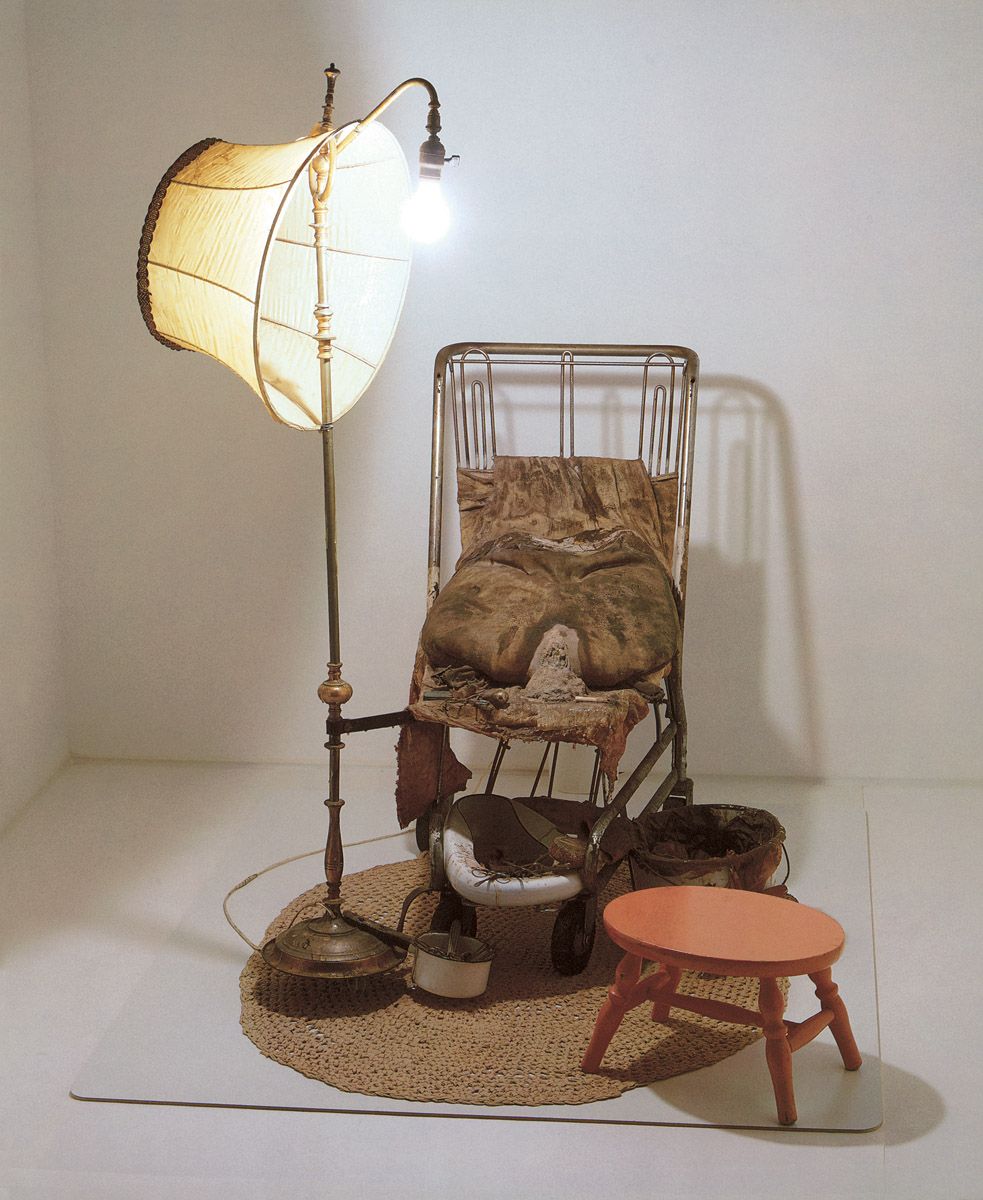
Ed Kienholz, The Illegal Operation, 1962. Polyester resin, paint, shopping cart, furniture, concrete, lamp, cloth, bedpan and medical implements, 149.9 x 121.9 x 137.2 cm. Betty and Monte Factor Family collection.
Ed Kienholz was born in Fairfield, Washington in 1927. He received very little higher education and no proper art training. Instead, he spent his formative years working at a variety of jobs, including nursing in a psychiatric hospital, managing a dance band, selling used cars, acting as a general handyman, decorator, caterer and vacuum-cleaner salesman, and even becoming the part-owner of the cutting-edge Ferus Gallery in Los Angeles (where, under subsequent ownership, Andy Warhol would first exhibit his seminal group of 40 Campbell’s Soup paintings in 1962 – see above). Kienholz took up sculpture in 1954, initially making wood reliefs. His breakthrough work, Roxy’s of 1961-2 (1, 2, 3, 4, 5), is briefly discussed in the introductory essay above; it caused a sensation at the Dokumenta exhibition at Kassel, Germany, in 1968. In 1972 Kienholz met Nancy Reddin, whom he later took as his fifth wife and with whom he collaborated on all his subsequent ensembles. Retrospectives of his work were held in Los Angeles in 1966, a show that generated much outrage; in London in 1971; in Berlin and Paris in 1977; in New York, Los Angeles and Berlin in 1996-7; and in Newcastle and Sydney in 2005. He died in 1994.
From a shopping trolley emerges a piece of metal attached to a lamp, as though clinging to it for security. The lampshade is awry, obviously to reflect light on to what had recently taken place before it. On the trolley, filthy pillows prop up a fairly shapeless bag, at the base of which an opening seems to ooze a dried-up fluid. It is surely correct to interpret the bag, breach and flow as the body and blood of a woman who has suffered an abortion, especially as the gap very much resembles the dilated female orifice and is surrounded by various metal instruments that in reality might well have been used to terminate a life.
On the lower platform of the trolley is a squalid and filthy bedpan loaded with scissors and other sharp instruments; beneath it a saucepan is similarly filled with cutting tools. By the side of the trolley stands a bucket brimming with soiled rags, while before it a stool suggests the low seat employed by a back street abortionist to perform her gruesome business.
Clearly, Kienholz was not attacking abortion per se here; instead, he aimed his venom at the outlawing of abortion, which by 1962 had forced millions of women to resort to the subterfuge, dangerous and utterly unhygienic methods the sculpture projects (and indeed, still compels them to do so in many parts of the world).
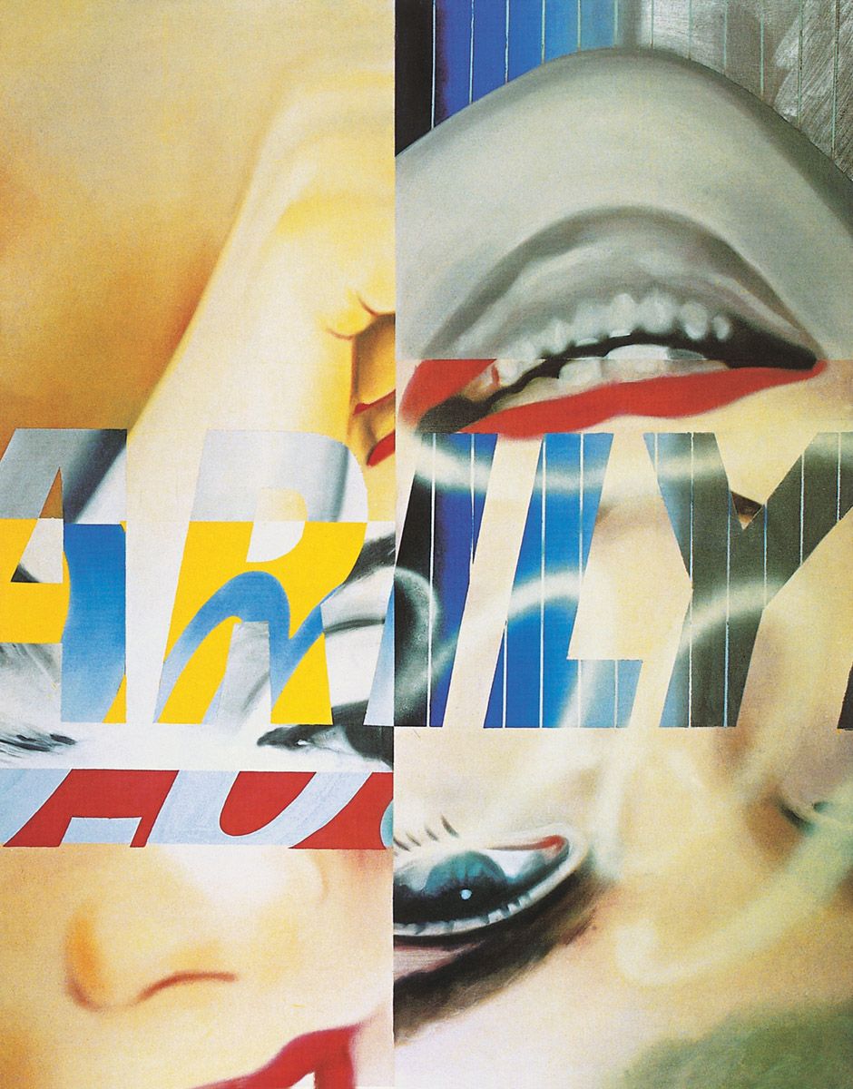
James Rosenquist, Marilyn Monroe I, 1962. Oil and spray enamel on canvas, 236.2 x 183.5 cm. The Museum of Modern Art, New York. Art © 2006 James Rosenquist/ Licensed by VAGA, New York, NY
Rosenquist’s tendency to abstract from reality is apparent here. Although Marilyn Monroe appears upside-down across the right-hand side of the canvas, the work hardly resembles a traditional portrait. Instead it signifies the actress more obliquely, for Rosenquist has projected the general if glossy fragmentation of imagery and language that is such a constant factor in the world today.
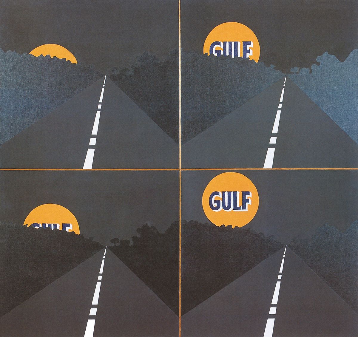
Allan D’Arcangelo, Full Moon, 1962. Acrylic on four canvases, each 60.9 x 60.9 cm. The Sidney and Francis Lewis collection, courtesy of The Virginia Museum of Fine Arts. Art © 2006 Estate of Allan D'Arcangelo/Licensed by VAGA, New York, NY
Allan D’Arcangelo was born in Buffalo, New York in 1930. He studied at the University of Buffalo between 1948 and 1953, and then for a further year in New York City. Between 1957 and 1959 he also spent two years studying in Mexico City, where he held his first one-man show in 1958. His first US exhibition was mounted at Long Island University in 1961. Since then he has exhibited many times throughout America, as well as in Brazil, Germany and Holland.
In the early 1960s D’Arcangelo not only painted pictures of media personalities but also turned his attention to a new social and cultural development which eventually became his major preoccupation. From the mid-1950s onwards, and partly in response to the Cold War, the United States had begun an enormous road-building programme. Moreover, post-war prosperity had equally engendered a car culture that gradually transformed the look of America by creating a massive amount of building development which often filled roadside strips with a seemingly endless confusion of gas stations, motels, chain restaurants, street lights, advertising billboards, road-signs and the like.
All this proved grist to D’Arcangelo’s mill, as here. The highway stretches away endlessly in each of these sequential images. At the top-left we might think we are seeing a moonrise, given the partially-masked disc with its orange colour. However, in the next canvas we begin to learn that the landscape is dominated by a manmade orb which, in the following pictures, fully sheds light and consumer identity upon the world. D’Arcangelo may have created a simple pictorial statement in this work, but culturally he was very prescient.
Michael Andrews was born in Norwich, Norfolk, England, in 1928. He studied at the local art school and then, after his compulsory military service, at the Slade School of Art, London, between 1949 and 1953. Upon graduation he was awarded two important scholarships, one of which enabled him to work in Rome. His paintings were already in demand by that time, and he held his first one-man exhibition at the Beaux-Arts Gallery in London in 1958. Francis Bacon, who was a friend and drinking-companion, once called him Britain’s most interesting young artist. A major retrospective of his work was held in London in 1980-1. He died in 1995.
The falsity of a Hollywood glitzy and glamorous view of the world is the subject of this work, as it is of a number of pictures Andrews produced during the early-to-mid 1960s. The painting took its title from Norman Mailer’s 1955 novel The Deer Park which not only explores the troubled politics of McCarthyite America in the early 1950s but also the Hollywood highlife and its sexuality, including homosexuality (one critic in 1955 called the book, “The year’s worst snake pit in fiction”). Another stimulus for the painting may have been Federico Fellini’s 1960 film La Dolce Vita (‘The Sweet Life’) which similarly projects the amoral, hedonistic and shallow existence of the international jet set.
Some of the visual imagery of the painting derived from observations made in a Soho drinking dive, the Colony Club, where both Andrews and Bacon hung out, along with many other likeminded nihilists, bohemians and culture-lovers. In the centre the French symbolist poet Arthur Rimbaud (1854-91) typifies that unruly lifestyle.
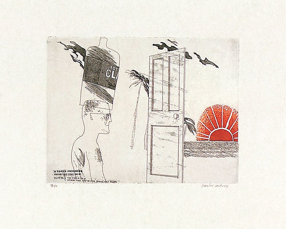
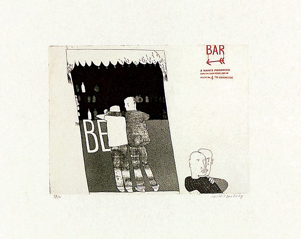
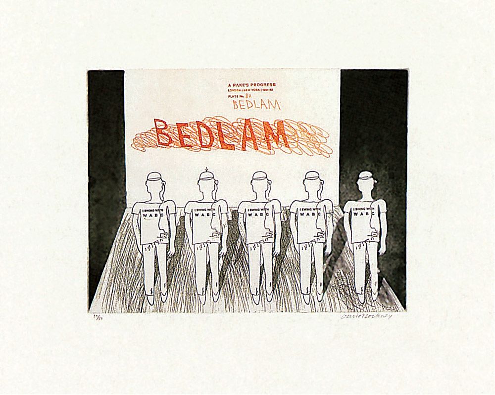
David Hockney, From ‘The Rake’s Progress’ series of etchings, 1961-63. Etchings, 30.5 x 40.6 cm. The Royal College of Art, London.
These are four of the designs in a series of sixteen etchings that Hockney began when studying at the Royal College of Art in 1961. He embarked upon the project because, being somewhat impoverished, he ascertained that students working in the printmaking department received their materials for nothing. In many ways The Rake’s Progress series of etchings is the key to the first phase of Hockney’s artistic maturity, for in these designs he perfected the approach to space and figuration that would inform his work in oil and acrylic contemporaneously. The set is a reworking of the famous series of paintings and prints by William Hogarth dating from 1735, in which a rake progresses from wealth obtained through loveless marriage, to debauchery, madness and death.
Hockney’s Rake’s Progress is almost unique within the Pop/Mass-Culture Art tradition, for it explores contemporary society in a narrative way, and often touches upon aspects of mass-behaviour, as here. It is mainly set in New York, which the artist first visited in 1961. In the first etching we see the rake – who looks like Hockney somewhat – arrive in a city with skyscrapers, one of which strongly resembles the Empire State Building. In the subsequent prints the rake receives his inheritance, meets the good people of Washington DC, attends a gospel meeting in Manhattan, embarks upon a spending spree, is reminded of his physical puniness in a send-up of a Charles Atlas advertisement, goes drinking in gay bars (above), marries an old maid (presumably for her money), witnesses an election campaign, visits a cinema showing the 1958 film The Defiant Ones starring Tony Curtis and Sidney Poitier, visits a Harlem funeral parlour (in an image adapted from a Cecil Beaton photograph), begins to run out of money and to disintegrate psychologically, is cast aside socially, and finally ends up in a psychiatric ward. That is the final scene illustrated here, with the nickname given to the Bethlehem mental hospital in Hogarth’s eighteenth century London written on the wall. Unlike the earlier painter’s inmates however (who range around a mad ward in varying states of lunacy), Hockney’s psychiatric patients are stood in a line and kept mindlessly docile by being forced to listen through earpieces to endless pop music being broadcast by the radio station WABC.
In 1975 Hockney would return to the subject of The Rake’s Progress by designing sets and costumes for the opera of that name written by Stravinsky to a libretto by W.H. Auden.
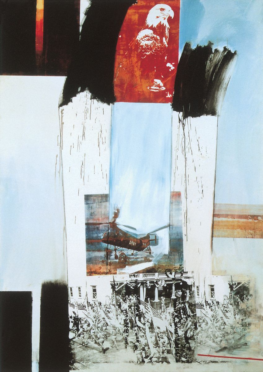
Robert Rauschenberg, Kite, 1963. Oil and silkscreen on canvas, 213.3 x 152.4 cm. Ileana and Michael Sonnabend collection. Art © 2006 Robert Rauschenberg/ Licensed by VAGA, New York, NY
The Cuban missile crisis, which brought the world to the very brink of nuclear catastrophe, occurred not long before Rauschenberg painted this picture, and the United States was also militarily engaged elsewhere by 1963. With its American bald eagle, US Army helicopter and battle scene from the 1939 film Gone with the Wind, the picture brings together images associated with both patriotism and conflict. Such links were very prescient, for as the 1960s progressed the United States would become increasingly bogged down in Vietnam, with its domestic, political and social structures progressively coming under strain as a result. The dynamic paintwork and plenitude of spatters augment a pictorial restlessness that fully projects the instability of the day.
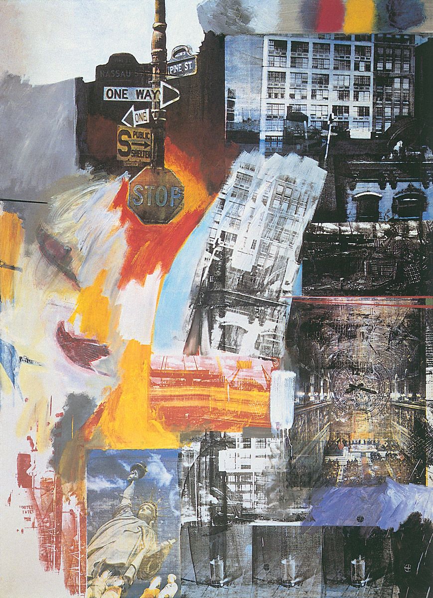
Robert Rauschenberg, Estate, 1963. Oil and silkscreen on canvas, 243.2 x 177.1 cm. Philadelphia Museum of Art, Philadelphia. Art © 2006 Robert Rauschenberg/ Licensed by VAGA, New York, NY
As noted in the introductory essay, Rauschenberg discovered the expressive potentialities of photographic silkscreen printing in 1962, after Andy Warhol’s studio assistant had suggested it would prove a helpful technique for his employer. For Rauschenberg it opened up a new, more direct and faster way of operating ‘between art and life’, which was one of his stated objectives. It also helped him impart a greater overall cohesion to his images, for the photos act as fairly stable visual building blocks amid the welter of gestural brushwork, which Rauschenberg carried over from Abstract Expressionism to impart dynamism to his pictures.
At the upper-left a confusion of street signs typifies the muddle of urban life. The signs themselves had originally been erected on the corner of Pine and Nassau Streets in lower Manhattan during the construction of the Chase Manhattan bank complex. Also apparent are five entire or cropped photos of a 1940s six-storey warehouse that stood at 123 Front Street; in the one appearing at the top-right we can also see part of the East River beyond it. Details of other buildings are also incorporated to enhance the sense of urban jumble. On the left, three images of birds appear sideways and are overpainted to varying degrees; perhaps they are intended to suggest that nature is being crowded out by the city. Across the lower part of the picture appear images of a rocket and the Statue of Liberty, possibly to suggest America more generally. To their right, a repeated image of a glass of water might allude to the containment of water that proves essential to city life. Just above the glasses can be seen a general view of the Sistine Chapel in Rome, with a clock face superimposed over it. Naturally, it is difficult to make out Michelangelo’s ceiling and wall frescoes through all this but the inclusion of such an image might have been intended to signify that religion and the great art of the past are gradually being drowned out by time, by the speed and confusion of contemporary life, and by the constant urban development of modern cities, as specified by the title of the painting.
Roy Lichtenstein, Torpedo… Los!, 1963. Oil on canvas, 172.7 x 203.2 cm. Collection of Mrs Robert B. Mayer, her son, Robert N. Mayer and her daughter, Ruth M. Mayer.
The original cartoon image from which Lichtenstein developed this design had appeared in a comic-book entitled Battle of the Ghost Ships!. This related how a Second World War German U-boat had repeatedly torpedoed the same ship without any effect other than to drive the submarine skipper crazy.
Among the more significant alterations Lichtenstein made to the original was to delete all but two words from the original speech-bubble; to move the scar from the captain’s nose to his cheek, so as to make it more readily apparent; to change the eye by which the officer peers through the periscope; and to open the man’s mouth and thus make him seem more aggressive. Additionally, Lichtenstein added various bits of paraphernalia to the submarine’s interior, to augment our sense of the mechanical complexity of the ship. The overall effect of all these changes is to intensify the sense of threat posed by the image although, paradoxically, that menace is counterbalanced by the extreme detachment with which the work is painted.
In works such as Hopeless Lichtenstein operates in the space between sophistication and the lack of it by affording us a culturally condescending perspective of a young girl’s emotional responses. By emulating a technique of mechanical reproduction he also reminds us of the magazines through which adolescent emotions are often laid bare. In the context of the original comic-strip story, those feelings may have appeared genuine; taken out of context and physically enlarged they seem overwrought, sentimental and facile. By this simple but effective means Lichtenstein projects the general debasement of authentic feeling in the contemporary world.
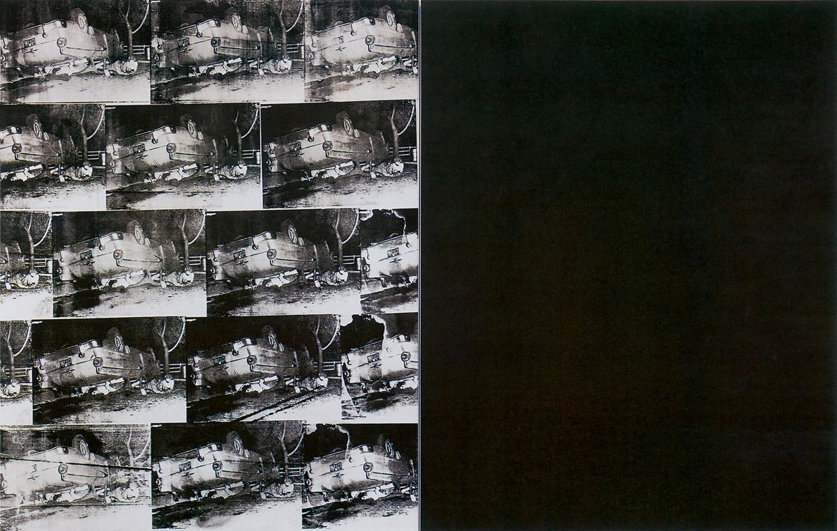
Andy Warhol, Five Deaths Seventeen Times in Black and White, 1963. Silkscreen ink on synthetic polymer paint on two canvases, each 262 x 209 cm. Oeffentliche Kunstsammlung, Kunstmuseum, Basel.
Warhol obtained the photographs he used for his many car-crash canvases from police and press sources; these organisations held the pictures back because they were deemed too horrific to be viewed publicly. Initially he may have obtained the idea of dealing with smashed cars from a sculpture entitled Jackpot by the American, John Chamberlain, which he had purchased in 1961. The piece comprises the crushed body of an automobile painted in factory colours.
Through its monochromatic starkness, this is one of the most visually powerful of all of Warhol’s car-crash pictures. It certainly justifies Julian Schnabel’s claim that Warhol “…presented the horror of our time with the thoroughness of Goya in his time.” As in other Warhol paintings, visual repetition confuses the eye and thereby augments the inherent abstraction of the image. That repetitiveness also reminds us that death is everywhere. The uneven inking enforces subtle differences between the individual images, thus lending visual variety to the work. But ultimately the imaginative power of the picture resides in the relationship between its two distinct halves.
Warhol attached identically-sized and identically-coloured but wholly monochromatic canvases devoid of all imagery to many of the paintings he produced during the early 1960s. On different occasions he claimed that such couplings gave purchasers twice as much art for their money, or that he was defrauding those buyers by getting them to pay for partially empty images, or that the blanks emulated the near-empty canvases of the abstract artist, Ellsworth Kelly, one of which he owned. But clearly there was another, more serious reason for such pairings, namely the expression of negation.
Blankness does not necessarily lack meaning, for it can easily signify vacancy or the absence of something. Given that in many of his works Warhol expressed his sense of anomie or utter alienation from life, it is clear that in his paired disaster paintings he employed large blank areas of adjacent colour or tone to suggest negation and nothingness. Such a cosmic emptiness is surely the lot of the dead victims on the left.
James Rosenquist, Painting for the American Negro, 1962-63. Oil on canvas, 203 x 533.5 cm. National Gallery of Canada, Ottawa. Art © 2006 James Rosenquist/ Licensed by VAGA, New York, NY
At the time this work was created, full civil rights and the true economic and cultural emancipation of American blacks were being urgently demanded across the United States. In his customary fashion, Rosenquist avoided tackling this major social issue head on. Instead he created a fragmented, allusive addressal of the subject, with a white figure balanced in a crouching position upon the head of a black youth at the top-left, the inverted legs of both black and white basketball players at the lower-left, and part of the head of a black male represented in red monochrome towards the right. All the other images – the car in green monochrome, the slice of cake, the couple about to kiss, the adjacent head of a baby, the computer-card punch holes, the horse’s head and the spectacles – merely imply the behaviour, creatures and artefacts that help form the American Dream.
Yet Rosenquist did subtly inject one small but significant reference to the race issue here, for just behind the neck of the head with parted lips towards the left of centre, he painted a small, circular dial. Lettering next to it implies or reads ‘DARKEN’, ‘NORMAL’ and ‘LIGHTEN’, as though skin colour could be altered just by turning a dial. Undoubtedly, many Americans would have loved such an easy means of avoiding racial conflict in 1963 but fortunately for human diversity things are not that simple.
Andy Warhol, Ethel Scull 36 Times, 1963. Silkscreen ink on synthetic polymer paint on thirty-six canvases, 202.6 x 363.2 cm overall. Whitney Museum of American Art, New York.
Robert Scull, a New York taxi-fleet owner who was one of the most prominent collectors of new art in the early 1960s ordered and paid for this work, which was Warhol’s first commissioned silkscreen portrait.
Here the artist’s customary habit of dealing directly with reality paid off handsomely. Knowing that Warhol wanted to use photographs for her portrait, Ethel Scull imagined that he would ask a photographer of the stature of Richard Avedon to take such pictures. Accordingly she dolled herself up in an Yves St Laurent suit for the photographic session. However, Warhol took her instead to a group of 42nd Street photo-booth machines that he fed with small change; as the sitter later related:
He said, “Just watch the red light,” and I froze. I watched the red light and never did anything. So Andy would come in and poke me and make me do all kinds of things, and I relaxed finally. I think the whole place…thought they had two nuts there. We were running from one booth to another, and he took all these pictures, and they were drying all over the place.
Subsequently Warhol selected seventeen of the photographs for the portrait, in which some of them appear several times. He then photo-silkscreened the pictures onto the individual panels which he finally brought together to form one work in the Scull’s Fifth Avenue apartment.
The novel result of Warhol’s approach was that effectively Ethel Scull portrayed herself, and did so in the round, for by finally posing unselfconsciously she revealed facets of her personality that would normally be hidden by more conventional approaches. She herself liked the work, stating that, “It was a portrait of being alive and not like those candy box things, which I detest, and never ever wanted as a portrait of myself.”
Andy Warhol, Mona Lisa, 1963. Silkscreen ink on synthetic polymer paint on canvas, 319.4 x 208.6 cm. Blum Helman Gallery, New York.
The Mona Lisa by Leonardo da Vinci (Louvre, Paris) is certainly the world’s most famous artistic icon. For that reason it has long acted as a target for anyone wanting to attack traditional cultural values. Perhaps the most infamous of these assaults is Marcel Duchamp’s L.H.O.O.Q of 1919, in which a moustache and goatee were added to a reproduction of the painting; when uttered phonetically in French, the title of the work enacts a pun which can be translated as ‘She sure has a hot arse’. Warhol undoubtedly knew the Duchamp.
In February 1963 da Vinci’s painting was lent for a month to the Metropolitan Museum of Art, New York. The tremendous media hullabaloo sparked off by the loan motivated Warhol to produce a number of large-scale paintings which recycled the image. As a means of mirroring the endlessly repetitive cultural treatment that was being meted out to the Mona Lisa, Warhol emphasised replication in those works, and even entitled one of them Thirty Are Better Than One (private collection), a wry comment on the popular equation of artistic and economic value with multiplicity. In the version reproduced here, he dealt with the reproduction of the work of art by the print media, and specifically by colour printing.
Colour reproductions are composed of three primary colours: cyan, a sharp sky-blue; magenta, a deep red; and yellow, plus black and white, all of which are visible here. The disorganised array of Mona Lisa reproductions makes the overall image look exactly like a colour printer’s rough proof sheet. These are single sheets of paper that printers use again and again for testing the quality of their work when they do not want to waste multiple pieces of paper. Naturally those sheets contain large numbers of arbitrary overprintings. Warhol must have seen such rough proofs many times during his commercial art career, which is clearly why he emulated them here.
Andy Warhol, Blue Electric Chair, 1963. Silkscreen ink on synthetic polymer paint on two canvases, each 266.7 x 203.8 cm. Saatchi collection, London.
Death by electrocution was being strongly debated in New York State in 1963, for it was used for the last two times in Sing Sing prison in March and August of that year. Warhol was clearly inspired by that controversy to make a set of Electric Chair images. In some of them he superimposed the black, silkscreened images of the chair over areas of attractive colour, thereby creating an ironic juxtaposition of horror and prettiness, a linkage he probably regarded as a metaphor for life itself. In other versions he silkscreened the chair over extremely polarised colours that carry unmistakeable associations of the effects of high-energy electrical discharges upon photographic emulsions.
The vivid blue of the present work was surely intended to suggest the colour given off by a powerful electrical discharge. Certainly the repeated chairs serve to remind us of the long series of executions the piece of furniture had effected. And once again a complementary void on the right clearly communicates the emptiness of death itself.
Andy Warhol, Atomic Bomb, c. 1963. Silkscreen ink on synthetic polymer paint on canvas, 264.1 x 204.5 cm. Saatchi collection, London.
This painting has usually been dated to 1965, but it seems likely it was created earlier. As Warhol celebrated his birthday on 6 August, he had every reason to be aware of atomic explosions, for it was on his seventeenth such celebration that the very first atomic bomb had been dropped on Hiroshima on 6 August 1945.
Despite Warhol’s disclaimers to have expressed any meanings in his works, this painting indubitably demonstrates that he did want his imagery to say something about the world. The garish red colour (which bears connotations of fire) and the gradual blackening of the image so that it ends in total darkness at the lower right, together create an outstandingly inventive metaphor for the fiery annihilation rapidly brought about by atomic explosion.
Claes Oldenburg, French Fries and Ketchup, 1963. Vinyl and kapok, 26.6 x 106.6 x 111.7 cm. Whitney Museum of American Art, New York.
Claes Oldenburg was born in Stockholm, Sweden, in 1929 but he was taken to the United States the following year when his father was appointed a Swedish Consul-General there. Initially Oldenburg lived in New York City and Rye, New York, and then mostly in Chicago between 1936 and 1956. Since the latter date he has lived almost continuously in New York City. Between 1946 and 1950 he studied at Yale University, and between 1950 and 1954 at the Art Institute of Chicago. His early works were influenced by Abstract Expressionism. After moving to New York in 1956 Oldenburg came into contact with the highly experimental artist Allan Kaprow, following whose example Oldenburg mounted a number of Happenings around 1958. He held his first one-man exhibition at the Judson Gallery in New York in 1959. As touched on above, in 1961 and 1962 Oldenburg aped the marketing processes of capitalism by holding two exhibitions on the subject of retail stores, for the second of which he created his first batch of larger-than-life emulations of everyday consumer objects and foodstuffs. In 1976 he first worked with the Dutch artist and curator Coosje van Bruggen whom he married in 1977 and with whom he has collaborated on all subsequent projects. Since 1964, major showings of his works have been held in Venice, Kassel, New York, Amsterdam, Stockholm, Tübingen, Cologne, Krefeld, Duisberg and London.
Oldenburg once stated, “I have always been fascinated by the values attached to size”, and the enhancement of normal dimensions has been a constant factor within his mature work, rendering the familiar unfamiliar and thus forcing us to question what we usually take for granted. Naturally, because of the sheer physical immensity of the United States and its grandiose political and materialistic aspirations, Oldenburg’s enlargements of common things have consistently paralleled a very deep vein within that nation’s psyche. And because of his conversion of familiar articles into other materials, he has always stressed the inherent formal qualities of both the items he replicated and of the representations themselves. Thus the work seen here not only portrays fried potatoes and tomato ketchup but equally it forces us to appreciate the shapes, colours and textures of the materials used for their denotation.
Oldenburg’s first mature works were usually made of canvas. This was often internally reinforced with wire armatures and filled with foam rubber or even cardboard boxes before being soaked in plaster and painted when dry; for an example see Floor Burger. Here, however, the artist used artificial fabrics to parallel and project the somewhat synthetic nature of fast food.
Claes Oldenburg, Soft Fur Good Humors, 1963. Fake fur filled with kapok, painted wood, four units, 48.2 x 24.1 x 5 cm. Roger I. Davidson collection.
In 1920 Harry Burt, a candy maker in Youngstown, Ohio, created a smooth chocolate coating for ice cream. Unfortunately the new combination was too messy to eat, but luckily for Burt his son came up with the clever idea of freezing a lollipop stick into the ice cream, thereby creating the world’s first such comestible. The resulting ice cream bars on sticks were named Good Humors and they were marketed by Burt by means of chauffeur-driven trucks which initially carried bells to attract customers. By 1963 the Good Humor Corporation owned and operated 200 such trucks throughout the United States. Oldenburg’s take on the various attractive flavours of Good Humor ice creams is seen here. By being converted into fake fur his Good Humors emphasise both the artificiality of much modern food and the equally false whetting of appetite commonly encountered in mass-culture.
It should be noted that in addition to chocolate and vanilla, and lemon and orange coatings to the ice creams, Oldenburg gives us tiger-skin and leopard-skin coverings too. This choice of outer casings may have been dictated by the types of artificial furs he was forced to work with, but it could equally allude to the sacrifice of rare animals to pleasure relatively affluent tastes. Such a message certainly remains very relevant today.


