IN THIS CHAPTER
 Discovering the painting tools
Traversing the panels and selecting colors
Painting the fine-art way with specialty tips and tools
Adding colors to artwork in other ways
Painting. The word evokes images of brushes and palettes and color being precisely applied to canvas. Or, perhaps, images of drop cloths, ladders, rollers, and buckets — color being slopped on a wall and spread around. It doesn’t generally bring to mind digital image editing. But painting certainly has a place in your arsenal of Photoshop skills, even if you never create an image from scratch.
In addition to painting landscapes and portraits (which you certainly can do in Photoshop, if you have the talent and training), you can use Photoshop’s painting tools for a variety of other tasks. For example, you can paint to create masks and layer masks, adjust tonality or sharpness in specific areas, repair blemishes and other damage in an image — even to create graphic elements and special effects.
In this chapter, I concentrate on those editing-related painting skills and give you a quick look at painting with the Mixer Brush tool and the airbrush and erodible brush tips (like a pencil that eventually needs sharpening). I introduce you to the basic concepts of painting in Photoshop and also walk you through the basic brush-related tools and the Brush and Brush Presets panels, concentrating on those features that you most likely need (as well as a few of the other, more artistic features). To wrap up the chapter, I give you a look at other ways to add areas of color to your images, including the very useful Gradient tool.
Discovering Photoshop’s Painting Tools
Nothing in Photoshop gives you more precise control of color in your image than using the Pencil tool with a 1-pixel brush. Remember that your image consists of a whole lot of little colored squares (pixels) and that the color of those individual squares is what produces the appearance of a tree or a sunset or even good ol’ Uncle Bob. If you zoom in really close on an image, you can paint pixel by pixel — you could even create an entire image, one pixel at a time! You are, however, much more likely to use the Brush tool with a much larger brush tip to add strokes of color, rather than working one pixel at a time.
As you work in Photoshop, you’ll also find many very important roles for the brush-using tools other than painting imagery. From touching up dust and scratches in a scan to removing distant power lines from a photo to perhaps adding wispy hairs to soften the outline of a head, you have lots of reasons to paint in Photoshop (many of which you can read about in Chapters 9 and 10). When you’re capable and confident using the Brush tool, you might even find it the best way to make selections in your image. Selections with the Brush tool? That’s right — painting in an alpha channel creates or refines a saved selection. (You can read about alpha channels in Chapter 8.) Photoshop even has a brush-using tool that you can use to make selections directly. The Quick Selection tool, like the Magic Wand, selects areas of similar color. However, instead of Shift+clicking in a variety of areas with the Magic Wand to add to your initial selection, you simply drag the Quick Selection tool. The brush diameter, selected on the Options bar, tells Photoshop the size of the area you want to search for similarly colored pixels.
In addition to the Quick Selection tool, you have 19 other tools that use brushes available in Photoshop. Here’s a quick look at the various capabilities of those tools:
- Painting tools: The Brush, Pencil, and Mixer Brush tools (all discussed a bit later and in more depth) add the selected foreground color to the active layer as you click or drag the tool.
- Eraser tools: These tools (also discussed in more depth in pages to come) can make areas of a layer transparent or can paint over pixels with the current background color (if the layer doesn’t support transparency).
- Healing tools: The Spot Healing Brush and Healing Brush are designed to repair texture, like smoothing wrinkles or adding the appearance of canvas. With the Healing Brush, you first designate a source point — an area from which you want to copy texture — by Option/Alt+clicking and you then drag the brush over the area targeted for repair. The Spot Healing Brush, on the other hand, automatically samples the texture around an area and makes the target area match its surroundings. With the Content-Aware option, this tool can better match the healed area to the surrounding image. Quite cool!
- Color Replacement tool: Nested with the Brush and Pencil, the Color Replacement tool replaces the color over which you drag with the foreground color. Remember that, by default, the Color Replacement tool alters only the color, not luminosity, so painting with black over pink gives you gray rather than black. From the Options bar, you can set the tool to change luminosity rather than color to darken or lighten, or choose to match hue or saturation.
-
Stamp tools: The Clone Stamp tool, unlike the Color Replacement tool or the Healing Brush, doesn’t copy an attribute (such as color or texture), but actually copies pixels. It’s like having copy/paste in a brush. Option/Alt+click a source area and then move the cursor and drag where you want to copy those pixels. It’s powerful! The Pattern Stamp tool paints with a selected pattern, using the blending mode and opacity that you designate on the Options bar. The Pattern Stamp tool is sometimes a good way to add texture selectively.
 When working with the Clone Stamp tool and the Clone Source panel, you can specify and move between up to five different source points. You also have the option of showing an overlay, which lets you see in advance what dragging the tool will do to your artwork.
- History brushes: The History Brush, discussed in Chapter 1, allows you to paint areas of the image to restore them to a previous state in the development process. Nested with the History Brush, the Art History Brush uses the history state selected in the History panel to add an Impressionist look where you paint.
-
Focus tools: The Blur and Sharpen tools do just what their names say, but you’ll likely find the default 50% Strength to be way too powerful (Sharpen) or way too weak (Blur) for most jobs. Selective sharpening can help bring out details and direct attention in an image. Likewise, selective blurring can hide minor defects and help direct the viewer’s eye toward areas of sharpness in the image. If you have avoided the Sharpen tool in the past, give it another chance using the Protect Detail option.
Tucked in with the focus tools is the Smudge tool. Click and drag to smear pixels along the path. (I find the Smudge tool especially useful for dragging out wispy hairs from heads that appear perhaps too well defined and smooth.)
-
Toning tools: The Dodge tool lightens, the Burn tool darkens — and if you use the defaults, they do it too much! When using these tools to adjust luminosity in your image, it’s best to start with an Exposure setting of about 15% and paint carefully, perhaps repeatedly, rather than making a huge change with Exposure set to 50%.
The Sponge tool is nested with the Dodge and Burn tools. Use it to either increase or decrease saturation as you drag. (Decreasing saturation with the Sponge tool is a great way to create an image that’s partially grayscale.)
The Healing Brush and the Clone Stamp have a button to the right of the Sample menu on the Options bar. When the Sample pop-up menu is set to All Layers or the Current & Below option, that button gives you the option of ignoring adjustment layers. You might want to use this option if, for example, you’re cloning or healing from multiple layers below an adjustment layer to a new layer that itself would be affected by the adjustment layer. This prevents the adjustment from being applied twice.
Painting with the Brush tool
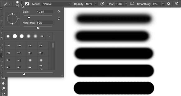
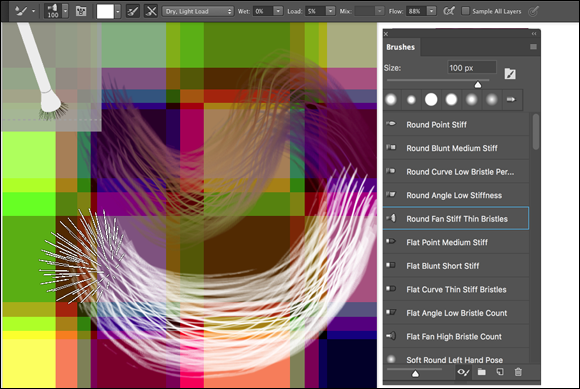
You control where the Brush tool works by selecting a brush tip of a particular size, shape, and hardness (the fuzziness, or lack thereof, along the edges of a round brush tip). Remember, too, that you can use the Brush and other painting tools to create subtle changes in existing colors. By selecting an appropriate blending mode and opacity, you can mix the painting color into the existing colors in your image. Make these basic decisions from the Options bar, shown for the Brush tool in Figure 14-1.
As you see in Figure 14-1, the Options bar gives you access to a miniature Brush Settings panel (click the arrow to the right of the brush size) from which you can pick a brush tip, change its size, orientation, roundness (some brush tips), and adjust the hardness of the brush’s edges. (Only round brush tips use the Hardness adjustment on the Options bar.) You also have a handy button just to the right of the arrow button to toggle the visibility of the full Brush panel on the Options bar. The five sample lines to the right show Hardness, from 0% to 100% in 25% increments, all using a 40-pixel brush. The Brush tool can use any brush tip that you have in the Brush panel — and, as you can read later in this chapter, you can customize the brush tip in a variety of ways.
You’re actually ready to paint in Photoshop already! Select a foreground color, select the brush size that you want, decide how hard or fuzzy the edges should be, change the blending mode and opacity (if desired), and drag the tool in your image. (And, perhaps best of all, no turpentine needed for cleaning up — just switch tools in the Toolbox.)
 As you work with the brush-using tools, always remember that the selected brush tip is applied as a series of individual impressions, called instances. Consider an instance to be a single impression of the brush tip, like tapping a pen once on a piece of paper — it leaves a single dot. Take a look at the outer borders in Figure 14-2. Changing the brush tip’s Spacing value in the Brush Settings panel shows how instances appear. In the upper left, the spacing is set to the default 25% and a continuous line results. To the upper right, Spacing is set to 67%, and the individual brush tip instances are visible as overlapping circles. To the lower left, Spacing is set to 133% — this is a setting that you might use for a dotted or dashed line — and each brush tip instance is visible individually.
If you know you have the cursor set to show the brush tip, but you’re seeing the tiny little crosshairs instead, check the Caps Lock key on your keyboard. Caps Lock toggles between precise and brush-size cursors for the brush-using tools. (During the discussion of Photoshop’s Preferences in Chapter 3, I showed a comparison of the three brush cursor options in Figure 3-11.)
When you change the Brush tool’s Opacity setting on the Options bar, you change the appearance of the stroke as a whole. Changing the Flow setting (also on the Options bar), on the other hand, changes the amount of color applied with each instance of the brush tip. When the flow is reduced and the spacing is set to less than 100%, the overlapping area of each brush instance appears darker (or lighter when painting with, for example, white on black). To the right of the Flow field is the Airbrush button. When the Airbrush is on (the button turns dark), the Flow value takes on more meaning. As you paint with the Brush in Airbrush mode with a reduced Flow setting, pausing the cursor with the mouse button down allows color to build up (become more opaque) as if you were using a real airbrush. You can use the Airbrush both as a traditional airbrush artist and to simulate spray paint. You can see both in Figure 14-3.
To the right of the Airbrush button you find the new Smoothing field and the related gear button to control smoothing options. When painting curved strokes, the Smoothing option helps keep the stroke from becoming too sharp as you change directions. Depending on your input device and the amount of smoothing you’ve selected, you may see a slight delay on-screen as you paint. You also have a Smoothing pane in the Brush Settings panel (discussed in the “Working with Panels and Selecting Colors” section).
With a video card that supports OpenCL drawing, you can rotate the image on-screen for easier painting — not rotate the canvas, but rotate the on-screen image! This can be great for fine-tuning a layer mask or doing other delicate painting tasks. Using the Rotate View tool (nested with the Hand tool) permits you to arrange the artwork for your most comfortable painting stroke. While dragging the Rotate View tool, an on-screen compass’s red arrow always orients you to the top of the image. When you want the image oriented back to the top, simply double-click the Rotate View tool icon in the Tools panel.
Adding color with the Pencil tool
The Pencil tool differs from the Brush tool in one major respect: Regardless of the Hardness setting in the Brush panel, the Pencil tool always uses a hardness value of 100%. With the Pencil tool active, the Options bar offers the miniature Brush panel, a choice of blending mode and opacity, and the somewhat-misnamed Auto Erase option. When selected, Auto Erase lets you paint over areas of the current foreground color using the current background color. Click an area of the foreground color, and the Pencil applies the background color. Click any color other than the foreground color, and the Pencil applies the foreground color. But remember, you’re not erasing, just painting with the background color (even on layers with transparency).
Removing color with the Eraser tool
The fourth of your primary painting tools is the Eraser. On a layer that supports transparency, the Eraser tool makes the pixels transparent. On a layer named Background, the Eraser paints with the background color. On the Options bar, the Eraser tool’s Mode menu doesn’t offer blending modes, but rather three behavior choices. When you select Brush (the default), the Options bar offers you the same Opacity, Flow, and Airbrush options as the Brush tool. You can also select Pencil, which offers an Opacity slider, but no Flow or Airbrush option (comparable to the actual Pencil tool). When Mode is set to Block, you have a square Eraser tool that erases at the size of the cursor. (When you click or drag, the number of pixels erased is tied to the current zoom factor.) Regardless of which mode is selected, the Options bar offers one more important choice: To the right of the Smoothing field’s gear button, you find the Erase to History check box. When selected, the Eraser tool paints over the pixels like the History Brush, restoring the pixels to their appearance at the selected state in the History panel.
A couple of variations on the Eraser tool are tucked away with it in the Toolbox, too. The Background Eraser tool can, in fact, be used to remove a background from your image. However, it’s not limited to something in your image that appears to be a background. Remember that digital images don’t really have backgrounds and foregrounds or subjects — they just have collections of tiny, colored squares. What does this mean for using the Background Eraser? You can click and drag on any color in the image to erase areas of that color. You can also elect to erase only the current background color and designate the foreground color as protected so that it won’t be erased even if you drag over it.
The Magic Eraser, like the Magic Wand selection tool (see Chapter 8), isn’t a brush-using tool, but this is a logical place to tell you about it. Click a color with the Magic Eraser tool, and that color is erased, either in a contiguous area or throughout the image, depending on whether you have selected the Contiguous option on the Options bar. And, like the Magic Wand, on the Options bar you can set the tool to work on the active layer or all layers, and you can also set a specific level of sensitivity (Tolerance). Here is the one difference between the two: The Magic Eraser is, in fact, a painting tool in that you can set an opacity percentage, which partially erases the selected pixels.
Working with Panels and Selecting Colors
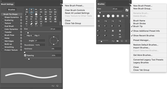
To select and customize brush tips, Photoshop offers the Brush Settings and the Brush panels (both shown in Figure 14-4). Select a brush tip in the Brush Settings panel (or in the Brush panel or on the Options bar), and then customize it to do your bidding using the options in the Brush panel.
 The Brush panel’s menu includes the New Brush Group command. If you often use certain brushes together and want to streamline the Brush panel to make those brushes more easily located, select the brush tips and create a group. Expand and collapse groups in the panel as desired.
You must have a brush-using tool active to access the Brush Settings panel. If the active tool doesn’t use brushes, the entire panel is grayed out and unavailable. However, regardless of what tool is active, clicking a brush preset in the Brush panel automatically switches you to the Brush tool.
An overview of options
The Brush Settings panel, like the Layer Style dialog box, has a column on the left that lists options. Like the Layer Style dialog box, you mark the check box to activate the feature, but you have to click the name to open that pane in the panel. As you can see in Figure 14-4, the Brush Settings panel menu offers very few commands, whereas the Brush panel menu includes variations in how to display the panel content, some housekeeping commands for resetting/loading/saving brushes, and a list of brush sets in the bottom half of the menu.
Don’t overlook those little lock icons to the right of the various pane names in the Brush Settings panel. Click the lock to preserve the settings in that pane while you switch among brush tip presets. Any unlocked attributes revert to those with which the brush tip was created. Locking, for example, Shape Dynamics retains those settings even if you switch to a totally different brush tip.
Here, in order, are the Brush panel panes and the options in those panes to which you should pay attention:
- Brushes: This button (just above the names of the panes) opens the Brush panel, where you pick the basic brush tip shape from the brushes loaded in the panel. You can also resize the brush tip, but that’s it. (Note that you can also select a brush tip in the Brush Tip Shape panel of the Brush Settings panel.)
- Brush Tip Shape: Without a check box to the left or a lock icon to the right, Brush Tip Shape is the pane in which you can select and customize a brush tip. (Refer to the Brush Tip Shape pane in Figure 14-4.) This is perhaps the most important part of the Brush panel. In this pane, you can select a brush tip, change its size, alter the angle at which it’s applied, change the height-width relationship (Roundness) of the tip, and adjust the Spacing setting.
- Shape Dynamics: Dynamics in the Brush panel add variation as you drag a tool. Say you’re working with a round brush tip and choose Size Jitter. As you drag the brush tip, the brush tip instances (the individual marks left by the brush as you drag) will vary in diameter. The Shape Dynamics pane offers Size Jitter, Angle Jitter, and Roundness Jitter. Each of the “jitters” can be set to fade after a certain number of brush tip instances or can be controlled with the stylus that you use with a Wacom tablet. Angle can also be set to Direction, which forces the brush tip to adjust the direction that you drag or the direction of the selection or path you stroke. Use Shape Dynamics to add some variation and randomness to your painting, as shown in Figure 14-5.
- Scattering: Scattering varies the number of brush tip instances as you drag as well as their placement along the path you drag. Like Shape Dynamics, Scattering can be set to fade or can be controlled with a Wacom tablet.
- Texture: Use the Texture pane to add a pattern to the brush tip, as shown in Figure 14-5. You can select from among the same patterns that you use to fill a selection. Texture is most evident when Spacing is set to at least 50%.
- Dual Brush: Using a blending mode you select, the Dual Brush option overlays a second brush tip. You could, for example, add an irregular scatter brush to a round brush tip to break up the outline as you paint.
- Color Dynamics: Using the Color Dynamics pane, you can vary the color of your stroke as you drag. This comes in most handy for painting images and scenes rather than, say, working on an alpha channel. Just as you might add jitter to the size, shape, and placement of a grass brush while creating a meadow, you might also want to add some differences in color as you drag. You could pick different shades of green for the foreground and background colors and then also add jitter to the hue, saturation, and brightness values as the foreground and background colors are mixed while you drag. (See the greenery in Figure 14-5.)
- Transfer: Think of this pane as Opacity and Flow Jitter. You can add variation to the opacity and flow settings from the Options bar to change the way paint “builds up” in your artwork.
- Brush Pose: When working with a Wacom tablet (see Chapter 19), this panel enables you to ensure precision by overriding certain stylus-controlled variations in a stroke. If, for example, you want to ensure that the brush tip size doesn’t change, regardless of how hard you press on the tablet, open Brush Pose, set Pressure to 100%, and select the Override Pressure check box. You can also override the stylus’s rotation and tilt as you paint, setting any value from –100 to +100 for both tilt axis values and 0 to 360 degrees for rotation.
- Other Options: At the bottom of the left column are five brush options that don’t have separate panes in the Brush panel. They’re take-it-or-leave-it options — either activated or not.
- Noise: Adding Noise to the brush stroke helps produce some texture and breaks up solid areas of color in your stroke.
- Wet Edges: Wet Edges simulates paint building up along the edges of your stroke.
- Build-up: The Build-up check box simply activates the Airbrush button on the Options bar.
- Smoothing: Smoothing helps reduce sharp angles as you drag your mouse or stylus. If the stroke you’re painting should indeed have jagged turns and angles, disable Smoothing.
- Protect Texture: The Protect Texture option ensures that all the brushes with a defined texture use the same texture. Use this option when you want to simulate painting on canvas, for example.
When creating a dashed line or stroking a path with a nonround brush tip, go to the Shape Dynamics pane of the Brush panel and set the Angle Jitter’s Control pop-up menu to Direction. That enables the brush tip to rotate as necessary to follow the twists and turns of the selection or path that it’s stroking. (You’ll generally want to leave Angle Jitter set to 0% so that the stroke follows the selection or path precisely.)
Creating and saving custom brush tips
You can use any artwork as a custom brush tip. With the artwork on a transparent or white background (you don’t even need to make a selection), choose Edit ⇒ Define Brush Preset, type a name, and click OK. Your new custom brush is added to the Brush panel. After you define a piece of artwork as a brush, you can add that image to any project with a single click or drag.
Remember that a brush tip is always grayscale, regardless of the color in the artwork from which it was defined, and that it will be used to apply the foreground color. Also keep in mind that the maximum size for a brush tip is 5,000 pixels in either dimension.
Picking a color
If you want to apply a specific color to your image with a painting tool, you have to be able to select that color, right? Photoshop provides you with a number of ways to select a color:
- Click a saved color swatch in the Swatches panel.
- Enter numeric values or drag sliders in the Color panel.
- Click a color swatch at the bottom of the Toolbox, on the Options bar, or in the Color panel to open the Color Picker.
- Select a sample size and specify which layers to sample on the Options bar. When set to Point Size (the default), the eyedropper samples only the one pixel directly under the cursor. You can set the Eyedropper to set the foreground color to an average of a 3x3 sample to avoid having one stray pixel misrepresent the area of the image you want to sample. The sample size average can be as large as 101x101 pixels. (Remember, too, that you can right-click with the Eyedropper to change the sample size without having to visit the Options bar.)
- Specify which layers to sample on the Options bar. When working with layered documents, the Eyedropper offers a number of sampling options. You can elect to pick up the color on the currently active layer, the active layer and the layer immediately below it in the Layers panel, all layers, all layers except adjustment layers, and the current layer and the next pixel layer below (ignoring any adjustment layers in between).
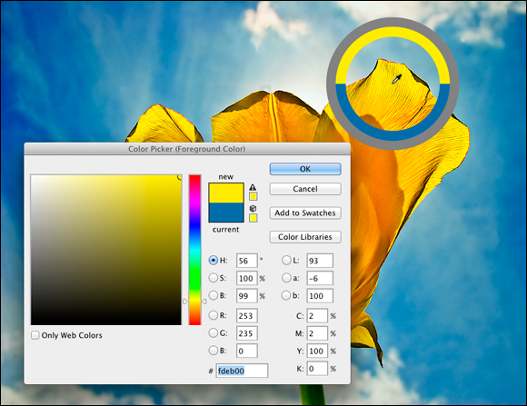
The Eyedropper’s Options bar offers the Show Sampling Ring option. When active and the Eyedropper is in use, the Sampling Ring is a pair of concentric circles (as shown to the upper-right in Figure 14-6). The outer ring is neutral gray to isolate the inner ring from surrounding colors. The bottom half of the inner ring shows the current foreground color, whereas the top half shows the color over which you have dragged the cursor. If you find it distracting, disable it on the Options bar.
In both the Toolbox and the Color panel, the foreground color is shown in the swatch to the upper left, and the background swatch is partially hidden behind it. Swap the foreground and background colors by pressing the X key on your keyboard. Reset them to the default black and white by pressing the D key.
In Chapter 6, I introduce the Color panel and the various ways you can define color with it. Now take a look at the Color panel’s big brother, the Color Picker. (See Figure 14-6.) (If, in Preferences ⇒ General, you have elected to use the system color picker rather than the Adobe version, your color picker will differ.) Note the reminder in the title bar of the Color Picker window that tells you whether you’re changing the foreground or background color. (If you find that you’re changing the background color when you want to change the foreground color, exit the Color Picker, open the Color panel, and click the foreground swatch.) The best way to get a feel for the incredible versatility of the Color Picker is to open it (click a color swatch at the bottom of the Toolbox or in the Color panel) and click each of the buttons to the left of the numeric fields. Each option changes how the Color Picker appears as well as how it defines color.
The default Color Picker configuration uses the radio button to the left of the H (Hue) field. It presents you with a vertical rainbow slider (the hue) and a square area that defines saturation (left-right) and brightness (up-down). Click or drag in the square area to the left and drag the slider up and down to pick a color. (Compare the two swatches to the left of the Cancel button to see the new color above the previously selected color.) If you click the button to the left of the S field, the slider shows saturation, and hue and brightness are defined in the square area to the left. Starting to see the pattern? Check out the configuration for Brightness (B) as well as the RGB and Lab options. And note that you can type numeric values to define a color as CMYK, but there are no buttons to the left to reconfigure the Color Picker. Likewise, you can type in the # (hexadecimal) field below the B field, but you can’t use it to reconfigure the Color Picker. (Hexadecimal color definition is used with HyperText Markup Language [HTML] code in web pages.)
Between the two color swatches in the top center and the buttons to the right are a pair of little icons that aren’t always visible. (Check them out in Figure 14-6 if they’re not currently showing in your own Color Picker.) The top warning triangle tells you that the current color can’t be reproduced within your working CMYK color profile. Unless you’re preparing artwork for commercial offset press, ignore it — it has nothing to do with your inkjet printer, for example. If, on the other hand, you are working on a press-destined project, click the swatch just below the warning triangle to jump to the nearest reproducible color.
The lower icon, a little cube symbol, lets you know that your current color isn’t web-safe. Web-safe colors are the couple hundred colors that are exactly the same in the base color scheme for both Mac and Windows. If visitors to your website have their monitors — or other devices — set to show only 256 colors, everyone sees the same thing with web-safe colors. Generally, you can safely ignore the warning because the variation isn’t worth worrying about. (If you do want to work with web-safe colors, click the swatch below the warning cube icon and then select the Only Web Colors check box in the lower-left corner.)
After you define a custom color with the numeric fields or by clicking in the sample colors to the left, you can easily save the color to the Swatches panel by clicking the Add to Swatches button. Should you need to reselect that specific color later, or even when working on another image, it’s right there in the Swatches panel, exactly as originally defined.
Also note the Color Libraries button. Clicking that button swaps the Color Picker for the Color Libraries dialog box, in which you can select spot colors. Spot colors, which I explain in Chapter 6, are special premixed inks that can be specially requested when preparing a job for a commercial printing press. Adding a spot color ensures that the color will appear in the final product exactly as expected. However, because they generally require an extra pass through a press, adding spot colors increases the cost of your printing. (Remember that if you want the color to print as a spot color, you don’t paint with it, but rather create a spot channel to identify where the spot color appears in your artwork.) Spot colors can be used to define colors for nonpress jobs, but the color is converted to your working color mode and printed with a mixture of your regular inks. Return to the Color Picker from Color Libraries by clicking the Picker button.
Fine Art Painting with Specialty Brush Tips and the Mixer Brush
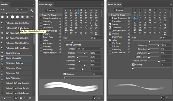
Traditionally trained artists have a whole load of options available when using the Brush tool. Depending on what sort of brush tip is selected in the Brush Preset or Brush panel, the Brush panel itself changes configuration. Check out the erodible brush tips which, like the pastel and charcoal sticks they represent, actually wear down as you use them! The profile of the tip changes as you work. You’ll also find airbrush and watercolor brush tips with such Brush panel options as Distortion, Granularity, Spatter Size, and Spatter Amount.
As you start to explore these brush tips and their capabilities, I suggest that you open the Brush Presets panel menu and switch the view to Large (or Small) List. The thumbnails will still be visible, but the actual names of the brush tips will give you more insight into how each behaves before you select one. Brush tip names with the words Stiff or Bristle are designed for use with the Mixer Brush (discussed later in this section).
Exploring erodible brush tips
Brush tips with names such as Square Pastel, Charcoal Pencil, and Round Watercolor are erodible tips. Options in the Brush panel for erodible brush tips are shown in the middle panel in Figure 14-7.
For erodible tips, Size is the brush size before it starts to wear down. The Softness determines how quickly the tip erodes, with zero being the softest and a setting of 100% maintaining the brush tip — no eroding. Preset erodible brush shapes available include point, flat, round, square, and triangle. The Sharpen button resets the brush tip to its default shape.
Introducing airbrush and watercolor tips
Airbrush and watercolor brush tips, with names such as Watercolor Build Up, Watercolor Wash, Airbrush Soft Low Density Grainy, and Watercolor Spatter Big Drops, use the options shown in the Brush Settings panel to the right in Figure 14-7.
When working with an airbrush or watercolor tip, the options in the Brush panel include Hardness (think of it as the density of the spray), Distortion (the amount of overspray or spread), Granularity (fine spray or speckles or color), Spatter Size (the size of the droplets), and Spatter Amount (the number of droplets).
Keep in mind that selecting an airbrush brush tip does not activate the Airbrush option on the Options bar. If you want to combine an airbrush tip with airbrush action (so that color builds up when you pause the cursor), click the Airbrush button on the Options bar.
 Think about pixel dimensions before selecting these tips — the maximum working area for these tips is about 100 pixels in diameter. You may find times when, to achieve your artistic vision, you need to open a separate document at smaller dimensions, paint in that image, and then use Image Size to scale before copying into your working document. Alternatively, work on a small document, save it, and then use the Place command to add it to your working document as a Smart Object.
Chapter 19 is titled “Ten Reasons to Love Your Wacom Tablet.” That chapter is oriented toward general Photoshop users, for the most part. If you’re an artist, these brush tips are more than enough justification to start tablet (or Cintiq) shopping! A mouse or trackpad just can’t take advantage of all the new, powerful, artistically liberating painting features. Tablets take advantage of not only pen pressure, but also angle and rotation, enabling you to control the shape of the tip as you work with it.
Mixing things up with the Mixer Brush
The Mixer Brush, nested in the Toolbox with the Brush tool, is designed to give traditionally trained artists a more familiar feel. Also best used with a Wacom tablet or Cintiq and a stylus, this tool takes painting several steps forward. The bristle tips available for the Mixer Brush are designed to work more like the physical brushes used to add physical paint to physical canvas, but in a digital sort of way. (The bristle tips can be used with other painting tools, but they pretty much behave like the static tips, the brush tips normally used with the other tools.)
The Mixer Brush can apply the foreground color interactively with pixels already on the active layer. Using a “wet” brush (selected on the Options bar) liquefies or melts the existing colors on the layer, pulling them along (with the foreground color) as you drag the tool. To minimize interaction with existing colors, use a “dry” brush or add a layer and paint on the new layer. For a comparison of brushes using the wet (upper stroke) and dry (lower stroke) options, as well as a look at the Mixer Brush Options bar and the Brush Presets panel, see Figure 14-8.
Some options for the Mixer Brush (going from the upper left in Figure 14-8) deserve explanation:
- To the right of the standard tool preset and mini-Brush panel, the color swatch represents the current brush load, the paint on the brush. Clicking the swatch opens the Color Picker; clicking the triangle to the right of the swatch provides an easy way to clean the brush (so that it interacts only with existing colors on the layer) or to reload the brush (add color to the mix).
- The two buttons to the right of the color swatch can be used to automatically reload the tool after each stroke and to automatically clean the brush after each stroke. The two buttons can be used together.
- The pop-up menu to the right of the Auto-Load and Auto-Clean buttons provides a list of dry, moist, wet, and very wet presets from which to choose.
- The Wet field controls how the brush interacts with color already on the layer. The wetter the brush, the more it picks up color (and blends with the current brush load) on the layer. A low value overlays the load color without mixing in the existing colors.
- The Load field controls how much “paint” is added to the brush. With a low value, the color runs out quickly and strokes are short. With a high value, the strokes continue to add color. The load settings are most apparent when using a dry brush.
- The Mix field also contributes to how the load color and existing color on the layer interact. A low value uses lots of the load color, whereas a high value uses more of the color already on the layer. Mix isn’t used with dry brushes (because they don’t interact with the existing colors).
- The Flow field is yet another variable for the amount of color added by the Mixer Brush. Low values result in a more transparent stroke, whereas very high values produce opaque strokes (which tend to be shorter because the brush, you might say, “runs out of paint”).
The Mixer Brush can also interact with strokes applied by the Brush and Pencil tools. And as you fine-tune your masterpiece, remember that you can push this paint around with the Smudge tool and use the Blur, Sharpen, Dodge, Burn, and Sponge tools, too. Sometime when you need a break, open a new empty document, select the Mixer Brush, and explore your inner Rembrandt (or Salvador Dali, perhaps).
Don’t forget about the Oil Paint filter in Photoshop’s Filter — Stylize menu. You’ll find information about using it in Chapter 15.
Filling, Stroking, Dumping, and Blending Colors
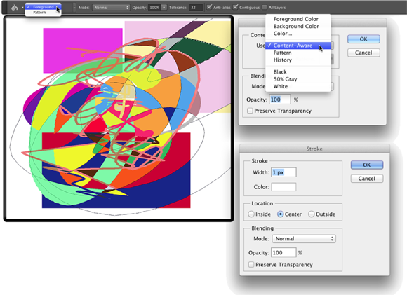
You have several more ways to add color to your artwork, none of which use brushes at all. You can, for example, make a selection and fill the selection with color by choosing Edit ⇒ Fill, or you can add a band of color along the edge of the selection by choosing Edit ⇒ Stroke (using the dialog boxes shown to the right in Figure 14-9).
Deleting and dumping to add color
The first time you press the Delete/Backspace key, the keystroke opens the Fill dialog box. The Content-Aware option is sort of a “smart fill.” The area surrounding the current selection is analyzed and Photoshop fills to match that surrounding area as seamlessly as possible. If you simply want to delete to the current background color, hold down the ⌘ /Ctrl key and press Delete/Backspace. You can also fill with the current foreground color by using Option/Alt with Delete/Backspace.
You can also “dump” color into your image with the Paint Bucket tool, nested below the Gradient tool in the Toolbox. Use the Paint Bucket tool to fill an empty selection with color or to replace the color on which you click with the foreground color. Don’t forget vector shapes, either! They’re a great way to add perfectly defined areas of solid color to an image. (You can read about working with shapes in Chapter 11.)
Using gradients
You can add gradients, which are subtle blends of color, quite easily to your artwork. Follow these steps:
-
Make a selection.
Unless you make a selection first, the gradient fills your entire layer. If you want the gradient to fill the entire layer, don’t make a selection first.
-
Select the Gradient tool.
Click the Gradient tool in the Toolbox. If you don’t see it, look for it nested with the Paint Bucket tool.
-
Select a gradient.
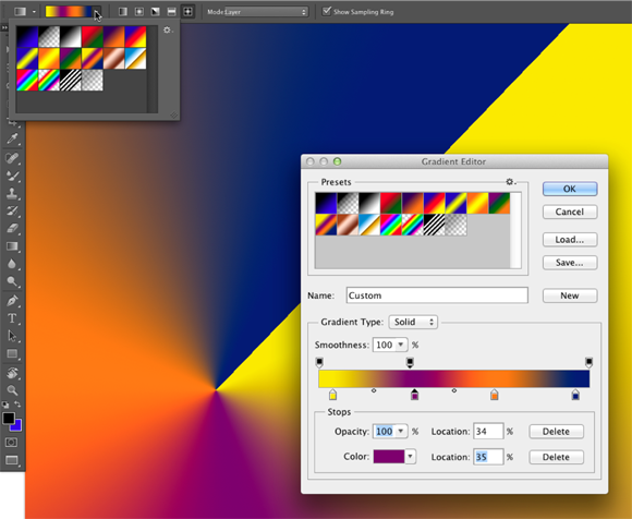
You can open the Gradient panel by clicking the triangle to the right of the sample gradient on the Options bar. (See Figure 14-10.) You can also click the sample gradient on the Options bar to open the Gradient Editor.
-
Choose a shape.
The five buttons to the right of the sample gradient on the Options bar show the shapes available for the Gradient tool. (From the left, the buttons are Linear, Radial, Angle, Reflected, and Diamond.)
-
Choose additional options.
You can pick a blending mode and opacity, flip the colors in the gradient with the Reverse option, choose Dither to help disguise the transitions between colors, and select the Transparency option to preserve any transparency defined in the gradient.
-
Drag the Gradient tool.
Where you start and in which direction you drag ultimately determine the appearance of the gradient.
The background gradient in Figure 14-10 uses the Angle Gradient option on the Options bar and the gradient that you see in the Gradient Editor. Notice in the Gradient Editor the Opacity stops (above the sample being edited) and Color stops (below the sample). The stops — the squares with points positioned along the sample gradient — determine the color or opacity of the gradient at that particular point. By default, there’s a smooth and even blend between neighboring stops, but you can adjust the blend by dragging the small diamonds you see on either side of the opacity and color stops. (Hint: The active stops use filled triangles instead of hollow triangles with their little squares.)
Click anywhere along the top (opacity) or bottom (color) of the gradient to add a new stop. Drag stops to move them. Option/Alt+drag a stop to duplicate it. Change the attributes of the selected stop with the options just below in the Gradient Editor.
After designing your new gradient, remember to click the New button to add it to the Gradient panel. But keep in mind that custom gradients aren’t really saved until you use the Save button or the Preset Manager to create sets on your hard drive. If you don’t save your custom gradients, they’ll be gone if you need to reset Photoshop’s Preferences file. (See Chapter 3 for more on saving presets.)