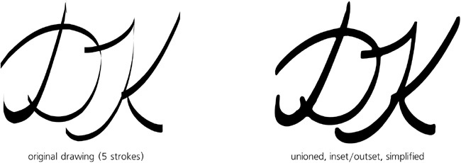
Our first business card attempt was mostly inspired by a layout of the text lines, with graphic elements coming secondary to support and reinforce that layout. Could we go the other way around, starting from some piece of graphic and building the design around it?
Of course, if you’re doing a company business card, the obvious starting point is the company’s logo. If you’re designing a card just for yourself and want it to be more personal, you can try tracing (18.8 Tracing) an imported photo of yours. Finally, you can also use a piece of clipart, for example from http://openclipart.org (1.3 Sources of Inkscape Art), which has many decorations and abstract pieces that might become the centerpiece of your card.
For my second demo card, however, I chose another approach: artistic initials. I switched to the Calligraphic pen, set the Angle to 90 degrees with a Fixation of 100 and drew a couple of intertwined letters. After I finally got the lettershapes more or less right, the result was mildly interesting but far from exciting. I then tried to improve it by creating a union of the path objects and then simplifying, insetting, and outsetting it a few times:
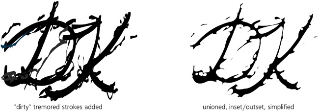
Now the letters look more natural—but they can still be made much more interesting. The general rule of modern design seems to be: Don’t be too neat! If you can dirty, distort, or damage your art in a creative way, go ahead and do it. So I selected a somewhat narrower pen nib, maximized Tremor to 100 and danced wildly around the letters with my tablet pen (though this could just as well be done with a mouse). At first the result may appear rather unattractive, but this is because I forgot to do the usual Simplify/Inset/Outset magic to it:

