Chapter 3. Classification Walkthrough: Titanic Dataset
This chapter will walk through a common classification problem using the Titanic dataset. Later chapters will dive into and expand on the common steps performed during an analysis.
Project Layout Suggestion
An excellent tool for performing exploratory data analysis is Jupyter. Jupyter is an open-source notebook environment that supports Python and other languages. It allows you to create cells of code or Markdown content.
I tend to use Jupyter in two modes. One is for exploratory data analysis and quickly trying things out. The other is more of a deliverable style where I format a report using Markdown cells and insert code cells to illustrate important points or discoveries. If you aren’t careful, your notebooks might need some refactoring and application of software engineering practices (remove globals, use functions and classes, etc.).
The cookiecutter data science package suggests a layout to create an analysis that allows for easy reproduction and sharing code.
Imports
This example is based mostly on pandas, scikit-learn, and Yellowbrick. The pandas library gives us tooling for easy data munging. The scikit-learn library has great predictive modeling, and Yellowbrick is a visualization library for evaluating models:
>>>importmatplotlib.pyplotasplt>>>importpandasaspd>>>fromsklearnimport(...ensemble,...preprocessing,...tree,...)>>>fromsklearn.metricsimport(...auc,...confusion_matrix,...roc_auc_score,...roc_curve,...)>>>fromsklearn.model_selectionimport(...train_test_split,...StratifiedKFold,...)>>>fromyellowbrick.classifierimport(...ConfusionMatrix,...ROCAUC,...)>>>fromyellowbrick.model_selectionimport(...LearningCurve,...)
Ask a Question
In this example, we want to create a predictive model to answer a question. It will classify whether an individual survives the Titanic ship catastrophe based on individual and trip characteristics. This is a toy example, but it serves as a pedagogical tool for showing many steps of modeling. Our model should be able to take passenger information and predict whether that passenger would survive on the Titanic.
This is a classification question, as we are predicting a label for survival; either they survived or they died.
Terms for Data
We typically train a model with a matrix of data. (I prefer to use pandas DataFrames because it is very nice to have column labels, but numpy arrays work as well.)
For supervised learning, such as regression or classification, our intent is to have a fuction that transforms features into a label. If we were to write this as an algebra formula, it would look like this:
y = f(X)
X is a matrix. Each row represents a sample of data or information about an individual. Every column in X is a feature. The output of our function, y, is a vector that contains labels (for classification) or values (for regression) (see Figure 3-1).
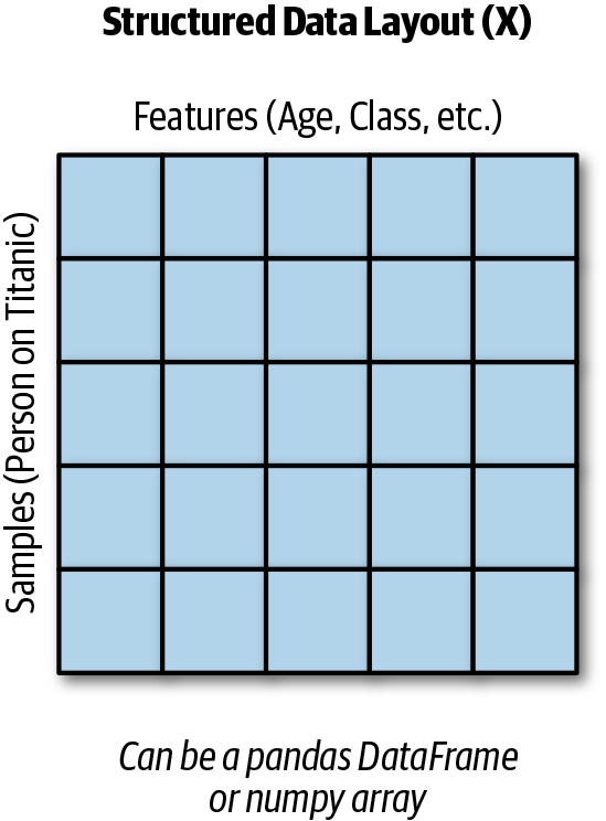
Figure 3-1. Structured data layout.
This is standard naming procedure for naming the data and the output. If you read academic papers or even look at the documentation for libraries, they follow this convention.
In Python, we use the variable name X to hold the sample data even though capitalization of variables is a violation of standard naming conventions (PEP 8). Don’t worry, everyone does it, and if you were to name your variable x, they might look at you funny. The variable y stores the labels or targets.
Table 3-1 shows a basic dataset with two samples and three features for each sample.
| pclass | age | sibsp |
|---|---|---|
1 |
29 |
0 |
1 |
2 |
1 |
Gather Data
We are going to load an Excel file (make sure you have pandas and xlrd1 installed) with the Titanic features. It has many columns, including a survived column that contains the label of what happened to an individual:
>>>url=(..."http://biostat.mc.vanderbilt.edu/"..."wiki/pub/Main/DataSets/titanic3.xls"...)>>>df=pd.read_excel(url)>>>orig_df=df
The following columns are included in the dataset:
-
pclass - Passenger class (1 = 1st, 2 = 2nd, 3 = 3rd)
-
survival - Survival (0 = No, 1 = Yes)
-
name - Name
-
sex - Sex
-
age - Age
-
sibsp - Number of siblings/spouses aboard
-
parch - Number of parents/children aboard
-
ticket - Ticket number
-
fare - Passenger fare
-
cabin - Cabin
-
embarked - Point of embarkation (C = Cherbourg, Q = Queenstown, S = Southampton)
-
boat - Lifeboat
-
body - Body identification number
-
home.dest - Home/destination
Pandas can read this spreadsheet and convert it into a DataFrame for us. We will need to spot-check the data and ensure that it is OK for performing analysis.
Clean Data
Once we have the data, we need to ensure that it is in a format that we can use to create a model. Most scikit-learn models require that our features be numeric (integer or float). In addition, many models fail if they are passed missing values (NaN in pandas or numpy). Some models perform better if the data is standardized (given a mean value of 0 and a standard deviation of 1). We will deal with these issues using pandas or scikit-learn. In addition, the Titanic dataset has leaky features.
Leaky features are variables that contain information about the future or target. There’s nothing bad in having data about the target, and we often have that data during model creation time. However, if those variables are not available when we perform a prediction on a new sample, we should remove them from the model as they are leaking data from the future.
Cleaning the data can take a bit of time. It helps to have access to a subject matter expert (SME) who can provide guidance on dealing with outliers or missing data.
>>>df.dtypespclass int64survived int64name objectsex objectage float64sibsp int64parch int64ticket objectfare float64cabin objectembarked objectboat objectbody float64home.dest objectdtype: object
We typically see int64, float64, datetime64[ns], or object.
These are the types that pandas uses to store a column of data.
int64 and float64 are numeric types. datetime64[ns] holds
date and time data. object typically means that it is holding
string data, though it could be a combination of string and other
types.
When reading from CSV files, pandas will try to coerce data
into the appropriate type, but will fall back to object. Reading
data from spreadsheets, databases, or other systems may provide
better types in the DataFrame. In any case, it is worthwhile
to look through the data and ensure that the types make sense.
Integer types are typically fine. Float types might have some
missing values. Date and string types will need to be converted
or used to feature engineer numeric types. String types that
have low cardinality are called categorical columns, and
it might be worthwhile to create dummy columns from them (the pd.get_dummies function
takes care of this).
Note
Up to pandas 0.23, if the type is int64, we are guaranteed that there
are no missing values. If the type is float64, the values might be all floats, but also could be
integer-like numbers with missing values. The pandas library converts integer values that have missing numbers to floats, as this type supports missing values. The object typically means
string types (or both string and numeric).
As of pandas 0.24, there is a new Int64 type (notice the capitalization).
This is not the default integer type, but you can coerce to this type and have
support for missing numbers.
The pandas-profiling library includes a profile report. You can generate this report in a notebook. It will summarize the types of the columns and allow you to view details of quantile statistics, descriptive statistics, a histogram, common values, and extreme values (see Figures 3-2 and 3-3):
>>>importpandas_profiling>>>pandas_profiling.ProfileReport(df)
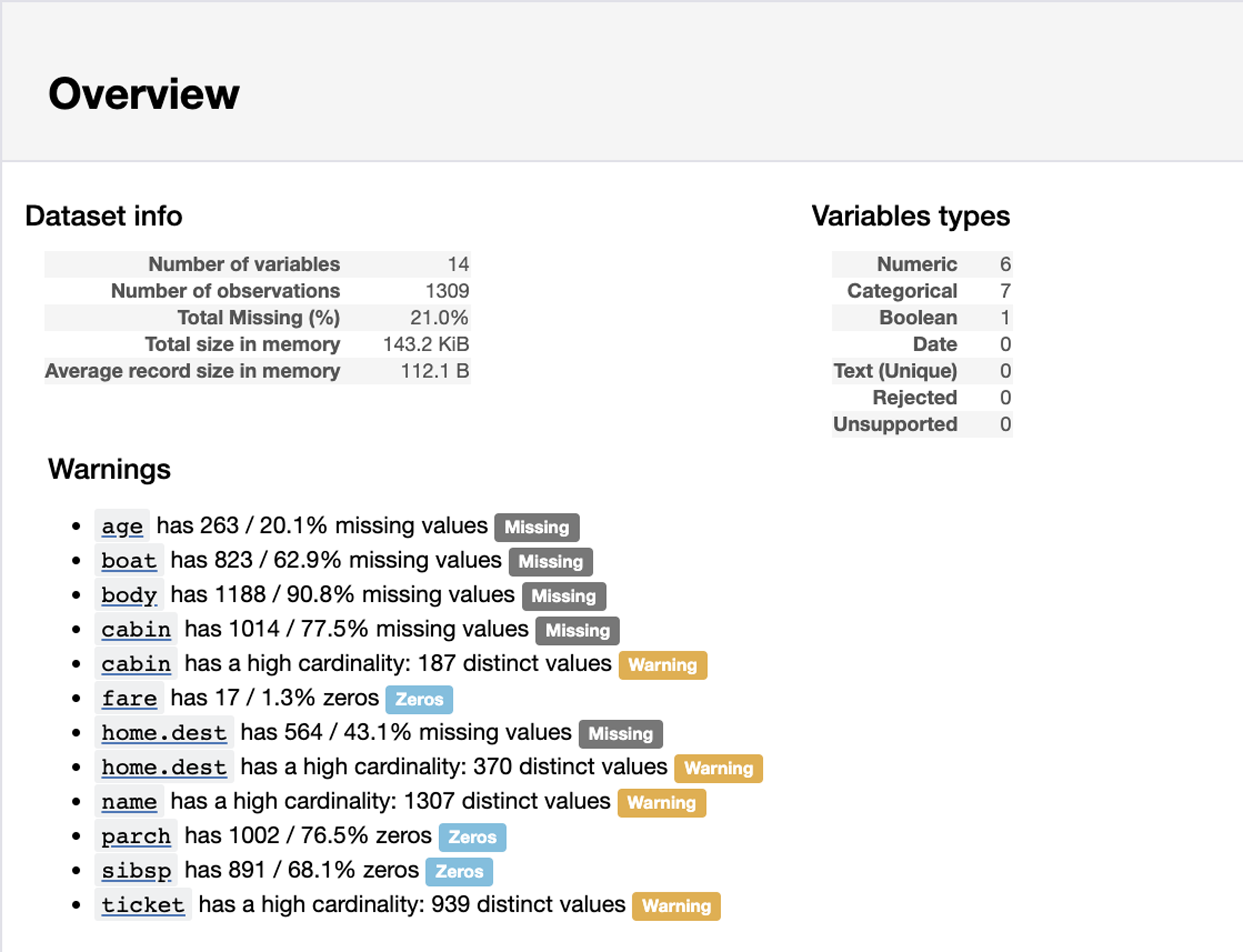
Figure 3-2. Pandas-profiling summary.
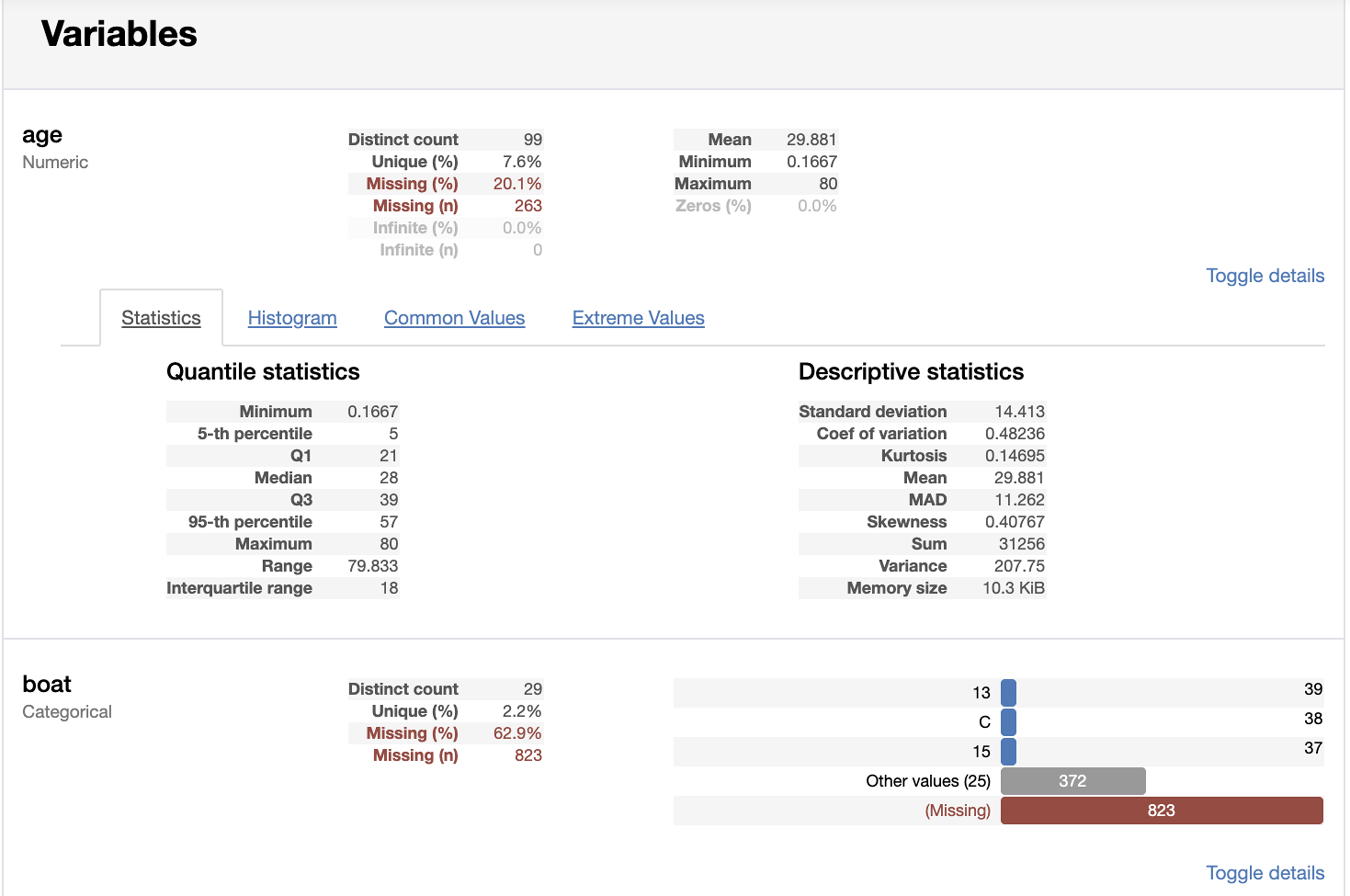
Figure 3-3. Pandas-profiling variable details.
Use the .shape attribute of the DataFrame to inspect the number of rows and columns:
>>> df.shape
(1309, 14)
Use the .describe method to get summary stats as well as see
the count of nonnull data. The default behavior of this method
is to only report on numeric columns. Here the output is truncated
to only show the first two columns:
>>>df.describe().iloc[:,:2]pclass survivedcount 1309.000000 1309.000000mean 2.294882 0.381971std 0.837836 0.486055min 1.000000 0.00000025% 2.000000 0.00000050% 3.000000 0.00000075% 3.000000 1.000000max 3.000000 1.000000
The count statistic only includes values that are not NaN, so it is useful for checking whether a column is missing data. It is also a good idea to spot-check the minimum and maximum values to see if there are outliers. Summary statistics are one way to do this. Plotting a histogram or a box plot is a visual representation that we will see later.
We will need to deal with missing data.
Use the .isnull method to find columns or rows with missing values.
Calling .isnull on a DataFrame returns a new DataFrame with every
cell containing a True or False value. In Python, these values
evaluate to 1 and 0, respectively. This allows us to sum them
up or even calculate the percent missing (by calculating the mean).
The code indicates the count of missing data in each column:
>>>df.isnull().sum()pclass 0survived 0name 0sex 0age 263sibsp 0parch 0ticket 0fare 1cabin 1014embarked 2boat 823body 1188home.dest 564dtype: int64
Tip
Replace .sum with .mean to get the percentage of null values.
By default, calling these methods will apply the operation along axis 0, which is along the index. If you want to get the counts of missing features for each sample, you can apply this along axis 1 (along the columns):
>>>df.isnull().sum(axis=1).loc[:10]0 11 12 23 14 25 16 17 28 19 2dtype: int64
A SME can help in determining what to do with missing data. The age column might be useful, so keeping it and interpolating values could provide some signal to the model. Columns where most of the values are missing (cabin, boat, and body) tend to not provide value and can be dropped.
The body column (body identification number) is missing for many rows. We should drop this column at any rate because it leaks data. This column indicates that the passenger did not survive; by necessity our model could use that to cheat. We will pull it out. (If we are creating a model to predict if a passenger would die, knowing that they had a body identification number a priori would let us know they were already dead. We want our model to not know that information and make the prediction based on the other columns.) Likewise, the boat column leaks the reverse information (that a passenger survived).
Let’s look at some of the rows with missing data. We can create a boolean array
(a series with True or False to indicate if the row has missing data)
and use it to inspect rows that are missing data:
>>>mask=df.isnull().any(axis=1)>>>mask.head()# rows0 True1 True2 True3 True4 Truedtype: bool>>>df[mask].body.head()0 NaN1 NaN2 NaN3 135.04 NaNName: body, dtype: float64
We will impute (or derive values for) the missing values for the age column later.
Columns with type of object tend to be categorical (but they may also be high cardinality string data, or a mix of column types). For object columns that we believe to be categorical, use the .value_counts method to examine the counts of the values:
>>>df.sex.value_counts(dropna=False)male 843female 466Name: sex, dtype: int64
Remember that pandas typically ignores null or NaN values. If you want to include those, use
dropna=False to also show counts for NaN:
>>>df.embarked.value_counts(dropna=False)S 914C 270Q 123NaN 2Name: embarked, dtype: int64
We have a couple of options for dealing with missing embarked values. Using S might seem logical as that is the most common value. We could dig into the data and try and determine if another option is better. We could also drop those two values. Or, because this is categorical, we can ignore them and use pandas to create dummy columns if these two samples will just have 0 entries for every option. We will use this latter choice for this feature.
Create Features
We can drop columns that have no variance or no signal. There aren’t features like that in this dataset, but if there was a column called “is human” that had 1 for every sample this column would not be providing any information.
Alternatively, unless we are using NLP or extracting data out of text columns where every value is different, a model will not be able to take advantage of this column. The name column is an example of this. Some have pulled out the title t from the name and treated it as categorical.
We also want to drop columns that leak information. Both boat and body columns leak whether a passenger survived.
The pandas .drop
method can drop either rows or columns:
>>>name=df.name>>>name.head(3)0 Allen, Miss. Elisabeth Walton1 Allison, Master. Hudson Trevor2 Allison, Miss. Helen LoraineName: name, dtype: object>>>df=df.drop(...columns=[..."name",..."ticket",..."home.dest",..."boat",..."body",..."cabin",...]...)
We need to create dummy columns from string columns. This will create
new columns for sex and embarked. Pandas has a convenient get_dummies
function for that:
>>>df=pd.get_dummies(df)>>>df.columnsIndex(['pclass', 'survived', 'age', 'sibsp','parch', 'fare', 'sex_female', 'sex_male','embarked_C', 'embarked_Q', 'embarked_S'],dtype='object')
At this point the sex_male and sex_female columns are perfectly inverse correlated. Typically we remove any columns with perfect or very high positive or negative correlation. Multicollinearity can impact interpretation of feature importance and coefficients in some models. Here is code to remove the sex_male column:
>>>df=df.drop(columns="sex_male")
Alternatively, we can add a drop_first=True parameter to the get_dummies call:
>>>df=pd.get_dummies(df,drop_first=True)>>>df.columnsIndex(['pclass', 'survived', 'age', 'sibsp','parch', 'fare', 'sex_male','embarked_Q', 'embarked_S'],dtype='object')
Create a DataFrame (X) with the features and a series (y) with the
labels. We could also use numpy arrays, but then we don’t have column
names:
>>>y=df.survived>>>X=df.drop(columns="survived")
Tip
We can use the pyjanitor library to replace the last two lines:
>>>importjanitorasjn>>>X,y=jn.get_features_targets(...df,target_columns="survived"...)
Sample Data
We always want to train and test on different data. Otherwise you don’t
really know how well your model generalizes to data that it hasn’t seen
before. We’ll use scikit-learn to pull out 30% for testing (using
random_state=42 to remove an element of randomness if we start
comparing different models):
>>>X_train,X_test,y_train,y_test=model_selection.train_test_split(...X,y,test_size=0.3,random_state=42...)
Impute Data
The age column has missing values. We need to impute age from the numeric values. We only want to impute on the training set and then use that imputer to fill in the date for the test set. Otherwise we are leaking data (cheating by giving future information to the model).
Now that we have test and train data, we can impute missing values on the
training set, and use the trained imputers to fill in the test dataset.
The fancyimpute library
has many algorithms that it implements. Sadly, most of these algorithms are not
implemented in an inductive manner. This means that you cannot call .fit
and then .transform, which means you cannot impute for new data based
on how the model was trained.
The IterativeImputer class (which was in fancyimpute but has been migrated to
scikit-learn) does support inductive mode. To use it we need to add a
special experimental import (as of scikit-learn version 0.21.2):
>>>fromsklearn.experimentalimport(...enable_iterative_imputer,...)>>>fromsklearnimportimpute>>>num_cols=[..."pclass",..."age",..."sibsp",..."parch",..."fare",..."sex_female",...]>>>imputer=impute.IterativeImputer()>>>imputed=imputer.fit_transform(...X_train[num_cols]...)>>>X_train.loc[:,num_cols]=imputed>>>imputed=imputer.transform(X_test[num_cols])>>>X_test.loc[:,num_cols]=imputed
If we wanted to impute with the median, we can use pandas to do that:
>>>meds=X_train.median()>>>X_train=X_train.fillna(meds)>>>X_test=X_test.fillna(meds)
Normalize Data
Normalizing or preprocessing the data will help many models perform better after this is done. Particularly those that depend on a distance metric to determine similarity. (Note that tree models, which treat each feature on its own, don’t have this requirement.)
We are going to standardize the data for the preprocessing. Standardizing is translating the data so that it has a mean value of zero and a standard deviation of one. This way models don’t treat variables with larger scales as more important than smaller scaled variables. I’m going to stick the result (numpy array) back into a pandas DataFrame for easier manipulation (and to keep column names).
I also normally don’t standardize dummy columns, so I will ignore those:
>>>cols="pclass,age,sibsp,fare".split(",")>>>sca=preprocessing.StandardScaler()>>>X_train=sca.fit_transform(X_train)>>>X_train=pd.DataFrame(X_train,columns=cols)>>>X_test=sca.transform(X_test)>>>X_test=pd.DataFrame(X_test,columns=cols)
Refactor
At this point I like to refactor my code. I typically make two functions. One for general cleaning, and another for dividing up into a training and testing set and to perform mutations that need to happen differently on those sets:
>>>deftweak_titanic(df):...df=df.drop(...columns=[..."name",..."ticket",..."home.dest",..."boat",..."body",..."cabin",...]...).pipe(pd.get_dummies,drop_first=True)...returndf>>>defget_train_test_X_y(...df,y_col,size=0.3,std_cols=None...):...y=df[y_col]...X=df.drop(columns=y_col)...X_train,X_test,y_train,y_test=model_selection.train_test_split(...X,y,test_size=size,random_state=42...)...cols=X.columns...num_cols=[..."pclass",..."age",..."sibsp",..."parch",..."fare",...]...fi=impute.IterativeImputer()...X_train.loc[...:,num_cols...]=fi.fit_transform(X_train[num_cols])...X_test.loc[:,num_cols]=fi.transform(...X_test[num_cols]...)......ifstd_cols:...std=preprocessing.StandardScaler()...X_train.loc[...:,std_cols...]=std.fit_transform(...X_train[std_cols]...)...X_test.loc[...:,std_cols...]=std.transform(X_test[std_cols])......returnX_train,X_test,y_train,y_test>>>ti_df=tweak_titanic(orig_df)>>>std_cols="pclass,age,sibsp,fare".split(",")>>>X_train,X_test,y_train,y_test=get_train_test_X_y(...ti_df,"survived",std_cols=std_cols...)
Baseline Model
Creating a baseline model that does something really simple can give us
something to compare our model to. Note that using the default .score
result gives us the accuracy which can be misleading. A problem where a positive case is 1 in 10,000 can easily get over 99% accuracy by always predicting negative.
>>>fromsklearn.dummyimportDummyClassifier>>>bm=DummyClassifier()>>>bm.fit(X_train,y_train)>>>bm.score(X_test,y_test)# accuracy0.5292620865139949>>>fromsklearnimportmetrics>>>metrics.precision_score(...y_test,bm.predict(X_test)...)0.4027777777777778
Various Families
This code tries a variety of algorithm families. The “No Free Lunch” theorem states that no algorithm performs well on all data. However, for some finite set of data, there may be an algorithm that does well on that set. (A popular choice for structured learning these days is a tree-boosted algorithm such as XGBoost.)
Here we use a few different families and compare the AUC score and standard deviation using k-fold cross-validation. An algorithm that has a slightly smaller average score but tighter standard deviation might be a better choice.
Because we are using k-fold cross-validation, we will feed the model all of X and y:
>>>X=pd.concat([X_train,X_test])>>>y=pd.concat([y_train,y_test])>>>fromsklearnimportmodel_selection>>>fromsklearn.dummyimportDummyClassifier>>>fromsklearn.linear_modelimport(...LogisticRegression,...)>>>fromsklearn.treeimportDecisionTreeClassifier>>>fromsklearn.neighborsimport(...KNeighborsClassifier,...)>>>fromsklearn.naive_bayesimportGaussianNB>>>fromsklearn.svmimportSVC>>>fromsklearn.ensembleimport(...RandomForestClassifier,...)>>>importxgboost>>>formodelin[...DummyClassifier,...LogisticRegression,...DecisionTreeClassifier,...KNeighborsClassifier,...GaussianNB,...SVC,...RandomForestClassifier,...xgboost.XGBClassifier,...]:...cls=model()...kfold=model_selection.KFold(...n_splits=10,random_state=42...)...s=model_selection.cross_val_score(...cls,X,y,scoring="roc_auc",cv=kfold...)...(...f"{model.__name__:22} AUC: "...f"{s.mean():.3f} STD: {s.std():.2f}"...)DummyClassifier AUC: 0.511 STD: 0.04LogisticRegression AUC: 0.843 STD: 0.03DecisionTreeClassifier AUC: 0.761 STD: 0.03KNeighborsClassifier AUC: 0.829 STD: 0.05GaussianNB AUC: 0.818 STD: 0.04SVC AUC: 0.838 STD: 0.05RandomForestClassifier AUC: 0.829 STD: 0.04XGBClassifier AUC: 0.864 STD: 0.04
Stacking
If you were going down the Kaggle route (or want maximum performance at the cost of interpretability), stacking is an option. A stacking classifier takes other models and uses their output to predict a target or label. We will use the previous models’ outputs and combine them to see if a stacking classifier can do better:
>>>frommlxtend.classifierimport(...StackingClassifier,...)>>>clfs=[...x()...forxin[...LogisticRegression,...DecisionTreeClassifier,...KNeighborsClassifier,...GaussianNB,...SVC,...RandomForestClassifier,...]...]>>>stack=StackingClassifier(...classifiers=clfs,...meta_classifier=LogisticRegression(),...)>>>kfold=model_selection.KFold(...n_splits=10,random_state=42...)>>>s=model_selection.cross_val_score(...stack,X,y,scoring="roc_auc",cv=kfold...)>>>(...f"{stack.__class__.__name__} "...f"AUC: {s.mean():.3f} STD: {s.std():.2f}"...)StackingClassifier AUC: 0.804 STD: 0.06
In this case it looks like performance went down a bit, as well as standard deviation.
Create Model
I’m going to use a random forest classifier to create a model. It is a
flexible model that tends to give decent out-of-the-box results. Remember to
train it (calling .fit) with the training data from the data that we split
earlier into a training and testing set:
>>>rf=ensemble.RandomForestClassifier(...n_estimators=100,random_state=42...)>>>rf.fit(X_train,y_train)RandomForestClassifier(bootstrap=True,class_weight=None, criterion='gini',max_depth=None, max_features='auto',max_leaf_nodes=None,min_impurity_decrease=0.0,min_impurity_split=None,min_samples_leaf=1, min_samples_split=2,min_weight_fraction_leaf=0.0, n_estimators=10,n_jobs=1, oob_score=False, random_state=42,verbose=0, warm_start=False)
Evaluate Model
Now that we have a model, we can use the test data to see how well the model generalizes to data that it
hasn’t seen before. The .score method of a classifier returns the
average of the prediction accuracy. We want to make sure that we call the
.score method with the test data (presumably it should perform better with
the training data):
>>>rf.score(X_test,y_test)0.7964376590330788
We can also look at other metrics, such as precision:
>>>metrics.precision_score(...y_test,rf.predict(X_test)...)0.8013698630136986
A nice benefit of tree-based models is that you can inspect the feature importance. The feature importance tells you how much a feature contributes to the model. Note that removing a feature doesn’t mean that the score will go down accordingly, as other features might be colinear (in this case we could remove either the sex_male or sex_female column as they have a perfect negative correlation):
>>>forcol,valinsorted(...zip(...X_train.columns,...rf.feature_importances_,...),...key=lambdax:x[1],...reverse=True,...)[:5]:...(f"{col:10}{val:10.3f}")age 0.277fare 0.265sex_female 0.240pclass 0.092sibsp 0.048
The feature importance is calculated by looking at the error increase. If removing a feature increases the error in the model, the feature is more important.
I really like the SHAP library for exploring what features a model deems important, and for explaining predictions. This library works with black-box models, and we will show it later.
Optimize Model
Models have hyperparameters that control how they behave. By varying the values for these parameters, we change their performance. Sklearn has a grid search class to evaluate a model with different combinations of parameters and return the best result. We can use those parameters to instantiate the model class:
>>>rf4=ensemble.RandomForestClassifier()>>>params={..."max_features":[0.4,"auto"],..."n_estimators":[15,200],..."min_samples_leaf":[1,0.1],..."random_state":[42],...}>>>cv=model_selection.GridSearchCV(...rf4,params,n_jobs=-1...).fit(X_train,y_train)>>>(cv.best_params_){'max_features': 'auto', 'min_samples_leaf': 0.1,'n_estimators': 200, 'random_state': 42}>>>rf5=ensemble.RandomForestClassifier(...**{..."max_features":"auto",..."min_samples_leaf":0.1,..."n_estimators":200,..."random_state":42,...}...)>>>rf5.fit(X_train,y_train)>>>rf5.score(X_test,y_test)0.7888040712468194
We can pass in a scoring parameter to GridSearchCV to optimize for different metrics.
See Chapter 12 for a list of metrics and their meanings.
Confusion Matrix
A confusion matrix allows us to see the correct classifications as well as false positives and false negatives. It may be that we want to optimize toward false positives or false negatives, and different models or parameters can alter that. We can use sklearn to get a text version, or Yellowbrick for a plot (see Figure 3-4):
>>>fromsklearn.metricsimportconfusion_matrix>>>y_pred=rf5.predict(X_test)>>>confusion_matrix(y_test,y_pred)array([[196, 28],[ 55, 114]])>>>mapping={0:"died",1:"survived"}>>>fig,ax=plt.subplots(figsize=(6,6))>>>cm_viz=ConfusionMatrix(...rf5,...classes=["died","survived"],...label_encoder=mapping,...)>>>cm_viz.score(X_test,y_test)>>>cm_viz.poof()>>>fig.savefig(..."images/mlpr_0304.png",...dpi=300,...bbox_inches="tight",...)
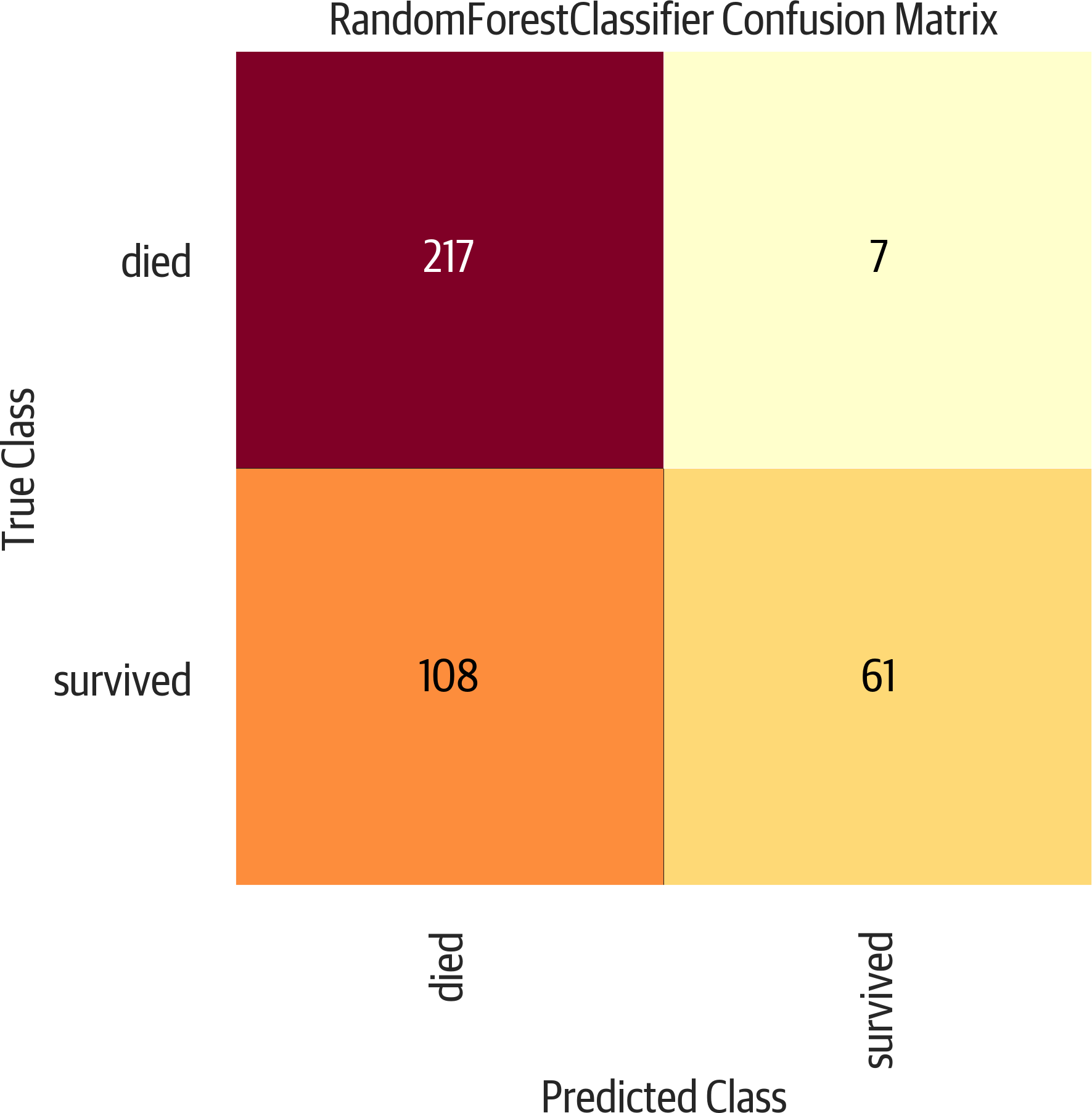
Figure 3-4. Yellowbrick confusion matrix. This is a useful evaluation tool that presents the predicted class along the bottom and the true class along the side. A good classifier would have all of the values along the diagonal, and zeros in the other cells.
ROC Curve
A receiver operating characteristic (ROC) plot is a common tool used to evaluate classifiers. By measuring the area under the curve (AUC), we can get a metric to compare different classifiers (see Figure 3-5). It plots the true positive rate against the false positive rate. We can use sklearn to calculate the AUC:
>>>y_pred=rf5.predict(X_test)>>>roc_auc_score(y_test,y_pred)0.7747781065088757
Or Yellowbrick to visualize the plot:
>>>fig,ax=plt.subplots(figsize=(6,6))>>>roc_viz=ROCAUC(rf5)>>>roc_viz.score(X_test,y_test)0.8279691030696217>>>roc_viz.poof()>>>fig.savefig("images/mlpr_0305.png")
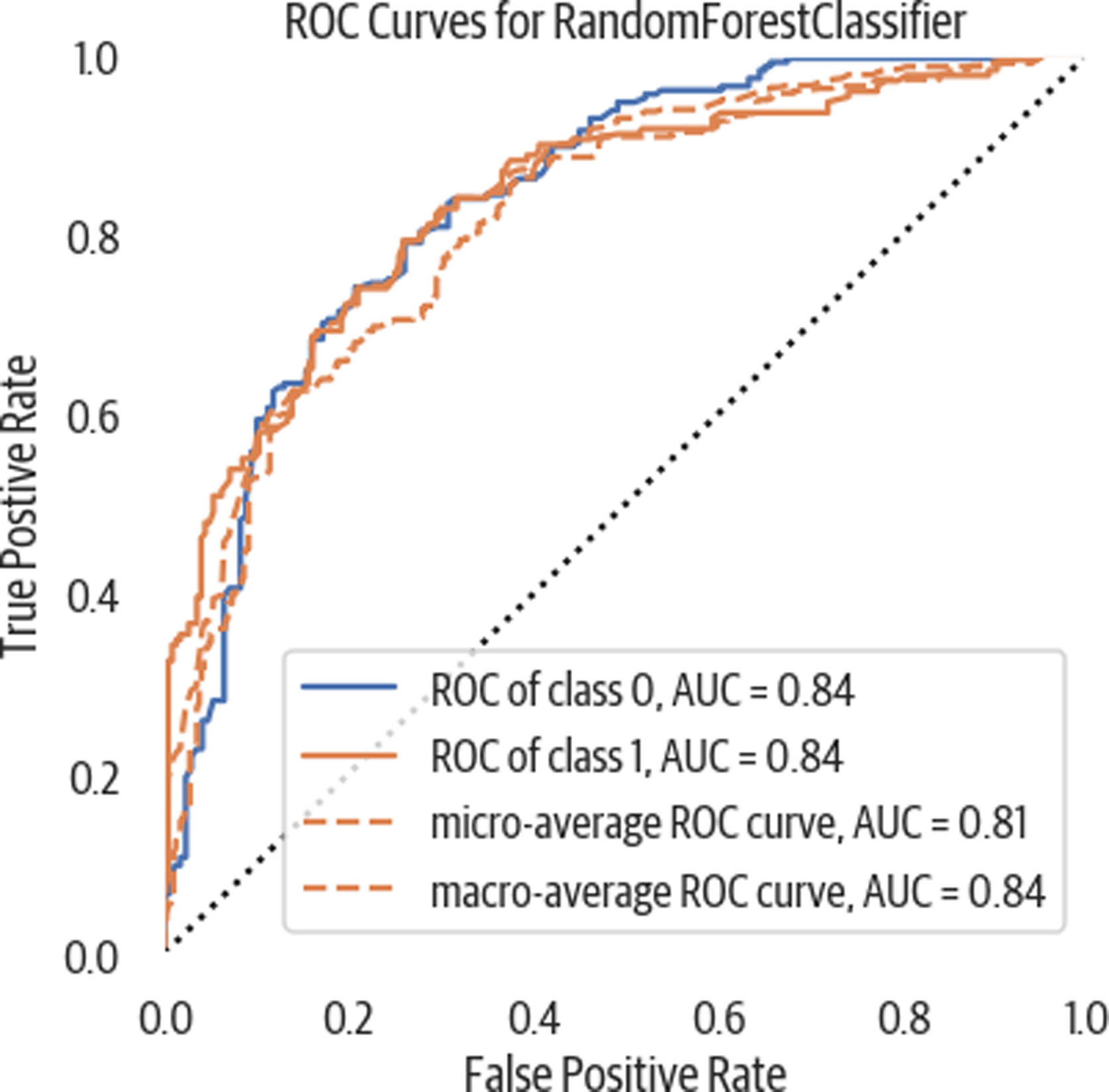
Figure 3-5. ROC curve. This shows the true positive rate against the false positive rate. In general, the further it bulges out the better. Measuring the AUC gives a single number to evaluate. Closer to one is better. Below .5 is a poor model.
Learning Curve
A learning curve is used to tell us if we have enough training data. It trains the model with increasing portions of the data and measures the score (see Figure 3-6). If the cross-validation score continues to climb, then we might need to invest in gathering more data. Here is a Yellowbrick example:
>>>importnumpyasnp>>>fig,ax=plt.subplots(figsize=(6,4))>>>cv=StratifiedKFold(12)>>>sizes=np.linspace(0.3,1.0,10)>>>lc_viz=LearningCurve(...rf5,...cv=cv,...train_sizes=sizes,...scoring="f1_weighted",...n_jobs=4,...ax=ax,...)>>>lc_viz.fit(X,y)>>>lc_viz.poof()>>>fig.savefig("images/mlpr_0306.png")
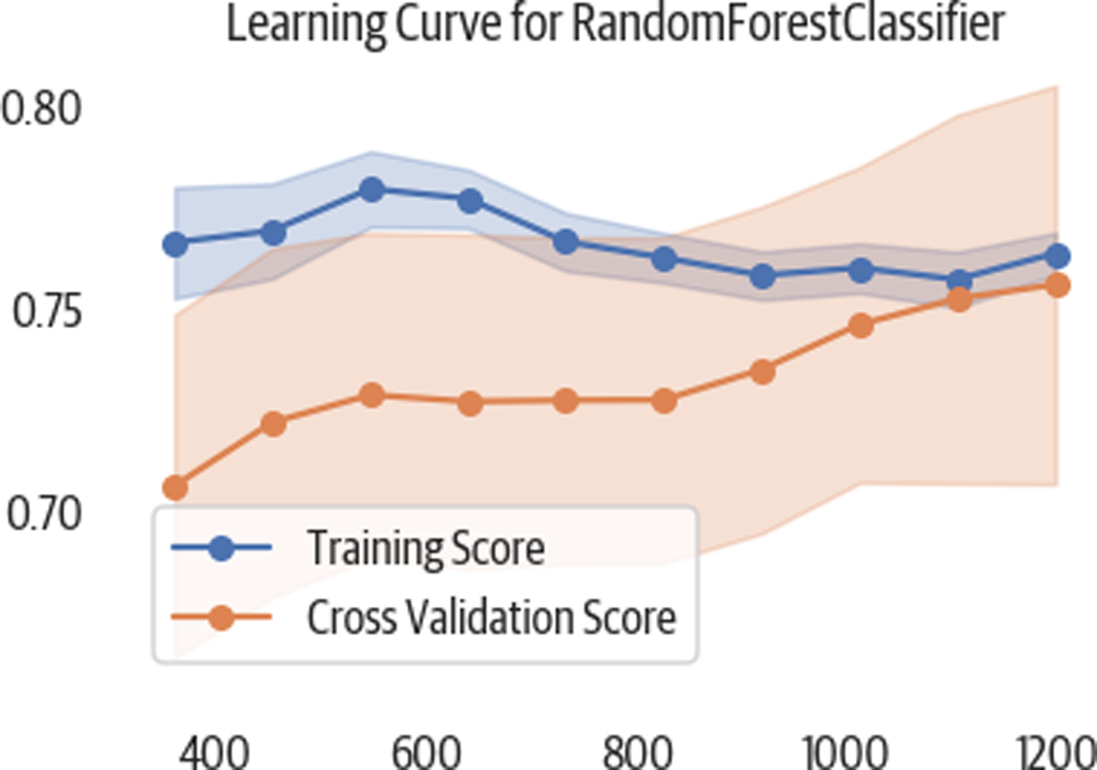
Figure 3-6. This learning curve shows that as we add more training samples, our cross-validation (testing) scores appear to improve.
Deploy Model
Using Python’s pickle module, we can persist models and load them.
Once we have a model, we call the .predict method to get a
classification or regression result:
>>>importpickle>>>pic=pickle.dumps(rf5)>>>rf6=pickle.loads(pic)>>>y_pred=rf6.predict(X_test)>>>roc_auc_score(y_test,y_pred)0.7747781065088757
Using Flask to deploy a web service for prediction is very common. There are now other commercial and open source products coming out that support deployment. Among them are Clipper, Pipeline, and Google’s Cloud Machine Learning Engine.
1 Even though we don’t directly call this library, when we load an Excel file, pandas leverages it behind the scenes.