8. Color Temperature and Light
Just as exposures can be objectively or subjectively correct for any image, color temperatures and color balance settings can be quite nuanced. The color of an image can be used as a powerful creative tool to enhance mood or to alter the feel of a photograph. For example, shooting with the camera’s white balance at the daylight preset might be correct for many outdoor scenes you run across—but, quite often, a photographer may choose to shoot at another setting in order to add a slight bit of warmth to the scene.
Working with the preset color settings in today’s modern cameras gives the photographer many variations in color to select from. And, of course, in postproduction there is an almost unlimited color palette to choose from. Again, as with exposure levels, the “correct” color balance is a subjective choice that has to be made on a case-by-case basis. However, some commercial clients will dictate how the overall color appears—and there are certainly general guidelines and realities that are expected from the viewer’s perspective.
The options available for determining and setting the color temperature at the time of capture are: automatic (the camera adaptively sets the white balance); custom (the white balance is locked in by metering a neutral tone in the scene); color temperature (the photographer manually dials in the desired Kelvin setting); and scene presets (the photographer locks in a setting predetermined to coordinate with a certain lighting condition). Each camera’s manual can help walk you through the particular functions of selecting and setting the white balance on that model.
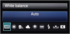
Image 8–1. The automatic white balance setting.
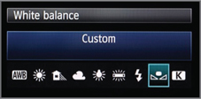
Image 8–2. The custom white balance setting.
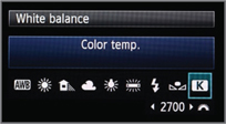
Image 8–3. The color temperature white balance setting.

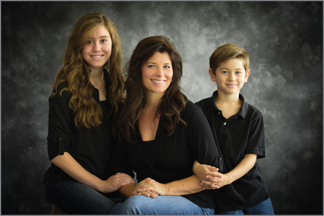
Images 8–4 and 8–5. In this portrait of my friend Bill Porter (left), there is clearly a strong, red color cast. The postproduction edit would require that I pull out some of the red in order to make him look less sunburned than he does in this image. The beautiful portrait of Mandy and her gorgeous children (right) has a bit of a yellow cast. I failed to use a custom white balance that would have removed this yellow tint from the image.
For each different situation and client you have to make a different choice. I use scene presets almost all of the time. I have tested my gear sufficiently to be able to predict quite accurately how the color will be affected by just about any combination of the daylight (at various times of day), the camera white balance settings, and any additional lighting (speedlights, studio strobes, etc.) I might choose to use. This allows me to set the camera before I start shooting.
Naturally, there will be occasions when the custom white balance function is critically important. For example, when you are photographing fabrics or clothing for publication, the reproduction of the tonal range often has to be very precise. Another situation might be when photographing building interiors for a commercial client that will use the work in an ad or publication. In these and other color-critical circumstances, implementing a fully color-managed workflow will be invaluable. Even in general wedding and portrait work, using a custom white balance can be important when shooting with mixed lighting on your subject—perhaps from a window and fluorescent overhead lights or when using light bounced off of a highly reflective building that has a tint to the glass.
It is very difficult to anticipate precise colors in these situations, so it is necessary to establish a custom white balance setting using a product such as the X-Rite Color Checker Passport. To do this, you simply take a test shot of the device in the lighting you plan to use (as in images 8–6 and 8–7, you can simply have the model hold it), then use the known, standardized values on the card to set neutral white balance on the camera—or to establish and apply color-balance values to the images in postproduction. A word of caution, though: if you don’t have a custom white balance tool like the Passport, you should use a white card instead—not a gray card. Many of the gray cards I have seen tended to be a little green or to have a shift toward the blue tones. If you want your custom white balance to be perfectly accurate, you need to be sure that the target of your test image is a true white. Again, a helpful tool like the Passport offers a bit of insurance.
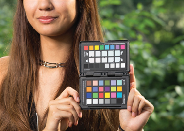

Images 8–6 and 8–7. Taking a test shot of the model with a color checker provides a precise color balance standard.
Since we are discussing location photography, which usually involves ambient lighting, another variable to discuss would be the time of day. As long as the sun is more than 20 degrees above the horizon, in either horizon, the color temperature remains relatively consistent throughout the day. However, as the daylight starts to change and the sun gets lower, the color temperature shifts to a more warm color and it continues to shift warmer and warmer until the sun sets. This would also be another good time to use a custom white balance.
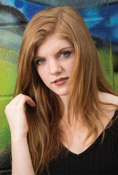
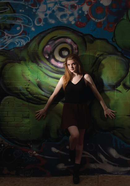
Images 8–8 and 8–9. Using a custom white balance ensures predictable, consistent results in mixed light, changing light, or in situations where saturated background colors might trip up the camera’s automatic white balance.
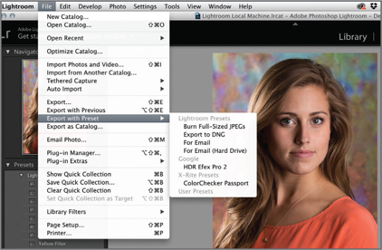
Image 8–8. I used the X-Rite Passport Export Preset with Lightroom to ensure a true color balance—despite the possible influences of the flash and camera settings at the time of capture.
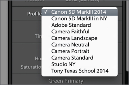
Image 8–9. Selecting the previously saved Camera setting under the Develop module for Camera Calibration objectively aligns the tones to the X-Rite Passport color chart and accounts for my specific camera’s color bias (if there is any).
The other time photographers can address color balance issue is during the postproduction process. Working within Adobe Photoshop and Lightroom (or your camera manufacturer’s proprietary image processing software), you can easily make global adjustments to a RAW file. Syncing those color adjustments (or copying and pasting them) to all the files from the same lighting situations is also fairly easy. However, I have always subscribed to the idea of taking every opportunity to make all of my exposure and color decisions before I take the picture. I want to “get it right in the camera,” as they say. This inspires greater confidence from your client, reduces the amount of time you need to spend working in postproduction, and generally redirects your efforts back to the process of taking pictures.