Here’s a little known fact: did you know that the Academy of Motion Picture Arts and Sciences (the folks who give out the annual Academy Awards) originally created the Special Effects Oscar category as a way to honor the work done by photographers using Lightroom’s Effects panel? Okay, well that’s not 100% true. Actually, it’s not even 1% true, but if you ever looked in Lightroom’s Effects panel and saw that not only are there just two effects in there (Grain and Post-Crop Vignetting), you’d have to ask yourself, are those even effects? Really, is the bar so low for what’s allowed into that panel that the simple act of adding noise to your photo is worthy of 50% of an entire panel? I would expect to see some kick butt stuff in that panel, so I figure that Adobe’s Lightroom engineers, brilliant as they are, just weren’t particularly awesome at putting features in the right spots. I thought it was one of those left brain/right brain things, but a friend at Adobe, who works closely with the Lightroom team, revealed to me how it’s really decided: it’s the work of paid lobbyists. I know, it’s hard to imagine, but it’s a well-known fact out in San Jose, where Adobe is based. Here’s how it works: when Lightroom’s engineers come into work in the morning, in the lobby of Adobe HQ are small groups of people yelling out where they think certain features should be placed, and they hold up free samples of everything from cans of Monster Energy drink to Star Wars action figures (apparently, it was a Boba Fett action figure that shot little missiles and an off-color 12" wampa that got an engineer to move Dehaze to the Basic panel). If I was there with an original Jawa figure with fabric cape, I’ll bet I could get the Exposure slider moved to the Split Toning panel. Just sayin’.
Back in Chapter 5, we looked at applying camera profiles to your RAW images. Well, buried in the menu where Adobe put those RAW profiles they also included a bunch of creative profiles for applying more special-effect-style “looks,” but using these isn’t just limited to RAW photos—you can add them to JPEGs, TIFFs, whatever. These creative profiles have a huge advantage over presets, because presets just move your Develop module sliders to a “pre-set” location (like somebody stepped in and processed the photo for you). However, the profiles don’t mess with your sliders—they’re their own separate thing, more like special effect filters, so you can still edit your image any way you want after you apply a profile.
Step One:
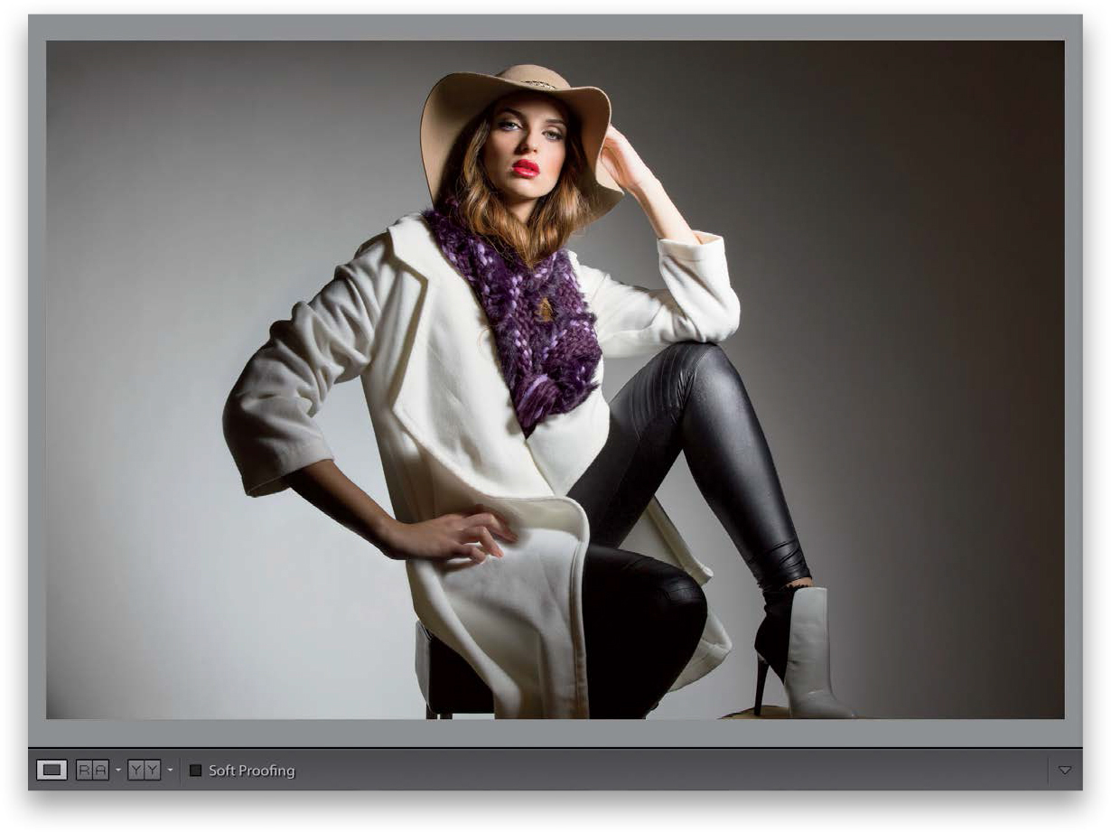
Here’s our original image (remember, the creative profiles don’t need a RAW image, you can use them on JPEGs, TIFFs, and PSDs, as well). In the Develop module, at the top of the Basic panel, choose Browse from the Profile menu (as shown here), or click the icon with the four little boxes to the right of it. This brings up the Profile Browser with rows of thumbnails (seen in Step Two). There are four sets of creative profiles (behind the scenes, these looks are based on Color Lookup Tables; just throwin’ that in for you techie folks). They are: (1) Artistic, (2) B&W (which I cover in this chapter on page 232), (3) Modern, and (4) Vintage.

Step Two:
Two important things to know about the Profile Browser: (1) each thumbnail displays your image with its look applied to it, so you’re getting a mini-preview just by looking at the thumbnails, but even better (2) you can audition these looks right on your full-size image by simply hovering your cursor over a thumbnail. So, you can really see whether this is a look you like before committing to it (of course, nothing in Lightroom is really very committed because if you did click on a particular profile and decided you didn’t like it after all, you’d just press Command-Z [Ctrl-Z] to undo it). Here, I applied the Artistic 08 creative profile.

Step Three:
Let’s take this a step further. Scroll down to the Modern profiles, and click on one you like (here, I chose Modern 05, which has kind of a nice desaturated-type look). I actually really like this profile (it’s one of my personal favorites out of the whole bunch). You can also see one of the B&W thumbnails at the top of the browser, here (this list of thumbnails scrolls up/down, but the controls at the top, including the all-important Close button, which you click after you’re done applying your profile, stay static). By the way, you can add any one or more of these creative profiles to the Favorites section at the top by moving your cursor over a thumbnail, and then clicking on the star icon in the top-right corner.

Step Four:
I like the profile I applied in Step Three, but I wish it wasn’t quite so desaturated. Luckily, there’s an Amount slider for these creative profiles (unlike with presets) at the top of the Profile Browser, so I can drag this slider to the left, which backs off the intensity, and I can dial in just the right amount (here, I dragged it down to 59; compare it with the full amount in Step Three). This works for any creative profile (there isn’t an Amount slider for the RAW profiles), and not only can you back off the amount, if you want a more intense effect, then you can drag the slider to the right.

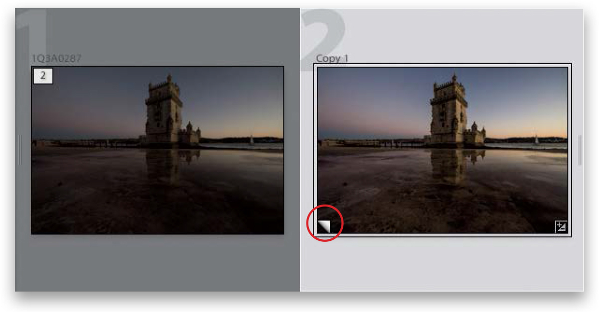
Let’s say you added a vignette to a bridal shot. Well, what if you wanted to see a version in black and white, and a version with a color tint, and a really contrasty version, and then maybe a version that was cropped differently? Well, what might keep you from doing that is having to duplicate a high-resolution file each time you wanted to try a different look, because it would eat up hard drive space and RAM like nobody’s business. But luckily, you can create virtual copies, which don’t take up space and allow you to try different looks without the overhead.
Step One:
You create a virtual copy by just Right-clicking on the original photo and then choosing Create Virtual Copy from the pop-up menu (as shown here), or using the keyboard shortcut Command-’ (apostrophe; PC: Ctrl-’). These virtual copies look and act the same as your original photo, and you can edit them just as you would your original, but here’s the difference: it’s not a real file, it’s just a set of instructions, so it doesn’t add any real file size. That way, you can have as many of these virtual copies as you want, and experiment to your heart’s content without filling up your hard disk.

Step Two:
When you create a virtual copy, you’ll know which version is the copy because the virtual copies have a curled page icon in the lower-left corner of the image thumbnail (circled in red here) in both Grid view and in the Filmstrip. So now, go ahead and tweak this virtual copy in the Develop module any way you want (here, I increased the Exposure, Contrast, Shadows, Clarity, and Vibrance), and when you return to Grid view, you’ll see the original and the edited virtual copy (as seen here).
Step Three:
Now you can experiment away with multiple virtual copies of your original photo, at no risk to that original or your hard drive space. So, click on your first virtual copy, then press Command-’ (PC: Ctrl-’) to make another virtual copy (that’s right—you can make virtual copies of your virtual copy), and then head over to the Develop module, and make some adjustments (here, I made changes to the White Balance, adding more blue and magenta to get this look. I also increased the Exposure, Contrast, Shadows, Clarity, and Vibrance). Now, make some more copies to experiment with (I made a few more copies and tried a few other looks). Note: When you make a copy, you can hit the Reset button at the bottom of the right side Panels area to return the virtual copy to its original unedited look. Also, you don’t have to jump back to Grid view each time to make a virtual copy—that keyboard shortcut works in the Develop module, too.

Step Four:
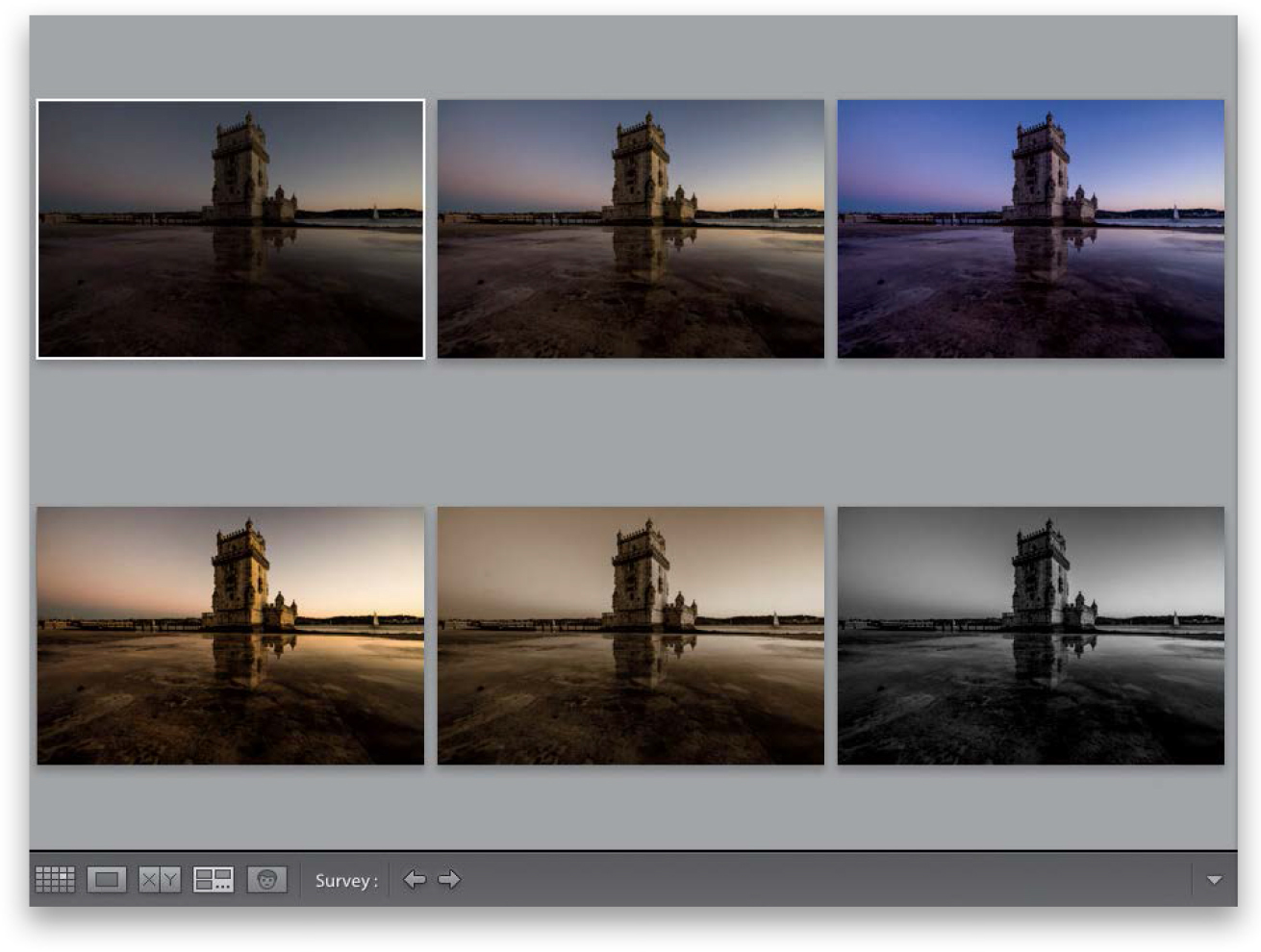
Now, if you want to compare all your experimental versions side by side, go back to Grid view, select your original photo and all the virtual copies, then press the letter N on your keyboard to enter Survey view (as shown here). If there’s a version you really like, of course you can just leave it alone, and then delete the other virtual copies you don’t like. (Note: To delete a virtual copy, click on it and press the Delete [PC: Backspace] key, and then click Remove in the dialog that appears.) If you choose to take this virtual copy over to Photoshop or export it as a JPEG or TIFF, at that point, Lightroom creates a real copy using the settings you applied to the virtual copy.
Anytime you have just one color you want to adjust in an image (for example, let’s say you want all the reds to be redder, or the blue in the sky to be bluer, or you want to change a color altogether), one place to do that would be in the HSL panel (HSL stands for Hue, Saturation, Luminance). This panel is incredible handy (I use it fairly often) and luckily, because it has a TAT (Targeted Adjustment tool), using it is really easy. Here’s how this works:
Step One:
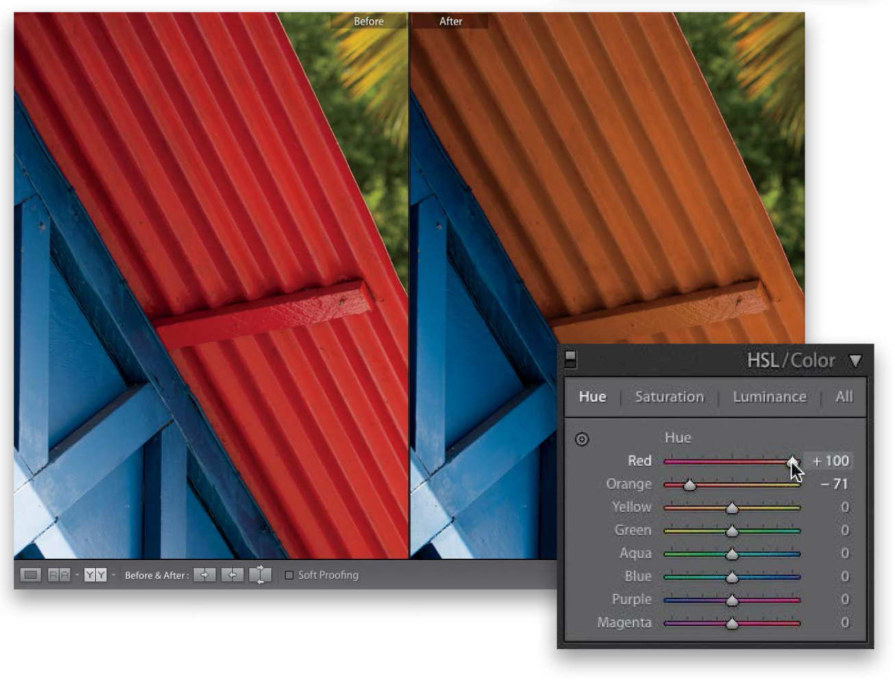
When you want to adjust an area of color, scroll down to the HSL panel in the right side Panels area (by the way, those words in the panel header, HSL/Color, are not just names, they’re buttons, and if you click on either of them, the controls for that panel will appear). Go ahead and click on HSL (since this is where we’ll be working first), and four buttons appear in the panel: Hue, Saturation, Luminance, and All. The Hue panel lets you change an existing color to a different color by using the sliders. Just so you can see what it does, click-and-drag the Red slider all the way to the left and the Orange slider to –71, and you’ll see it changes the red roof to magenta.

Step Two:
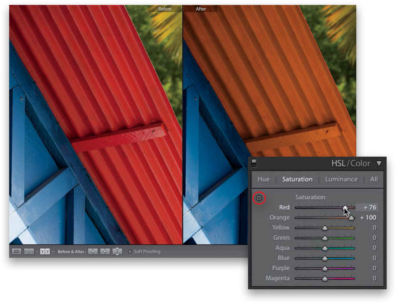
If you dragged the Red slider all the way to the right, and left the Orange slider at –71, it would change the color of the red roof to more of an orangeish color. This is a perfect task for the Hue sliders of the HSL panel. Now, what if you wanted to make the orange color more orange, but you’ve pushed the sliders just about as far as they can go? Well, you’d start by clicking on the word “Saturation” at the top of the panel.
Step Three:
Now, these eight sliders control just the saturation of colors in your image. Drag the Orange slider way over to the right, and the Red not quite as far, and the orange in the roof becomes more vibrant (as seen here). If you know exactly which color you want to affect, you can just drag the sliders. But if you’re not sure exactly which colors make up the area you want to adjust, then you can use the TAT (the Targeted Adjustment tool in the top-left corner of the panel). So, if you had a blue sky and wanted to make it more vibrant, you’d click on the TAT, then click it on the sky, and drag it upward to make it bluer (downward to make it less blue). And it wouldn’t just move the Blue slider, but would increase the Aqua Saturation amount, as well. You probably wouldn’t have realized that there was any aqua in that blue sky, and this is exactly why this tool is so handy here. In fact, I rarely use the HSL panel without using the TAT!
Step Four:
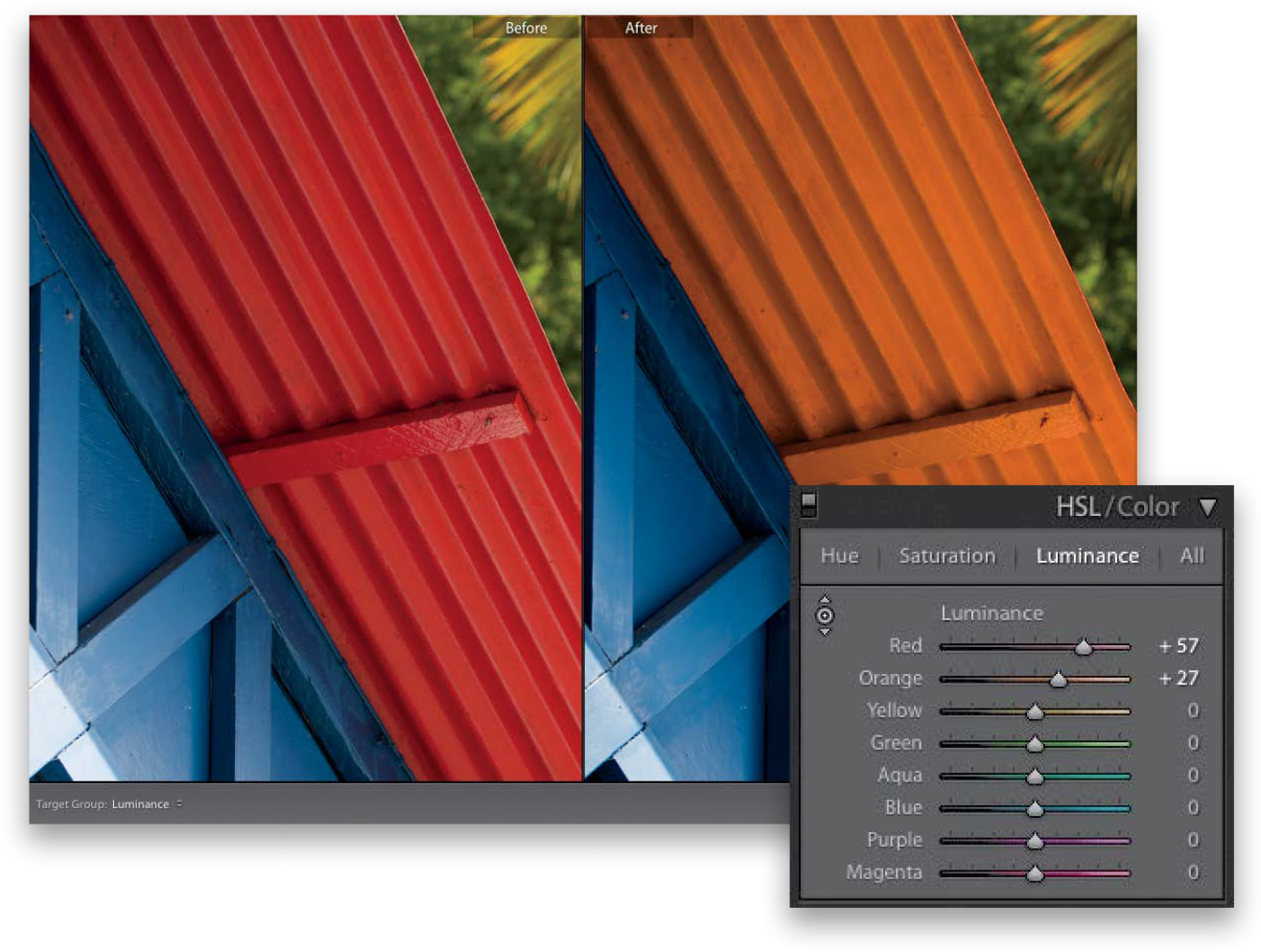
To change the brightness of the colors, click on Luminance at the top of the panel. To brighten the orange color of the roof, take the TAT and click-and-drag straight upward on it, and its color gets brighter (the Luminance for both Red and Orange increased). Two last things: Clicking the All button (at the top of the panel) puts all three panels in one scrolling list and the Color panel breaks them all into sets of three for each color—a layout more like Photoshop’s Hue/Saturation. But, regardless of which layout you choose, they all work the same way. A before/after is shown here, after we changed and brightened the color of the roof.
An edge vignette effect (where you darken all the edges around your image to focus the attention on the center of the photo) is one of those effects you either love or that drives you crazy (I, for one, love ‘em). Here we’re going to look at how to apply a simple vignette, one where you crop the photo and the vignette still appears (called a “post-crop” vignette), and how to use the other vignetting options.
Step One:
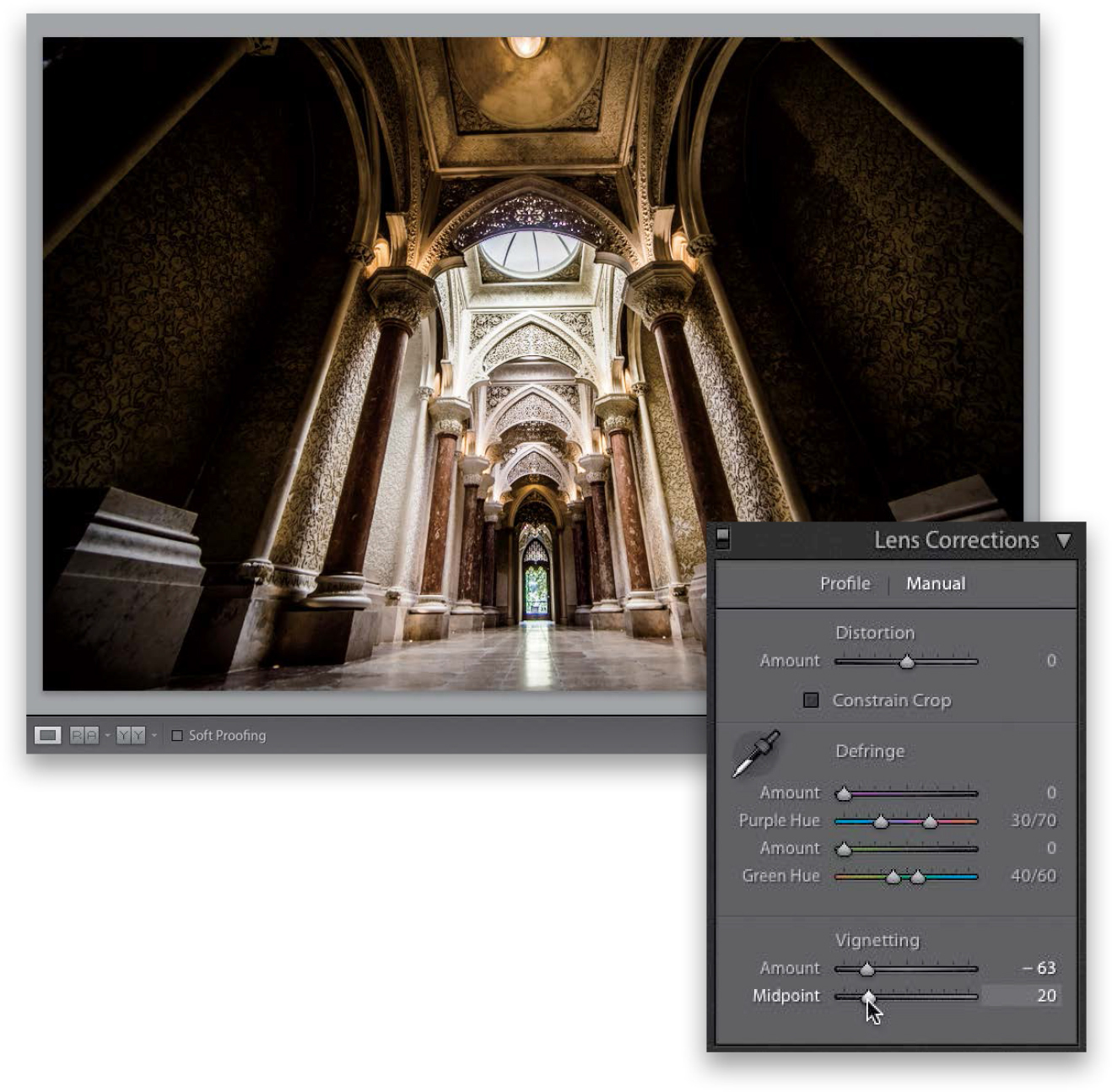
To add an edge vignette effect, go to the right side Panels area and scroll down to the Lens Corrections panel (the reason it’s in the Lens Corrections panel is this: some particular lenses darken the corners of your photo, even when you don’t want them to. In that case, it’s a problem, and you’d go to the Lens Corrections panel to fix a lens problem, right? There, you would brighten the corners using the controls in this panel. So, basically, a little edge darkening is bad, but if you add a lot intentionally, then it’s cool. Hey, I don’t make the rules—I just pass them on). Here’s the original image without any vignetting (by the way, we’ll talk about how to get rid of “bad vignetting” in Chapter 8—the chapter on how to fix problems).
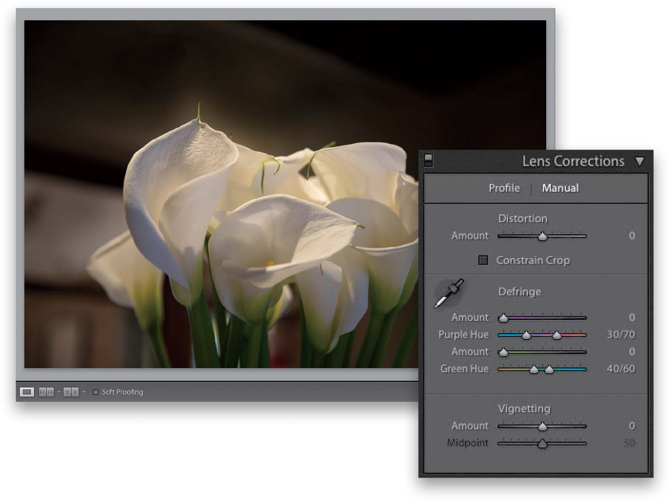
Step Two:
We’ll start with regular full-image vignetting, so click on Manual at the top of the panel, then drag the Vignetting Amount slider all the way to the left. This slider controls how dark the edges of your photo are going to get (the further to the left you drag, the darker they get). The Midpoint slider controls how far in the dark edges get to the center of your photo. So, try dragging it over quite a bit, too (as I have here), and it kind of creates a nice, soft spotlight effect, where the edges are dark, your subject looks nicely lit, and your eye is drawn right where you want it to look.

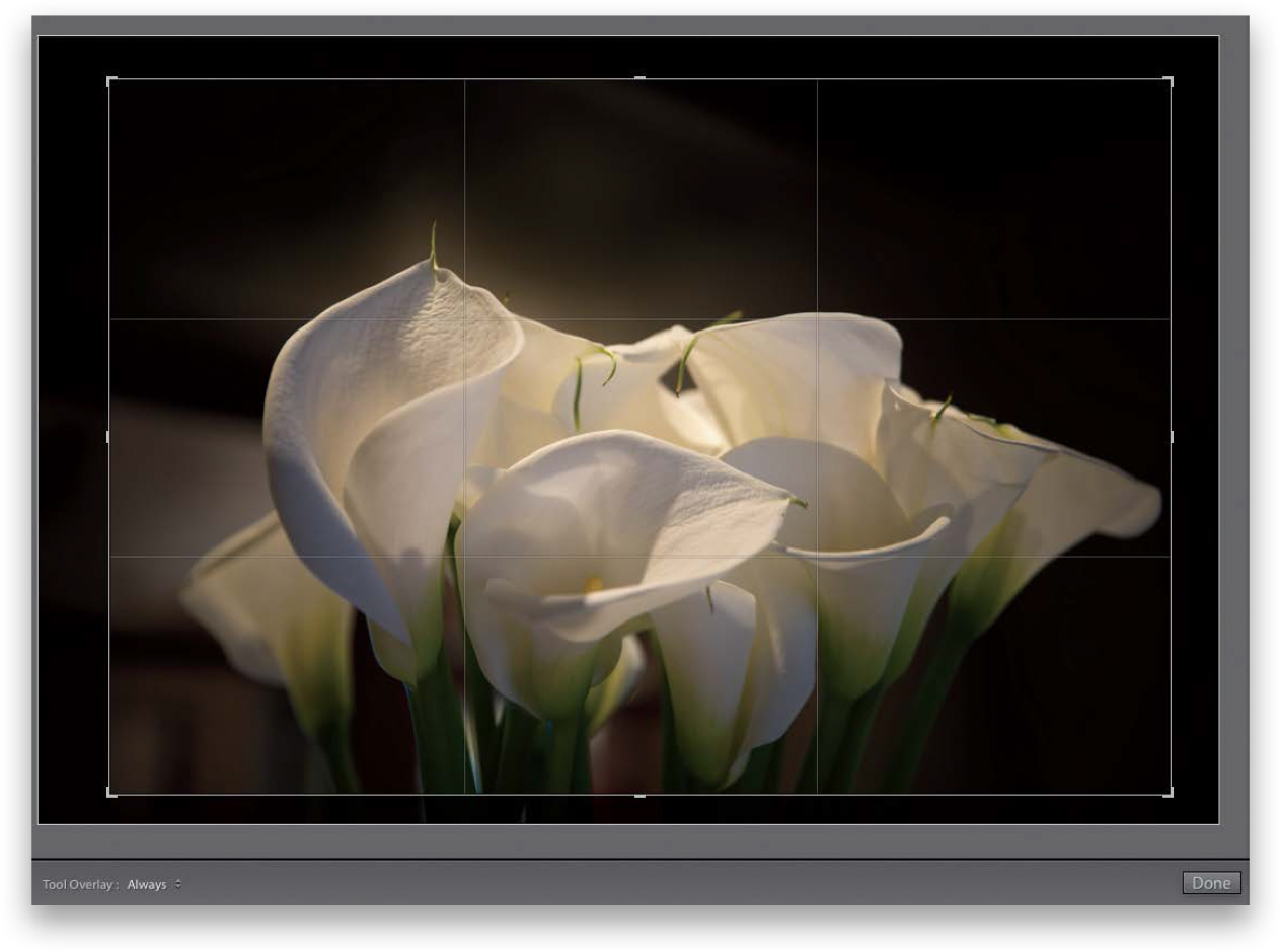
Step Three:
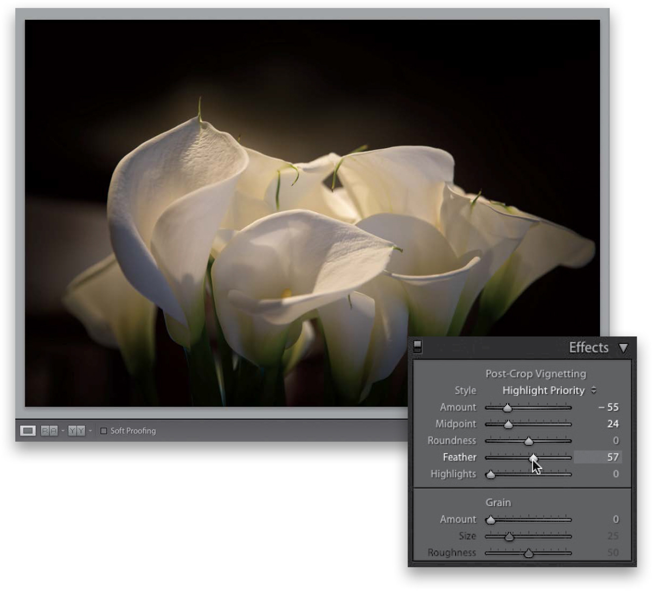
Now, this works just fine, until you wind up having to crop the photo, because cropping will crop away the edge vignette. To get around that problem, Adobe added a control called “Post-Crop Vignetting,” which lets you add vignetting effects after you’ve cropped. I’m cropping that same photo in tight here, and now most of the edge vignetting I added earlier will be cropped away. So, scroll down to the Effects panel, and at the top, you’ll see Post-Crop Vignetting. Before we try that, reset your Vignetting Amount slider (in the Lens Corrections panel) to 0 (zero), so we don’t add the post-crop vignetting on top of the little bit of original vignetting still in our photo.
Step Four:
Before we get to the sliders, let’s talk about the Style pop-up menu. You have three choices: (1) Highlight Priority, (2) Color Priority, and (3) Paint Overlay (though the only one that really looks good is Highlight Priority, so it’s the only one I ever use). Highlight Priority is more like what you get with the regular vignette. The edges get darker, but the color may shift a bit, and I’m totally okay with the edges looking more saturated. This choice gets its name from the fact that it tries to keep as much of the highlights intact, so if you have some bright areas around the edges, it’ll try to make sure they stay bright. I made the edges pretty darn dark here—darker than I would make mine, but I wanted you to really see the effect on the cropped image (just for example purposes). The Color Priority style is more concerned with keeping your color accurate around the edges, so the edges do get a bit darker, but the colors don’t get more saturated, and it’s not as dark (or nice) as the Highlight Priority style. Finally, Paint Overlay gives you the look we had back in Lightroom 2 for post-crop vignetting, which just painted the edges dark gray (yeech!).
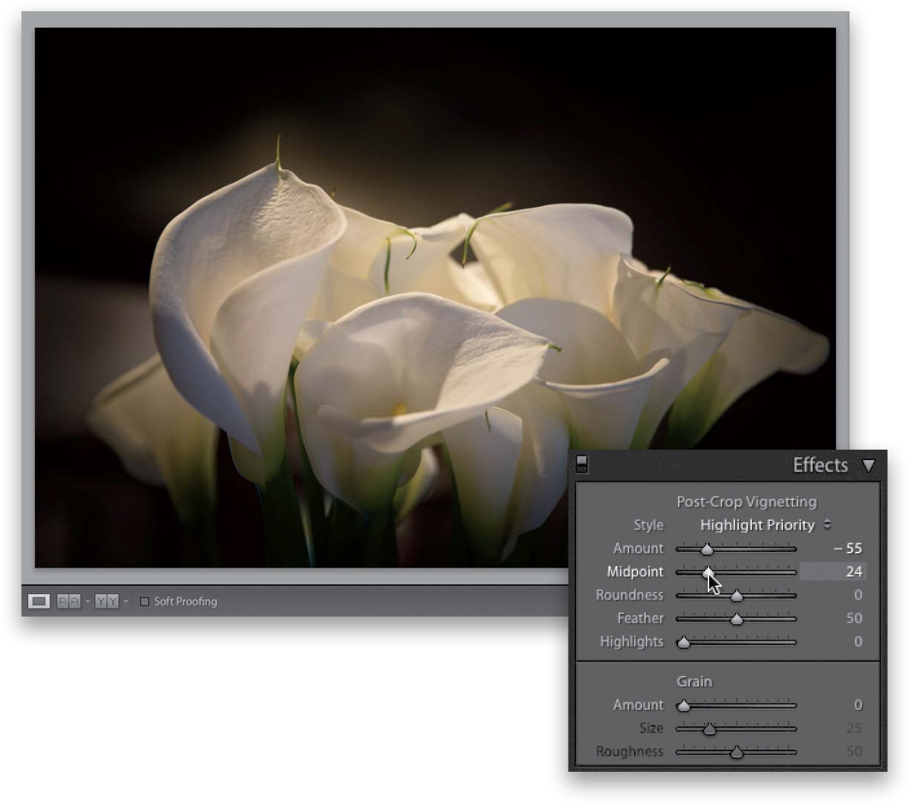
Step Five:
The next two sliders were added to give you more control to make your vignettes look more realistic. For example, the Roundness setting controls how round the vignette is. Just so you know exactly what this does, try this: leave the Roundness set at 0, but then drag the Feather amount (which we’ll talk about in a moment) all the way to the left. You see how it creates a very defined oval shape? Of course, you wouldn’t really use this look (well, I hope not), but it does help in understanding exactly what this slider does. Well, the Roundness setting controls how round that oval gets (drag the slider back and forth a couple of times and you’ll instantly get it). Okay, reset it to zero (and stop playing with that slider). ;-)
Step Six:
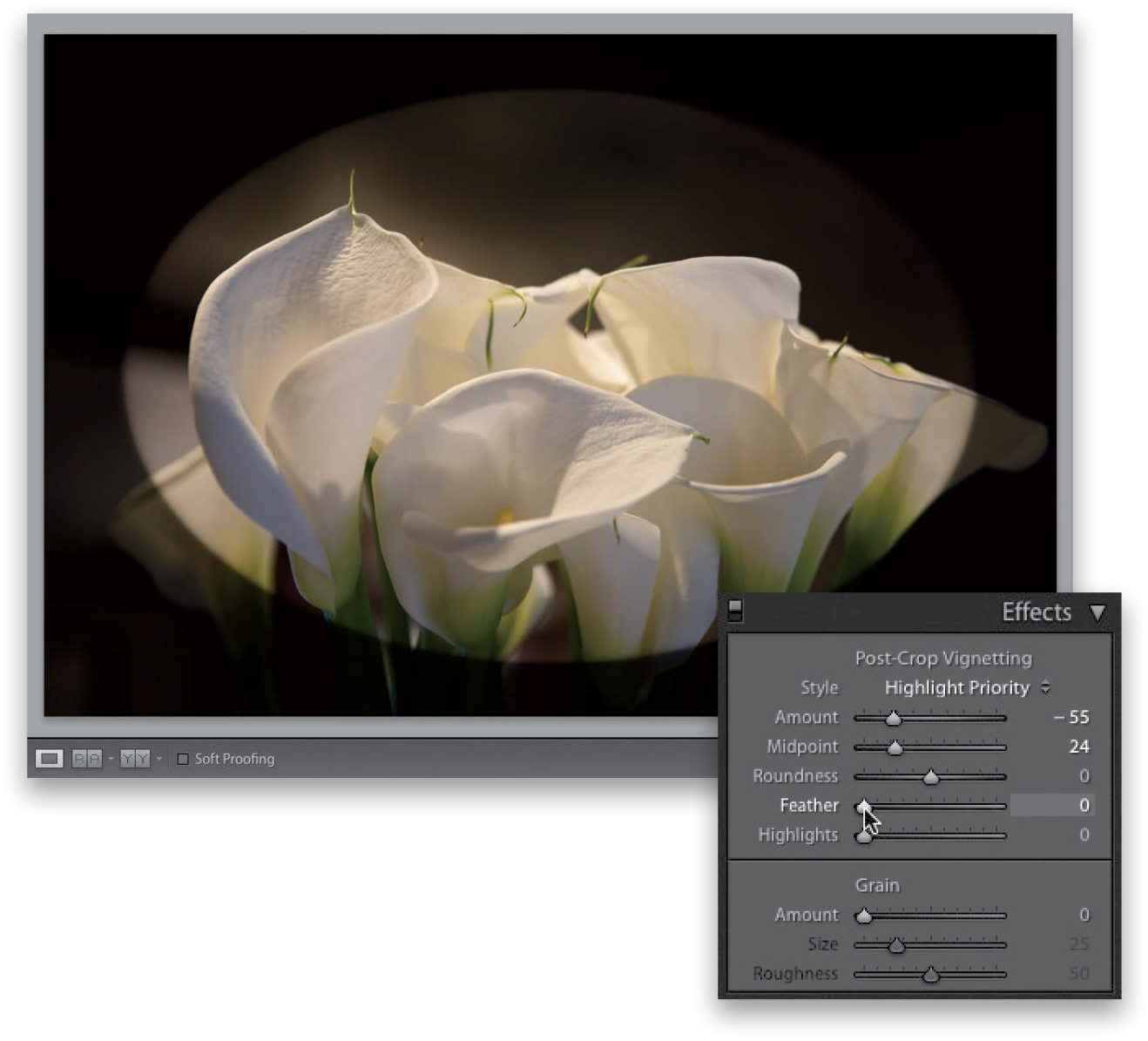
The Feather slider controls the amount of softness of the oval’s edge, so dragging this slider to the right makes the vignette softer and more natural looking. Here, I clicked-and-dragged the Feather amount to 57, and you can see how it softened the edges of the hard oval you saw in the previous step. So, in short, the farther you drag, the softer the edges of the oval get. The bottom slider, Highlights, helps you to maintain highlights in the edge areas you’re darkening with your vignette. The farther to the right you drag it, the more the highlights are protected. The Highlights slider is only available if your Style is set to either Highlight Priority or Color Priority (but you’re not going to set it to Color Priority, because it looks kind of yucky, right?). So there ya have it—how to add an edge vignette to focus the viewer’s attention on the center of your image by darkening the edges all the way around.
There’s a Photoshop effect that started making the rounds a couple years ago, and now it’s one of the hottest and most requested looks out there—you see it everywhere from big magazine covers to websites to celebrity portraits to album covers. Anyway, you can get pretty darn close to that look right within Lightroom itself. Now, before I show you the effect, I have to tell you, this is one of those effects that you’ll either absolutely love (and you’ll wind up over-using it), or you’ll hate it with a passion that knows no bounds. There’s no in-between.
Step One:
Before we apply this effect, I have a disclaimer: this effect doesn’t look good on every photo. It looks best on photos that have lots of detail and texture, so it looks great on city shots, landscapes, industrial shots, and even people (especially guys)—anything you want to be gritty and texture-y (if that’s even a word). So, you’re usually not going to apply this effect to anything you want to look soft and/or glamorous. Here’s a shot with lots of detail and that has lots of texture. It’s just screaming for this type of treatment.

Step Two:
You’re going to really crank up four sliders in the Develop module’s Basic panel: (1) drag the Contrast slider all the way over to +100, (2) drag the Highlights slider all the way to –100, (3) drag the Shadows slider all the way to +100 (that opens up the shadows), and (4) drag the Clarity slider all the way to the right to +100. Now, the whole image has that high-contrast look already, but we’re not done yet.

Step Three:
At this point, depending on the photo you applied this effect to, you might have to drag the Exposure slider to the right a bit if the entire image is too dark (that can happen when you set the Contrast at +100). Or, if the photo looks washed out a bit (from cranking the Shadows slider to +100), then you might need to drag the Blacks slider to the left to bring back the color saturation and overall balance. Here, I ended up decreasing the Exposure to –0.20 and the Blacks to –23. Outside of those potential tweaks, the next step is to desaturate the photo a little bit by dragging the Vibrance slider to the left (here, I dragged it over to –25). This desaturation is a trademark of this “look,” which kind of gives the feel of an HDR image without combining multiple exposures.

Step Four:
The final step is to add an edge vignette to darken the edges of your photo, and put the focus on your subject. So, go to the Lens Corrections panel (in the right side Panels area), click on Manual at the top, and drag the Vignetting Amount slider to the left (making the edges really dark). Then drag the Midpoint slider pretty far to the left, as well (the Midpoint slider controls how far the darkened edges extend in toward the middle of your photo. The farther you drag this slider to the left, the farther in they go). This made the whole photo look a little too dark, so I had to go back to the Basic panel and increase the Exposure amount a little bit (to +0.10) to bring back the original brightness before the vignette. I included a few befores and afters on the next page just to give you an idea of how it affects different images. Hey, don’t forget to save this as a preset (see page 208), so you don’t have to do this manually every time you want to apply this look.

There are two methods for converting your images from color to black and white, and I’ll start with the method that has been in Lightroom from the start. But, the newer method (definitely my preferred method) gives you more choices, live previews, and, I think, a far better result. Plus, once you’ve made the conversion, you can use the same techniques you learned in Chapters 5 and 6 to really fine-tune your conversion.
Step One:
Here’s our original color image (taken in Banff, Canada), and I thought it would make a good candidate for converting to black and white (not every color image makes a good black-and-white, no matter how good the conversion technique). Before we do the conversion, take a look in the right side Panels area, and you’ll see a panel called “HSL/Color.” Keep an eye on that panel. Now, at the very top of the Basic panel, in the Treatment section, click on Black & White (as shown here).

Step Two:
Now look at the HSL/Color panel, again. It’s no longer visible—it has been replaced by the B&W panel (seen in the inset here), and Lightroom has applied its Adobe Monochrome profile. If you click on the Auto button at the bottom of the panel, it applies an Auto mix (as seen here). Since “it’s less than awesome,” I don’t use it, but instead do it manually. Each of the sliders in this panel affects the underlying tones represented by that color slider. For example, drag the Blues slider back and forth and you’ll see how it affects the sky. What these sliders do is brighten or darken parts of your image, and if you just drag each one back and forth a few times, you’ll get what they do and how each affects your black-and-white image.
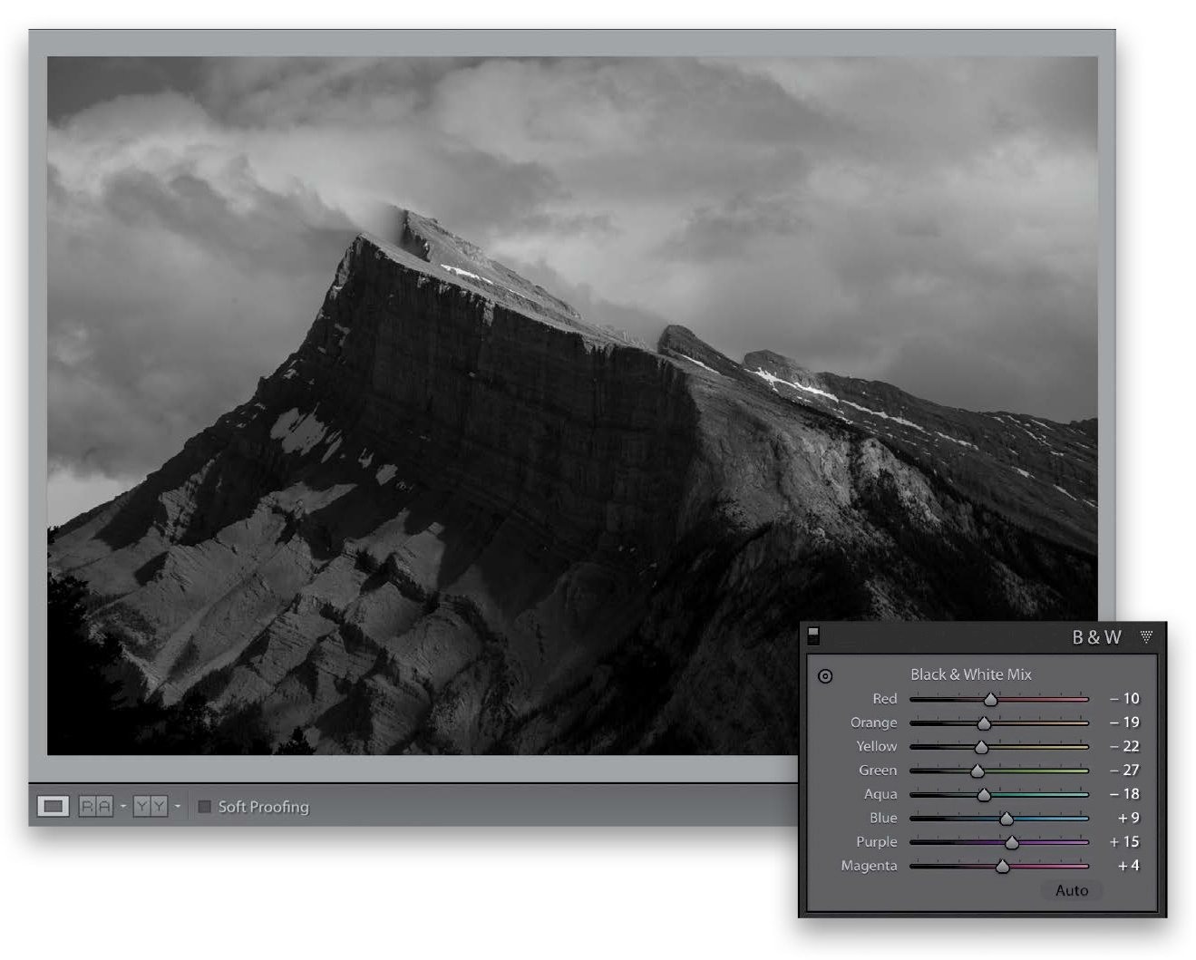
Step Three:
That’s what I did here—I double-clicked on Black & White Mix at the top of the panel to remove the Auto mix, then I dragged each slider back and forth a few times to see how each affects the image. The Red slider and the Magenta slider didn’t affect this particular image at all, but most of the other sliders did, so I dragged each one, evaluated how it looked to me, and if I liked what a particular slider did, I left it there. This alone won’t make a great black-and-white, but it’s good to know this is here if you want to tweak a particular part of your image later. What I’m saying here is that I wouldn’t use this feature at this stage of the game, but later (when we do our conversion using the better method) we can come back here if we need some part of the photo to be brighter, and we can’t think of an easier or faster way to do it.
Step Four:
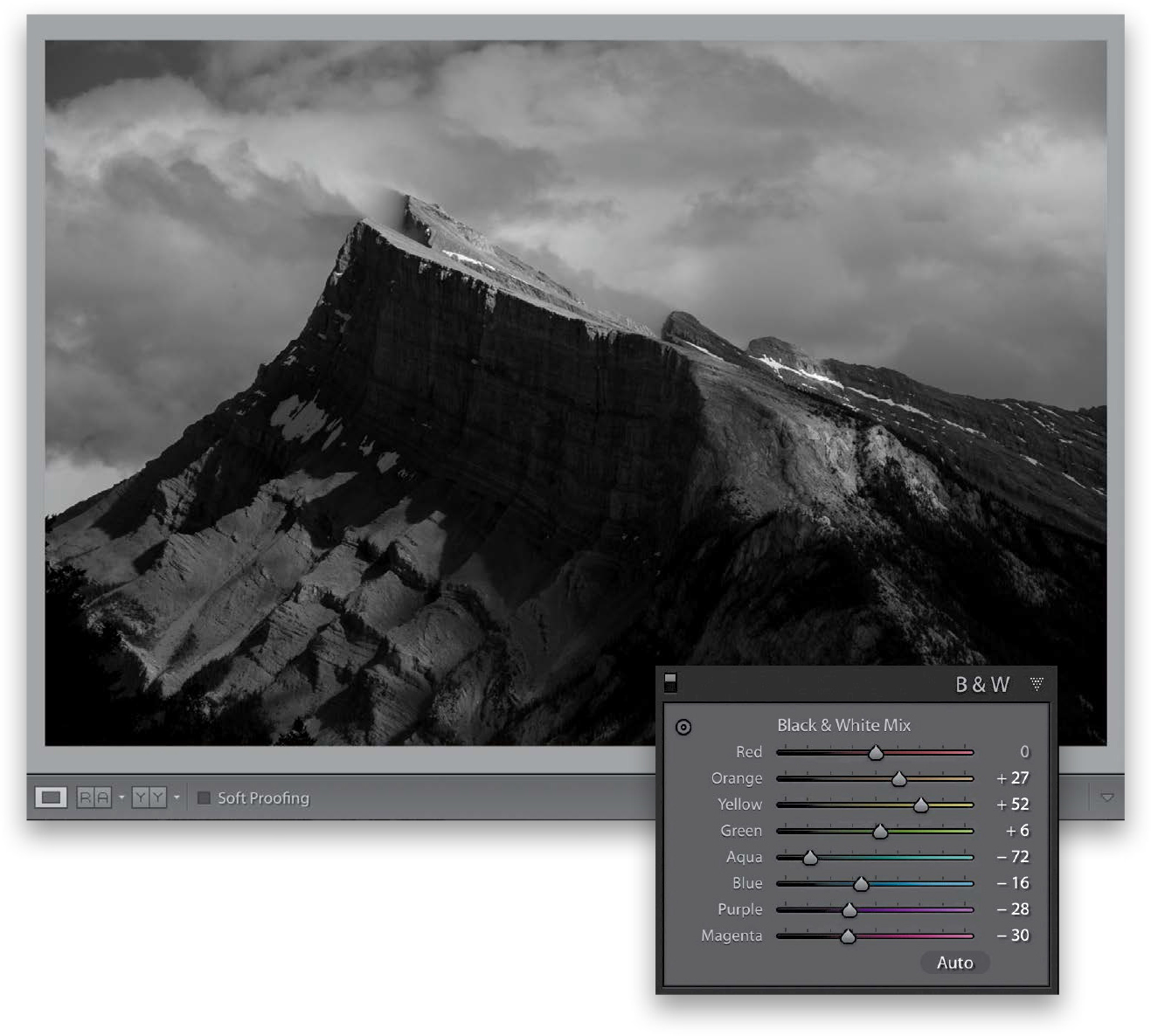
Okay, hit the Reset button at the bottom of the right side Panels area and let’s try the other method. Go to the top of the Basic panel, and from the Profile pop-up menu, choose Browse (as shown here). We’re going to use a profile to convert to black and white, and we’re going to have a lot of choices as to how this conversion happens, and how the final image winds up looking.
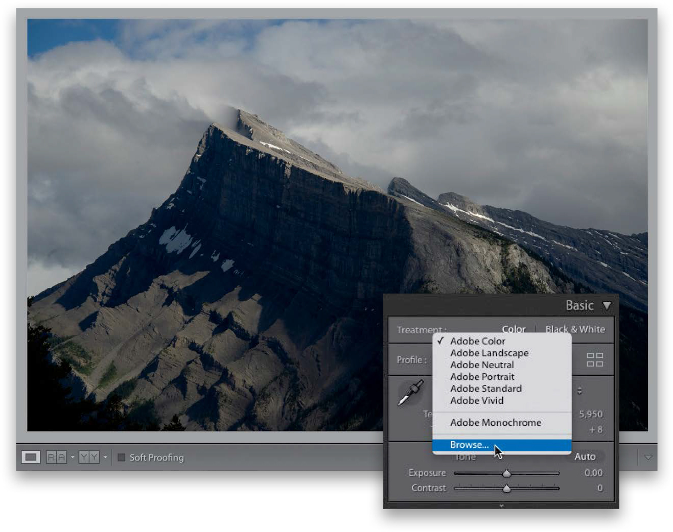
Step Five:
When you choose Browse, it brings up the Profile Browser you see here. Scroll down to the B&W profiles. The awesome thing about these B&W profiles is that they’re not presets—they don’t move any sliders—so when find one you like and apply it, you can still tweak the resulting image to your heart’s content. It shows you a preview of what each B&W profile looks like right on the thumbnail themselves. To find which one looks best to you, just hover your cursor over each thumbnail and you’ll get a live preview right on your image. Here, I moved my cursor over each of the thumbnails to find out which one looked best on this particular image, and, for me, it was B&W 07. So, that’s what you’re seeing here. Just one click.

TIP: Would This Make a Good B&W Image?
If you’re looking through your images and wonder if a particular one would make a good black-and-white, just press the letter V on your keyboard and it makes the image black and white, and you’ll see whether there’s potential there or not. If it doesn’t look good, press V again to return to the full-color image.
Step Six:
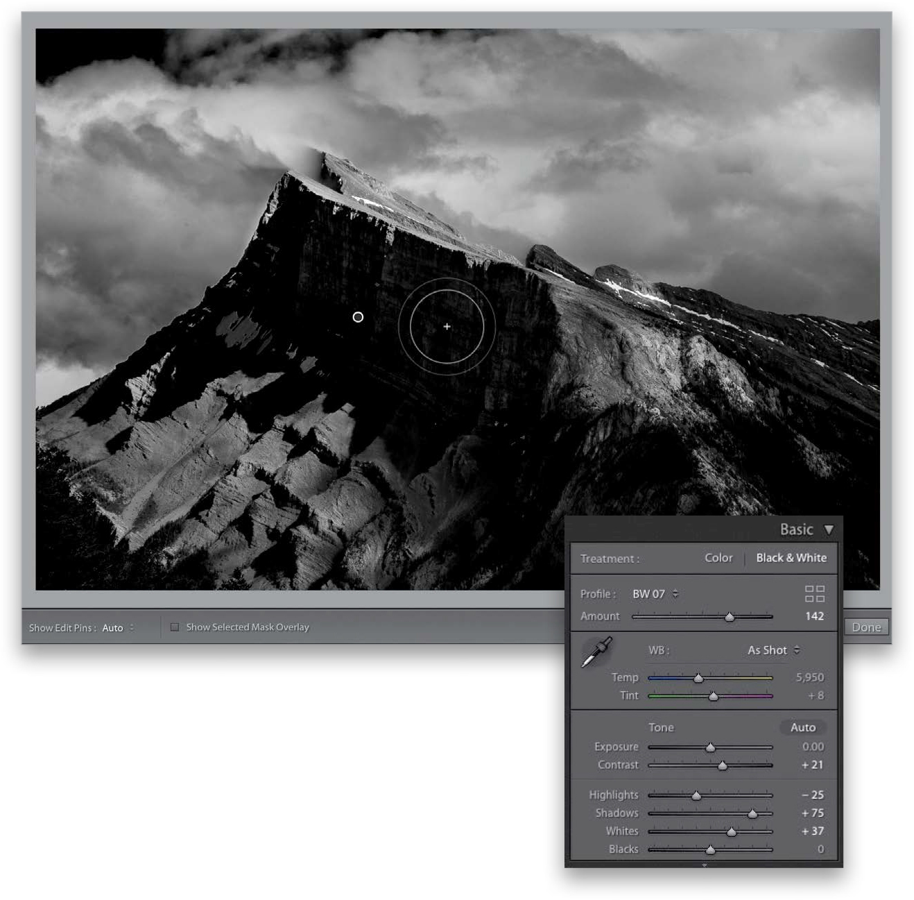
One of the best things about these profiles (besides the fact that they don’t move any sliders when you use them) is that you can control their amounts—if you apply one and the effect is too intense, you can use the Amount slider at the top of the panel to back off the intensity. Or, if you like what you see, you can intensify the profile’s effect, so that’s what I did here, where I increased the Amount by dragging the slider to the right to 152.

Step Seven:
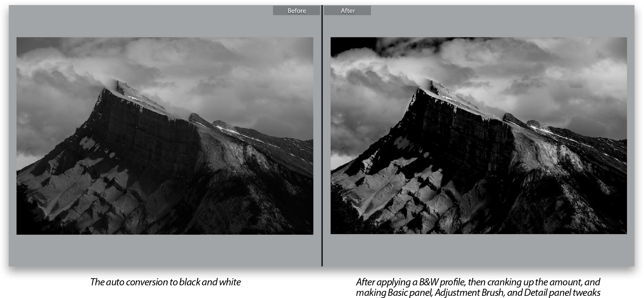
Since the B&W profiles don’t move any sliders, you’re free to use them to tweak your image. That’s what I did here, adding a little more Contrast, backing off the Highlights a bit, and opening up the Shadows and the Whites. After all that, I still felt the top side of the mountain was a bit dark, so I switched to the Adjustment Brush (K), increased the Exposure amount to 0.71, and painted over just that area to brighten it. Or, rather than using the Adjustment Brush, you could go to the B&W panel and tweak individual color sliders (like we did in Step Three). Lastly, I went to the Detail panel and sharpened the living daylights out of it (which I always do with black-and-white images) by setting the Amount to 90 and the Radius to 1.1.
TIP: Add Some Noise!
If you want a more film-like look, go to the Effects panel, under Grain, and increase the Amount to add a film-grain look. The further you drag this slider to the right, the grainier it gets.
This is such a simple technique, but it’s so effective. I learned this trick years ago from my buddy and Adobe Worldwide Evangelist, Terry White, who learned it from another photographer who works for Adobe, and now I’m passing it on to you. Of all the methods I’ve used to create duotones over the years, this is definitely the easiest, but crazy enough, it’s also the best.
Step One:
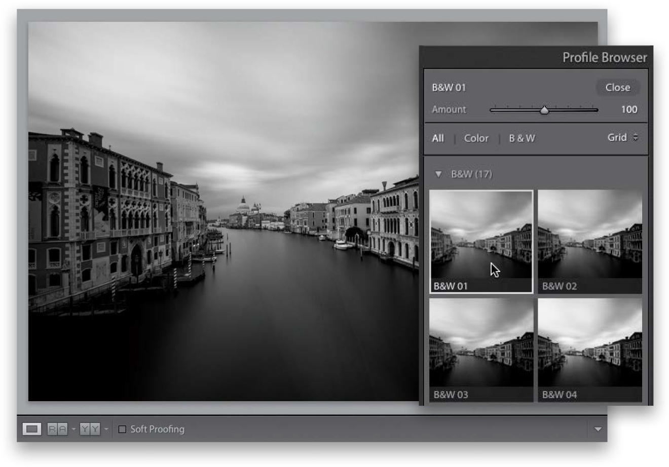
Although the actual duotone is created in the Split Toning panel (in the right side Panels area), you should convert the photo to black and white first. (I say “should” because you can apply a duotone effect on top of your color photo, but…well…yeech!) So, go to the Profile Browser, by clicking on the icon with the four squares in the top right of the Basic panel, and scroll down to the B&W profiles—see page 202 for more on these, but for now, just find one that looks good to you as a starting point (I chose B&W 01 here), and then click the Close button in the top right of the browser.
Step Two:
The trick to creating duotones is actually incredibly simple: you only add the color tint in the shadows, and you leave the highlights untouched. So, go to the Split Toning panel, in the right side Panels area, and start by dragging the Shadows Saturation slider to around 25, so you can see some of the tint color (as soon as you start dragging the Saturation slider, the tint appears, but, by default, the hue is a reddish color). Now, drag the Shadows Hue slider over to 35 to get more of a traditional duotone look (I usually pick a hue from 32 to 41, somewhere in there. While you’re there, lower the Shadows Saturation to 20, as shown here). That’s it.

TIP: Reset Your Settings
If you want to start over, press-and-hold the Option (PC: Alt) key, and the word “Shadows” in the Split Toning panel changes to “Reset Shadows.” Click on it to reset the settings to their defaults.
This matte finish look has become really popular in the last couple of years and luckily, it’s pretty easy to pull off. It’s just a simple Curves move (and even if you’ve never used Curves before, you’ll be able to do this).
Step One:
In the Develop module, go down to the Tone Curve panel (if your Tone Curve doesn’t look like this one, and instead has sliders under it, click on the little curve icon in the bottom-right corner of the panel to switch to the curve you see here). You’re going to add two control points to the diagonal line by just clicking right on that line. So, add one about 1/4 of the way up from the bottom-left corner (you can see the point I added here) and one 1/4 of the way down from the top-right corner (where my cursor is in the image shown here). If you mess up and add a point you didn’t mean to, Right-click on it and choose Delete Control Point. Adding those two control points locks down most of the curve, so we can adjust the deep shadows and highlights without messing with the rest of the tones of the image. That’s the hard part, the rest is easy.

Step Two:
Now, go to the very bottom-left corner, click on that control point, and drag straight up, right along the left edge. Then, do the same thing with the control point up in the very top-right corner, except drag it down a bit along the right edge (as shown here). That’s it—you’ve got the matte look, and now you can rule Instagram like a boss!

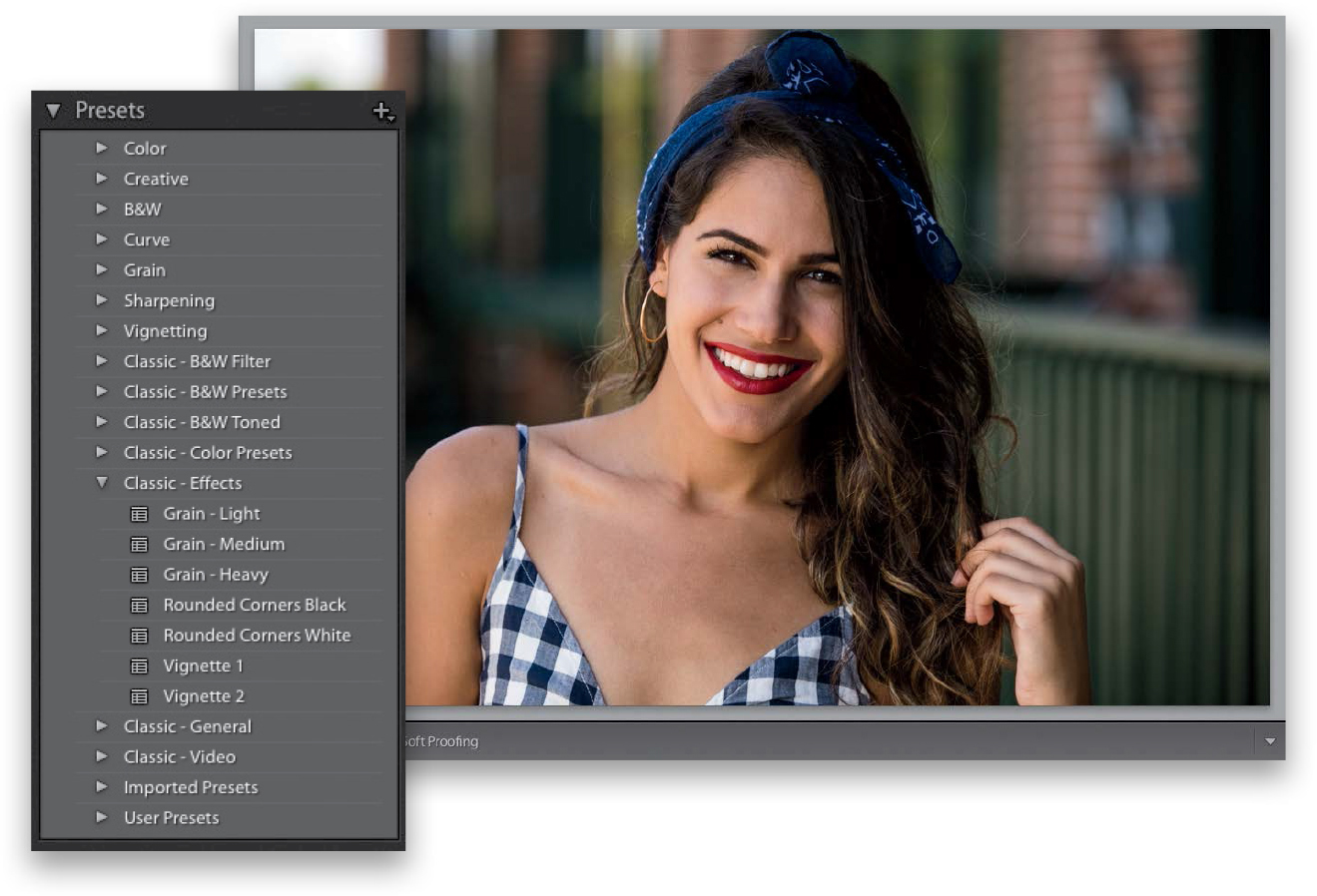
Lightroom comes with a number of built-in Develop module presets that you can apply to any photo with just one click. These are found in the Presets panel over in the left side Panels area, where you’ll find 15 different collections of presets: 14 built-in collections put there by Adobe and a User Presets collection (that one’s empty for now, because this is where you store the ones you create on your own). These are huge time savers, so take just minute or two and learn how to put them to use (and how to create your own).
Step One:
We’ll start by looking at how to use the built-in presets, then we’ll create one of our own, and apply it in two different places. First, let’s look at the built-in presets by going to the Presets panel (found in the left side Panels area). There are 14 built-in Lightroom collections (and a User Presets collection, where you can save and store your own presets. If you imported any presets, as I have, you’ll also have an Imported Presets collection). When you look inside each collection, you’ll see that Adobe named these built-in presets by starting each name with the type of preset it is (for example, within the Classic - Effects presets, you’ll find Grain. That’s the type of preset, then it says, “Light,” “Medium,” or “Heavy”).
TIP: Renaming Presets
To rename any preset you created (a user preset), just Right-click on the preset and choose Rename from the pop-up menu.
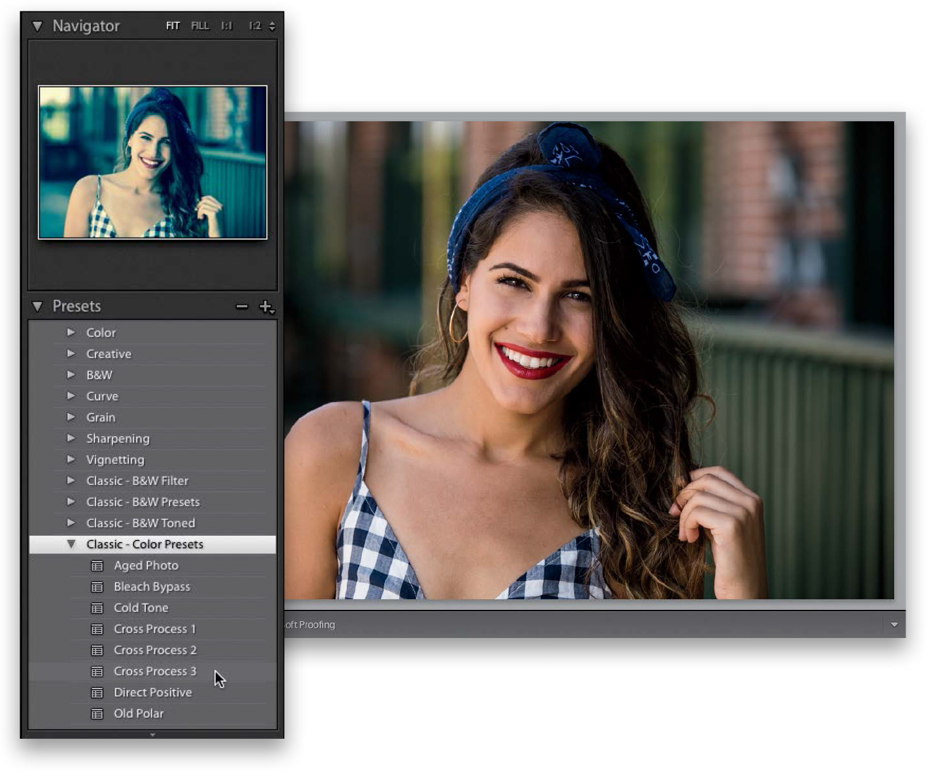
Step Two:
You can see a preview of how any of these presets will look, even before you apply them, by simply hovering your cursor over the presets in the Presets panel. A preview will appear above the Presets panel in the Navigator panel (as shown here, where I’m hovering over a Classic - Color preset called Cross Process 3, and you can see a preview of how that color effect would look applied to my photo, up in the Navigator panel, at the top of the left side Panels area).
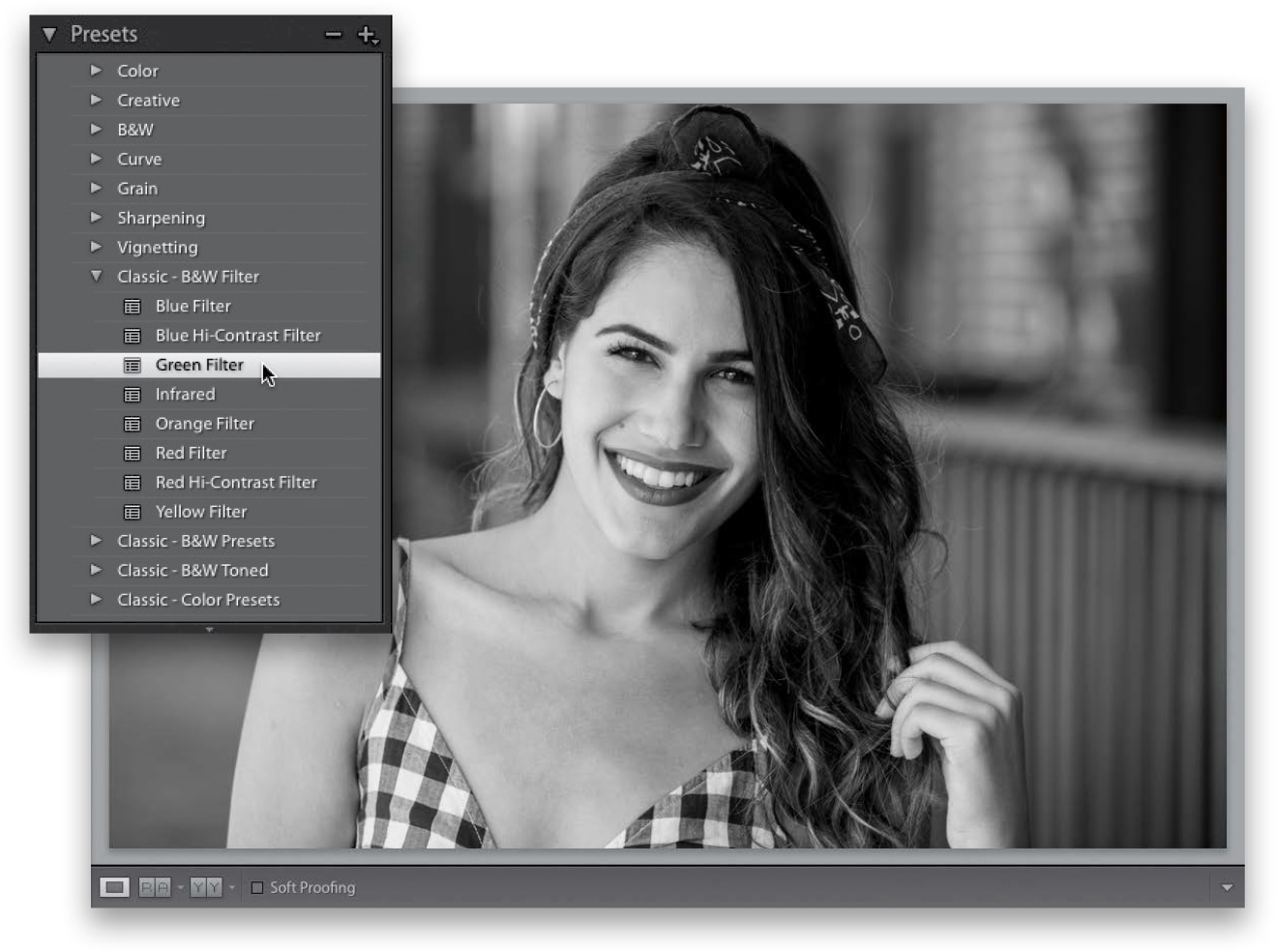
Step Three:
To actually apply one of these presets, all you have to do is click on it. In the example shown here, I went to the Classic - B&W Filter presets and clicked on the Green Filter preset to create this black-and-white conversion. I could be done right there with one click, but the nice thing is if you want to tweak things after the preset has been applied, you can just grab the sliders in the Basic panel and go to town!
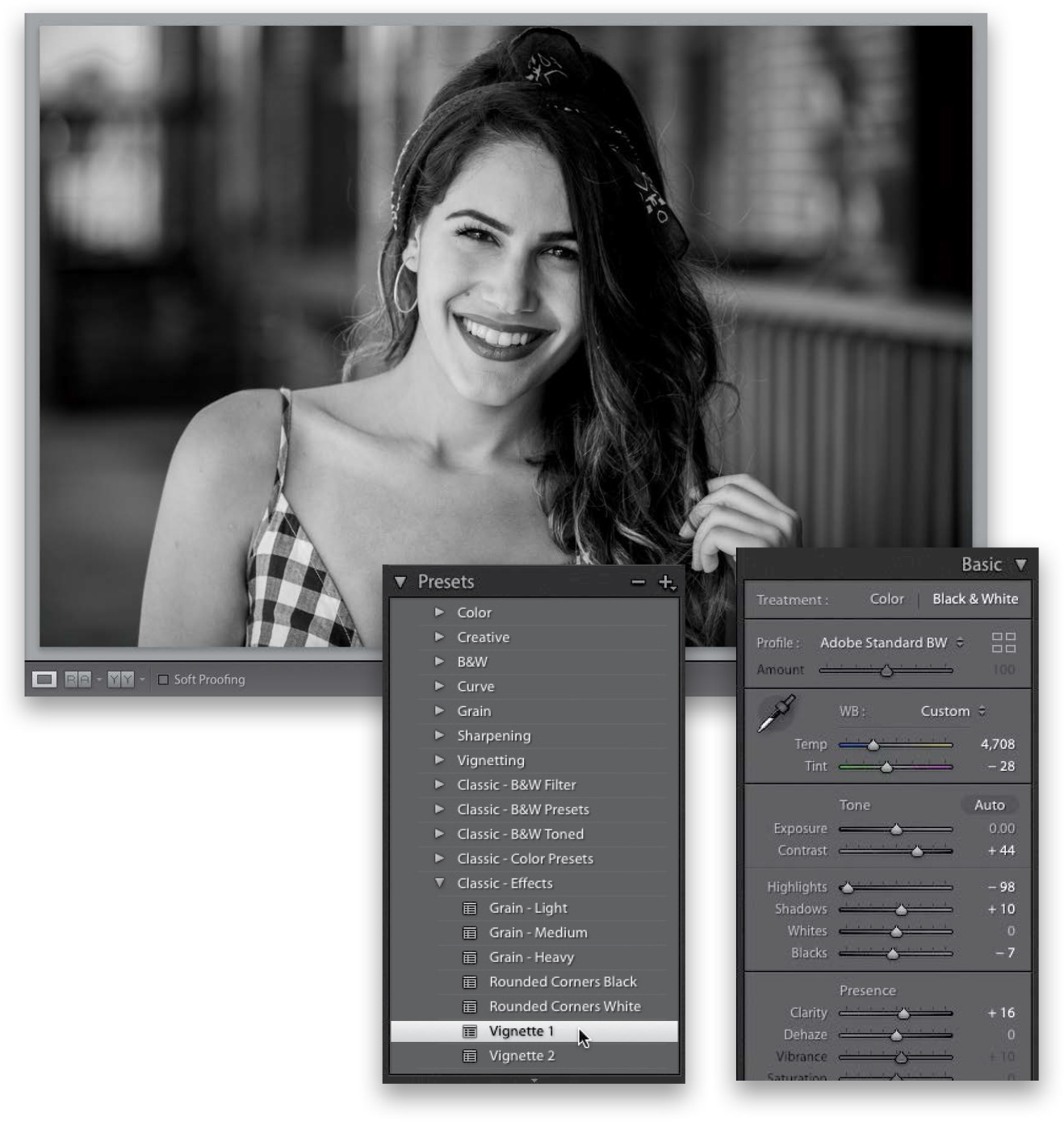
Step Four:
For example, here I increased the Contrast to +44, and I lowered the Highlights a bit more than the preset had (to –98), so I could darken the background a bit. I opened up the Shadows a bit to +10, so you could see more detail in the dark parts of her hair, and I backed off the Clarity amount to +16 to keep the image from looking so “crunchy.” Also, once you’ve applied a preset, you can apply more presets and those changes are added right on top of your current settings, as long as the new preset you chose doesn’t use the same settings as the one you just applied. So, if you applied a preset that set the Exposure, White Balance, and Highlights, but didn’t use vignetting, if you then chose a preset that just uses vignetting, it adds this on top of your current preset. Otherwise, if the new preset uses Exposure, White Balance, or Highlights, it just moves those sliders to new settings, so it might cancel the look of the original preset. For example, after I applied the Green Filter preset, and tweaked the settings I mentioned above, I went to the Classic - Effects presets collection and applied the preset called “Vignette 1” (as shown here) to add a dark edge effect. The Green Filter didn’t have a vignette, so it added it on top.
Step Five:
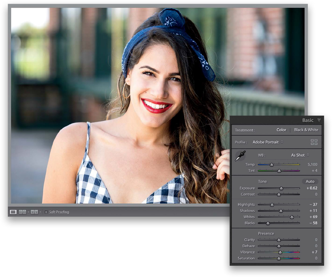
Now, of course you can use any built-in preset as a starting place to build your own preset, but here’s how build your own custom preset from scratch: Click the Reset button at the bottom of the right side Panels area to reset our photo to how it looked when we started. Now we’ll create a look that’s kind of like the popular Instagram filter, Clarendon. Choose the Adobe Portrait profile from the Profile pop-up menu, then increase the Exposure amount to +0.62 to brighten things up, bring the Highlights down to –37, and the Shadows up to +11 to open the dark areas a bit. Set the Whites way up to +69, the Blacks to –58, and Vibrance to +7 to add a little more punch to the color. That’s it for the Basic panel tweaks.
Step Six:
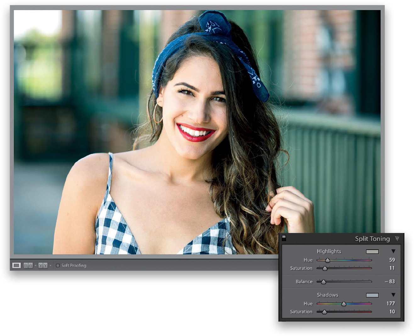
Now, go the Split Toning panel. In the Highlights section, set the Hue to 59 (for an amber tone) and Saturation to 11, so there’s not too much of it. In the Shadows section, set the Hue to 177 (kind of a greenish shade) and the Saturation to 10. The Balance slider in the middle lets you choose the balance between the Highlights Hue and the Shadows Hue. Drag the Balance to –83, so the image is learning toward the greens in the shadows. Okay, we have our Instagram Clarendon-like look. Now, let’s save it as a preset so we can apply this same look to other photos in just one click.
Step Seven:
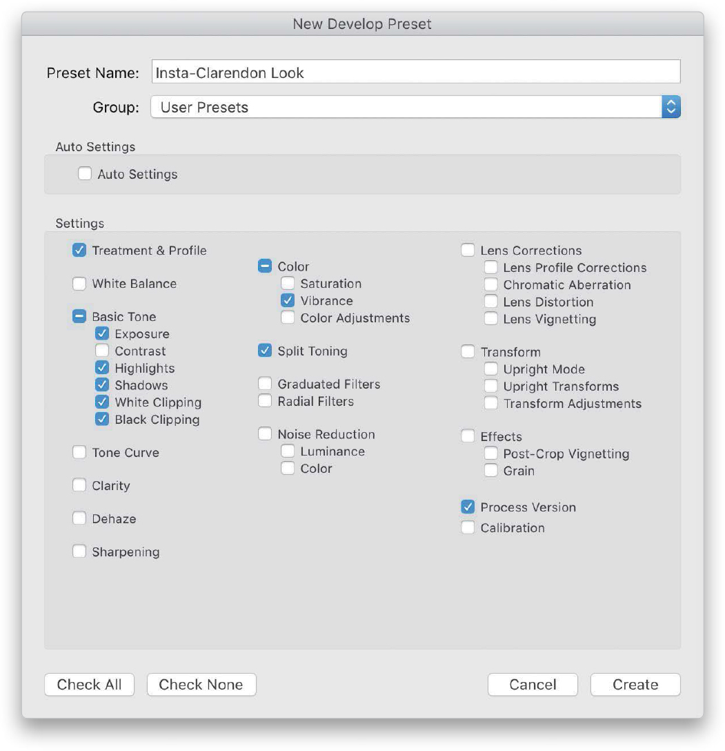
In the Presets panel, click on the + (plus sign) button on the right side of the panel header and choose Create Preset to bring up the New Develop Preset dialog (shown here). Give your new preset a name (I named mine “Insta-Clarendon Look”), click the Check None button at the bottom of the dialog (to turn off all the checkboxes), then turn on the checkboxes beside all the settings you edited (as seen here). Now, click the Create button to save all the edits you just made as your own custom preset, which will appear under the User Presets collection in the Presets panel.
Note: To delete a user preset, just click on the preset, then click on the – (minus sign) button, which will appear to the left of the + button on the right side of the Presets panel header.
Step Eight:
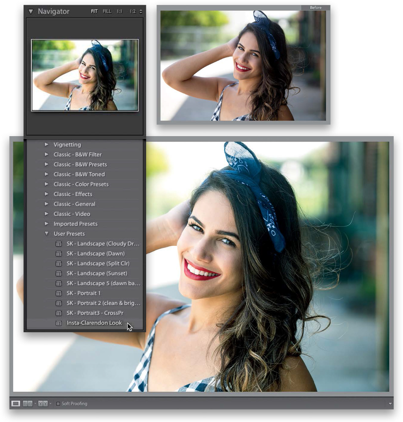
Now click on a different photo in the Filmstrip, then hover your cursor over your new preset. Look up at the Navigator panel, and you’ll see a preview of the preset (as seen here). Seeing these instant live previews is a huge time saver, because you’ll know in a split second whether your photo will look good with the preset applied or not, before you actually apply it. Click on it to apply it.
TIP: Updating a User Preset
If you tweak a user preset and want to update it with the new settings, Right-click on your preset and choose Update with Current Settings from the pop-up menu.
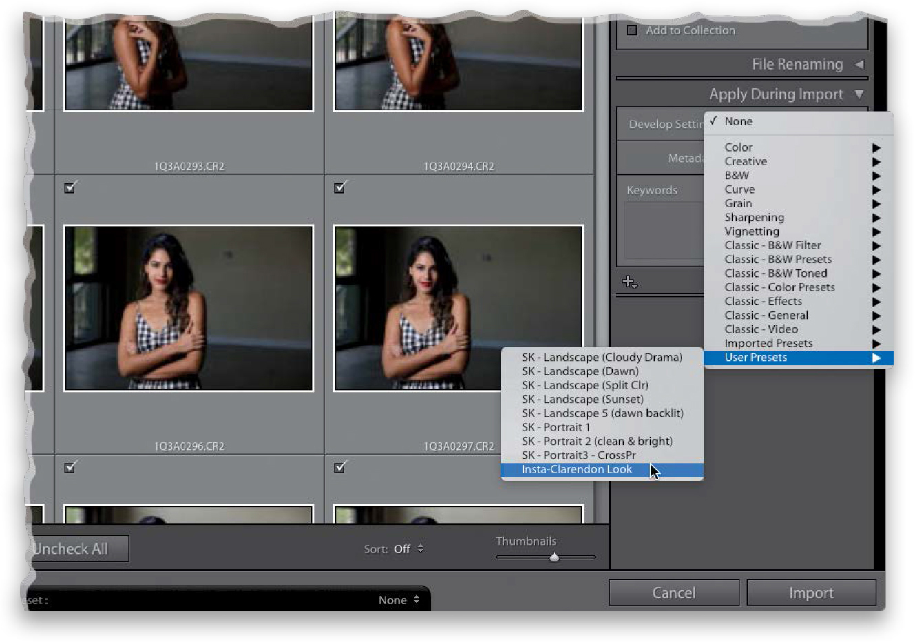
Step Nine:
If you’re going to apply a particular preset (either a built-in one or one you created) to a bunch of images you’re importing, you can actually have that preset applied to your images as they’re imported, so when they appear, they already have your preset applied. You do this right within the Import window. Just go to the Apply During Import panel (seen here), where you’d choose which preset you want from the Develop Settings pop-up menu (as shown here, where I chose that Insta-Clarendon Look preset we just created), and now that preset is automatically applied to each photo as it’s imported. There’s one more place you can apply these Develop presets, and that’s in the Saved Preset pop-up menu, at the top of the Quick Develop panel, in the Library module (see more about the Quick Develop panel in Chapter 5).
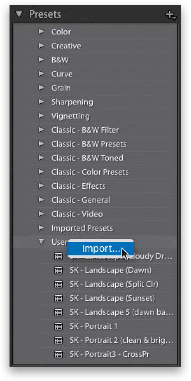
TIP: Importing Presets
There are lots of places online where you can download free Develop module presets (like from this book’s companion website and my LightroomKillerTips .com site). Once they’re downloaded, go to the Presets panel, click the on + (plus sign) button on the right side of the panel header, choose Import Preset(s), and navigate your way to the preset(s) you just downloaded. You can also just Right-click directly on User Presets, and choose Import from the pop-up menu (as seen here). Locate the preset(s) you downloaded and click the Import button, and it will now appear in your User Presets.
Sun flare effects are really popular right now, and thankfully, they’re pretty darn easy to do. Plus, there are two ways you can pull this off. I’ll go with my favorite method first, and I’m adding the second method as a tip, since it uses the same settings—just a different tool.
Step One:
Here’s our original image, and if you look at her hair and the backlighting from the sun, you can already see which side you’re going to need to put your sun flare on.

Step Two:
Get the Radial Filter tool in the toolbox near the top of the right side Panels area (it’s shown circled here; or press Shift-M), but before you click-and-drag it out, drag the Temp slider way over to the yellow side (here, I dragged it over to 78). Now, crank up the Exposure (it is the sun, ya know, and in this case, I dragged it over to the right to 1.51, so basically adding a stop-and-a-half exposure). Then, click-and-drag it out over her shoulder on the left (as seen here). Notice the position of the oval here—I’m intentionally letting it spill a little over onto the side of her face.

Step Three:
Next, we’re going to add some negative Clarity to soften our sunbeam, so drag the Clarity slider way over to the left (here, I dragged it over to –78). It’s a little dark, so let’s also increase the Exposure to brighten it up (I increased it to 2.93). To better position the flare, click on the little black edit pin and drag it up and to the left a bit (as shown here).

Step Four:
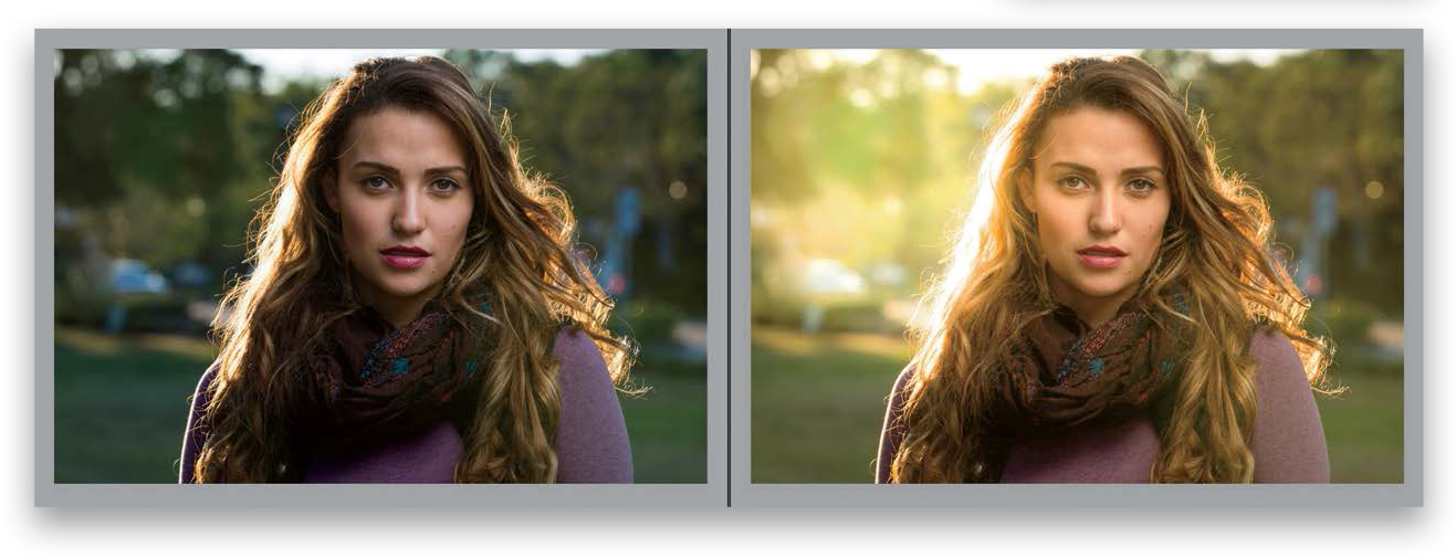
To make the effect look more realistic, you’re going to need to somewhat match up the color of the rest of the image with the very warm color you just added with this sun flare. So, go to the Basic panel and drag the Temp slider over to the right a bit, so the sun flare blends in. To finish things off, back off the Contrast a bit (one of the rare times I add negative contrast, but in this case, with the sun bursting in, it helps “sell” the look by lowering the contrast of the rest of the image). A before and after is shown below.
TIP: Optional Second Method
Another way to get a similar effect is to use the Adjustment Brush (K) with a really large brush size. Same settings as with the Radial Filter tool—just one or two clicks in the same spot with the brush, and you’re there.
The hot look in fashion right now is to add a cross-process effect, and there are a couple of different ways to do this. We’ll start with the easy version, and at least uncork the advanced version, which uses Curves.
Step One:
These cross-processing effects are usually applied to color images using the Split Toning panel, like we use when creating a duotone look (see page 206), but unlike the duotone, you’re going to choose one hue for the highlights and a different hue for the shadows here.
TIP: See a Tint Color Preview
To make it easier to see which color tint you’re choosing, press-and-hold the Option (PC: Alt) key, drag the Hue slider, and it will give you a temporary preview of your color tint as if you bumped up the Saturation amount to 100%.
Step Two:
Here, I set the Highlights Hue to 57 and the Shadows Hue to 232. I then set the Shadows Saturation slider to 56 and the Highlights Saturation slider to 51 (a little bit higher than usual, just to add more color). That’s all there is to it (I told you this was easy). By the way, the Balance slider (found between the Highlights and Shadows sections) lets you balance the color mix—dragging to the right tips the balance toward the Highlights color and dragging left tips the balance more toward the color in the shadows. You can also choose colors from the color swatches to the right of the words Highlights and Shadows—clicking on either swatch brings up a color picker, and along the top are some common split-tone highlight colors. To close the color picker, click on the X in the upper-left.

Step Three:
The other method for creating cross-processing looks is to tweak the individual Red, Green, and Blue color channels using the Tone Curve panel (found in the right side Panels area). To pick an individual channel to edit, click on the Channel pop-up menu and choose the channel you want to edit (in our example, the Red channel). Our original image is shown here, and to apply this particular cross-processing effect (you can use this curve to create any color combination you want), you can leave the Red channel alone. Choose Green from the channel pop-up menu (shown bottom middle) and add a point to the curve by clicking once 1/4 of the way up from the bottom of the diagonal line, and then drag it diagonally up to increase the amount of green in the shadows. Add another point 1/4 of the way down from the top and pull it down just a tiny bit. Now, go to the Blue channel and drag the bottom-left corner point straight upward along the left edge a little bit (as shown) to add some blue into the lower midtones. Then, drag the top-right corner point down along the right side (as shown here) to add some blue. Add a point 1/4 of the way down from the top of the curve, and then drag it down just a little, which adds some yellows to the highlights. Finally, add another point 1/4 of the way from the bottom and drag that one up a bit.
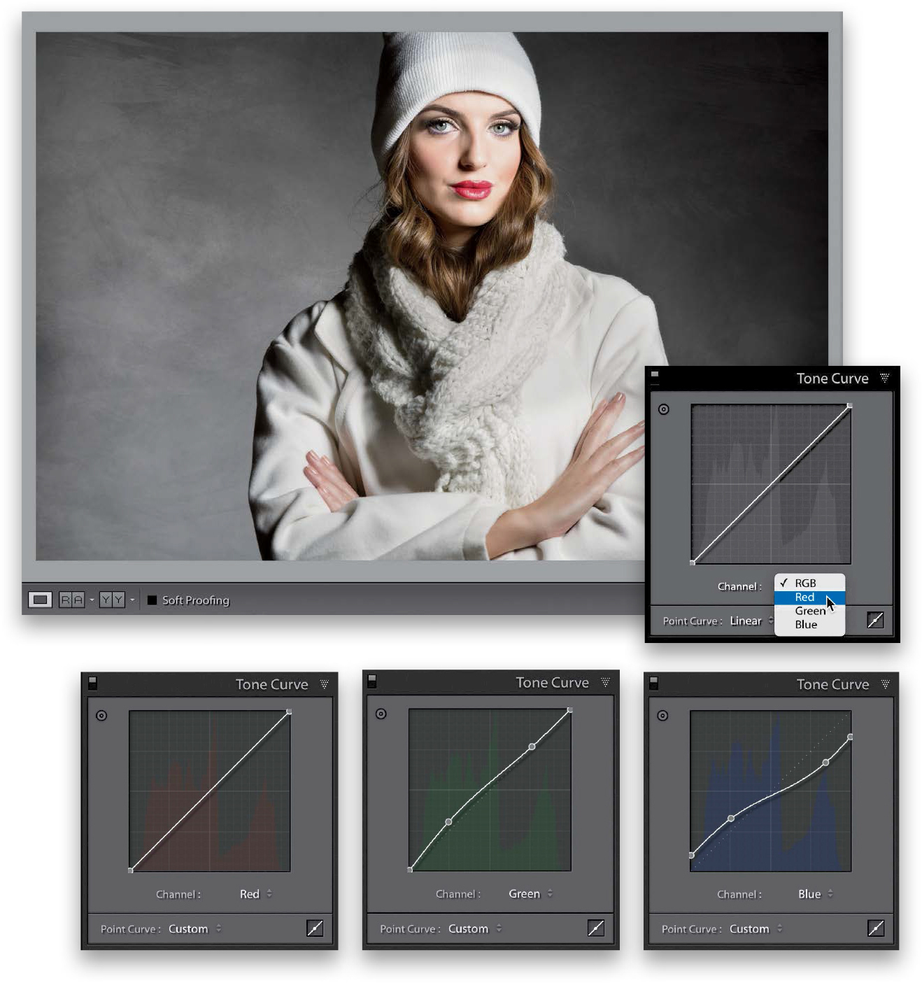
Step Four:
Now you have blues, greens, and yellows. If you think the image looks too contrasty or doesn’t have enough contrast, go to the Basic panel and adjust the Contrast slider until it looks right to you.

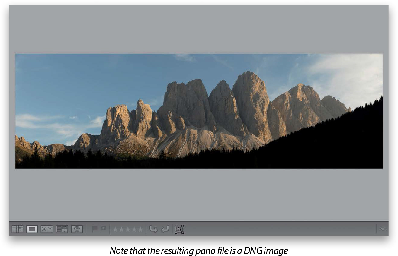
Lightroom’s panoramic feature (which stitches multiple frames into one very wide, or very tall, shot) is one of the best out there, and one of the coolest things about it (besides how fast it is, and the great options it has) is that the final panoramic image it creates is still a RAW image. What?!! I know. Crazy, right, but that’s how it works (well, that’s how it works if you started with RAW images anyway).
Step One:
Start by selecting the images you want combined into a panorama (or pano, for short) in the Library module. Then, go under the Photo menu, under Photo Merge, and choose Panorama (as seen here) or just press Control-M (PC: Ctrl-M).

TIP: Overlap 20% or So In-Camera
For Lightroom to successfully stitch together your shots into one single image, when you’re taking your pano photos, be sure to overlap each frame by at least 20%. It helps Lightroom determine which frames go together and keeps you from having gaps. Well, it really wouldn’t have gaps, it just wouldn’t successfully stitch it together—you’d get a warning.
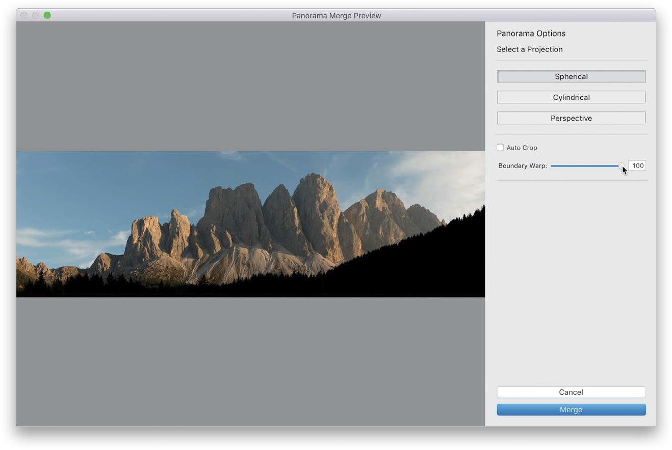
Step Two:
This brings up the Panorama Merge Preview dialog (shown here). It has three Projection choices for creating your pano, but it automatically chooses which one it thinks is best. Personally, I only use Spherical, and according to Adobe, it works best for wide panos. If you shoot architectural panos, where you’d want to keep the lines that are supposed to be straight, straight, Adobe recommends the Perspective projection. Lastly, the Cylindrical projection is a cross between the two, as it’s supposed to work better for panos that are really wide, but still need straight vertical lines. All that being said, I still just use Spherical all the time.
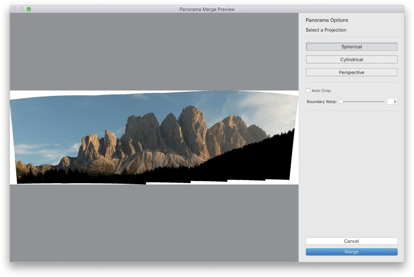
Step Three:
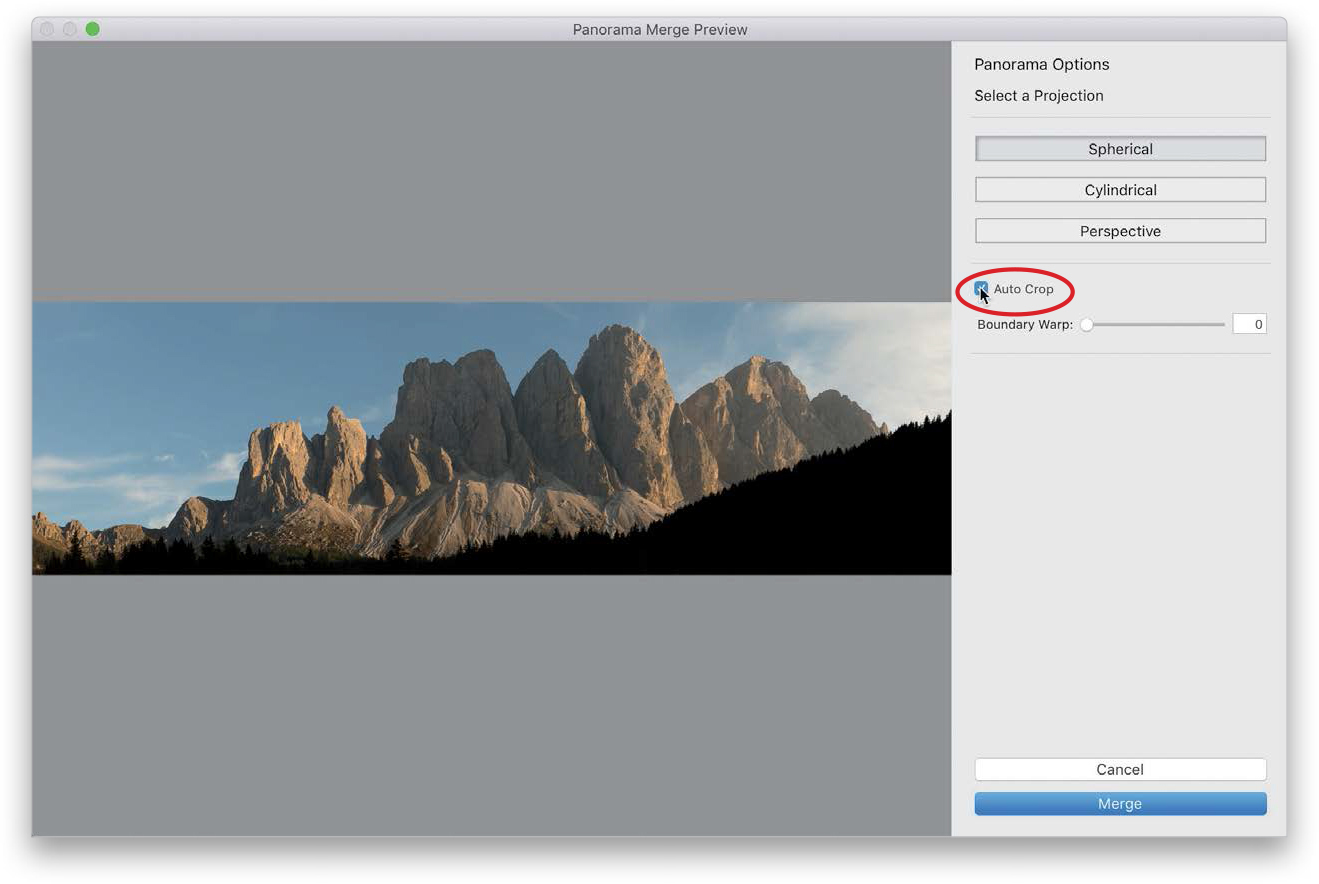
Take a look back at that preview in Step Two. See all that white space around it that needs to be cropped off? Well, you could always crop that away later in Lightroom, but you have two solid options here in this dialog: The first is to have it automatically crop away any of the white gaps around the edges of your image. Just turn on the Auto Crop checkbox (as shown here), and it crops the image tight so none of those white areas are visible. The downside of Auto Crop is cropping this tight makes your pano less tall and less wide. Depending on the photo, that might not be a problem, but it might crop off the tops of mountains or the tops of buildings, etc. The good news is: if you turn it on and you don’t like what you see in the preview, you can just toggle it right back off. But, there is a better option.
TIP: This Pano Dialog Is Resizable
You can resize it to whatever size and dimensions you like by just clicking-and-dragging its edges. Since panos are usually wide images, I drag mine out as wide as it can fit onscreen.
Step Four:
Now, behold the wonder that is Boundary Warp. This is my “go-to” option for panos (I use it every time) and simply dragging the slider all the way to the right does as close to magic as you’re going to see in Lightroom—it just moves the pano around somehow to fill in those open gaps and yet, when it’s done, it doesn’t look funky, it looks fantastic! I’m not sure why it’s a slider and not a checkbox because I do a lot of panos, and I’ve never not wanted it at 100% (drag it back to 90% or 80% and you’ll see what I mean). Either way, it’s pretty darn awesome and I use it on every pano I stitch (I have some comparisons for you on the next page).
Step Five:
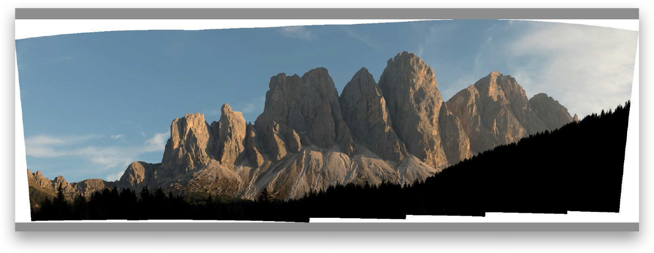
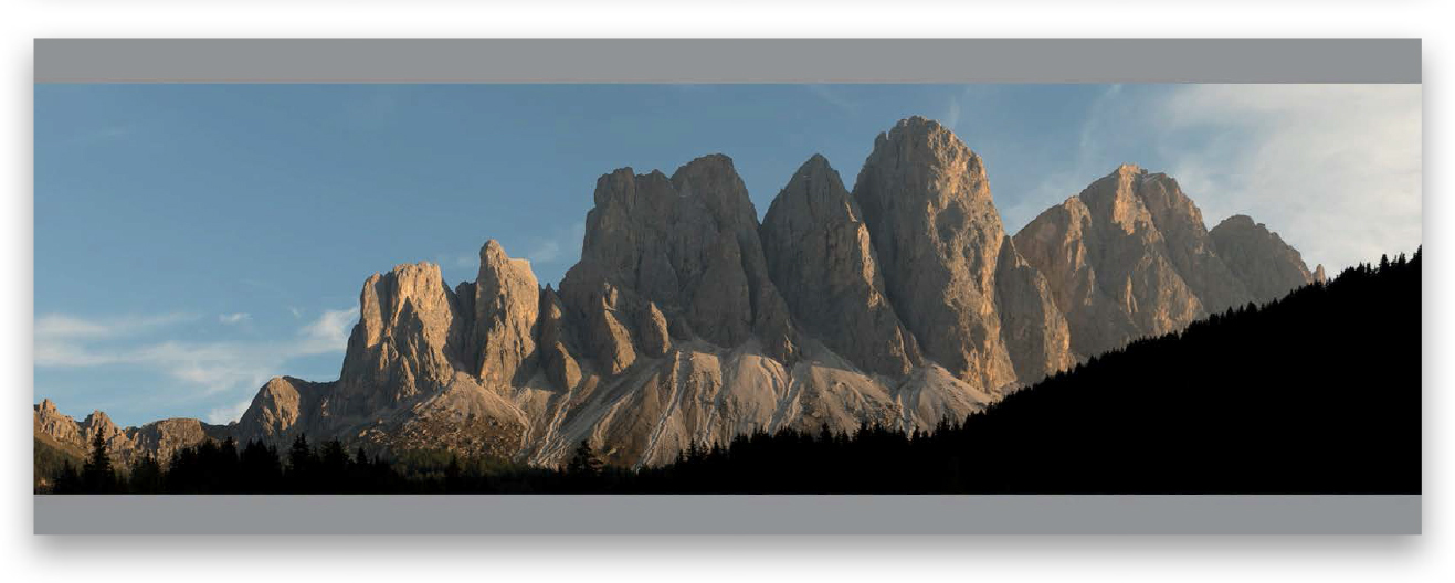
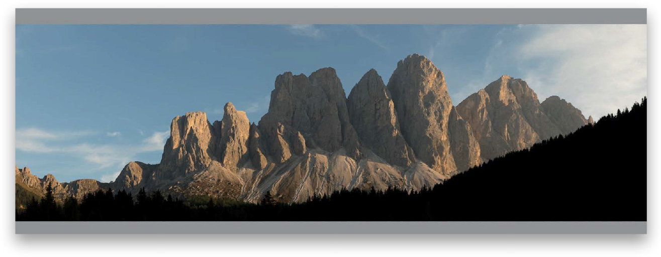
Just for visual comparison purposes, take a look at the three images here. The top image is the original pano as-is; the middle shot is with the Auto Crop checkbox turned on and the white gaps around the edges trimmed away; and the bottom image is the same pano, but with the Boundary Warp slider dragged all the way over to 100%. There is no answer that is wrong here—you can choose whichever one you want, including making no choice at all and cropping it later in Lightroom or taking it over to Photoshop to use Content-Aware Fill to fill in those gaps. Totally your call.
TIP: If It Can’t Find a Lens Profile
If you see a warning icon and it says Lightroom is “Unable to match a lens profile automatically,” it’ll still make the pano—the results just won’t be quite as good. To fix this, click the Cancel button, make sure your pano photos are still selected, then go to the Lens Corrections panel (in the Develop module’s right side Panels area) and turn on the Enable Profile Corrections checkbox in the Profile tab. Next, choose your lens make/model from the pop-up menus, then go back and try your pano again, and all should be good.
Step Six:
Now, click the Merge button and it will render the final high-res version of your pano (it renders in the background, but you’ll see a progress bar in the upper-left corner of Lightroom). When it’s finished, your final stitched pano appears as a DNG file in the same collection as the images you used to create the pano (provided, of course, that the images were in a collection when you started. If not, it’ll appear in the same folder, but usually at the bottom of the folder), and you can tweak this pano like you would any other image.
This effect makes use of the fact that Lightroom has two brushes, and you can make each of the brushes a different size and switch between the two. We use that to create a transition between a small brush and a large brush, and the feathering keeps the transitions smooth. Super-easy to do, and on the right image, it’s really effective.
Step One:
Here’s the original RAW image we want to add light beams to. If you’re thinking, “Scott…that’s a pretty lame photo,” well, I would have to agree, but it does have one thing going for it: the sun is peeking through the trees. But, I’m with you on the lameness of this shot, which is why in the next step we’re at least going to try to take it from lame to not quite as lame.

Step Two:
The first thing we need to do is to warm up the image (color-wise), so in the Basic panel, drag the Temp slider way over to yellow. That’s a start. Now let’s make it a little bit brighter (maybe 1/4 of a stop or so) by increasing the Exposure to +0.25 and the Contrast to +56. Then, drag the Highlights back quite a bit, so the sun isn’t so bright (it’s going to get brighter when you add the beams)—I took it over to –60. Now, the woods still look pretty dark, so drag the Shadows slider all the way over to +100. I also dragged the Whites all the way down to –100 because it’s really bright where the sun is coming through. Finally, crank up the Clarity to +24 to bring out the detail, and then crank up the Vibrance to +27 to bring out more color, and well…it’s still not an awesome photo, but it does look better.

Step Three:
Now, to create our beams, get the Adjustment Brush (K) from the toolbox near the top of the right side Panels area, then drag the Temp slider over to 77 (so it paints a very yellow stroke) and crank up the Exposure to around 2.00. At the bottom of the panel, we have two brushes we can use marked “A” and “B.” Click on the A brush, set the Feather amount to 100 (to make the edges of your brush soft), and then set the Flow amount to 100 (so we get a consistent amount of the effect we’re going to apply). Now, set your Brush size really small at 0.1 (yes, that is one tiny brush), then take that brush and click once right on the sun. It’s so small, you won’t actually see anything, but you should see a little black edit pin appear in the spot where you clicked (as shown circled here in red).

Step Four:
Now click on the B brush and, again, make sure the Feather and Flow are set at 100, but set this brush at a much larger size (here, I set it to 18.0). Remember, you’ve already clicked once, right on the sun, right? Now that you have the B brush, move to the bottom of the image, press-and-hold the Shift key (holding the Shift key makes it draw a straight line between where you first clicked on the sun and where you’ll click at the bottom of the image), and click once with that larger brush. It will draw a straight line between the two spots, starting at that small size and growing until it reaches the size of the larger brush click at the bottom of the screen. That’s how you create a beam, but there’s something we can do (on the next page) to make the process of adding more beams a little quicker.

Step Five:
We’re going to continue the process of adding more beams, but to speed things up, instead of going to the bottom of the Adjustment Brush panel every time we need to switch brushes, we’re going to use a keyboard shortcut to make the process much faster and easier. Here’s what you do: With the A brush selected, click once on the sun, then press the / (forward slash) key to switch to the B brush, press-and-hold the Shift key and click at the bottom of the screen, but to the right or left of your original beam. Each time you press the forward slash key, it toggles between the A and B brushes. So, hit the forward slash key to toggle to the A brush, click once on the sun, press it again to switch to B, press-and-hold the Shift key, and click again somewhere else along the bottom, hit forward slash to return to A, and do it all again, with your beam ending somewhere else, until your image looks like the one you see here.

Step Six:
All of these beams of light you have added are represented by the same edit pin you created the first time you clicked the brush on the sun. This is really handy because you’ll probably need to lower the intensity of those beams, so they blend in better with the rest of the image and look more realistic. To do that, simply go to the Exposure slider (you’re still in the Adjustment Brush panel, by the way), and back it off some. You were painting at 2.00 (plus 2 stops), so drag it back to the left a bit until it looks like they blend in better (in our case, I lowered the Exposure to 1.04, so I dropped the brightness of my beams by nearly a full stop).

Step Seven:
This is an optional step, but depending on the image, this can add a nice bit of realism, as we add a little haze or fog around our beams. Here’s how: First, click on the New button near the top-right corner of the panel, then double-click on the word “Effect” to reset all your Adjustment Brush sliders to zero. Go down to the Dehaze slider and drag it just a little bit to the left (here, I dragged it to –5), and then take a large brush and paint over the area where the beams are, and it adds a foggy haze around the beams (as seen here). Again, it’s a totally optional step, but I wanted to give you the option.

TIP: Creating Softer Beams
If you think your beams need to be a little bit softer, drag the Adjustment Brush’s Clarity slider over to the left a bit, and you’ll see the beams soften.
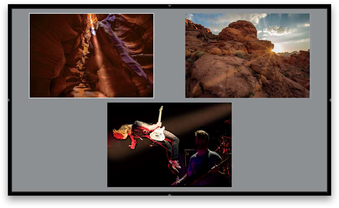
Step Eight:
Here are a few more examples using the exact same technique, but with the color of the beam varied (which you do by changing the white balance). In the slot canyon shot at the top left, I moved the white balance Temp slider more toward blue to create a whiter beam, but without turning white. In the shot at the Valley of Fire on the top right, I lowered the Temp slider (dragging it to the left), so the beams weren’t so yellow, and I lowered the Exposure amount quite a bit. In the concert shot, I made the A brush a lot bigger (I set A to 20 and B to 35), and I changed the white balance of the beam.
Lightroom lets you take a series of shots that were bracketed in-camera and combine them into a single 32-bit HDR image. But, don’t worry—it doesn’t create that “Harry Potter on acid” style of HDR. In fact, the merged HDR will look a lot like the normal exposure, but the tonal range is expanded to the extent that you can now do things like opening up the shadows big time without getting a ton of noise. Plus, the final HDR image is a DNG image, so you can edit it like any other RAW image (but with more headroom and tonal depth).
Step One:
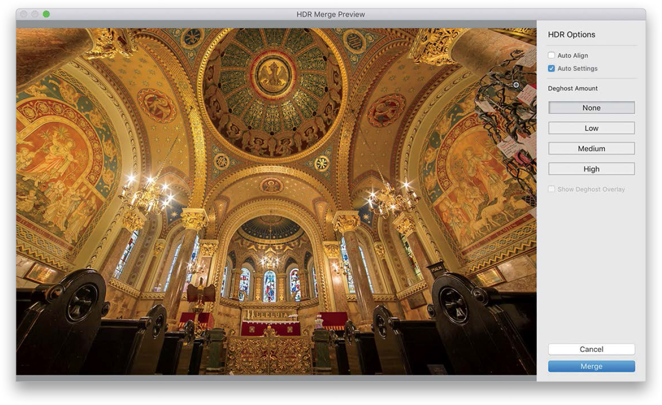
Select your bracketed shots in the Library module. Here, I have three bracketed shots (the regular exposure, one shot that is two stops underexposed, and one shot that is two stops overexposed), but according to Adobe’s own engineers, Lightroom doesn’t need more than just two frames to do its thing—the one that’s two stops under and the one that’s two stops over. So, here I selected just those two shots. Now, go under the Photo menu, under Photo Merge, and choose HDR (as shown here; or just press Control-H [PC: Ctrl-H]).

Step Two:
This brings up the HDR Merge Preview dialog (seen here), and in a few moments, a preview of your HDR image will appear. (Note: This dialog is resizable—just click-and-drag the edges to resize it.) Near the top right, the Auto Settings checkbox is on by default (it’s the same as Auto Tone from the Basic panel, which I don’t generally use on my regular images, but with HDR images, it actually works surprisingly well, so I leave it on). Depending on the image, it can have more detail or it might look brighter in the shadow areas, but it won’t look a whole lot different (with Lightroom’s brand of HDR, you don’t really see the benefits until you “tone” the image in the Develop module).
TIP: Faster HDR Processing
To skip this dialog and have it create your HDR in the background (using whatever settings you used on your last HDR image), just press-and-hold the Shift key as you choose HDR from the Photo menu.
Step Three:
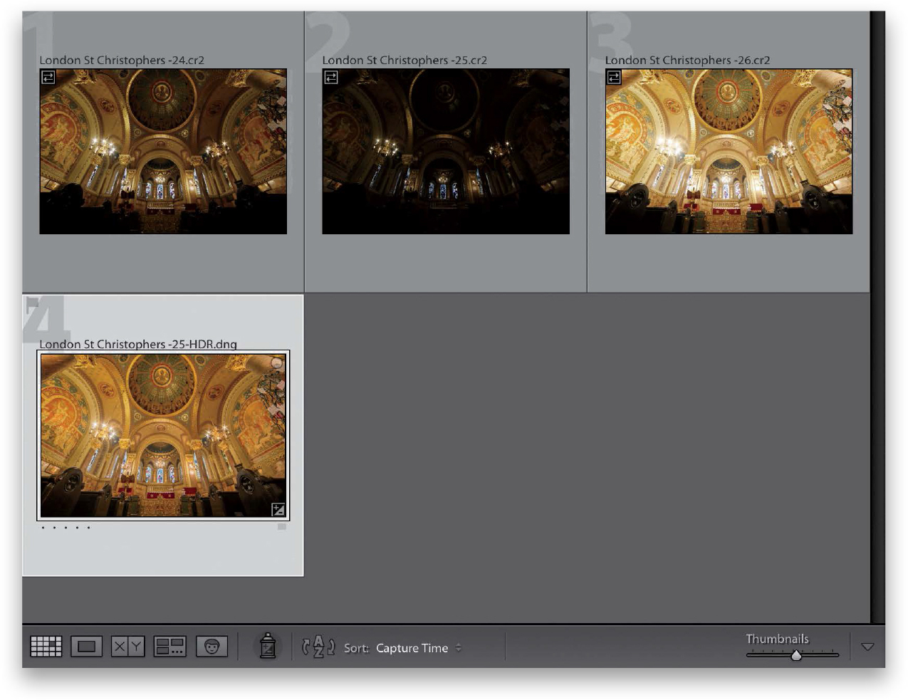
We’ll skip the Auto Align checkbox for now because we’ll talk about that on the next page. So, for now, just click the Merge button, and it will create your single HDR image, which will appear right next to your individual frames in your collection, as seen here (if you’re working in folders, you might have to scroll to the bottom of the folder to find this HDR.dng image). By the way, by just looking at the thumbnails, you can see how your HDR image takes the best from those two images to create an image with more depth.
Step Four:
Now you can tweak your HDR image just like you would any other regular RAW image (yes, the resulting HDR image Lightroom creates is a RAW image). Here, Auto Tone has already been applied (so don’t be surprised if you see that some of the sliders have already been moved), but I increased the Contrast and Clarity (as shown here), and I actually decreased the Vibrance a bit because I thought the overall color was a bit too punchy—I wanted more of a gold color than yellow. Anyway, the point is you can tweak it like you would any other image, however, on the next page you’ll learn one of the big advantages of creating an HDR image.

Step Five:
Lightroom’s big HDR secret is that with the added tonal range that comes with merging your images to HDR, you can really open up the shadow areas and bring out detail, without getting a bunch of noise. For example, take a look at the normal single-frame image here on the left. When you open up those shadows, you get a ton of noise—it’s raining noise in that single image. Now, look at the HDR image on the right, where I opened up the shadows big time. Where’s the noise? Exactly! That’s one of the big secrets and one of the best reasons to create HDR images like this. The added tonal range rocks!

Step Six:
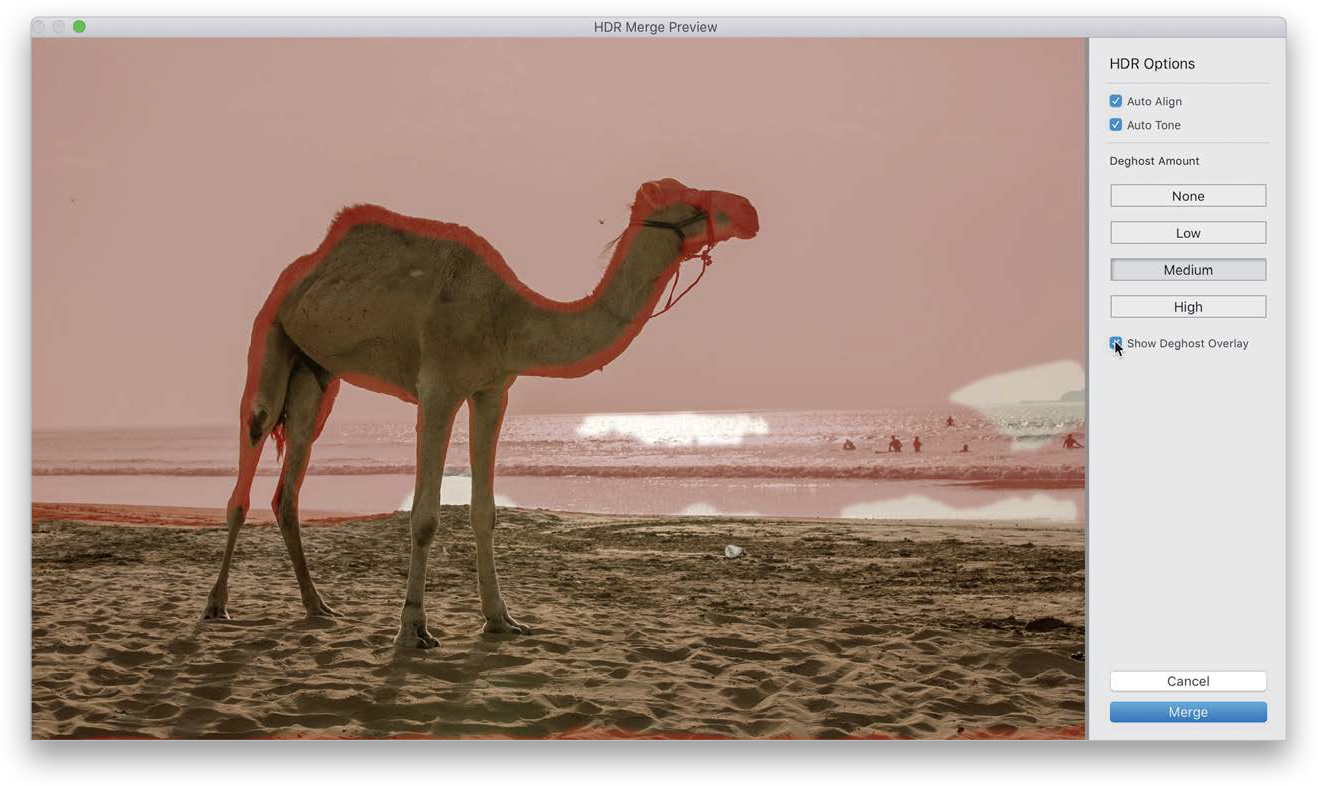
We’re switching images here to discuss the Auto Align checkbox in the HDR Merge Preview dialog. What this helps with (mostly) are shots you hand-held while bracketing—if the alignment is off a little (or a lot), it’ll fix that automatically. For example, take a look at the hand-held, bracketed shot of this camel on the left (I know, I know, it only has one hump, so technically it’s not a camel, it’s a dromedary). You can see it almost has an outline of a second “camel-like animal” along the edges. That’s because I hand-held it. Turn on the Auto Align checkbox and now look at the image on the right. It automatically aligns the images for you, and it usually does a pretty amazing job. Of course, if you shot your HDR on a tripod, it doesn’t need to align anything, so you can skip the Auto Align checkbox, and it’ll process faster. The Deghost Amount feature is different than the Auto Align feature in that Auto Align helps align things if you moved your camera a little when you took the photos. Deghost helps if something was actually moving in your shot (like someone walking in your frame, who now appears like a fully- or semi-transparent ghost, but it doesn’t look cool, it looks like a mistake).

Step Seven:
By default, Deghost Amount is turned off (only turn it on if you have visible ghosting). To turn it on, click either Low (for mild deghosting), Medium (for more), or High (if there’s a lot of ghosting in the image), and it does a pretty amazing job of basically pulling a non-moving area from one of the bracketed exposures and seamlessly displaying it, rather than the ghosted movement. I always start with the Low amount and only move up to Medium or High if the ghosting is still visible. If you want to see the areas that are being deghosted in your image, you can turn on the Show Deghost Overlay checkbox, and after a few seconds (it has to rebuild a new preview), the areas that are being deghosted will appear in red (as seen here, where I chose Medium).
Step Eight:
Jumping back to our original HDR, I thought I would show you the normal, single image (the one shown here at the top. Note how dark the pews are, and you saw what happens if I increase the shadows in those pews), and the HDR image (shown below). No noise, but a great range of tones.

TIP: Seeing the Expanded Range for Yourself
If you really want to see how much your range has been expanded with an HDR image, go to the Exposure slider and drag it all the way to the right. Notice it didn’t stop at +5.00? Now, it goes to +10.00 and –10.00 (if you drag it to the left) stops. You can go from absolutely solid black to absolutely solid white.
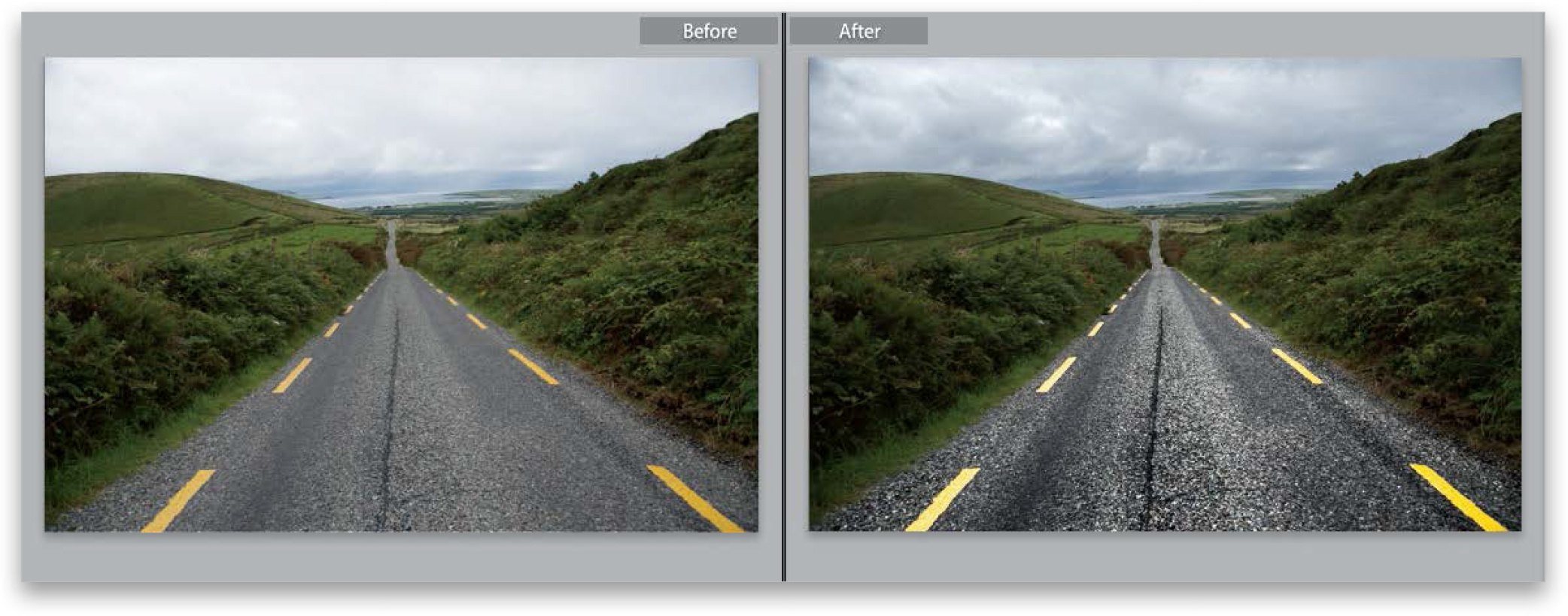
This is a trick I’ve been using for a while to make streets look wet in my travel photos, and what I love about it is that it’s so simple (you just use two sliders) and yet it’s amazingly effective (especially on cobblestone streets, where it looks especially good, but also on just regular ol’ asphalt streets, too).
Step One:
In the Develop module, go ahead and make any regular tweaks to the image in the Basic panel (I Shift-double-clicked on the Whites slider and the Blacks slider to have Lightroom automatically set the white and black points. I also decreased the Shadows a bit to bring out detail in the bridge). None of these adjustments have anything to do with the effect you’re about to learn, but I thought you might at least want to know what the basic edits I applied to prep the photo were.

Step Two:
Click on the Adjustment Brush tool (K) up in the toolbox and then double-click on the word “Effect” to zero out all the sliders. You’ve got just two sliders to adjust here: (1) Drag the Contrast slider to 100, then drag the Clarity slider to 100, as well. That’s it—that’s the recipe. Now, paint over the surface you want to appear wet (here, I’m painting over the street in the foreground). As you paint, the area looks wet and appears to add reflections like an actual wet street.

Step Three:
If you paint over the street and it doesn’t look “wet” enough, click the New button at the top-left corner of the Adjustment Brush panel and start painting over the same area, but start in a different part of the street (that way, you’re stacking this second pass of the look over the first coat of “wet”). By the way, if for any reason the street looks too bright from applying that much Clarity, just lower either the Exposure slider or Highlights slider a little bit for each pin, so it looks to have about the same brightness overall (here, I lowered the Highlights slider to –16. I tried lowering Exposure, as well, but lowering just the Highlights looked better to me).

Step Four:
This technique looks particularly great on cobblestone streets, but it also works for most regular paved streets. I did a before/after here, so you can see an example. Okay, that’s it. Instant wet streets.