MORE TIPS


PICTORIAL COMPOSITION
The dictionary defines composition as “the act of combining parts or elements to form a whole.” Good composition is important in any drawing, and the art of still life is an excellent way to practice arranging objects in your picture. Try to achieve a pleasing balance by moving objects around until they look “comfortable” in the scene.
Study the examples below. They have the right balance of background elements, shadows, and white space, strategically placed around the drawing, to make the picture appealing and interesting.
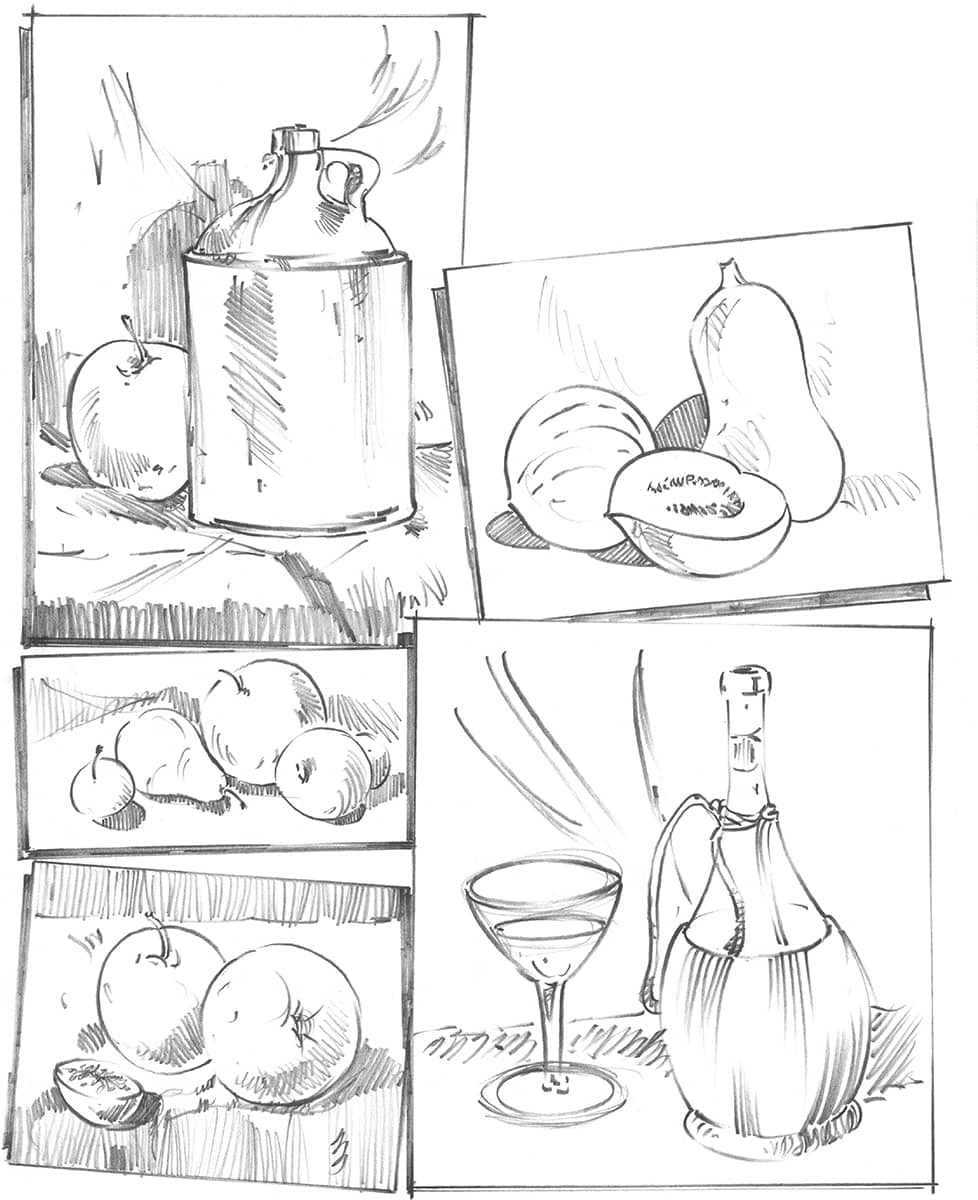
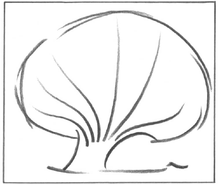
When drawing, be sure to arrange the elements in a way that creates a pleasing design or composition. The overall design is determined by the placement of different shapes and lines. The composition should direct the viewer’s attention to the most important area of the drawing.
In the example below, the fanlike shape of the treetop draws the eye to the trunk area.
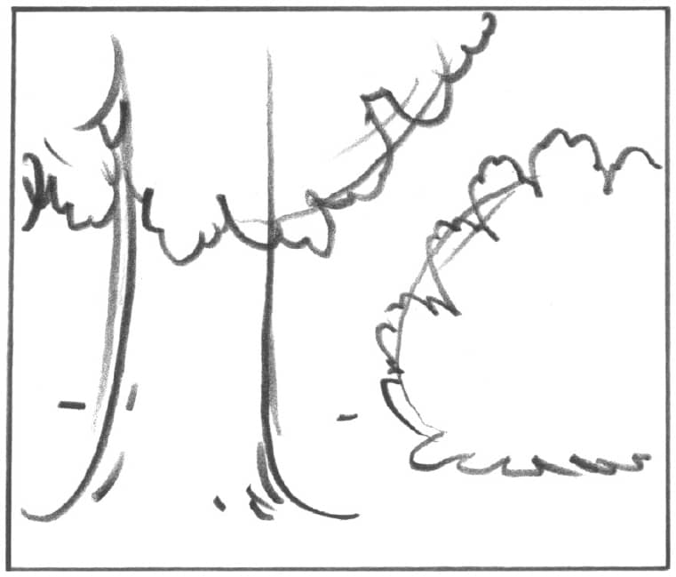
Below, the tree to the left is in the foreground, the area that appears closest in distance. The vertical direction of the trunk is subdued by the rounded foliage mass in the upper left corner. Balance is achieved by placing the shrub in the background and to the right. The background is the area of the scene that is farthest away.
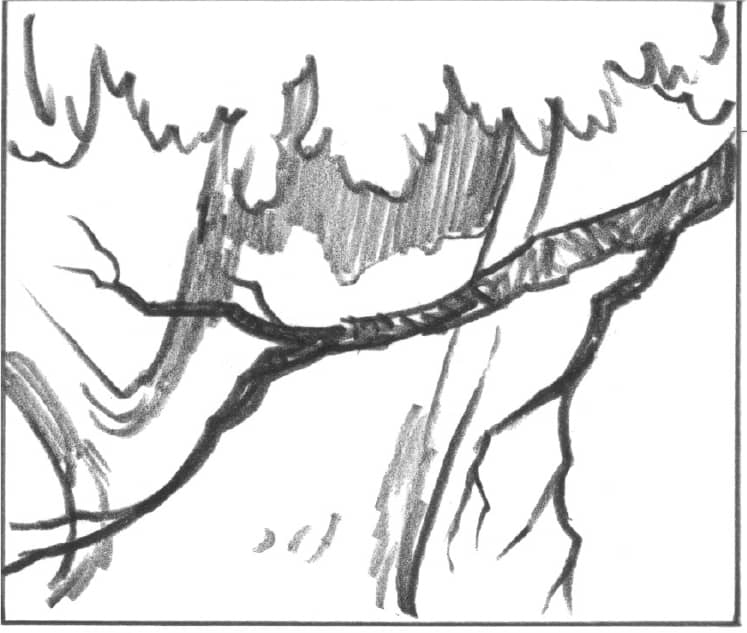
As shown below, a close-up of a tree can look very dramatic. Balance is achieved with opposing lines, which also lead the eye through the picture.
In the square composition below, the opposing lines of the branches create a focal point for the tree. (Try not to place the point of interest in the direct center.) The portrait (vertical) example to the right shows flowing lines, producing rhythm and balance.
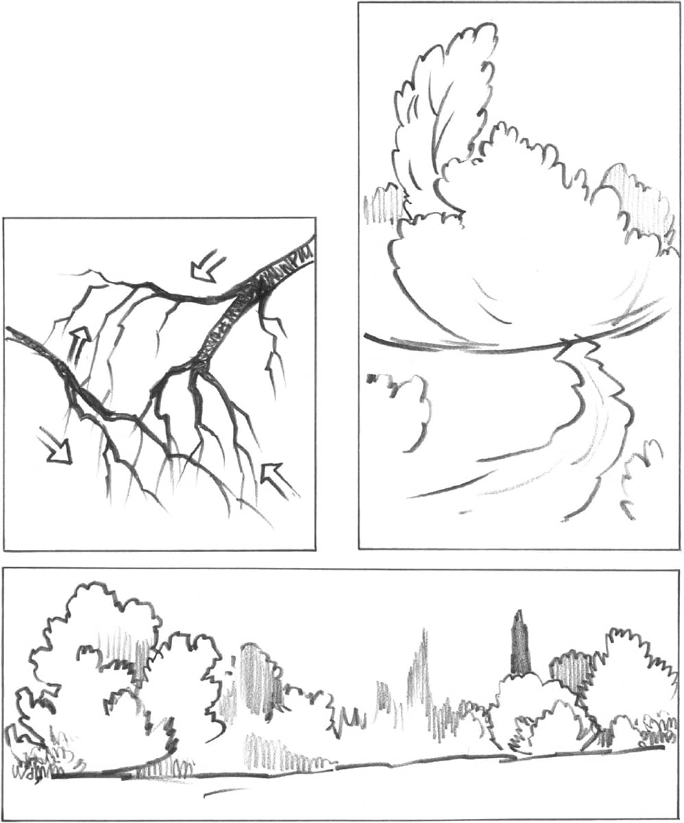
The landscape (horizontal) composition above represents a panoramic view. The large trees on the left are balanced by a group of smaller trees on the right. By placing the major elements on the right and left sides of the drawing, the center appears serene.
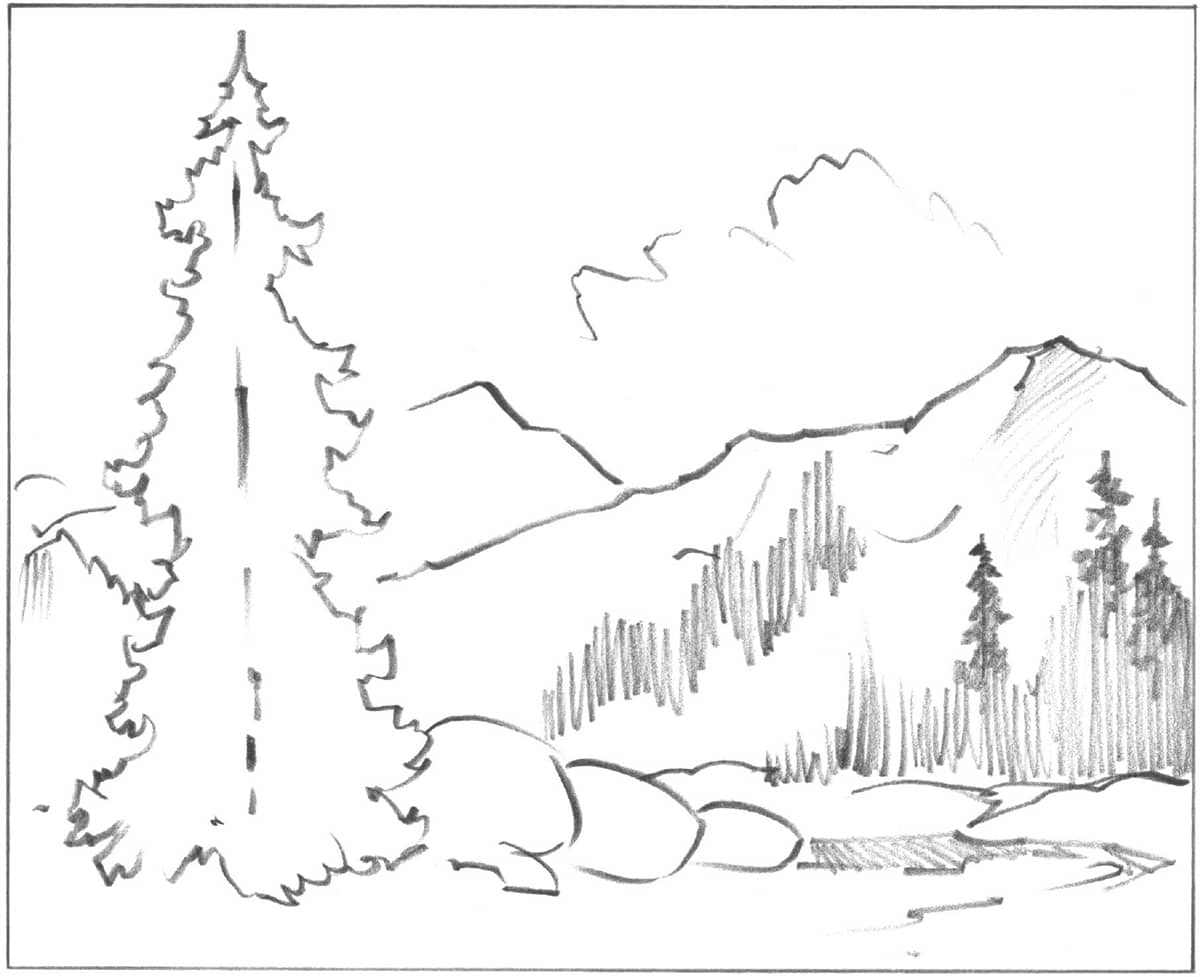
The tall tree in the foreground is complemented by the clouds, mountains, and smaller trees in the distance.
PERSPECTIVE
Drawing is actually quite simple. Just sketch the shapes and masses you see. Sketch loosely and freely—if you discover something wrong with the shapes, you can refer to the rules of perspective below to make corrections. Your drawings don’t need to be tight and precise as far as geometric perspective goes, but they should be within the boundaries of these rules for a realistic portrayal of the subject.
Practice is the only way to improve your drawing skills and to polish your hand-eye relationships. It’s a good idea to sketch everything you see and keep all your drawings in a sketchbook so you can track the improvement. The following are a few exercises to introduce the basic elements of drawing in perspective. Begin with the one-point exercise.
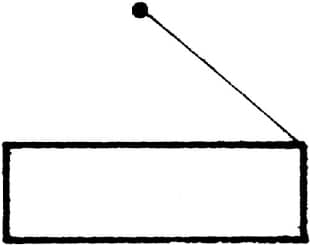
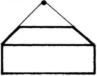
ONE-POINT PERSPECTIVE In one-point perspective, the face of a box is the closest part to the viewer, and it is parallel to the horizon line (eye level). The bottom, top, and sides of the face are parallel to the picture plane. |
|
|
Horizon line |
1. Draw a horizontal line, and label it “eye level” or “horizon line.” Draw a box below this line. |
|
|
Vp |
2. Now draw a light guideline from the top-right corner to a spot on the horizon line. Place a dot there, and label it VP (vanishing point). All side lines will go to the same VP. |
|
|
Vp |
3. Next, draw a line from the other corner as shown, and then draw a horizontal line to establish the back of the box. |
|
|
Vp |
4. Finally, darken all lines as shown, and you will have drawn a perfect box in one-point perspective. This box may become a book, a chest, a building, etc. |
|

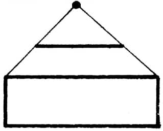
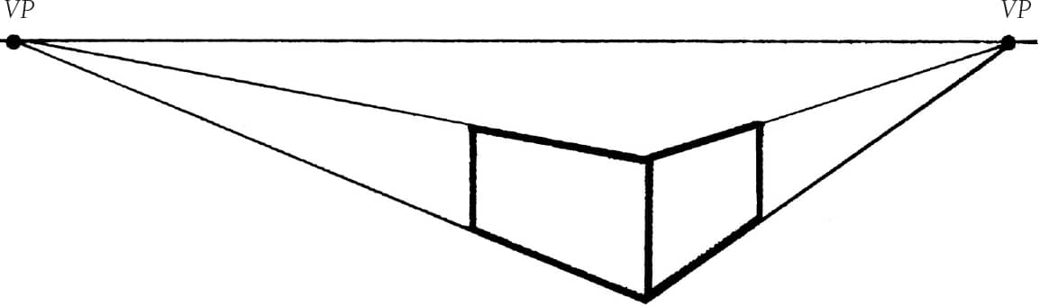
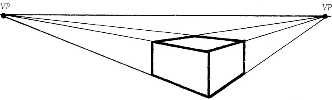
TWO-POINT PERSPECTIVE In two-point perspective, the corner of the box is closest to the viewer, and two VPs are needed. Nothing is parallel to the horizon line in this view. The vertical lines are parallel to the sides of the picture plane. |
|
|
|
1. Establish the horizon line (see “One-Point Perspective” at left), and then place a dot at each end and label them VP. Draw a vertical line that represents the corner of the box closest to the viewer. |
|
|
|
2. Draw guidelines to each VP from the top and the bottom of the vertical line. Draw two more vertical lines for the back of the sides. |
|
|
|
3. Draw two lines to the VPs, as shown, to establish the top of the box. Now darken all the lines, and you will have drawn a perfect box in two-point perspective. |
|


FINDING THE PROPER PEAK AND ANGLE OF A ROOF
1. Draw a box in two-point perspective.
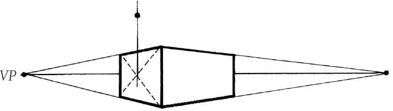
2. Find the center of the face by drawing diagonal lines from corner to corner; then draw a vertical line upward through the center. Make a dot for the roof height.
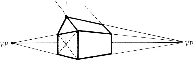
3. Using the vanishing point, draw a line for the angle of the roof ridge; then draw the back of the roof. The angled roof lines will meet at a third VP somewhere in the sky.
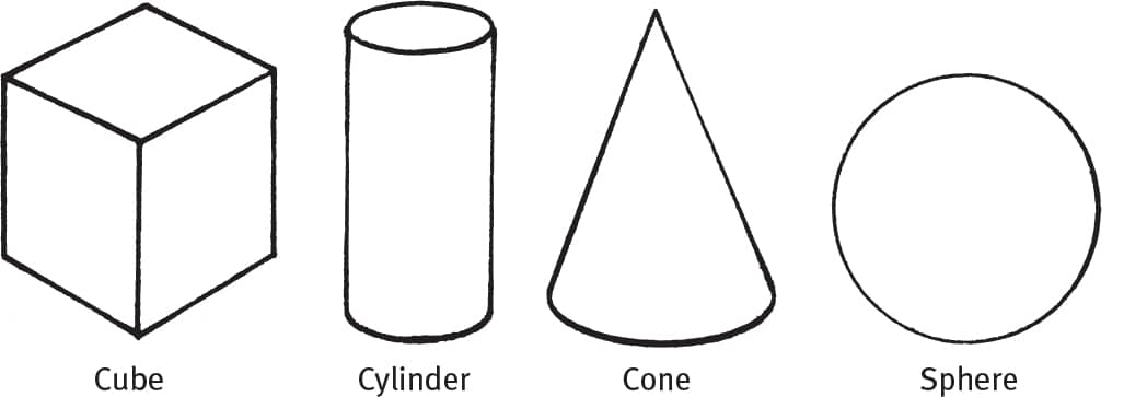
BASIC FORMS
There are four basic forms you should know: the cube, the cone, the cylinder, and the sphere. Each of these forms can be an excellent guide for beginning a complex drawing or painting. Below are some examples of these forms in simple use.
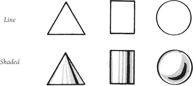
CREATING DEPTH WITH SHADING
To create the illusion of depth when the shapes are viewed straight on, shading must be added. Shading creates different values and gives the illusion of depth and form. The examples below show a cone, a cylinder, and a sphere in both the line stage and with shading for depth.
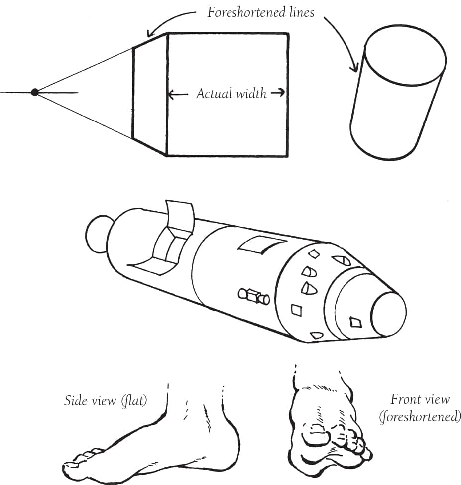
FORESHORTENING
As defined in Merriam-Webster’s dictionary, to foreshorten is “to represent the lines (of an object) as shorter than they actually are in order to give the illusion of proper relative size, in accordance with the principles of perspective.” (For more on foreshortening, see here.) Here are a few examples of foreshortening to practice.
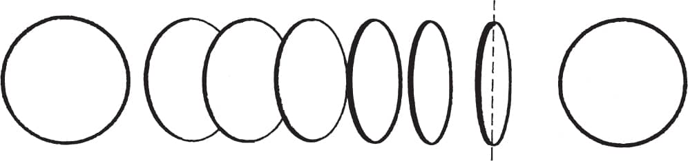
ELLIPSES
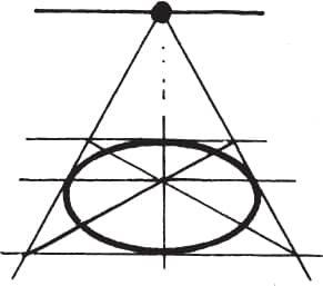
An ellipse is a circle viewed at an angle. Looking across the face of a circle, it is foreshortened and we see an ellipse. The axis of the ellipse is constant and represented as a straight centerline through the longest part of the ellipse. The height is constant to the height of the circle. Here is the sequence we might see in a spinning coin.
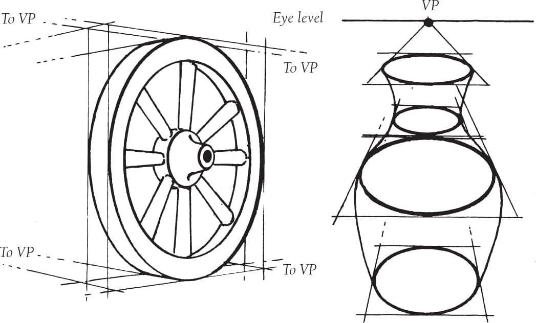
Notice the use of eye-level VPs to establish planes for the ellipses.
CAST SHADOWS
When there is only one light source (such as the sun), all shadows in the picture are cast by that single source. All shadows read from the same vanishing point. Whether on the horizon line or more forward in the picture, this point is placed directly under the light source. The shadows follow the plane on which the object is sitting. Shadows also follow the contour of the plane on which they are cast.
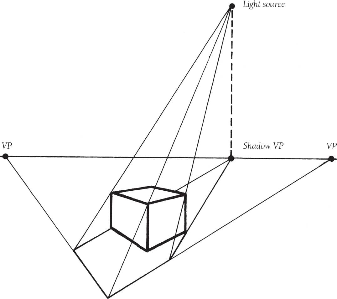
Light rays travel in straight lines. When they strike an object, the object blocks the rays from continuing and creates a shadow relating to the shape of the blocking object. Here is a simple example of the way to plot the correct shape and length of a shadow for the shape and the height of the light.
If the light is raised, lowered, or moves to the side, the shape of the shadow will change accordingly.
PRACTICING PERSPECTIVE
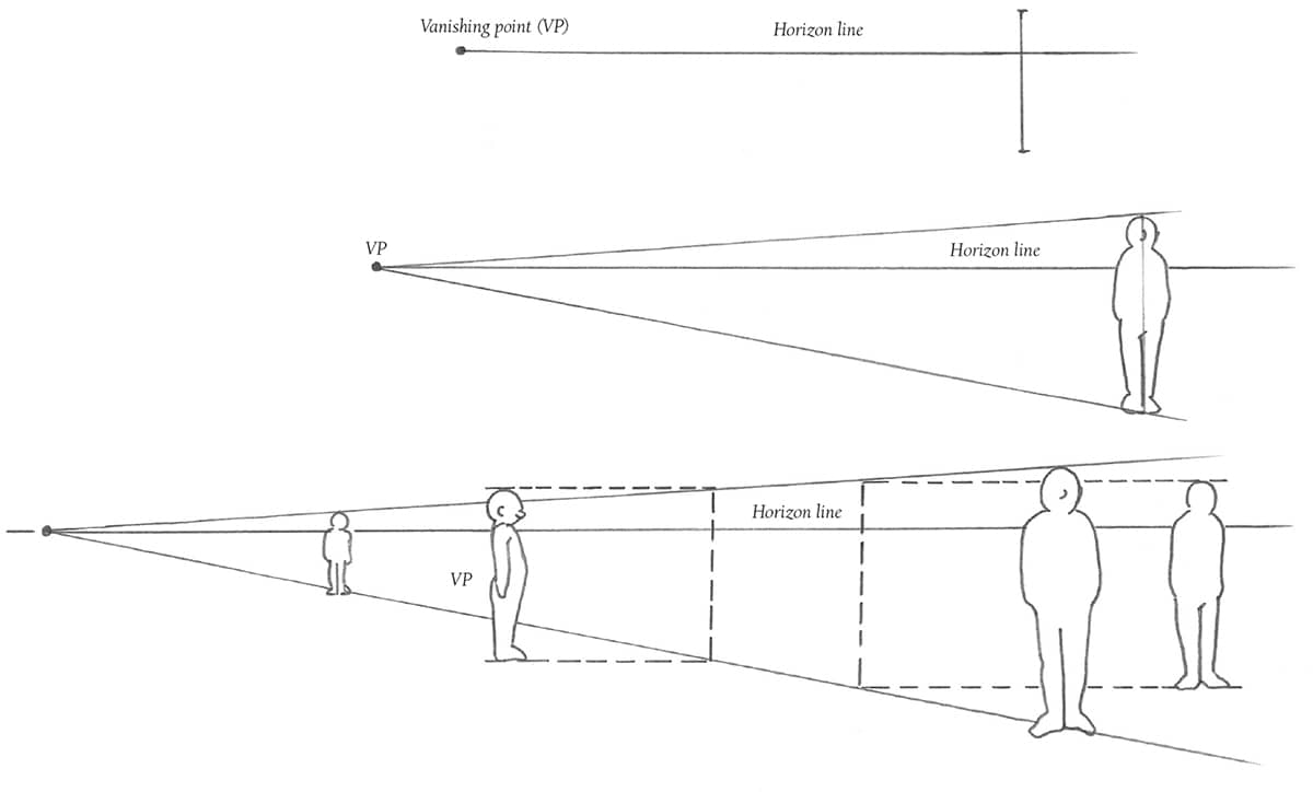
A little bit of knowledge will go a long way, especially when it comes to perspective. Nothing will make your drawings of landscapes and buildings more realistic than applying a rule or two of perspective. In fact, you may already know more than you think. Have you ever noticed the way railroad tracks seem to narrow to one spot in the distance? That’s linear perspective at work.
DEFINING THE TERMS
Linear perspective is a complex subject, but not one to fear once you are acquainted with a few basics. The horizon line is a horizontal line that’s level with the viewer’s eyes. In a landscape, it is usually the actual horizon. When two parallel lines recede, the point on the horizon line where they appear to converge is known as the vanishing point (VP). For example, picture a row of railroad tracks. This is called one-point perspective, because the lines meet at one point. When you draw a building at anything but a full frontal view, you will see two sides, or planes. Each plane will have its own vanishing point on the horizon, one to the left and one to the right of the building. This is an example of two-point perspective (see sketch at right). But enough of counting planes and points—let’s draw some structures with linear perspective.
One-point perspective You don’t need horizontal lines to show one-point perspective; a vertical row of trees follows the same principle. Equally spaced objects, such as these trees and their cast shadows, appear to get closer together as they move toward the vanishing point.
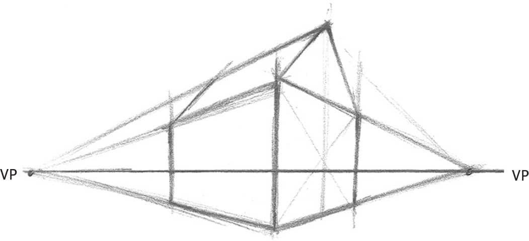
Two-point perspective This thumbnail shows the vanishing points for the two sides of a building. Drawing lines from the top and bottom corner to each vanishing point gives me the lines of my building.
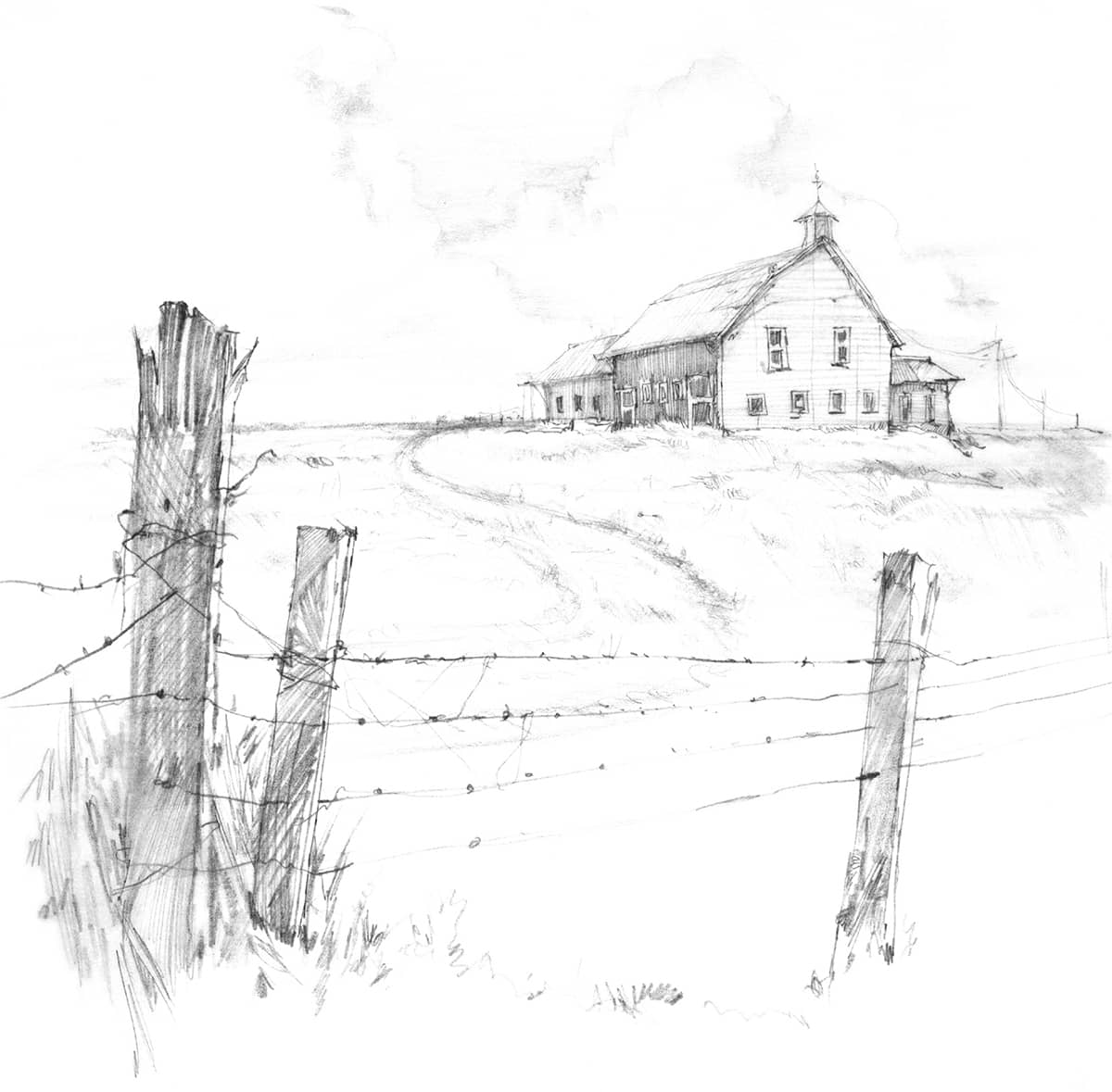
Applying Perspective This simple-looking drawing is a wonderful example of how perspective can add interest and depth. The fence in the foreground and the telephone lines in the background were drawn with one-point perspective, and the building itself is drawn in two-point. Notice that the vanishing point for the fence isn’t on my paper; it’s farther off to the right, but it’s there!
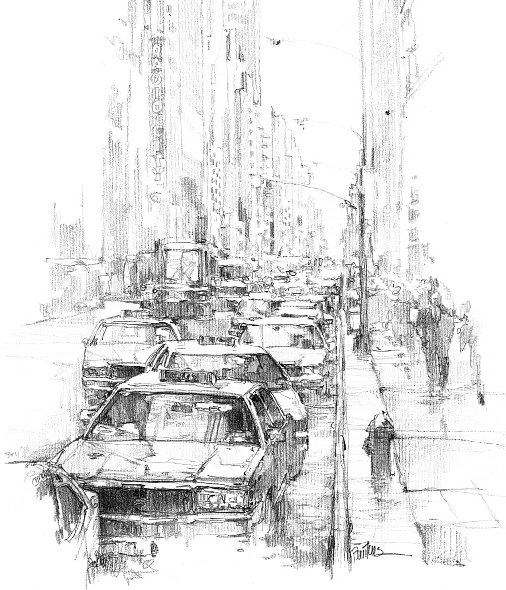
Conveying Distance This busy, big-city street scene is a classic example of one-point perspective, although that’s not the only technique at play. I also overlapped objects, made scale changes, and lightened the distant values to let you know this traffic jam goes back a long, long way.
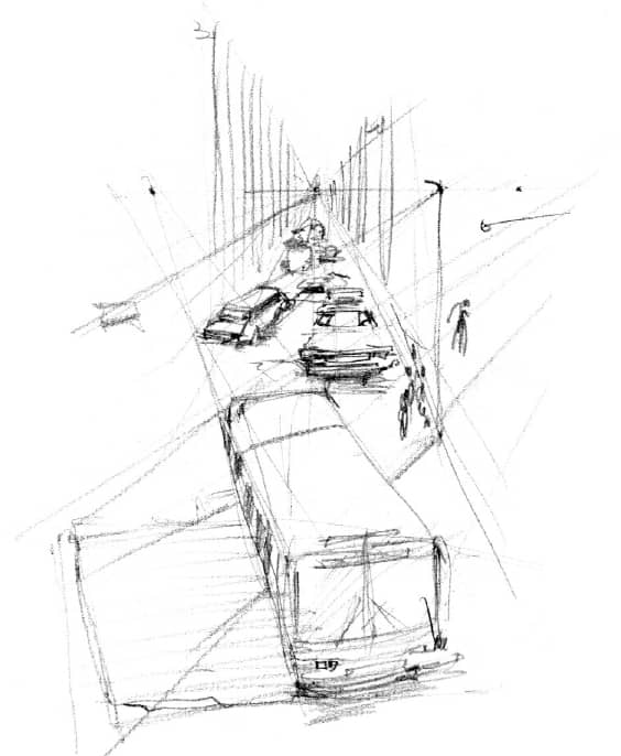
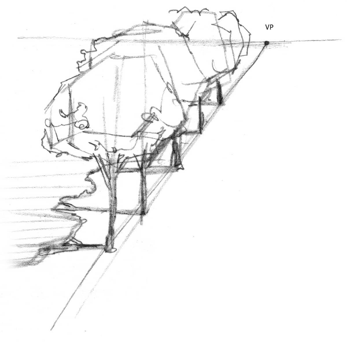
Taking Advantage of Thumbnails Small sketches are great for working out the correct perspective in a scene. This view is high, as if looking down from an upper window.
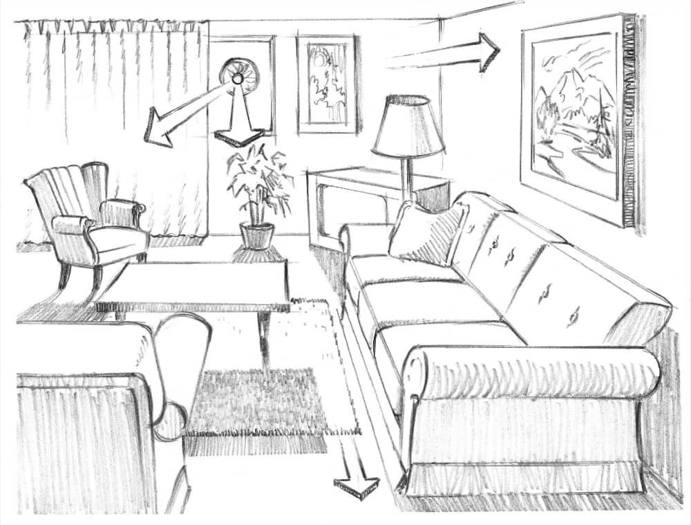
INDOOR PERSPECTIVE
With indoor compositions, you can’t really see the horizon line, but it is at your eye level. Pick a point at your center of vision to be the vanishing point, and draw all lines of the room and the lines of the objects in it so they recede to that vanishing point. Then apply the same techniques you use in landscapes to create depth: Use lighter values in the background and more detail in the foreground. Just make the differences more subtle because the distance isn’t great.
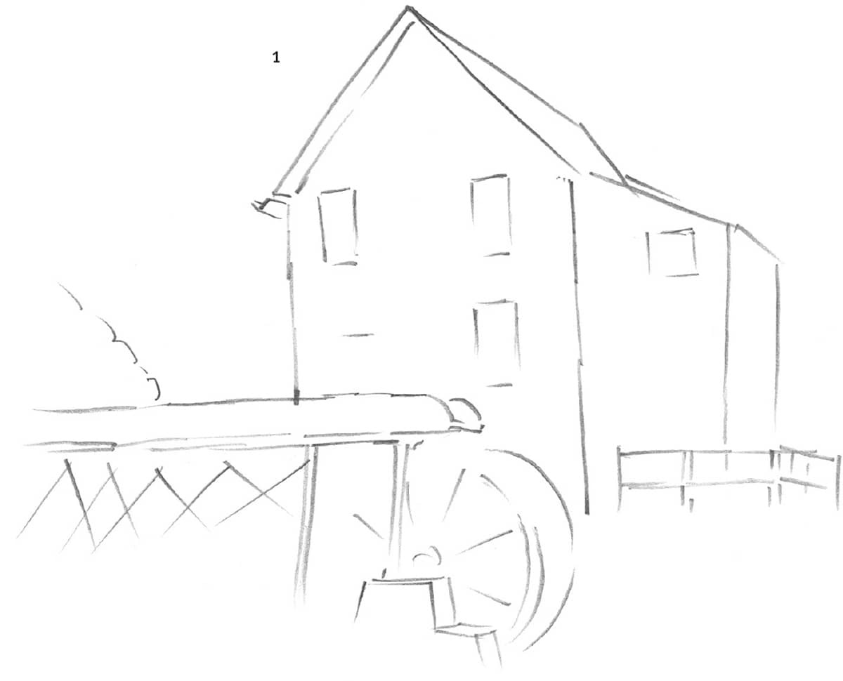
Establishing the Basic Structure This drawing was done on plate-finish Bristol board. In this landscape, the view is closer than in the previous drawing; therefore, the structure takes up more space. In step 1, lightly sketch the major shapes with an HB pencil, using as few lines as possible. Be sure the perspective is correct before shading.
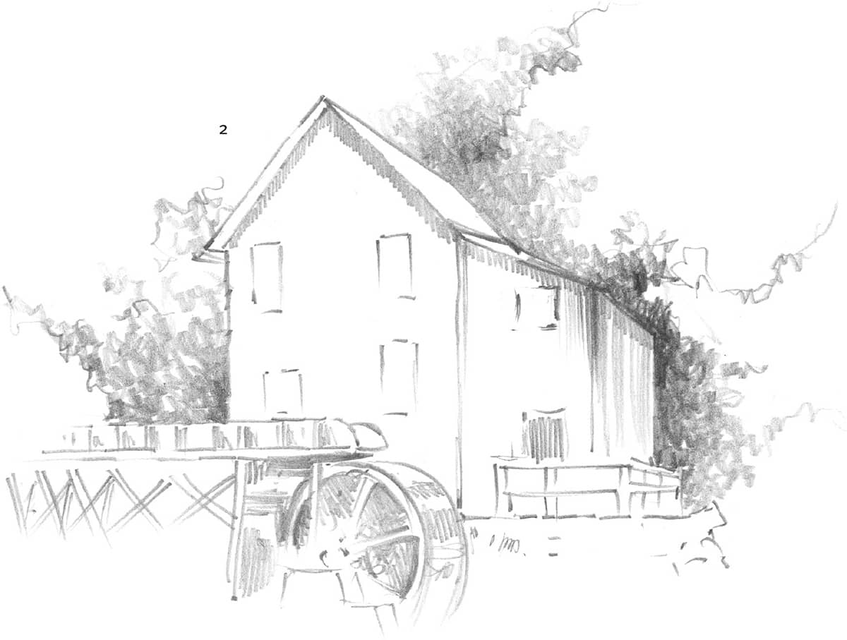
Creating Form Begin creating form by shading the background with a 2B pencil. Apply strokes in various directions, studying closely where the shading values differ. Shade with long, vertical strokes along the structure wall; these will contrast with the bushy background texture. Next, fill in the shadows between the water wheel, spokes, and trough. Keep the shading light and even at first; then make the darker shadows heavier and more saturated.
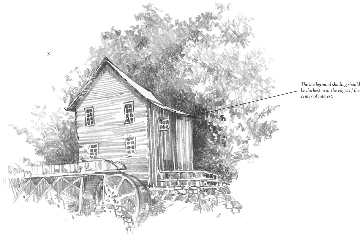
Finishing Your Drawing A nice quality about this drawing is that some details appear sketchy and unfinished. Keep this in mind as you work on your own original landscapes. Try not to overwork your drawings.
PEOPLE IN PERSPECTIVE
Knowing the principles of perspective allows you to draw more than one person in a scene realistically. As when you’re drawing a building (see here), first establish the horizon line and the vanishing points. Any figures drawn along these lines will be in proper perspective. Study the diagrams at right and below to help you.
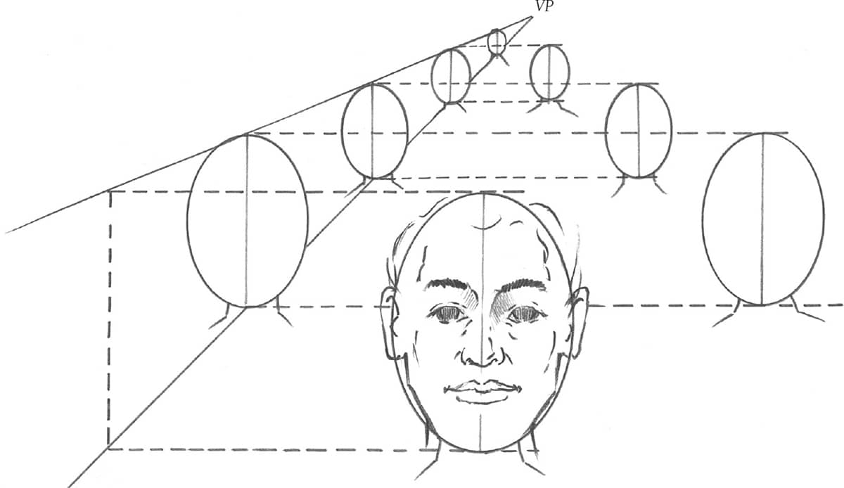
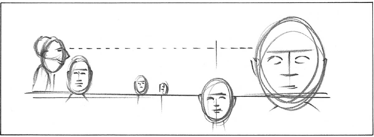
Altering Size and Depth Try drawing a frontal view of many heads as if they were in a theater. Start by establishing your vanishing point at eye level. Draw one large head representing the person closest to you, and use it as a reference for determining the sizes of the other figures in the drawing.
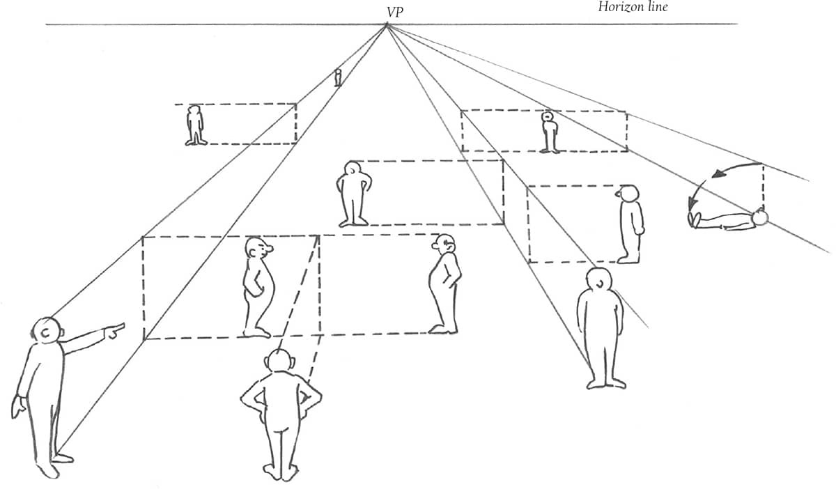
Drawing Full Figures The technique illustrated above can be applied when drawing entire figures, as shown in the diagram at right. Although all of these examples include just one vanishing point, a composition can even have two or three vanishing points. (See here.)
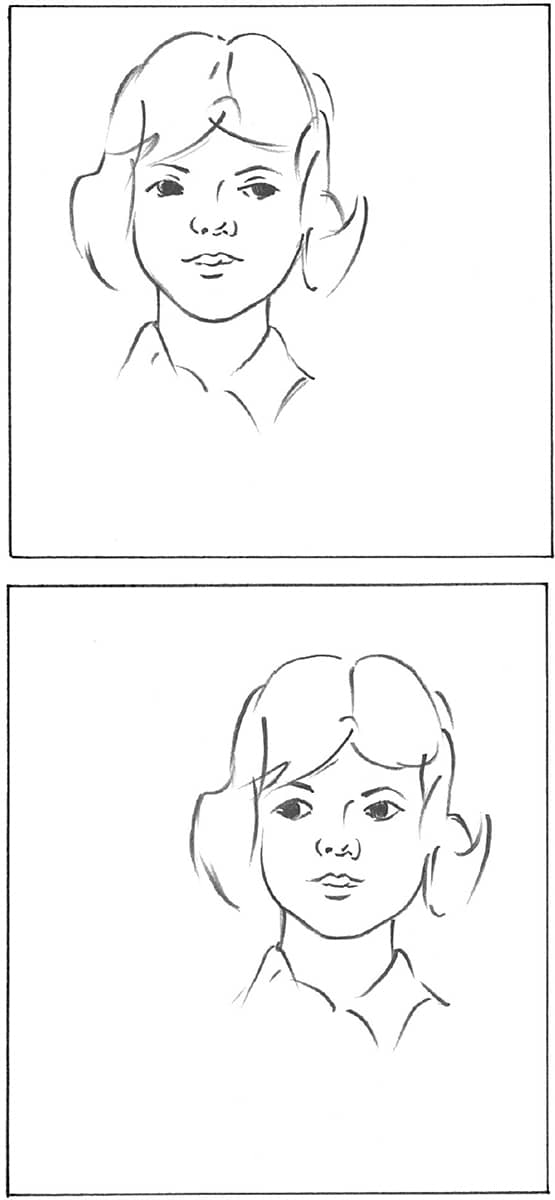
COMPOSING FIGURES
Creating a good composition is important in any drawing; therefore, let your subject(s) guide you. It’s not necessary to place the main subject directly in the center of your composition. For example, the eyes of the girls below are looking in different directions, which determines where the girls are positioned.
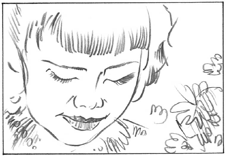
Zooming In Intentionally drawing your subject larger than the image area, as shown in the example below, is also a unique composition. While part of the image may be cut off, this kind of close-up creates a dramatic mood.
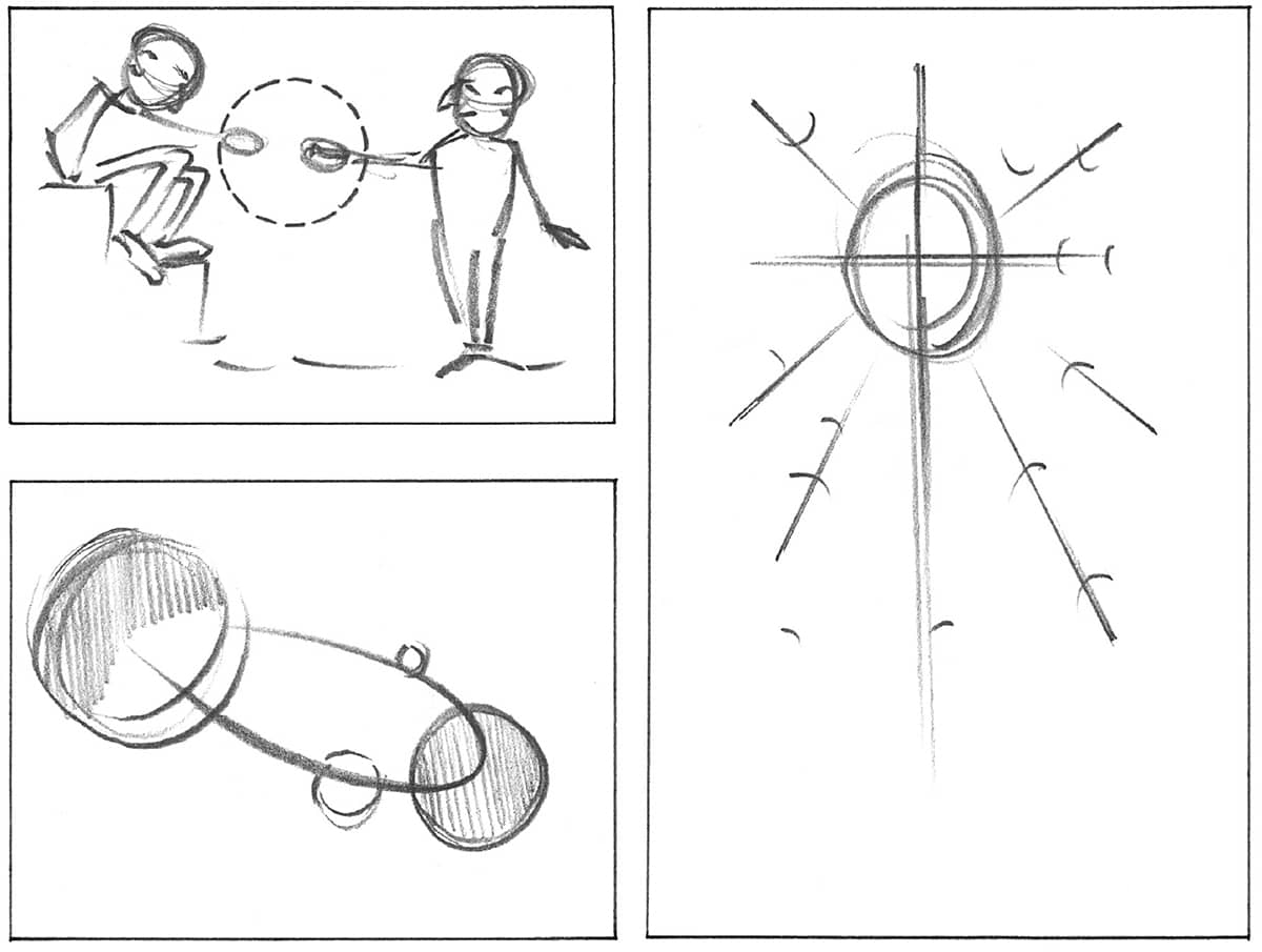
Combining Multiple Subjects You can create a flow or connection between multiple subjects in a composition by creatively using circles and ellipses, as shown to the right.
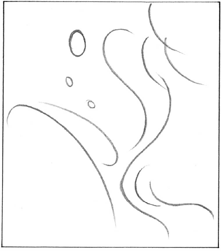
Practicing Curvatures Curved lines are good composition elements—they can evoke harmony and balance in your work. Try drawing some curved lines around the paper. The empty areas guide you in placing figures around your drawing.
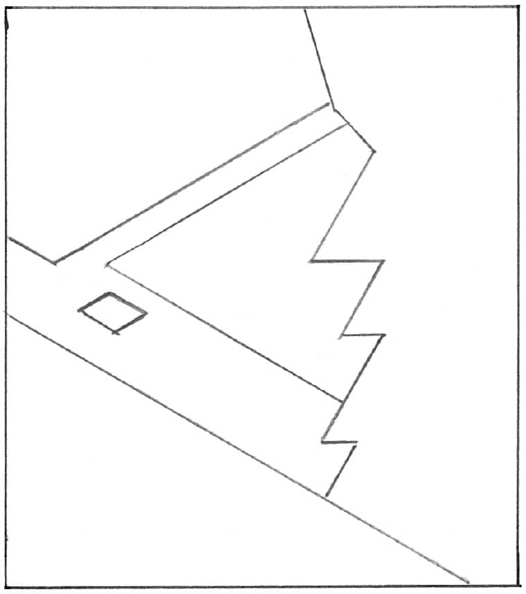
Producing Sharp Angles Sharp angles can produce dramatic compositions. Draw a few straight lines in various angles, and make them intersect at certain points. Zigzagging lines also form sharp corners that give the composition an energetic feeling.
The compositions above and below illustrate how arm position, eyesight direction, and line intersection can guide the eye to a particular point of interest. Using these examples, try to design some of your own original compositions.
FORESHORTENING
To achieve realistic depth in your drawings, it’s important to understand foreshortening. Foreshortening refers to the visual effect (or optical illusion) that an object is shorter than it actually is because it is angled toward the viewer. Objects closer to the viewer appear proportionately larger than objects farther away. For example, an arm held out toward the viewer will look shorter (and the hand will look larger) than an arm held straight down by the subject’s side. When foreshortening something in a drawing, be sure to draw the object the way you really see it, not the way you think it should look. Foreshortening helps create a three-dimensional effect and often provides dramatic emphasis. Study the examples here to see how foreshortening influences their sense of depth.
Side View In this view, the young woman’s limbs are not distorted because the view is directly from the side, not at an angle. Her torso, head, and legs are all at roughly the same distance from the viewer. The fingers of her left hand are somewhat foreshortened because they are turned toward the viewer.
FOCUS ON FINGERS
When foreshortening occurs, you must forget everything you know about proportion and draw what you see instead of what you expect to see. Even something as simple as a fingertip can take on a drastically different appearance.
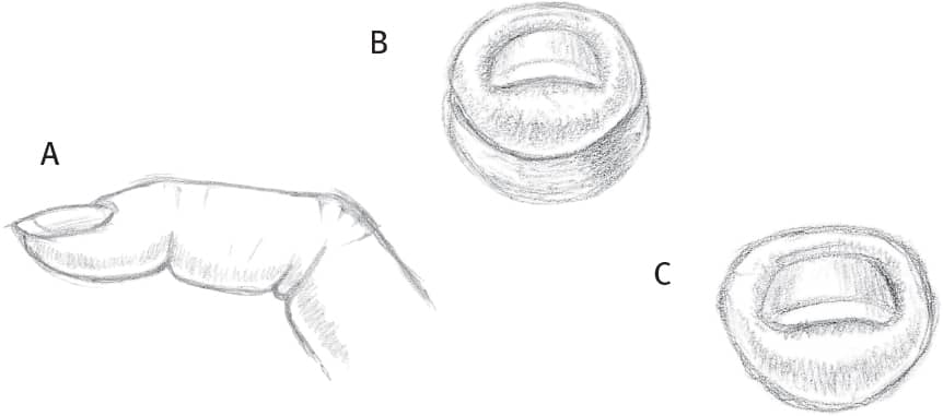
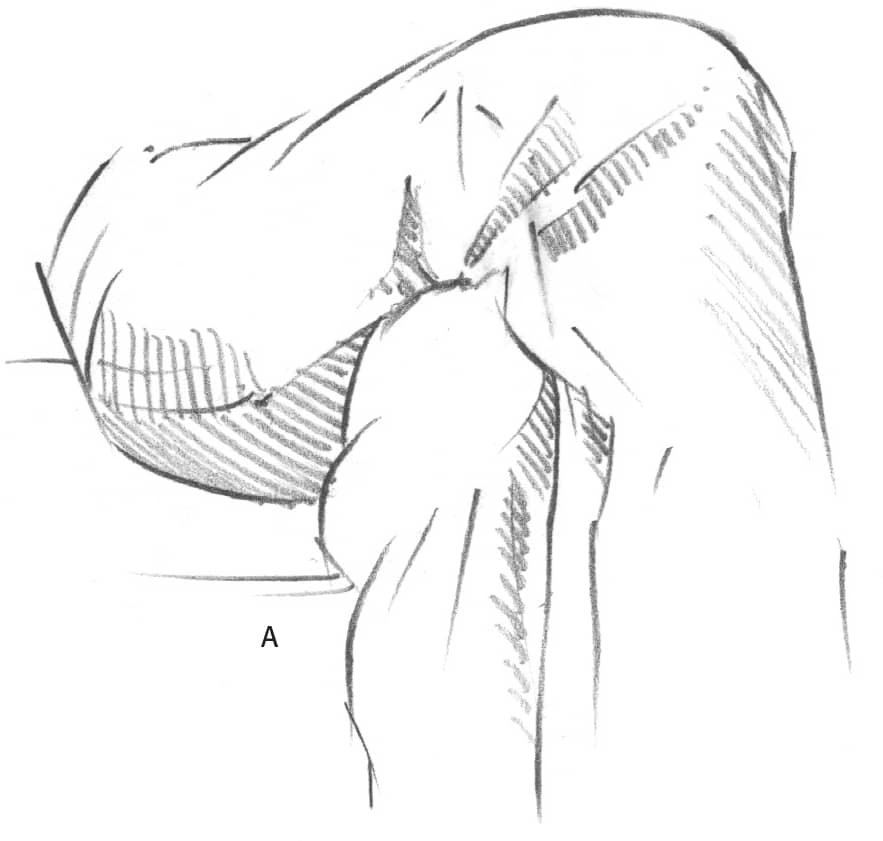
Fingers When viewing a finger from the side (A), the tip of the finger is much smaller than the knuckle. When viewed straight on (B), the tip and the knuckle appear equal in size. When the lines of the rounded fingertip and nail are shortened, both appear quite square (C). Foreshortening from this angle causes the length of the fingernail to appear quite short as well.
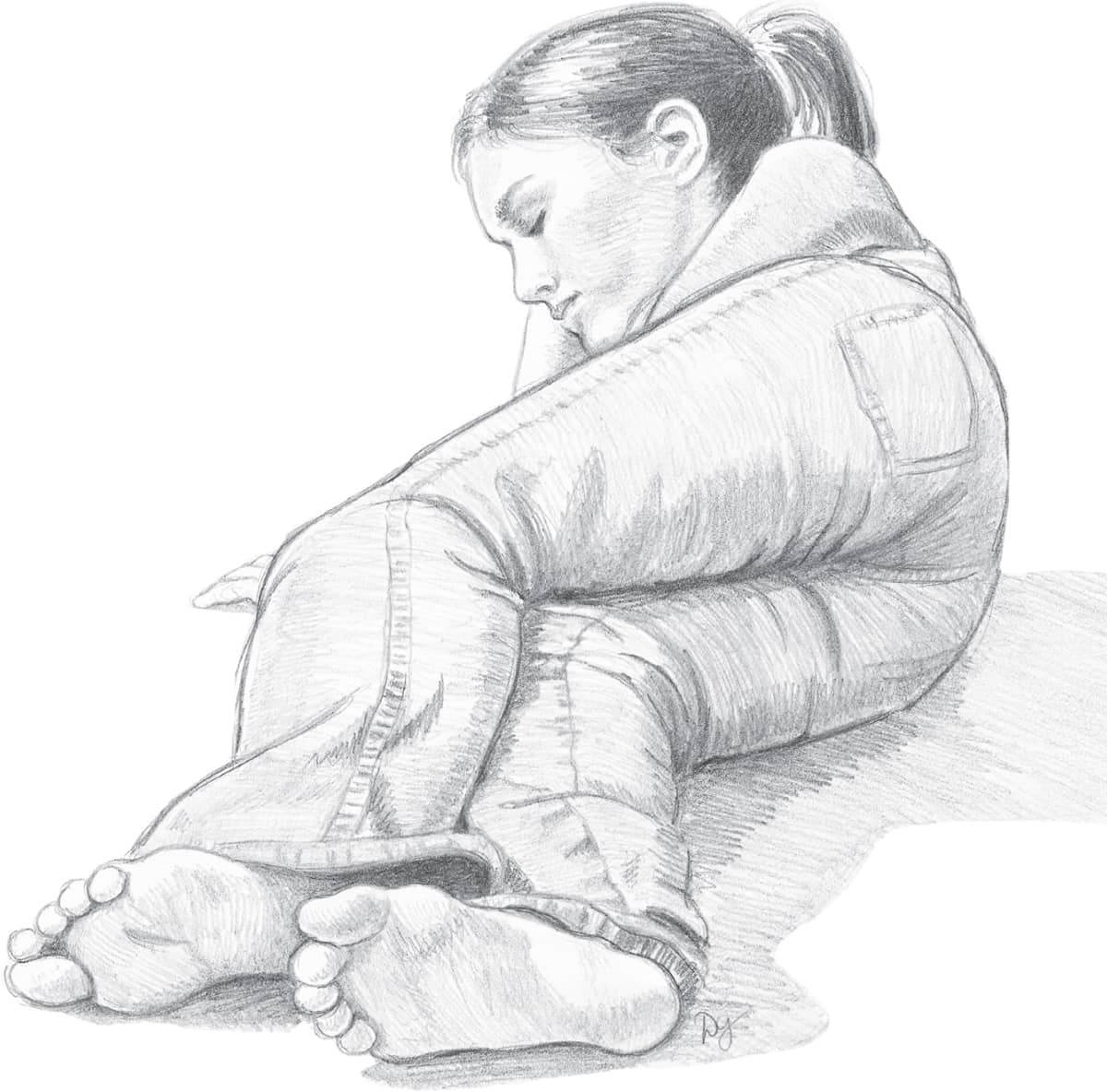
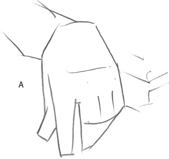
Foot to Head View Here the feet are closest to the viewer and the head is farthest away, so the feet appear relatively larger than they would normally. The lower legs are foreshortened because they are angled directly toward the viewer. Most of the torso and the arms are hidden behind the legs—remember that you shouldn’t draw what you can’t see!
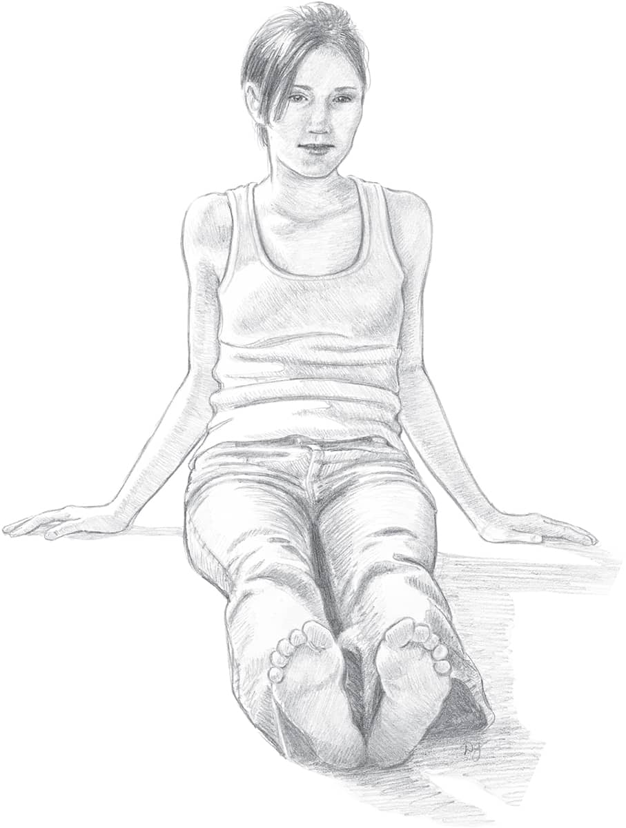
Straight-On View Now the legs are extended directly toward the viewer so the legs are foreshortened, making them appear much shorter than they really are. This distortion creates the illusion that the feet are much closer to the viewer than the rest of the body. The torso, head, and arms are all on the same plane and in proper proportion to one another. Notice here that the stretched-out legs appear to be only about two heads long.
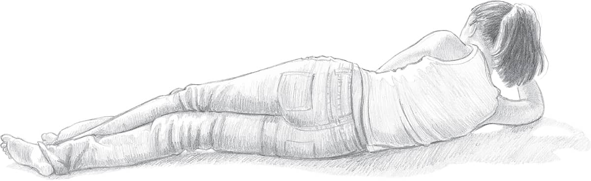
Back View with Angled Head and Arm In this view, most of the body is on the same plane (and parallel to the picture plane), but the head and arms are angled slightly away from the viewer and appear relatively small when compared with the rest of the body.
MORE FORESHORTENING
Foreshortening allows you to create the illusion of an object coming toward you in space. While the principles of perspective still exist, body parts are more difficult to draw in this manner because they don’t have straight edges. In addition, the body proportions are somewhat skewed, or shortened, in a drawing that includes foreshortened subjects.
Foreshortening means you are shortening what is coming forward. Notice at the dinner table when someone passes you something how his or her arm is foreshortened.
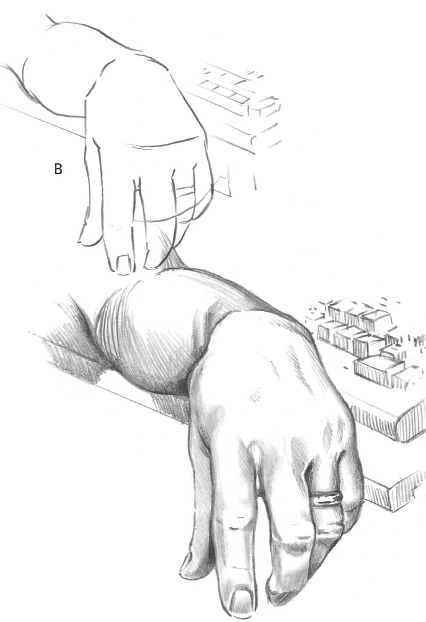
The arm resting on the keyboard appears to be receding back into space. The parts of the body closest to you should be shaded the least because they have the most light on them. Also, keep in mind that as objects move farther away, they become less detailed and more blurred.
Foreshortening is a technique necessary for realistic people drawings with three-dimensional subjects. Success requires extensive practice.
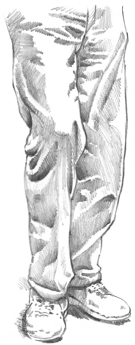
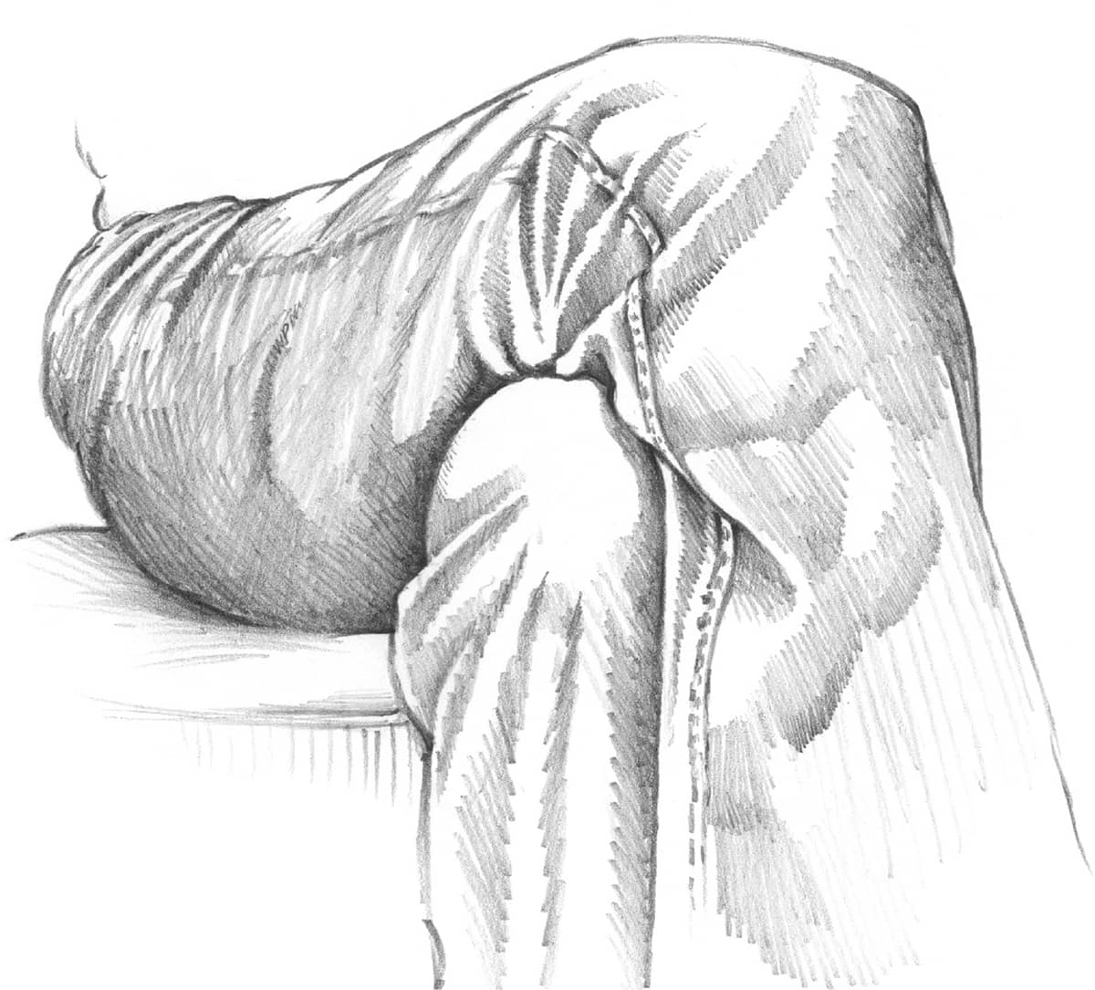
With crossed legs, most of the shading falls on the part of the leg farthest away, enhancing the perception of depth in the drawing. Be certain to rough in both legs and the major folds correctly before you begin shading.
CHOOSING A POSE
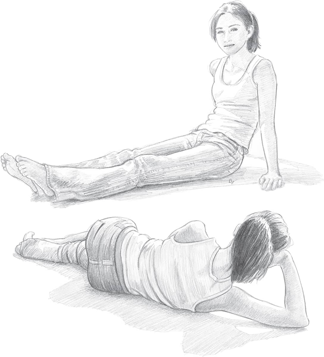
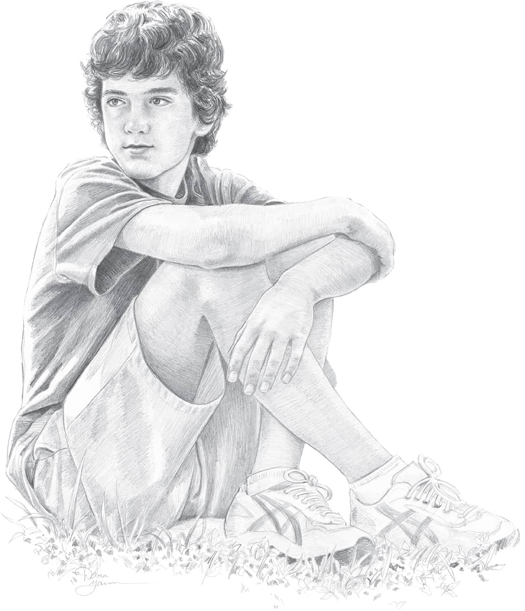
Not every photo you take is going to be good, and not every pose your model strikes is going to be perfect. Look for poses that are natural and balanced, not stiff or boring. Some movement or tension can make the pose more interesting, but your subject should look stable and comfortable in the position. Unless in motion, the model should not have his or her arms and legs stretched out in all directions. Instead, he or she should be more compact and relaxed. The pose should reflect the personality or interests of the subject. Take many photos to use as references, and evaluate them for suitability.
EVALUATING PHOTOS
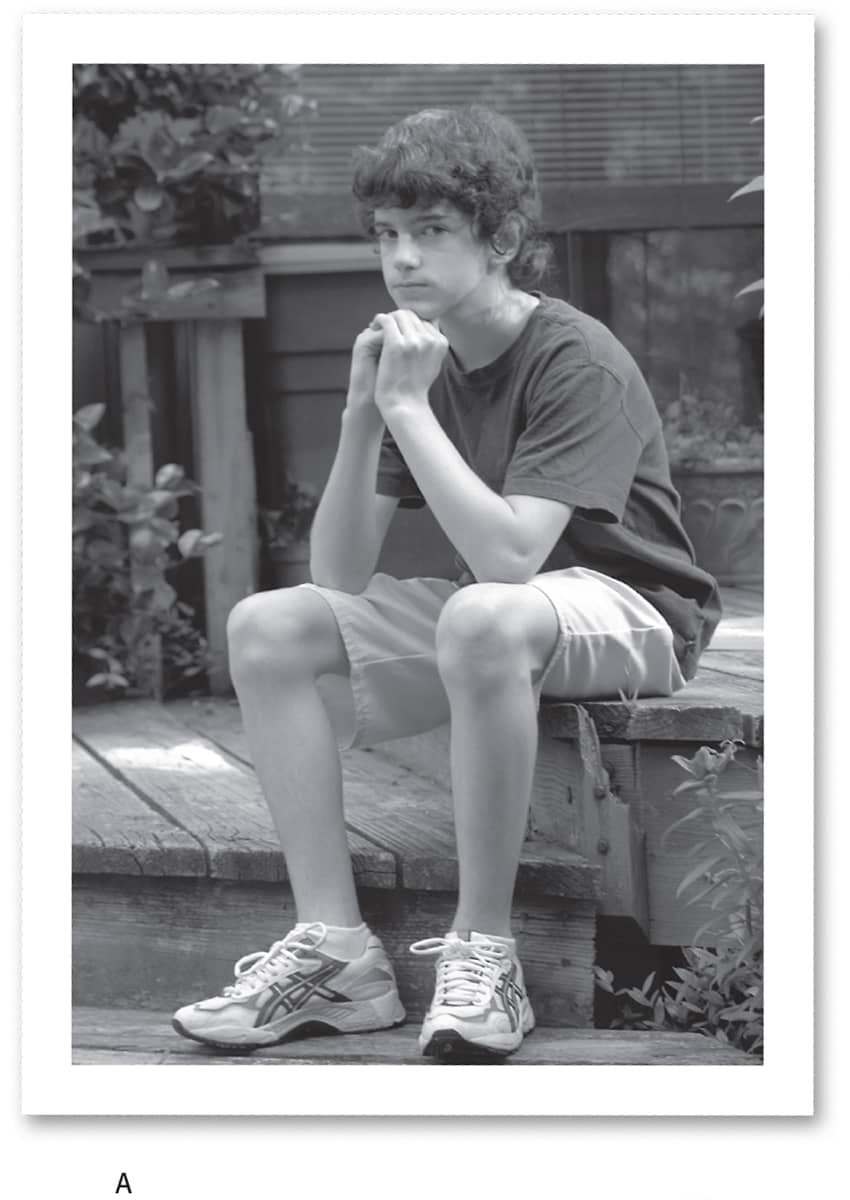
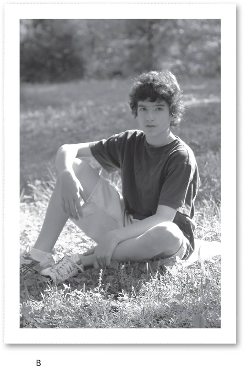
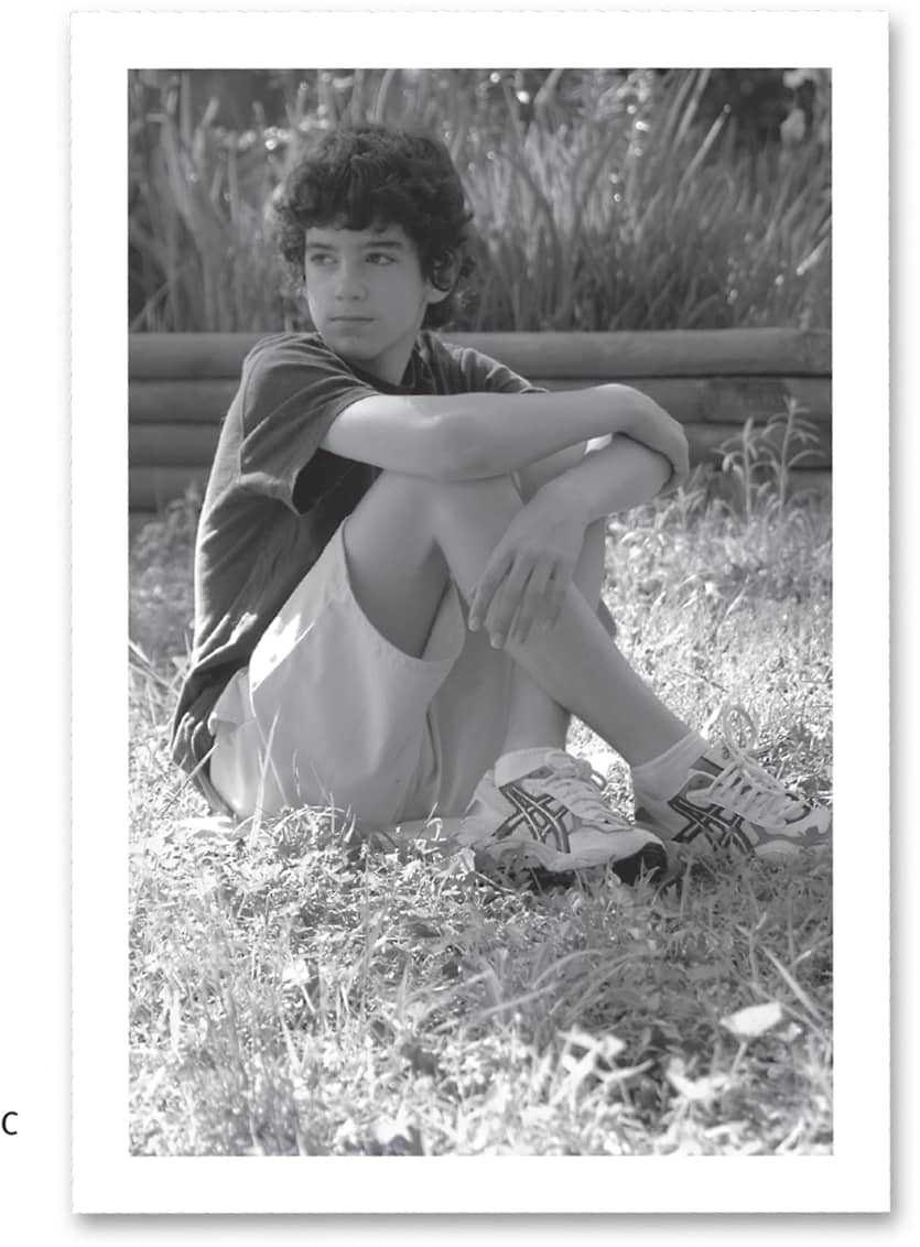
Selecting a Photo Reference In photo A, the subject has a stable, compact pose, but he looks a bit stiff and bored, and his personality doesn’t show through. The pose in photo B is more relaxed, but the boy looks a little out of balance, and his arms and legs are in awkward positions; in addition, the light behind him is a bit harsh. Photo C is a great pose to represent this young man. He looks comfortable and his hands and feet are in good, natural positions. His head is turned at a 90-degree angle to his body, which helps give some movement and interest to the pose. The lighting is more even as well. This is the best pose to use for a drawing.
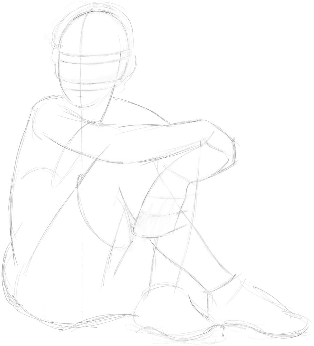
Step 1 Using an HB pencil, block in the figure. Place the head above the center of the main body mass, as indicated by the vertical line. Sketch the shapes of the arms and legs, drawing through the overlapping body parts for correct placement. The vertical centerline on the head shows the three-quarter view. Add the horizontal guidelines for the facial features. Sketch the general shapes of the shoes and the lines for the ends of the shorts and the shirt sleeve. Be sure the pose and proportions are accurate before adding any details.
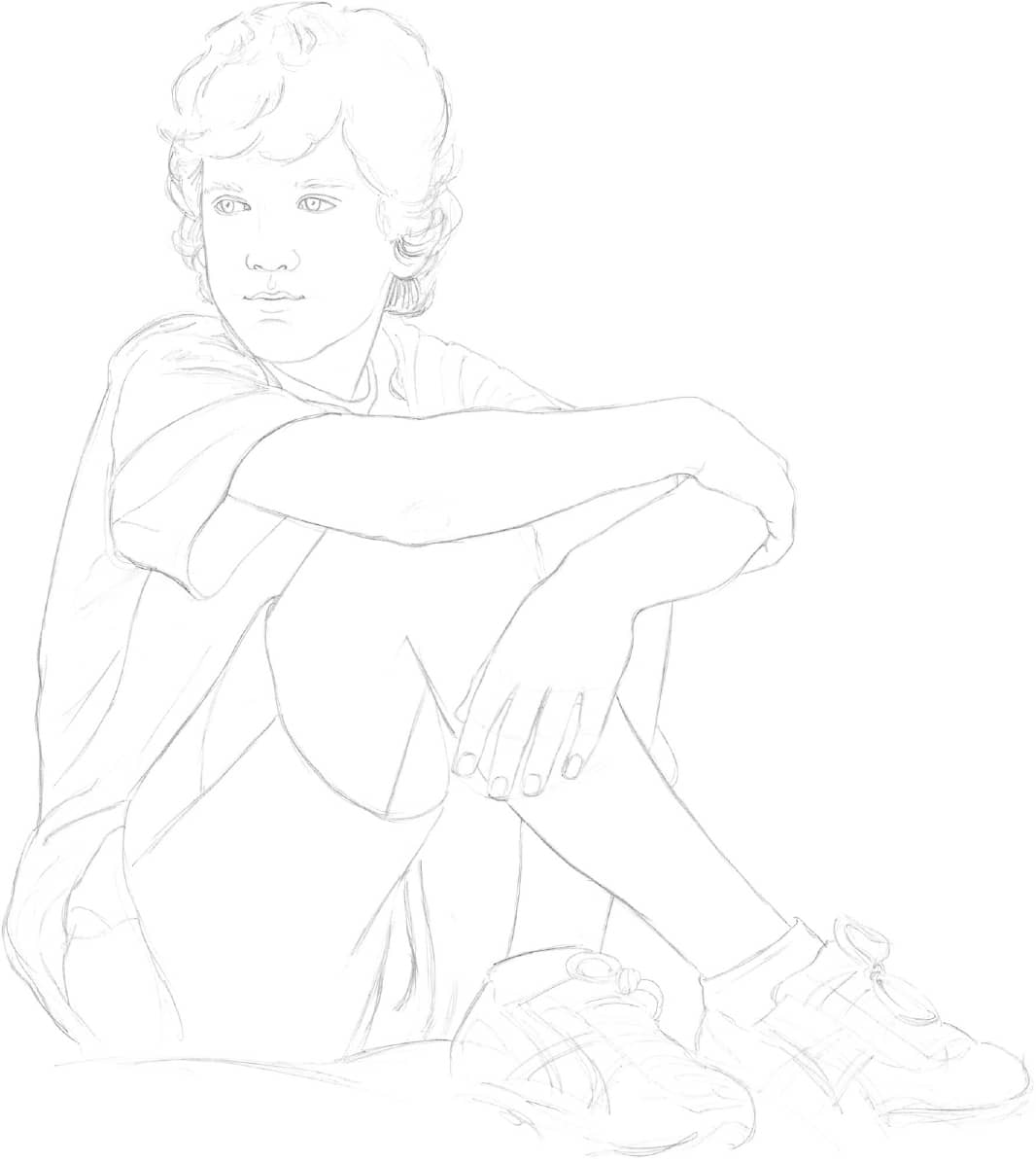
Step 2 Now it’s time for some definition. Place the facial features on the guidelines. Remember: The guides you learned about earlier are based on averages. To achieve a good likeness, be sure to follow your photo reference and adjust accordingly—for example, accounting for this boy’s high forehead and wide-set eyes. Indicate the hair, and sketch in the clothing, showing some of the folds and wrinkles. Sketch in the shapes of the fingers of his left hand and the elbow of his right arm. Refine the shapes of the shoes, and indicate laces.
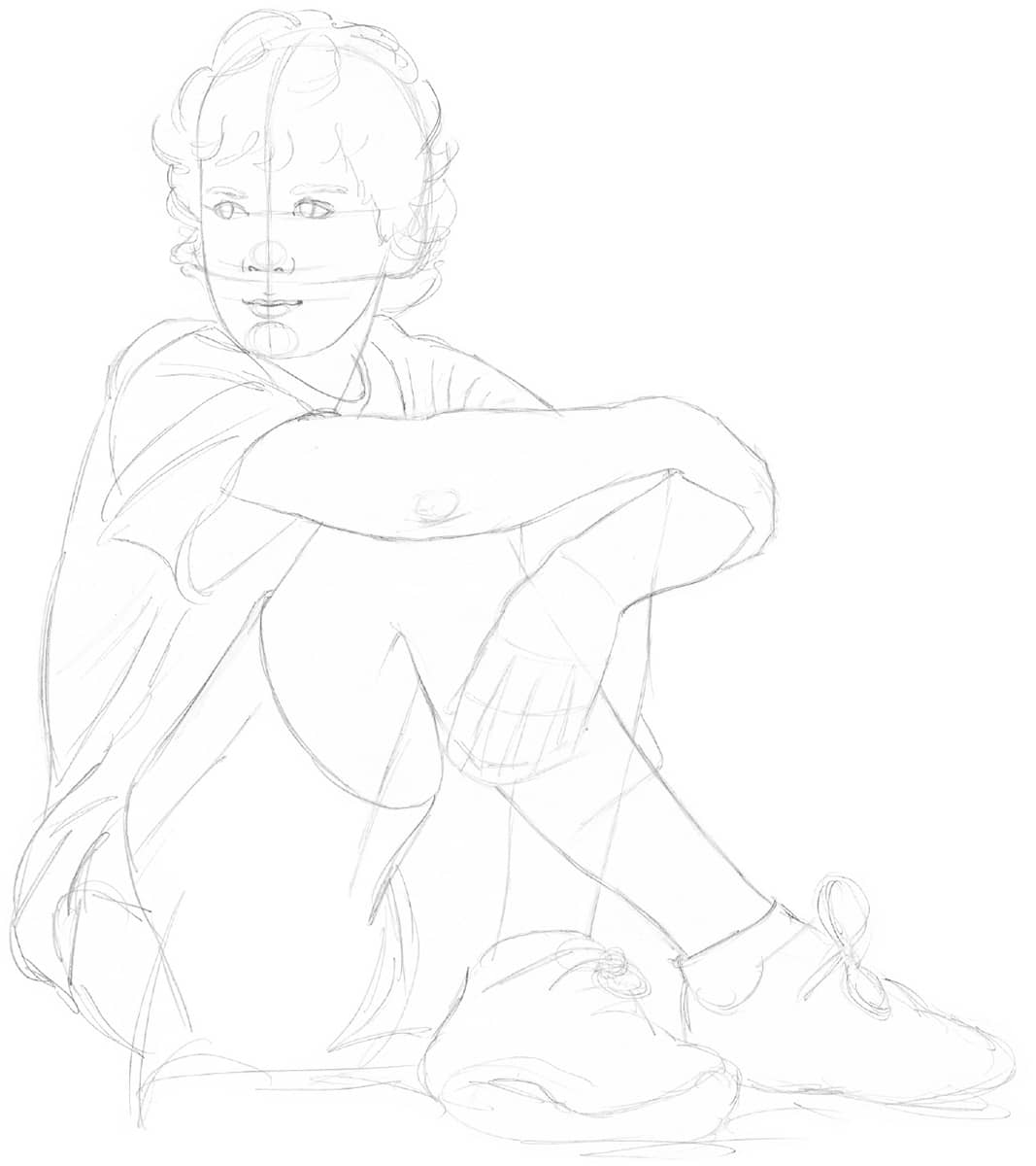
Step 3 Erase the guidelines. Then use a B pencil to refine the facial features and the hair. Give the fingers a more precise shape, and add the fingernails. Refine the shapes of the arms, legs, and clothing, removing unneeded lines with a kneaded eraser. Using artistic license (the artist’s prerogative to ignore what actually exists and to make changes, deletions, or additions), the author decides to change the shoelace so it is not awkwardly sticking up at an odd angle.
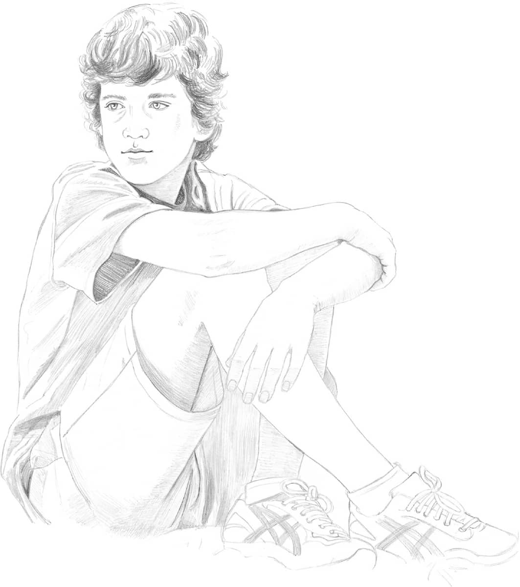
Step 4 Using a 2B pencil, begin shading the hair with strokes that follow the direction of growth. Leave areas of white paper where the light hits the hair. Shade some darker areas around the eyes, cheekbones, and under the lips as well as on the neck. Use a very sharp pencil and small strokes for the eyebrows and lashes. Darken the legs where they are in shadow; these strokes follow the curve of the leg and help show its form. (See “Shading the Forms” to the right.) Begin to shade the arms and other areas in shadow, such as the ends of the fingers. Add more shading to the clothing and shoes, rendering additional details as you go.
SHADING THE FORMS
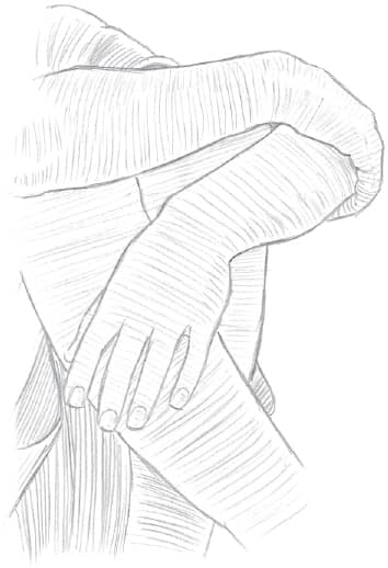
Shading with varying values—from black through all shades of gray to white—enhances the illusion of depth in a drawing. Effective shading also adds life and realism to a drawing. When shading cylindrical elements, such as the arms and legs, make sure your pencil strokes follow the curved forms, as shown in the diagram at the right. This illustration has been exaggerated to demonstrate the different directions the shading lines should follow. Your strokes, of course, will be smoother with subtle gradations and highlighting.
UNDERSTANDING LIGHTING
An important aspect of drawing—especially when drawing people—is lighting the subject. Lighting can have a dramatic effect on the figure’s appearance, eliciting an emotional response from the viewer and setting the mood of the drawing. Subtle lighting often is associated with tranquility and can make a subject appear soft and smooth. This type of lighting tends to lighten the mood, generally lending a more cheerful feel to the composition. On the other hand, strong lighting makes it easier to see the contrasts between light and dark, which can add drama and make the subject appear more precisely formed. Longer shadows can mute the mood of a portrait, producing an air of pensiveness. Here strong shadows on the subject’s face make her subtle smile seem reflective rather than content.
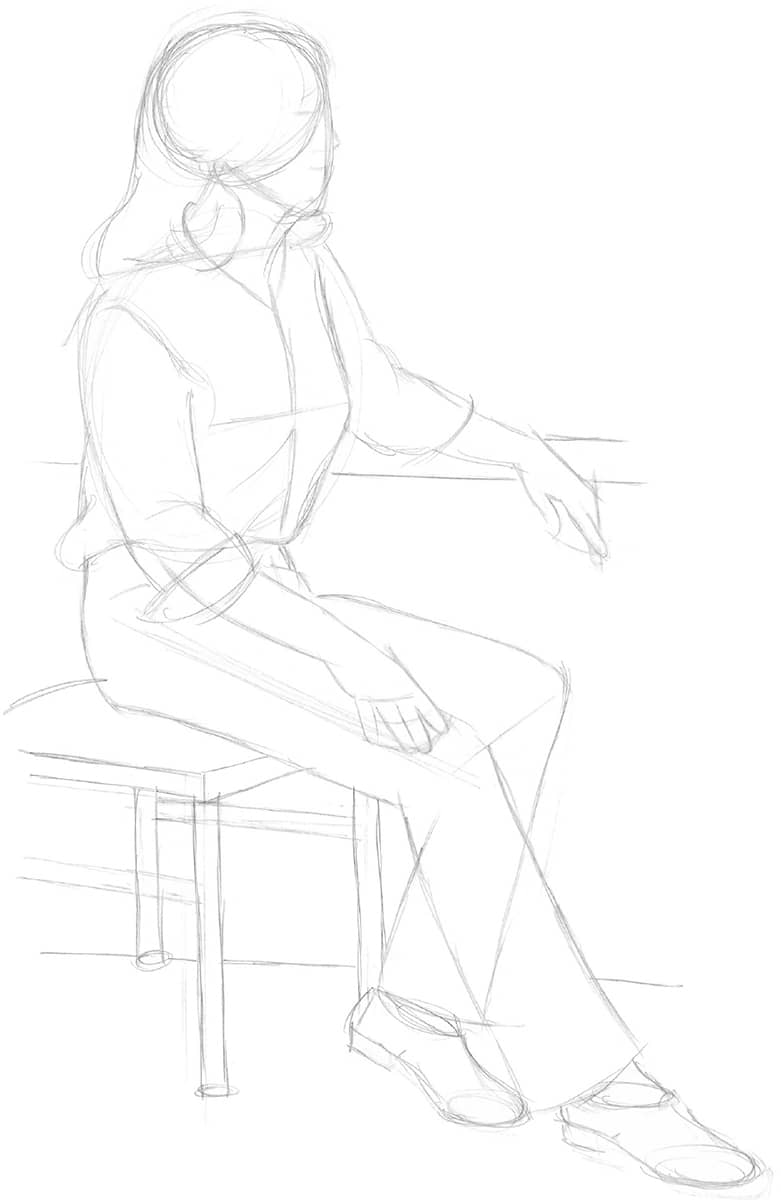
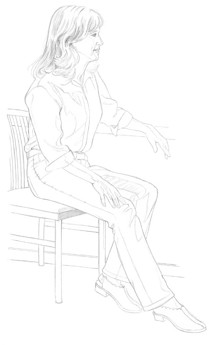
Step 1 First sketch the outlines of the figure on white drawing paper using an HB pencil. Start with the torso, and then add the shape of the head. This is a three-quarter view of the body, but the face is in complete profile as the subject looks out the window. Block in the lines of the shoulders and chest; then add the window frame and sketch both arms. Draw the seat of the chair, and indicate the chair legs. Then add the subject’s legs, with the subject’s right leg stretched out in front of her and the left leg pulled back toward the chair. Lightly sketch the entire back leg, “drawing through” the front leg to help position the leg correctly, and then erase any unnecessary lines.
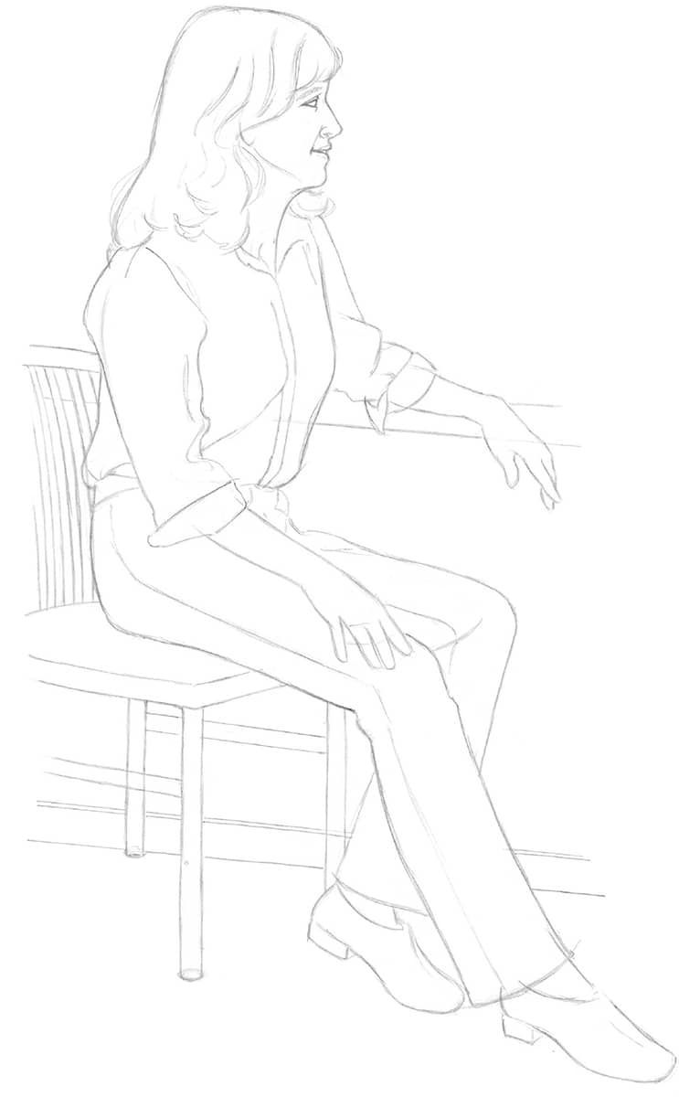
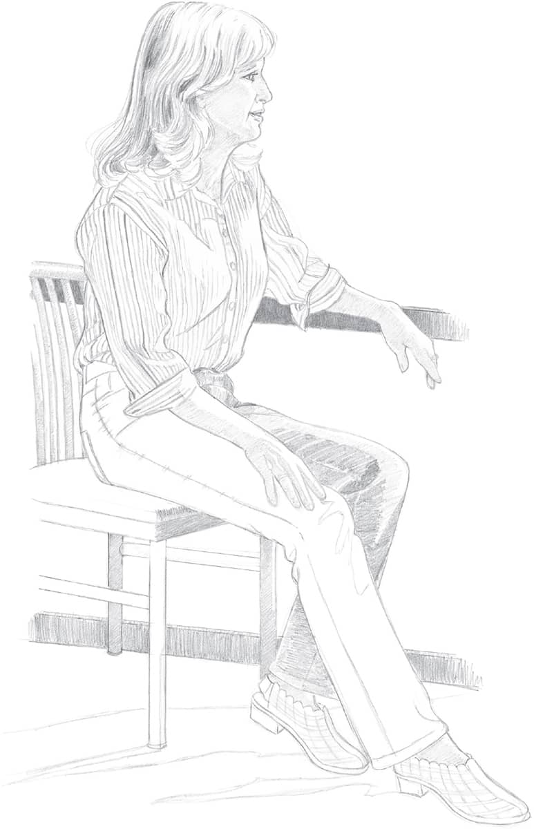
Step 2 Switching to a B pencil, begin refining the head by adding the features and the hair, erasing unneeded lines as the drawing progresses. Refine the shirt and jeans, adding details like the seam along the leg. Add the back of the chair, and refine the shape of the rest of the chair. Draw the lower window frame, and refine her fingers and the shapes of the shoes. The main concern at this stage is establishing the overall shape of the figure—shading to indicate lighting and mood will come next.
Step 3 Using a very light touch, draw the edges of the shadows along the face, neck, arms, hands, and ankles. These lines will serve as a guide for adding the shading later. Also, add this shading line to the shirt and pants, following your reference photo to outline areas where the lightest highlights will be, as this part of the paper will remain white. Begin to shade the hair, curving the strokes to follow its shape. Then shade the front of the chair.
Step 4 Shade the skin using light, diagonal strokes, except where the highlight is strongest. Erase any remaining shading guidelines. Then draw the stripes of the subject’s shirt, following the folds and curves of the fabric over her form and leaving the lightest areas white. After adding details to the shoes, use a 2B pencil to create dramatic contrasts in value—shading the inside of the left leg, adding a few more dark values to the hair, and drawing the outlines of the shadows on the floor. Look at your reference photo frequently to check the placement and strength of your highlights and dark values. Then apply additional shading to the back and legs of the chair, and shade the window frame.
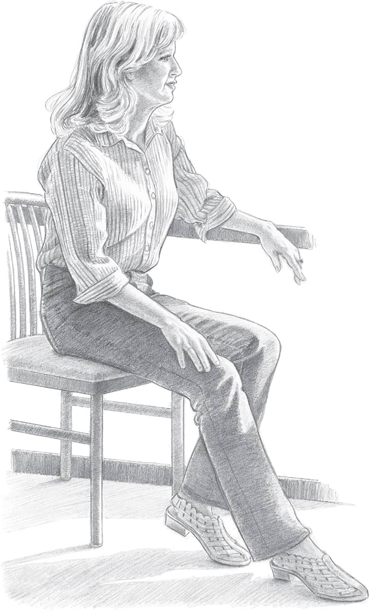
Step 5 Switch back to a very sharp B pencil to add some details to the face. Using a 2B pencil, create more dark values in the hair, and shade the stripes on the shirt. Darken the rest of the jeans using strokes that follow the form of her legs. With a sharp pencil point, carefully add a layer of shading to the darker areas of the skin. Reflected light from the shirt lightens her jaw line. Reflected light also appears on her arms and fingers; stroke across the arms to give them form. Shade the rest of the chair, leaving white on the chair legs where the light hits them. Because this portrait utilizes strong contrasts in light, larger portions of the drawing will remain nearly white—including the highlights on her legs, her throat, and her chest. A portrait that comprises varying degrees of shadows without these large areas of highlight would lose drama and intensity. Next, shade the shoes, making them darker where the woven pattern is more detailed. On the floor, use diagonal hatching strokes, angling away from the light to create the shadows cast by the legs of both the subject and the chair.
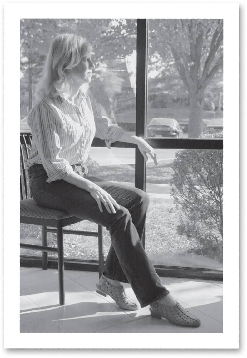
Using Strong Natural Light The model for this drawing is sitting beside a floor-to-ceiling window. The sun is streaming through the glass from above and in front of her. The strong light creates visual interest by casting deep shadows and creating bright highlights.
DEPICTING TEXTURES
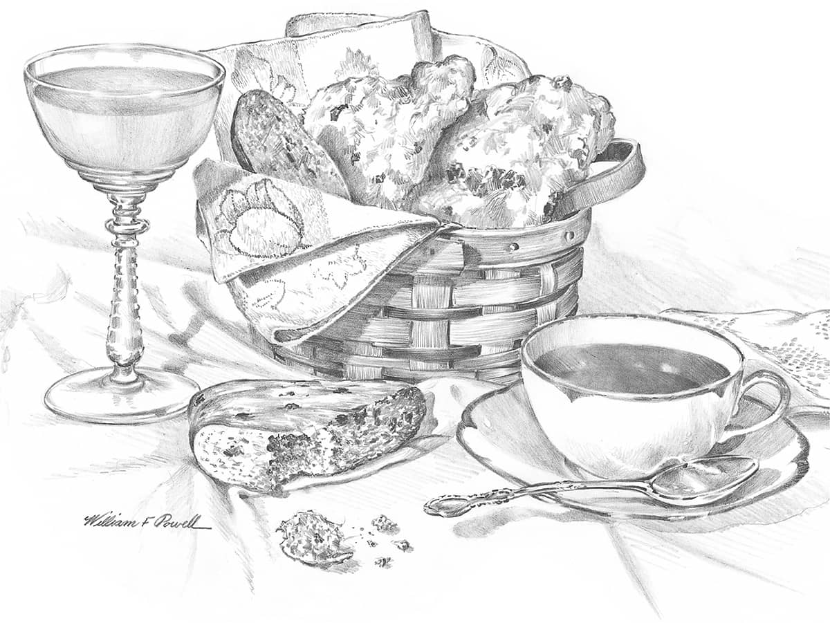
Textures are great fun to draw, and because each type of texture requires a different pencil technique, they add a tremendous amount of interest to a drawing. Test your observation skills by studying the textures of different subjects: Are they rough or smooth? Hard or soft? Dark or light? Then try to determine how to convey these qualities in your drawings. For instance, I would draw the texture of a plastered wall differently than I would that of a brick wall, a wooden wall, or one with peeling paint. And a piece of torn or broken bread has a different texture than a piece that’s been neatly sliced. Some surfaces, such as rocks or tree trunks, require a combination of techniques—smooth, blended shading plus a variety of pencil strokes.
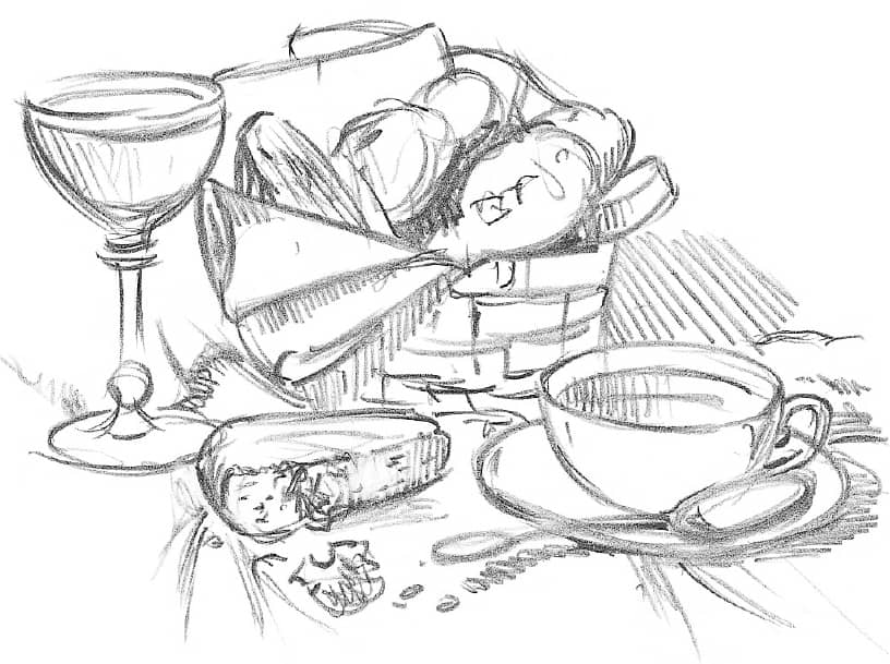
One of the best ways to learn how to create different textures is to draw a still life of objects you have at home. Gather items with a variety of different textures, and arrange them in a dynamic composition. For this project, I’ve chosen subjects of wood, glass, silver, fabric, liquid, and china. As you follow the steps on page 231, refer to the detailed enlargements below to better see the highlights and individual pencil strokes.
Thumbnail I worked out the composition in this thumbnail sketch to check that it “reads” well in two dimensions.
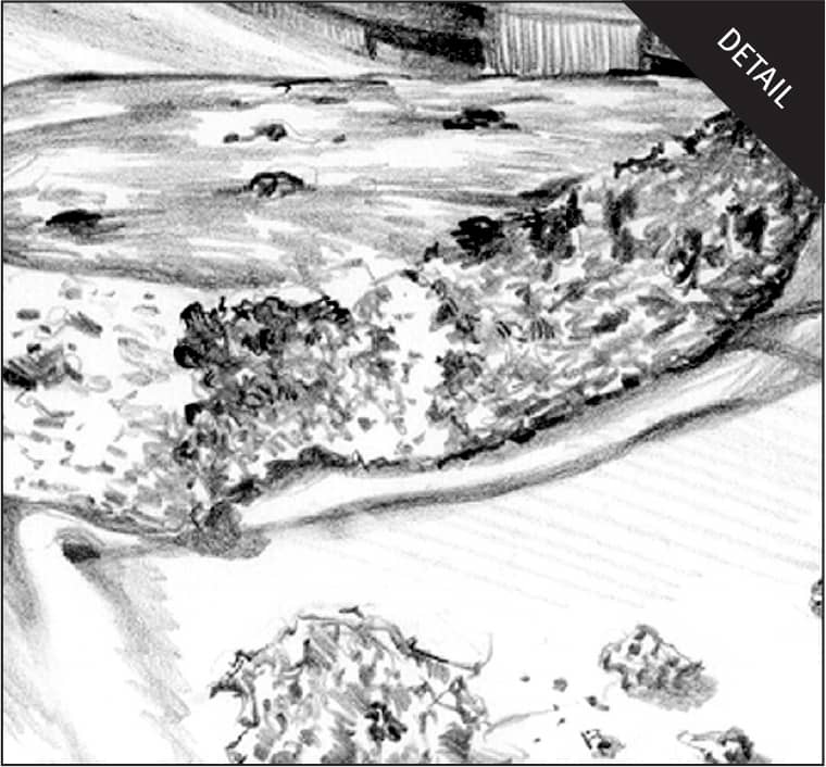
Crumbly Scone I made long, straight strokes with an HB pencil for the smooth portion of the scone and drew short, hatched strokes of different values and in different directions for the rough edge and broken portion. For the darker, more solid masses of currants within the scone, I used a 2B pencil.
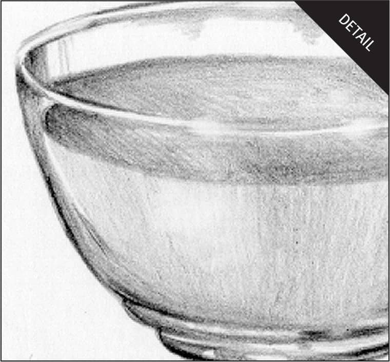
Glass The best way to indicate the texture or surface of clear glass is not to draw it all—only suggest selected light and dark portions. I used the point and side of an HB pencil for this smooth surface and varied the values slightly. Notice that the glass also distorts the elliptical surface of the liquid at the left edge of the glass.
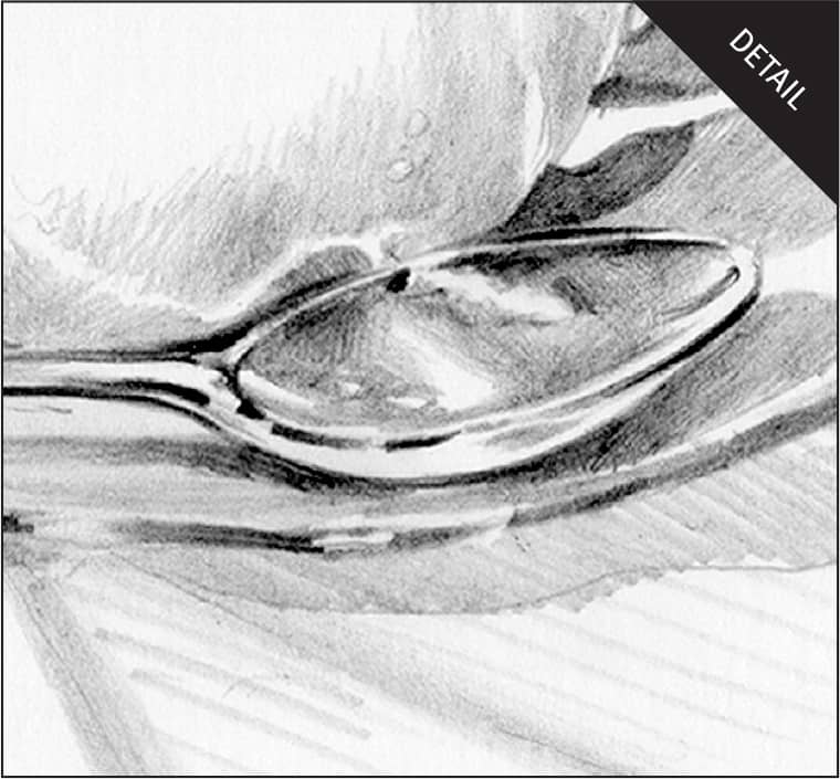
Silver The carefully placed highlights are the most important part of creating the illusion of metal. Notice that the shiny spoon absorbs dark areas and reflects light onto the side of the coffee cup. I used an HB pencil for the mid-tone areas and smoothed them with a blending stump. Next, I used a 2B pencil to build up the darks.
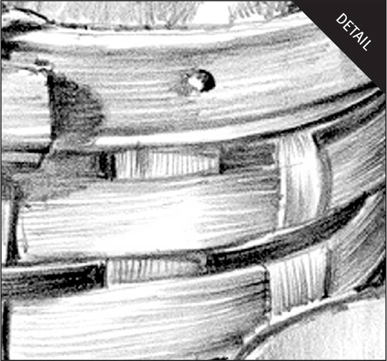
Basket To mimic the texture of the basket, I used a sharp HB pencil and made vertical strokes for the vertical weave and horizontal strokes for the horizontal weave. I started the strokes at the end of a segment and worked toward the middle, pressing firmly at the beginning of each stroke and lifting the pencil at the end.
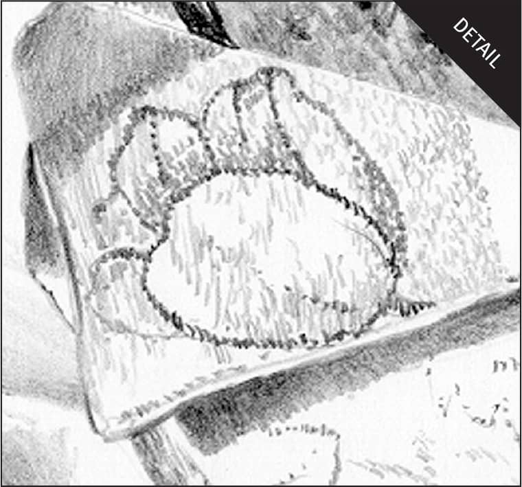
Fabric I used a series of short, directional strokes with the blunt point of an HB pencil to make the small, dense weave of the cloth. I used the same strokes in the cast shadow but made them darker and placed them closer together. For the flower pattern, I varied the pressure on my pencil and the density of my strokes to duplicate the design.
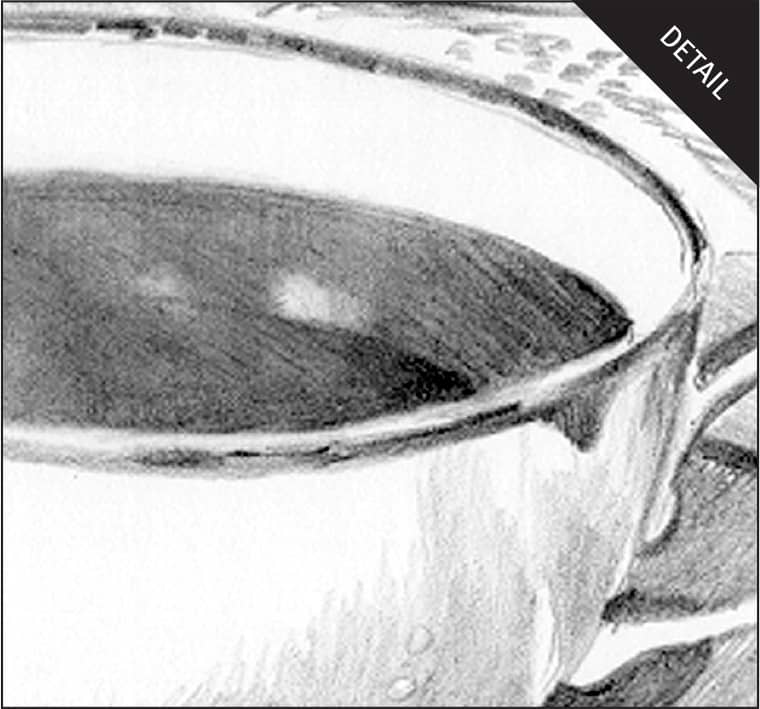
Liquid The coffee is dark, but its surface reflects the light from the side of the cup. Notice that there are several areas of value changes within the dark coffee as well. After establishing the darks in the coffee and the middle and light values in the cup, I used a kneaded eraser to pull out highlights on the coffee surface.
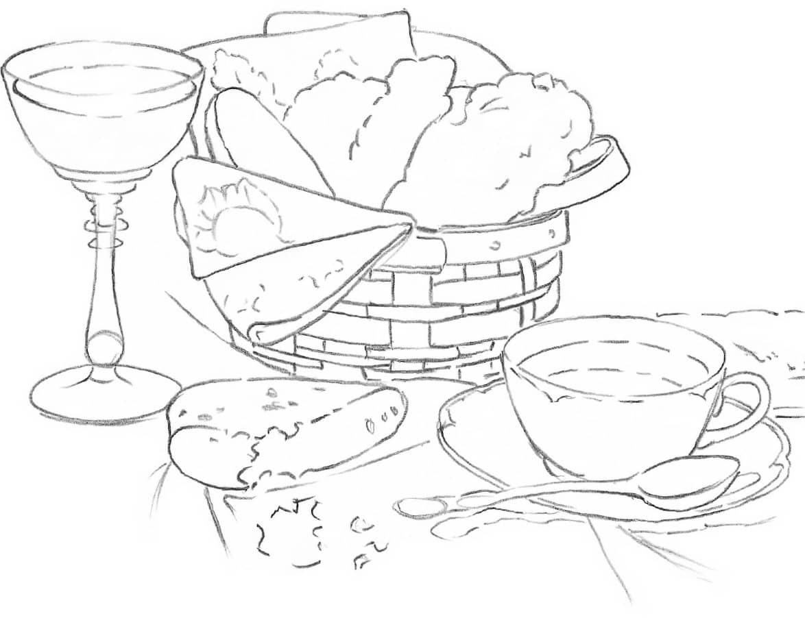
Step 1 With the point of an HB pencil, I blocked in the general shapes. Then I drew the outlines of each element in the composition with very light lines. I took my time on this step, frequently checking my drawing against the arrangement to make sure I got all the proportions right. I drew only a few lines for the folds in the cloth just for placement, because I will develop those forms with shading.
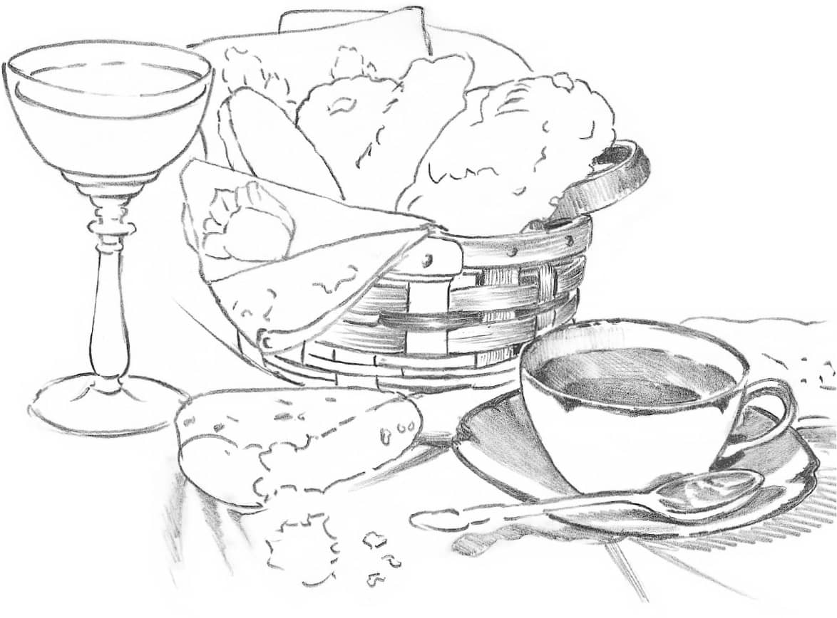
Step 2 When I was satisfied with the basic outlined shapes, I began building up their forms with various techniques (see details here). I started with an HB pencil for the light values and then switched to a 2B pencil and a 4B pencil for the darkest accents. Rather than lay in and build up the values for the whole composition at once, I worked on one area at a time. That kept me from being confused by all the details of the entire scene.
Step 3 After shading all the objects, I finished by pulling out highlights with a kneaded eraser and darkening accents with sharply pointed 2B and 4B pencils.
DESCRIBING SURFACE TEXTURES
Being able to render textures will help you add realism and interest to your drawings. It’s fun to explore a variety of surface textures, such as shiny metal or rough bark, and try to recreate them with paper and pencil. Even the most complex textures can be rendered with just a few pencil techniques—and a lot of practice!
MATCHING THE PENCIL TECHNIQUE TO THE TEXTURE
The first step in depicting texture is to find the technique that suits it best. The smooth, shiny surfaces of metal and glass reflect a lot of light. The highlights on these surfaces will be well-defined, and a tight, controlled pencil stroke is called for. For these subjects, use smooth paper and your harder pencil leads. To draw the irregular, rough texture of weathered wood, use both hard and soft pencils and a variety of strokes to suggest knots, gnarls, lumps, and bumps. The more loosely rendered, the better. Choose a paper with some texture, and let the tooth of the paper add its own texture to your drawing.
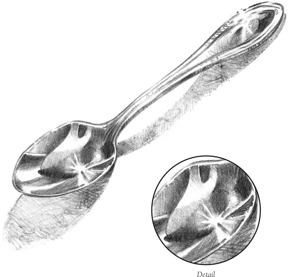
Drawing Shiny Surfaces The smooth, shiny surface of a spoon mirrors lights and darks and casts an interesting shadow. I used an HB to shade smooth layers of dark values, carefully duplicating the shapes I saw in the reflections. I left the paper white for the radiating highlights, as shown in the detail below right.
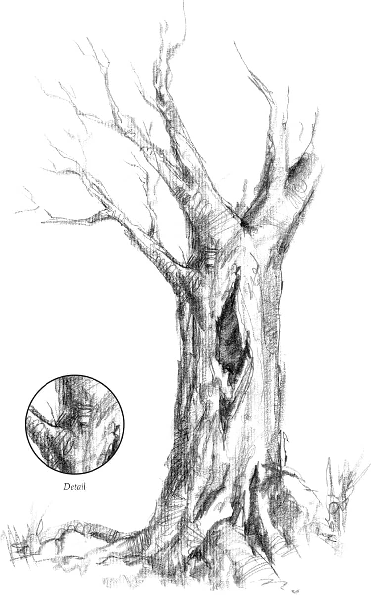
Rendering Bark I drew the rough texture of this gnarled tree trunk with a variety of pencil lines—doodles, scallops, and smudges —along with vertical strokes that followed the form of the trunk. You can see some of these different types of strokes in the detail below.
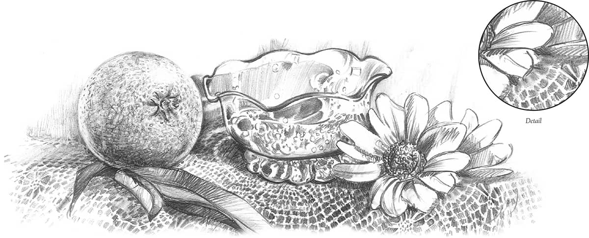
Combining Textures This still life of various surface sheens and texture patterns was challenging yet great fun. I simply looked for patterns and shapes and then drew exactly what I saw. For instance, I made the lace by drawing the shape of the holes and leaving the threads clean (drawing negative shapes), as shown below.
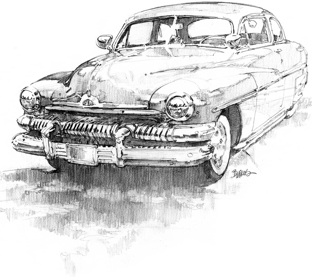
Rendering Reflections This vintage car made a great study in drawing reflective surfaces. To see the reflections as simple shapes, I squinted my eyes to blur the details, and then I sketched the outlines of the shapes I saw. Next I blocked in the medium and dark values with short strokes and hatches. Then I darkened the deepest shadows and added details with a sharp-pointed HB pencil.
PICKING UP PATTERNS
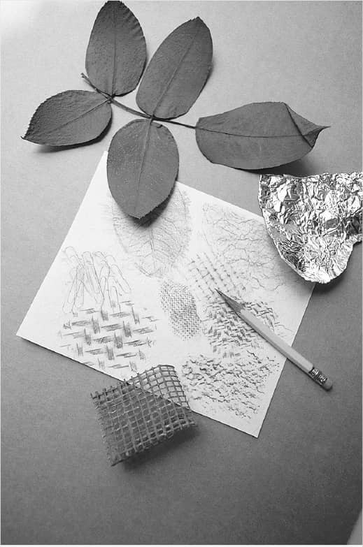
Make rubbings from household surfaces or objects from nature for a quick, easy application of texture. Take rubbings from a leaf, crumpled aluminum foil, rice, basket, window screen, paper clips, or stucco wall—anything with an imprint. These make fantastic backgrounds.
Once you’ve recorded the impression, use your drawing tools—pencils, erasers, stumps, fingers—to enhance selected areas by darkening, lightening, or even accenting texture. Always use a thin paper in order to record the most texture possible. Also, make variations of a texture by using papers with different surface textures. The combination of paper and subject texture can create some very interesting designs.
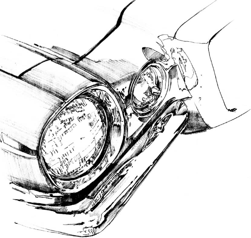
Detailing Here, I paid special attention to the curvature of the highlighted areas and the distortion of reflected forms in this shiny, chrome bumper. This was a study in precise detail.
CAPTURING VACATION SCENES
I always keep my camera close by when I travel, because I may see an intriguing scene or subject and not have enough time to sketch it. I photograph everything that catches my eye (asking permission when necessary), always trying to create interesting compositions with my camera. I also photograph subjects from unusual points of view and from different angles. Then when I get home, I file them away for future drawing and painting reference.
RESEARCHING YOUR SUBJECT
In addition to taking your own photos, I recommend collecting pictures of places you visit from catalogs, magazines, books, and postcards. (A collection of such references is commonly called an “artist’s morgue.”) Take care when using these references. Copying photos you have taken yourself is fine, but be sure to use others’ pictures for ideas and general references only. Never copy them exactly (or even closely), because you may infringe on someone else’s copyright. Creating original compositions should be your goal!
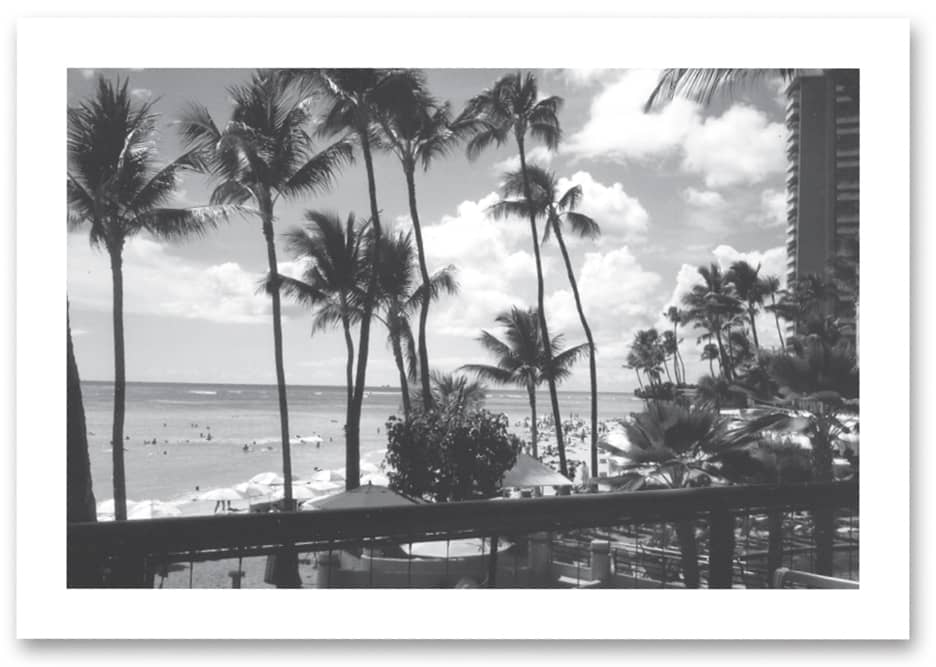
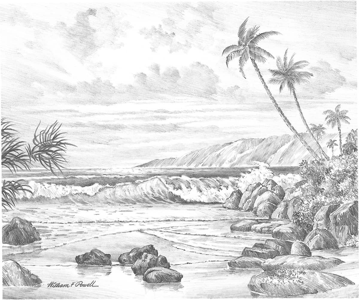
Using Photos for Reference Photos don’t have to be perfect to be helpful. From this photo of Waikiki Beach taken from a hotel terrace, I gleaned information about palm trees and cloud formations and used them in my drawing below.
CREATING A COMPOSITION WITH THE VIEWFINDER OF YOUR CAMERA

Use your camera’s viewfinder to frame the scene, moving it around and zooming in or out to find the angle that best presents your subject. For taller objects, turn your camera sideways and shoot vertically. The photo above of the Jefferson Memorial in Washington, DC, is nice enough since it shows the structure and grace of the columns, but compare it with the view below.

I walked around the building until I came upon a more unusual view. This composition with the statue of Jefferson silhouetted between columns is far more striking and rich with feeling and meaning than the one above. Now I have two photos to use for reference. The first can be mined for its architectural information, and I can use this one for the final dramatic presentation of the scene.
Step 1 For this sunset scene, I lightly blocked in the outlines of all of the elements with the sharp point of an HB pencil. Notice that I placed the horizon line slightly below center.

Step 2 As I developed the contours of each object, I kept all guidelines light, especially in the sky. Just as I do with a still life, I checked that all elements are in correct proportion.

Step 3 Using the side of an HB pencil, I built up the values and shapes of clouds in the sky, making most of my strokes follow the same angle. Then I began shading the water.

Step 4 Next I continued adding details and developing depth with shading. Notice how my pencil strokes follow the surface of the water and the shapes of the rocks.
Step 5 I developed the shading values and textures using the point and sides of an HB pencil and the point of a 2B. I didn’t overwork the background; I wanted it light to suggest distance.
EXPERIMENTING WITH DIFFERENT MEDIA
Drawing is a creative process. As an artist, I am constantly looking for new ways to stimulate my imagination, and I’m always interested in exploring different methods of working. One of the best ways to do this is to experiment with different media. Here I’ve branched out and drawn with pen and ink, charcoal sticks and pencils, and Conté crayons to show just a glimpse of the possibilities. Be adventurous, and try some new materials on your own.
EXPLORING ANIMAL TEXTURES
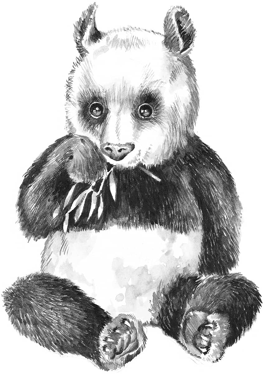
I love drawing animals, partly because I’m so fond of them and partly because they’re such beautiful creatures. They range from small and delicate to large and powerful, with an array of different colors, textures, and patterns. It’s great fun to try to show the differences between the shaggy coat of the coyote pup and the long mane of the lion, or the thick, black-and-white fur of the panda and the patterned stripes of the tiger or zebra. Try it yourself!
Ink Wash This drawing was done with a wash of India ink and water. By adding more or less water to the ink, you can make any value you want. For the larger masses of shading, I loaded the brush with diluted ink and applied a wash with the side of the brush. Then I used a small round, fine-pointed watercolor brush and drew lines with a stronger ink solution for the details.
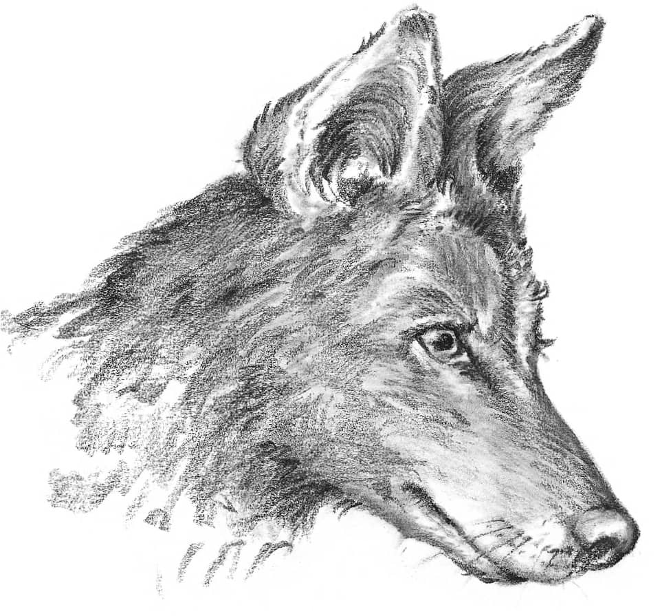
Conté Crayon To show the rough fur of this coyote pup, I decided to use Conté crayon. I used loose, sketchy strokes for the longer hair and blended my strokes around the eyes and face. To blend, you can smudge with your fingers or with a soft brush and water. Here I blended by layering a white Conté over the black.
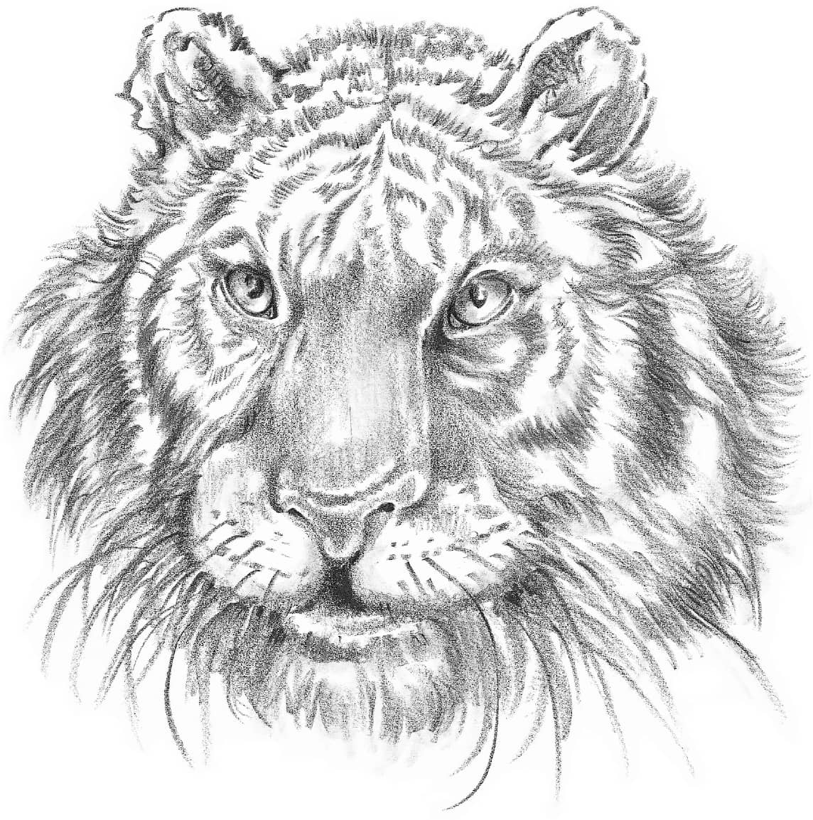
Colored Pencil I used a black wax pencil for this portrait of a tiger. I was able to create the soft, dark areas of hair using the side of the pencil and holding it in the underhand position. Paper blending stumps don’t blend wax pencil strokes well, so I used one only for the very subtly blended areas, such as the eyes.
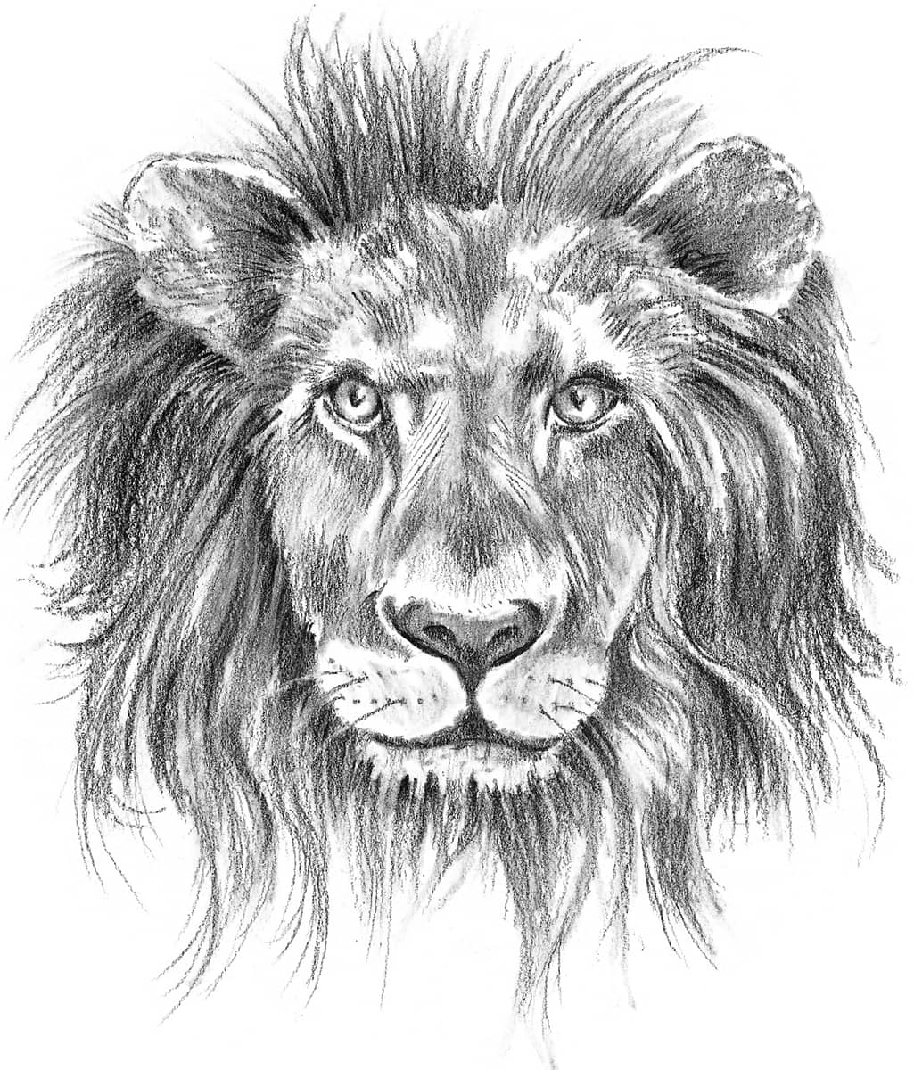
Subtle Blends For this portrait of a regal male lion, I chose charcoal pencil. This enabled me to duplicate the different textures of the hair on the face and on the mane. Then I used white Conté crayon to blend around his cheeks, making the gray tones.
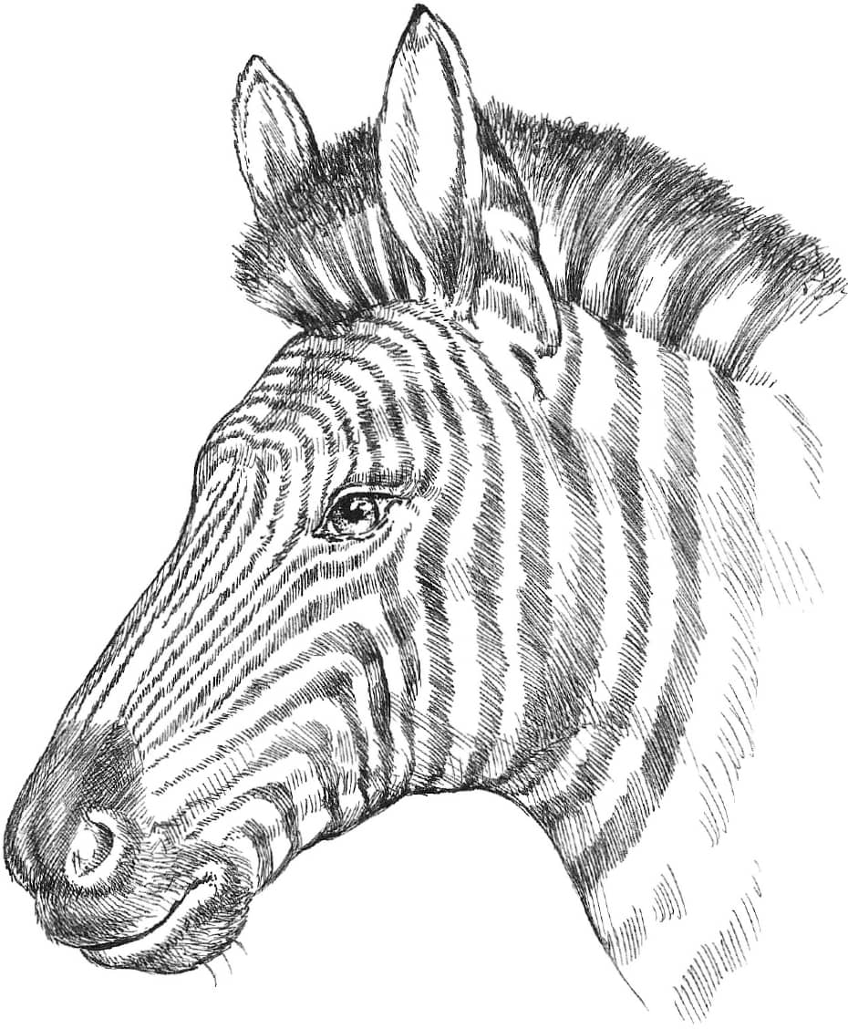
Pen and Ink This zebra was rendered with a drawing pen with a nonflexible point, which produces the same line width with each stroke. By using very quick, hatching strokes, I was able to achieve some variation of line and shading, although not as much variation as with a ballpoint pen. This tool was well suited for the fine hair and intricate pattern of this striped zebra.
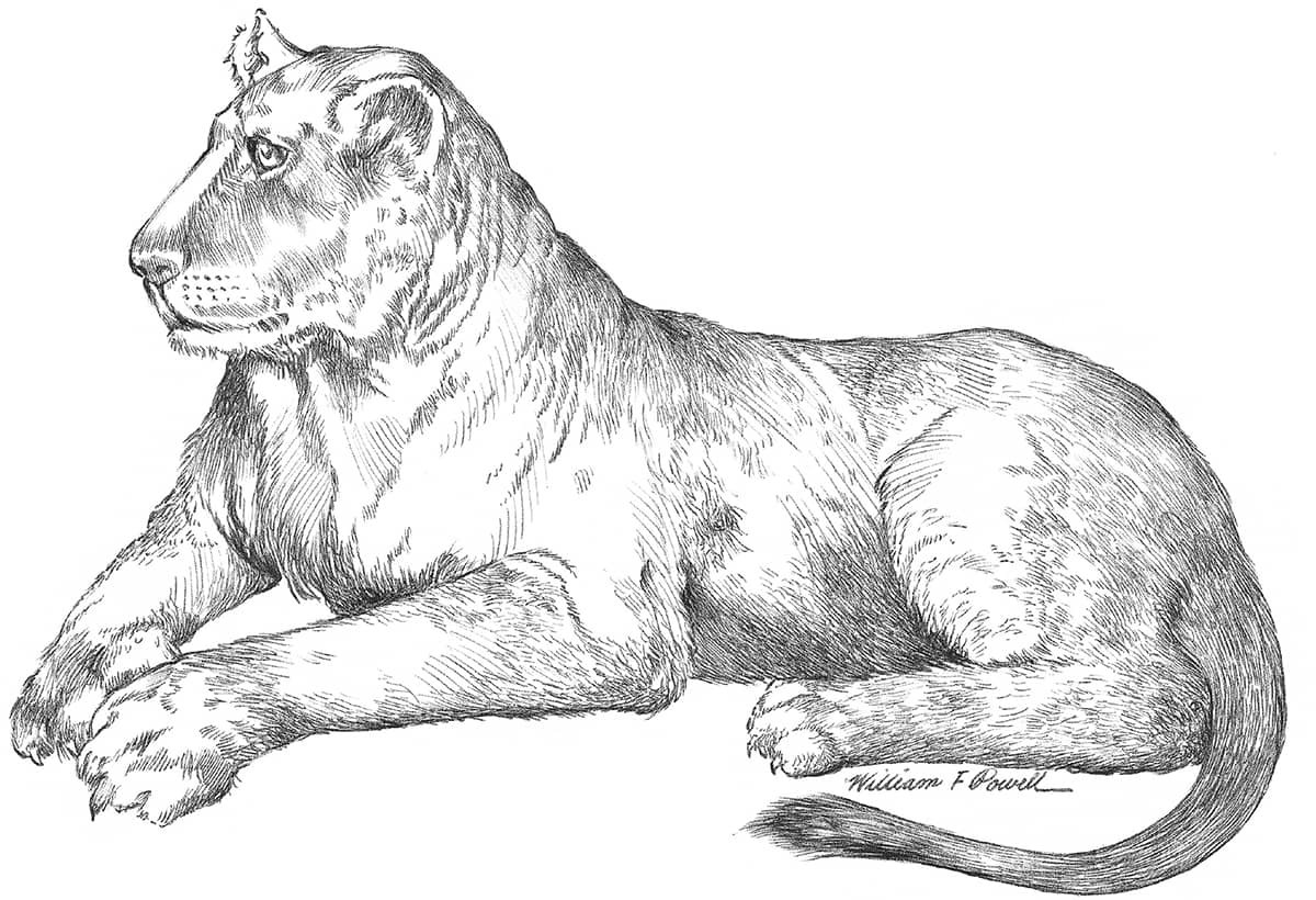
Ballpoint Pen For this lioness, I chose a ballpoint pen with a medium point. I made thicker lines by pressing harder on the point, and I made fine lines and detailed shading strokes by holding the pen lightly at its end. Notice the variations in line width and character I was able to produce, as compared to the ink drawing of the zebra. When drawing with ballpoint pen, place a sheet of paper between your hand and the drawing to prevent smudging.
CONCLUDING THOUGHTS
Choose subjects to draw that you really like, because then you’ll be inspired to spend the time and energy necessary to make your drawings great. Put objects in your still life setups that have special meaning to you. Draw landscapes of places that bring back fond memories, and although there is no substitute for practice, if you connect with your subject, it will show in your art. Let your interests, hobbies, and personal passions encourage and guide your artistic talent. Best of luck to you, and have fun drawing!