40
The geography of social inequality and health1
Some statistical pictures of the rich world, the local, and the global
This chapter documents a lecture that presented some 30 pictures: maps, graphs and ‘map-graphs’ that were intended to show a group of public health physicians what a geographical perspective can bring to the understanding of social inequality and inequalities in health. Here those images have been grouped into eight figures to provide some food for thought. The mapping of disease is rumoured to have been initiated by a medical doctor in charge of a lunatic asylum who gave his patients crayons to colour in maps by disease rate. Maps and map-like graphs can have a wide appeal and can draw people into issues that might otherwise not interest them. I begin with changing gender inequalities in the rich countries of the world, move on to local health inequalities in one country (the UK) and then to new emerging global patterns in social inequality and health inequalities as depicted geographically and graphically. The images were originally drawn in colour but have to be reproduced in black, white and grey here. However, the original versions of most can be found in the plate section of this book.
Graphs that look like maps: mortality by age, year and sex
Figure 1a: Rich world female mortality rates (top half of diagram)
This first image is a graph which looks like a contour map. Along the bottom axis are marked 150 years in time and along the side axis 100 years of age. The colours of the cells in the graph depict 15,000 mortality rates. The bottom left-hand corner of the graph is the mortality rate of infant girls who were born in 1850 into what are now the rich countries of the world. Between an eighth and a quarter died before their first birthday. The top right-hand corner of the graph shows that by the year 2000 between a quarter and a half of the women aged 100 in the rich world died before their 101st birthday. The contours in the graph show that it is for the young that progress has been most rapid and that only one event, the influenza epidemic of 1918, interrupts the trends shown in data involving more than half a billion people. Data sources are given in the figure, and this work was carried out in collaboration with Dr Jan Rigby.
Figure 1a: Rich world female mortality rates 1850–2000 (per year per 1,000)
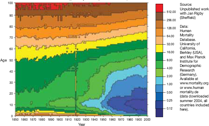
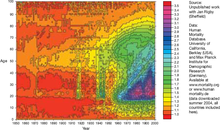
Figure 1b: Rich world male/female mortality rates 1850–2000 (per year per cohort)
The technique of mapping deaths by birth year and age is called drawing a lexis diagram and a useful primer is to found at www.demog.berkeley.edu/~bmd/lexis.html where it is explained how all human lives flow at 45 degrees from the base of the graph upwards.
When the graph showing male mortality rates is divided by the graph just shown (Figure 1) for women then a clear pattern emerges for the richest countries of the world. Note that at different times different countries enter the world mortality database but this does not have a great effect on the patterns shown and, if anything, ensures that countries are included only when they are sufficiently wealthy to be able to record mortality rates accurately. Figure 1b shows that before 1914 mortality rates for men and women were very similar at all ages. The First and Second World Wars are evident in the graph above as is the ‘smoking plume’ (the ‘cloud-like’ structure) centred around age 60 in 1975 (of the men born in 1915). The striking inequality in Figure 1b is the triangle to the right with an apex around age 20 in 1960 (the men born in 1940). Men of my age (when I gave this talk) across the rich world are now three times more likely to die, this year, than are women of my age.
Figure 2a: US male/female mortality ratios, 1900–2071 (diagram on page 313)
Data for individual countries show local variation. The First World War had little effect on mortality rates of the citizens of the US; their smoking plume is centred on those slightly older men who could afford large numbers of machine-rolled cigarettes a little earlier, and were kept alive a little longer perhaps, but in essence the pattern is the same. The horizontal bands in the figure for future years show that US actuaries predict a remarkably uneventful future as current trends become embedded. I don’t think we should be so hopeful. We are likely to live in more interesting times than these.
Figure 2a: USA male/female mortality ratios 1900–2071 (per year per cohort)
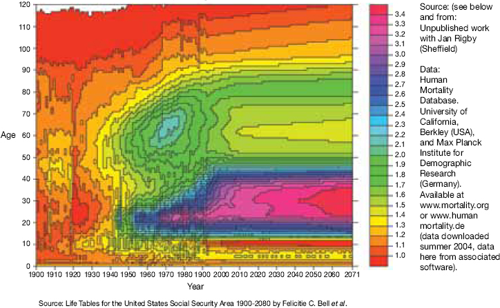
Figure 2b: England and Wales male/female mortality ratios, 1840–2050 (diagram at the top of this page)
For the UK, with only one-twentieth of the billion total population from the world mortality dataset, the patterns are less clear but still similar to those of the US. The First World War is more significant; the inequalities attributable to differential rates of smoking between men and women in the past peak a little later, but by only a few years, and the variability in the figure suggests that UK actuaries are perhaps slightly more imaginative than their US colleagues, but they are still naturally conservative in their predictions. Growing inequalities in mortality at young ages are, of course, based on low numbers of deaths, but for many age groups of younger men their deaths rates remain at levels reached shortly after the Second World War. Diseases of despair such as cirrhosis of the liver and deaths from overdoses are on the rise for younger men in the rich world and especially in more unequal rich nations such as the UK and the US.
Figure 2b: England–Wales male/female mortality ratios 1840–2050 (year/cohort)

Inequality in morbidity across the districts of the UK
Figure 3: Sick/disabled and limiting long-term illness
Figure 3a: Sickness and disability in the UK in 2001 and change from 1991
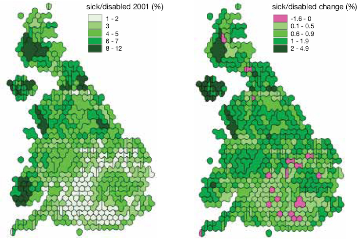
Figure 3b: Limiting long-term illness in the UK in 2001 and change from 1991
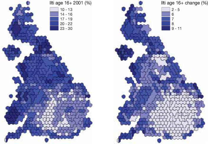
Turning to the local and returning to both sexes, what might these diseases of despair be? Above are two maps of the UK each showing over 400 areas, with each area in each map drawn roughly in proportion to its population. The first map shows the proportion of people who could not work because they were sick and disabled in the year 2001; the second shows the percentage point change in that rate since 1991. None of these rates are age- or sex-standardised because, in these areas where population demography is similar, that confuses unnecessarily. Note that the rate reaches 12 per cent of the population in some areas in the North, and has risen almost everywhere over time. Physically the population now have better health than a decade ago, but everywhere higher rates of overall sickness are reported as mental health worsens. Geographically the worst reported health is where people are poorest and have become poorer.
Limiting long-term illness rates are at their maximum in northern and Welsh areas, where up to almost a third of the population in particular places report that they suffer from an illness which limits their daily activities. These rates of illness have risen everywhere in the UK since 1991, but have increased the most furthest away from a population circle centred on London.
Inequality in education and affluence, mortality, income and health over time in the UK
Figure 4a: Key to the human geography of the UK (top third of figure and right-hand list)
The population circle of constant health, centred on London, also coincides with the area from which children are most likely to attend university in the UK: a ‘T’-shaped ‘valley’ (as shown on this map) where height of areas is drawn in proportion to children not attending university. The ‘T’ is made up of areas of low height indicating that the highest proportions of all young people living in the UK attending university are found here.2
Figure 4b: The geography becomes simpler over time (middle third of figure)
Here are shown simple cartograms of all-cause and lung cancer age- and sex-standardised mortality ratios (SMRs) to illustrate just how simple many local geographical patterns are. Rates of 40% and even of 120% above national mean levels can be seen in Glasgow – some of the highest rates in Western Europe.3
Figure 4a: Key to the human geography of the UK


Figure 4b: The geography becomes simpler over time
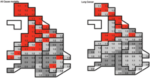
Figure 4c: Trends in UK inequalities – life expectancy and income
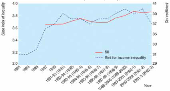
Figure 4c: Trends in UK inequalities – life expectancy and income (bottom third of figure)
In the UK inequalities in income, both socially and geographically, rose quickly in the 1980s and this was mirrored by rising and then stable but still high inequalities in life expectancy between areas. Only for the most recent year of data have inequalities in income been seen to fall – seven years after the current Labour government came to power.4
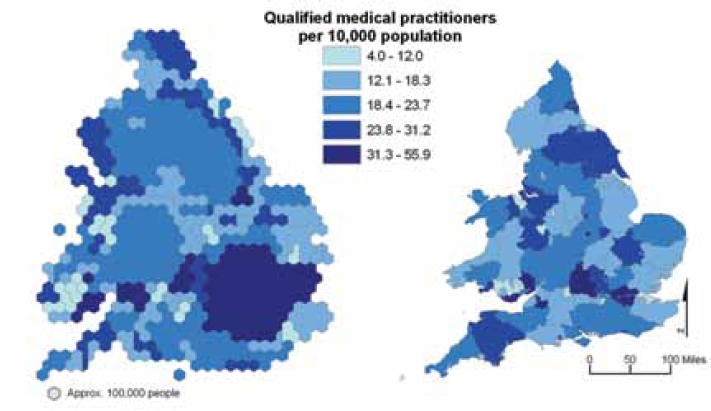
The geography of supply and demand of physicians in England and Wales
Figure 5a: Demand for the health industry (top half)
If even simpler geographical boundaries are used in one country then patterns often become clearer as this figure demonstrates by plotting rates for large counties. Here are the proportion of people who suffer both poor health and a limiting long-term illness (combined) in England and Wales. Note that rates are lowest to the north and west of London. The rate at which the population expresses a demand for health care varies by more than fourfold between these large areas. If these rates were age- and sex-standardised the gap would actually widen slightly.
Figure 5b: Supply for the health industry (lower half)
Health professionals, in this case qualified and working medical practitioners, generally prefer to live and work where there are fewer ill people, in university towns and cities of the south of England and in places similar to those in which they are likely to have grown up and entered university from. Thus they remain distributed geographically away from the majority of their prospective patients, even after more than 50 years of national health planning and allocation formulae. Nurses in the north of England reduce the size of the gap considerably, being the only group of health professionals in the UK who tend to be located towards where there are more sick people. The inverse care law in the UK is as strong as ever.
Turning from inequality within a rich country to inequality across a poor world
Figure 6: A global context: the world’s children
Figure 5a: Demand for the health industry
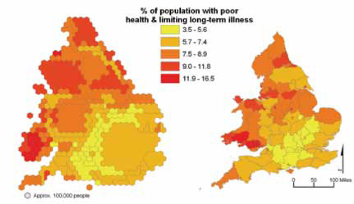
Figure 5b: Supply for the health industry
Two billion of the six billion5 people on earth are children and half of them are growing up in countries within Africa, or in India or China. Moving from local inequalities in the UK (which contains only 0.5% of the world’s children) to global inequalities in health involves reporting illness and mortality rates which were last experienced in the UK in the 1850s [the point in time this lecture began with; see Figure 1]. Figure 6 shows one possible map of the world’s children, which can be coloured according to the rates at which they are deprived of shelter, clean water, education, health care, information, food, and so on – but, in essence, global inequalities in health can be summarised more clearly by concentrating on a dozen regions of the world rather than all 200 (or so) countries. All the data that follow were derived from the UNDP World Development Report 2004.6
Figure 6: A global context – the world’s children

Figure 7a: Population (top left panel)
Here are shown the 12 regions used in the Worldmapper project and their respective shares of the world’s population. These regions are used in the rest of the panels in Figure 7. The two smallest regions are the islands of Japan and the countries of the Congo basin (Central Africa) – each containing over 100 million people. These regions are defined by continental location, income and by the locations of the world’s two largest states (India and China), which contain over a billion people each; globally these 12 regions of the earth order the population by space into social groups which suggest that there is a continuum to global social and health inequalities.
Figures 7a-7e: Population, life expectancy, health spending
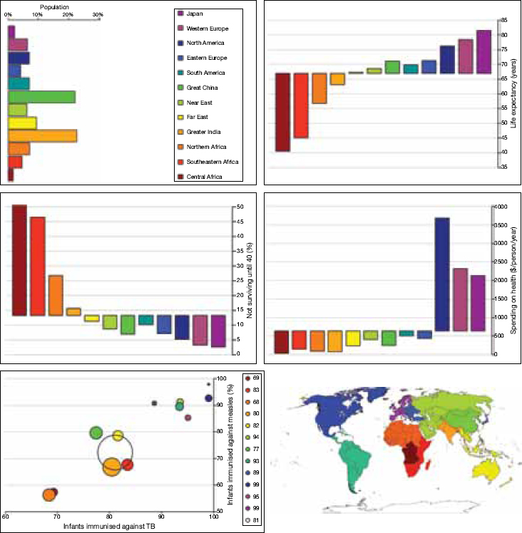
Note: In the three horizontal bar charts above the bars rise up if above the world average rate and descend if they represent below average rates.
Figure 7b: Life expectancy in years (top right panel)
By 2002 the best-off 100 million people on earth (by large area) lived twice as long as the worst-off 100 million. The main irregularity in the continuum is that the people of China now live a little longer, on average, than do those of South America. Within Africa there are regional inequalities that are mirrored, at the opposite end of the global scale, by inequalities between geographically contiguous groups of OECD nations.
Figure 7c: Population not surviving up to age 40 (%) (middle left panel)
By 2002 a majority of people living in central Africa did not survive up to age 40. In both China and the Near East a higher proportion do survive to age 40 than in South America, but again the regional continuum is clear.
Figure 7d: Spending on health in $ per person per year (middle right panel)
When compared by equal purchasing power parity dollars, the spending on health care per person is higher in North America than in Western Europe and higher there again than in Japan. This is total public and private spending. Thus the country with the longest life expectancy is not that which spends most on health care. Nevertheless the global inverse health care law is still stark. The spending per person in Central Africa is near zero. The reverse continuum is clearer on a log scale (not shown here).
Figure 7e: Proportion of infants immunised against TB and measles (bottom panel)
Globally around four in every five infants are immunised against TB and three in every four against measles, annually. More are immunised where the diseases are least common. Regions are drawn in proportion to the number of infants in each region (135 million infants a year now worldwide).
Figure 8a: HIV prevalence, ages 15-49, in millions in 2003 (top left panel)
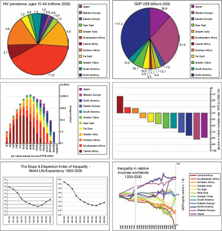
Figures 8a-8f: HIV, GDP, infant mortality, life expectancy, income
Note: In the horizontal bar chart above the bars rise up if above the world average, similarly with the multiple-line graph.
Three quarters of all people dying with HIV live in Africa and India and, to all intents and purposes, almost none in Japan.7
Figure 8b: GDP in US$ billions, 2002 (top right panel)
Three quarters of the world’s income is enjoyed in North America, Western Europe and Japan. To all intents and purposes, as near to none is enjoyed in Central Africa as can be shown without employing a log scale.
Figure 8c: Per capita annual income in PPP$, 2000 (middle left panel)
The world income distribution appears to be essentially log normal, formed by the addition of these 12 log normal distributions. It is continuous, not bimodal – although this graph relies on estimates made for individual countries. Almost no one earns (rather than receives) more than 1 million US$ a year. One million people, almost all in Africa, live on less than $64 a year. Of course, with the limited real data we have, rather than the estimates shown here, we know that the richest people in the world have incomes very much higher than the combined incomes and assets of groups of ten thousand of the poorest of peoples. In this figure inequalities are underestimated.
Figure 8d: Decline in infant mortality rate 1970–2002 (%) (middle right panel)
Infant mortality rates have declined most since 1970 where they were lowest to begin with. Globally inequality in infant mortality has been growing since the 1970s.
Figure 8e: Slope and dispersion index of inequality – world life expectancy, 1950–2005 (bottom left panel)
Continental variations in life expectancy have been rising since the mid-1980s using the SII measure and since the early 1990s using the DII measure.8 Irrespective of how global inequalities in mortality are measured, they are continue to rise as much because of events in Eastern Europe and the Near East as because of what is occurring in Africa, and because health improvements are still rapid in the richest regions of the world.
Figure 8f: Inequalities in relative incomes worldwide, 1200–2000 (bottom right panel)
When OECD estimates by Angus Maddison for GDP and population are amalgamated for the 12 regions used here it becomes evident that average incomes in Central Africa have now fallen to a tenth of the world average (which is itself low). India and the remainder of Africa live half an order of magnitude away. China, Japan and the Far East each, at different points in the last 60 years, broke away from the group of regions they were travelling downhill with, in relative terms. However, globally income inequalities are