Placing and tiling a background image is just half the fun. With the background-position property, CSS lets you control the exact placement of an image in a number of ways. You can specify both the horizontal and vertical starting points for a graphic in three ways—keywords, exact values, and percentages.
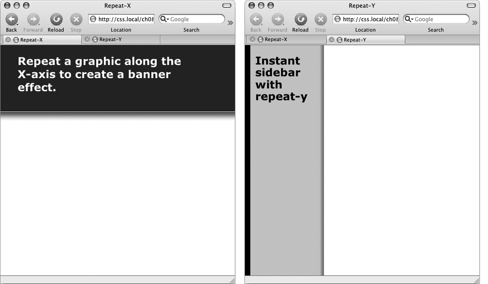
Figure 8-4. Add graphic backgrounds to the banners and sidebars of a page by taking advantage of the tiling control offered by the repeat-x (left) and repeat-y (right) options.
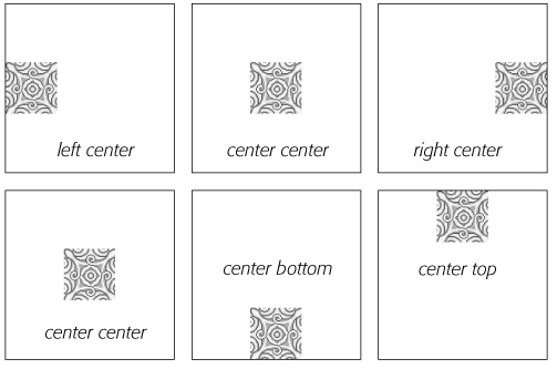
You get two sets of keywords to work with. One controls the three horizontal positions—left, center, right—and the other controls the three vertical positions—top, center, bottom (Figure 8-5). Suppose you want to place a graphic directly in the middle of a web page. You can create a style like this:
body {
  background-image: url(bg_page.jpg);
  background-repeat: no-repeat;
  background-position: center center;
}
To move that graphic to the top-right corner, just change the background position to this:
background-position: right top;
Note
If you've decided to tile an image (by setting background-repeat to one of the values listed in the previous section), then the background-position property controls the starting point of the first tile. So, for example, if you use the repeat option, you'll still see the entire background filled by the image. It's just that the position of the first tile changes based on which background-position setting you used.
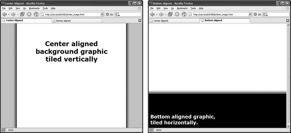
Keywords are really useful when you want to create vertical or horizontal banners. If you wanted a graphic that's centered on a page and tiled downwards in order to create a backdrop for content (Figure 8-6, left), then you'd create a style like this:
body {
  background-image: url(background.jpg);
  background-repeat: repeat-y;
  background-position: center top;
}
Figure 8-5. You can use keywords to position an image in the background. The order in which you specify the keywords doesn't matter—top center and center top both have the same effect.
Likewise, using the bottom, center, or top keywords you can position a horizontally repeating image using repeat-x (Figure 8-4, left) in a particular place on the page (or within a styled element). Use the technique shown on the right side of Figure 8-6, to position a line under headlines in the tutorial on Replacing Borders with Graphics.
Figure 8-6. Use the background-position property when tiling an image either vertically (left) or horizontally (right). In the left image, the graphic is a wide white box with drop shadows on the left and right edges. The page's background color is gray, so the text of the page looks like it's on a white piece of paper floating above the screen.
Tip
You can actually add a background image to both the <html> and <body> tags. If you tile both images horizontally and place <body> tag's image at the top and the <html> tag's image on the bottom, you can achieve the effect of two stripes cutting across the top and bottom of the page—no matter how tall the page is. And it works in all current browsers, even IE 6!
You can also position background images using pixel values or ems. You use two values: one to indicate the distance between the image's left edge and the container's left edge, and another to specify the distance between the image's top edge and the style's top edge. (Put another way, the first value controls the horizontal position, the second value controls the vertical position.)
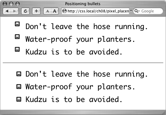
Say you want custom bullets for a list. If you add a background image to the <li> tag, the bullets often don't line up exactly (see Figure 8-7, top). So you can just nudge the bullets into place using the background-position property (Figure 8-7, bottom). If the list would look better with, say, the bullets 5 pixels farther to the right and 8 pixels farther down, then add this declaration to the style defining the background image:
background-position: 5px 8px;
You can't specify distances from the bottom or right using pixel or em measurements, so if you want to make sure an image is placed in the exact bottom right corner of the page or a styled element, then use keywords (bottom right) or percentages, as discussed next. However, you can use negative values to move an image off the right edge or above the top edge, hiding that portion of the image from view. You may want to use negative values to crop out part of a picture. Or, if the background image has lots of extra white space at the top or left edge, you can use negative values to eliminate that extra space.
Finally, you can use percentage values to position a background image. Using percentages in this manner is tricky, and if you can achieve the effect you're after with the keyword or precise values discussed previously, then use them. But you have to use percentages to position an element in a spot that's proportional to the width of an element. For example, if you want to place a graphic three-quarters of the way across a headline and you don't know the width of the element.
Note
Percentage values are also useful for a little trick often used with float-based layouts to give left and right sidebars background colors or graphics that span the entire height of a web page.
As with pixel or em values, you supply two percentages: one to indicate the horizontal position and the second to indicate the vertical position. What the percentage is measuring is a little tricky. In a nutshell, a percentage value aligns the specified percentage of the image with the same percentage of the styled element. What?
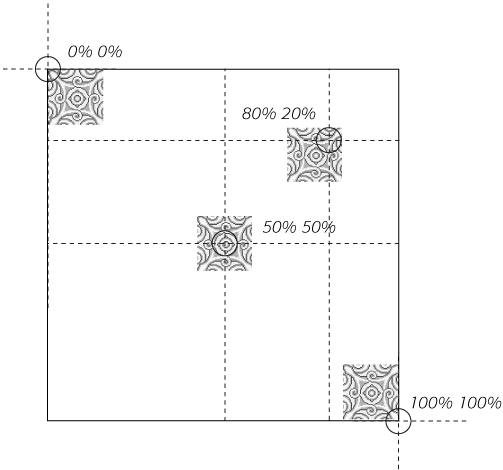
The best way to understand how percentage values work is to look at a few examples. To position an image in the middle of a page (like the one shown in the center of Figure 8-8) you'd write this:
background-position:50% 50%;
This declaration places the point on the image that's 50 percent from its left edge directly on top of the point that's 50 percent from the left edge of the page (or whatever element you've styled with the background image). The declaration also aligns the point on the image that's 50 percent from its top with the point that's 50 percent from the top edge of the page or styled element. In other words, the center of the image is aligned with the center of the element. This means that, when using percentages, the exact point on the image that's being aligned can be a moving target. (That's because your styled element's positioning percentages can change if your visitors resize their browsers.)
Note
Positioning an image vertically in the background of a page using percentages won't necessarily put the image in the correct spot if the page content doesn't fill the entire height of the browser window. See the box on Precise Values for the solution to this problem.
As with pixel and em values, you can specify negative percentage values, though the results can be hard to predict. You can also mix and match pixel/em values with percentage values. For example, to place an image that's 5 pixels from the element's left edge, but placed in the middle of the element's height, you could use this:
background-position: 5px 50%;
Avoid mixing percentages or pixels/ems with keywords: top 50px, for example. Some browsers can handle this combination, but some can't.
Note
Although background images can raise the visual quality of your web pages, they usually don't show up if your visitor prints the page. Most browsers can print out the backgrounds, but it usually requires extra work on your visitor's part. If you plan to have your visitors print pages from your site, then you may want to keep using the <img> tag to insert mission-critical images like your site logo or a map to your store.
Figure 8-8. Each of the four images pictured here have been positioned on this web page (represented by the large black box) using percentage values. When using percentage values, first identify the "anchor point" on the image: 50 percent 50 percent, for example, is the center of the middle image. Next, identify the 50/50 point on the page itself: again, that would be directly in the center of the page. That spot is where the image's anchor point gets placed. The three other images are all positioned in the same way.
Normally, if there's a background image on a web page and the visitor has to scroll down to see more of the page, the background image scrolls as well. As a result, any pattern in the background of the page appears to move along with the text. Furthermore, when you have a nonrepeating image in the background, it can potentially scroll off the top of the page out of view. If you've placed the site's logo or a watermark graphic in the background of the page, then you may not want it to disappear when visitors scroll.
The CSS solution to such dilemmas is the background-attachment property. It has two options—scroll and fixed. Scroll is the normal web browser behavior; that is, it scrolls the background image along with the text and other page content. Fixed, however, keeps the image in place in the background (see Figure 8-9). So if you want to place your company's logo in the upper-left corner of the web page, and keep it there even if the viewer scrolls, then you can create a style like this:
body {
  background-image: url(images/logo.gif);
  background-repeat: no-repeat;
  background-attachment: fixed;
}
The fixed option is also very nice when using a repeating, tiled background. When you have to scroll, the page's text disappears off the top, but the background doesn't move: The page content appears to float gracefully above the background.
