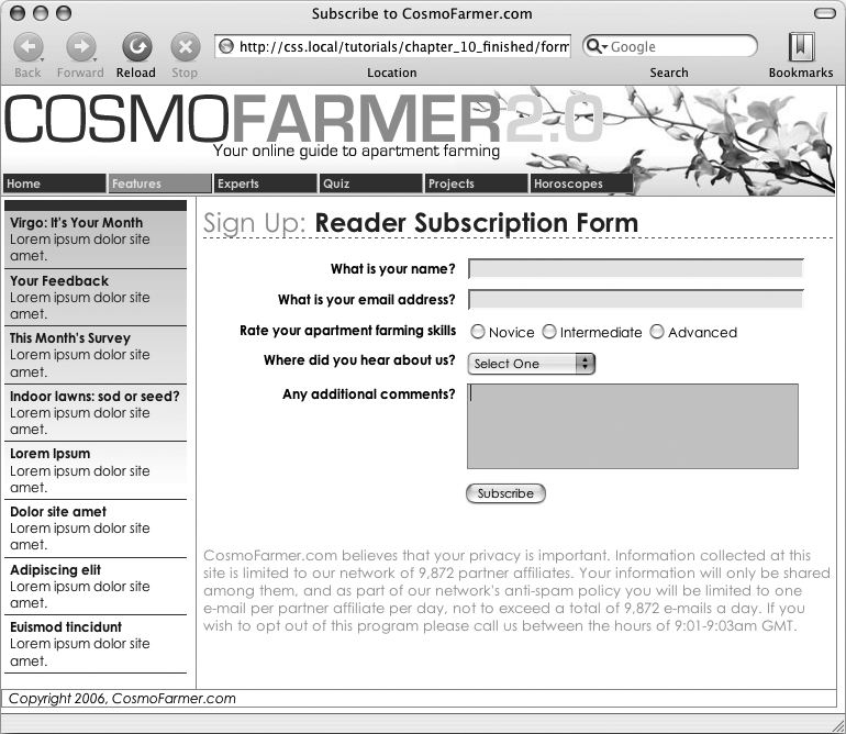
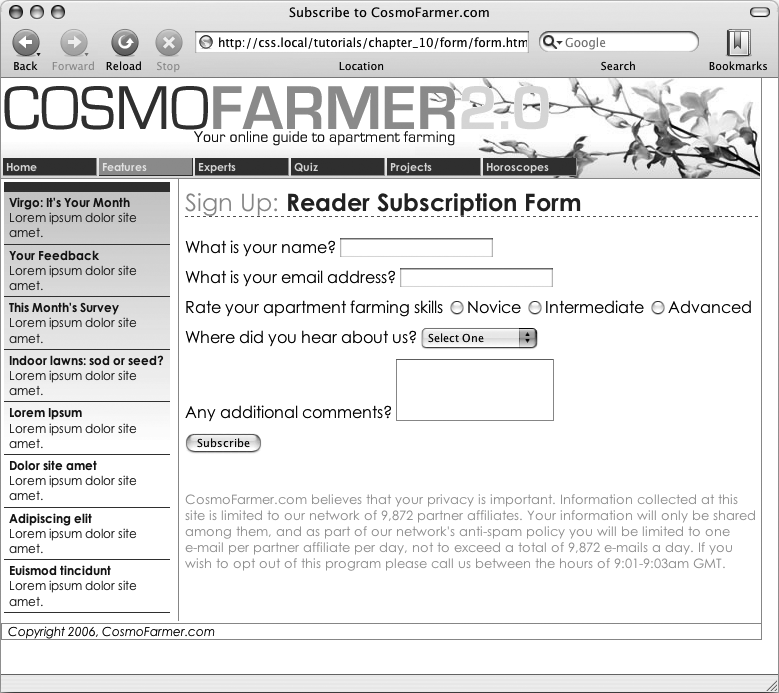
This tutorial gives you some practice using CSS to organize a form and make it more attractive. If you open 10 → form → form.html in a web browser, then you'll see it contains a simple form for subscribing to fictitious website, CosmoFarmer.com (Figure 10-11). The form asks several questions and uses a variety of form elements for input, including text boxes, radio buttons, and a pull-down menu.
As subscription forms go, it looks fine, but a little bland. In the steps on the following pages, you'll spruce up the fonts, line up the questions and boxes better, and add a few other improvements.
Open the file form.html in a text editor.
There's already an external style sheet attached to this page, but you'll add your new styles to an internal style sheet. Start by bringing down the size of the type in the form.
Click between the opening and closing <style> tags, and then add the following style:
#subForm {
  font-size: .8em;
}
The subscription form has an ID of subForm applied to it, so this style sets the text size for all text between the <form> tags.
Figure 10-11. While the HTML <table> tag is a common way to organize the questions of a form, you can also use CSS to make a disorganized jumble of labels and form fields (like the ones pictured here) and make a form's layout clearer and more attractive.
Time to work on the layout. To better align the form elements, you'll create the appearance of two columns, one for the questions (labels) and another for the answers (form fields).
Add another style to the internal style sheet:
#subForm .label {
  float: left;
  width: 230px;
}
This descendent selector identifies any element with a class of .label within this form. The style sets a width of 230 pixels and floats the element to the left. Remember the float property lets you move elements to one side or the other of a containing block. It has the added benefit of letting you set a width and force elements that follow the style to wrap around it. As a result, when you apply this style to each of the questions in the form, you create an even-width column. But in order to see the effect, you must first apply the class to the appropriate page elements.
In the page's HTML, locate this code <label for="name"> and add class="label", so the tag looks like this:
<label for="name" class="label">
You must do the same for each question in the form, so…
Repeat step 5 for the following pieces of HTML code: <label for="email">, <label for="refer">, <label for="comments">.
There's one additional question on the form—"Rate your apartment farming skills." It isn't inside a label tag, since its purpose is to introduce a series of radio buttons, each of which has its own label. You need to add a <span> tag to this text so you can apply the label style to it.
Find the text Rate your apartment farming skills, and then wrap it in a <span> tag with a class of label, like so:
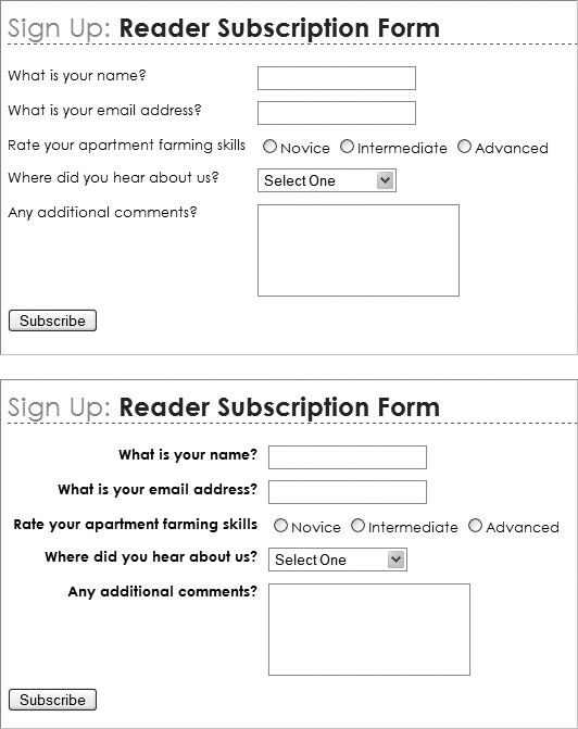
<span class="label">Rate your apartment farming skills</span>Now the questions appear to be in a single column (Figure 10-12, top). But they'd look better if they stood out more and lined up with the corresponding form fields.
Edit the #subForm .label style you created in step 4, so it looks like this:
#subForm .label { float: left; width: 230px;margin-right: 10px;text-align: right;font-weight: bold;}Preview the page in a web browser. The form should look like the bottom image in Figure 10-12.
There's one last step for these labels. Because they're floated to the left, if the text runs more than one line, the question that follows will also try to wrap around to the right. Fix that by applying the clear property.
Note
You can see a similar problem illustrated in Figure 7-12. See Stopping the Float for more detail on clearing floats.
Add a clear property to the #subForm .label style:
#subForm .label { float: left; width: 230px; margin-right: 10px; text-align: right; font-weight: bold;clear: left;}The form is shaping up, but that Subscribe button looks out of place over at the left edge. You'll align it with the other form elements next.
Add another style to the internal style sheet.
#subscribe {
  margin-left: 240px;
}
The <input> tag that creates this Subscribe button has an ID of subscribe already applied to it, so this style indents the button 240 pixels to match the width and right margin of the #subForm .label style.
Edit the Subscribe button style by adding a background color and font to the style you just created:
#subscribe { margin-left: 240px;background-color: #CBD893;font-family: "Century Gothic", "Gill Sans", Arial, sans-serif;}You can even change the font used in a pull-down menu.
Add a style for the form's select menu:
#refer {
  font-family: "Century Gothic", "Gill Sans", Arial, sans-serif;
}
There! You've got the text labels and Subscribe button looking great, but why stop there? Time to jazz up the form fields. Begin by changing their font and background colors.
Create a new group selector for styling the three text boxes in the form:
#name, #email, #comments {
  background-color: #FBEF99;
  font-family: "Lucida Console", Monaco, monospace;
  font-size: .9em;
}
This group style gives the text boxes (each of which has its own ID applied to it) a light yellow background color and sets a new size and font for text visitors to type into them. The boxes look a little narrow, and they also appear a little low compared with their labels at right. Fixing these two problems with CSS is a snap:
Edit the style you just created by setting a width and altering the top margin:
#name, #email, #comments { background-color: #FBEF99; font-family: "Lucida Console", Monaco, monospace; font-size: .9em;width: 300px;margin-top: -2px;}You can make your form easier for your visitors to fill out by highlighting the active form element with the special :focus pseudo-class (:first-child). You'll add that in the next step.
At the end of the internal style sheet, add one last style for the pull-down menu and the three text fields:
#name:focus,
#email:focus,
#comments:focus,
#refer:focus
{
  background-color: #FDD041;
}
The :focus pseudo-class works only in Internet Explorer 8, Firefox, Safari, and Opera, but since it doesn't do IE 7 or IE 6 people any harm, adding a :focus style is a fun enhancement.
Preview the page in a web browser. It should now look like Figure 10-13 You can find a completed version of this tutorial in the 10_finished → form folder.