1. RELIGIOUS FLYERS
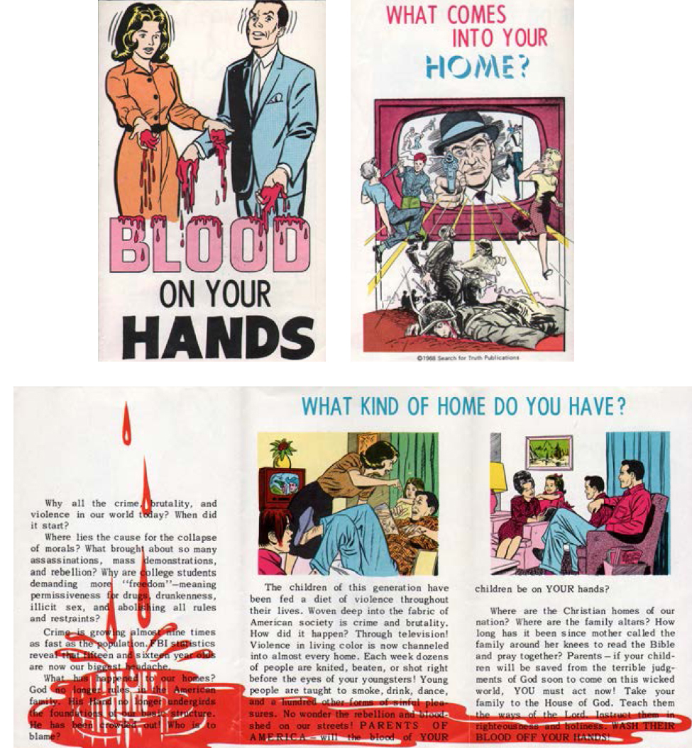
Religious flyers like this are a unique and pervasive form of graphic design language that peppers our consciousness (and unconsciousness). The classic example image is the “road to perdition” type of image that has been around throughout most of our history. You know the image (with variations) of a guy standing at the beginning of a path… and that path has many forks in it, some sinful, some foolish, many “incorrect,” and the true path (if you navigate all the horrors along the way) leads to personal salvation? THAT’s the salvation business.
I found this laying on a sidewalk, scattered among the hooker cards and spent needles. I love finding this stuff. I collect it. I have a great pile of Jack Chick comics (including the classic “Bad Bob” printed entirely in Thai!)
There was a local ad agency art director who was one of the most successful ad guys in Seattle for years. He gave it up to become a public access television preacher. His technique was astonishing: he glared straight into the camera lens (I mean UP CLOSE—his eyes, nose and mouth filled the entire TV screen) and he FURIOUSLY SCREAMED into your FACE about how you were going to Hell—top volume. Amazing to see. Horrifying, actually. But extremely effective. It was brilliant marketing language.
My point is that a lot of designers/illustrators/ad guys take this propagandist manipulation language game that we all master and sorta crack. They start to use it as a nearly insane way to control their environment as best they can. It seems to tweak the obsessive-compulsive side of the creative process (many studies are beginning to show chemical linkage between these things). This can be the entry into madness for some.
True believers who can control this visual language we all speak (and don’t know we speak) can do untold amounts of damage to all of us. We are just so vulnerable in our ignorance. Because we so thoughtlessly accept what they say, simply because we ignore the language, enormous power is blindly placed in their hands. We should never forget who gave us the conservative revolution: Michael Deaver. He was one of the most successful and powerful men in California advertising history. He eventually took on a new client and focused his efforts on him. A client by the name of Ronald Reagan. Deaver built Reagan’s election ad campaign. He was the guy who put President Ronald Reagan in office. And the rest is history. Always remember that, OK?
Designers need to be aware out there. This stuff we do isn’t “art”—it’s marketing language and propaganda. We live in a capitalist Industrial Marketing culture. This visual language is the common language of our culture. It’s our truest FOLK art, and it’s a service industry. So, who do you serve?
It’s hard for us to remember in these heady days of conservative religious political activism, but back in the 1950s and 1960s, the church was a bastion of liberal and progressive thought and action. Religious activists dominated the Peace movement beginning with the “Ban the Bomb” campaign begun in the mid-1950s. The neighborhood church meeting room was the epicenter of the popular Peace movement, and the ministers, priests and lay clergy were the masterminds of the civil actions that eventually removed us from legal segregation and even the Vietnam war.
Peace march planning meetings were always somewhere halfway between an angry mob and a church service. One was surrounded by smiling beaming young people with God on the brain following the dictates of their leadership into street battle. It was much like today, except the target was the atomic bomb and not the abortion clinic. Peace, not assassination, was the goal.
The Religious Left led the marches that peppered the land, always carrying homemade signs that read sappy things like “War is not healthy for children and other living things” and “Today is the first day of the rest of your life.” These phrases were, in their day, actual calls to action against a common enemy. The corporate psychedelic pop culture machine turned them into ridiculous clichés meaning nothing at all, i.e., “Hang in there, baby!”


The imagery for all of these signs was also dictated by the church. These meeting halls were decorated with the religious design style of the era: the Christian banner. We’ve all seen them. You can go into any Christian bookstore in the country and still find books on how to make them. Anybody who was a member of high school Pep Club and owned a pair of scissors was perfectly qualified to handle their creation.
This style seems to have emerged from the influence of Matisse. In the early 1940s, Henri Matisse underwent surgery that left him wheelchair-bound. In response, he decided to tackle cut paper as a medium of choice (influenced by the likes of other modern artists like Jean Arp). He simply cut out colored shapes and created what he could still actually see. The result was one of the most popular illustration styles of the last half-century.
By the late 1940s, Matisse had created a series of illustrations and covers for magazines like Verve that begat numerous imitators across the creative spectrum. Then he released his monograph, called simply JAZZ. It was a lightning strike. From that point on, his new style was THE Modernist look. It even continues to this day. It did more to launch the “international modern” style and even the “Googie” look and “retro ’50s design” than any other single look.
Around 1950, shortly before his death, Matisse installed his Chapelle du Rosaire de Vence with the famous stained-glass windows. This new modern style so perfectly fit the mood of the modern church and the forward-thinking “peacenik” movement that it echoed extremely powerfully. Many creative sorts in the church groups saw those images of glass and color and realized that they could do the same in cloth. It was a perfect “DIY” appropriation into the heart of the American religious community—liberal and all. And it was so pretty!
These banners, simply by their physical locality next to the antiwar movement’s birth, became the style of much of the early protest signs of the 1960s cultural movements. Through that channel it became adopted directly into an influence on even the fabled psychedelic poster of the Hippie era.
Try to imagine the career of Sister Corita Kent without the influence of the banners surrounding her. Her style owes so much to that environment of Christian banners as it does to the influence of any “fine art” printmaker of the same era (even Matisse himself). Through this lowest of lowbrow arenas came one of the most populist and profound visual language “dialects” in America. Those crummy fake psychedelic daisy stickers that every Volkswagen in America had slapped on them back in the ’60s are a perfect example of the influence of these Matisse-inspired goofy Christian banner art murals.
These fake-Matisse banners with their reinterpretation of style and meaning became the visual art of the liberal Christian church of the late ’50s and early ’60s. They still exist today, but more as artifacts in the choir practice room or youth ministry offices. The style is also seen in the modern revival of handcrafted quilts. They are a nostalgic reminder of the past. Still powerful and still so very wholesome.
3. INSPIRATIONAL BOOKS
After all these years of thrashing around thrift stores looking for cool junk, I finally started to look in the book section labeled “Inspirational.” This is the section in the back (or in the front if it’s a religious charity thrift store) of the used book section. It’s the section nobody ever seems to be looking through.
These are the religious books. Sometimes they also toss in crackpot literature, like flying saucer or ESP books, but those usually get stashed in sections often labeled “New Age” or “Occult” or even “Science.” The Inspirational section is almost entirely toss-outs from the behemoth Christian publishing empire.
Normally, I don’t go for that Christian stuff. I sneer at it and move on. But finally I started taking a guilty peek into that section and began to find solid gold!
No, not some mystical calling based on Heaven or Hell or anything. I’m talking cool, interesting and somewhat weird graphic design.
These books never go out of print. Also, many Christians buy them, but never seem to read them, as if they were only purchasing them to satisfy some obligation or guilt. In any case, they are almost always brand new, and in untouched mint condition. The copies that are read are worn to tatters. There doesn’t seem to be much in between the two extremes: people either don’t read them, or they read them to death.
The artwork in these books can be fascinating. It’s like a peek into the culture of a foreign planet. It’s a culture that I only see from the outside so its norms and standards and tastes are another language different from my own. It’s a very strange world to me.
The work seems to fall into three major categories, at least the categories I pay attention to. The first (and easiest to approach) are Christian books designed and illustrated by famous artists. These are designers and illustrators and artists who are famous in spite of their religious bent.
One of the best and easiest to spot is Sister Corita Kent. Corita worked in calligraphy, color fields, swatches and cut-and-paste silkscreen prints. She also happened to be a nun. Her initial output at the beginning of her career is all over the place in the Inspirational category of publishing. Her books stand out on the shelves in thrift stores like flashing beautiful neon lights.
Another interesting example is Basil Wolverton. He was dubbed the “comic artist too ugly for MAD magazine.” His work is like an exercise in gross-out humor. It is still idolized and collected today. In private life he was an evangelical lay minister (the Radio Church of God) living in Vancouver, Washington. He also did a lot of work for privately published Christian writings. It is really hard to spot because it looks like almost nothing else he became famous for, but it’s out there if you know what to look for.
My favorite category of interest in the Inspirational book section is the hack work. There are huge numbers of wonderfully and myopically drawn covers by earnest semi-talented true believers that stumbled through and managed to create not-quite-passable images that are endlessly used to adorn these books. They’re a hoot. They got reprinted and sold for decades and decades, so they seem to have the afterlife they believed in.
The other sort of hack you’ll find are real professional designers and illustrators who take on work from these publishers simply to cover the rent. We all do it. I have even done work for religious groups in order to keep food on the table. Imagine that. Me! I’m not proud of it, but I’ve had to do it to survive.
This cover, I believe, is in this last category of interest. It’s competently executed and way beyond some amateur scribbling. But it’s done extremely quickly—it almost looks unfinished, and sent off without revision. It’s as if the artist really doesn’t care about anything beyond the effort he already extended. It’s still pretty darn good, though.
The artist is credited as “James N. Howard.” Never heard of him. I assume he had a career of modest achievement. This was done lickety-split and out the door. But it still has managed to capture that lovely moment of creation, that point of inspiration. You can see the artist thinking as it progressed through the piece. He made quick and instinctive decisions and spit them out onto the paper. The result is gifted and revealing and pretty darn nice.
This sort of thing is the stuff of life for me. I look everywhere to find spontaneous creation—the point of genius that comes from the mind that is drawing on the back part of the brain. This artist was dreaming of what he was going to eat when he got that paycheck while the other part of his brain (the unconscious part that is the creative mind) was drawing this project for him—like driving a car. You’re not thinking about actually driving, but you still drive expertly. The miracle of creation.
So appropriate for an “inspirational” book, ya know?
