
The Acrimonious History of the Happy Face
Mr. Smiley! Happy Face! Smiley Face! “Have A Happy Day”! Even Mr. Yuk! Whatever you wanna call it (“drek” comes to mind), it’s got my vote for the most famous and most ubiquitous and familiar piece of graphic design of the last half-century. I don’t think there is a person on Earth who isn’t intimately familiar with this image. It is literally everywhere, and has been everywhere for over 50 years now. Terrifying, really.
So, where did this thing come from? That’s a debate that’s raged on in the pop dialog for decades. Graphic design history has virtually ignored it (except weirdos like me). That’s enough to even further marginalize it in graphic design circles. Most “design historians” have traced the happy face back to a marketing dude in upstate New York. (ALWAYS New York!) One highly educated “fine design” student once told me that Paul Rand (!) designed the happy face!! What an idiot.
In “fine design” culture, it is the “great man” theory behind the development and history of design thought. When something is noticed as a part of the popular dialog, the fine design culture immediately sets about trying to identify the PERSON who they think actually invented something out of sheer personal genius. Then they lionize that individual person and make him (always male) a part of HIStory. It’s a lazy approach to writing of history. As I always say, graphic design is a visual language that is spoken by the entire culture of Homo sapiens. It has always been my view that most important design language that develops is created by the group-think shared culture and merely copycatted by individuals who take all the credit.
The actual name that “fine design” credits for the “invention” and creation of the happy face is a guy named Harvey Ball. He was hired as a freelance designer for an insurance company to create something to boost employee morale. (Jeez, how bad was it?) He drew up a happy face (yellow and all) and the HR folks applied it to buttons and posters and other company swag. The “Smile” campaign was so catchy and successful that it spilled out of the offices and into popular culture. The smiley face took off like a rocket and was pirated by a bazillion other companies (especially Hallmark) in a bazillion other ways from stickers to umbrellas to underwear patterns. It was especially popular among womenfolk (so cheerful, ya know!)

Harvey Ball’s happy face, however, was not the very first instance of this yellow smiling ball. It was predated by at least one other design: a radio station promotion for a New York station called WMCA. They were one of the very first pop radio stations to promote the deejays as hipster cool dudes with lots of personality and yammer. The deejays themselves soon became as well-known as the music and bands they promoted (like The Beatles, The Beach Boys, The Rolling Stones, etc.)
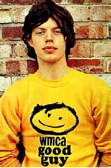
In fact the WMCA deejays became so popular that the station started to promote them rather than the station or the music itself! They started a campaign where they nicknamed the squad of talkers the “WMCA Good Guys.” They developed an image/icon to go along with it: a big smiling happy face on a yellow sweatshirt! There are photos of famous early Brit-rock stars like Mick Jagger and Eric Burdon sporting the shirt—all from around 1962–63. It seems like it was this shirt campaign that Harvey Ball “borrowed” his happy face design idea from, but the “fine design” culture is happy to quit their research with him. Case closed.
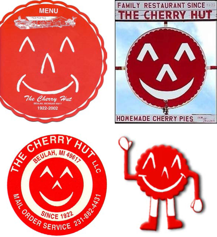
Well, tell that to The Cherry Hut, in Beulah, Michigan—sour cherry capital of the world! This label they’ve used on their products and their business signage dates all the way back to 1922. Sure, it’s not a yellow happy face, but it’s a smiley red pie face! (Those WMCA good guy sweatshirts didn’t EXACTLY match the Hallmark happy face, either, ya know.) The happy face goes waaaaaay back in advertising circles. and before that it was the province of every high school pep squad and cheerleader in America. I imagine, if you look long and hard enough, you’ll find a happy face hidden in among some of those Paleolithic cave paintings, too. It’s ALWAYS been a part of us.
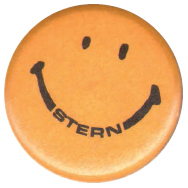
Of course, the snobby design historians ignore the issue of regional variations of the happy face logo. For instance, on the West Coast, there was a slightly different variation of the happy face. It emerged in 1967 as part of a promotion for a Seattle savings bank (now gone) called University Federal Savings & Loan. It was promoted as part of a “good neighbor”-style campaign by a marketing whiz named David Stern. When Stern needed actual artwork, he turned to legendary (and forgotten) local Seattle design journeyman George Tenagi for help. George was an old Japanese gentleman and was a master at calligraphy, logo and packaging design. Among his many achievements were the original logo for the Seattle Supersonics basketball team and the original Rainier Beer packaging.

The logo George Tenagi produced for David Stern’s campaign was somewhat different from the East Coast version, with a longer face, ovoid eyes and a slightly wiggly smile line (very similar to the Nirvana logo version—which was stolen directly from a local strip club that used it on their buttons with the tagline “Have an Erotic Day”). When little lapel buttons were produced and given away, the smiley face took off like an explosion in Seattle. It seems everybody from the lowly street hippie to the wealthy suburban housewife was wearing one of those things in 1967–68. My mom wore one.
That version of the happy face eventually took off from the local Northwest market region and spread southward along the coast and eventually became THE version of the happy face everybody grew up with out this way. It’s completely different from the East Coast version/Harvey Ball’s version—which is the only version accepted by academic “fine” design culture as viable and worth noting.

On an interesting side note, decades later, in the early 1990s, David Stern decided to run for mayor of Seattle. He chose “his” happy face as his entire campaign focus, claiming he was the man who invented it. In fact, in the lazy work of regionalized local Seattle historians, David Stern HAS been credited with inventing the happy face. Entire generations of Northwesterners grew up learning that the happy face was invented in Seattle—and it was invented by David Stern.
When Stern ran for mayor, his platform was virtually “Vote for the me, the guy who invented the happy face and put Seattle on the map.” He used it on all his campaign materials and wore smiley-face buttons and pushed on it hard. Eventually, a local sleazoid tabloid paper called me up and asked me about this. They’d heard through the grapevine that I’d been making fun of David Stern’s claim. So, over the phone, I laid out the history of the happy face that I knew, including Harvey Ball’s MUCH earlier claim to it.
The next day, there was a front-page headline story in that rag—an EXPOSÉ—decrying the LIE and FALSITY of David Stern and his claim to history. Stern attempted to come back from the humiliation of his getting “found out” on his “lie,” but he was essentially out of the mayoral race at that point. Strange to think I helped destroy a political career with a happy face. Now, THAT is powerful design!
The happy face has a way of popping back up in our cultural dialog over and over again in interesting and fabulous ways. Another case in point is the famous “MADchester” scene in Manchester, England, in the late 1980s. When it first hit the media spotlight, one of the things the magazines’ coverage featured (just like when the same idiots covered the punks and the hippies) was the silly wild fashion statements. The baby boomers thought the Manchester ravers were so charming with their use of recycled old ’60s imagery like peace symbols and happy faces and flowers. Fashion designers festooned their clothing with them. If these kids were emulating the “peace, love and happiness” motif of the old hippies, then they must be all right, correct? Or, so their parents thought...
The underground reality of those recycled old images was a little darker than all the boomers assumed. This was the era of rave drugs like acid and, especially, “X” (ecstasy). You see, the old peace symbol became a logo that was stamped on all the acid tabs being distributed. And the happy face? Well, it was stamped on X pills. These symbols literally became the new logos for the underground illegal party drug language. It was a brilliant sort of stealth or camouflage language. It actually fooled the straight world for a long time (some are still fooled today).
Then, of course, you have Walmart™. They actually attempted to steal the happy face outright and make it their corporate logo/brand. It didn’t work (the courts wouldn’t let them), so they phased it out and only recently abandoned it. For yet another generation of young kids, the happy face has been the corporate identity of Walmart™. Sad, huh?
This little silly face which has been around forever is still with us and is still mutating—sort of like that germ from space in the old movie The Andromeda Strain. It is part of our shared vocabulary, and like all words, verbal and visual, its meaning changes constantly as time moves along. The very idea of trying to claim “authorship” is almost laughable. The academic design culture’s attempt to pinpoint a “great man” behind it is embarrassingly short-sighted. Even our attempts to trace its history are impossible at this point.
Yet, they still claim to have it figured out and it was a genius named Harvey Ball who started it all. I disagree. I mean, just go ask any girl named Debbie if they’ve ever heard of Harvey Ball. Since time immemorial, haven’t they ALWAYS dotted their “i” with a happy face?