The Anonymity of Manufactured Art
1. NOVELTY ITEMS AND GAG GIFTS
When I got this fake scab as a gift, I was immediately reminded of Mark Newgarden’s wonderful little book, Cheap Laffs. In it, he documents and collects as much information about those crappy little “American novelty” items as he can, and he does one amazing job. He even manages to track down a large collection of the ORIGINAL ARTWORK created for those amazing little ads, those cruddy little images that we all grew up staring at in the back pages of our favorite comic books and catalogs.
This sort of “generic” American spot illustration is the backbone of many careers and styles and mainstream historical progressions in American graphic design and pop culture. Without this stuff, there are entire generations who would never have been attracted to commercial art. It probably is as influential as comic books and hot rod/kustom kulture artwork. The only field of imagery that likely surpasses this stuff in influence is the mystic order of sign painting.
The part about this genre that always interests me is how the mainstream steadfastly refuses to give credit to this stuff or even acknowledge its authorship—seems a great deal of it was drawn by illustrator Louis M. Glackens and conceived by Soren Sorensen Adams, who invented the Joy Buzzer and the Whoopee Cushion. It’s as if the mere fact of its tacky existence is enough to make “designers of good taste” turn away in disgust. In my opinion, the imagery associated with this territory is as important to American culture as anything drawn by Milton Glaser or designed by Paul Rand or David Carson. It is NOT “vernacular.” It did NOT grow on a tree. It is NOT anonymous. It IS part of a very large continuous thread of delicious cultural dialog.
That being said, it sure is fun and it sure is tacky, eh? This little package was given to me as a gift (thanks, Cha Cha). It’s only about 2″ square and the cellophane wrap is starting to yellow and crack. The crummy scab is sorta melted and smeared inside the packaging. But, it’s like the perfect object. The wonderful illustration says it all. It nails the market (dumm kidz) and function (gross-out and shock). It’s a beautiful time capsule of another age and another era of innocent unsophisticated humor (a.k.a. “yuks” and “gags”) that we barely understand anymore. I wish I had created this. I’d LOVE to have this in my portfolio.
There is a period of human development that we all share. As we grow up, we all pass through a phase where we discover “humor.” Our underdeveloped childish infatuation with our own bodies creates a huge turf of “jokes” about farting (whoopee cushions) and snot and, yes, scabs. We soon outgrow this stuff, but secretly, privately, deep inside ourselves, we remember. We still giggle. Sometimes we subvert our shameful amusement into the next best reaction—the “ewwwww....” gross-out. I always view these two reactions as essentially identical. One is displayed as laughter, the other displayed by anger (a “secondary” or “substitution” emotion—it’s one we use in REACTION to a primary emotion). Spot the diff....
I think we should spend much more time as academicians and researchers delving into the lost history of the creation of all these ignored regions of our culture. It’s really up to us.
2. THE BEISTLE COMPANY
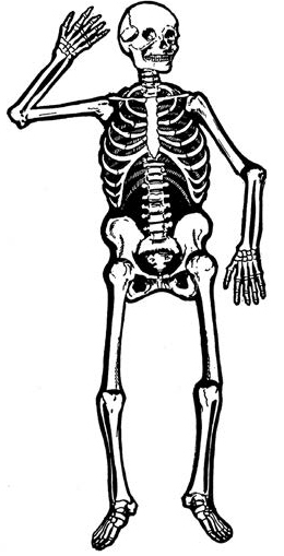
The Beistle company (pronounced ‘bye-still’) is probably one of the most widely distributed, widely viewed, most famous creators of manufactured art in the United States. Never heard of them, right? But I’ll bet you’ve seen their work. They’re the folks who have made the bulk of all that great Halloween decor we’ve lived with all these years.
Articulated skeletons, embossed jack o’ lanterns, dangling witches, scary ghosties—all Beistle. Probably the most famous is the classic articulated skeleton (the joints are grommeted to allow them to move) that every single person in America hung in their window or on their door. You know the one. Sorta scary and sorta goofy and has shown up in every amateur haunted house over the last 50–60 years?
Over the years, I’ve collected numerous vintage catalogs of their products. No one is ever referenced for the artwork. The ubiquitous and extraordinarily over-familiar images are all credited to “Beistle” or marked with one of the Beistle trademarks. There is no other authorship noted.
So, who actually were the hands that drew this stuff? No one knows. The company initially hired local artists, but I haven’t seen a mention of names. There are obvious individual stylistic traits involved. You can spot the differing voices creating the images. There is also a transition over time; you can see new hands coming into the picture and the old hands fading away. In effect, these hands created our shared experience of Halloween. We can’t think of Halloween without drawing upon these images, and yet we have no idea who created these memories for us. It’s rather sad.
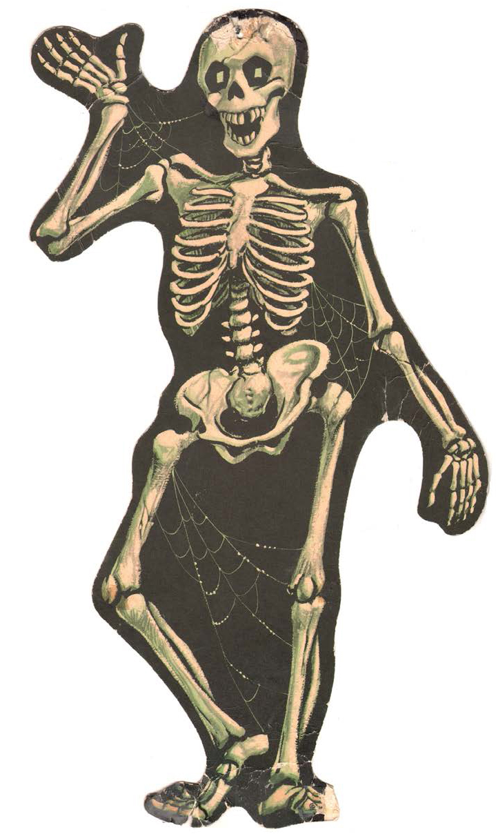
This one I remember rather well from my youth because it marked the transition from “scary Halloween” images to “friendly Halloween” images. There was a moment, about the time of my early adolescence, when somebody out there made the unchallenged “PC” decision to make Halloween no longer the province of scary monsters and ravenous ghouls, but “Casper” ghosts and smiley-face jack o’ lanterns.
One problem with this piece was that it was the first major seasonal Halloween skeleton line that Beistle had made in decades that wasn’t “articulated.” The second problem of this design was that you couldn’t fold it up and use it again next year. It was one big solid piece of cardboard and it got trashed very quickly. Almost none of this design seems to survive in larger sizes. This particular copy made it through the years because it is tiny (about 14″ tall). Even so, it lost part of a foot somewhere along the way.
It was phased out within a year or two for a move back to the old articulated design, but reworked with a smiling visage. A real step down, as far as I was concerned.
In retrospect, this was actually a pretty terrific image. Now that I’m an adult “commercial artist,” I recognize the serious skill and experience the correct nostalgic sentimentality when I look at it. It currently hangs on my wall.
Anyway, this silly-looking skeleton failed rather quickly in the marketplace. It wasn’t scary. Since it was the first of the “happy” skeletons, it was new and different. And finally, it was too fragile. It was anonymous. It was “vernacular.” It became lost.
I wonder who drew it?
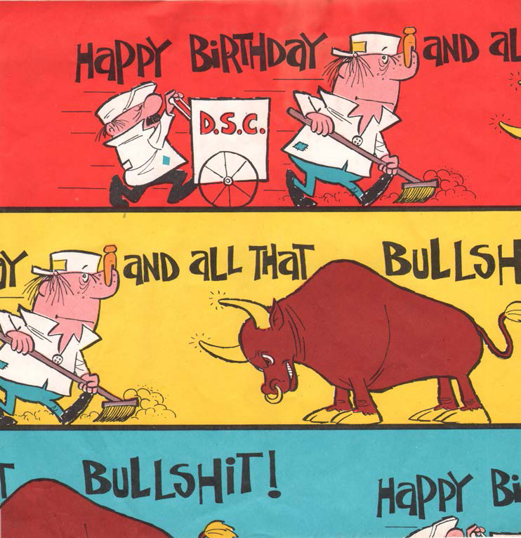
3. ’60s NOVELTY ILLUSTRATION STYLE
This is some vintage “adult” humor. Why do they call this “adult,” when it’s so embarrassingly juvenile and stupid that it only appeals to pre-adolescents? This is “dirty gift wrap” from the 1960s. Avert your eyes, my children.
Adult novelty markets used to be so entertaining. This was an era where “pornography” constituted a curvy gal in a bikini (maybe no top). A naked bottom was lewd. Many young men grew up thinking women had a blank spot between their legs. I think that’s why there’s an huge “T&A” fetish in this country: because our collective training process—porn—was so weirdly restrictive that we all developed obsessions with what we actually “know.” It’s a lame theory, but one you hear a lot.
The very tameness of that “adult dirty” world of the past is so charming today. All of those goofy novelties—glow-in-the-dark condoms, naked lady hot water bottles, “gag” gifts, rubber this and plastic that. It has all become a huge collector’s market today. The stuff is still buried in closets (Oh, the embarrassment! You never throw a gift away, right?) so it’s still plentiful and in great untouched condition for the most part. Once in a while, you may even find an old shop that still has a huge inventory of that stuff in the back. That’s like finding a pot of gold—well, maybe fool’s gold.
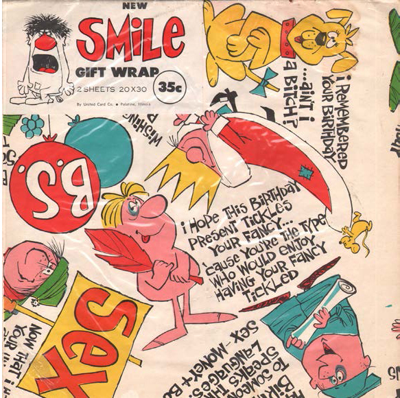
The reason I picked this up is that I’m fascinated by this illustration style that was so hugely popular back in the 1960s. Maybe inspired by the MAD magazine artists, but that’s a BIG assumption, though. It could easily be the other way around. This “look” was ubiquitous—a Hallmark style of the era. From greeting cards to gift wrap to cartoons to kiddie mags to T-shirts and even early surfer graphics. (Just look at early Rick Griffin cartooning, for instance. “Murph” was totally done in this standard style of the era.) There were thousands of people working in this fun humorous style.
Most of this work was by small-time nearly anonymous illustrators just trying to get by. There are a few bigger names, like Griffin and the MAD crew, and those guys who did so much work for Hallmark, like Don Branham. But this was largely a style of the lower class, the great unwashed. I doubt any of this work EVER won any design awards. I’ve never seen anything like this in a prestigious design annual or magazine. It slipped under the “academic graphic design history” radar, yet it was maybe the biggest look of the era. It is fascinating and I want to learn more about it. There were likely more artists doing this style for a living than all the other styles of the era combined. It was that common of a look.
It’s all gone now. Nothing looks remotely like this today. I think it’s a style that is high time for revival. Somebody needs to study this and revive it. Just watch the fad start. Mark my words!