Ross F. George (1889–1959) was probably the most familiar, most influential, most ubiquitous and the most important calligrapher, lettering artist, type designer and graphic designer of the last century. Sure, we all know about Herman Zapf and Frederic Goudy and even Billy-Bob Helvetica. But this Ross F. George guy launched a million ships. He taught America how to do lettering. We still use his typeface designs today everywhere in our digital universe, but nobody seems to recognize Ross F. George. Why is this? I think it was because he was living in Seattle. Back in the early 20th century, Seattle was so far off the beaten path that people thought folks made a living trapping furs. In fact, I still meet New Yorkers who think that.
Ross F. George was one of those entrepreneurs, a show card writer “commercial artist” that existed in abundance during the first half of the century. These small-fry guys learned their skills via mail order, set up shops in their hometowns and simply drew “show cards.” These were hand-drawn cardboard sales signage and street signs, business cards, ads, murals—whatever the customer ordered. They were one-stop shops for “art,” and they DID it ALL.
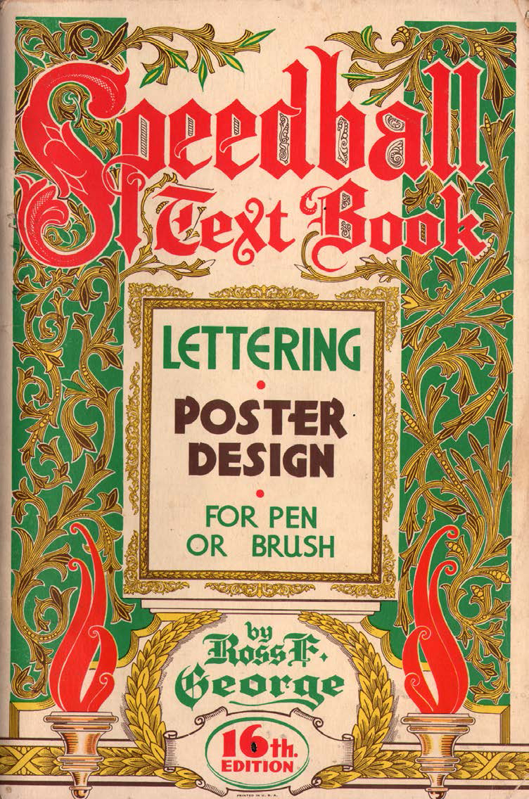
However, Ross F. George was more ambitious than most and invented a custom set of drawing ink pen nibs. Each tip design made drawing a certain sort of artistic line a snap—each nib a different size and style. He called this the “Speedball” system for pen and brush. He had them mass-produced and put them in art supply shops in attractive shelf and counter displays. He quickly learned that nobody knew how to use them, so he went about putting together a companion booklet that taught you how to use these wonderful pen points to do the most wonderful things.
There are dozens of editions of these little books called the Speedball Text Book: Lettering and Poster Design for Pen and Brush. The booklets were full of lessons on how to draw letters and stuff using the pens he sold. He also crammed these little books FULL of cool examples, by both himself and other pals, and hundreds of clip art illustration images and the most amazingly novel typeface designs. Every couple of years (starting in 1915) he would put out an updated version of his little book with a few new images and maybe a couple of hip new modern typefaces, while removing anything that looked so “old-fashioned” as to be out of style. He’d slap a new cover design on it and sell them in his display for around a buck.
Instruction books like these were not unusual. Hundreds of other lettering artists and commercial artists had also put together little books of instructions and sold them by mail order. This was how graphic design was actually taught throughout most of the 20th century. The idea of taking classes in “graphic design” didn’t really become familiar until the 1970s, the term “graphic designer” (though it existed) didn’t become standard use until the 1960s. A “sign painter” was always able to find work, even during the Depression. Ross F. George’s Speedball system was the cheapest and easiest to access. You could pick it up anywhere—anybody could buy his nibs and copy what he did in the book (to a point). The result was that his work was THE textbook for commercial art and type design for the “American century.”
Flipping through one of these books (they are actually still in production today, albeit in a much toned-down version) triggers an avalanche of imagery we’ve all seen a million times. He made no effort to protect his copyrights (such an idea was still foreign to commercial artists—and even fine artists), so all of this stuff became “public domain.” As soon as people could use a Photostat camera, they were directly copying his work and pasting it into their layouts. Most of his typeface designs are still used everywhere today, even in digital formats. Since there were no copyrights on them, they were just taken by the professional corporate thieves and sold willy-nilly. I spot his designs everywhere, even in cheezy TV used car ads. His typefaces are probably the most used this side of Helvetica.
Despite all this, nobody knows much about the guy. There is usually a photo of him demonstrating in his book, and a biography stating that he lived and worked in Seattle. That’s about it. One friend of mine found examples of his show cards reproduced in old magazines, but his name has been pretty much excised from the history of graphic design.
Why? Well, there is a notoriously powerful East Coast/NYC bias in the writing of the history of graphic design. The old cliché that “if it didn’t happen in New York City, it didn’t happen” still holds true today—even though we now know that is a ridiculous attitude. New York (and therefore academia) completely ignores any graphic design work done west of Chicago, and barely admits Chicago existed before the 1960s. That attitude is finally starting to change. More volumes about design on the West Coast are finally starting to be produced (Saul Bass, Ed Roth, California airbrushers, movie posters, etc.), so that historical injustice is starting to be remedied (not fast enough in my opinion, however). I think a critical history of the work and career and influence of Ross F. George would make a really fine volume and research project (hint hint).