GRAND MASTER OF CORPORATE DESIGN
Corporate history books are great reads. They’re produced by the company itself as puff-piece exercises in self-aggrandizement and corporate mythmaking. In other words, they’re usually fulla crap. But they’re interesting because they often reveal themselves in other ways, like through the design language used to make the book.
This item pictured is the history of CBS radio, produced as an in-house promotional history book. CBS was the Godzilla of the entertainment industry for most of the second half of the last century. CBS began in the movies and then moved to radio and immediately conquered television when it arrived on the scene. They defined what the world looked like to us for generations. And this little book is a personal inside history of their work told from their corporate power perspective. CBS published lots of little books like this. It’s as if they couldn’t stop tooting their own horn, assuming we were “entertained” by anything they decided to put forward.
This radio history came out in about 1951 and provides a history of the previous 20–30 years of America, particularly WWII. It’s told through a corporate mythmaking perspective about their personal involvement in “Bringing the War to you.” Like they were somehow “presenting” it. It’s arrogant and extremely familiar. It’s the history we are all still taught as defined by the entertainment industry monster that allowed us to experience it. So, it’s a very surreal item.
The thing I like about this is that the designer, William Golden (1911–1959), is brilliant. He was maybe the first major-league postwar CORPORATE design genius. He and his work for CBS came to define what corporate design was to look like up until this very day. He basically made the mold for the job. His tenure at CBS is unparalleled in its cohesive and powerful vision and execution, from the smallest spot ad to the corporate headquarters building itself. He was the best, no contest. There is an out-of-print book on him and his career out there, written right after he died (The Visual Craft of William Golden, 1962). Try to find out more about this guy. He’s really important.
One of the things that Golden brought to CBS was an incredibly sympathetic viewpoint to the “consumer” of their “product” (all terms unused back then). He CARED about the average American. He survived the war and took this job at CBS as a way to insure and protect the little guy. He brought a heavy social conscience to corporate America that influenced the development of corporations until the Reagan era (when social responsibility went out the window).
William Golden actually thought corporations OWED the citizen and ought to behave accordingly. He wasn’t anti-corporate (like, say, me), but he saw corporations as an extension of the public, and therefore was beholden to act in a responsible and protective fashion when it came to the public. CBS became the standard-bearer for the future model upon which all corporations were to be built. However, he died young. The rest is history.
This little book is a history told from a perspective of a corporate monster in the making, but it’s designed by a man with a deep social conscience. The result is very revealing. Since it’s a history of radio, how do you “picture” or “illustrate” radio? Starting with the beautiful heavily manipulated photo of a radio tower on the spine, Golden goes for the abstract.
His simple and elegant device/solution is to show a “radio wave”—depicted as a wiggly-style line wave like you’d see on an oscilloscope. As the history of CBS, radio, and America is told, through words and archival pictures, it’s told in a consecutive structure. The trick was, as the history becomes important or calm or violent or peaceful or astonishing, the radio wave wiggles in sympathy. You can flip through this book and see the important parts of major history being made by how extreme the wiggle is in the radio wave. Brilliant!
The example I show in the next image is the page where the atomic bomb is dropped on Japan. The wiggle in the radio wave goes right off the page, right through the text. It’s so shattering a moment in history that it literally blows the legibility of the book apart. For such a clean, controlled gridded corporate layout, this moment depicts Golden’s view of the importance of human life.
Throughout his tenure at CBS, William Golden made a point of hiring and training unknowns alongside the great talents of the era. Some of the “kids” he threw his arm around and helped to train were guys like Lou Dorfsman and Andy Warhol.

William Golden’s wife, Cipe Pineles, was already independently well established as a major design mind and practitioner. However, when Golden was voted the gold lifetime achievement award medal by the New York Art Directors Club, he refused membership or the award unless his wife was also given the award. No woman had ever been given that award. In fact, no woman had ever been a MEMBER! It just wasn’t done. He fought and they relented and Cipe Pineles was allowed to be the first (and for a long time ONLY) woman in the art directors club. Eventually, they awarded her the gold lifetime grand master medal as well.
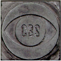
The single most influential thing William Golden ever designed, his crowning achievement, was the brilliant CBS corporate identity/trademark. “THE EYE”! The simple, elegant beauty and incisive thinking and concept are so utterly William Golden, that it might as well be his personal logo as well. The idea that the media is looking AT you and seeing YOU, then reflecting yourself back to you is a funhouse mirror of an idea. His ever so simple execution of such a complicated idea set the standards of corporate language for generations to come. Somehow, though, we’ve very rarely managed to live up to his standards.