IF YOU CAN’T DESIGN IN B&W, YOU CAN’T DESIGN
I really don’t know anything about Judith Viorst. She seems to be a rather pretty poet from the late ’60s/early ’70s who slipped into the self-help genre with her work. Her serious streak succumbed to slightly off-key humor as she aged and began to write about the process of becoming older. At any rate, I think her little books sold pretty darn well, because now that she’s become a relic of a different, more liberal era, her stuff can be easily found in most used bookstores.
What intrigues me about Viorst, however, is the design of her cute little books. She seemed to have been rather close to Herb Lubalin (1918–1981)—the greatest, most influential typographer/designer of that era. In fact, he seems to have been her exclusive book designer for her entire career.
Herb Lubalin’s mature career appears to have started in the late ’50s/early ’60s, after a 20-year stint at Sudler & Hennessey. He had been part of that youthful postwar crowd that invaded NYC and became the dominant new style-setters in graphic design. He was very good friends with Lou Dorfsman at CBS, and helped create Dorfsman’s incredible “Gastrotypographicalassemblage” (1966), a gigantic typographic wall assemblage in the CBS cafeteria. Together, they set the standard template of typographic design in America for the next generation.
You really can’t escape the influence of Lubalin’s incredible “eye.” For instance, he became the house designer at ITC (International Typeface Corporation, one of the oldest existing type manufacturers on Earth), where he not only designed their free and widely distributed (largely to students) design newsletter called U&lc (which meant “upper and lower case”—old typographer terms for handset type). His incredibly stylized and influential work in that publication alone was more than enough to redirect the world of young graphic design students in his direction across the United States.
U&lc was incredibly smartly and inventively designed. Lubalin’s typographic sensibility was almost supernatural. He did things with type that had only been hinted at in the generations before him. He could do anything and literally did—constantly. It was sort of mind-blowing to look at his work back then. It still is, actually. Even with the wonders of digital manipulation, his mind worked in ways no computer jockey has even begun to approach.
Even MORE influentially, he was assigned to completely “modernize” the entire ITC typeface catalog. He redesigned so many traditional typeface designs that he literally changed the way we see what we read. For instance, he increased the “x”-height of the lower case—making the line of type appear larger without actually increasing the point size. Smart and brightly effective.
We still look at that innovation alone in American typography as so natural and effective that we don’t even realize we’re looking at a distorted redesign made only a generation or so back—we actually think we’re looking at type designed in the 1700s. A lot of type “purists” still hate Lubalin for that.
So, Lubalin worked on CBS television, U&lc, and revolutionized modern typefaces. Just those achievements were monumental in their sneaky influence, but he also designed many of the most overused typefaces of the last half-century. Typeface designs like “Avant Garde” and “Lubalin Graph.” They came standard with most cheap typesetting machines back then and as a result were used to death by every novice typesetter and designer to do everything that came across their desk that was a “blow-off.”
Those beautiful designs were used BADLY for over a decade and we hate them today. Everybody now thinks they’re “ugly.” It’s such a shame, because they really worked and they worked well if you knew how to properly use them (which nobody did back then). We blame a decade of incompetent amateurish design work on the typeface, not the designers using them.
Lubalin primarily worked out of his own studio from 1964 until his death. He picked up many edgier clients like most freelancers often do. We freelancers get left with all the strange slightly “off” clients who don’t have much money. If they had any money, the bigger design firms would have snagged them way back and sucked their pocketbooks dry and given them dull mainstream claptrap (as design firms are so good at doing).
Herb Lubalin had the strange good fortune to hook up with Ralph Ginzburg. Ralph had a classic New York publishing history, albeit one dealing in “adult” material. Ralph was also a visionary and a cultural/political firebrand. His small publishing empire dealt with “adult” material, often historical or clinical (copyright-free) to give it the patina of respectability. It was very profitable.
In the early ’60s, Ginzburg decided to go into the adult magazine business, and wanted to do it with “klass.” He began a magazine of “erotic love” called Eros, and he hired Lubalin. It was a hardbound (a fad of the times), beautifully designed (by Lubalin) book-like magazine that completely changed the world of publishing—not only with its content and looks, but with its uproar in the courts. It was nailed by the postal inspectors as “obscene”—which is pretty funny to try to imagine, looking at a copy of it today. I don’t think there’s much of anything in there you would hide from your kids.
Ralph Ginzburg was dragged into the legal system and fought an epic battle against censorship. In the end, he lost one of the fights, and eventually ended up going to jail for a short term. Eros ended after four incredible issues. Those four issues changed editorial design and art direction and typography for the rest of the century. Amazing things to admire. Brilliant work by Lubalin.
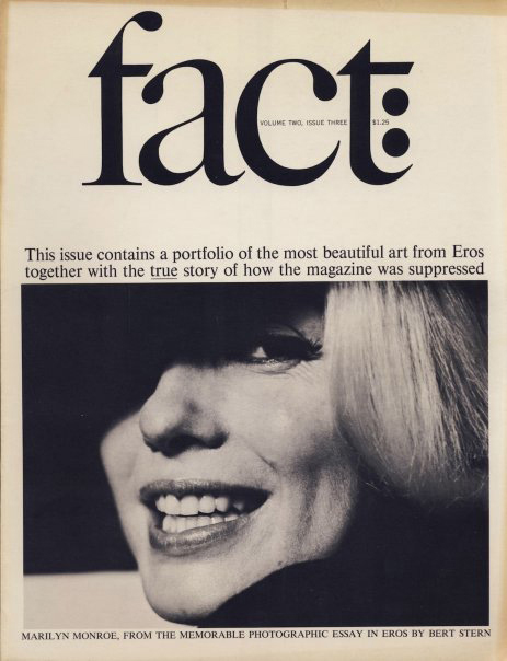
After Eros was shut down, Ralph started another magazine of “opinions and thought” called fact:. fact: was a platform for Ralph to spew his political positions and support like-minded radical creeds. It was also wonderfully typographic—heavily designed by Lubalin. Exquisite, but doomed to be censored and sued out of commission by Barry Goldwater, the pissed-off Republican candidate about whom a none-too-flattering article had been written.

Not to be deterred, Ginzburg next published (and edited and controlled) Avant Garde magazine. It was a magazine about art and culture at the edge, and he again hired Herb Lubalin to design and art-direct it (it’s where the “Avant Garde” typeface was created, as the official logogram for the magazine). It was one of the most brilliant and visually stunning and innovative magazines of all time. And also doomed to disappear under the disapproving eye of wholesome America once Ginzburg was sent to prison.
Lubalin continued working out of his private studio (U&lc, the International Typographic Corporation and many other projects) until his death at the age of 63. Too soon. I would love to see what he’d be doing now with the wonders of computers at his disposal.
Oh, by the way… Herb Lubalin was color-blind!