
Peter Max and the Cult of Fake Psychedelia
I know it sounds crazy, but when you ask 99% of Americans, “Who did the animation in the movie Yellow Submarine?” they say, “Peter Max.” Crazy, huh? That’s the power of hustle and brand.
The guy who actually created the look and style (who basically “drew it”) was a fella named Heinz Edelmann (1934–2009). He had already been working in that style for a very long time before being asked to do the movie animation. In fact, Edelmann had been pioneering new cool design and illustration styles in Europe for over a decade prior to that movie. He developed styles and then abandoned them time and time again. I wonder how many individual illustration styles he worked in during his lifetime? It must be dozens. A truly great, inventive, restless design mind.
However, the style he’s historically been locked to is the style of that movie. If people remember him at all it’s that film that they remember. But, dang, ain’t it grand? I wish I could be remembered for a project like that. Heavenly.
Now, a lot of you will bark out in a knee-jerk fashion, “But Peter Max did it first! Edelmann RIPPED HIM OFF!!!” These days of self-righteous and ignorant artists’ brand control has spawned a childish overprotection of “copyrights.” Every Tom, Dick and Harry assumes their own scribblings are so precious that they must be protected against—whom? I dunno. But we all seem to fight until blood is drawn over the most minute and silly infringement imaginable. It’s like we’re in some amateur professional wrestlin’ match of “GIMMEE!” So boring.
The truth is that we exist in a postmodern era where creativity has become hopelessly derivative and exploitative. We don’t come up with original thoughts anymore; we come up with new adaptations of older ideas—appropriation. That is the thought process of the modern world we inhabit. There are NO original ideas in graphic design anymore. Show me the piece and I can show you precedent after precedent—and done better. The very idea that we have original ideas to copyright is laughable.
So, whenever I hear about the “who was first” argument, I chuckle. Especially when it comes to the most famous and popular “ideas”—like Yellow Submarine.
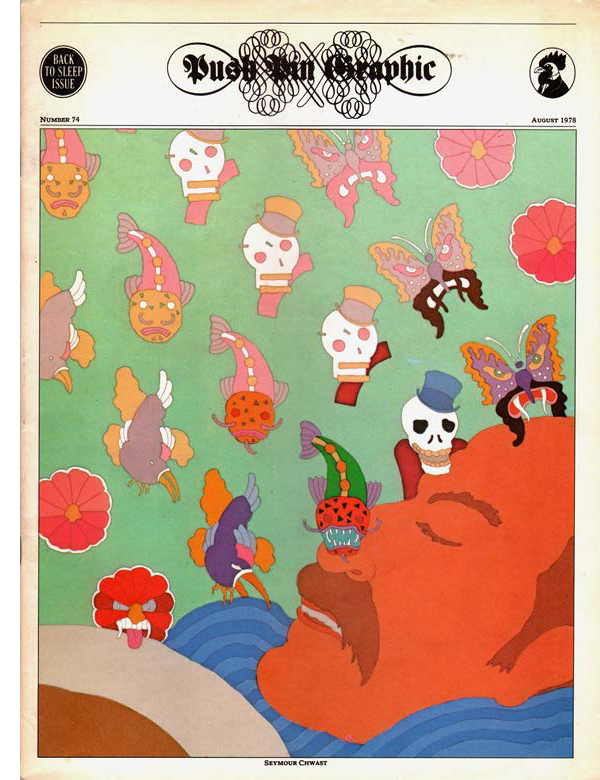
Yes, Peter Max ripped off Heinz Edelmann, not the other way around. But Peter Max (more importantly) was directly ripping off the Push Pin Studios work of Seymour Chwast and John Alcorn and Milton Glaser (ESPECIALLY Milton Glaser). Max went so far as to rip off Milton Glaser’s “signature” stroke. It was embarrassing.
Peter Max (b. 1937) didn’t have an original bone in his body. He was a professional copycat. But the one thing he DID have that put him ahead of the rest of the pack was a supreme salesman personality. He was a world-class hustler. In fact, he’s still at it today. He sells his work through “art galleries” in shopping malls and on home shopping networks for hefty five and six figures. He still promotes himself as a guru. He’s hilarious, and very, very wealthy.
To be fair, Peter Max was also a really experienced and truly gifted design production artist. He had the process down cold. If you carefully examine his old posters, you can see that it’s absolutely exquisite handwork along with a mastery of the printing process that borders on genius. One poster I looked at was only a three-color printing job—three “passes” through a single-color press. Nothing really that special at first glance.
On closer inspection, it was all split fountains. Sometimes the color splits were three and four carefully selected hues of the same basic color. Then he would overlap the colors ruthlessly to build new colors. The results are his secret weapon. It’s what we are really admiring when we look at his crappy designs. It’s his printing skills that we see and gawk at.
His earlier work (he was just another hack low-level freelance illustrator working the ad agency circuit) was nothing special—crosshatch and watercolor/gouache washes. Very solid, average work for the period.
When he discovered Push Pin Studios—and who didn’t back in that same period? They hit like a thunderbolt—he jumped on the bandwagon and never looked back. Then he promoted himself as the official “New York City Hippie Godhead” and cashed in. He’s been uber-famous ever since. If you’re über-famous in NYC, you’re über-famous forever. They have a very powerful and lazy media empire centered there. He knew this and exploited it mercilessly.
However, that begs the question: Did Push Pin invent that style? Well, no. Not really. There is evidence that Edelmann was working in that style even before Push Pin. But Push Pin didn’t rip off Edelmann, either. They were all borrowing from Japanese graphics. The heavy cartoon styling of Japanese painting (derived from brush stroke, so it tended away from sculpting and into flat line work) was coming on strong in the postwar exploitation period.
Japanese illustrators worked in a cartoon outline tradition, and the Western “sculpted” painting stylist world freaked when they discovered it back in the late 1800s. Those cheapo pop Japanese prints that are so highly valued today were like baseball cards to the Japanese. They used them to wrap the porcelain they exported. The French painting avant-garde discovered them in the trash and immediately saw something new to them. The result was an important step toward Impressionism and the whole modern art dialog of the last 150 years.
Push Pin Studios, the young lions of the New York marketing design world back in the late ’50s/early ’60s, also paid attention to the Japanese art world—particularly the illustration and design work that was re-entering the popular eye back then.
One of the marvelous little ideas that inspired the Push Pin guys was the simple idea that the line-art drawing (before you add the color areas like a coloring book) didn’t HAVE to be printed in black ink. You could use red. Or blue. Or green. Then you fill in the regions (again, like a coloring book—or even stained glass, if you must) and the results looked, well... Japanese. So modern, so cool.
Milton Glaser and Seymour Chwast and John Alcorn and others in their circle dabbled in many technical styles in their earlier days, but when they developed this new “Japanese” look, they took off like a rocket. And when a million dumb kids copied them, you had the “Peter Max” fake psychedelic style that we all know and so deeply love today. The original hippies didn’t work in a style remotely like this. It was a product of professional illustrators working in the New York City business world pretending to be psychedelic. Salesmen hustling their version of what the kids were up to. Fake kulture.
When Heinz Edelmann did Yellow Submarine, it was in this style, developed along the same lines as the Push Pin boys. The fact that it was an extremely popular professional hipster fake psych look was pure gravy. That was why he got the gig. He looked right. That’s how this stuff works. It’s what cements our thinking together.
Graphic design works on a deeper level than what we tend to imagine. We see it, we “read” it and then it gets into our mind. It moshes around and becomes part of our thinking. Then it comes back out in a different interpretation. I don’t think Glaser copied anybody and I don’t think Japan copied anybody. Instead, everybody learned each other’s dialects and thoughts were changed and ideas were spread. Then somebody comes along and copies it—exploits the language they see and read. They consciously DO something with it and a Peter Max is born. But, like a pinball, those guys tend to have a narrow ambition that gets stuck in a bumper until it runs out of juice and creeps to the gutter and rolls out of the game. The more important result is a CULTURAL dialog, but not a PERSONAL dialog.
I also want to point out that NONE of the Push Pin/Edelmann/Peter Max stuff was “psychedelic.” The psych guys on the West Coast or in England did nothing that looked remotely like any of this style we’re talking about here. Zero. This style was strictly a professional interpretation of what they thought LOOKED like psych. It’s as if the San Francisco guys (as an example) were folk artists doing cultural dialog and the Push Pin guys were inspired by it to the point of creating their professional version to make a buck. The difference between real psych and professional “fake” psych is vast. Yet the design profession (such as it remains) can’t spot the diff, generally. I read history books where the history of the psychedelic style begins with Milton Glaser! That’s so incredibly stupid, yet it goes unchallenged. It is a huge ignorant mistake that has become accepted as narrative in many “fine design” circles. The same sort of idiot fumble happens all over the place.