THE LOST ART OF THE PRINT PROCESS
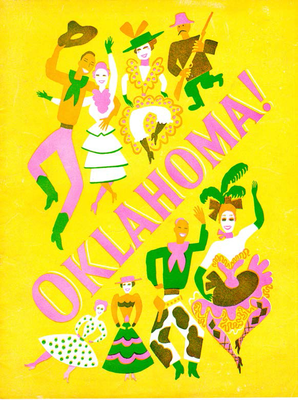
I think this little souvenir program cover (actually, not so little—it’s 8½″ × 11″) is from very close to the actual premiere of Rodgers & Hammerstein’s musical Oklahoma! The image itself is by Witold Gordon, and the program is from a period of time close to the introduction of this classic American musical, around 1944.
The cover is a wonderful little illustration printed in the most happy cheerful fluorescent colors (a.k.a. “Day-Glo”). The inks are matte (it “scars” if you scrape your nail across it) and the registration is pretty bad. So, it’s a cheap printing in three colors (bright yellow, bright green and fluorescent pink). That’s a hell of a palette. it’s really great.
Ink colors were very different back when this was printed. There was no Pantone matching system (introduced around 1960 along with many other “ink systems”—it survived for some reason, while other, better systems died out). The way you selected colors back “pre-PMS” was to work directly with the printer and they would mix their colors, often on the spot. You had to know your chromatics to get what you wanted. With printing, you had to really know all of it to be a “good” graphic designer. Sadly, much of that has been tossed out these days.
The truth is that graphic design has always primarily been about printing. That’s what we do. We design artwork for print reproduction (the Internet design work is still modeled after the rules of print design). Knowing print process is as essential to mastering graphic design as knowing about brush and pigment and canvas is to a painter. It’s our medium.
Since the introduction of computer graphics and layout programs, there has been a sudden and distressing ignorance of print process emerging. Schools barely mention how printing works. Students from even the highest university programs know virtually nothing about what happens to their designs after they leave their monitor. It is shocking to me.
The illustration on the cover of this souvenir program for Oklahoma! is a wonderful sample of process art used as illustration. The way this image was created was by designing directly for the printing press. It didn’t even exist as a completed image until after it came off the printing press. It is process art as a medium—and the home of real graphic design.
Looking at it through a loupe, you can discern the fine details and trace the process, and you can see that it’s cheaply and badly printed. Every color is slightly off—but hugely off by comparison to the craft of printing as it existed back then.
The colors are solid pigment and the subsequent colors created from the three original colors are simply overlapped (printed on top of each other) to create a much larger and more vivid color palette. Screens (dot patterns) were used to create mid-ranges as well (the brown, for instance). It is very smart and knowledgeable about print processing and designed to be literally bomb-proof—it could get printed off-register quite severely and still read correctly. That way, you could use a very inexpensive printer and let it be badly printed and still acceptable to your client’s needs.
Today’s computer design has limitations. To begin with, there are severe restrictions in size (you gotta work so small in order to scan things) and chromatics. A screen is projected light—looking into a flashlight beam. It has a different spectrum (RGB) than reflected light—ink printed on white paper (CMYK). The problems with matching color is tremendous.
Computers are essentially big “comping” tools. Clients expect to have instant results (just punch a button, right?) and then get exactly what they see on a screen. We let the computer essentially create the process artwork (through directives). Then we hand the disk to a printer to “make it so” (or run it off a desktop, which also speaks to quality and process limitations—and ignorance).
The printer then has to have their technician tear apart your entire piece of “design” and redo all of it in a way that can actually be printed. Don’t worry, they tear down EVERYBODY’S artwork, no matter how smart you think you are. They have to totally reconfigure what you do, because we are all different and we are all stupid. Now, when it comes to printing, it’s printed “four-color process on white paper.” How many of you folks regularly go to press checks any more? Do you have any idea how this is done? Any idea of the potential for creative expression this magnificent system has to offer? Do you realize how it’s being lost through being ignored?
A huge loss.
The new paradigm sort of reminds me of those badly translated Japanese instruction manuals—where the Japanese translator translates English into Japanese and then back into “Engrish”—and it reads as humorous gibberish. The digital design process is sort of like that. Instead of designing directly for the printing press, we know design and translate into a comping tool (for the client). Then we retranslate that into yet another language (printing) and expect it to not be a mess? This new “middleman” is like the worst-case-scenario client interference. A recipe for mayhem and lousy work—design gibberish. The language of graphic design gets lost.
Without the language of printing, what are we now? Are we still “graphic” designers? It’s like learning to paint and then making a living as a painter, but never really touching brush to canvas. The results are mechanical and dulling in expression. A whole world of creative vision disappears like it was nothing. We’ll never see process illustration like this Oklahoma! cover again. Once the older generation (myself included) dies out, it’s gone. Will anybody even notice?
If you think you are a graphic designer and you don’t know printing, then you don’t know jack. We now have an entire generation of design jack-offs.