I wonder how many of you out there recognize this thing? It’s called a Haberule™ (named after the famous NYC type shop named Haber). It is what every designer used to set type before the advent of the computer. What you are looking at is a cheap little chunk of plastic that did everything your computer does, only BETTER and more precisely. Amazing, huh? This little device is more than the equivalent of all your computing power and it only cost a few bucks. Think about that. The catch was, you had to actually use your brain as well.
How it worked is simplicity defined. It was based on the infamous “printer’s stick” (a.k.a. “pica stick,” “pica rule,” “agate stick,” “stick”). A “stick” was simply a ruler that old-school printers (who also set all the type with their foundry type and lead type systems) used to measure the typography when they composed the pages.
It’s called “pica” because it was all based on the measurements of typefaces as they evolved over the centuries and “pica” was the original name for the type size that we now call “12 point.” Pica (being “12pt”) shoves type measurement into a base 12 system of measurement, like the clock. There are 12 points (the smallest common unit of measurement) in one “pica.” 24pt type was the equivalent of 2 picas. 6pt is the same as a half pica. All of these old type sizes originally had actual names for them. Since the 12pt size evolved as the most common (for legibility reasons) it evolved as the general unit of measurement. At least that’s the story of the pica.
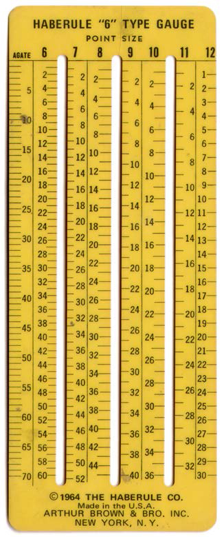
A pica stick (a.k.a. “stick”) was a ruler with measurements set up in picas on the right side and “agate” (another archaic unit of printing measurement that only the very old-school use any more) on the left side. Flip it over and it has measurements in inches on the back. This is the basis of the primary element of the Haberule™. If you look at the image I posted, you’ll note that the right hand side has “12” written at the top of the column. This means 12pt, so it is a pica rule on the right side. The left side has agate (which, like I said, almost nobody uses anymore).
The genius of the Haberule™ is that it also has all the baseline (bottom line where the main body of the type actually rests) measurements for most commonly used typeface sizes. This is a brilliant composition tool addition that allows for quick type measurement and rapid composition.
Take 8pt type. If you have, say, six inches deep of space to place the type, you can measure down quickly (through the little gap/window in the plastic) to exactly how far down it goes to fit. Easy! But, how do you know how wide the type fills the column? How do you know how many letterforms will fit on a single measured line? To do that you had to use your head. There were books in common use around the average designer’s office (type specimen catalogs from local typesetting shops, commercially available collections, salesmen samples, etc. etc.) that had the character count measurements for every typeface imaginable. You simply looked it up and found out how much space the type design required. Using simple math calculations and your Haberule™, you could set type with extremely exact precision. To the letter, even.
So, this little chunk of yellow plastic was your typesetting device. It did everything that you needed and cost only a few bucks. However, most students were happy to see this go away, because then they didn’t have to master the elementary levels of mathematics needed to actually use it. It’s so much easier to just push a button and let a machine do it, right? Never mind that the machine does a shitty job of it and it costs an enormous amount of money and upgrades to maintain and you have to spend months or years mastering it. It only took a few days to master the Haberule™. You do the math.
Have you noticed that in my essay, I never once used the word “font”? That’s because a “font” is a collection of every letterform of an individual typeface design in a specific point size (including punctuation and ligatures). Font is what you call a “set” of every character of a specific design in a specific size as used with lead and wood type. It does NOT specifically refer to a typeface design. The way we use “font” now is a complete misuse of the language. Every time I hear it used wrong these days, I cringe. I cringe a lot when talking to young designers.