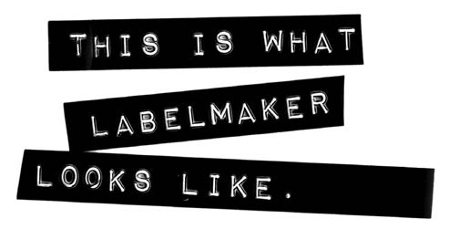
LABELMAKER: PUNK TYPOGRAPHY 101
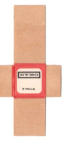
LabelMaker was a big cheapo solution for typography back in the early Punk days. You saw it everywhere: record covers, posters, ’zines. You could literally buy a LabelMaker gun (especially the gutbucket brand called Dymo) for two bits in a thrift store and then get the tapes out of the free bin. A few clicks, some bad spelling, and voilà: Professional Lettering. Sorta.
I first used LabelMaker in my graphic design work in the mid-1970s when I was still a student. I used it on a poster for a student art exhibit. That poster was a great lesson for me, because everything I used for it was found in the garbage. It was my very first “garbage poster.” Even my LabelMaker gun and tape were found in a trashcan. You see, I used to be a garbage man before those college days and I found cool stuff I’m still using to this day. In fact, my very first business card I ever made for myself was LabelMaker type. Man, it looked awful. It was perfect. Perfectly awful. Delicious.
Then the punk thing hit with a sledgehammer, and LabelMaker was one of the “solutions of choice,” alongside ransom note type, scribbled handwriting, crudely drawn handwork and typewriters. Anything that was cheap was perfectly acceptable in punk graphics. LabelMaker type was used so much that it was instant overkill. It became cliché.
In hipster circles, when something becomes used to death, it’s over and gone. LabelMaker disappeared from graphic design almost completely. It was poison. A pathetic joke. From about 1978 to the end of the 1980s, it was totally forgotten as an interesting design solution for anything in type or design. This business is extremely faddish, you may note.
In the late ’80s, I was hired by Larry Reid at COCA (The Center on Contemporary Art) to do up a poster promoting their next big show called “Low Technology.”
It was to be an exhibit of machines made by artists, grouping all those mad scientist artists I was associated with into one big public display.
COCA had just been the unfair target of Jesse Helms’ campaign to defund the NEA (National Endowment for the Arts). COCA was one of the organizations caught in the middle of that bullshit. The poster I designed dealt with not only the mad scientist machine artists, but also the political situation of COCA. It turned out great. But that’s not what I’m here to talk about.
I needed a type solution for the poster. Since the theme was “machines made by artists,” I knew the look of the show would be total DIY. This prompted me to remember good old LabelMaker. I dug around and found my old gun and cranked out some label type. Then I Xeroxed it a couple of generations, so it would be flat on the paste-up and look properly amateurish, like the punk lettering artists’ originals. I thought it was a great joke, and the perfect type metaphor for the gig. Not to mention a great graphic design retro reference. It looked amazing. Then it won typography awards from professional design organizations. We all laughed a lot at that. LabelMaker? Awards? Ha!
It worked so well that I used it a couple more times here and there. It looked fresh and new again, probably because it’d been forgotten and ignored so completely.
The most prominent place I used it was on the Rocket weekly as section headers throughout the magazine. They looked good and it was exactly the right nuance for a trashy music mag. To top it off, for every new issue I went back to the previous issue and photocopied off the LabelMaker headers from there. Then I pasted the deteriorated image into the new mock-up. Readers got to watch as the section header slowly rotted away into illegibility over a span of the next nine months. When they became unreadable, I switched to a new header design. I played the game out to a logical conclusion.
I began to realize that this was a great example of how graphic design language works. It spreads like a virus (thanks, William Burroughs). A design image can catch the popular consciousness and spread like disease, infecting people who come into visual contact. I’d seen it happen over and over, but here it was happening on this small scale and it was being witnessed and commented upon.
Eventually other directors and designers saw the joke and copped it too. It popped up in Rolling Stone and a few other faux-subculture mags, then it started to transfer across mediums into record covers (a logical jump from music magazines). It was used on a Duran Duran record cover, and then LabelMaker showed up on a Joan Baez LP! It was spreading. It began to show up on best-selling fiction dust jackets as well.
David Carson saw it and began to use it mercilessly in his early phase. When he made a CD-ROM of typefaces (everyone was doing that back then—you could make huge money fast if it clicked) it included “LabelMaker” as a typeface. So now you could buy a $3000 computer and $1000 worth of software and a $200 CD-ROM to re-create LabelMaker. It cost me $.25.
Then it went corporate due to its availability as a computer typeface. It started to show up in annual reports. Most notably it was on a Warner Brothers annual report that won dozens of prestigious industry awards. It even showed up in logos and corporate identities. I was awestruck at how far it had ricocheted by this point.
The crowning glory was still to come. That summer, the new season baseball cards hit the markets. The wrappers for Topps actually used LabelMaker! That old LabelMaker joke actually bounced around graphic design culture and made it onto the American staple of baseball cards! Does it get any better?
What started off as an old punk cliché was then used to illustrate the machines of artists, then folded into the design aesthetic of The Rocket. Then, like a pinball stuck in a bumper, the gimmick stuck in the New York City design grinder. Occasionally, the ball bounced over to the West Coast again and then maybe over to Japan once or twice, but then slipped back off the rail into that original New York City bumper and scored even higher points before getting lost down the bucket. It was one of the best small illustrations of how this stuff works that I’ve ever witnessed. When it’s “spoken” right, everybody knows what it means and they start to speak it too. It’s not copycatting. It’s language.