12 Exploring Creative Uses of Effects and Graphic Styles
Lesson overview
In this lesson, you’ll learn how to do the following:
-
Work with the Appearance panel.
-
Edit and apply appearance attributes.
-
Copy, enable and disable, and remove appearance attributes.
-
Reorder appearance attributes.
-
Apply and edit an effect.
-
Apply a variety of effects.
-
Save and apply an appearance as a graphic style.
-
Apply a graphic style to a layer.
-
Scale strokes and effects.

This lesson takes approximately 60 minutes to complete. Please log in to your account
on peachpit.com to download the lesson files for this chapter, or go to the “Getting Started” section
at the beginning of this book and follow the instructions under “Accessing the lesson
files and Web Edition.”
Your Account page is also where you’ll find any updates to the chapters or to the
lesson files. Look on the Lesson & Update Files tab to access the most current content.

You can change the look of an object without changing its structure simply by applying
attributes, such as fills, strokes, and effects, from the Appearance panel. And because
the effects themselves are live, they can be modified or removed at any time. This
allows you to save the appearance attributes as graphic styles and apply them to another
object.
Starting the lesson
In this lesson, you’ll change the appearance of artwork using the Appearance panel,
various effects, and graphic styles. Before you begin, you’ll need to restore the
default preferences for Adobe Illustrator. Then you’ll open a file containing the
finished artwork to see what you’ll create.
-
To ensure that the tools function and the defaults are set exactly as described in
this lesson, delete or deactivate (by renaming) the Adobe Illustrator CC preferences
file. See “Restoring default preferences” in the “Getting Started” section at the
beginning of the book.
 Note: If you have not already downloaded the project files for this lesson to your computer
from your Account page, make sure to do so now. See the “Getting Started” section
at the beginning of the book.
Note: If you have not already downloaded the project files for this lesson to your computer
from your Account page, make sure to do so now. See the “Getting Started” section
at the beginning of the book.
-
Start Adobe Illustrator CC.
-
Choose File > Open, and open the L12_end.ai file in the Lessons > Lesson12 folder
on your hard disk.
This file displays a completed illustration of a flyer for a bike tour company.
-
In the Missing Fonts dialog box that most likely will appear, click Sync Fonts to
sync all of the missing fonts to your computer. After they are synced and you see
the message stating that there are no more missing fonts, click Close.
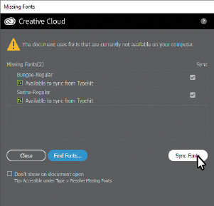
If you can’t get the fonts to sync, you can go to the Creative Cloud desktop application
and choose Assets > Fonts to see what the issue may be (refer to the section “Changing
font family and font style” in Lesson 8, “Adding Type to a Poster,” for more information on how to resolve it).
You can also just click Close in the Missing Fonts dialog box and ignore the missing
fonts as you proceed. A third method is to click the Find Fonts button in the Missing
Fonts dialog box and replace the fonts with a local font on your machine. You can
also go to Help (Help > Illustrator Help) and search for “Find missing fonts.”
Note: You will need an Internet connection to sync fonts.
-
Choose View > Zoom Out to make the finished artwork smaller. Adjust the window size,
and leave it on your screen as you work. (Use the Hand tool [ ] to move the artwork where you want it in the window.) If you don’t want to leave
the image open, choose File > Close.
] to move the artwork where you want it in the window.) If you don’t want to leave
the image open, choose File > Close.
To begin working, you’ll open an existing art file.
-
Choose File > Open. In the Open dialog box, navigate to the Lessons > Lesson12 folder,
and select the L12_start.ai file on your hard disk. Click Open to open the file.
The L12_start.ai file uses the same fonts as the L12_end.ai file. If you’ve synced
the fonts already, you don’t need to do it again. If you didn’t open the L12_end.ai
file, then the Missing Fonts dialog box will most likely appear for this step. Click
Sync Fonts to sync all of the missing fonts to your computer. After they are synced
and you see the message stating that there are no more missing fonts, click Close.
Note: For help on resolving any missing fonts, refer to step 4.
-
Choose File > Save As, name the file BikeTours.ai, and select the Lesson12 folder. Leave the Format option set to Adobe Illustrator
(ai) (macOS) or the Save As Type option set to Adobe Illustrator (*.AI) (Windows)
and then click Save.
-
In the Illustrator Options dialog box, leave the Illustrator options at their default
settings and then click OK.
-
Choose Reset Essentials from the workspace switcher in the Application bar to reset
the workspace.
Note: If you don’t see Reset Essentials in the workspace switcher menu, choose Window >
Workspace > Essentials before choosing Window > Workspace > Reset Essentials.
-
Choose View > Fit Artboard In Window.
Using the Appearance panel
An appearance attribute is an aesthetic property—such as a fill, stroke, transparency, or effect—that affects
the look of an object but does not affect its basic structure. Up to this point, you’ve
been changing appearance attributes in the Properties panel, Swatches panel, and more.
Appearance attributes like these can also be found in the Appearance panel for selected
artwork. In this lesson, you’ll focus on using the Appearance panel to apply and edit
appearance attributes.
-
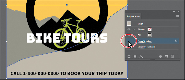
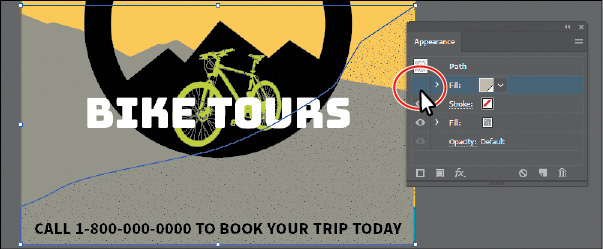
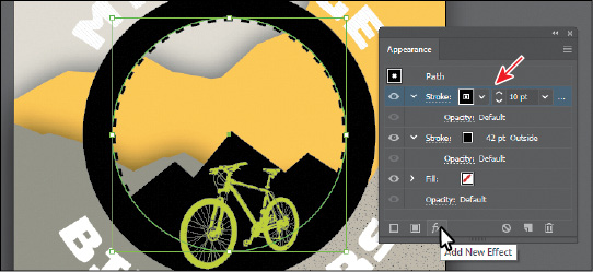
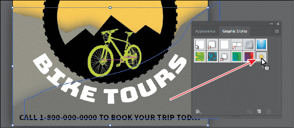
Select the Selection tool ( ), and click to select the orange shape in the background, behind the “CALL 1-800...”
text.
), and click to select the orange shape in the background, behind the “CALL 1-800...”
text.
-
Click More Options ( ) in the Appearance section of the Properties panel on the right (an arrow is pointing
to it in the following figure) to open the Appearance panel.
) in the Appearance section of the Properties panel on the right (an arrow is pointing
to it in the following figure) to open the Appearance panel.
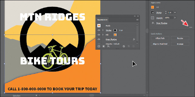
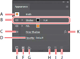
The Appearance panel shows what the object is (a path) and the appearance attributes
applied to it (Stroke, Fill, Drop Shadow, and Opacity).
 Tip: You may want to drag the bottom of the Appearance panel down to make it taller, like
I did.
Tip: You may want to drag the bottom of the Appearance panel down to make it taller, like
I did.
The different options available in the Appearance panel are described here:
Tip: You can also choose Window > Appearance to see the Appearance panel.
- Selected object and thumbnail
- Attribute row
- Visibility column
- Link to options
- Add New Stroke
- Add New Fill
- Add New Effect
- Clear Appearance
- Duplicate Selected Item
- Delete Selected Item
- Indicates an effect applied
The Appearance panel (Window > Appearance) can be used to view and adjust the appearance
attributes for a selected object, group, or layer. Fills and strokes are listed in
stacking order; top to bottom in the panel correlates to front to back in the artwork.
Effects applied to artwork are listed from top to bottom in the order in which they
are applied to the artwork. An advantage of using appearance attributes is that they
can be changed or removed at any time without affecting the underlying artwork or
any other attributes applied to the object in the Appearance panel.
Editing appearance attributes
You’ll start by changing the appearance of artwork using the Appearance panel.
-
With the orange shape selected, in the Appearance panel, click the orange Fill color
box in the fill attribute row as many times as needed, until the Swatches panel appears.
Select the swatch named “Mountain1” to apply it to the fill. Press the Escape key
to hide the Swatches panel.
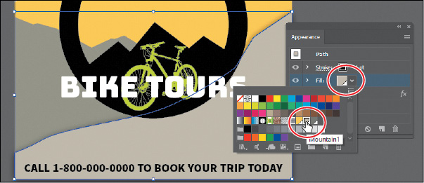
Note: You may need to click the Fill box more than once to open the Swatches panel. The
first click on the Fill box selects the Fill row in the panel, and the next click
shows the Swatches panel.
-
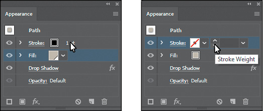
Click the words “1 pt” in the Stroke row to show the Stroke Weight option. Change
the stroke weight to 0 to remove it (the Stroke Weight field will be blank or show
“0 pt” when it’s 0).
-
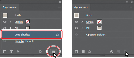
Click the visibility column ( ) to the left of the Drop Shadow attribute name in the Appearance panel.
Tip: In the Appearance panel, you can drag an attribute row, such as Drop Shadow, to the
Delete Selected Item button ( ) to delete it, or you can select the attribute row and click the Delete Selected
Item button.
) to delete it, or you can select the attribute row and click the Delete Selected
Item button.
Appearance attributes can be temporarily hidden or deleted so that they no longer
are applied to the selected artwork.
Tip: You can view all hidden attributes (attributes you have turned off) by choosing Show
All Hidden Attributes from the Appearance panel menu ( ).
).
-
With the Drop Shadow row selected (click to the right of the link “Drop Shadow” if
it isn’t selected), click the Delete Selected Item button ( ) at the bottom of the panel to completely remove the shadow, rather than just turning
off the visibility.
) at the bottom of the panel to completely remove the shadow, rather than just turning
off the visibility.
Adding another stroke and fill to artwork
Artwork in Illustrator can have more than one stroke and fill applied. This can be
a great way to add interesting design elements. You’ll now add another fill to an
object using the Appearance panel.
-
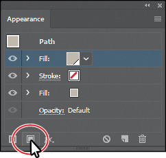
With the shape still selected, click the Add New Fill button ( ) at the bottom of the Appearance panel.
The figure shows what the panel looks like after clicking the Add New Fill button.
A second Fill row is added to the Appearance panel. By default, new fill or stroke
attribute rows are added directly above a selected attribute row or, if no attribute
rows are selected, at the top of the Appearance panel list.
-
Click the bottom (original) Fill color box in the fill attribute row a few times, until the Swatches
panel appears. Click the pattern swatch named “USGS 22 Gravel Beach” to apply it to
the original fill. Press the Escape key to hide the Swatches panel.
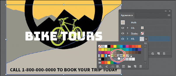
The pattern won’t show in the selected artwork because the second fill you added in
the first step is covering the “USGS 22 Gravel Beach” fill. The two fills are stacked
on each other.
Tip: Other ways to close panels that appear when clicking an underlined word, like “Stroke,”
include pressing the Escape key, clicking the Stroke attribute row, or pressing Enter
or Return.
-
Click the eye icon to the left of the top fill attribute row to hide it.
You should now see the pattern fill in the shape. In the next section, you’ll reorder
the attribute rows in the Appearance panel so the pattern will be on top of the color
fill.
-
Click where the eye icon was to the left of the top fill attribute row to show it.
Next, you’ll add another stroke to a shape using the Appearance panel. This can be
a great way to achieve interesting design effects with just one object.
-
With the Selection tool () selected, click to select the black circle that will become a bicycle tire.
-
Click the Add New Stroke button ( ) at the bottom of the Appearance panel.
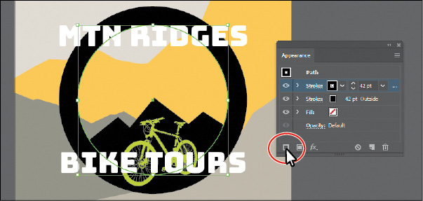
A second stroke, which is a copy of the original, is now applied to the selected circle.
This is a great way to add interest to your designs without having to make copies
of shapes, changing the formatting (stroke in this case), and putting them on top
of each other.
-
With the new (top) stroke attribute row selected, change the stroke weight to 10 pt.
-
Click the word “Stroke” in the same attribute row to open the Stroke panel. Click
the Align Stroke To Center button ( ), select Dashed Line, and ensure that Dash is set to 12 pt. Press the Escape key
to hide the Stroke panel.
), select Dashed Line, and ensure that Dash is set to 12 pt. Press the Escape key
to hide the Stroke panel.
Clicking underlined words in the Appearance panel, as in the Properties panel, shows
more formatting options—usually a panel such as the Swatches or Stroke panel. Appearance
attributes, such as Fill or Stroke, can have other options, such as Opacity or an
effect applied to only that attribute. These additional options are listed as a subset
under the attribute row and can be shown or hidden by clicking the disclosure triangle
( ) on the left end of the attribute row.
-
Choose Select > Deselect.
Adding another stroke and fill to text
Adding multiple strokes and fills to text can be a great way to add interest to your
text. Next, you’ll add another fill to text.
-
Select the Type tool ( ), and select the text “MTN RIDGES.”
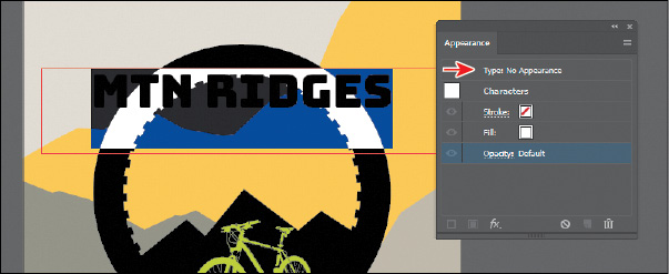
Notice that “Type: No Appearance” appears at the top of the Appearance panel. This
is referring to the type object, not the text within.
You will also see the word “Characters.” Formatting for the text (not the type object)
is listed below the word “Characters.” You should see the stroke (none) and the fill
(white). Also notice that you cannot add another stroke or fill to the text since
the Add New Stroke and Add New Fill buttons are dimmed at the bottom of the panel.
To add a new stroke and/or fill to text, you need to select the type object, not the
text within.
-
Select the Selection tool (). The type object will now be selected (not the text).
Tip: You could also click “Type: No Appearance” at the top of the Appearance panel to
select the type object (not the text within).
-
Click the Add New Fill button ( ) at the bottom of the Appearance panel to add another fill above the word “Characters.”
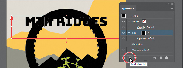
Once again, “Characters” refers to the formatting for the text within the text object.
If you were to double-click the word “Characters,” you would select the text and see
the formatting options for it (fill, stroke, etc.).
-
Click the fill attribute row to select it, if it’s not already selected. Click the
Fill color box, and select the pattern swatch named “USGS 8B Intermit. Pond.” Press
the Escape key to hide the swatches.
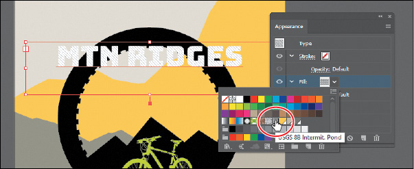
Note: If you are wondering why I would name a swatch “USGS 8B Intermit. Pond,” know that
I didn’t. That pattern swatch can be found in Illustrator by default (Window > Swatch
Libraries > Patterns > Basic Graphics > Basic Graphics_Textures).
-
Click the disclosure triangle () to the left of the same fill row to show other properties, if necessary. Click the
word “Opacity” to show the Transparency panel and change Opacity to 20%. Press the Escape key to hide the Transparency panel.
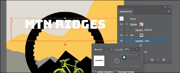
Each appearance row (stroke, fill) has its own opacity that you can adjust. The bottom
Opacity appearance row affects the transparency for the entire selected object.
Tip: Depending on which attribute row is selected in the Attributes panel, the options
in panels, such as the Properties panel, Gradient panel, and others, will affect the
attribute selected.
-
Leave the type object selected.
Reordering appearance attributes
The ordering of the appearance attribute rows can greatly change how your artwork
looks. In the Appearance panel, fills and strokes are listed in stacking order—top
to bottom in the panel correlates to front to back in the artwork. You can reorder
attribute rows in a way similar to dragging layers in the Layers panel to rearrange
the stacking order. Next, you’ll change the appearance of artwork by reordering attributes
in the Appearance panel.
-
Select the Selection tool () and click to select the bottom tan shape behind the “CALL 1-800...” text.
-
In the Appearance panel, drag the bottom fill attribute row (with the pattern swatch
applied) up above the original Fill attribute row. When a line appears above the Fill
attribute row, release the mouse button to see the result.
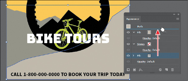
Moving the new Fill attribute above the original Fill attribute changes the look of
the artwork. The pattern fill is now on top of the solid color fill.

Tip: You can also apply blending modes and opacity changes to each Fill row to achieve
different results.
-
Choose Select > Deselect and then choose File > Save.
Using live effects
Note: When you apply a raster effect, the original vector data is rasterized using the
document’s raster effects settings, which determine the resolution of the resulting
image. To learn about document raster effects settings, search for “Document raster
effects settings” in Illustrator Help.
Effects alter the appearance of an object without changing the underlying artwork.
Applying an effect adds the effect to the object’s appearance attribute, which you
can edit, move, delete, or duplicate, at any time, in the Appearance panel.

Artwork with a drop-shadow effect applied.
There are two types of effects in Illustrator: vector effects and raster effects. In Illustrator, click the Effect menu item to see the different types of effects
available.
-
Illustrator Effects (vector): The top half of the Effect menu contains vector effects. You can apply these effects
only to vector objects or to the fill or stroke of a bitmap object in the Appearance
panel. The following vector effects can be applied to both vector and bitmap objects:
3D effects, SVG filters, Warp effects, Transform effects, Drop Shadow, Feather, Inner
Glow, and Outer Glow.
-
Photoshop Effects (raster): The bottom half of the Effect menu contains raster effects. You can apply them to
either vector or bitmap objects.
In this section, you will first explore how to apply and edit effects. You will then
explore a few of the more widely used effects in Illustrator to get an idea of the
range of effects available.
Applying an effect
Effects are applied using the Properties panel, the Effect menu, and the Appearance
panel, and they can be applied to objects, groups, or layers. You are first going
to learn how to apply an effect using the Effect menu, and then you will apply an
effect using the Properties panel.
-
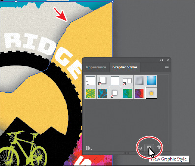
With the Selection tool () selected, click the yellow background shape and Shift-click the grayish-brown background
shape beneath it on the artboard. Arrows are pointing to them in the figure.
-
Choose Object > Group.
By grouping the objects before applying an effect, the effect is applied to the group,
not the individual objects. You’ll see later that if you ungroup, the effect will be
removed.
-
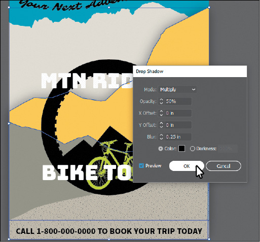
Choose Effect > Stylize > Drop Shadow from the Illustrator Effects section of the
menu that appears. In the Drop Shadow dialog box, change the following options:
-
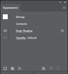
Select Preview to see the drop shadow applied to the group. Click OK.
Since the drop shadow is applied to the group, it appears around the perimeter of
the group, not on each object independently. If you look in the Appearance panel right
now, you’ll see the word “Group” at the top and the Drop Shadow effect applied. The
word “Contents” refers to the content within the group. Each object in a group can
have its own appearance properties.
-
Choose File > Save, and leave the group selected.
Editing an effect
Note: If you attempt to apply an effect to artwork that already has the same effect applied,
Illustrator will warn you that you are about to apply the same effect.
Effects are live, so they can be edited after they are applied to an object. You can
edit the effect in the Properties panel or Appearance panel by selecting the object
with the effect applied and then clicking the name of the effect or, in the Appearance
panel, double-clicking the attribute row. This displays the dialog box for that effect.
Changes you make to the effect update in the artwork. In this section, you will edit
the Drop Shadow effect applied to the group of background shapes.
-
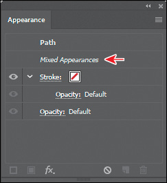
With the group still selected, choose Object > Ungroup to ungroup the shapes, and
leave them both selected.
Notice that the drop shadow is no longer applied to the artwork. When an effect is
applied to a group, it affects the group as a whole. If the objects are no longer
grouped together, the effect is no longer applied. In the Appearance panel, you’ll
see “Mixed Appearances.” This means that more than one path is selected currently
and they have different appearances (different fills, for instance).
-
With the shapes selected (and ungrouped), choose Effect > Apply Drop Shadow.
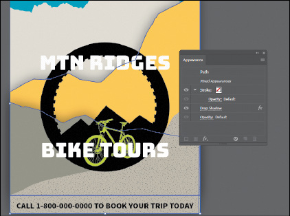
The Apply Drop Shadow menu item applied the last used effect with the same options
set. The Drop Shadow effect is now applied to each selected object independently.
Tip: If you were to choose Effect > Drop Shadow, the Drop Shadow dialog box would appear,
allowing you to make changes before applying the effect.
-
With the shapes still selected, click the text “Drop Shadow” in the Appearance panel.
Note: You could also select each shape independently to edit the Drop Shadow effect in
the Appearance panel.
-
In the Drop Shadow dialog box, change Opacity to 75%. Select Preview to see the change and then click OK.
Styling text with a Warp effect
Text can have all sorts of effects applied, including Warp, like you saw in Lesson 8, “Adding Type to a Poster.” Next, you will use a Warp effect to warp text. The difference between the warp
you applied in Lesson 8 and this Warp effect is that this one is an effect and can be turned on and off,
edited, or removed easily.
-
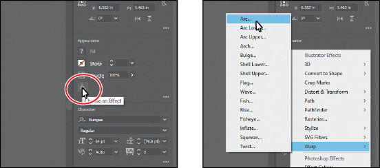
With the Selection tool () selected, click the text “MTN RIDGES” and Shift-click the “BIKE TOURS” text.
-
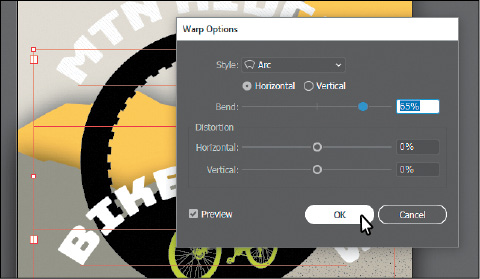
Click the Effect option ( ) in the Appearance section of the Properties panel. Choose Warp > Arc.
-
In the Warp Options dialog box, to create an arcing effect, set Bend to 65%. Select Preview to preview the changes. Try choosing other styles from the Style
menu and then return to Arc. Try adjusting the Horizontal and Vertical Distortion
sliders to see the effect. Make sure that the Distortion values are returned to 0 and then click OK.
-
Choose Select > Deselect.
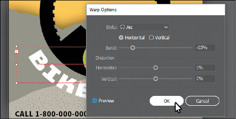
-
Click the “BIKE TOURS” text. In the Appearance panel, click the “Warp: Arc” text in
the Properties panel (or Appearance panel) to edit the effect. In the Warp Options
dialog box, change Bend to {{#}}8211;65%. Click OK.
Editing text with a Warp effect
You can edit text with a Warp effect applied, but sometimes it’s easier to turn off
the effect, make the change to the text, and then turn the effect back on.
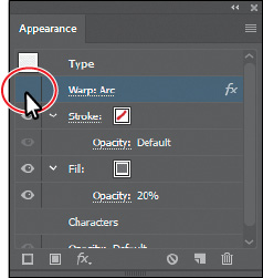
-
With the Selection tool () selected, click the “MTN RIDGES” type object. Click the visibility icon ( ) to the left of the Warp: Arc row in the Appearance panel to temporarily turn off
the effect.
) to the left of the Warp: Arc row in the Appearance panel to temporarily turn off
the effect.
Notice that the text is no longer warped on the artboard (see the following figure).
-
Select the Type tool ( ) in the Tools panel, and change the text to “MTN RIDGE.”
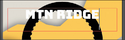
-
Select the Selection tool () in the Tools panel. This selects the type object, not the text.
-
Click the visibility column to the left of the Warp: Arc row in the Appearance panel
to turn on visibility for the effect so that the text is once again warped.
-
In the Appearance panel, click the “Warp: Arc” text to edit the effect. In the Warp
Options dialog box, change Bend to 64%. Click OK.
Note: You may want to move the text closer or farther from the black wheel shape by pressing
an arrow key a few times.
-
Choose Select > Deselect and then choose File > Save.
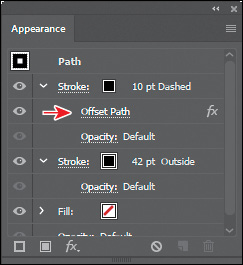
Applying the Offset Path effect
Next, you will offset the dashed stroke you applied to the bicycle tire (the black
circle). This process allows you to create the appearance of multiple stacked shapes.
-
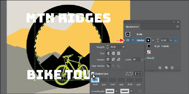
With the Selection tool () selected, click the black circle to select it.
-
Click the Stroke row in the Appearance panel with the 10 pt Dashed stroke applied
to select it.
-
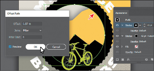
With the stroke attribute row selected in the Appearance panel, click the Add New
Effect button ( ) at the bottom of the panel, and choose Path > Offset Path.
-
In the Offset Path dialog box, change Offset to 0.57 in, select Preview, and then click OK.
-
In the Appearance panel, click the disclosure triangle () to the left of the words “Stroke: 10 pt Dashed” to toggle it open (if it’s not already
open).
Notice that the Offset Path effect is a subset of Stroke. This indicates that the
Offset Path effect is applied to only that stroke.
-
Choose Select > Deselect.
-
Choose File > Save.
Applying a Photoshop effect
As described earlier in the lesson, raster effects generate pixels rather than vector
data. Raster effects include SVG filters, all of the effects in the bottom portion
of the Effect menu, and the Drop Shadow, Inner Glow, Outer Glow, and Feather commands
in the Effect > Stylize submenu. You can apply them to either vector or bitmap objects.
Next, you’ll apply a Photoshop effect (raster) to some of the background shapes.
-
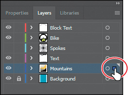
In the Layers panel (Window > Layers), click the selection column to the right of
the Mountains layer to select the layer contents.
-
Click the Properties panel tab to show the panel again.
-
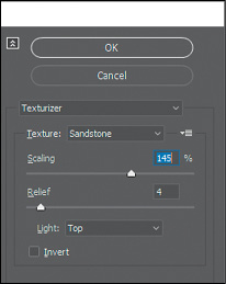
Click the Effect option () in the Appearance section of the Properties panel. Choose Texture > Texturizer.
When you choose most of the raster (Photoshop) effects (not all), the Filter Gallery
dialog box opens. Similar to working with filters in Adobe Photoshop, where you can
also access a Filter Gallery, in the Illustrator Filter Gallery, you can try different
raster effects to see how they affect your artwork.
-
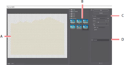
With the Filter Gallery dialog box open, you can see the type of filter (Texturizer)
showing at the top. Choose Fit In View from the view menu in the lower-left corner
of the dialog box. That should fit the artwork in the preview area so you can see
how the effect alters one of the shapes.
The Filter Gallery dialog box, which is resizable, contains a preview area (labeled
A), effect thumbnails that you can click to apply (labeled B), settings for the currently
selected effect (labeled C), and the list of effects applied (labeled D). If you want
to apply a different effect, expand a category in the middle panel of the dialog box
(labeled B), and click an effect thumbnail.
-
Change the Texturizer settings in the upper-right corner of the dialog box as follows
(if necessary):
Tip: You can click the eye icon ( ) to the left of the name “Texturizer” in the section labeled “D” to see the artwork
without the effect applied.
) to the left of the name “Texturizer” in the section labeled “D” to see the artwork
without the effect applied.
Note: The Filter Gallery lets you apply only one effect at a time. If you want to apply
multiple Photoshop effects, you can click OK to apply the current effect and then
choose another from the Effect menu.
-
Click OK to apply the raster effect to all four shapes.
-
Choose Select > Deselect.
Working with 3D effects 
To learn about other working with 3D effects, check out the video Working with 3D Effects that is a part of the Web Edition. For more information, see the “Web Edition” section
of “Getting Started” at the beginning of the book.
Using graphic styles
A graphic style is a saved set of appearance attributes that you can reuse. By applying graphic styles,
you can quickly and globally change the appearance of objects and text.
The Graphic Styles panel (Window > Graphic Styles) lets you create, name, save, apply,
and remove effects and attributes for objects, layers, and groups. You can also break
the link between an object and an applied graphic style to edit that object’s attributes
without affecting other objects that use the same graphic style.
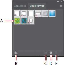
The different options available in the Graphic Styles panel are described here:
- Graphic Style thumbnail
- Graphic Styles Libraries menu
- Break Link To Graphic Style
- New Graphic Style
- Delete Graphic Style
For example, if you have a map that uses a shape to represent a city, you can create
a graphic style that paints the shape green and adds a drop shadow. You can then use
that graphic style to paint all the city shapes on the map. If you decide to use a
different color, you can change the fill color of the graphic style to blue. All the
objects that use that graphic style are then updated to blue.
Applying an existing graphic style
You can apply graphic styles to your artwork from graphic style libraries that come
with Illustrator. Next, you’ll explore some of the built-in graphic styles and apply
a few to artwork.
-
Choose Window > Graphic Styles. Click the Graphic Styles Libraries Menu button ( ) at the bottom of the panel, and choose Vonster Pattern Styles.
Tip: Use the arrows at the bottom of the Vonster Pattern Styles library panel to load
the previous or next Graphic Styles library in the panel.
-
With the Selection tool (), select the bottom background mountain shape.
-
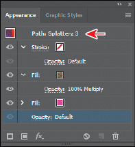
Click the Splatterz 2 style and then click the Splatterz 3 graphic style in the Vonster
Pattern Styles panel. Close the Vonster Pattern Styles panel.
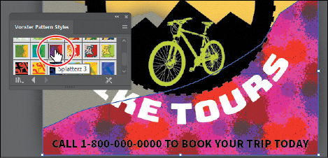
Clicking the styles applies the appearance attributes to the selected artwork and
adds both graphic styles to the Graphic Styles panel for the active document.
-
With the artwork still selected, look in the Appearance panel to see the fills applied
to the selected artwork. Also notice “Path: Splatterz 3” at the top of the panel.
This indicates that the graphic style named Splatterz 3 is applied.
-
Click the Graphic Styles panel tab to show the panel again.
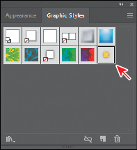
You should see the two graphic styles, Splatterz 2 and Splatterz 3, listed in the
panel now.
-
Right-click and hold down the mouse button on the Splatterz 2 graphic style thumbnail
in the Graphic Styles panel to preview the graphic style on the selected artwork.
When you’re finished previewing, release the mouse button.
Previewing a graphic style is a great way to see how it will affect the selected object,
without actually applying it.
Creating and applying a graphic style
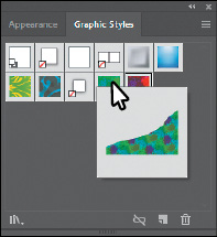
Now you’ll create a new graphic style and apply that graphic style to artwork.
-
With the Selection tool selected, click the yellow shape that the arrow is pointing
to in the following figure.
Tip: To create a graphic style, you can also click to select the object that you are using
to make the graphic style. You can then either drag the object directly into the Graphic
Styles panel or, in the Appearance panel, drag the appearance thumbnail at the top
of the listing into the Graphic Styles panel. The panels can’t be in the same panel
group.
-
Click the New Graphic Style button ( ) at the bottom of the Graphic Styles panel.
The appearance attributes from the selected shape are saved as a graphic style.
-
In the Graphic Styles panel, double-click the new graphic style thumbnail. In the
Graphic Style Options dialog box, name the new style Mountain. Click OK.
-
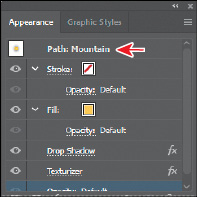
Click the Appearance panel tab, and at the top of the Appearance panel you’ll see
“Path: Mountain.”
This indicates that a graphic style named “Mountain” is applied to the selected artwork.
-
With the Selection tool, click the bottom rectangle shape in the background (beneath
the “Call 1-800...” text). In the Graphic Styles panel, click the graphic style named
“Mountain” to apply the styling.
-
Leave the shape selected and then choose File > Save.
Updating a graphic style
Once you create a graphic style, you can update the graphic style, and all artwork
with that style applied will update its appearance as well. If you edit the appearance
of artwork that a graphic style is applied to, the graphic style is overridden, and
the artwork will not update when the graphic style is updated.
-
With the bottom yellow shape still selected, look in the Graphic Styles panel; you
will see that the Mountain graphic style thumbnail is highlighted (has a border around
it), indicating that it’s applied.
-
Click the Appearance panel tab. Notice the text “Path: Mountain” at the top of the
panel, indicating that the Mountain graphic style is applied. Like you saw earlier,
this is another way to tell whether a graphic style is applied to selected artwork.
-
Click the yellow fill color box a few times to open the Swatches panel. Select the
swatch named Mountain2. Press the Escape key to hide the swatches.
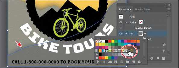
Notice that the “Path: Mountain” text at the top of the Appearance panel is now just
“Path,” telling you that the graphic style is no longer applied to the selected artwork.
-
Click the Graphic Styles panel tab to see that the Mountain graphic style no longer
has a highlight (border) around it, which means that the graphic style is no longer
applied.
-
Press the Option (macOS) or Alt (Windows) key, and drag the selected shape on top
of the Mountain graphic style thumbnail in the Graphic Styles panel. Release the mouse
button and then release the modifier key when the thumbnail is highlighted. Both mountain
shapes now look the same since the Mountain graphic style was applied to both objects.
-
Choose Select > Deselect.
-
Click the Appearance panel tab. You should see “No Selection: Mountain” at the top
of the panel (you may need to scroll up).
When you apply appearance settings, graphic styles, and more to artwork, the next
shape you draw will have the same appearance settings listed in the Appearance panel
as the previous one.
-
Click to select the top shape in the background that has the Mountain graphic style
applied. An arrow is pointing to it in the following figure.
-
Click the fill color for the Fill appearance row, and in the Swatches panel that appears,
select the Mountain1 swatch.

-
Choose Select > Deselect and then choose File > Save.
Applying a graphic style to a layer
Note: If you apply a graphic style to artwork and then apply a graphic style to the layer
(or sublayer) that it’s on, the graphic style formatting is added to the appearance
of the artwork—it’s cumulative. This can change the artwork in ways you didn’t expect,
since applying a graphic style to the layer will be added to the formatting of the
artwork.
Tip: In the Layers panel, you can drag a target icon to the Trash button ( ) at the bottom of the Layers panel to remove the appearance attributes.
When a graphic style is applied to a layer, everything added to that layer has that
same style applied to it. Now you’ll apply a drop shadow graphic style to the layer
named Block Text; this will apply the style to all the contents of that layer at once.
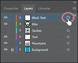
-
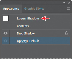
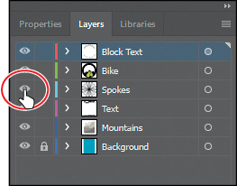
In the Layers panel, click the target icon ( ) for the Block Text layer.
This selects the layer content and targets the layer for any appearance attributes.
-
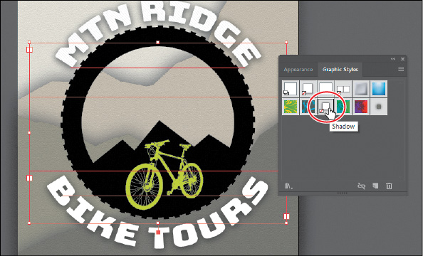
Click the Graphic Styles panel tab, and then click the graphic style named “Shadow”
to apply the style to the layer and all its contents.
The target icon in the Layers panel for the Block Text layer is now shaded.
-
Click the Appearance panel tab, and you should see, with all of the artwork on the
Block Text layer still selected, the words “Layer: Shadow.”
This is telling you that the layer target icon is selected in the Layers panel and
that the Shadow graphic style is applied to that layer.
Note: If you want to edit the drop shadow applied to either of the text objects, you can
do this a few ways. You can click the target icon in the Layers panel to see the Drop
Shadow effect in the Appearance panel, or you can select the artwork (text object
in this case) and click Layer: Shadow in the Appearance panel to see the appearance
properties for the layer and then click Drop Shadow.
Tip: In the Graphic Styles panel, graphic style thumbnails that show a small box with
a red slash ( ) indicate that the graphic style does not contain a stroke or fill. It may just be
a drop shadow or outer glow, for instance.
) indicate that the graphic style does not contain a stroke or fill. It may just be
a drop shadow or outer glow, for instance.
-
Choose Select > Deselect and then choose File > Save.
Scaling strokes and effects
In Illustrator, by default, when scaling (resizing) content, any strokes and effects
that are applied do not change. For instance, suppose you scale a circle with a 2-pt.
stroke from small to the size of the artboard. The shape may change size, but the
stroke will remain 2 pt. by default. That can change the appearance of scaled artwork
in a way that you didn’t intend, so you’ll need to watch out for that when transforming
artwork. Next, you’ll make the spokes group larger.
-
Choose View > Fit Artboard In Window, if necessary.
-
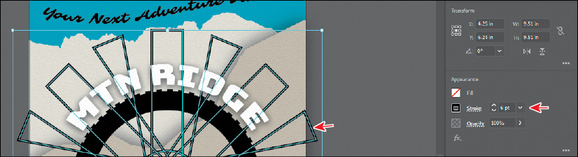
In Layers panel, click in the visibility column for the layer named “Spokes” to show
the artwork.
This shows a large group of wheel spokes on the artboard.
-
Click the spokes artwork, and notice the stroke weight of 6 pt in the Properties panel.
-
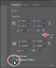
Click More Options in the Transform section of the Properties panel, and select Scale
Strokes & Effects at the bottom of the panel that appears.
Without this option selected, scaling the spokes would not affect the stroke weights
or effects when it is scaled. You are selecting this option so that the spokes will
scale smaller and not remain the same stroke weight.
-
Click the Constrain Width And Height Proportions button ( ) to ensure it’s active (
 ). Change Width (W) to 5 inches. Press the Tab key to move to the next field. The height should change proportionally
with the width.
). Change Width (W) to 5 inches. Press the Tab key to move to the next field. The height should change proportionally
with the width.
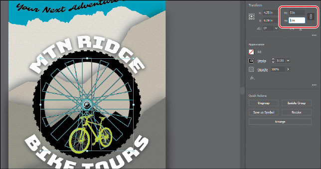
After scaling the spokes, if you look at the stroke weight in the Properties panel,
you will see that it has changed (scaled).
-
Choose Select > Deselect.
-
Choose File > Save and then choose File > Close.


 ), the fill color (if there is one) in the text will override the color of the graphic
style.
), the fill color (if there is one) in the text will override the color of the graphic
style.
 ) or Add New Fill button (
 ) in the Properties panel or at the bottom of the Appearance panel, and then choosing
the effect from the menu that appears.
) in the Properties panel or at the bottom of the Appearance panel, and then choosing
the effect from the menu that appears.