
In earlier chapters we discussed the concepts of peak-and-trough progression, support and resistance, trendlines, and rudimentary volume characteristics. These are all basic building blocks of price pattern construction. Now it’s time to put them all together to gain a better understanding of how we recognize, interpret, and appreciate the significance of specific formations. For a more complete, in-depth discussion of price patterns, their underlying psychology, and significance, please refer to Martin Pring on Price Patterns (McGraw-Hill, 2005).
The concept of price patterns is demonstrated in Figures 8.1 and 8.2. Figure 8.1 represents a typical market cycle in which there are three trends: up, sideways, and down. The sideways trend is essentially a horizontal or transitional one, which separates the two major market movements.
FIGURE 8.1 Top and Bottom Reversals

FIGURE 8.2 Reversal on a Dime
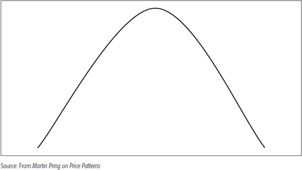
Sometimes, a highly emotional market can change without warning, as in Figure 8.2, but this rarely happens. Consider a fast-moving train, which takes a long time to slow down and then go into reverse; the same is normally true of financial markets.
To the market technician, the transitional phase has great significance because it marks the turning point between a rising and a falling market. If prices have been advancing, the enthusiasm of the buyers has outweighed the pessimism of sellers up to this point, and prices have risen accordingly. During the transition phase, the balance becomes more or less even until finally, for one reason or another, it is tipped in a new direction as the relative weight of selling pushes the trend (of prices) down. At the termination of a bear market, the reverse process occurs.
These transition phases are almost invariably signaled by clearly definable price patterns or formations whose successful completion alerts the technician to the fact that a reversal in trend has taken place.
This phenomenon is illustrated in Figure 8.3, which shows the price action at the end of a long rising trend. As soon as the price rises above line BB, it is in the transitional area, although this is apparent only sometime after the picture has developed.
FIGURE 8.3 Trading Range Reversal
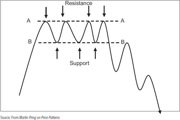
Once into the area, the price rises to line AA, which is a resistance area. The word “resistance” is used because at this point the price shows opposition to a further rise. When the demand/supply relationship comes into balance at AA, the market quickly turns in favor of the sellers because prices react. This temporary reversal may occur because buyers refuse to pay up for a security, or because the higher price attracts more sellers, or for a combination of these two reasons. The important fact is that the relationship between the two groups is temporarily reversed at this point.
Following the unsuccessful assault on AA, prices turn down until line BB, known as a support level, is reached. Just as the price level at AA reversed the balance in favor of the sellers, so the support level BB alters the balance again. This time, the trend moves in an upward direction, for at BB, prices become relatively attractive for buyers who missed the boat on the way up, while sellers who feel that the price will again reach AA hold off. For a while, there is a stand-off between buyers and sellers within the confines of the area bounded by lines AA and BB. Finally, the price falls below BB, and a major new (downward) trend is signaled.
To help explain this concept, the contest between buyers and sellers is like a battle fought by two armies engaged in trench warfare. In Figure 8.4, example a, armies A and B are facing off. Line AA represents army A’s defense, and BB is army B’s line of defense.
FIGURE 8.4 Trench Warfare
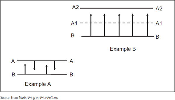
The arrows indicate the forays between the two lines as both armies fight their way to the opposing trench but are unable to penetrate the line of defense. In the second example, army B finally pushes through A’s trench. Army A is then forced to retreat and make a stand at the second line of defense (line AA2). In the markets, line AA represents selling resistance, which, once overcome, signifies a change in the balance between buyers and sellers in favor of the buyers, so that prices will advance quickly until new resistance is met. The second line of defense, line AA2, represents resistance to a further advance.
On the other hand, army B might quite easily break through AA2, but the further it advances without time to consolidate its gains, the more likely it is to become overextended and the greater is the probability of its suffering a serious setback. At some point, therefore, it makes more sense for this successful force to wait and consolidate its gains.
If prices extend too far without time to digest their gains, they, too, are more likely to face a sharp and seemingly unexpected reversal.
The transitional or horizontal phase separating rising and falling price trends discussed earlier is a pattern known as a rectangle. This corresponds to the “line” formation developed from Dow theory. The rectangle in Figure 8.5, marking the turning point between the bull and bear phases, is termed a reversal pattern.
FIGURE 8.5 Downside Breakout Signal
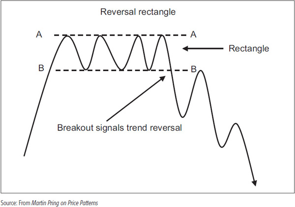
Reversal patterns at market tops are known as distribution areas or patterns (where the security is “distributed” from strong, informed participants to weak, uninformed ones), and those at market bottoms are called accumulation patterns (where the security passes from weak, uninformed participants to strong, informed ones. In Figure 8.6 we see a completed pattern with a victory for the buyers as the price pushed through line AA.
FIGURE 8.6 Upside Breakout Signal
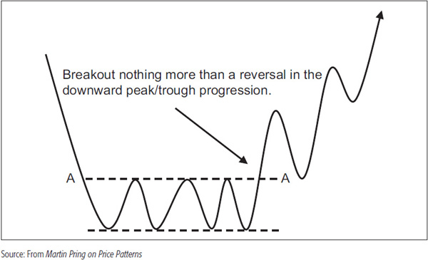
Note that as the price moves through AA, the series of declining peaks and troughs reverses to one of rising peaks and troughs. On the other hand, in Figure 8.7, the price breaks to the upside, reinforcing the series of rising peaks and troughs that precede the formation of the rectangle, thereby reaffirming the underlying trend.
FIGURE 8.7 Upside Continuation Breakout Signal
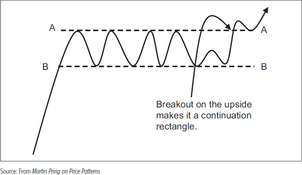
In this case, the corrective phase associated with the formation of the rectangle would temporarily interrupt the bull market. Such formations are referred to as consolidation or continuation patterns. An example of a bearish continuation rectangle is shown in Chart 8.1 for the copper price and Chart 8.2 for the Dow Jones Rail Average.
CHART 8.1 Copper Featuring a Consolidation Rectangle
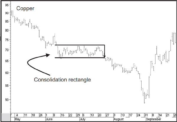
CHART 8.2 Dow Jones Rail Average 1946. This chart shows a classic rectangle as traced out by the Dow Jones Rail Average at the peak of the 1942–1946 bull market. Note the declining trend of volume as reflected by the declining dashed line during the formation of the rectangle. Worth special attention is the saucer like formation of the volume during the late July to early August rally. The expansion of activity accompanying the downside breakout in late August signals the successful completion of this pattern.

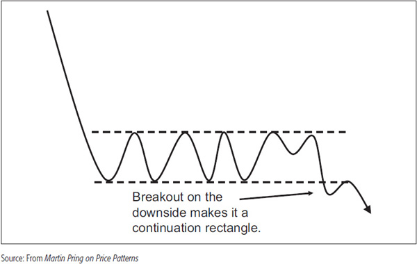
During the period of formation, there is no way of knowing in advance which way the price will ultimately break; therefore, it should always be assumed that the prevailing trend is in existence until it is proved to have been reversed. Figure 8.8 shows an example of a continuation rectangle that develops in a downtrend.
FIGURE 8.8 Downside Continuation Breakout Signal
The principles of price pattern construction and interpretation can be applied to any time frame, right from one-minute bars all the way through to monthly or even annual charts. However, the significance of a price formation is a direct function of its size and depth.
Thus, a pattern that shows up on a monthly chart is likely to be far more significant than one plotted with intraday data and so forth. It is just as important to build a strong base from which prices can rise as it is to build a large, strong, deep foundation upon which to construct a skyscraper. In the case of financial market prices, the foundation is an accumulation pattern that represents an area of indecisive combat between buyers and sellers. The term “accumulation” is used because market bottoms always occur when the news is bad. In markets, such an environment stimulates sales by uninformed investors who were not expecting developments to improve. During an accumulation phase, more sophisticated investors and professionals would be positioning or accumulating the asset concerned in anticipation of improved conditions for the security in question six to nine months ahead. During this period, the security in question is moving from weak, uninformed traders or investors into strong and knowledgeable ones. At market tops, the process is reversed, as those who were accumulating at or near the bottom sell to less sophisticated market participants, who become more and more attracted as prices rise. For equities, this might develop because business conditions improve and forecasts for the economy are revised upward. Thus, the longer the period of accumulation, the greater the amount of a security that moves from weak into strong hands, and the larger is the base from which prices can rise. The reverse is true at market tops, where a substantial amount of distribution inevitably results in a protracted period of price erosion or base building.
The time taken to complete a formation is important because of the amount of an asset changing hands and also because a movement in price beyond the boundaries of a pattern means that the balance between buyers and sellers has altered. When the price action has been in a stalemate for a long time and investors have become used to buying at one price and selling at the other, a move beyond either limit represents a fundamental change, which has great psychological significance. A great example of a very long rectangle is shown in Chart 8.3 for the CRB Composite.
CHART 8.3 CRB Composite 1957–1982. This chart features a multiyear rectangle breakout that took place in 1972. There was no way of predicting the character of the rally, but the length of the rectangle indicated that something big was likely afoot.

There was every probability that a breakout from such a pattern would be followed by a good move, but there was no indication that prices would rise so sharply over such a brief period of time.
The depth of a formation also determines its significance. Consider the trench warfare analogy once more. If the opposing trenches are very close together—say, within 100 yards—this means that the victorious assault, when it comes, will be less significant than if the armies are separated by several miles, for in that case, the battles will have been much more intense and the victory that much greater. The same is true in the financial markets. The breeching of a wide trading range has far greater psychological significance than does a narrow one.
Most of the results obtained with technical analysis procedures do not indicate the eventual magnitude of a trend. Price patterns are the exception, since their construction offers some limited forecasting possibilities. Pretty well all price patterns obtain measuring objectives from their depth. The rectangle is no exception. Figure 8.9 shows a rectangle that has formed and completed a (distribution) top.
FIGURE 8.9 Rectangle Top Measuring Objective
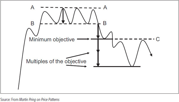
The measuring implication of this formation is the vertical distance between its outer boundaries, i.e., the distance between lines AA and BB projected downward from line BB.
In many cases, the price trend will extend beyond the objective. In really strong moves, it will travel in multiples of it. We can take the process a step further by stating that the various multiples of the objective itself can become important potential support and resistance areas in their own right. Time and again, these price objective areas turn out to be important support or resistance points. Unfortunately, there is no way to determine where the actual juncture point will be for any rally or reaction. This emphasizes the principle that in technical analysis there is no known way of consistently determining the magnitude of a price movement. It is only possible to speculate on the probability that a specific area will prove to be a support or resistance zone. Consequently, while this measuring formula offers a rough guide, it is usually a minimum expectation.
Having established the fact that price patterns offer price objectives when completed, it is also important to revisit the options of arithmetic and logarithmic scaling covered earlier.
If you recall, arithmetic scaling involves using the same vertical distance for equal point amounts so that the difference in space between 2 and 4 is the same as that between 20 and 22. This compares to ratio or logarithmic scaling, where the same vertical distance plots the same proportionate move. Thus, for example, one inch might represent a 20 percent price move at whatever level it takes place.
The importance of using logarithmic scales whenever possible is shown in Figures 8.10 and 8.11. In Figure 8.10, the price traced out and broke down from a rectangle. Projecting the vertical distance between 200 and 100 downward gives an objective of 0, clearly a very unlikely possibility.
FIGURE 8.10 Measuring Implications Using an Arithmetic Scale
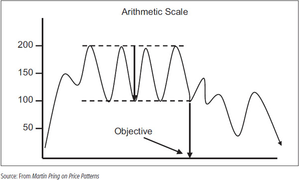
FIGURE 8.11 Measuring Implications Using a Logarithmic Scale

On the other hand, Figure 8.11 uses the same projection based on a logarithmic scale. In this case, a more realistic objective of 50 is obtained.
It is important to remember that market prices are a function of psychological attitudes toward fundamental events. Since these attitudes have a tendency to move proportionately, it makes sense to plot them on a scale that reflects proportionate moves equally. Clearly, this distinction has little effect on very shortterm (2 to 6 weeks) or intraday charts, but since you do not know exactly when it will, it’s definitely a good idea to set your charting software to ratio as a default.
If a rectangle appears as a bottom reversal pattern, the measuring rules remain consistent with the example given for the distribution formation. The only difference is that we project the objective and multiples of the objective in an upward direction, not downward. The exact same principles also apply to continuation rectangles. Figure 8.12 shows an upside breakout from a rectangle that forms during a bullish trend.
FIGURE 8.12 Upside Continuation Rectangle Measuring Objective
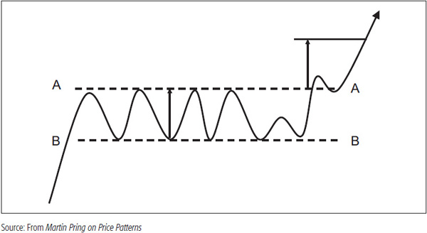
Note in this case that the price does not immediately reach its upside objective, but does so after a small rally and reaction. This is why the objective is described by the term “ultimate.” Most people buy the breakout on the assumption that they will make more or less instant profits as the price moves straight to the objective, but that is not necessarily the case.
In many cases, the price will move beyond the objective. In really strong moves, it will move in multiples of the objective, where the various multiples or the objective itself become important support and resistance areas.
So far, it has been assumed that any move out of the price pattern, however small, constitutes a valid signal of a trend reversal (or resumption, if the pattern is one of consolidation). Quite often, misleading moves known as whipsaws occur, so it is helpful to establish certain criteria to minimize the possibility of misinterpretation. Conventional wisdom holds that you should wait for a 3 percent penetration of the boundaries before concluding that the breakout is valid. This filters out a substantial number of misleading moves, even though the resulting signals are less timely.
This approach was developed in the first part of the twentieth century when holding periods for market participants were much longer. Today, with the popularity of intraday charts, 3 percent could represent the complete move and then some! I have no basic objection to the 3 percent rule for longer-term price movements in which the fluctuations are much greater. However, the best approach is a common sense one based on experience and judgment in each particular case. It would be very convenient to be able to say that anything over a specific percentage amount represents a valid breakout, but unfortunately, a lot depends on the time frame being considered and the volatility of the specific security.
For example, electric utilities are very stable in their price action compared to mining stocks, where the volatility is far greater. Applying the same percentage breakout rule to both obviously doesn’t make sense. What constitutes a decisive breakout, where the odds of a whipsaw are considerably reduced, is then very much a matter of personal judgment based on experience, trial, and error. This judgment should take into consideration such factors as the type of trend being monitored, the volatility of the security, volume, and momentum characteristics.
Another factor that can help early on in deciding if a breakout is valid is the fact that a good breakout should hold for several periods. For example, you may observe a decisive upside breakout from a rectangle on a daily chart, but if it cannot hold for more than one day above the breakout level, the signal is highly suspect. Often, the technical position is worse after such breakouts because breakouts that cannot hold indicate exhaustion and exhaustion moves are often followed by strong price trends in the opposite direction to that indicated by the (false) breakout.
On entering any trade or investment based on a price pattern breakout, it is important to decide ahead of time what type of price action would cause you to conclude that the breakout was a whipsaw. In effect, this will be below a support level for an upside breakout and below a resistance zone for a downward one. For this you can draw on the information contained in Chapter 5 on support and resistance. An example of a false upside breakout might be a penetration of a previous minor low, a decline below a predetermined level from the breakout point, or the rupture of a minor up trendline. Some possibilities are featured in Figure 8.13.
FIGURE 8.13 Identifying a Whipsaw Breakout

A stop should then be placed below the support level. In this way, you will have calculated the loss you are willing to undertake and the point where the original premise for the trade, i.e., the breakout, is no longer operative. Failure to make such a decision ahead of time will mean that your decision to sell is more likely to be based on emotion and kneejerk reactions to news events than on a logical preset plan.
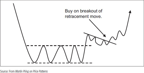
Retracement Moves A great deal of the time, when the price breaks out from a pattern, the initial thrust is followed by a corrective move back to the upper or lower reaches of the formation, depending on the direction of the breakout. This is known as a retracement move, and it offers an additional entry point, often under substantially less emotional conditions. The retracement serves two functions. First, it helps to correct the excessive emotion associated with the breakout and brings people back to earth. From here, it is then possible for the new trend to extend on a sounder basis. Second, it acts as a test of the breakout. A downside retracement will find support at the breakout point and an upside retracement will find resistance in the lower boundary of the pattern as these two zones reverse their former roles.
Retracements, then, represent normal price behavior, and although they can be frustrating, are nothing to get concerned about. Indeed, the breakout itself is often a volatile illiquid affair, as one side or the other heads for the entrance or exit, depending on its direction. As a result, orders are often executed with horrendous fills. Price activity during the retracement process, on the other hand, is relatively quieter. This means that buying or selling can be undertaken in a much more controlled environment. Figure 8.14 shows that it is often a good idea to wait for a retracement in a rising trend and buy as the price signals that the retracement is over.
FIGURE 8.14 Buy on the Retracement Breakout
Cancellations If the minimal objective proves to be the ultimate extension of the new trend, a substantial amount of accumulation or distribution, whichever is appropriate, will typically have to occur before prices can move in their previous direction. Thus, a 2-year rectangle might be completed and the downward price objective reached. Even though further price erosion does not take place, it is still technically necessary for a base (accumulation) of approximately the same size as the previous distribution (in this case, 2 years) to be formed before a valid uptrend can take place. An example is shown in Figure 8.15, where an upside breakout is cancelled by a downside one.
FIGURE 8.15 Cancellation

The word technically has been emphasized because that is not always the case, and there are lots of examples where large distribution formations have been cancelled by small ones and vice versa. That means if you can spot a cancellation, pay attention to the signal and look around at the other indicators to see if they agree. If so, go with the cancellation, as it’s probably telling the truth.
So far, we have just considered price in our analysis, but volume is an important independent variable that can help us obtain a more accurate reflection of crowd psychology. To quickly recap, volume typically goes with the trend, i.e., it expands with a rising trend of prices and falls with a declining one. This is a normal relationship, and anything that diverges from it should be considered a warning sign that the prevailing price trend may be in the process of reversing. Volume is always measured in relation to the recent past. Thus, heavy volume relates to volume 20 to 30 bars or so ago, not to volume, say, 10 years ago, where institutional changes may have permanently increased the level of activity.
In the case of the rectangle, and with most other patterns, it is normal for the trend of volume to contract as the formation develops. Activity may continue to fluctuate along with the price, but with the benefit of hindsight we would expect to see the various peaks and troughs of volume shrink as the pattern develops, along the lines of Figure 8.16. As it nears completion, disinterest prevails and volume often dries up.
FIGURE 8.16 Volume Trend Shrinks as the Rectangle Is Being Formed

The quality of an accumulation formation is certainly improved if volume expands on the upside break. Sometimes it is even possible to draw a trendline joining the lower volume peaks, as shown in Figure 8.16.
It is this upward surge in trading activity that confirms the validity of the breakout because it flags the enthusiasm of buyers. A similar move on low and declining volume would be suspect and would result in its failure to move with the trend. An example is shown in Figure 8.17.
FIGURE 8.17 Shrinking Volume on an Upside Breakout Is Bearish

In this instance, volume definitely declines as the price is breaking out. Such action typically signals that prices are advancing more on a lack of sellers than strong enthusiastic buyers. As the price starts to slip, volume picks up noticeably, suggesting that this is happening because of selling pressure. It is a definite sign that increases the possibility that the breakout is a whipsaw.
In many instances you will see charts where successful upside breakouts develop with no obvious change in activity, either on the upside or downside. Unfortunately, this is a fact of life. Thus, a good volume expansion is a desirable, but not necessarily a mandatory, condition for a valid breakout. It certainly increases the odds, but other indicators such as oscillators could also tip the balance. If volume declines on the breakout, as in Figure 8.17, this is more than a missing piece of positive evidence and is, actually, a negative factor. Figure 8.18 shows a downside breakout from a rectangle.
FIGURE 8.18 Expanding Volume on a Downside Breakout Is Bearish

The same shrinking volume characteristics during the development of the pattern are present as for the bullish variety. However, volume characteristics on the breakout are less critical. This is because it is normal for it to contract as prices decline. Thus, contracting volume on a breakdown is perfectly normal. What is not typical, though, is for it to expand on a downside move. This in itself suggests that sellers are more motivated and therefore adds a negative flavor to the pattern. More often than not, prices will reverse and put on a small recovery or retracement rally following the downside breakout (Figure 8.19).
FIGURE 8.19 Volume Should Shrink on the Retracement Rally
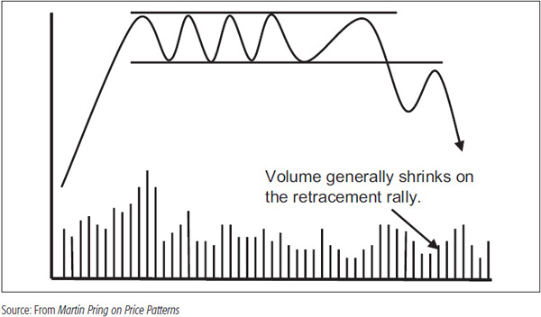
This advance is invariably accompanied by declining volume, which itself reinforces the bearish indications. It is halted at the lower end of the rectangle, which now becomes an area of resistance. The same idea of declining volume should accompany a retracement move that follows an upside breakout. Figure 8.20 shows an example where both price volatility and volume shrink dramatically.
FIGURE 8.20 Narrow Rectangle and Nonexistent Volume Are Often Followed by a Sharp Move
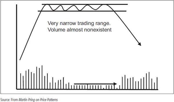
This combination indicates an extremely fine balance between buyers and sellers that takes place over an extended period. Normally, a price objective is determined by the depth of the formation. In this case, though, the finely balanced supply/demand situation is usually followed by a far greater and sharper move than that indicated by the normal measuring techniques. Figure 8.20 dramatizes a sharp downside breakout, but the principle of rapidly declining volume followed by a huge expansion applies equally as well to an upside breakout. In this instance, volume typically explodes as we move from a situation in which there is virtually no interest by either party to one in which buyers cannot get enough of the security at any price. Such are the ingredients for the start of a dramatic rally. An example is shown in Chart 8.4 of the U.S.-traded St. Jude Medical, where a very narrow rectangle developed with a dramatic drop in volume. When activity expanded, a short but sharp rally followed.
CHART 8.4 St. Jude Medical Featuring a Consolidation Rectangle

Finally, Chart 8.5 features Moser Baer, an Indian stock, that shows the formation of a rectangle top. It meets the minimum requirement of trendline touches, so the lines as support or resistance areas are not that significant in themselves.
CHART 8.5 Moser Baer 2006–2008 Rectangle Completion with Multiple Objectives
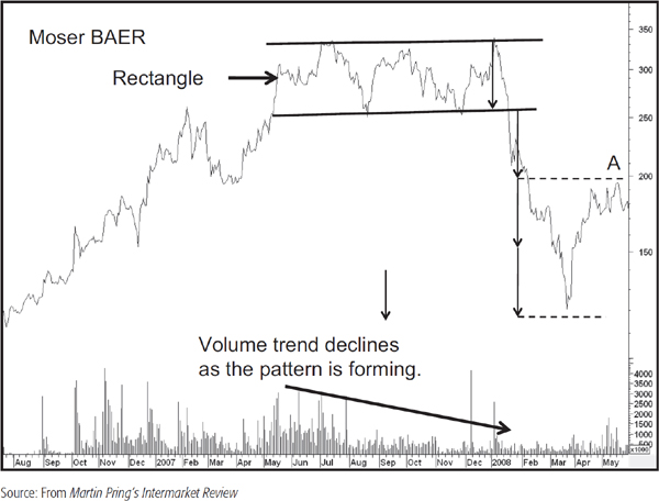
During the formation of the rectangle, the odd day experienced an expansion in volume, but the overall trend is a declining one. The fact that prices fell so sharply after the breakout is testament to the fact that volume does not necessarily have to expand on the downside. Prices can just as easily fall due to a lack of bids. Note also that while the price almost reached three times its objective, the level of the actual objective (A) became a resistance area on the way back up. Consequently, it’s always a good idea to measure for these objectives at the outset because you can never be sure where prices might find timely reversal points.
A lot of the time, we find price moves following breakouts from consolidation patterns to be quite substantial, often more so than from reversal patterns. That’s because reversal patterns need to build up some momentum, whereas momentum was already in place prior to the formation of the consolidation pattern.
At Tops Head and shoulders (H&S) are probably the most reliable of all chart patterns. They occur at both market tops and market bottoms. Figure 8.21 shows a typical head-and-shoulders distribution pattern. (See also Chart 8.6.)
FIGURE 8.21 Classic H&S Top

CHART 8.6 The New York Times Average, 1928. This chart of the New York Times average of 50 railroad and industrial stocks shows the formation of an upward-sloping H&S during March, April, and May 1928. The minimum downside objective of about 182 was achieved fairly quickly, but a three-month period of base building commensurate with the H&S pattern was still necessary before the effect of the distribution was cancelled out and prices were able to resume their primary advance. Note the heavy volume on the left shoulder and head and the relatively low volume on the right shoulder. Also, activity declined substantially during the formation of the triangle, but began to expand during the breakout in September; a bullish expansion in such a volatile manner was a strong warning of the underlying weakness. A small right-angled broadening formation seemed to develop in July and August, but this would eventually prove to be the left shoulder of a 2½-month H&S pattern, the completion of which terminated the long bull market. Triangles and broadening formations are discussed later.
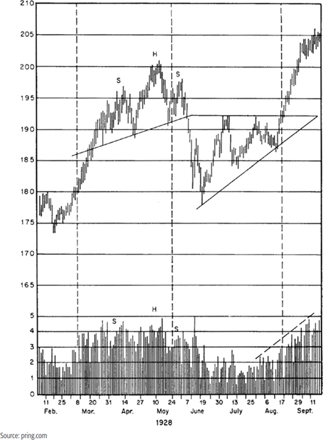
It consists of a final rally (the head) separating two smaller, although not necessarily identical, rallies (the shoulders). If the two shoulders were trends of intermediate duration, the first shoulder would be the penultimate advance in the bull market, and the second the first bear market rally. The head would, of course, represent the final intermediate rally in the bull market.
Volume characteristics are of critical importance in assessing the validity of these patterns. Activity is normally heaviest during the formation of the left shoulder and also tends to be quite heavy as prices approach the peak. The real tip-off that an H&S pattern is developing comes with the formation of the right shoulder, which is invariably accompanied by distinctly lower volume. Quite often, the level of volume contracts as the peak of the right shoulder is reached. The line joining the bottoms of the two shoulders is called the neckline.
If you look carefully at Figure 8.21, you will appreciate that the violation of the neckline also represents a signal that the previous series of rising peaks and troughs has now given way to at least one declining peak and trough. The right shoulder represents the first lower peak and the bottom of the move following the breakdown, a lower trough.
The measuring formula for this price formation is the distance between the head and the neckline projected downward from the neckline, as shown in Figure 8.21. It follows that the deeper the pattern, the greater its bearish significance once it has been completed. Sometimes, a head-and-shoulders completion will be followed by a fairly extensive downtrend; at other times, the negative effect of the pattern will be quickly cancelled by the completion of a base.
Often, traders will observe the formation of a head-and-shoulders top and anticipate a breakdown. This is an incorrect tactic based on this evidence alone because it is not known until later whether the prevailing trend will continue or if a reversal signal will be given with a decisive break below the neckline. Over the years, I have seen many analysts who should know better forecast a bearish trend based on an incomplete head-and-shoulders top. Remember, in technical analysis, the prevailing trend is assumed to be in force until the weight of the evidence proves otherwise. An incomplete head and shoulders is not evidence, just a possible scenario. Moreover, since a right shoulder rally should be accompanied by a trend of shrinking volume, one that develops under the context of heavy volume provides a clue that the “top” will fail.
H&S patterns can be formed in 10 to 15 minutes or can take decades to develop. Generally speaking, the longer the period, the greater the amount of distribution that has taken place, and, therefore, the longer the ensuing bear trend is likely to be. The larger H&S formations are often very complex and comprise several smaller ones, as shown in Figure 8.22.
FIGURE 8.22 Complex H&S
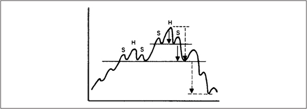
The H&S patterns illustrated in Figures 8.21 and 8.22 have a horizontal neckline, but there are many other varieties (as Figure 8.23 shows), all of which possess the same bearish implications as the horizontal variety once they have been completed.
FIGURE 8.23 H&S Variations

Chart 8.6 shows a classic H&S pattern that formed in the middle of 1928.
At Bottoms Figure 8.24 shows an H&S pattern at a market bottom; this is usually called an inverse H&S, a reverse H&S, or an H&S bottom.
FIGURE 8.24 Classic Reverse H&S
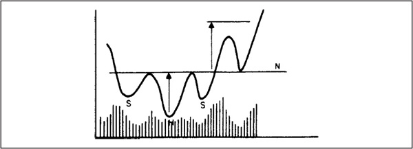
Normally, volume is relatively high at the bottom of the left shoulder and during the formation of the head. The major factor to watch for is activity on the right shoulder, which should contract during the decline to the trough and expand substantially on the breakout (see Chart 8.7).
CHART 8.7 DJIA 1898. This downward-sloping, inverse H&S pattern developed in the spring of 1898. Note that the April rally developed on very low volume. The subsequent reaction successfully tested the March low, and the ensuing breakout rally was accompanied by a bullish expansion of volume.
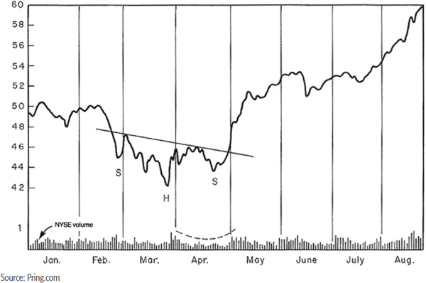
That’s an ideal situation, but it is surprising how many successful breakouts develop under circumstances where the volume does not expand noticeably. If it contracts on the breakout rally, that is a definite no-no and is a strong sign that the breakout is likely to fail. Like the H&S distribution patterns, the inverse (accumulation) H&S can have a number of variations in trendline slope, number of shoulders, etc. Usually, the more complex the formation, the greater its significance. This goes back to the idea that price formations represent battles between buyers and sellers; the more battles that take place, i.e., the greater the complexity, the more significant the new trend once the battle has been resolved. Some of these reverse head-and-shoulders variations are shown in Figure 8.25.
FIGURE 8.25 Reverse H&S Variations

H&S patterns are extremely reliable formations, and their successful completion usually gives an excellent indication of a trend reversal.
H&S and reverse H&S formations occasionally show up on the charts as continuation patterns. Measuring implications and volume characteristics are the same as for the reversal type. The only difference is that these patterns develop during a trend rather than at the end. Chart 8.8, featuring AEP Industries, shows a great example of a continuation reverse head and shoulders, complete with a huge expansion of volume just before and just after the breakout. Substantial markup phases such as this are not uncommon following these continuation formations.
CHART 8.8 AEP Industries 2011–2012 Featuring a Reverse Head and Shoulders

We have already established that prices are determined by crowd psychology. Individuals can and do change their minds; so can crowds, and therefore, markets. As a result, what might appear to be a perfectly valid head-and-shoulders breakout one day may well turn out to be a whipsaw the next. This is generally not the case, but any trader or investor who does not recognize the ability of markets to reverse otherwise perfectly legitimate signals is in a state of delusion.
The first step is to make sure that the pattern you are following is indeed a legitimate formation. For example, the price action may exhibit all the characteristics of an H&S distribution pattern, but the price refuses to penetrate the neckline. We have already established that until the formation is completed with a decisive break below the neckline, it is not a true pattern. This is because the neckline represents a support area, and support has not been violated. In the case of a horizontal formation, failure to penetrate the neckline also means that the series of rising peaks and troughs is still intact.
Chart 8.9 features a reverse head and shoulders for Albertson’s that did not work. The price rallied up to the (solid) neckline for a final time in mid-2002, but was unable to push through.
CHART 8.9 Albertsons 1998–2003 Featuring a Failed Inverse Head-and-Shoulders Pattern
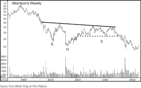
The dashed trendline is there to indicate that the final part of the head and the potential inverse right shoulder actually formed a head-and-shoulders top. Often, it is possible to spot these technical situations where the glass is half full or half empty. In this case, it was half empty, and the price declined.
Failures used to be fairly rare, but they now appear to be more common, which indicates the necessity of waiting for a decisive breakout on the downside (or the upside in the case of a reverse head and shoulders). They typically develop when the pattern suggests a break in the opposite direction to the then-prevailing trend. Obviously, if this is the actual top or bottom, the formation will be valid. However, when a head-and-shoulders top forms in a bull market and does not experience a meaningful decline, this will tend to be a countercyclical signal. In fact, the very failure of the pattern may be interpreted as a sign that the prevailing (dominant) trend probably is still in force.
There are several points in the chart where the probabilities of a valid signal sink below 50 percent and those of an outright failure start to increase. Figures 8.26 and 8.27 try to address these points. Point A in Figure 8.26 represents the bottom following the break below the neckline.
FIGURE 8.26 Identifying an H&S Failure
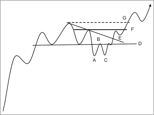
FIGURE 8.27 Identifying an Inverse Head-and-Shoulders Failure

The next rally, which ends at B, is a perfectly typical development because retracements are a normal, and indeed healthy, phenomenon. The price then falls to C and something unexpected happens: Instead of following through on the downside, as would be expected from a head-and-shoulders top, the price rises back to the neckline again. This is the first sign that things may not work out as expected. When the price once again rallies back above the neckline (D), the odds of a failure increase. The balance tips more to the bullish side when the price moves above the down trendline joining the head with the right shoulder (E). This is probably the time to cover all shorts, since the reason for going short in the first place—i.e., the breakdown—no longer exists. The nature of the trendline will have a great deal to do with the change in probabilities. For example, if the line is steep and has been touched only twice, it will have nowhere near as much significance as it would if it were shallow and had been touched several times. A refresher on trendline interpretation in Chapter 6 would be a good idea at this point.
The next line of defense is the right shoulder. If the price can rally above this point (F), then in some cases, it will now be experiencing a series of rising peaks and troughs. Finally, when the price moves above the head, the pattern is cancelled beyond a reasonable doubt.
If action on the long side is contemplated, it should be taken either when the price breaks above the trendline joining the head and the right shoulder (line E) or when it breaks above the right shoulder (F) on heavy volume. Usually, such signals offer substantial profits in a very short period of time and are well worth acting on. Again, some common sense comes into play, for if the trendline joining the head and the right shoulder is unusually steep and has been touched only twice, it will not have the authority of a shallower trendline that has been touched or approached on numerous occasions.
Inverse H&S patterns can also fail, as we see from Figure 8.27.
Again, the failure is usually followed by a fairly lengthy decline as participants who bought in anticipation of an upward breakout are flushed out when the new bearish fundamentals become more widely known. Note that the line joining the head with the right shoulder is more significant in this example than that in Figure 8.26. That’s because the line is shallower and has been touched on more occasions. The joint break with the neckline is also impressive and would greatly increase the odds of a failed pattern. The move below F obviously puts the issue beyond any reasonable doubt.
Chart 8.10 shows a failed head-and-shoulders top for Andrew Corp. This one developed during a very strong linear bull market.
CHART 8.10 Andrew Corp. 1993–1994 Featuring a Failed Head-and-Shoulders Top

The first indication of failure would have been given when the price broke back above the neckline after forming a small base. The clincher developed when the dashed trendline joining several rally peaks was bettered on the upside. Failed patterns are often followed by dynamic moves in the opposite direction to that indicated by the pattern. The rationale for this lies in the fact that market participants who bought or sold short, depending on the direction of the whipsaw, are caught on the wrong side of the market and are forced to liquidate. As a result, false moves should be viewed not with fear, but as an opportunity for profits. The degree of opportunity will depend on the strength of the signal and the closeness at which a realistic stop can be placed (the perceived risk). In this case, the trendline was a very strong one, and a stop could have been placed just below the low of the breakout day. Provided it was bought pretty close to the breakout point, this would have represented a very low-risk, potentially high-reward trade.
A double top consists of two peaks separated by a reaction or valley in prices. Its main characteristic is that the second top is formed with distinctly less volume than the first (see Figure 8.28 and Chart 8.11).
FIGURE 8.28 Double Top
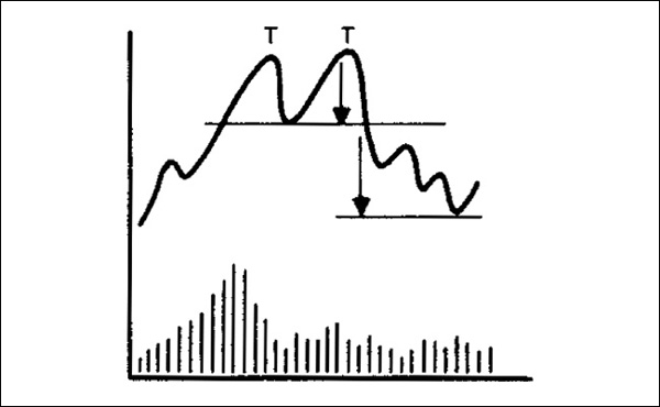
CHART 8.11 DJIA 1936–1937 Double Top. Following a substantial advance from 1932, the first post-Depression bull market ended in 1937. The chart shows a classic double top. Note that the volume during the July-to-August rally was substantially below that of the January-to-March peak.

It is normal for both peaks to form at the same price level, but it is also possible for the second peak to slightly exceed the first or to top out just a little below it. Remember, this is not an exact science, but a common sense interpretation of a battle between buyers and sellers.
Minimum downside measuring implications for double tops, as shown in Figure 8.28, are similar to H&S patterns.
A double bottom is shown in Figure 8.29. This type of pattern is typically accompanied by high volume on the first bottom, very light volume on the second, and very heavy volume on the breakout.
FIGURE 8.29 Double Bottom
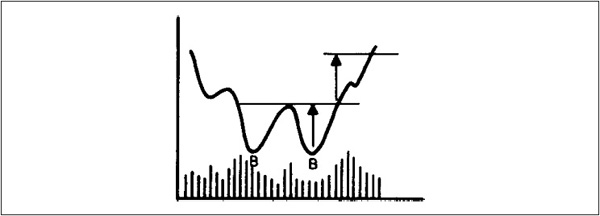
Usually, the second bottom is formed above the first, but these formations are equally valid whether or not the second reaction reaches (or even slightly exceeds) the level of its predecessor.
“Double” patterns may extend to form triple tops or bottoms, or sometimes even quadruple or other complex formations. Some variations are shown in Figure 8.30.
FIGURE 8.30 Triple Tops and Bottoms

In some instances, it may be difficult to differentiate between a head and shoulders, rectangle, or triple top and bottom. That is not important. What is important is the fact that such formations represent a battle between buyers and sellers. When one side or the other wins out with a reversal in the peak/trough progression or the violation of a trendline, that’s what is significant. Remember, we give these patterns specific names for identification purposes. If a formation, say, breaks in a bearish way, it does not matter what you call it—it’s bearish and likely to lead to lower prices. That’s really the lesson to take home.
The measuring implications of all these patterns are derived by calculating the distance between the peak (trough) and lower (upper) end of the pattern and projecting this distance from the neckline. Chart 8.12 Shows a classic double bottom in the DJIA in 1974 and 1962.
CHART 8.12 DJIA 1962. This chart depicts a classic double bottom in the DJIA, which formed during 1962. Note that the second one was accompanied by lower volume than the first. While volume expanded during the breakout, the increase in activity was not particularly spectacular.

Broadening formations occur when a series of three or more price fluctuations widen out in size so that peaks and troughs can be connected with two diverging trendlines. The easiest types of broadening formations to detect are those with a “flattened” bottom or top, as shown in examples a and b in Figure 8.31.
FIGURE 8.31 Right-Angled Broadening Formations
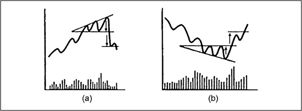
The patterns in Figure 8.31 are sometimes referred to as a right-angled broadening formation. Since the whole concept of widening price swings suggests highly emotional activity, volume patterns are difficult to characterize, though at market tops, volume is usually heavy during the rally phases. The patterns at both bottoms and tops are similar to the H&S variety, except that the “head” in the broadening formation is always the last to be formed. A bear signal comes with a decisive downside breakout. Volume can be heavy or light, but additional negative emphasis arises if activity expands at this point.
Since a broadening formation with a flattened top is an accumulation pattern, volume expansion on the breakout is an important requirement, as shown in example b in Figure 8.31. Examples of broadening formations are shown in Chart 8.13 for WW Grainger and Chart 8.14 for the copper price.
CHART 8-13 WW Grainger: A Right-Angled Broadening Formation. This chart shows that it is not always possible to draw the outer boundaries of the pattern so that they connect all the peaks and troughs exactly. The most important thing is to make sure that the bottoms diverge and that the tops form at roughly the same level. The concept is one of growing instability on the downside that is “unexpectedly” reversed to the upside.
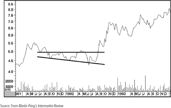
CHART 8.14 Copper 2000–2002. It Features Two Broadening Formations
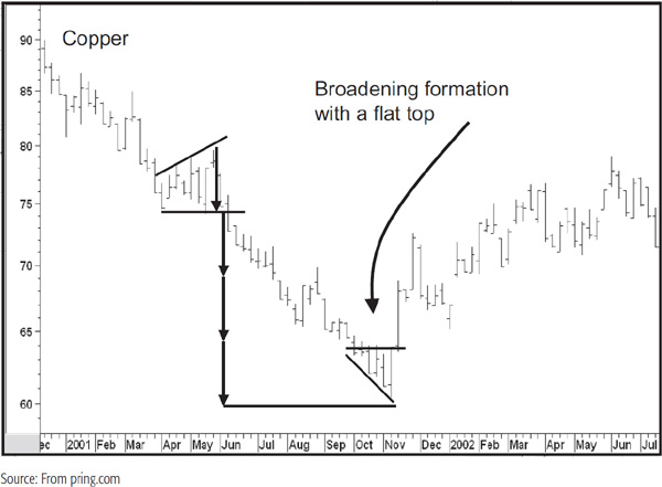
Notice how the bearish one exceeded its price objective by three times. That third multiple proved to be the end of the decline, following which a bullish broadening formation was formed. The power of these patterns can also be appreciated from Chart 8.14, which shows the formation of another right-angled pattern coming off the 2009 bottom. These two types of broadening formations can also develop as consolidation patterns. A bullish one is featured in Figure 8.32.
FIGURE 8.32 Consolidation Right-Angled Broadening Formation
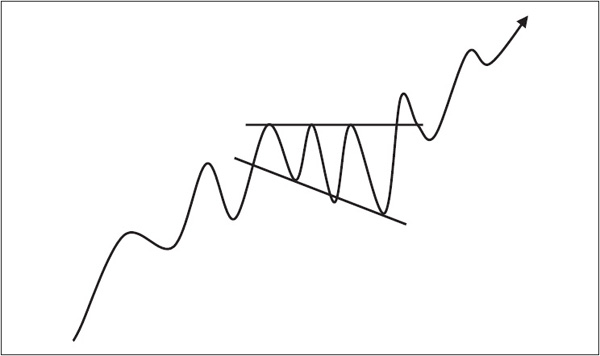
Broadening formations occasionally fail to work. Possibilities are shown in Figure 8.33. Unfortunately, there does not appear to be a reliable point beyond which it is safe to say that the pattern has failed to operate. The best defense in such cases is to extend the diverging trendlines, i.e., the dashed lines in Figure 8.33, and await a decisive penetration by the price as confirmation.
FIGURE 8.33 Broadening Formation Failures

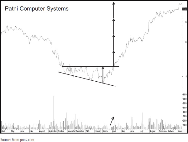
When completed, right-angled broadening formations of both the reversal and the continuation type result in a particularly dynamic move. It is almost as if they are aborted H&S formations in which the move is so powerful that there is not time to complete the right shoulder. An example of a bullish right-angled broadening formation, where the price objective was achieved multiple times, is shown in Chart 8.15 for Patni Computers.
CHART 8.15 Patni Computers 2007–2008. Broadening Formation with Multiple Price Objectives
A variation on the right angled broadening formation is the broadening wedge. These patterns are similar in that they consist of two diverging trendlines, but instead of one of them being constructed at an angle of 90 degrees, it slopes up (or down in the case of a bullish pattern) but at a smaller angle of ascent (descent), as shown in Figures 8.34 and 8.35.
FIGURE 8.34 Bearish Broadening Wedge
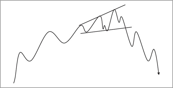
FIGURE 8.35 Bullish Broadening Wedge
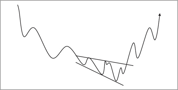
The measuring implications and other characteristics are identical to those of the right-angled variety.
The final type of broadening formation, known as an orthodox broadening top, is shown in Figure 8.36.
FIGURE 8.36 Orthodox Broadening Formation
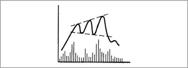
This pattern comprises three rallies, with each succeeding peak higher than its predecessor, and each peak separated by two bottoms, with the second bottom lower than the first. Orthodox broadening formations are associated with market peaks rather than market troughs.
These patterns are extremely difficult to detect until some time after the final top has been formed, since there is no clearly definable level of support where the violation of which could serve as a benchmark. The violent and emotional nature of both price and volume swings further compounds the confusion and increases the complexity of defining these situations. Obviously, a breakout is difficult to pinpoint under such conditions, but if the formation is reasonably symmetrical, a decisive move below the descending trendline joining the two bottoms, or even a decisive move below the second bottom, usually serves as a timely warning that an even greater decline is in store.
Measuring implications are similarly difficult to determine, but normally, the volatile character of a broadening top formation implies the completion of a substantial amount of distribution. Consequently, price declines of considerable proportion usually follow the successful completion of such patterns. The problem is that they are quite rare and do not show up on the charts very often.
Triangles, the most common of all the price patterns discussed in this chapter, are unfortunately the least reliable. They may be consolidation or reversal formations, and fall into two categories: symmetrical and right-angled.
A symmetrical triangle is composed of a series of two or more rallies and reactions in which each succeeding peak is lower than its predecessor, and the bottom from each succeeding reaction is higher than its predecessor (see Figure 8.37).
FIGURE 8.37 Symmetrical Triangles

A triangle is, therefore, the opposite of a broadening formation, since the trendlines joining peaks and troughs converge, unlike the (orthodox) broadening formation, in which they diverge.
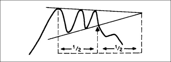
These patterns are also known as coils, because the fluctuation in price and volume diminishes as the pattern is completed. Finally, both price and (usually) volume react sharply, as if a coil spring had been wound tighter and tighter and then snapped free as prices broke out of the triangle. Generally speaking, triangles seem to work best when the breakout occurs somewhere between one-half and three-fourths of the distance between the widest peak and rally and the apex (as in Figure 8.38).
FIGURE 8.38 Classic Symmetrical Breakout
The volume rules used for other patterns are also appropriate for triangles. Another factor that affects reliability emanates from one of the principles of determining trendline significance. While a triangle can theoretically be constructed by joining four turning points, two for each line, it follows that those lines will gain greater significance if touched or approached on more numerous occasions. Consequently, when they are eventually violated, their more formidable role as a dynamic support/resistance zone will likely result in a more trustworthy signal.
Right-angled triangles are really a special form of the symmetrical type, in that one of the two boundaries is formed at an angle of 90 degrees, i.e., horizontal to the vertical axis. An example is illustrated in Figure 8.39.
FIGURE 8.39 Right-Angled Triangles

The symmetrical triangle does not give an indication of the direction in which it is ultimately likely to break, but the right-angled triangle does, with its implied level of support or resistance and contracting price fluctuations. One difficulty in interpreting these formations is that many rectangles begin as right-angled triangles. Consequently, a great deal of caution should be used when evaluating these elusive patterns. An example is shown in Figure 8.40, where a potential downward-sloping right-angled triangle in example a, develops into a rectangle in example b.
FIGURE 8.40 Triangle Failures

Traditionally, measuring objectives for triangles are obtained by drawing a line parallel to the base of the triangle through the peak of the first rally. This line (BB in Figure 8.41) represents the objective that prices may be expected to reach or exceed.
FIGURE 8.41 Triangle Measuring Implications
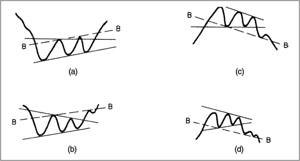
The reverse procedure at market tops is shown in Figure 8.41, examples c and d. The same technique is used to project prices when triangles are of the consolidation variety. However, in my own experience, I have not found this method to be particularly useful. I prefer, instead, to treat the triangle as with any other pattern by calculating its maximum depth and then projecting this distance at the breakout. An example of this alternative method is shown in Figure 8.42.
FIGURE 8.42 Alternative Triangle Measuring Implications
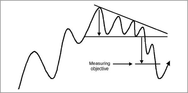
An example of a right-angled triangle followed by a bullish broadening formation is shown in Chart 8.16 featuring the DJIA.
CHART 8.16 DJIA 1938. This excellent example of a right-angled triangle occurred at the bottom of the 1937–1938 bear market. Note the substantial volume that accompanied the upside breakout. Following the breakout, the average traced out a right-angled broadening formation with a flat top. Usually, breakouts from these consolidation patterns are followed by a dramatic rise. In this case, however, the 158 level in November was destined to become the high for the 1938–1939 bull market.

This pattern has been made famous by William O’Neil and is described in his How to Make Money in Stocks (McGraw-Hill, 1995). The pattern develops as a bullish one, usually in a continuation format. Figure 8.43 shows that it takes the form of a big U (the cup), followed by a rally and a small rounding platform (the handle). The cup is typically preceded by a very strong rally, so the left side reflects aggressive profit-taking.
FIGURE 8.43 Cup-and-Handle Formation
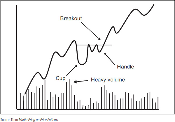
The left part of the cup usually marks the culmination of a strong rally and is often associated with heavy volume. The bottom of the cup can take the form of a rounding bottom, as in Figure 8.43, or some ranging action, as in Figure 8.44.
FIGURE 8.44 Alternative Cup-and-Handle Formation

The next step in the development of this pattern is a rally on expanding volume, followed by a period of profit taking in which both volume and price go quiet. Finally, the handle is completed and prices explode to the upside.
If it is going to fail, the signal to look for is a break below the lower part of the handle. If the price eventually breaks above the upper level of the handle, the situation will again become bullish. Any breakouts that develop with shrinking volume, though, should be regarded with suspicion.
Chart 8.17 shows a cup with a handle formation for ADC Telecom. The breakout above the handle is not accompanied by much of an expansion in volume, but the price certainly doesn’t suffer.
CHART 8.17 ADC Telecom 1990–1991 Cup-and-Handle Formation

By its very nature, the cup with a handle is a consolidation formation. Since the breakout follows a shakeout move (the left part of the cup), it is often followed by a very strong rally.
1. Prices in financial markets move in trends. A reversal is characterized by a temporary period in which the enthusiasm of buyers and sellers is roughly in balance. This transitional process can usually be identified by clearly definable price patterns, which, when completed, offer good and reliable indications that a reversal in trend has taken place.
2. Until a pattern has been formed and completed, the assumption should be that the prevailing trend is still operative, i.e., that the pattern is one of consolidation or continuation. This principle is more important when the trend has been in existence for only a relatively short period, because the more mature it is, the greater the probability of an important reversal.
3. Price patterns can be formed over any time period. The longer the time required to form a pattern and the greater the price fluctuations within it, the more substantial the ensuing price movement is likely to be.
4. Measuring formulas can be derived for most types of patterns, but these are generally minimum objectives. Prices usually extend much further.
5. Price objectives represent the minimum ultimate target and are not normally achieved in one move. Usually, a series of rallies and reactions in an upside breakout is required, or reactions or retracements in a downside breakout, before the objective is reached.