
It is evident that trends in prices for any freely traded entity can be very volatile, almost haphazard at times. One technique for dealing with this phenomenon is the moving average (MA). An MA attempts to tone down the fluctuations of stock prices into a smoothed trend so that distortions are reduced to a minimum. The three principal types of MAs used in technical analysis are simple, weighted, and exponential. When the terms “moving average or MAs” are used in this book, we are referring to the simple type. Exponential MAs (EMAs) and weighted MAs (WMAs) will always be specifically referenced. The construction and use of these averages are different; therefore, each type will be dealt with in turn. In the meantime, it’s important to remember that MAs, like trendlines, should be considered as dynamic levels of support and resistance. They are dynamic because, unlike specific levels, which by definition remain constant, MAs keep changing their values. If a specific MA has not worked well in the past on a particular security, there are few grounds for suspecting that it will in the future and vice versa.
A simple MA (SMA) is, by far, the most widely used. It is constructed by totaling a set of data and dividing the sum by the number of observations. The resulting number is known as the average or mean average. In order to get the average to “move,” a new item of data is added and the first subtracted. The new total is then divided by the number of observations, and the process is repeated.
For example, the calculation of a 10-week MA would follow the method shown in Table 11.1.
TABLE 11.1 Simple MA Calculation

On March 12, the total of the 10 weeks ending on that date was 966, and 966 divided by 10 results in an average of 96.6. On March 19, the number 90 is added and the observation of 101 on January 8 is deleted. The new total of 955 is then divided by 10. The calculation of a 13-week MA would require totaling 13 weeks of data and dividing by 13. This process is then repeated in order to get the average to “move.” Generally speaking, a rising MA indicates a rising trend (market strength), and a declining one denotes weakness.
A comparison of the price index with its 13-week MA (Chart 11.1) shows that the average changes direction well after the peak or trough in the price and is, therefore, “late” in changing direction. This is because the MA is plotted on the thirteenth week, whereas the average price of 13 weeks of observations actually occurs halfway through the week time span, i.e., in the seventh week.
CHART 11.1 NASDAQ 100 2011–2012 Centering an MA
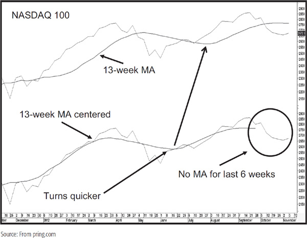
If it is to reflect the underlying trend correctly, the latest MA should be centered, i.e., plotted on the seventh week, as shown in Chart 11.1 for the NASDAQ 100.
The chart in the lower panel shows an MA that has been centered. The good news is that it turns fairly closely to the turning point in the price. The bad news is that it is necessary to wait 6 weeks before it’s possible to ascertain whether the average has changed direction. See how the centered MA plot ends 6 weeks prior to the end of the chart.
A time delay, though it is an irritant, is not particularly critical when analyzing other time series such as economic data. However, given the relatively rapid movement of prices in the financial markets and consequent loss of profit potential, a delay of this nature is totally unacceptable. Technicians have found that, for the purpose of identifying trend reversals, the best results are achieved by plotting the MA on the final week.
Changes in the price trend are identified, not by a reversal in direction of the MA, but by the price itself crossing its MA. A change from a rising to a declining market is signaled when the price moves below its MA. A bullish signal is triggered when the price rallies above the average. Since the use of MAs gives clear-cut buy and sell signals, it helps to eliminate some of the subjectivity associated with the construction and interpretation of trendlines.
More often than not, it pays to take action based on MA crossovers, but only if you can look back and see a fairly consistent relationship between the price and the MA. The degree of accuracy depends substantially on the choice of MA, as discussed later. First we need to examine some of the characteristics of MAs in greater detail.
1. An MA is a smoothed version of a trend, and the average itself is an area of dynamic support and resistance. In a rising market, price reactions are often reversed as they find support in the area of the MA. If the rest of the evidence agrees, it’s not a bad idea to wait for the price to reach its MA prior to making a purchase. After all, if the MA represents support, you can place a stop below support, i.e., the MA. Similarly, a rally in a declining market often meets resistance at an MA and turns down. The more times an MA has been touched, i.e., acts as a support or resistance area, the greater the significance when it is violated.
2. A carefully chosen MA should reflect the underlying trend; its violation, therefore, warns that a change in trend may already have taken place. If the MA is flat or has already changed direction, its violation is fairly conclusive proof that the previous trend has reversed.
3. If the violation occurs while the MA is still proceeding in the direction of the prevailing trend, this development should be treated as a preliminary warning that a trend reversal has taken place. Confirmation should await a flattening or a change in direction in the MA it-self, or should be sought from alternative technical sources.
4. Generally speaking, the longer the time span covered by an MA, the greater is the significance of a crossover signal. For instance, the violation of an 18-month MA is substantially more important than a crossover of a 30-day MA.
5. Reversals in the direction of an MA are usually more reliable than a crossover. In instances in which a change in direction occurs close to a market turning point, a very powerful and reliable signal is given. However, in most instances, an average reverses well after a new trend has begun and so is only useful as a confirmation.
In short, think of an average as a type of “moving trendline,” which, like and actual trendline, obtains its significance from its length (time span), the number of times it has been touched or approached, and its angle of ascent or descent.
A crossover is any penetration of an MA. However, close observation of any chart featuring an MA will usually reveal a number of whipsaw, or false, signals. How can we tell which ones are going to be valid? Unfortunately, there is no way of knowing for certain. Indeed, many whipsaws cannot be avoided and should be regarded as a fact of life. However, it is possible to avoid some of these close calls by using filtering techniques. The type of filter to be used depends on the time span in question, and is very much a matter of individual experimentation. For example, we may decide to take action on MA crossovers for which a 3 percent penetration takes place and to ignore all others. Violations of a 40-week MA might result in an average price move of 15 to 20 percent. In this instance, a 3 percent penetration would be a reasonable filter. On the other hand, since 3 percent would probably encompass the whole move signaled by a 10-hour MA crossover, this kind of filter would be of no use whatsoever.
Some analysts, recognizing that one-period whipsaws are quite common, require an MA crossover to hold for at least two periods. In the case of daily data, this approach would mean waiting for the second or third day before concluding that the average had been violated. A more sensible method is to use a combination of the period and percentage penetration for deciding whether a crossover is valid.
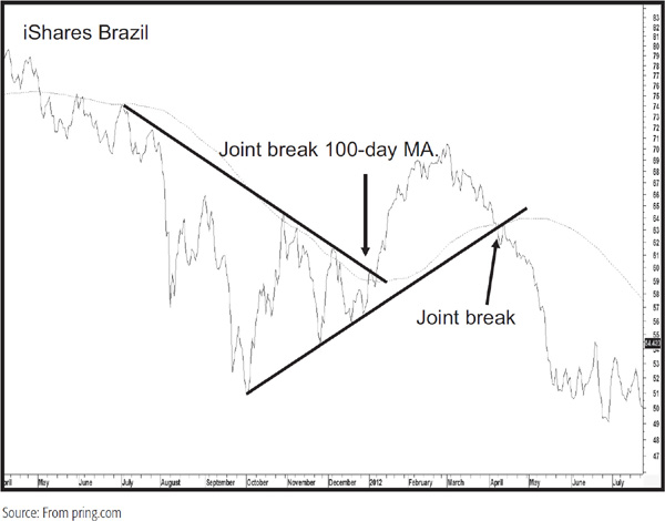
A useful tip is to wait for an MA crossover to take place at the same time a trendline is violated or a price pattern completed. Such signals strongly reinforce the trendline or price pattern signal and, therefore, need less in the form of a filter requirement. Two examples are shown in Chart 11.2 for the iShares MSCI Brazil ETF.
CHART 11.2 iShares Brazil 2011–2012 Joint Trendline/MA Violations
Sometimes, it’s possible to see an MA crossover accompanied with exceptionally heavy volume. In such circumstances, you could lower your standards of what represented a decisive breakout since the expanding volume would emphasize enthusiasm by the buyers or fear by the sellers, depending on the direction of the break. We see this in Chart 11.3 for an early August 2012 downside break in the iShares MSCI Emerging Markets ETF.
CHART 11.3 MSCI Emerging Markets ETF 2010–2012 MA Crossovers and Volume Characteristics

The cross was accompanied by expanding volume and a trendline break. Two other breaks also developed on expanding activity, one of which was an upside violation, which was also associated with a trendline break.
Chart 11.4 features the Eurotop Index together with a 40-week MA and two bands that have been plotted 3 percent above and below the average itself.
CHART 11.4 Eurotop 1993–2001 40-Week MA and 3 Percent Bands
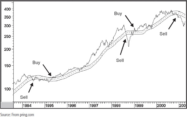
Buy signals are generated when the price crosses above the upper line and sell signals when it crosses below the lower one. This has the effect of filtering out some of the whipsaws, yet does not give up too much in terms of timing.
MAs are usually constructed from closing data. These are more reliable than intrasession prices because they reflect positions that investors are willing to carry overnight or, in the case of weekly charts, over the weekend. Moreover, bar charts are subject to intraday rumors and other random noise. It’s certainly true that the bar charts are penetrated intraday and, therefore, offer more timely signals. However, there are also a far greater number of whipsaws or misleading signals. That’s because the intraday trading can be subject to manipulation or distorted by kneejerk emotional reactions to news events. For this reason, it is usually best to wait for the closing price to penetrate the average before concluding that a crossover has taken place.
One exception to using close-only charts would be if the MA was touched or approached by the highs or lows of the bars on numerous occasions. In this instance, it would mean that the MA represented an unusually strong resistance or support level. Consequently, its penetration would have greater significance.
During a trading range, MA crossovers have a strong tendency to be counterproductive. Two examples are shown in Chart 11.5 for Asian Paints, an Indian stock. In these situations, it is usually best to use the outer ends of the trading range for the signal rather than the MA.
CHART 11.5 Asian Paints MA 2002–2005 Crossovers and Trading Ranges
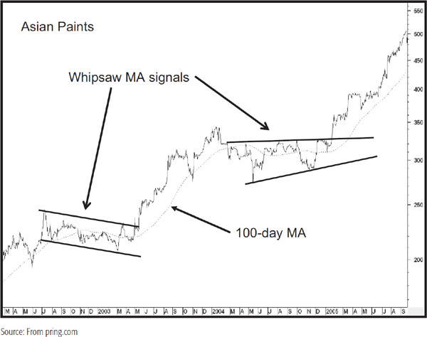
Obviously, no one rings a bell to say the price has entered a trading range, but after a couple of whipsaw signals, it becomes apparent. That is the time when a well-constructed trendline should be substituted for an MA crossover.
MAs can be constructed for any time period, whether a few days, several weeks, many months, or even years. Optimal selection of length is very important. For example, if it is assumed that a complete bull and bear cycle lasts for 4 years, an MA constructed over a time span longer than 48 months will not reflect the cycle at all. This is because it smoothes out all the fluctuations that take place during the period and will appear more or less as a straight line crossing through the middle of the data, unless there is a particularly sharp linear trend. On the other hand, a 5-day MA will catch every minor move in the stock cycle and will be useless for the purpose of identifying the actual top and bottom of the overall cycle. Even if the 48-month average were shortened to 24 months, using the crossover signals would still cause the 24-month average to give an agonizingly slow confirmation of a change in trend. The 4-week average would be so sensitive that it would continually give misleading or whipsaw signals. Only an MA that can catch the movement of the actual cycle will provide the optimum trade-off between lateness and oversensitivity, such as the 10-month MA in Figure 11.1.
FIGURE 11.1 A Short- Versus a Longer-Term MA
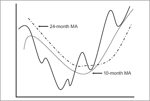
The choice of MA depends on the type of market trend that is to be identified, i.e., short, intermediate, or primary. Because different markets have different characteristics and the same markets go through different cyclic phenomena, there is no such thing as a “perfect” MA. In recent years, extensive computer research has been done on the optimum MA time span. The conclusion from all sources is that there is no one perfect time span.
What may work extremely well in one market over one specific period of time is unlikely to be duplicated in the future. When we talk about choice of time span, we are really trying to identify an MA that will work most of the time with a specific time frame, i.e., short, intermediate, or long.
Perfection just does not exist in psychologically driven markets. Generally speaking, long-term time spans are less influenced by manipulation and kneejerk random reactions to unexpected news than are short-term ones. This is why long time spans usually give the best test results; both daily and weekly averages work best at or above a 40-period span. Research also shows that simple averages generally outperform weighted and exponential ones.1 Recognizing these limitations, the time spans in Table 11.2 are suggested.
TABLE 11.2 Suggested Time Frames

*Recommeneded by Willaim Gordon, The Stock Market Indicators, Investors Press, Palisades Park, NJ, 1968. †Reported by Robert W. Colby and Thomas A. Meyers in The Encyclopedia of Technical Market Indicators, Dow Jones-Irwin: Homewood, IL, 1988, to be the best average for the U.S. stock market using weekly data.‡Ibid. Colby and Meyers. Reported to be the best average for the U.S. stock market using monthly data.
The important thing to remember is that an MA is one tool in the technical arsenal, which is used with other techniques as part of the art of identifying trend reversals. Again, it’s important to remember that we are looking for a time span that works reasonably well over most securities, i.e., the idea of consistency over perfection. After all, it’s always possible to find the perfect time span with back-testing and fitting the data accordingly. However, we are interested in the past only in so far that it can reliably point us in the right direction in the future, and deliberately fixing past results does not help us in this task—quite the reverse.
A technique that has a lot of potential, but is not widely used, is to advance an MA. In the case of a 25-day MA, for example, the actual plot would not be made on the twenty-fifth day, but advanced to the twenty-eighth or thirtieth, and so forth. The advantage of this approach is that it delays the crossover and filters out occasional whipsaws or false signals. In Profits in the Stock Market (Lambert Gann Publishing, 1935), H. M. Gartley calculated that during the period 1919–1933, which covered almost all kinds of market situations, use of a simple 25-day MA crossover netted 446 Dow points (slightly better than 433 points for the 30-day MA and far better than 316 and 216 for 40- and 15-day MAs, respectively). However, when the 25-day average was plotted on the twenty-eighth day, crossovers resulted in an increase of 231 points to 677. The 30-day MA, when advanced 3 days, also produced superior results, with an additional gain of 204 points for a total of 637.
Although the 25-day MA advanced 3 days may not ultimately prove to be the best combination, the technique of advancing an MA is clearly one that could be usefully incorporated into the technical approach. It is always difficult to know how much to advance an MA. Experimentation is the answer. One possibility is to advance the average by the square root of the time span; e.g., a 36-week MA would be advanced by 6 days (the square root of 36 = 6).3
In that spirit, Chart 11.6 features the iShares MSCI Hong Kong ETF with both a 25-day MA and a 25-day MA that has been advanced by 5 days.
CHART 11.6 iShares Hong Kong 2008–2009 Advancing MAs
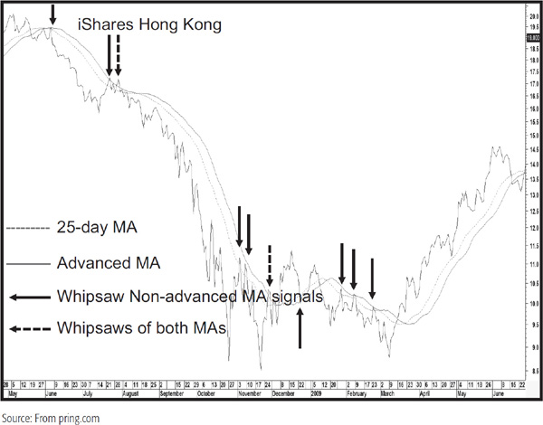
Note how the regular (dashed) MA experiences whipsaws as flagged by the solid arrows, whereas the advanced (solid) MA does not. The dashed arrows indicate where both MAs are penetrated on a whipsaw basis. This approach appears to come into its own after a strong trend, such as when the regular average was temporarily penetrated by two small back rallies that developed in November 2008. It is in situations such as this that the delaying effect of advancing the MA avoids the whipsaw. Of course, there is a trade-off and that comes in the form of delayed signals, but in most situations, the loss of timing is offset by fewer misleading signals.
A sharp price move is often preceded by a gradually narrowing trading range. In effect, decreasing price fluctuations reflect a very fine balance between buyers and sellers. When the balance is tipped one way or the other, the price is then free to embark upon a major move. This kind of situation can often be identified by plotting several MAs and observing when they are all at approximately the same point. Chart 11.7, for example, shows the daily price for cash euroyen. Note how the three MAs almost completely converge just before the price embarks on a sharp decline.
CHART 11.7 Cash Euroyen 1999–2000 Multiple MAs
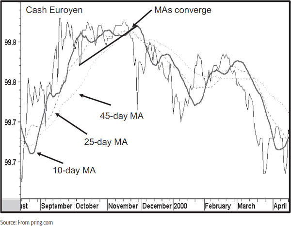
The convergence of the averages warns that a major move is likely, but the actual signal comes from the violation of the trendline.
Some techniques of trend determination involve more than one MA. Signals are given by a shorter-term MA crossing above or below a longer one. This procedure has the advantage of smoothing the data twice, which reduces the possibility of a whipsaw, yet it warns of trend changes fairly quickly after they have taken place. In this respect, Chart 11.8 features the iShares MSCI Italian ETF. Two averages that have traditionally been used for identifying primary trend moves are the 10- and 30-week spans.
CHART 11.8 MSCI Italian ETF 2006–2012 Two MAs
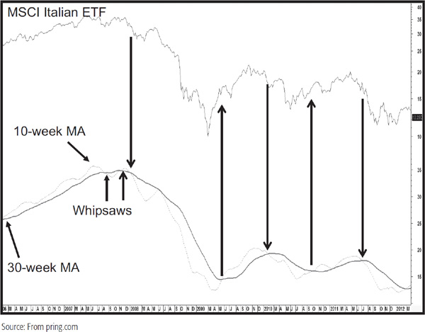
Signals are given when the (dashed) 10-week average moves below the 30-week average. Some technicians prefer to wait until the 30-week series is moving in the direction of the cross, so a negative cross would require a declining 30-week MA. Negative signals of either variety warn that the major trend is down. It is not assumed to have reversed until either the 10-week MA moves higher than the 30-week MA or it does so when both are rising simultaneously. By definition, either methodology results in signals being triggered after the ultimate price peak or trough. Therefore, they serve as a confirmation of a change in trend rather than as actual juncture points in themselves. If the signal develops close to the final turning point, then it can be acted upon in a timely and practical way. On the other hand, if it is triggered some distance from the previous peak or trough, then it can merely be used as confirmation. Even that information can be useful because if you are going to run into trouble, it will usually be when you act on a contratrend signal. A clearer understanding of the direction of the main trend through this double moving average approach will offer less of a chance that contratrend trades will be executed.
An alternative approach is to use two averages of similar or identical time spans and advance the plot of one of them along the lines discussed earlier. Chart 11.9, which again features the Italian ETF, shows such a setup for a 25-week MA and a 25-week MA advanced by 5 weeks.
CHART 11.9 MSCI Italian ETF 2006–2012 Two MAs, with One Advanced
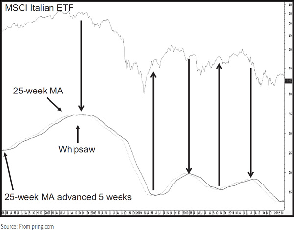
The advantage of this method is that it appears to generate fewer whipsaws; the disadvantage is that the signals have a tendency to be less timely. These two multiple moving averages are not offered as the Holy Grail, but more as a starting point because I am sure that the resourceful reader could come up with a better combination. Just remember in such experimentation that consistency is much preferred over perfection, which does not exist, of course.
MAs should always be used in conjunction with other indicators. This is because prices occasionally fluctuate in a broad sideways pattern for an extended period of time, resulting in a series of misleading signals. The good news is that such frustrating trading-range action is often followed by an extremely strong trend in which the losses incurred from the trendless period of whipsaw signals are more than made up for. This is because the whipsaws indicate confusion between buyers and sellers, and this implies a big battle. When one or the other wins out, the victorious side is then able to push prices in a much stronger way.
Figure 11.2 shows an example of an MA offering numerous whipsaw signals as it moves through a trading range.
FIGURE 11.2 A Moving Average in a Trading Range

At first, it is not obvious that the price action is a trading range. However, at point X, when the price crosses below the MA again, it is possible to construct two trendlines that reflect this ranging action. At such a time it makes much better sense to await the verdict by acting on a trendline break rather than an MA crossover, since there is no reason to suspect that the next crossover after X will not turn out to be a whipsaw.
A simple moving average (SMA) can only correctly represent a trend from a statistical point of view if it is centered, but centering an average delays the signal, as discussed earlier. One technique that attempts to overcome this problem is to weight the data in favor of the most recent observations.
An MA constructed in this manner (WMA) is able to “turn” or reverse direction much more quickly than a simple MA, which is calculated by treating all the data equally.
There are countless ways in which data can be weighted, but the most widely used method is a technique whereby the first period of data is multiplied by 1, the second by 2, the third by 3, and so on until the most recent one. The calculations for each period are then totaled. The divisor for a simple MA is the number of periods, but for this form of weighted average, the divisor is the sum of the weights; i.e., 1 + 2 + 3 + 4 + 5 + 6 = 21. For a 10-week weighted MA, the sum of the weights would be 1 + 2 + 3 + 4 + 5 + 6 + 7 + 8 + 9 + 10 = 55. Table 11.3 illustrates how the calculations are made.
TABLE 11.3 Weighted Moving Average Calculation
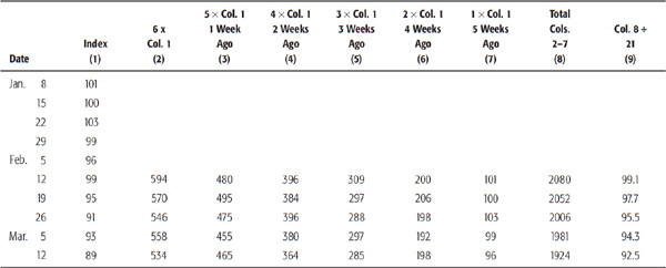
Another method is to calculate a simple MA, but in doing so, use the most recent observation twice, which doubles its weight.
The interpretation of a weighted average is different from that of a simple average because the weighted average is more sensitive. A warning of a trend reversal is given by a change in direction of the average rather than by a crossover.
Weighted MAs are helpful for the purpose of identifying trend reversals. In the past, the time-consuming calculations required to construct and maintain such averages greatly detracted from their usefulness. The widespread use of computers in the last few decades has largely overcome this drawback. An exponential moving average (EMA) is a shortcut to obtaining a form of weighted MA. A calculation for a 20-week EMA is shown in Table 11.4.
TABLE 11.4 EMA Calculation
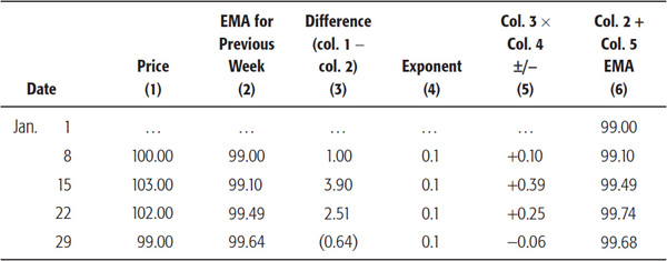
In order to construct a 20-week EMA, it is necessary to calculate a simple 20-week MA first, i.e., the total of 20 weeks of observations divided by 20. In Table 11.4, this has been done for the 20 weeks ending January 1, and the result appears as 99.00 in column 6.
The 20-week average becomes the starting point for the EMA. It is transferred to column 2 for the following week. Next, the entry for the twenty-first week (January 8 in the earlier example) is compared with the EMA, and the difference is added or subtracted and posted in column 3; i.e., 100 – 99 = 1.00. This difference is then multiplied by the exponent, which for a 20-week EMA is 0.1. This exponentially treated difference, 1.00 × 0.1, is then added to the previous week’s EMA, and the calculation is repeated each succeeding week. In the example, the exponentially treated difference for January 8 is 0.1, which is added to the previous week’s average, 99.00, to obtain an EMA for January 8 of 99.10. This figure in column 6 is then plotted.
If the difference between the new weekly observation and the previous week’s EMA is negative, as in the reading 99.00 versus 99.64 for January 29, the exponentially treated difference is subtracted from the previous week’s EMA.
The exponent used varies with the time span of the MA. The correct exponents for various time spans are shown in Table 11.5, where the time periods have been described as weekly.
TABLE 11.5 Exponential Factors for Various Time Frames

In effect, however, the exponent 0.1 can be used for any measure of 20 days, weeks, months, years, or an even longer period.
Exponents for time periods other than those shown in the table can easily be calculated by dividing 2 by the time span. For example, a 5-week average will need to be twice as sensitive as a 10-week average; thus, 2 divided by 5 gives an exponent of 0.4. On the other hand, since a 20-week average should be half as sensitive as for a 10-week period (0.2), its exponent is halved to 0.1.
If an EMA proves to be too sensitive for the trend being monitored, one solution is to extend its time period. Another is to smooth the EMA by another EMA. This method uses an EMA, as calculated earlier, and repeats the process using a further exponent. There is no reason why a third or fourth smoothing could not be tried, but the resulting EMA, while smoother, would be far less sensitive.
By definition, EMA crossovers and reversals occur simultaneously. Buy and sell signals are, therefore, triggered by crossovers just like a simple moving average.
Chart 11.10 shows the three types of calculations plotted on the same chart of the popular Indian market index, the Nifty.
CHART 11.10 The Indian Nifty’s Three Types of MA

You can see that at essentially all times the weighted (WMA) average is the most sensitive since it hugs the turning points more closely. The simple (SMA) and exponential (EMA) alternate, depending on how the data falls. My experience is that in most situations the SMA works best, though I have to admit that unless I am relying on a longer-term time span, such as a 200-day/9-month average, I rarely place much emphasis on the crossovers unless other evidence, such as a trendline break, suggests that the trend has reversed.
Table 11.2 has already listed some suggested time frames for simple moving averages. This section will expand the discussion a bit by applying some of these ideas to the markets.
We discussed the importance of the primary trend and the need to identify its direction earlier. That brings us to the subject of the 12-month SMA. This time span has been very useful for identifying reversals in such trends, as has the 9-month (200-day/39-week) one. It really does not matter too much which you choose, although the 12-month span is preferred since it contains all the months of the calendar year and is therefore seasonally adjusted. Chart 11.11 shows the Morgan Stanley Capital International (MSCI) World Stock Index.
CHART 11.11 MSCI World Stock Index 1987–2008 12-Month MA
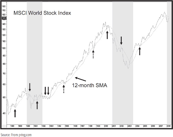
If you are going to monitor primary trends, a 12-month MA for this global equity series is not a bad place to start. The solid arrows indicate where the 12-month MA has acted as a good support/resistance zone. The dashed ones show a couple of whipsaw signals, which emphasize the point that we are going for consistency over perfection. Most of the period under consideration experienced primary bull markets, but the shaded areas indicate primary bears, as defined by the relationship between the index and its MA.
Chart 11.12 features a 200-day SMA for the (dollar-based) gold price. Once again, it gets its share of whipsaw signals, but by and large, it works reasonably well.
CHART 11.12 Spot Gold 2003–2008 200-Day MA
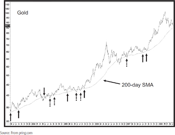
It further underlies the point that MA crossovers should not be used in isolation, but in conjunction with other indicators to form a weight-of-the-evidence approach.
Finally, Chart 11.13 shows a 65-week EMA for the Canadian dollar/U.S. dollar cross. This time span appears to be very useful for incorporation with longer-term charts. The solid arrows note the places where the average serves as an effective support/resistance zone, whereas the dashed ones point up some whipsaws.
CHART 11.13 Canadian Dollar 1997–2008 65-Week EMA

You should not expect all markets to behave this well, but if it’s possible to look back at several years of data and see such a good relationship, then it’s reasonable to expect it to work reasonably well in the future. If not, then lower the importance of the average in your analysis.
You may be wondering why we have not included many short-term MAs in our explanation. The reason is that the briefer the time frame under consideration, the greater the effect of random noise and the less reliable the MA crossover technique becomes.
1. One of the basic assumptions of technical analysis is that stocks move in trends. Since major trends comprise many minor fluctuations in prices, an MA is constructed to help smooth out the data so that the underlying trend will be more clearly visible.
2. Ideally, a simple MA (SMA) should be plotted at the halfway point of the time period being monitored (a process known as centering), but since this would involve a time lag during which stock prices could change rapidly and lose much of the potential profit of a move, it is plotted at the end of the period in question.
3. This drawback has been largely overcome by the use of MA crossovers, which provide warnings of a reversal in trend, and by the use of WMAs or EMAs, which are more sensitive to changes in the prevailing trend since they weight data in favor of the most recent periods.
4. There is no such thing as a perfect average. The choice of time span always represents a trade-off between timeliness—catching the trend at an early stage—and sensitivity—catching the trend turn too early and causing an undue amount of whipsaws. For short-term trends, 30- and 50-day spans are suggested, but for longer-term time spans, 40- and 45-week averages are recommended. A helpful time span using monthly data is 12 months.
1Arthur Skarlew, Techniques of a Professional Commodity Chart Analyst, Commodity Research Bureau: New York, 1980.