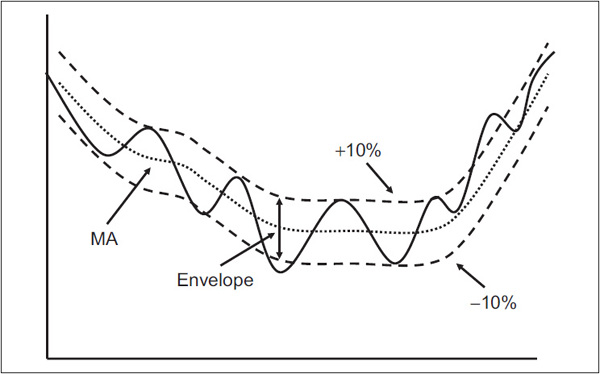
It has already been established that moving averages (MAs) can act as important juncture points in their role as support and resistance areas. In this respect, the longer the time span, the greater the significance of MAs. This support and resistance principle can be taken one step further by constructing symmetrical lines parallel to an MA of any variety, called envelopes (see Figure 12.1).
FIGURE 12.1 An MA with a + and - 10% Envelope

This technique is based on the principle that stock prices fluctuate around a given trend in cyclical movements of reasonably similar proportion. In other words, just as the MA serves as an important juncture point, so do certain lines drawn parallel to that MA. Looked at in this way, the MA is really the center of the trend, and the envelope consists of the points of maximum and minimum divergence from it. Just as a leash pulls an unruly dog back to its owner and then allows him to run off in the opposite direction until the leash stops him, prices act in a similar manner. The leash in this case is the two envelopes, or more if we choose to draw them.
There is no hard-and-fast rule about the exact position at which the envelope should be constructed. That can be discovered only on a trial-and-error basis with regard to the volatility of the price being monitored and the time span of the MA. This process can be expanded, as in Figure 12.2, to include four or more envelopes (i.e., two above and two below the MA).
FIGURE 12.2 An MA and Four Envelopes
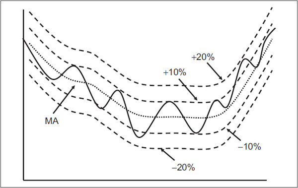
Each is drawn at an identical proportional distance from its predecessor. In this example, the envelopes have been plotted at 10 percent intervals. If the MA is at 100, for example, the envelopes should be plotted at 90, 110, etc. Since prices are determined by psychology, and psychology tends to move in proportion,
For example, 10 percent above and below the MA as opposed to 10 points etc.
Chart 12.1, which features the Indian market average, the Nifty, shows that the envelope technique can be helpful from two aspects: (1) developing a “feel” for the overall trend and (2) discerning when a rally or reaction is overextended.
CHART 12.1 The Nifty 2004–2009 and Two 10 Percent Envelopes
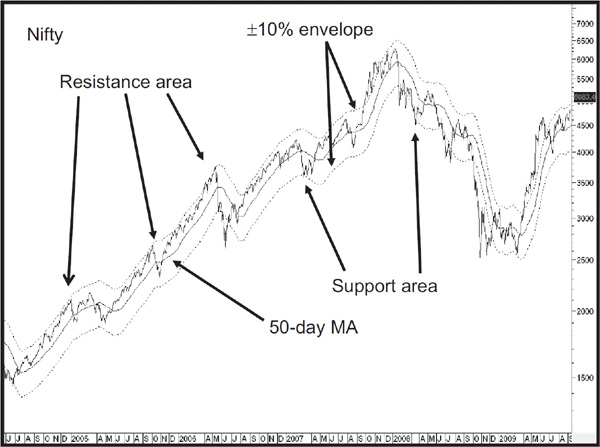
The disadvantage is that there is no certainty that the envelope will prove to be the eventual turning point. This method, like all techniques that attempt to forecast the duration of a move, should be used on the basis that if the index reaches a particular envelope, there is a good probability that it will reverse course at that juncture, provided of course, that the envelope has had a reasonable record of acting as a support/resistance point in the past. The actual trading or investment decision should be determined after assessing a number of characteristics, of which envelope analysis is one ingredient. In Chart 12.1, you can see that the upper band consistently acted as a good resistance zone during the 2004–2008 bull market. However, the advance in 2009 was so strong that reaching the upper envelope really had no technical meaning whatsoever. As for the downside, there were a couple of times the price reversed at the –10 percent level, but either it never reached it, as in the 2004–2006 period, or it greatly exceeded it, as in 2008. Clearly, if this technique is to be employed with any degree of certainty, it is very important to make a careful study of the relationship between the price and a specific envelope ahead of time to establish its reliability. In this respect, Chart 12.2 shows the iShares Biotech ETF with a 10 percent envelope. The lower panel shows the data displayed in a different manner, with the MA at zero and the upper and lower envelopes being represented by the dashed horizontal lines at +10 percent and –10 percent. Note how the envelopes often serve as support and resistance areas and that the price occasionally swings from one envelope to the other, just as the oscillator swings like a pendulum from an overbought to oversold condition.
CHART 12.2 iShares Biotech 2007–2012 and Two 10 Percent Envelopes
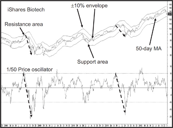
Chart 12.3 goes through a similar exercise for the Brazilian Bovespa Index, but this time the envelope has been expanded to 35 percent to suit the characteristic of the market. Once again, the touching of the envelope suggests the direction of the primary trend, upper envelope touches being a bull market characteristic and vice versa. That does not mean that touching the outer band is a prerequisite for a bull market. Just as it’s possible to have winter without snow, it’s also possible to experience a primary trend where the outer envelope is not touched or penetrated. The dashed arrows show that the recrossing of the envelope is usually followed by an important decline of some kind. The early 2004 signal was an obvious exception to this rule. My suggestion is to experiment with many different combinations of MAs and envelopes because each security has its own personal characteristics. Some will work quite well for you, but never expect perfection—it doesn’t exist.
CHART 12.3 Bovespa 1995–2009 and Two 35 Percent Envelopes

Bollinger bands (Chart 12.4) operate in a similar way, except that the envelopes, or bands, are calculated using standard deviations.1 For those of you who, like me, are not mathematically oriented, a simple explanation is that the bands contract or expand, depending on the level of volatility. The greater the volatility, the wider the bands, and vice versa. The first requirement in plotting a Bollinger band is a time span, as with a moving average. The longer the span, the smoother, but less sensitive, are the fluctuations. Chart 12.4, featuring the NASDAQ 100 ETF, plots both bands with the standard or default time span of 20 periods and a deviation of 2.
CHART 12.4 NASDAQ 100 2011–2012 and a Bollinger Band
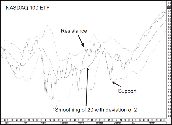
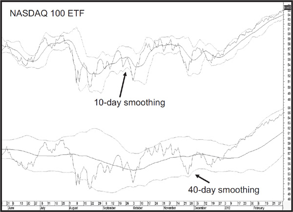
Chart 12.5 compares the difference with different smoothings. The plot in the upper window shows one of 10 days and the lower one a smoothing of 40 days. It is pretty obvious that the 40-bar span is far smoother and is plotted further away from the price action.
CHART 12.5 NASDAQ 100 2011–2012 Comparing Bollinger Smoothing Parameters
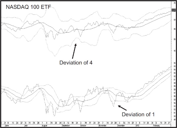
The second parameter for plotting a Bollinger band is the amount of deviation. In this respect, the bands in the upper window of Chart 12.6, again featuring the NASDAQ 100 ETF, are calculated with a value of 4. The lower panel takes it to the other extreme with a deviation of 1 percent. It is fairly evident from this comparison that the smaller the deviation, the tighter the band and vice versa. The tight band in the lower panel is touched so many times, it is not at all useful. Alternatively, a larger deviation factor returns a band that is rarely, if ever, touched. Think of the deviation as a parameter that corresponds with an overbought/oversold level.
CHART 12.6 NASDAQ 100 2011–2012 Comparing Bollinger Standard Deviation Parameters
John Bollinger, the creator of this technique, recommends a factor of 20 for the time span and 2 for the deviation. Those are the parameters used for the remainder of charts in this chapter.
Rule 1. When the bands narrow, there is a tendency for sharp price changes to follow.
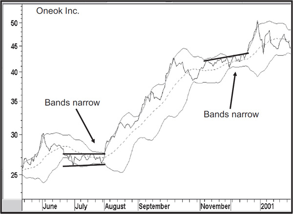
This, of course, is another way of saying that when prices trade in a narrow range and lose volatility, demand and supply are in a fine state of balance and its resolution will trigger a sharp price move. In this context, a narrowing of the bands is always relative to the recent past. That’s where Bollinger bands can help visually by showing the narrowing process. They also give us some indication of when a breakout might materialize because the bands start to diverge once the price begins to take off. Two examples are shown in Chart 12.7, where it is also possible to construct some trendlines marking the breakout points.
CHART 12.7 Oneok 2000–2001 and Bollinger Bands
Rule 2. If the price exceeds a band, the trend is expected to continue.
This is really another way of saying that if the price moves above the band, upside momentum is strong enough to support higher ultimate prices, and vice versa. This is a common experience at the start of a bull market and vice versa for a downward penetration. After both breakouts in Chart 12.7, we see the price immediately move outside the band. The re-crossover of the Bollinger band usually indicates short-term exhaustion, and it quickly pulls back again. However, this is just a process of pausing for breath until the trend is then able to extend again. By now, you will have noticed that the price often crosses the band several times before the trend reverses. The obvious question at this point is: How do you know when it has been crossed for the last time? In other words, how do you know how to spot the bottom and top of a move? The answer lies in the next rule.
Rule 3. When the price traces out a reversal formation after it has crossed outside a band, expect a trend reversal.
In Chart 12.8, featuring the New York Stock Exchange (NYSE) Composite, we see a series of three rallies that touch or exceed the upper band (range A). The first two show no sign of exhaustion. However, after the final attempt, the up trendline is violated. Then the price falls below the previous minor low to complete a small top at point F.
CHART 12.8 NYSE Composite Intraday Chart and Bollinger Bands
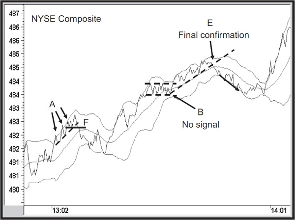
Later, the price touches the outer band again just prior to the trading range at B, but there is no signal since it manages to hold above the lower portion of the trading range. Finally, a nice up trendline is violated and a sell signal is triggered at point E, following a temporary penetration of the outer band. What we are seeing is a series of overstretched readings, which is what a price touching the band really is. It finally confirms the overbought reading. If there is no signal, the implication is that following a brief correction, the price will then go on to register a new high or low for the move, depending on its direction. That is not always the case because there is no such word as always when working with technical indicators. For instance, Chart 12.9, also featuring the NYSE Composite, shows where the price crosses below the upper band (point A), yet it does not go on to make a new high until a worthwhile decline has taken place. In such instances, the best place to liquidate a long position is when the price crosses below the moving average.
CHART 12.9 NYSE Composite Intraday Chart and Bollinger Bands
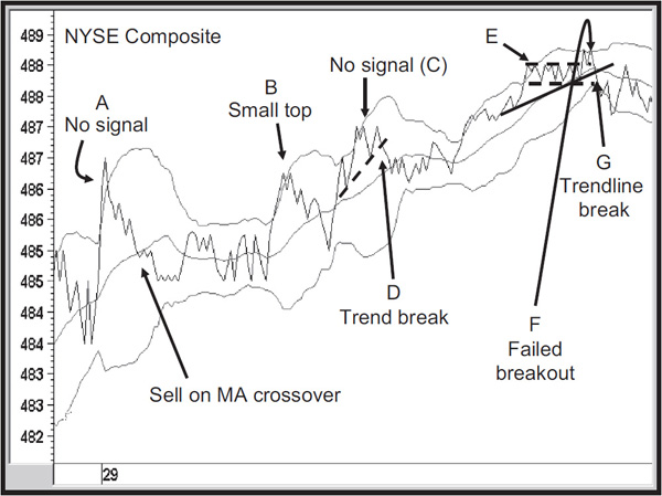
Later on, at point B, you can see a small double top as the price tries for a second time to break above the band. At the next attempt (point C), there is no signal, but after the subsequent penetration, a trendline is violated (point D). Then we see a series of lows (range E). But this support was not broken, so there was no reason to sell. Finally, the price tries to break out from the trading range, but is held back by the upper band (point F). A subsequent trendline break (point G) is the signal to liquidate. In retrospect, what we see is a failed breakout, which just adds to the bearishness, once the series of lows is penetrated on the downside.
Sometimes it is possible to combine Bollinger band analysis with the Know Sure Thing (KST). This indicator is discussed at length in Chapter 15; for now, just think of it as a smoothed momentum indicator that triggers buy and sell momentum indications when it crosses above or below its moving average. In Chart 12.10 featuring Vijaya Bank, an Indian stock, the bands narrow in the late October period as the price experiences a sideways correction.
CHART 12.10 Vijaya Bank 2006–2007 and Bollinger Bands
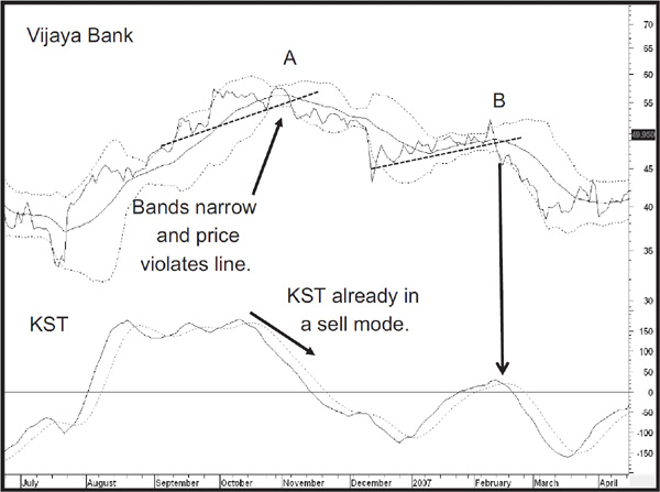
The question is: Which way will the price break? A vital clue can sometimes be gleaned by looking at an oscillator. In this chart, I am using the KST, but it could easily be the moving-average convergence divergence (MACD), stochastic, relative strength indicator (RSI), and so forth. The idea is that the KST is already declining and therefore telling us that short-term momentum is trending down. Since the price soon confirms the violation of the dashed trendline, it is not surprising that the narrowing bands, i.e., finely balanced supply/demand situations, are resolved in a negative way. Later on at point B, we see a similar setup with the narrowing bands. This time, the KST falls below its MA at around the same time that the trendline is violated.
1. Envelopes are moving averages that are plotted at equidistant levels above and below a specific moving average.
2. They provide useful support/resistance points that often halt rallies and reactions.
3. Occasionally, it is a good idea to plot several series of envelopes around the moving average.
4. Bollinger bands are a form of envelope that is constructed from standard deviations. These expand and narrow, depending on pricing volatility.
5. When Bollinger bands narrow, the subsequent widening of the bands is often followed by a sharp price move.
6. When the price breaks through one of the bands, this is a sign of strong momentum and we should expect the trend to continue.
7. When the price returns through the band, expect a pause in the trend, unless this crossover is associated with a trendline break, in which case the crossover probably represents exhaustion.
1John Bollinger, Bollinger Capital Management, P.O. Box 3358, Manhattan Beach, CA (www.bollingerbands.com)