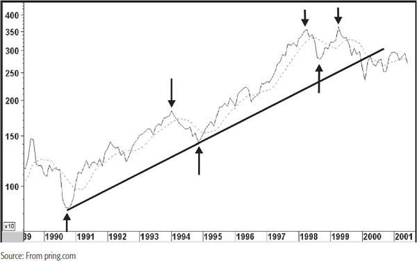
It is now time to combine the indicators that we have covered so far into an analysis of the long-term picture. For this purpose I’ve chosen the Dow Jones transportation average between 1990 and 2001. Chart 20.1 shows the average together with its 9-month MA. This was one of the best testing averages derived by optimizing from 1931 through to the year 2000.
CHART 20.1 Dow Jones Transports, 1989–2001, and Turning Points

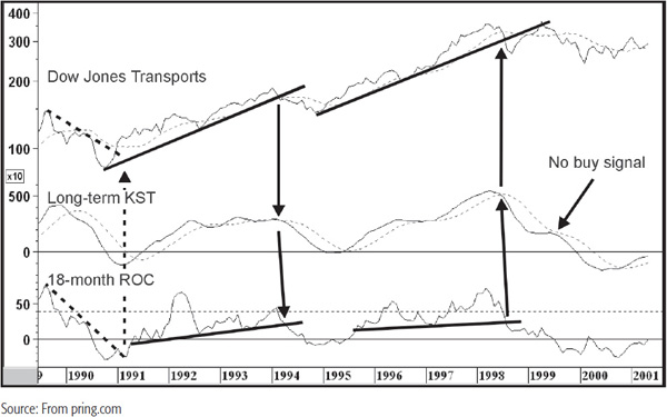
The upward and downward pointing arrows indicate the principal turning points in this period. The 1990 bottom was not an easy one to recognize because the average virtually reversed on a dime. Chart 20.2 shows that the 18-month rate of change (ROC) violated a sharp down trendline just before the price.
CHART 20.2 Dow Jones Transports, 1989—2001, and Long-Term Momentum
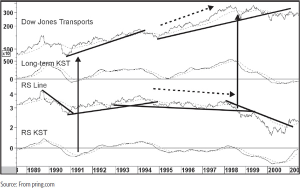
The relative strength (RS) line, in the center panel of Chart 20.3 actually broke its bear market trendline ahead of the absolute price. This indicated that the DJ Transports were likely to outperform the market during the early stages of the new bull market.
CHART 20.3 Dow Jones Transports, 1989—2001, and Relative Strength
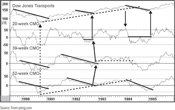
The vertical line in Chart 20.4 shows that this was one of the few occasions in which all three oscillators were simultaneously oversold. This chart also offered the strongest buy signal because the down trendline for the price was violated at approximately the same time as the 65-week exponential moving average (EMA). Also, the 39-week CMO completed a base. By February 1991, several positive signs had therefore developed, all of which indicated that downside momentum had probably dissipated sufficiently to allow the long-term know sure things (KSTs) to reverse to the upside.
CHART 20.4 Dow Jones Transports, 1989—2001, and Three Weekly CMOs
The next major event was the intermediate peak in 1992. The average briefly crossed below its 12-month (Chart 20.2) and 65-week EMAs (Chart 20.3), and the long-term KST also triggered a negative whipsaw signal. These events could certainly have justified the conclusion that the Transports had begun a bear market. However, once the average and the long-term KST (Chart 20.2) had crossed back above their respective moving averages (MAs), there was little reason to maintain a bearish stance.
Unfortunately, this whipsaw type activity occasionally develops from an intermediate correction. Under such circumstances it is important to keep an open mind on the indicators. In this case, Chart 20.4 shows that the 20-week Chande momentum oscillator (CMO) broke out from a base and several down trendlines were broken, so there was plenty of evidence that the tide had turned.
The top of the bull market developed 2 years later in early 1994. Signs of a major top were quite widespread. In Chart 20.2 the Transports simultaneously violated a 4-year up trendline and the 12-month MA. The KST gave a decisive sell signal, and the 18-month ROC completed a head-and-shoulders (H&S) top. In the whole 11 years covered by the chart, there were only two completed chart patterns for this indicator, so the early 1994 breakdown was very significant.
Chart 20.4 was equally significant in its bearish entrails. The 39- and 52-week CMOs diverged negatively with the price, and both series completed a top or experienced a major trendline violation. At the peak itself, the 20-week CMO was actually overbought. The chart shows that, except for the strongest of up- or downtrends, the overbought and oversold conditions were often associated with intermediate-type reversals. Later in the year something more ominous started to happen, and this was a trendline break in the RS line. For the first time since the bull market in RS began the long-term RS, KST (shown in Chart 20.3) triggered a decisive sell signal. Although it was not apparent at this point, the transports had begun a long period of underperformance.
Because the ensuing bear market was relatively mild, the bottom in early 1995 was only signaled on the weekly charts. Once again, Chart 20.4 holds the key, as the down trendline in the 52-week CMO was violated and a base in the 20-week series completed. The Transports themselves more or less simultaneously broke above their bear market down trendline and 65-week EMA. The long-term KST in Chart 20.3 also turned positive around the same time.
The average remained above its 65-week EMA for the next 4 years and the series of rising peaks and troughs continued. Then, some extremely serious trend breaks developed. First, the average itself crossed below its 12-month MA and violated its bull market trendline (Chart 20.2). The KST also triggered a sell signal and the 18-month ROC completed a top.
Chart 20.5 shows that the Transports also completed and broke down from an upward-sloping H&S top and crossed below its 65-week EMA more or less at the same time. Notice how the 39- and 52-week CMOs were actually below zero at the time the average was forming the right shoulder. This distinct lack of upside momentum was a very bearish sign. Not surprisingly, the Transports experienced a pretty sharp decline into the fall of 1998.
CHART 20.5 Dow Jones Transports, 1995—2001, and Three Weekly CMOs
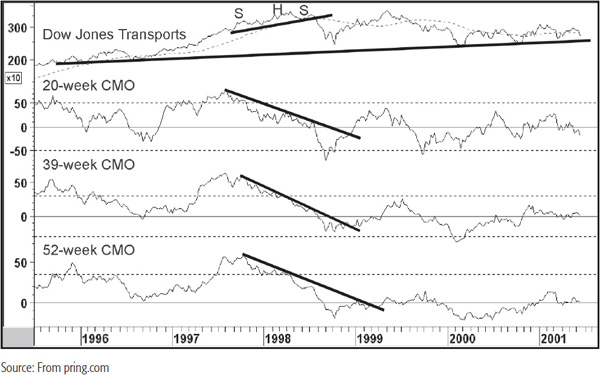
The most serious technical damage of all came from Chart 20.3 in the form of a major breakdown in the RS line below a 6-year support trendline. This happened as the absolute price was crossing below its 65-week EMA. Trouble on the RS front had been signaled long before this, because it had utterly and completely failed to confirm the bull market in the absolute price. By the time of the 1998 peak in the Transports themselves, the RS line had experienced a major negative divergence. When the RS line moved to a new post-1993 low at the end of 1996, this should have been warning enough that there were far better places for exposure than transportation stocks.
The 1998 bottom, like that of 1990, was an elusive affair, but more so because the turn was so sharp. All three CMOs in Chart 20.5 violated down trendlines, but the average itself did not cross above its average until it had rallied a long way from the bottom. No down trendlines could be drawn against the price, so it was not really possible to build a timely and convincing bullish case. In cases where the evidence of a trend reversal is incomplete, it is always better to avoid the security in question. In any event, the overriding factor should have been the early 1998 breakdown in the RS line, as this set the scene for the next several years of trading action.
Indeed, as it turned out, the 1998–1999 advance was really an above-average reflex rally since all the price was able to do was to rally back to resistance in the form of its 1998 high and the extended bull market trendline. During this whole period the KST failed to give a buy signal and the RS line in Chart 20.3 never crossed back above its 65-week EMA.
Finally, the average violated its 1990–2000 up trendline at the start of the new century. This was not a great trendline, for, although it was quite long, it had only been touched on two occasions and was not therefore a great reflection of the underlying trend. However, it did result in a sideways trading range over the ensuing 2 years. The critical point after this would be the trendline joining a series of lows between 1996 and 2001. A break below it, not with standing other evidence, would be a serious technical blow.
This has been a brief account of the technical position of the Transports between 1990 and 2000. Although it was not possible to include too many indicators, it has enabled us to describe how trend indicators for price, momentum, and RS can be combined to help identify major turning points.