Our discussion of these long-term trends will begin with a quick review of the Kondratieff long wave, later moving on to consider what constitutes secular trends and how they come about. Finally, it will be helpful to look at some ways by which we can identify reversals in this all-important price movement.
In the 1970s, a school of thought (this author included) rationalized long-term trends in equity prices through an explanation of the Kondratieff wave. Nikolai Kondratieff, a Russian economist, observed that the U.S. economy had undergone three complete waves between its inception and the time he made his study in the 1920s. Interestingly, E. H. Phelps Brown and Sheila Hopkins of the London School of Economics wrote about the recurrence of a regular 50- to 52-year cycle in UK wheat prices between 1271 and 1954.
Kondratieff used wholesale prices as a central part of his theory, but since movements in commodity prices and interest rates are usually so closely interwoven, they could just as easily have been used.
Using U.S. economic data between the 1780s and the 1920s, Kondratieff observed that the economy had traversed through three very long-term structural cycles, each lasting approximately 50 to 54 years in length. It consists of three parts: an up wave, which is inflationary; a down wave, which is deflationary; and a transitional period that separates the two. The up and down waves vary in time, but typically take between 15 and 25 years to play out. The transition, or plateau period, exists for around 7 to 10 years.
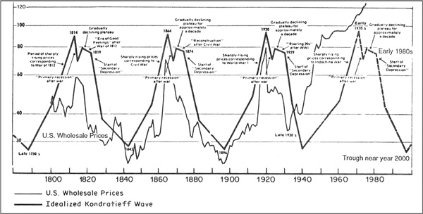
Figure 23.1 uses the trend of wholesale (commodity) prices to reflect the cycle. The up wave is associated with rising interest rates and commodity prices. The transition, or plateau period, is accompanied by stable rates and prices, and the down wave with declining rates and prices.
FIGURE 23.1 The Kondratieff Wave 1789–2000
The cycle begins with the start of the up wave, which gets underway when the structural overbuilding of the previous cycle has been substantially worked off. The overbuilding phase involves an excessive accumulation of debt, so cleaner balance sheets are another sign that a new cycle is underway. Kondratieff also noticed that each of the major turning points were associated with a war. Those that developed around the end of the down wave he termed trough wars. They acted as a catalyst to use capacity and get the inflationary process underway again. At some time during the early phase of the up wave, new technology is adopted, and that grows from seeds that were planted in the previous cycle. As the wave progresses, recessions become fewer and less severe and entrepreneurs become more emboldened. Growing confidence results in a progressively higher number of careless decisions being made. Throughout this period, price inflation is building in intensity, culminating in a peak war that sucks up excess capacity with a consequential explosion in commodity prices.
The up wave then culminates in a sharp recession as the price structure reverts toward equilibrium and the careless, overextended nature of many business decisions results in a substantial number of bankruptcies as the economy contracts sharply.
Thus begins the transitional phase, called the plateau period because commodity prices experience a flat or ranging action not much below the up-wave peak. Equity investors love the predictability of this stable phase. Consequently, the plateau period is associated with very strong equity bull markets, such as the roaring 1920s. During the plateau period, the excesses of the previous boom are never unwound and typically new ones develop. It’s really the eye of the Kondratieff storm. As an example of plateau-oriented excesses, 1929 saw the U.S. auto industry with the capacity to produce 6.4 million cars, yet the best previous sales year had been 4.5 million.
The next phase is the down wave in which deflationary forces take over and the system painfully corrects its excesses. Once this cathartic process has run its course, it’s possible for a new cycle to get underway.
There is no question that the very long-term structural and psychological trends observed by Kondratieff continue to operate today. However, as a rigid forecasting tool, it leaves a lot to be desired. For example the idealized cycle shown in Figure 23.1 called for a trough low around the year 2000, yet we know with the benefit of hindsight that this turned out to be a secular peak as far as stock prices were concerned. Bond yields, instead of bottoming, continued lower for the next 12 years. Commodity prices, true to form, did trough around the turn of the century. The idea of peak-and-trough wars suddenly emerging at the two key turning points at first glance appears to be irrational, in that they are a predetermined part of the wave. However, when it is considered that these wars develop at times when the cycle is at its most structurally unbalanced stages, it is not hard to see how domestic economic unrest can transform into a military conflict.
What is not disputable is the fact that commodity prices, real stock prices, and bonds continue to experience secular or very long-term trends of their own and that secular trends between inflationary and deflationary forces do exist. It is these trends on which we will focus since they set the scene for very long-term investment themes and dominate the characteristics of primary or business cycle–associated trends.
In earlier chapters, we discussed the concept of the secular trend, an extended price movement that embraces many different business cycles and averages between 15 and 20 years. In this chapter, the very long-term or secular trend will be examined in greater detail because it dominates everything, whatever the asset class—bonds, stocks, or commodities. The calendar year goes through four seasons—spring, summer, winter, and fall—and various phenomena are associated with each season, such as winter being the coldest. However, the seasons are not the same in all parts of the world. That’s because the weather is ultimately dominated by the climate. In the Dakotas, winter is extremely cold and long and summers are short, but in Florida, winter is hardly felt and summers are hot and extended. Both areas of the country receive the same seasons, but their climates dictate the nature of those seasons. The same is true for the business cycle, since each one undergoes the same chronological sequence of events, whatever the direction of the secular trend. However, the characteristics of each individual cycle differ, depending on the direction and maturity of the secular trend. Figure 23.2 overlays the secular trend on the cyclical.
FIGURE 23.2 Secular versus Primary Trends
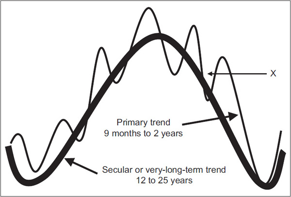
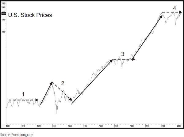
Chart 23.1 shows that since 1900 the U.S. equity market has alternated between bullish and bearish secular trends, which have averaged 14 and 18.5 years, respectively.
CHART 23.1 U.S. Stock Prices, 1900–2012 Showing Secular Trends
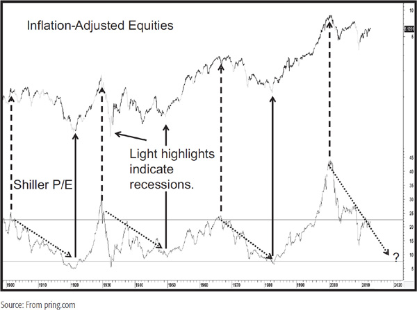
We will be concentrating on the secular equity bears here because of their challenging nature, secular bulls being a largely buy-and-hold environment. You may be saying to yourself that the 1900–1920 and 1966–1982 periods were really trading ranges and, therefore, not bear markets. However, we are only looking at part of the picture. For example, it’s possible to buy a stock at $10 and sell it for $20. That would imply a doubling of the original investment, but the real question should be what the purchasing power of the proceeds is when the stock is sold compared to when it was purchased. If the cost of living had doubled, there would be no gain. Chart 23.2 puts this in perspective because it shows the S&P deflated by the Consumer Price Index (CPI). Now the trading ranges reflect their true bear market status. Two questions that might come to mind at this point are: What are the root causes of these secular bear trends? and How can the birth of a new secular bull market be identified?
CHART 23.2 Inflation-Adjusted Equities and the Shiller P/E 1899–2012
There are three primary reasons why secular bear markets take place, and they have their roots in psychology, structural economic problems, and unusual volatility of commodity prices. The third factor is, to some extent, an offshoot of the second. Let’s consider them in turn.
Psychological Causes If you refer to Chart 23.2 again, you will see the Shiller Price Earnings Ratio in the bottom panel. This series uses a 10-year average of earnings adjusted for inflation in order to iron out cyclical fluctuations. You may be wondering why we are featuring what is essentially a fundamental indicator in a technical book. The answer is that the price/earnings (P/E) ratio is treated here as a measure of sentiment. For example, why were investors prepared to pay a very high P/E for stocks in 1929? The answer was that they were projecting previous years of upward multiple revisions. Such a level of overvaluation clearly indicated that investors were unusually optimistic. The P/E declined during successive secular bear markets to a low reading in the 7 to 8 area. Why? Because investors had watched inflation-adjusted stocks decline for a couple of decades, expected more of the same, and wanted be paid handsomely for the excessive risk that was generally perceived. In effect, sentiment typically reverses from exceptional optimism reflected by a high P/E to panic and despair at the secular low. The chart shows that the psychological pendulum is continually swinging from one extreme to the other. It also demonstrates that a prerequisite for a sustainable new secular bull is a once-in-a-generation mood of despondency and despair. Please note that although the actual low developed in 1932, it was not until 1949 that the P/E ratio was able to rally away from its oversold zone on a sustainable basis. That is a principal reason why that particular secular bear is dated in such a way. These psychological swings associated with giant earnings contraction and expansion cycles are not just limited to P/E ratios. They also extend to other methods of valuation, such as swings in the dividend yield on the S&P Composite, from 2 to 3 percent at peaks, to an average of 6 to 7 percent at secular lows. Replacement value for the whole stock market, as measured by the Tobin Q Ratio, moves from $1.00 to $1.15 at peaks to average a discounted 30 cents on the dollar at secular lows. The same principles hold true. High valuations, whichever method is used, reflect optimism and careless decisions, and low ones reflect fear and extreme pessimism, where investors demand to be paid handsomely for what the crowd thinks is a very risky environment.
Ironically, the actual level of inflation-adjusted earnings, when calculated as a 10-year moving average, actually rose during each of the twentieth-century secular bear markets. Consequently, the more important influence on equity prices over long periods of time is investors’ attitude to those earnings rather than the earnings themselves.
To understand the nature of secular price movements in equities, we need to take into consideration the fact that the longer a specific trend or condition exists, the more mentally ingrained it becomes. Investors are cautious at the start of a secular bull market because they are mindful of the previous bear market. Eventually, they gain confidence, as each successive primary-trend bull market rewards them. This process extends as investors gradually lower their guard, sooner or later falling victim to careless decisions as they are sucked in by their own success and egged on by an ever more optimistic crowd around them. In addition, due to the passage of time, new, younger market participants arrive on the scene, investors who had no experience of the previous secular bear and, therefore, no fear of another one. A common mantra—“this time, it’s different”—typically comes to the fore.
Structural Causes The second cause of secular bear markets is structural in nature. The secular peak is preceded by a decade or so in which a specific industry or economic sector gains in popularity. This results in a misallocation of capital as everyone wants a piece of the action and overbuilding results in substantial excess capacity. In the early part of the nineteenth century, the culprit was canals; in the 1870s, it was railroads. Recently, we saw the dot-com and later the housing bubbles. Such excesses usually take at least a couple of business cycles to unwind, but the pain that that involves gets the attention of governments whose solutions compound the problem and drag out the secular bear. For example, the natural response to the 1930 downturn was to slap on tariffs to protect an overbuilt U.S. manufacturing industry. Other governments around the world followed suit in retaliation. It was worse than a zero-sum game because international trade spiraled on the downside, so everyone lost. In the twenty-first century, the problems are compounded by demographic trends as fewer workers have the burden of supporting greater numbers of older nonworkers. Government response to this reality has been to run huge, mathematically unsustainable deficits, which, not understandably, will become a burden on future growth.
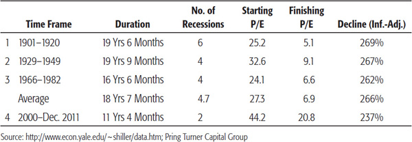
If evidence of structural deficiencies during secular downtrends is required, look no further than Table 23.1, which sets out their characteristics. The third column catalogues the number of recessions experienced in previous secular bears. They number between four and six, which compares to two in the 1949–1966 secular bull and one in the 1982–2000 period. An economy that is continually experiencing periods of negative growth is clearly one cursed with structural challenges. Also, the repeated experience of recessionary behavior adds to the mood of psychological despair at the secular bear market low.
TABLE 23.1 Comparing Secular Bear Characteristics It may take two or more business cycles for valuations to reach historic secular lows.
Unstable Commodity Trends It could be argued that unstable commodity prices are a symptom of structural problems rather than a root cause of secular equity bears. However, there can be no doubt that these secular environments are characterized by unstable commodity prices on the upside as well as occasional pockets of sharp, but mercifully brief, waterfall declines. The drop between 1929 and 1932 was a prime example, though the briefer 1920–1921, 1974–1975, 1980, and 2008 declines remind us that equities do not like unstable commodity prices whichever direction they develop.
Chart 23.3 compares the Inflation Adjusted S&P Composite (spliced to the Cowles Commission Index prior to 1926) to the CRB Spot Raw Industrials (spliced to U.S. wholesale prices prior to 1948). The chart flags secular bear markets with the dashed arrows. It is fairly evident that all of them, with the exception of the pockets of deflation outlined earlier, have been associated with a background of rising commodity prices. The relationship is not an exact tick-by-tick correlation, but the chart clearly demonstrates that a sustained trend of rising commodity prices sooner or later results in the demise of equities.
CHART 23.3 Inflation-Adjusted Equities and Commodity Prices, 1850–2012
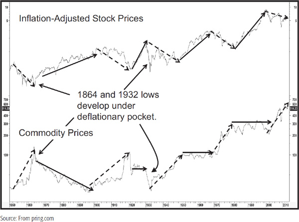
The thick solid arrows show that a sustained trend of falling or stable commodity prices is positive for equities as all secular bulls developed under such an environment. This point is also underscored by the opening decade of the last century. It is labeled a secular bear, but real equity prices were initially quite stable, as they were able to shrug off the gentle rise in commodities. Only when commodity prices accelerated to the upside a few years later did inflation-adjusted stock prices sell off sharply.
A useful approach for identifying a secular peak in commodity prices, and usually a secular low in equities, is to calculate a price oscillator or trend-deviation measure. In this case, the parameters used in Chart 23.4 are a 60-month (5-year) simple moving average divided by a 360-month (30-year) average.
CHART 23.4 Inflation-Adjusted Equities versus Long-Term Commodity Momentum, 1829–2012
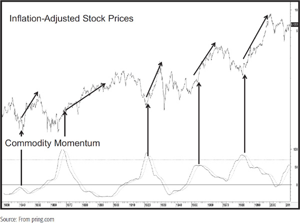
The downward-pointing arrows indicating reversals from an overextended position have offered four reliable buy signals for equities in the last 150 years or so. If nothing else, the chart demonstrates that dissipating long-term inflationary pressures are very positive for equities.
In the previous section we established the fact that secular trends develop in commodity prices and that their direction greatly influences long-term trends in equities. It’s difficult to pinpoint a specific cause of secular commodity bull markets, as they appear to emanate from a combination of structural imbalances, wars, and liquidity provided by central banks to offset these problems. Long-term uptrends in commodity prices also embolden producers to expand capacity, leading to overbuilding at or just after secular peaks. Secular bear markets, then, evolve as this oversupply situation is gradually worked off. Psychology also plays a part in that monetary velocity greatly affects the inflationary ability of any given dollar of liquidity in the system. Suffice it to say that these factors integrate in such a way that it is possible to observe clear-cut secular trends in commodity prices. Chart 23.5 shows a historical perspective back to the early nineteenth century. You can see that, excluding the rising trend that began in 2001, the average secular bull market lasted 19 years and the average bear 21 years, for an overall average of 20 years. Some of these “bear” markets were really trading ranges, as the 1950s and 1960s and the 1980–2001 periods testify.
CHART 23.5 U.S. Commodity Prices, 1840–2012 Highlighting Secular Trends
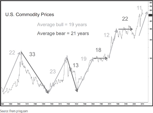
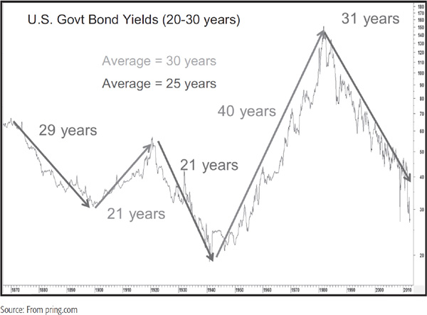
Chart 23.6 shows the long-term history for bond yields. It is fairly evident that their trends are much better behaved than their volatile commodity counterparts, which makes secular reversals relatively easier to identify. The arrows show the five secular trends since 1870. The two completed bear markets for bond prices (bull markets in yields) averaged 30 years, and the bull markets for bond prices (bear markets in yields) averaged 25 years, for an average of 27.5 years. U.S. bond yields had been in a secular downtrend (bull market for bond prices) since 1981, or for about 31 years at the end of 2012. This favorable bond trend is long in the tooth in terms of time served, which makes it likely that it will not extend that much into the second decade of the current century.
CHART 23.6 U.S. Government Bond Yields, 1865–2012 Highlighting Secular Trends
Arguably the biggest driver of secular trends in bond yields is inflation in the form of industrial commodity prices. In this respect, Chart 23.7 compares bond yields to commodity prices.
CHART 23.7 U.S. Government Bond Yields versus Commodity Prices, 1860–2012
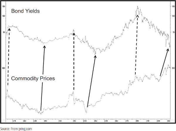
The relatively close, but certainly not perfect, correlation between them is self-evident. What is striking is that commodity prices led yields in four of the five secular turning points shown on the chart. In 1920, the two reversed more or less simultaneously. Clearly, the lead times varied, and one could certainly argue the point that the mid-1990s commodity peak was higher than that of 1980. Nevertheless, the record shows that commodities lead interest rates at secular as well as at cyclical turning points. Unfortunately, the leads for each turning point are varied, starting from the simultaneous reversal in 1920 to a 10-year lead time in the 1932–1946 period. Even so, the strong secular commodity rally in the 2001–2011 period, coming after a 31-year decline in yields, suggests that a secular reversal in favor of inflation may well be in the cards as we approach the middle part of the decade.
When we are trying to spot changes in primary trends associated with the business cycle, it is occasionally possible to identify reversal signals that take place within a matter of a couple of months of the final turning point. Secular trends extend over many business cycles and, therefore, are much longer in duration. This means that it may take many years, or indeed several business cycles, before a reversal signal can be identified. However, the patience and discipline required to track down these changes are well worth the trouble. First, such signals do not develop very often and are likely to remain in force for one or more decades. Second, the direction of the secular trend has a huge influence on the character of the primary trend. Bull markets in uptrends last, on average, much longer than bull markets in downtrends and so forth. Understanding the direction of the secular trend can, therefore, put us ahead in the process of allocating assets around the business cycle.
The explanation that follows does not offer all the answers we might like, but it does represent a starting point.
One of the problems we face is that the recorded history of U.S. financial markets does not go back very far when we consider that a secular trend often extends for 25 years or more. This means that there are not that many turning points to consider. All we can do is apply some of the trend-following principles and tools that might be used for identifying reversals in short-term trends and see how well they work. Specifically, I have found that momentum offers the most accurate and timely signals when confirmed by trendline breaks, whereas moving-average analysis plays a less substantive role. Let’s start our analysis with stocks.
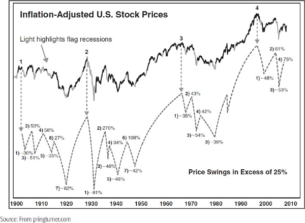
The average secular equity bull market since 1900 has lasted 12 years, whereas 18.5 years is the number for bear markets. If the 1921–1929 bull market outlier is ignored, the average length of just over 17 years is more in line with the average secular bear. Once a new secular trend has been identified, one starting point is to relate the time that has already elapsed to the average in order to see how much that trend may be expected to extend into the future. Another benchmark would be the Shiller P/E Ratio to see where it stands relative to its 22 times to 5 to 7 times extreme benchmarks. Chart 23.8 shows that previous secular bears have undergone five to seven price swings in excess of 25 percent. Working on the assumption that all secular bears will be subject to a similar experience, that, too, could be used as a benchmark for discerning the maturity of any existing decline.
CHART 23.8 Secular Bear Markets Are Deeply Cyclical Affairs, 1900–2011
Secular bulls are completely different, as primary-trend bear markets that develop under their context rarely experience declines in excess of 25 percent. The 1920–1929 and 1950–1966 inflation-adjusted bulls averaged around 400 percent, and the 1982–2000 experience was close to 700 percent.
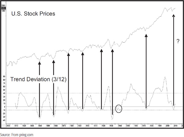
Charts 23.9 and 23.10 compare the U.S. stock prices to a price oscillator using a 3-year moving average (MA) divided by a 12-year span. Since annual data are being used, precise timing should not be expected, but the peaks and troughs in this indicator nevertheless do offer some useful benchmarks of the market’s long-term temperature. Secular accumulation points are indicated in Chart 23.9 when the oscillator bottoms out from at or below the –10 percent level. Only one of the seven signals since 1800 has proved to be a whipsaw and that was the one given in the late 1930s. It will be interesting to see whether the 2012 signal will turn out to be a valid one or more of an accumulation indication as it was in the 1930s and 1940s. Since markets spend more time rising than falling, the negative-signaling benchmark has been raised from 10 percent to 40 percent. In this exercise, peaks are signaled when the oscillator crosses below the +40 percent level. They have been flagged with the downward-pointing arrows. Often, the actual market peak is signaled when the oscillator reverses direction, so the negative overbought crossover is a more conservative approach. In some instances, these peaks are followed by multiyear trading ranges rather than actual declines, but in all instances, nominal prices had a hard time advancing for many years after the signal was given.
CHART 23.9 U.S. Stock Prices and a Trend Deviation Indicator 1800–2012 Showing Peaks
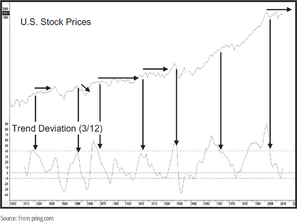
CHART 23.10 U.S. Stock Prices and a Trend Deviation Indicator 1800–2012 Showing Bottoms
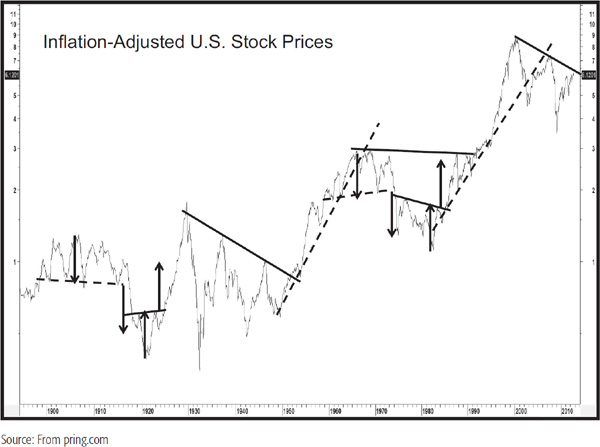
Trendlines are often a very useful secular identification tool. Chart 23.11 shows how trendline violations or price pattern completions have reliably signaled major reversals over the last 100 years or so. The problem, of course, is that it is not always possible to construct lines against fast markets, such as the 1929–1932 drop. Alternatively, lines can be constructed but their violation comes well after the turning point. That does not happen to any of the lines drawn on Chart 23.11, but would have for, say, the one joining the 1911 to the 1915 top had it been included.
CHART 23.11 Inflation-Adjusted Equity Prices 1890–2012 Showing Trendline Applications
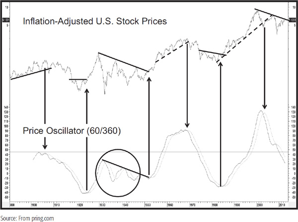
An alternative is to combine trendline violations with an oscillator. In this case, a useful secular span is to divide a 60-month (5-year) by a 360-month (30-year) moving average, as shown in Chart 23.12. Apart from the disastrous 1930s signal contained in the ellipse, when every signal developed completely out of kilter with the price, this approach worked well in the 1900–2013 period.
CHART 23.12 Inflation-Adjusted Equity Prices 1890–2012 Showing Oscillator Signals
One method is to run a long-term moving average through the data. The problem is that we need to extend the time frame to eliminate whipsaws, but the signals often develop well after the new trend is under way. Chart 23.13 shows a 156-month (13-year) MA for U.S. commodities. It works reasonably well, and crossovers are reliable enough to provide a hint of a reversal, but certainly not enough on which to bet the mortgage. Note that prior to 1860, annual prices are used in the commodity index.
CHART 23.13 U.S. Commodity Prices, 1800–2012 and a Rate of Change Indicator
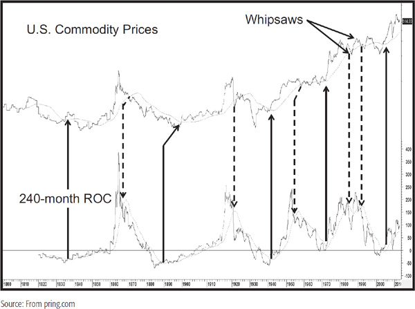
The chart also includes a momentum indicator—in this case, a 240-month (20-year) rate of change (ROC). The smoothing is a 72-month (6-year) MA, which is very good at identifying parabolic tops. Reversals in the smoothing often give reliable signals at bottoms. In that respect, the up-pointing (solid) arrows show when the moving average of the momentum series reverses to the upside. Often, these signals develop some time ahead of the final turning point in commodity prices, so some of the arrows slant to the right to indicate when the price series confirms with a moving-average crossover. The downward-pointing (dashed) arrows indicate secular peaks. In this case, the signals develop when the ROC crosses below its 72-month moving average, not when the average reverses direction. This is because bottoms tend to be rounded affairs, whereas peaks typically take the form of a spike. Note the two whipsaw signals that developed in the 1980–2001 trading range. At the end of 2005, the moving average for the ROC moved back above its 156-month moving average. This was the fifth confirmed buy signal in almost 150 years of data.
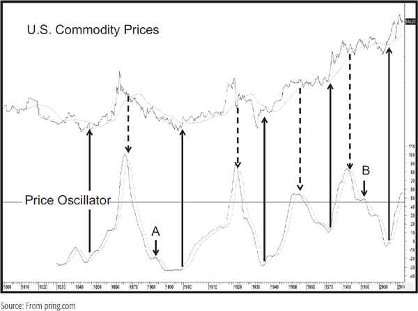
Another useful technique is to adopt the 60-month/360-month price oscillator approach used earlier for stocks. This is shown in Chart 23.14, where 48-month MA crossovers of the oscillator are used as momentum buy/sell alerts. Notice the two arrows at A and B, which indicate the only whipsaws in nearly 200 years of history—okay, a couple of the signals were late, but not a bad overall performance.
CHART 23.14 U.S. Commodity Prices, 1800–2012 and a Price Oscillator
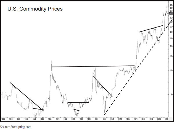
Trendline analysis can also be adopted for commodity prices. Some examples are shown in Chart 23.15. Note the dashed up trendline that has its roots in the 1930s. If it is ever violated, expect to see a major commodity decline or extended trading range follow.
CHART 23.15 U.S. Commodity Prices, 1800–2012 and Trendline Application
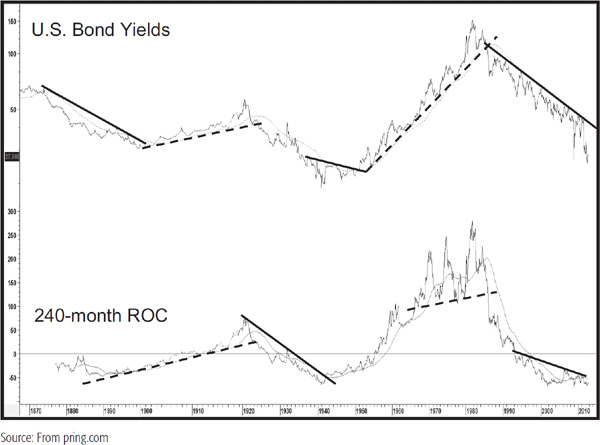
Many of the same techniques used in commodity analysis can be adopted for bond yields. For example, Chart 23.16 shows that the 240 ROC/trendline combination works quite well. The series in question uses the 30-year yield since its inception in the 1990s but is also spliced to the 20-year government yield prior to that.
CHART 23.16 U.S. Bond Yields, 1865–2012 and a Rate of Change
The path of bond yields tends to be smoother than that of stocks and commodities, so a useful combination is to compare a 9-month exponential moving average (EMA) with that of a 96-month series. This is shown in Chart 23.17.
CHART 23.17 U.S. Bond Yields, 1865–2012 and Two Moving Averages
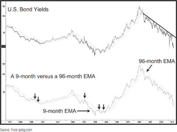
The small arrows show the very few whipsaws that have taken place in the last 150 years or so. Note that the yield remained below its 96-month MA for most of the course of the post-1981 secular bear. Since the MA and trendline are in the same vicinity and the line has been touched or approached on numerous occasions, their joint penetration should prove to be a very reliable secular trend-reversal signal whenever that comes. Chart 23.18 shows a more recent history. Note how the 96-month EMA and trendline were almost indistinguishable between 1990 and 2013, thereby reinforcing each one as a resistance barrier. Note also that the yield did not reverse on a dime at either of the two secular turning points shown on the chart. Instead, it experienced an extended trading range in both instances.
CHART 23.18 U.S. Bond Yields, 1928–2012 and Trendline and Peak-and-Trough Analysis
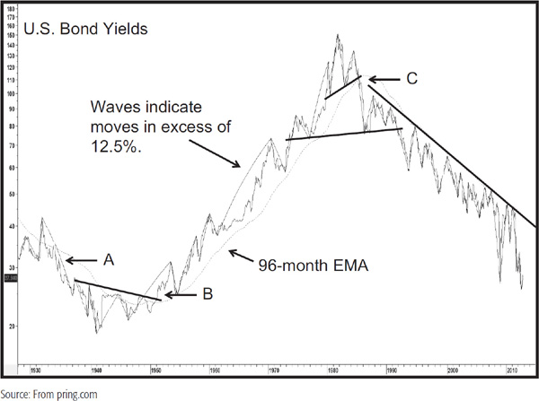
Peak-trough progression is another technique that can be applied to the process of identifying secular reversals in bonds yields. It is not a perfect approach, but seems to work on a timelier basis than most. The idea is that a valid uptrend develops when each successive peak is higher than its predecessor, as is each successive trough. In this instance, a peak is a rally high associated with a specific business cycle and a low is a low associated with the contraction or slowdown. When the series of rising peaks and troughs gives way to one of lower peaks and troughs, a trend-reversal signal is given by this technique. The magnitude and duration of the new trend, however, are not indicated. That would be nice to know, but a warning on the direction is not to be sneezed at. Downtrend reversals are signaled in exactly the opposite way, with a series of rising peaks and troughs replacing a declining trend. It should not be assumed that this technique will work in every situation, but it is surprising how effective it can be, especially when used in conjunction with moving-average crossovers and trendline violations, etc.
The solid wave forms represent movements in excess of 12.5 percent and are used as a basis for objectively measuring what constitutes a legitimate peak or trough. The first signal at A is actually a reconfirmation of the secular downtrend that began in 1920. The series of declining peaks and troughs had been interrupted in early 1932 with a higher high. Since the 1931 low was slightly below its predecessor, the declining troughs were still intact. The break below it at A reconfirmed the secular downtrend. Point B shows the reversal of this decline in the late 1940s. The yield then continued to trace out a series of rising peaks and troughs until point C in the early 1980s. As the chart closes in 2012, the downward peak tough progression continues.
In an earlier chapter, we learned that the primary trend determines the characteristics of shorter-term price movements. During a bull market, short-term uptrends have greater magnitude than short-term uptrends that develop in a primary bear market and vice versa. The same is also true for the relationship between the secular and business cycle (primary) associated trend. This is fairly self-evident if you look at Chart 23.2. You can see that primary-trend bear markets that developed, say, in the 1949–1966 or 1982–2000 secular bull market are far more benign those that developed in the secular bearish periods between 1966 and 1982 or 2000 and 2012. An understanding of the direction of the secular trend clearly puts you in a very powerful position. For example, if you correctly conclude that equities are in a secular bull market, it is likely that prices will be much more sensitive to an oversold reading. On the other hand, if the very long-term trend is a downward one, oversold readings would have far less power. Moreover, it is very probable that the magnitude and duration of a primary trend rally will be less in a secular bear market and more likely to run into resistance rather than register a sustainable new all-time high.
There is an old saying that surprises come in the direction of the main trend. Since the secular trend is really the more dominant, this means that during the secular uptrend, any surprises are likely to come on the inflationary side. Commodity prices rise much faster and further than most people expect. The same would be true of bond yields. The opposite set of surprises develops during a deflationary secular trend. Having said that, these “surprises” typically occur as the trend is in a more mature phase. When it is starting off, commodity prices and interest rates often experience a trading range or transitional period lasting around 5 to 10 years. It is only toward the end of the up wave, when distortions are beginning to evolve, that scary and unexpected rises in commodity prices and yields materialize.
Tables 23.2 to 23.5 show the actual movements during the 1946–1981 up phase and the 1981–201?down phase for Moody’s Corporate AAA yields.
TABLE 23.2 Cyclical Yield Rise in a Secular Uptrend
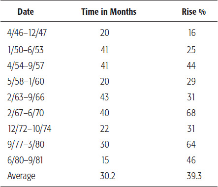
TABLE 23.3 Cyclical Yield Decline in a Secular Uptrend
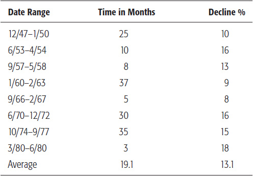
TABLE 23.4 Cyclical Yield Decline in a Secular Downtrend
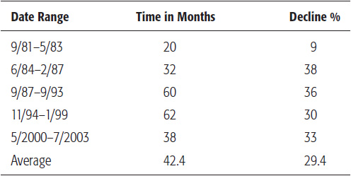
TABLE 23.5 Cyclical Yield Rise in a Secular Downtrend
We have noted that 2012 was the low for the secular trend, but in early 2013, there is insufficient evidence to draw a firm conclusion on this, even though several indicators were suggesting that that could be the case.
During the secular rise in yields, the average bull part of the cycle lasted around 30 months and took yields approximately just under 40 percent higher; bear markets in yields were shorter, at 19 months, and smaller, as they averaged 13 percent. During the down wave between 1981 and 2012, the bear markets lasted much longer, at 42 months, and took yields down an average 29 percent. Bull markets were shorter, averaging 15 months, but still took the yield up an average of 25 percent. Not every bull move in a secular advance is greater than every bull move in a secular decline and vice versa. However, the average figures indicate that if you can make a correct interpretation about the direction of the secular trend, you have already come a long way in the investment battle.
1. The Kondratieff wave describes the long-term interaction between inflation and deflationary forces, but its rigid, almost predetermined, interpretation has meant that many financial events have not transpired as expected.
2. Since the nineteenth century, stocks, commodities, and bonds have alternated between secular bull and bear markets, generally lasting about 15 to 20 years.
3. Secular bear markets for stocks are determined by long-term psychological swings. They are influenced by structural economic problems and unusually volatile commodity prices.
4. Secular trends can be analyzed with regular technical tools such as momentum, trendline, and moving-average analysis.
5. Surprises typically come in the direction of the secular trend, which determines the characteristics of the primary or business cycle–associated trends.