Now that there are so many formats and digital platforms for publications, publishers have lots of new decisions to make. Will a guidebook be better as a printed book or as an app? How can e-books be designed for all the different e-readers? What traditional print formats will be best for which markets? Can all the different versions be produced from the same data file? These are all things that require design and production skills, and the confidence and ability to manage publishing projects destined for a variety of formats for what might be widely different markets.
In all this, publishers need to be constantly aware of the importance of quality in the content and form of what they are producing. They need to be able to develop and keep to realistic schedules, budget effectively and establish pricing policies that lead to financial success. This chapter looks at how the design and production people in publishing contribute to this process and gives pointers on how to manage this important publishing function.
Platforms and formats appropriate for the content
The proliferation of formats and platforms for both print and digital publications requires managing content in a standardized way, so that it is possible to adapt this content for delivery to various markets through an array of production and distribution channels. An academic publisher, for example, can use the same core data files to prepare printed and online journals, printed books of conference papers and on-demand copies of individual articles. A trade publisher can use one file to create a hardback printed book, an e-book, and editions customized for other English-language markets. These editions may require new typefaces, formats, and designs, and even different punctuation and spelling conventions. Content may be ‘sliced and diced’ into chapter length (or shorter) sections for delivery through mobile phones and other devices, allowing publishers, like other media companies, to become aggregators and editors of content from a wide variety of sources.
The foundation of published works
Digital files have mostly replaced paper manuscripts at the core of publishing. These may be simple word-processed documents, more complicated files containing hyperlinks, audio and video content, or transmedia creations with an even richer content. In this context, creating one file (in a format such as XML) makes the content usable across a wide variety of platforms and formats, and it can be efficiently transferred between publisher, designer, printer and e-book distributor.
Using a common file format makes it possible to allocate identifiers for digital rights management (DRM). The integrated development of metadata, including unique identifiers in addition to the ISBN, enables discrete parts of any publication (such as sections, chapters, illustrations and appendices) to be identified and their usage tracked. Each file or sub-file can be identified by its DOI, the ownership of which can be validated and transacted across the global publishing network where others can create ‘new’ publications constructed of aggregated content.
Design decisions reinforce brand and access to the market
Designing even the simplest publication entails a number of critical decisions related to the format, typography, page layout, medium and packaging. These decisions involve a dialogue between the editor, designer and marketing manager, with regular reviews by senior management, to make sure that the content and presentation remain focused on the intended market. Whether the design is predetermined by the established style of an imprint or series, or whether it is a stand-alone, every decision affects the features and benefits that will influence readers (and everyone else in the publishing network) as they decide whether to buy, recommend or read the publication. Just as editors are usually guided and constrained by a ‘house style’, designers are likewise rarely given a blank canvas. Certain design and production features are dictated by industry norms such as standard book sizes (see here), limitations of printing technology, and customary prices for books and other publications. Each publisher decides on the design features and production qualities that it wants for a particular list or series. The standard features may extend to the choice of formats, typefaces, papers, bindings and cover illustrations, so the challenge for the designer is to work within the constraints of the overall style to create readable, user-friendly and economical designs.
5.1 | Brand and design
Design and production are now about much more than packaging one version of a publication. They are about brand, legacy, production integration and market penetration. Here, designer Olympia Le-Tan has used the iconic cover design for J.D. Salinger’s Catcher in the Rye on her clutch bags, extending the brand into an unexpected area of merchandising.
A design brief
A design brief or memo for an individual title may include instructions on some of the following:
•The format of the book and overall page layout to be followed, including the body text area and the placing of different text elements such as running heads, page numbers, notes and tables. The designer will generally be provided with (or will develop) a grid to ensure that these elements are consistent.
•Is the book to be in colour or black and white only, can it include spot colour or halftones? These decisions are made with marketing in mind, by consideration of the use of illustrations in competing titles, and by calculating the economic implications of the added cost of colour reproduction.
•Which typefaces (and in what point sizes) are to be used for the various elements such as body text, captions, headings and page numbers? This will be a part of the house style, and may well be built into the on-screen design template used by the designer.
•What illustrations are to be included? Is the designer expected to prepare illustrations or adapt those provided by the author, editor or picture researcher? These decisions are made by the editor and the author, but it is the designer’s job to make sure that they are integrated appropriately into the overall publication as it will be experienced by the reader.
In the next chapter we’ll look in more detail at the choices that relate specifically to the print versus digital decision, but first let’s consider the publishing design decisions that confront publishers of print products.
Using InDesign
Adobe InDesign® is currently one of the most common software programs used by designers to produce files for books, magazines, newspapers, flyers, brochures and other printed publications. InDesign files include page formatting information, page content, linked files, styles and colours. InDesign produces. indd files that are then converted to PDF files for use by the printer. Printers may use a variety of PDF file formats, depending on the different resolution required. The PDF file format, familiar to consumers from a multitude of internet downloads, is also used for some e-books, although it does not offer all the functions available with other file formats.
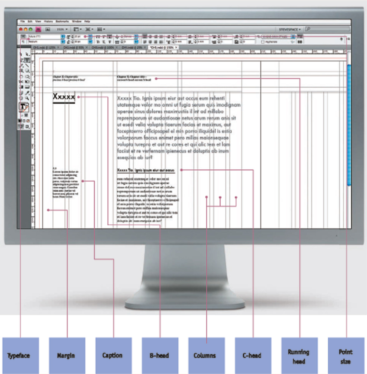
5.2 | Key design elements
This example of a spread shows some of the key design elements used in this book.
5.3 | InDesign template
When a designer uses a design package such as InDesign (shown here), the design template will be determined before any actual content is included. Images may appear as blank pages, and text will often be substituted using ‘lorem ipsum’, a sample Latin dummy text that has been in use since the 1500s.
Physical format
Printed books can come in all shapes and sizes, but the vast majority are produced in a small number of formats. Having standardized book formats means that printers can develop their production lines to offer cost savings, and production costs can also be controlled by using paper economically
Table 5.1
Book formats
| UK sizes |
Metric (h x w) approx. trim size |
| Paperback sizes |
| A format |
178 x 110 mm |
| V format |
198 x 129 mm |
| C format |
216 x 138 mm |
| Other popular sizes |
| Demy quarto |
276 x 219 mm |
| Crown quarto |
246 x 189 mm |
| Royal octavo |
234 x 156 mm |
| Demy octavo |
216 x 138 mm |
|
| US sizes |
Imperial (w x h) approx. trim size |
| Mass-market paperback |
4¼ inches x 7 inches |
| Paperback |
5½ inches x 8½ inches |
| Common hardback sizes |
6 inches x 9 inches
7 inches x 10 inches
8½ inches x 11 inches |
Slightly different book sizes (also called trim sizes) are used in the UK and the United States (see below). Books produced in other parts of the world are printed on different sized paper, or are trimmed to formats that have a traditional place in their respective book markets.
Most books are produced in a portrait orientation, although some are landscape and some are square. Book production has become more global, with much production in recent years being done in China, India and other expanding economies. In this globalized publishing world, book formats are gradually becoming more standardized. This has rationalized many aspects of production and made life much easier for other parts of the distribution chain, from packaging to shelf display.
Book formats
Book formats developed from the names of the sheets of paper used, and were traditionally named after the number of times a piece of paper was folded to make the size of the book. Thus the paper size called Crown (16¼″ × 21″, 413 mm × 533 mm) leads to book sizes such as Crown Royal, Crown Quarto and Crown Octavo depending on the number of times the sheet is folded, and other paper sizes make different quarto and octavo sizes. Modern book-size names are still based on these measurements, although the metric size is the standard in the UK and the rest of the world, except in the United States, where sizes are in inches, and expressed as width × height, rather than height × width.
‘Book design is seeing a resurgence. This statement is not based on the result of a poll. Its science emanates from the hefty postbags I receive every week, filled with books that are more beautiful, more inventive in design, than they used to be. Not just high-end books either, but those exquisitely designed flapped paperbacks (Pushkin Press) or smart commercial covers (Gone Girl), attractive “series” re-designs (Penguin English Library) and of course, the display-worthy hardbacks.’ Arifa Akbar, Literary Editor of The Independent
‘Because of e-books’ lack of . . . pleasing aesthetics, that provides an opening for traditional (hardcover and paperback books) publishing to give readers both the pleasure of reading a good book along with the additional pleasure of holding in one’s hands a beautiful physical object.’ Dennis Abrams, Contributing Editor for Publishing Perspectives
Page design
The traditions and conventions of page design that have arisen over the years are based on the assumption that the design should make the text more legible; ensure that the organization of the work is clear to readers; and aid readers in navigating their way around the book. To help with navigation, a good design is internally consistent (according to house style), so that readers can quickly understand how the text and illustrations are organized. Designers use various software packages to create pages for publication. Adobe InDesign and QuarkXPress are used by the majority of book designers although other major software suppliers such as Microsoft and Corel have similar design programs and some designers prefer to use open-source free software such as Scribus. Designers need to have a good understanding of and training in issues of readability, the effect of design features on meaning, and how readers navigate around the physical page. Some e-books are unable to replicate all features of printed books when the content is moved into the e-book medium.
Typography
Typography – the choice of typeface, size and text layout – is a major factor affecting the readability of any text. Different typefaces are thought to be more appropriate to different types of publication. Most novels, for instance, are produced using a serif face such as Baskerville, Palatino or Times New Roman: they create links between letters so that the eye sees whole words, making prolonged reading easier on the eye and brain.
On the other hand, we have grown accustomed (through computer use and word-processed documents) to reading more factual work-related texts in typefaces such as Arial or Verdana. Scientists and academics used to PDF versions of documents, produced for publication in journals, are unlikely to experience anything other than a limited range of typefaces, while readers of fiction or poetry may be more used to the traditional serif characters. The size of type is important. Large type is more easily read by children and those with limited eyesight. The point (pt) size determines how many characters there are in a line of printed text as it appears on the page or screen. The number of characters on a line of text can affect the readability, as can the kerning and tracking (spacing between letters), and the spacing (leading) inserted between lines. If our eyes have to move too often to the next line, or if they must move too far back to identify the start of the next line, reading is likely to be more tiring. Somewhere between forty and sixty characters per line is a good measure. This preferred measure is also true of texts that are intended to be read on screen, so fixed-width pages for e-books can be far more readable than e-books in which the number of characters per line changes when the content is zoomed. Different typefaces are used in the print culture of different countries, just as other design elements such as cover designs, formats, papers and bindings vary according to cultural traditions. The move to global digital publishing may have an effect on this creative diversity, as the tastes of publishers and readers become less bound by national and linguistic publishing traditions.
Illustrations
Illustrations are selected by an author, editor or picture researcher and can be an important part of the overall book package. A copy of the illustration required (usually in digital form) is obtained, and the cost and copyright clearance agreed. Some illustrations may need to be drawn (or redrawn) by a designer or artist. Expectations regarding the graphic quality of illustrations are developing to include HD and 3D images, and the text component of some transmedia publications may be much smaller than the other components as graphic elements gain prominence. With some multiform digital publications, the designer will have to make more complex decisions on the graphics and sound files that may become part of the overall transmedia package. When the content is ‘reflowed’ into the digital medium, images and text need to be linked together so that they appear in a useful juxtaposition.
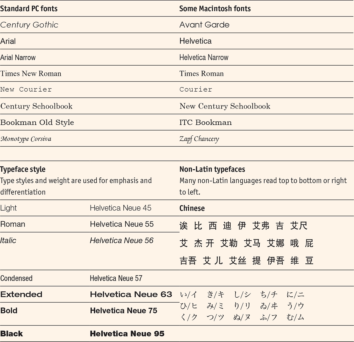
Typefaces used in this book –
This book is set in:
OfficinaSansITCStd
70 pt Black for chapter opener headings
17 pt Black for section headings
13 pt Bold for section introductions
10 pt Bold for subheadings
OfficinaSansITCStd Book, Bold and Black
9.5 pt for main text
8.5 pt Book and Bold for the captions
Book and Book Italic
9.5 pt for boxouts and diagrams
Table 5.2
Typefaces
| The development of computer-based typesetting led to a growth in typefaces designed specifically for the new media. |
Paper
Except for a very few books that are printed on plastics, fabrics or other exotic materials, most p-books are printed on paper, and their covers are printed on a paper board of some kind. The choice of what paper to use is often quite simple, as all printers keep a stock that is suitable for the kind of books that they produce and it is usually sensible (and more cost-effective) to use the paper the printer has in stock. As the printer buys a lot of this paper, it should be reasonably priced, and of a quality already tried and tested on the machines to be used. The publisher only needs to buy the exact amount needed to print the required quantity, and the same stock is also likely to be available for any subsequent reprint. Most books are printed on slightly off-white (to reduce the glare) or white paper. Book papers are lightweight (between 70 GSM and 100 GSM) and can have a range of bulk (thickness or calliper). In the United States, paper weight is calculated in pounds per ream (500 sheets). It is the bulk of the paper rather than the weight that determines how thick it is. Customers often compare the thickness of a book with its price, so the bulk can often be particularly important for the marketing of books with fewer pages.
The opacity of the paper is also important, and publishers are always concerned not to put off readers by using a paper that has too much show-through, particularly with pages that contain a mix of text and illustration. Bibles, however, are usually printed on ‘Bible paper’, which has low opacity, low weight and little bulk. Knowledge of paper is like knowledge of fine wine; the connoisseur can describe many subtleties in glowing terms, while many others will just know what they like. Most publishers will play safe and choose a paper because it is available from their printer, it works with similar books and it is available at a reasonable cost. Paper production is resource intensive and can cause pollution. It requires large volumes of water, energy and some chemicals as well as wood pulp. It is a major contributor to greenhouse gas emissions, being the third greatest industrial greenhouse gas emitter in the OECD (OECD Environmental Outlook). The Green Press Initiative and Forest Stewardship Council (FSC) and Sustainable Forestry Initiative (SFI) are just three of the programmes that the publishing industry has adopted to improve on its the environmental impact. Publishers with ‘FSC Chain of Custody’ certification include HarperCollins, Bloomsbury and Penguin, which produce most publications on FSC paper. SFI-certified sourcing labels show that the fibre used to produce paper is from a legal and responsible source.
Bindings and covers
Printed books come in a variety of bindings and covers. The choice of binding depends on the type of book and the market for which it is intended. Casebound or hardback books are usually produced for the top end of the market. Despite an increasingly uncertain market (according to the Association of American Publishers, US hardback sales dropped by 1.8 per cent from 2013 to 2014), they are back in fashion for trade books (both fiction and non-fiction), as publishers seek to differentiate print books from e-books by stressing their tangible and collectible qualities. The pages of hardback books are often sewn in sections, as are those of some paperback books. Most paperback books, though, are assembled using burst binding (perfect binding), in which the signatures (pages in multiples of 4, 8, 16 or 32) are held together by glue. Hardback and paperback books usually have an illustrated jacket or cover printed with an image, typographic design, basic metadata (title, author, ISBN, barcode) and promotional material. This includes the promotional blurb, review quotes, endorsements and biographical information about the author, the major characters and any other important facts, such as series or film adaptations.
Cover designs attract attention, define genre and create brand identity for imprints, authors and series. For thrillers like the French série noire, romances like Mills & Boon/Harlequin, children’s books like Ladybird, and the many Penguin sub-lists (Pelican, Modern Classics, Puffin), covers have long been a major component of book marketing. The design of the cover is thus of great importance to the publisher, the bookseller and the reader and represents an important part of the contribution designers make to publishing.
Most websites selling e-books feature a graphic identical or similar to the printed cover. For books published only as e-books, publishers recognize that there should be some visual clues about the genre and information on the text and the author. Given the nature of e-book purchases, this may include video material, interviews, readings, messaging services and interactive reviews. For the digital native generation, e-books sit comfortably alongside social network apps, SMS correspondence and multiplayer games.
5.4 | Colour photographs
Colour photographs are reproduced using techniques that apply different inks (usually magenta, yellow, cyan and black) to produce a full palette.
5.5 | Duotone photographs
Generally, duotone photographs are used for heightened visual effect, and printed in black and one other colour.
5.6 | Black-and-white photographs
Black-and-white halftone photographs are sometimes used for their dramatic effect. They are also usually cheaper to print as they use only one colour of ink.
5.7 | Line drawings
Line drawings have no variation of ink coverage, but rely on the variation of thickness of the lines for effect.
Judging a book by its cover
Book-cover design is one of the most important aspects of marketing: readers really do judge a book by its cover. This is increasingly apparent as self-publishing becomes more mainstream, and with it comes an abundance of amateur book design. Consequently, many companies have sprung up that offer professional book design services to independent authors. While book-cover design, particularly highly illustrated covers, is today important for author and publishing branding, and increasing the visibility of a book, it is a relatively new phenomenon. The illustrated covers that we know today did not become popular until the end of the nineteenth century, when there was more demand for cheaper books. Before this, book covers were generally ornate, leather bindings: a reflection of their owner’s status and wealth. Since then, there have been many experiments and progressions in book-cover design from Aubrey Beardsley’s The Yellow Book to Penguin’s radical approach to design (Jan Tschichold in the 1940s, Germano Facetti in the 1960s, and many others since) to Canongate’s partnership with design studio Pentagram to rebrand the Bible with its Pocket Canons collection. While all publishers cannot be expected to revolutionize book-cover design, and self-published authors cannot be expected to work with award-winning design companies to create their covers, it is clear that good cover design can add value to a book: whether that means extending its brand identity, making it easier for readers to identify a genre, increasing visibility in an online or a physical bookshop, or acting as a deciding factor to whether a consumer will buy a book or not.
5.8 | On the Side
The book cover for On the Side is attention-grabbing and distinctive, with its bold use of colour and quirky typographic design. This makes it perfect for use in e-book format, where the cover thumbnail is usually displayed quite small on the screen.
‘We are very much in the digital world, providing e-books for much of our list. But there’s something about the physical beauty of a book, finely executed inside and out, that readers find deeply satisfying. We bring much work and thought into the production of our books, from authoritative texts, interior design, to cutting-edge book design, and we have built a strong reputation for this distinction.’ Elda Rotor, vice president and publisher of Penguin Classics at the Penguin Random House in New York
Portability
One feature of the book remains constant: the e-reader or smartphone fits, like the paperback book has done for many years, neatly in a bag or pocket. The fundamental portability of the book remains one of its most valued qualities; only now, as an e-reader, it can carry whole libraries.
Printing basics
The first printing presses made direct impressions onto paper or other media from inked blocks that carried raised type or pictogram characters. Printing by direct impression (letterpress) continued into the twentieth century, becoming increasingly automated and fitted to the requirements of mass production. The development of automated hot-metal typesetting (to replace the hand assembly of cold type) during the 1880s (linotype) and 1890s (monotype), massively increased production capacity and improved the quality of reproduction. These innovations in typesetting, combined with the adoption of lithographic printing during the same period, provided the basis for the expansion of print publishing during the twentieth century. Central to this growth was offset lithography, in which the inked image is transferred (or ‘offset’) from a plate on a plate cylinder to a rubber blanket cylinder, from where it passes to the impression cylinder and then to the paper. Because there is no direct contact between the plate and the printing surface, this printing method produces a consistently high image quality and the plates have a longer printing life.
Modern offset presses can use paper in sheets (on a sheet-fed press) or in rolls (on a web-fed press). The efficiencies of continuous web printing make this especially useful for long runs such as those for newspapers, magazines and mass-market paperback books. The modern printing press makes plates directly from data files. Digital technology allows the settings of the machine to be done automatically, which ensures accurate imposition and the correct flow of ink and paper for an individual job. Offset litho is still the cheapest method to produce high-quality printing in commercial quantities. Improvements in automated set-up now also make it appropriate for quite small print runs (in the low hundreds). Digital printing is appropriate for small print runs of colour illustrated books. It is also employed by book printers who use POD and short-run printing for other types of books. On-demand copies of publications can also be produced on a local basis – sometimes within a conventional bookshop using, for instance, the Espresso Book Machine.
The number of pages in a book are multiples of the pages in a signature, for example a book composed of eight signatures each comprising 16 pages will have 128 pages. A signature is an individual section of a book made from a single sheet of paper folded in half, quarters, eighths and so on and then cut. A signature will usually consist of 8, 16 or 32 pages, although some presses can go as high as 64 or 128 pages printed on a single sheet. Each book is designed in such a way that there is a minimum of blank pages on each signature, as this represents an unnecessary paper cost. The signatures are folded and gathered together to form a book block, which is then bound together, covered and packaged. The first copies to come off the production line are inspected by the printer and the publisher’s production department before being released into the supply chain.
‘It’s a daunting landscape, far more savage and hostile to the author than any we’ve seen before. But one thing hasn’t changed, which is the ignored, unacknowledged, but complete dependence of those great interests on us and on our talents and on the work we do in the quiet of our solitude. They have enormous financial and political power, but no creative power whatsoever. Whether we’re poets, historians, writers of cookery books, novelists, travel writers, that comes from us alone. We originate the material they exploit.’ Philip Pullman, author of the His Dark Materials series
Scheduling the publication process
One of the major determinants of the publishing production process is the time it takes to develop the final physical or digital product or service, so that it can be brought to market on a planned date. Production departments construct the production schedule backwards from the publication date decided by the publisher, taking all the various milestones into account. The design and production schedule dovetails with the editorial schedule, and runs concurrently with the marketing, promotion, sales and distribution schedule. All the elements must work together to give the publication its best chance in the market.
5.9 | POD books from a Xerox machine
Print-on-demand books like these can be made in a variety of formats, and can be trimmed to smaller sizes as required by the publisher.
Discussion questions
1How is digital publishing affecting cover design?
2What advantages are there to using standardized book formats?
3When you read a novel, which typeface and type size do you prefer to read? Is this the same type style that you use on a computer screen?
4What is the difference between sewn and perfect binding?
5What is the future of illustrated books in the digital age?
6Why do you think there is still a demand for books with high production values?
Time
It is the production controller’s job to oversee the design and production activities undertaken both within the company and by external freelancers and commercial suppliers. The production controller needs to ensure that everyone keeps to the schedule, so that finished books are available for distribution in time for the publication date. At the same time, maintaining the schedule must not have a negative effect on quality. It is important to follow the schedule while keeping costs within agreed budgets and according to agreements with suppliers.
An effective workflow procedure means that spin-offs, repurposed versions, rapid revisions and adaptations to new platforms can be done in a cost-efficient way. Many publishers now use software technology to help with their workflow procedures, for example XML might be used to mark up text for e-publication. Many of the tasks done by copy editors, proofreaders, designers and web developers are now part of a common workflow that can ensure the simultaneous release of print, e-book, enhanced e-book or app. The use of XML means that the same content can be adapted for all these formats.
Scheduling tools
As mentioned earlier, production schedules are generally created backwards from a date when copies are needed for distribution and launch into the market. Although computer-based scheduling has mostly replaced the use of wallcharts, a good production coordinator will still need an instinctive feel for a likely delay before it happens and will quickly change his or her focus to react to possible critical points. All schedules are likely to be revised at points throughout the publication process, and the possibility of delays (known as ‘slippage’) must be built into any schedule. Anyone buying production services from outside suppliers must be aware of the seasonal demand for these services. Getting a book printed in time for Christmas would need an October publication date and may be more costly and require tighter scheduling than at other times. Conversely, if publishers can print a publication at a time when there is not much other work on offer, they may be able to get a good price and very flexible service from printers.
Project management
The fundamentals of production management remain as they were before the digital era: controlling the three variables of time, cost and quality. In other words, publishing on schedule, to budget and to the required specifications.
Digital workflow
The development of a digital workflow is seen by some as reflecting a fundamental shift in the publishing business model and the need for new publishing skills. Perhaps the most significant development is the need for a much closer working relationship between editorial and production, and this often entails a more integrated approach to new title development.
The importance of quality
For most users, a well-produced book simply means accurate and entertaining content that is well written, well edited and well produced. It must be easily navigable, with good quality production, so that the e-books work and the p-books don’t fall apart. The layout, typeface and any graphics must work within an overall publishing concept like the For Dummies series (see the case study in Chapter 4). In the case of e-publications, the book must work at least on all the most popular devices from day one – something that may involve extensive trialling if there is a multimedia element to the overall product design. The design must be appropriate to the reader’s expectations and needs, but not overly sophisticated, unless enhanced features really add something to the user experience. The quality of e-books is about more than technical compatibility and marketability of e-books on different devices; and fundamental design qualities need as much care as with a p-book. Readers may excuse some spelling and grammar mistakes on emails and tweets, but they don’t expect them in a book or an e-book. Copy-editing and proofreading remain a fundamental part of publishing in the digital age.
Proofs
The production process is punctuated by the different proof stages a book reaches in the process of typesetting, page layout and preparation for printing. Typeset material was traditionally first looked at in long galley proofs (unpaged impressions taken from the metal type put together by the typesetter), then in page proofs. First proofs are still corrected by the editor, author and designer, and changes made by each are incorporated into the finished work under the editor’s control. When the page layout is finalized and images prepared for reproduction, proofs of illustrations show up any loss of clarity or colour definition, particularly in halftone and colour illustrations. Further proofs are taken from the press before the final print-run, to check that imposition and colour values on the actual paper stock used in the printing are of the required quality. Now that designers make up finished pages on screen, there are far fewer occasions when proofs are printed, and pages are often checked on screen with corrections made directly onto the digital file. This change to production methods does not mean that there is less need for meticulous attention to detail, and many editors and proofreaders still prefer to work with hard-copy proofs that more directly mirror the physical book that will eventually be produced.
All of this proof checking is vital because the cost of paper and printing (the time the job takes on the printing press) are the most expensive parts of the production process for print publications. Because errors cannot be corrected once printing starts, proofs are often approved and signed off by senior staff. The quality of the pre-press work is monitored using a proof that is either a soft (on screen) or hard copy (on paper) of what the final product will look like when it comes off the press. Hard-copy proofing usually involves a high-quality one-off copy of the production artwork, while soft proofing usually involves high resolution computer images. Digital production systems ensure that the text and images are produced accurately and consistently and can embed any coding necessary for the efficient delivery of the text in other formats and on other platforms. Thus the file used for storage, reproduction and distribution is provided with the metadata needed for it to be located, identified and retrieved so that ownership, licensing, payment and attribution requirements are built into the structure of the publicly available (published) item.
5.10 | The Cuckoo’s Calling is reprinted after overnight success
When it was revealed that this book was penned by J.K. Rowling, sales of the book soared and the printers of the book, Clays, had to start reprinting the book in large numbers. The speed, efficiency and precision of the printing were crucial in a scenario such as this.
What kind of reader?
Design is integral to the market expectations and aspirations that the publisher has for a particular publication, and the production department is involved from a very early stage in developing the product strategy. The published package is designed and produced with specific readers in mind, and takes into account the way in which these readers will use and enjoy it. There is no doubt that reading habits are changing. Users of computers and mobile devices have become less used to deep or immersive reading (concentrated linear reading of one text at a time), and the ways in which content is presented (shorter texts, more graphics, stickier content) are changing to reflect this. Publishers are reacting to these developments in consumer behaviour in the same way that they have always paid attention to issues of readability and accessibility.
Discussion questions
1Why is it important to construct the production schedule backwards rather than forwards?
2Which is the most important element to control in the production process – quality, time or cost?
3How might another department (not production) adversely affect the publications schedule?
4What checks are made to ensure quality in the final published product?
Controlling costs and establishing prices
Whatever technology is used in the design and production of a publication, the responsibilities of the people who manage this part of the publishing process include the accurate estimation of costs prior to ‘greenlight’ approval of the project; obtaining competitive estimates from appropriate outside suppliers; purchasing services from the suppliers offering the best value and schedule for the service required; and the monitoring and control of costs throughout. This is done by maintaining good internal communications; working closely to understand the capabilities and limitations of suppliers; and having an effective system to plan and monitor expenditure.
Selecting suppliers
Production managers need to keep in close touch with their suppliers to maintain a good understanding of their capabilities. They must understand which printers are best for particular jobs, and also how to balance the requirements for quality with the need to get jobs done at an acceptable price and according to schedule. Developing mutual trust is important. Printers and other suppliers will make better deals with publishers who keep to deadlines, and provide all the required files and/or other materials in agreed formats. Likewise, publishers prefer to deal with suppliers who keep to the schedule, follow the job specifications, and are transparent about how their charges are calculated. Most larger companies have lists of approved suppliers, which are subject to regular monitoring.
Estimates, quotations, contingencies and final costs
As we saw in Chapter 4, the production department provides a production estimate to the editor so that he or she can calculate the financial viability of the project in the form of a profit and loss (P&L) projection for approval by the management team. This estimate is made on the basis of their knowledge and experience, but when the publication is submitted by the author, the editor has better information about the details of the book (for example, its extent, the number and kind of illustrations, any other special requirements) and the production department can obtain more precise quotations directly from suppliers. The production department may allow a certain percentage cost overrun for contingencies, but if changes are made to the specifications, revised quotations will be requested.
As the book progresses through the design, pre-press and production stages, the production controller will monitor progress and liaise with the editor and other departments to ensure that the schedule, quality and costs are in line with expectations. The production scenario may include a variety of outputs being launched simultaneously. This may require the coordination of the print and web design, the litho printing and digital file preparation, testing online and e-book delivery. In some companies the production department has responsibility for processing and storing all the elements of the publication, so that they can be deconstructed and reconstructed in any way required by the complex supply and communications network that connects the publisher with its readers. Every production job is examined on completion to see if any cost, quality or scheduling elements might be improved through better management.
Pre-press and manufacturing costs
Publishing, like all manufacturing industries, has two major kinds of costs associated with producing the goods it sells. First, there are the costs of developing a project. These costs include paying for the creation of intellectual property (the text and illustrations), developing the design prototype (the production file), and the tools necessary to mass-produce the product (printing plates). These one-off pre-press costs (sometimes called fixed costs or plant costs) are all incurred before the printing and binding, and are the same whether one copy or 10,000 copies are produced. The costs of manufacturing, on the other hand, are related to the number of copies being produced once the press is rolling. While there are some economies of scale as more copies are produced (and the initial cost of setting up the machine is absorbed over more copies), the manufacturing costs (machine time, paper, ink, folding, binding and covering) are generally in proportion to the number of copies being produced. A lot of production, both pre-press and manufacturing, is done in emerging market countries, so freight costs, quality control via the internet, and currency exchange rate variations must be taken into account and managed.
With digital production, the economic model of pre-press and manufacturing costs no longer applies. This is because when an item is delivered through digital platforms, the only production costs are really the product development costs and equivalent to pre-press costs for p-books. However, because of the technology involved and specialist skills required, these can be much higher than for a printed book. There are also additional costs involved in distributing and marketing e-books, such as the need to ensure proper adherence to EPUB® standards. The commonly held idea (by a broad group from writers to book buyers) that e-books are cheap to make is an illusion that has been reinforced by the loss-leader promotions that some device manufacturers have made in order to increase profitable sales of e-reading devices.
Discussion questions
1Why do the economics of physical publishing production favour larger print runs?
2What is included in pre-press costs?
3Why might one printer be better than another for a specific job?
4Why do publishers prefer some suppliers over others?
‘Either the book will continue to be the medium for reading, or its replacement will resemble what the book has always been, even before the invention of the printing press.’ Umberto Eco
Case study
Horrible Histories
Horrible Histories show how content can be designed and packaged for specific audiences: beginning as a book series, Horrible Histories is now an entertainment franchise. There is a series of books, published by Scholastic in the UK, a series of magazines, a TV series and game show, theatre adaptations, and numerous games and toys. Terry Deary, who writes the books, is one of the UK’s best-known authors of children’s books. The books are designed to interest younger children in history by concentrating on unusual and gory historical tales. Since the publication of the first titles (The Terrible Tudors and The Awesome Egyptians) in 1993, there are now over sixty titles, which have sold more than 25 million copies in thirty languages. With the TV series, computer games and other franchised spin-offs, Horrible Histories is now a major publishing brand. The books are vividly designed, and include page layouts and typography that are more associated with comic books, newspapers and other printed ephemera than traditional history books. They also have a considerable online presence and a range of audiobooks and e-books. In 2011, Scholastic announced a number of significant developments to the Horrible Histories brand, in particular by developing internet portals that can enable visitors to explore all aspects of the series, and participate in quizzes and games.
•The Gory Games World internet portal was launched in 2012 in time for the Olympic Games in the UK. The company has tied it in with a TV programme, ‘Horrible Histories: Gory Games’, co-hosted by Rattus Rattus, in which three horrible historians test their knowledge of the beastly bits of history with quirky quizzes, gory games and grisly prizes.
•It has developed an internet portal for Horrible Science. The Horrible Science series has partnered with Galt Toys to offer Horrible Science experiment kits, that encourage children to concoct slimy materials, construct rockets and make model eyeballs.
•The Horrible Histories books are available as e-books for Kindle.
•The website HorribleHistoriesWorld.com is being developed as a revenue earner, with subscriptions and virtual world purchases, using online currency ‘groats’, as well as click-through advertising. Subscribers will get a ‘room that they can customize’, such as an Egyptian tomb or a pirate cabin, and will also be able to use virtual currency, and access games, quizzes and quests.
•At the time of the launch, Steve Richards, head of the firm developing the website, said: ‘Any brand moving in the virtual world needs to be distinctive and to be spread across a number of areas such as television, books and film or sport.’
•People placing orders with Scholastic in the UK (the publishers of Horrible Histories) can nominate a school or charity to receive twenty pence for every pound that is spent. This is good for business, and good for the reputation of the publisher.
•In 2013, a number of the books were reissued to celebrate the twentieth anniversary of the series.
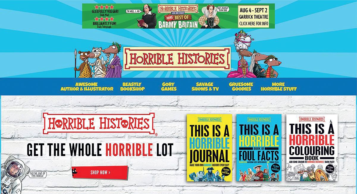
5.11 | Horrible Histories website
The website connects viewers to the wonderful world of Horrible Histories, a virtual world that can be explored, where books can be bought and much more.
5.12 | Groovy Greeks cover
One of the things that appeals to the young readers of Horrible Histories is the mix of humour and the macabre reflected in this cover.
Interview
Alex Bell, Production Programme Manager, Dorling Kindersley
What exactly does a production programme manager do? (i.e. tell us what your role entails. What are your responsibilities on a day-to-day basis? What’s a typical work week like?)
As Production Programme Manager for the Life and Travel list at DK (Dorling Kindersley), I manage a team of six Print Producers, three Pre-producers, and one Production Assistant, overseeing their pastoral care and that day-to-day workloads are evenly spread, and they have my support when dealing with any major issues or problems. I sometimes act as a bridge between the team and senior management, making sure any relevant information is escalated down to the Producers, and vice versa. I help to manage the important relationships between the production team and other parts of the business, such as Creative and Sales, and with external print suppliers. I also work on projects to improve our processes as a department – for example, at the moment I am working to make sure we have complete and consistent colour management on our printings in the Far East, by having Producers scan running sheets and record results; and having our print suppliers send us their own colour reports.
The job varies and my day often depends on what pops up on the spur of the moment. One day, I might have a couple of meetings with other Production managers or a catch up with one of my team, spending the rest quietly doing project work. The next, we might have a problem with a supplier or a printer, and it will be all hands on deck to communicate to the business and get it fixed as best we can.
Typically, how does a project go from start to finish? (e.g. what other departments do you work closely with and how do you manage these interactions?)
Speaking for the Producers who work on individual book projects – there are lots of stages involved. Initially, an idea for a book will emerge from Creative and/or Sales, often with the involvement of Production (we often highlight new trends/technologies/suggest new title ideas). If the book is one which needs special development, for example it has special finishes or novelty elements, then Creative will liaise with us to make sure the idea can become a physical reality. Production will gather costs based on estimated quantities to ensure the project is viable, and may gather dummies, proofs or samples for Creative and Sales to approve. It’s Production’s job to work hard with our print suppliers to get the best possible product, but also to manage expectations and let people know if something cannot be achieved at the cost or with the high quality we need. After a project is signed off, Pre-production will work with Creative to help them set up files correctly for the book, ironing out any issues before they reach the printer. Production will set up a schedule with the printer for proofing, plotter checking and final production, and with the shipper for final delivery to all of our markets worldwide. They will then oversee this process, making sure any issues or delays are communicated to other areas of the business where they have an impact. We manage relationships with our suppliers, including payment (passing invoices).
What changes, since you’ve worked in publishing, have you noticed that impact on production and the ability to design? (e.g. how have the technological developments changed what you do)
All of the changes that I have noticed have been positive ones. The ongoing improvement of systems and technologies in and out of house helps us to work more efficiently and work with fewer errors. Printer capabilities are also developing, and we are continually seeing existing finishes become more efficient, cheaper and better quality, as we see new finishes and products emerging. This means we can think much more creatively.
Have you noticed rising demand for beautifully made books? (i.e. do you think the value of design and production has increased over the last few years, and do you think publishers are using this to their advantage?)
It’s hard to say, as DK has always specialized in quality illustrated books, so this is what we were producing anyway. We are always looking for ways to make our books unique and eye-catching. Recent years have also seen the special sales market grow, and we find that customers in the UK and US are increasingly asking for customized products, to make their particular offering unique – often involving special innovative packaging and presentation.
Summary
Key points
The design for a series like Horrible Histories is developed with an eye to the publisher’s perception of the target market, so it is worth testing design elements with potential readers. The design must also be adaptable for different print and digital formats and be usable for co-editions and international editions.
•Designing for an age group: Horrible Histories are not produced for the school curriculum, so there are no constraints to design for a particular age group. Children from six to sixteen can enjoy them, as do many adults.
•Design elements for e-books: as the design style is such a strong feature of the brand, Scholastic decided not to do an early launch of Horrible Histories as e-books, preferring to wait until issues related to copy flow and illustration were resolved.
•International production: like DK titles in a previous decade, Horrible Histories are ideal for co-publication and adaptation for different market editions. In addition to rights licences for particular titles, overseas publishers have been encouraged to use the format concept to develop their own titles in the Horrible Histories style. This is a business model similar to TV franchising of popular show formats.
•Transatlantic: Scholastic publishes the Horrible Histories series in the United States, and also publishes another similar series called You Wouldn’t Want to Be . . . such as You Wouldn’t Want to Be a Chicago Gangster! Some Dangerous Characters You’d Better Avoid. This is an example of branding and associated design elements being adapted to local markets.
•Brand protection: Horrible Histories® is a registered trademark. While titles and series titles are not protected by copyright law, some are protected by the much stronger designation of trademarks. In another famous example, Frederick Warne & Co. owns the trademark rights of the Beatrix Potter characters.
•Social network: the Horrible Histories portal is being launched on subscription. Could this be a model for future publisher websites, emulating some of the web developments in newspaper and magazine publishing?
Activity
Find out about the international publishers involved in the Horrible Histories series and compare their titles, design elements and promotional messages. Compare these with other children’s publishing.
1What are the common design and production elements in the different editions?
2To what extent is Horrible Histories designed as a global brand?
3To what extent has the Horrible Histories publishing formula been applied differently in response to local market conditions by publishers around the world? How does the design of the original series help to facilitate the production of international adaptations?
4Look at the websites of a variety of children’s publishers and compare the designs used. What other membership, subscription or social network models can you identify?
5Do you think it is right to treat a potentially serious subject like history in such a light-hearted way and to use such bright and playful design elements?
Further resources
Baines, P. (2005), Penguin by Design: A Cover Story 1935–2005, London: Allen Lane.
Bullock, A. (2012), Book Production: A Manual of Project and Production Management in Book Publishing, Abingdon: Routledge.
Davies, G. (2004), Book Commissioning and Acquisition, 2nd edn, Abingdon: Routledge.
Garfield, S. (2010), Just My Type: A Book About Fonts, London: Profile.
Hand, D. and Middleditch, S. (2013), Design for Media: A Handbook for Students and Professionals in Journalism. PR and Advertising, Abingdon: Routledge.
Hitchcock, F.H. (2009), The Building of a Book, [Charleston, SC:] BiblioBazaar.
Mitchell, M. and Wightman, S. (2005), Book Typography: A Designer’s Manual, Marlborough: Libanus Press.
Woll, T. (2014), Publishing for Profit: Successful Bottom-Line Management for Book Publishers, 5th edn, Chicago: Chicago Review Press.
Zeegan, L. (2015), Ladybird by Design, London: Ladybird.