Traditionally in neuropsychology, before reaching any conclusions regarding cortical control of behavior, presence of sensory deficits is interpreted first. To infer the central influences on art, we need to explain and accommodate peripheral influences, those arising from sensory causes. Thus, alterations in visual acuity and color perception in either an artist or a viewer can arise from visual impairments in the eyes and interfere with how forms and colors are rendered (Ravin, 2008). The outcome of such changes needs to be considered in conjunction with other neuropsychological influences on art.
Consider aging, for example. As healthy individuals age, they suffer a gradual decline in visual acuity. The most common change in normally aging adults, for example, is presbyopia, the loss of flexibility in the eye’s crystalline lens, leading to the blurriness of closely viewed objects (Jackson & Owsley, 2003). Simple aging can also contribute to alteration in color-processing by the central nervous system (Wijk, Berg, Sivik, & Steen, 1999b) even when there is no specific eye pathology. There is no logical reason to assume that aged artists cannot be affected by such changes (see diagram of the eye in Figure 3.1).
Eye defects can also affect ability to detect changes in illumination, brightness spectrums due to surface refraction, shadows emanating from an ambient field, or subtleties in shades of gray. Color assists in isolating meaningful shapes set against mixed backgrounds, though color-deficient individuals, who lead normal lives, can make use of monochromatic cues (Simunovic, 2010). Symbolic use of color by early anatomically modern humans has been uncovered in conjunction with burial in an ancient cave (Balter, 2009, 2012; Hovers, Ilani, Bar-Yosef, & Vandermeersch, 2003). Color impairments can begin at the level of the eye itself and can be triggered by a disease process. As will be made clear in this chapter, however, there are various eye conditions that modify form perception and color sensations without detriment to the creative, artistic, or expressive aspects of art.
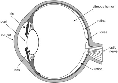
Figure 3.1 A cross-section of the eyeball. The cornea and lens are critical for seeing focused images. These two structures project outside images onto the retina in the back of the eye. The elasticity of the lens enables us to accommodate vision to close and distant objects. From infancy onward the lens undergoes progressive changes, which affect its transparency and, ultimately, color vision. One such change is increased yellowing of the lens. With aging, the yellowing prevents the retina from receiving short wavelengths, and, in addition, causes a glare effect in sunlight, due to decreased transparency. Also, with maturity the alteration in color vision is most noticeable in blue (the short wavelengths) and green (medium wavelengths). The fovea also undergoes changes (loss and degradation of photoreceptors) that compromise seeing details. Thus, we would expect alterations in how artists depict the visual world on canvas due to the status of the eye. Artists such as the Impressionists painted outdoors a great deal. Their fascination with light may have affected the health status of their eyes, which, in turn, could have contributed to their characteristic fuzzy paintings.
Color perception impairments due to non-sensory causes are also discussed in this chapter. The underlying brain regions controlling and processing color cognition have actively intrigued neurologists and neuropsychologists since the nineteenth century. Studies of neurological patients with focal brain damage have provided a number of clues regarding color-understanding deficits. Various tests have been devised to isolate the underlying nature of color impairments. On the whole, neurological cases with acquired isolated color deficits are rare. Nevertheless, we have learned from neuropsychological tests that there is dissociation between perceiving colors and knowing their meaning, between subjective color knowledge and wavelength discrimination, between memory and colored forms, between knowledge of the language of colors and other types of knowledge, and between other combinations of these functions (Davidoff, 1991). Both the brain’s and the eye’s roles in the processing of colors are discussed in this chapter with regard to the visual arts, as are the visual systems and vision impairments of established artists.
Evolutionary explanations for human color vision lie in the geographical terrain, environmental surroundings, and food resources available to our primate ancestors (Dominy & Lucas, 2004). Detecting edible fruits in leaves’ green background is considered a major contributing adaptive force in primate trichromatic evolution. The evolutionary change of face covering, as in going from fur on the face to bare skin, has also been proposed to play a role in primate color evolution because of the adaptive social value the change conferred (Changizi, Zhang, & Shimojo, 2006). Evolutionary adaptive pressures have also played a role in humans’ trichromatic color vision, originating in predator detection in non-human primates (Pessoa et al., 2014) and in other adaptations (Wagner & Kröger, 2005).
In the retina, specialized color-sensitive receptors (the cones) are initially exposed to light (wavelengths), and chemical reactions (derived from vitamin A) set off electrical neural signals to the brain (see further explanation in subsequent sections). Humans can see wavelengths ranging from 390 to 700 nanometers. The short wavelengths are processed by the S cones (the blues), the middle wavelengths are processed by the M cones (the greens and yellows), and the long wavelengths are processed by the L cones (the reds). All these specialized wavelength-sensitive photoreceptors are subject to genetic mutations, malformations, disease processes, medication and drug effects, external environmental effects, and natural aging.
Moreover, not all color sensitivities evolved simultaneously; receptors sensitive to blues, the S cones, are thought to have evolved gradually (45–30 million years ago), for example. They constitute approximately 5–10 percent of all retinal cones. Thus, the nature of their genetics (Deeb, 2004; Hunt & Peichl, 2014; Spalding, 2010), vulnerability to disease, and functionality in human vision could partially help explain the use of blue in visual art, and its prevalence in some of Monet’s late paintings (Wagner & Kröger, 2005). In any case, by 30 million years ago, humans had trichromatic color vision (Yokoyama et al., 2014).
Form and color are frequently combined in a single composition. Thus, color is a vital component of seeing and navigating in the visual world and is therefore an integral feature of visual art; it does not, however, define such art. After all, a large portion of visual art is not in color, and color-blind artists can still produce art, whether with color or not (Cole & Harris, 2009; Marmor & Lanthony, 2001). In Venice in the sixteenth century, for example, painters sometimes presented their initial ideas to patrons in monochromatic paintings (Gage, 1993). Those artists used a technique known as grisaille, a method of depicting forms in shades of gray. In the early 1950s, the American Expressionists in New York started to paint in black paint on white background; these artists included Willem de Kooning, Adolph Gottlieb, Robert Motherwell, and Jackson Pollock. The objects, shapes, and forms in the visual world all have colors associated with them, not because they themselves “possess” color but because they induce the perception of color in the human brain via the brain’s computation of light’s wavelengths, which enter the eye and hit the retina (Ball, 1999). The neural code for interpreting light entering the eye begins its work the moment the light strikes the retina. The association between seen objects and their evoked colors is what gives the latter their significance or meaning. An artist’s use of colors, then, conveys that artist’s particular intelligence, talent, and skill as well as the health status of the eyes.
The ganglion cells give rise to the axons that together form the bundle of fibers known as the optic nerve, through which further visual neuronal signals are transmitted to the brain (Goldstein, 2001). Figure 3.1 provides a diagram of the primary visual pathways. Light information falling on the nasal parts of the eyes is transmitted via two separate optic nerves that converge at the optic chiasm and then cross over to the opposite side. That is, the optic nerve from the nasal part of the left eye continues on to the right hemisphere of the brain and the optic nerve from the nasal part of the right eye continues on to the right hemisphere. Fibers from the temporal halves of each retina do not cross over at the chiasm but rather continue on the same (ipsilateral) side. The detailed, focused visual information of the external world is transmitted via the crossed fibers. In all, the great majority of fibers leaving the eye (approximately two-thirds) cross over to the opposite side while about one-third do not. Moreover, it appears that, despite the fact that there are approximately 120 million rods and 6 million cones in each eye, there are only about 1 million fibers (axons) leaving the retina through each optic nerve. This further confirms the suggestion that, before visual information leaves the eye, it is converted into small, efficient neural units that are then relayed to the brain.
Before reaching the primary visual cortex in the occipital lobes, the majority of the axons first project to the lateral geniculate body (LGN), in the thalamus. The LGN represents the first synaptic contact that retinal axons make after exiting the retina. Further neuronal processing and computation are performed in the LGN on visual input received via the retina. At this junction, information from the two eyes does not blend appreciably, with axons from each eye terminating in separate layers of the LGN. Additionally, not all the axons that cross at the chiasm end in the LGN; some proceed to the superior colliculus. The information transmitted via those fibers is not as detailed as the information transmitted via the retinal–LGN route. The geniculostriate visual pathway relays signals from LGN neurons to the primary visual cortex (also known as V1 (Area 17)) in the occipital lobes, and this chain is known as the primary visual pathway (for a review, see Leff, 2004).
After initially synapsing on the neurons in the V1 region of the visual cortex, two separate visual pathways, sometimes called “streams,” are formed consisting of further neuronal signals that travel forward carrying neural codes toward the front of the brain (Ungerleider & Mishkin, 1982). These are commonly called the dorsal (superior) and ventral (inferior) visual streams. The dorsal stream is the “where” system while the ventral stream is the “what” system. The “where,” a spatially oriented information system (hence, the “where”), feeds into the association areas of the parietal lobes to inform us where objects are located in space (and consists of further subtle subdivisions (Rizzolatti & Matelli, 2003)). In contrast, the “what” system reaches the inferotemporal cortex in the inferior portion of the temporal lobe, where information about object identity is coded. The two streams work in parallel. In neurologically impaired patients it is possible, through behavioral tests, to demonstrate that when one stream is damaged the other remains intact.
Color in the brain
Visual systems in each cerebral hemisphere can process colors when the response is not verbally yoked or the task does not have a heavy linguistic component. The projections of the visual tracts in each hemisphere are depicted diagrammatically in Figure 3.2. Geschwind and Fusillo (1966) described the case of a patient with damage in the left occipital lobe and the splenium (the posterior third of the corpus callosum) who could not name colors—a result one would expect from a left hemisphere lesion—but could nevertheless discriminate among various color patches. In Roger Sperry’s psychobiology laboratory, Colwyn Trevarthen (1974) studied the complete commissurotomy patients (in which corpus callosum, anterior, and hippocampal commissures were cut surgically down the midline) in the Bogen–Vogel series (Bogen, 1992, 2000; also known as the Caltech series: Sperry, 1968, 1974) and found that these patients could recognize and identify—albeit non-verbally—colors shown in the left and right visual half fields.
While the issue of color-sensitive regions in the brain has been debated, discussed, and described since the nineteenth century, the published detailed work of Zeki in the 1970s and 1980s on color-specialized regions of visual area 4 (V4) in monkeys (through the technique of single-cell brain recording) confirmed with greater precision than previously what many neurologists had observed on human patients (Damasio & Geschwind, 1985). Neurological cases with acquired isolated color deficits were rare in the nineteenth century and are rare nowadays. Nevertheless, the earliest reports were often accurate in pinpointing localization to the lingual and fusiform gyrus regions at the junction of the occipital and temporal lobes (Mackay & Dunlop, 1899). In his book on color cognition, Jules Davidoff (1991) describes and reviews several such early papers, many originally published in German. The prominent English-speaking neurologists of the era were not ready to accept a brain center for color processing, arguing instead that in many of the published cases it was difficult to distinguish between primary visual damage—that is, either to the eye itself, or to the optic nerve or optic pathways—and actual central cerebral damage. Despite evidence to the contrary, this mode of thinking persisted for more than half a century.
It was not until Meadows’ (1974) review of color perception deficits following localized brain damage that the way was paved for reconsidering that a color-specialized area existed in posterior cortical regions. Meadows (1974) described the underlying brain localization after reviewing 14 published achromatopsia cases (impairment in distinguishing hues following brain damage) and reported on three who underwent post-mortem brain examination. His overall conclusion was that the color impairment in these cases must have been due to damage in the inferior junction of the occipital and temporal lobes, specifically in the region of the lingual and fusiform gyri (see Figure 3.3), with the suggestion that
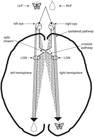
Figure 3.2 A schematic diagram showing a top view of the two hemi-fields and visual pathways. With both eyes focused on a single spot, visual information appearing left of the spot is in the left visual half-field (LVF) while information appearing right of the spot is in the right visual half-field (RVF). The detailed, focused images in either one of the two half-fields are transmitted to the back of the brain, the occipital lobes, via the crossed pathways (originating in the nasal half of each eye, labeled N). Non-detailed, gross information is transmitted via ipsilateral pathways (originating in the temporal half of each eye, labeled T). Based on this anatomical arrangement of the visual pathways, it has been possible to apply the hemi-field technique to test the competence of the left and right hemispheres in normal people. Before reaching the primary visual cortex in the occipital lobes, the majority of the axons first project to the lateral geniculate body (LGN) in the thalamus. The LGN represents the first synaptic contact that retinal axons make after exiting the retina. Further neuronal processing and computation are performed on visual input received by the retina. At this junction, information from the two eyes does not blend appreciably. Axons from each eye terminate in separate layers of the LGN. Not all of the axons that cross at the chiasm end in the LGN. Some proceed to the superior colliculus. The information transmitted via those fibers is not as detailed as that transmitted via the retinal–LGN route. The geniculostriate visual pathway, known also as the primary visual pathway, relays signals from LGN neurons to the primary visual cortex, V1 (Area 17), in the occipital lobes.
these regions are essential for color discrimination. We now associate these regions with the color-sensitive neurons in a monkey’s V4 (Zeki, 1993) and in a human’s V8 (Cowey & Heywood, 1995; Tootell & Hadjikhani, 2001; Slotnick, 2009) visual areas. However, unilateral focal damage in posterior brain regions in humans does not eliminate perception of or discrimination between colors (Cole, Heywood, Kentridge, Fairholm, & Cowey, 2003; Heywood & Kentridge, 2003).
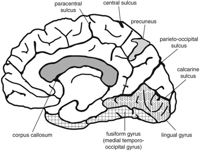
Figure 3.3
A schematic medial view of the cortex, showing the location of the lingual gyrus, fusiform gyrus, and precuneus.
Traditional tests of color perception in neurological and neuropsychological studies are described in a book by Birch (2001) as well as in a chapter on the neuropsychological aspects of color perception and cognition by De Renzi (1999). One of the first of these tests was Holmgren’s Wool Test, devised in the nineteenth century. Many of the papers in the neurological literature devoted to color perception used this test. Subjects were asked to put together small woolen skeins belonging to specific categories of colors and shades. The examiner named one color at a time and the subject then attempted to pick up from the array (placed on a gray background) all those skeins that matched the named color. In lieu of actually naming the target color, the examiner could also simply show a sample and have the subject pick up all the skeins in the array that closely matched or were identical to it. The test is rarely used nowadays because it is now known that the very act of categorization into similarly colored skeins involves more than just perception (De Renzi, 1999). At present, tests such as the Farnsworth–Munsell Hue Tests (28, 40, or 100 hues) are used because, with the hues equated for brightness, color perception deficits can be detected with greater accuracy (see Birch, 2001, for details).
Achromatopsia and hemi-achromatopsia: huediscrimination impairments
Cerebral achromatopsia is a perceptual impairment in which visual acuity is not compromised. Generally, the condition arises following damage to the anterior basal portion of the occipital lobes, either unilaterally or bilaterally. Only one visual half-field or both may be affected, as in hemi-achromatopsia, and the critical defect is seen in the field’s upper quadrant. There may be a color defect in the lower quadrant as well, but the upper quadrant bespeaks damage involving the fusiform and lingual gyri. Meadows (1974), in his summary of achromatopsia cases, reported no examples of inferior quadrant achromatopsia. Interestingly, bilateral damage in these regions does not lead to a doubly severe form of achromatopsia. Cases with hemi-achromatopsia are particularly important for understanding the underlying brain mechanisms because such patients have a color deficit in only a portion of their visual world. Patients with full-field achromatopsia report that the world is grayish and dull and that colors are faded; they also have great difficulty matching hues. In daily life, they rely on smell, touch, spatial position, and sound to distinguish among objects whose color is critical to their identification.
The essential feature in achromatopsia cases is that other aspects of their visual world are intact. Thus, visual acuity or spatial orientation, form and object recognition, reading, facial recognition, as well as many other cognitive abilities based on vision are all preserved. Nor do such patients necessarily have difficulties in providing the names of colors from memory, or from knowing what color a particular ripened fruit or vegetable should have, or naming what the color of the sky is on a cloudless day. Instead, their problems lie in matching, distinguishing, sorting, or arranging colors, and they may also not be able to actively imagine an object’s color in their mind (Levine, Warach, & Farah, 1985). Focal lesions accompanied by circumscribed behavioral deficits pertaining to colors further support the notion of functional specialization in the brain.
An important report on left hemi-achromatopsia has been published by Albert and associates (Albert, Reches, & Silverberg, 1975). The case was of a 59-year-old man who suffered from damage in the posterior region of the right hemisphere. His most salient color deficit was the inability to match colors in the left visual half-field. At the same time, however, he was able to name colors of various objects from memory (e.g., the color of a tomato), match colors in the right visual half-field, and recognize all objects presented in his left and right visual half-fields. Color discrimination and form discrimination are dissociable functions, and in this case the subject was spared damage to his visual form-processing region.
Damasio and associates described a hemi-achromatopsia neurological case in whom physiologically evoked visual brain responses were preserved for processing dichromatic black and white but not red and green (Damasio, Yamada, Damasio, & McKee, 1980). The color discrimination impairment in this patient was in the left visual half-field and the central damage was in the posterior region of the right hemisphere. Specifically, the anatomical localization of the damage was in the lingual and fusiform gyri while the calcarine fissure region was spared (see Figure 3.3). This was an important paper, as it emphasized anatomical localization with careful behavioral tests. An achromatopsia case reported by Heywood, Wilson, and Cowey (1987) is of particular interest because of the research team’s elegant approach to getting at the underlying deficit; they demonstrated that, despite the colorless world of such patients, it is nevertheless possible for them to match different shades of gray. Case CB was a 28-year-old man who, following a serious traffic accident, underwent neurosurgery to remove blood clots in the right frontotemporal region, although there could have been damage in the left hemisphere as well. Brain imaging did not reveal damage to the occipital lobes. When tested on color matching, the man had great difficulty discriminating green, yellow, red, and blue hues and less in matching different shades of gray. Compared to normal subjects, however, his matching of the shades of gray was somewhat slow and impaired. This case demonstrates a selective loss of the cortical neurons that process trichromatic colors but not of those that process dichromatic shades, and shows that there is a minute breakdown of neuroanatomical representation for different aspects of color processing. Generalizing from the above to colored art works, shadows depicted in shades of gray or black involve separate neuroanatomical regions.
In an effort to gain further insights into cerebral localization of color perception, neuroimaging techniques were used to study a case involving a 68-year-old woman exhibiting features of hemi-achromatopsia following a left hemisphere stroke (Short & Graff-Radford, 2001). Her problem with colors was evident upon examination of the upper quadrant of the right visual half field. All colors she saw in that part of her visual world had a grayish tinge, while color perception in her left visual half field was intact. Her ability to discriminate shades of gray was not tested. An MRI (magnetic resonance imaging) scan revealed damage in the medial junction of the left occipital and temporal lobes, which includes the lingual and fusiform gyri; the calcarine cortex (in the occipital lobe) was spared. Although the left-sided damage in this patient extended deeper into the temporal lobe, including the hippocampus region, the color discrimination deficit was attributed mostly to damage in the lingual and fusiform gyri, in the region of the inferior junction of the occipital and temporal lobes.
Acquired central dyschromatopsia
The subjective color of the visual world has a neuroanatomical basis. Dyschromatopsia is a partial inability to discriminate colors despite good vision (Kennard, Lawden, Morland, & Ruddock, 1995). Meadows (1974) describes a case with acquired dyschromatopsia thus:
Other disturbances occur occasionally; colours may appear altered, unpleasant, excessively bright or varying in intensity from time to time. A patient with bilateral posterior cerebral artery ischaemia studied by the author … whose acuity is admittedly somewhat impaired but nevertheless does not often interfere with recognition of everyday objects, complains that both colours and faces seem unpleasant and that colours appear excessively bright. On a sunny day their intensity dazzles him. The colour disturbance varies in severity but is always present to some degree. Occasionally he develops a type of visual perseveration for colour; for example, after looking at a red London bus his entire environment has appeared red for up to half an hour.
(Meadows, 1974, p. 628)
A particularly circumscribed lesion in the anterior region of the occipital lobes could give rise to a type of dyschromatopsia where the visual world appears continuously tinted by a color, say gold or red. At least two such cases have been described (Critchley, 1965; Rondot, Tzavaras, & Garcin, 1967). The 1995 case described by Kennard and associates (1995) had what appeared to be only partial destruction of the color-processing center. The patient was thus able to discriminate some colors under specific illumination conditions while failing to do so under other conditions.
The case of an art professor
The rare case of an art professor and color expert, KG, who suffered a stroke in posterior regions of both hemispheres, was investigated with functional magnetic resonance imaging (fMRI) (Beauchamp, Haxby, Rosen, & DeYoe, 2000). The damage was in the ventromedial occipital-temporal regions and included areas normally occupied by the lingual and fusiform gyri. It was not, however, severe enough to produce total achromatopsia. The spared color discrimination suggested that the patient suffered from dyschromatopsia. This was quite unexpected given the bilateral nature of the damage. The fMRI revealed that spared regions in the left color-cortex preserved at least some color processing, which accounted for the less than total achromatopsia. What is so interesting about this case, and illuminating for neuropsychology, is that the left color-cortex processed color information coming in from both visual half-fields! Normally, information from the left visual half-field is processed in the right hemisphere and vice versa. In the case of KG, input from the left half-field either crossed over callosal fibers or came in via ipsilateral pathways. The authors suggest that these ipsilateral pathways, ordinarily weak transmitters of gross information from the external world, became functional following the damage. The other proposed explanation is that in an expert with a sharp sense of color (in addition to being an art scholar, KG had previously worked in paint manufacturing), the color specializing cortex was sculpted functionally and anatomically differently from that of ordinary individuals. In the case of KG, it could have been the left cortex that saw the greatest reorganization, perhaps even prior to the damage. However, since the damage in the right side was more extensive than in the left, we cannot be sure that a similar pre-damage reorganization did not take place there as well.
An artist with color agnosia
Color agnosia is the loss of knowledge and meaning of colors due to cortical damage. Gordon Holmes (1945), the well-known neurologist, provided the following illuminating description of an artist with posterior brain damage with color agnosia:
Another man was a competent artist, but since his stroke he has been unable to use colours and states they had lost their natural significance for him. He is not colour blind, for he can name most colours and can select them when given their names, but when tested with Holmgren’s wools it was found he was unable to sort out colours, for example, to select the various shades of red or green. He is, however, unable to associate colours with familiar objects. When he was asked the colour of the sky, of grass, or of a rose, his replies, if correct, were based on verbal associations, not on the association of the colour with the object; colours are for him no longer properties of objects. This colour agnosia also results from disease of the lateral surface of the left occipital lobe in the neighborhood of the visual cortex.
(Holmes, 1945, p. 359)
With color agnosia, either the semantic neural store in the brain for the meaning of colors is damaged or else the access routes to this store are compromised, particularly those projecting from the visual modality. The bulk of evidence points to posterior cortical areas in the junction of the occipital and temporal lobes for attaining color meaning. Color agnosia is the dissociation between the concept of a color and its object; the meaning of a color is lost possibly due to a disconnection between the regions representing the object and its color representation. Cases of color agnosia are even more rare than those of achromatopsia, but their very existence illustrates the relationship between color and meaning, between colors and objects. While hues can be discriminated and named in such cases, the association between the color and visual objects is lost. Language deficits alone cannot explain this particular agnosic disorder. The left junction of the occipital and temporal region including the anterior fusiform area is more often implicated than the same region in the right side, not only in individual case studies but in large group studies as well (Basso, Faglioni, & Spinnler, 1976; De Renzi, 1999; De Renzi & Spinnler, 1967; De Renzi, Faglioni, Scotti, & Spinnler, 1972; Goldenberg & Artner, 1991; Hecaen, 1969; Hecaen & Albert, 1978; Holmes, 1945; Lewandowsky, 1908; Meadows, 1974).
Distinguishing between mere perceptual problems and cognitive linguistic versus non-linguistic impairments is not trivial. For years neurologists used tests that failed to isolate the nature of the color disorder. The person credited with devising appropriate and valid tests to tease out the association between an object and its color, and thereby show knowledge of the color’s meaning, is Lewandowsky (1908; see also Davidoff, 1996; De Renzi & Spinnler, 1967). He had a patient who had suffered a left posterior cerebral stroke, probably involving the occipital lobe, and who subsequently could not provide the names of colors or point to patches of color named by the examiner. Similarly, he could not recall the names of objects whose color the examiner provided. It became necessary to devise a test in which words or other overt linguistic components were excluded. Lewandowsky (1908) thus came up with an elegant test consisting of black-and-white line drawings of familiar objects, requiring the patient to fill each one up with the appropriate color(s) chosen from an array of colored pencils. His patient failed to fill the line drawings correctly, indicating that the color problem was due to several factors related to perception, language, and cognition. Years later, De Renzi and his associates, as well as many other investigators, began using Lewandowsky’s effective line-drawing coloring test (De Renzi & Spinnler, 1967), now considered the definitive method for determining the presence of color agnosia. Color agnosics sometimes paint a banana blue, the sky brown, the earth purple, strawberries yellow, and so on. In some of the larger studies of color agnosics, there seems to be a greater prevalence of left hemisphere damage (De Renzi & Spinnler, 1967; De Renzi et al., 1972).
Brain damage in established artists informs answers to only some of the questions regarding the components of art. The eye informs the brain in the first place; seeing clear, focused images of the external world depends on the integrity and health of the eyes (see Figure 3.1). In artists, a breakdown in the process of utilizing light normally for vision can compromise and alter the final artistic product. We see shapes, forms, color, contours, and patterns in the external world because they reflect light (wavelengths) that enters the eye and stimulates special receptors in the retina (the cones), which, in turn, give rise to sensations of color.
The retina itself is brain tissue and the photoreceptors are actually specialized neurons. Normally, light enters through the pupil—the opening in the iris—which constricts or expands depending on the amount of light that hits it. Then the cornea and the lens focus the light rays on the retinal receptors. The region of the retina responsible for seeing fine details is the fovea, a small area with an especially high density of photoreceptors. When we fixate our gaze to write, paint, sculpt, read, or embroider, for example, we are using foveal vision. We see images of the external world with clarity despite the fact that light goes through several layers of cells and liquid before hitting the receptors that send neural signals to the brain, and despite the fact that the image on the retina is inverted (see Figure 3.4). What compensates for the scattering of the light waves once they enter the eyes (because of layers of cells and liquid in the eyeball) are the Müller cells; the light waves encounter those prior to reaching and triggering the photoreceptors, and the function of the Müller cells is to “group” the waves and focus them onto appropriate receptors so as to maximize their intensity, and consequently their effectiveness (Labin, Safuri, Ribak, & Perlman, 2014). Exploring these normal mechanisms of vision and how the brain processes neural signals arriving from the eyes is critical for gaining insights into the neuropsychology of visual art. This section discusses the breakdown in normal functioning of the eye and the visual system in artists.
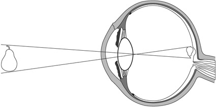
Figure 3.4 When light enters the eye and reaches the retina, the projected image is inverted. Only when neural signals from the retina reach the brain is the image computed neuronally to an upright position. Furthermore, the image on the retina, in each eye, is two-dimensional but the brain applies computations that incorporate the inputs from both eyes to yield an image in three dimensions.
Color deficiency and color-blindness
The fact that choice of color is not essential to what constitutes visual art can be seen in the works of accomplished color-deficient artists. Few of these are known, although, given the prevalence of color-blindness among the general population (it affects around 8 percent of all males), we would expect more artists to have some forms of this condition. Several currently practicing highly successful American cartoon and comic artists, including John Byrne, Mort Drucker, and Mike Kaluta, have some form of color-blindness (Cooke, 2001). Pickford described the case of American artist Donald Purdy, who had color deficiency particularly for greens (Pickford, 1964). Charles Meryon of France was a color-blind artist who painted with colors, illustrated, engraved, etched, and created beautiful and highly regarded drawings. He eventually gave up using colors, resorting instead to detailed black-and-white works (Collins, 1999; Marmor & Lanthony, 2001; Ravin, 2008; Ravin, Anderson, & Lanthony, 1995).
Specific artists are discussed later in the chapter. The rate of color-blindness in the male population is currently around 8 percent and there is no reason to believe that professional artists would be spared, particularly given its hereditary component. Color deficiency when present in artists illustrates that color is but one component in art expression and emphasizes instead the critical roles of talent, spatial abilities, expertise, skill, and sensitivity to shading and light in rendering the complete product. This and the extensive range of achromatic art are indications that form and shape play a stronger role than color in conveying the artist’s message.
Defective color vision affects limited features in the artist’s creation but does not detract from its composition or aesthetic effect on the observer. The disorder is commonly found in males, transmitted through the X chromosome of the unaffected mother. The condition arises in the retina when the cones responsible for reacting to certain wavelengths of light are either entirely missing or grossly defective (for a review see Boehm, MacLeod, & Bosten, 2014). In general, the most prevalent type of color-blindness is the red–green defect in which the afflicted person is particularly unable to differentiate between red and green hues. A less common defect is blue–yellow blindness (tritanopia), the inability to distinguish between these two colors. In both types the ability to distinguish objects on the basis of saturation and brightness remains intact. In other words, a light red may not be identified as red by a red–green color-blind person, but it can be distinguished from a dark red. In an even rarer condition, there is complete color-blindness to all hues, with the afflicted person seeing the world in monochrome (gray-scale vision). Partial color-blindness exists in people who have only a few defective cones specialized to process one type of wavelength, their color sensation deficits varying from mild to severe. The English artists Constable and Turner, who used a great deal of yellow, are suspected of fitting into this category, but this is far from certain (Lanthony, 2001).
Brightness in paintings
Color contrast facilitates luminance contrast in judgments of visual form. Normally, shading provides visual clues to object shape and identity, and to the perception of motion. Color vision also contributes to such recognition and perception by differentiating luminance gradations arising from shading and shadows from those that arise due to surface reflectance (Kingdom, 2003).
A critical determinant in how colors are perceived is their brightness. In addition to the amount of light that is reflected from a given surface, the angle from which the observer views the object plays an important role in its perceived brightness. Looking at a painting, we receive one type of signal from its colors and another signal from the brightness of those colors. The color blue, for example, seems less bright to us than yellow. Indeed, the degree of brightness in a painting contributes to its aesthetic value and general compositional appeal. The role that shades of brightness play in paintings is to convey depth, shape, texture, and movement, as well as mood. In paintings, artists make use of subtleties in luminance to create contrasts between background and foreground, while with line drawings, they create borders that are easily processed by the visual system. Consider Picasso’s line drawing of a woman’s nude back (Femme). Just a few crisp lines on white paper and we, the observers, interpret it as the lower back of a nude woman; the drawing contains no hatching, smoothing, or blending into subtle gray scales. In the real world there are no crisp lines, no sharp demarcations, yet we immediately understand Picasso’s representation.
In human visual perception of art, light and dark is another dimension of the aesthetic and evaluation experience. This is amply demonstrated in theatrical stage performances and particularly in films, where directors and cinematographers have tremendous artistic flexibility. Specifically, sitting in a darkened room watching a black-and-white movie brings out light-versus-dark modulations in a way that is unlike viewing black-and-white still photography, where the ambient environment is flooded with light.
Color and light in the art of film
Lighting in motion pictures is a critical aspect of the filmmaker’s art—central to what makes a movie what it is. Imagine how dull it would be to sit in a darkened movie theater watching a film shot with non-varying light. Used in the right way, light accentuates faces, emphasizes and de-emphasizes critical moments, induces doubt or clarifies ambiguous situations, molds and shapes the actor’s figure, creates impressions of depth, speeds up slow-moving objects or slows down fast ones, creates smoke where there is none, enhances colors, and performs innumerable other critical functions that give rise to meaning. Cinematographers manipulate light in order to convey non-verbal messages that are an essential support to the central meaning and theme of the film. Particularly interesting cinematic lighting effects are seen in black-and-white films. The famous cinematographer Sven Nykvist, known for his work with director Ingmar Bergman, has described his approach to lighting (Nykvist, 2003) as follows:
The most important task of the cinematographer is to create an atmosphere. The foundation of the film is always the script, and the director is the person with the vision of how that script should be realized. Actors give the story life, and it is the cinematographer who has the task of carrying out the intentions of the script and catching the moods and feelings that the director wants to convey. I mostly perform these tasks by using very little light and little color. There is a saying that a good script tells you what is being done and what is being said and not what someone thinks or feels, and there is some truth in that. Images, not words, capture feelings in faces and in atmospheres, and I have realized that there is nothing that can ruin the atmosphere as easily as too much light. My striving for simplicity derives from my striving for the logical light, the true light. I cannot deny that my job has become easier with the new and more light-sensitive film stocks, but the conclusion is always the same. A naturalistic light can only be created with fewer lights, sometimes none at all. At times I have used only kerosene lamps or candles. It may be that my spare lighting stems from the sparse light we have in Sweden compared to more southern countries and especially California. Ingmar Bergman and I studied this beautiful light extensively and learned that simplicity is the key for natural cinematic light.
(Nykvist, 2003, p. 10)
The interpretation of space stems from visual experience, where faraway objects are fuzzier than those in close-up. Similarly, our experience with shadows enables us to interpret pictorial representations that use bright versus dark colors to emphasize light and shadowing. The manipulation of light together with a knack for selecting the most effective vantage points informs the art of the world’s most talented cinematographers. How they use light to photograph faces and objects, and to capture the relationship between the two, is what makes their films remarkable. The widely known and highly regarded American film director John Ford provides his insight (Sharpe, 2001):
I can take a thoroughly mediocre bit of acting, and build points of shadow around a ray of strong light centered on the principals, and finish with something plausible—anyway that’s my one boast. If you’ll watch in any of my pictures you’ll see the trick I use for special effect: while the stars are running through their lines a diffused glow settles over the background assemblage, which at the same time begins to murmur and then to talk intelligibly. And the louder the voices, the stronger the glow, until the main actors are merely part of a group and the general realism is achieved. It always works. Good technique is to let a spot follow a bit player with an important line or two of dialogue across a shadowed set until his part of the scene is finished too.
(Sharpe, 2001, p. 19)
Light–shade defines shapes while simultaneously increasing the impression of depth in the viewer’s mind. This is one of the pictorial cues that give rise to depth perception. Film is after all a two-dimensional art form, albeit one that, through movement, can create an additional real-life illusion that still pictures cannot.
What compromises colors in the eye of artist and viewer?
The cornea and crystalline lens of the eye allow us to see clear, focused outside images by projecting them onto the retina. The elasticity of the crystalline lens enables us to accommodate our vision to close and distant objects. Thus, the health of the cornea, the lens, and their supporting muscles is what determines how focused that image will be.
Furthermore, let us suppose the artist suffers from an eye condition that compromises vision such as a persistent eye infection, hereditary retinal disease, a lens abnormality, color-blindness, color deficiency, macular degeneration, atrophy, or even normal age-related alterations (Nathan, 2002; Trevor-Roper, 1970). Moreover, consider the variability in the concentration of cone photoreceptors in the retina, or in sensitivity to short versus long wavelengths of light. The visibility of shapes and forms, the clarity of light and colors—all can be compromised by poor vision due to impaired or damaged eyes. We would expect such variables to shape artistic style without affecting talent or skill (Conway, 2012).
In her book on Cézanne, Mary Lewis quotes the French master: “Now being old, nearly seventy years, the sensations of colour, which give light, are for me the reasons for the abstractions that do not allow me to cover my canvas entirely” (Lewis, 2000, p. 307). And again, commenting on his vision in 1905, a year before his death: “I believe I have in fact made some more progress … It is, however, very painful to have to state that the improvement produced in the comprehension of nature from the point of view of the picture and the development of the means of expression is accompanied by old age and a weakening of the body” (p. 322). To his son he likewise noted: “I regret my advanced age, because of my colour sensation” (p. 322). Cézanne was reportedly also myopic, but did not regularly wear glasses; he felt that wearing them did not benefit his work (Nathan, 2002). In other words, he liked the world that he saw through poor vision.
The cone photoreceptors can be compromised genetically or through disease. The cones are concentrated in the macula, the region immediately surrounding the fovea. Some diseases, such as macular degeneration, lead to partial sight and loss in the perception of some colors. Consider the following: as measured in wavelengths, red is long, blue is short, while green and yellow are of medium length. Immediately around the fovea there is a paucity of cones reacting to short wavelengths (blue) and a relative abundance of cones reacting to long ones (such as red and brown). Blue, therefore, is not a color we see with foveal vision (Kaufman, 1974), and can be the last hue compromised in macular degeneration. On the other hand, red could be the first to go if the fovea is compromised. Normally, with regard to light wavelength sensitivity, there is great individual variability in the topographical distribution of cones. For this reason it has been difficult to construct a generic map of cone–pigment distribution. It is entirely possible that gifted visual artists have uniquely organized cones, not only within the macula, but also around it. Moreover, the pigments in cones could have particular neurochemical reactivity, unique in some visual artists. Indeed, there has always been a question in psychology and philosophy about sensations not being the same across individuals.
From the time we are born, the eye’s crystalline lens undergoes progressive changes that affect its transparency and, ultimately, our color vision (Grossniklaus, Nickerson, Edelhauser, Bergman, & Berglin, 2013; Trevor-Roper, 1970). With maturity, this is most noticeable in the perception of blue (short wavelength) and green (medium wavelength). One such change is increased yellowing of the lens, but whether this is due to a pigment already present at birth or increased exposure to sunlight is not yet clear. With aging, the yellowing prevents the retina from receiving short wavelengths, and, in addition, causes a glare effect in sunlight due to the tendency of light to reflect off the lens (again because of decreased transparency of the lens; Gaillard, Zheng, Merriam, & Dillon, 2000). The fovea also undergoes changes (loss and degradation of photoreceptors) with aging that compromise the seeing of details. Thus, variables in the eye would be expected to alter how the visual world is depicted on canvas. Artists such as the Impressionists painted outdoors a great deal; their cognitive fascination with light could have affected the health of their eyes because of extensive exposure to sunlight. Such extensive exposure results in retinal damage (Arnault et al., 2013). Both the natural yellow pigment in the lens and the yellow pigment in the macula itself have an effect on light that ends up stimulating the photoreceptors. With increasing age, the amount of filtering and refraction due to this yellowishness would be expected to affect the choice and use of colors (Ravin, 2008). However, again, there is tremendous variability in this natural yellow pigment and the degree of refraction that occurs.
Cataracts and consequences to clarity and colors in artists in old age
Cataracts typically develop in some people with advancing age. A cataract is a film that forms over the lens of the eye, causing blurred vision (Grossniklaus et al., 2013). This film also makes the lens thicker and less elastic (compromising accommodation to distance viewing, for example). Some people are known to be more susceptible to cataracts than others (e.g., diabetics, alcoholics, smokers). Prolonged exposure to bright sunlight, hereditary circumstances, and diabetes increase the chances of developing cataracts at a younger age than usual (Trudo & Stark, 1998). Vision becomes severely limited since the cataract prevents normal entry of light to the retina, which, in turn, leads to blurred, foggy, and fuzzy vision. The artists Claude Monet (discussed below) and Mary Cassatt suffered from serious cataract conditions in both eyes.
Cataracts and myopia have a selective effect on color vision, and ultimately on the choices artists make regarding color in their paintings. In both conditions, short wavelengths such as blue and violet are absorbed by the lens and consequently do not project well on the retina. On the other hand, long-wavelength colors such as red do penetrate the thickened lens (Trevor-Roper, 1970). After cataract removal, for instance, artists can suddenly see blues and may overcompensate by applying them everywhere in their paintings. Because reds are easier to see, some artists, as they develop cataracts or become increasingly myopic, seem to prefer red tones. For example, as Renoir aged, reds became preponderant in several of his late paintings. This observation has fed speculation that his vision had become impaired (Trevor-Roper, 1970).
Dopamine and colors
Dopamine, a major neurotransmitter in the brain, is found abundantly in the retina, where concentrations increase markedly during light adaptation (Hulka, Wagner, Preller, Jenni, & Quednow, 2013). Its presence in the retina is not unique to humans but occurs in all mammals and many other vertebrates. Dopamine somehow regulates cone sensitivity to colors (Shuwairi, Cronin-Golomb, McCarley, & O’Donnell, 2002). In cocaine addicts, for example, dopamine levels typically increase during cocaine use but levels either drop off or become irregular during withdrawal. Blue cone insensitivity during the withdrawal phase suggests that dopamine regulates specific color-sensitive cones (Roy, Roy, Williams, Weinberger, & Smelson, 1997; Roy, Roy, Berman, & Gonzalez, 2003). Thus, when levels of dopamine in Parkinson’s, schizophrenia, depression, or normal aging decline or fluctuate, color vision is altered (Djamgoz, Hankins, Hirano, & Archer, 1997; Jackson & Owsley, 2003). In normal states, efficient cognitive processes have been linked to efficient color discrimination (Colzato, Sellaro, Hulka, Quednow, & Hommel, 2014), and mood changes due to the action of dopamine in specific regions of the brain may cause alterations that could have an effect on the cones’ sensitivity to blue (short wavelengths). If this should occur in artists, the results could explain their choice of pigments.
Let us consider the works of several artists who have suffered from poor vision due to various eye defects (Dan, 2003). They are Pissarro, Monet, Cézanne, Degas, Kandinsky, Leonardo, Rembrandt, Van Gogh, and Goya.
Camille Pissarro
One of the founders of Impressionism was Camille Pissarro. He was born on the Caribbean island of St. Thomas, grew up and began drawing there, and eventually moved to Paris, where his friends included other notable Impressionists. He painted prolifically and consistently. In 1888, a reoccurring infection developed in his right eye (Ravin, 1997b). The style of the paintings he produced during the subsequent years could have been shaped by the nuisance infection as well as by his sensitivity to cold weather and by the eye patch he needed to wear over his right eye (Ravin, 1997b). The colors and shapes in his work are not as crisp as they were prior to his eye infection. Reportedly, during the post-infection period, he often preferred painting indoors and favored views he could see from his window (Eiermann, 2000). Nevertheless, the paintings he produced in his last fifteen years, though sometimes a bit blurry, remain true to his exceptional artistic talent.
Claude Monet
Claude Monet is one of the most famous Impressionists, considered by some to be the “father” of the school. Indeed, its name came from Monet’s painting Impression, Soleil Levant, displayed in a Paris exhibition in 1874. He and Pissarro were friends; they worked together and participated in joint group exhibitions. In 1912 Monet was diagnosed with cataracts in both eyes, although in 1908 he was already complaining of poor eyesight (Marmor, 2006; Ravin, 1997a), indicating that the cataracts might have begun developing at that time. Surgery to remove cataracts and restore vision is now routine and usually successful; in Monet’s time, however, the surgery was not a sure thing, a fact of which the artist was certainly aware. In 1913, a leading ophthalmologist diagnosed exceedingly poor vision in Monet’s right eye and prescribed powerful corrective lenses for distance (as well as for close-up vision in his left eye). Monet had cataract surgery on his left eye in 1923, but it was not entirely successful (Ravin, 1997a). Throughout this whole period of poor vision and cataracts, he continued to paint, though his choice of colors changed and his forms became less focused. Fuzzy images characterize many of his paintings, yet we the viewers derive pleasure from looking at them. His talent was unaffected, and the powerful aesthetic appeal of his famous water lily series, begun in 1914 and painted through 1920, continues to this day. What guided his creative expression were his immense talent, extensive skills, and conceptual organization; what contributed to the appearance of the final product was the fuzziness of his poor vision.
Paul Cézanne
Paul Cézanne was another prominent member of the Impressionist school. The French painter reportedly suffered from myopia (nearsightedness) and diabetes (Mills, 1936). Diabetes eventually compromises vision by constricting small blood vessels in the eye as well as altering the water balance within the crystalline lens (Trudo & Stark, 1998). Cézanne’s outdoor painted scenes do not emphasize color and the lines do not delineate clear-cut forms. Compared to these scenes, his indoor still-life close-ups do emphasize color (yet still with somewhat ill-defined forms). This is in keeping with the notion that near vision facilitates attention to detail. However, even here it has been suggested that some subtle distortions in his work may be attributed to poor focal vision with a resultant emphasis on peripheral vision (Mills, 1936). Consider The Card Players, painted in 1882. Earlier, observing Cézanne’s artistic style, a leading critic of the time, Thadée Natanson, confirmed that the style reflected an interest in anything but the precise depiction of objects, emphasizing instead the juxtaposition of those objects or color patches that together make up the painting’s composition (Thomson, 2002). Cézanne’s eyes did not detract from his extraordinary artistic talent, skill, creativity, and sense of proportionality (Conway, 2012). We may posit, however, that his innovative style was influenced by the impaired health of his vision.
Edgar Degas
Edgar Degas, famous for his paintings of ballerinas, suffered from poor vision believed to be linked to several causes, including a familial hereditary condition. His vision problems seem to have begun around age 36 (Karcioglu, 2007; Marmor, 2013; Ravin & Kenyon, 1997), particularly in his right eye. Because he suffered from sensitivity to strong light, he avoided painting outdoors, which likely explains his emphasis on indoor scenes. In this regard he was different from other Impressionists who, in their art, preferred to express their fascination with light and its effects on trees and water. Degas’ sensitivity to light together with his problems distinguishing colors has suggested to some that he may have suffered from a form of retinal degeneration affecting his central vision (Ravin & Kenyon, 1997). Eventually, he lost central vision bilaterally, and applied his attention to what he saw around the focal point (Mills, 1936). His later works, shaped by the further deterioration of his eyesight, emphasized certain colors and blurred forms; his experimentation with sculpture and pastel drawings reflects the ill health of his vision at that time (Karcioglu, 2007; Ravin & Kenyon, 1997; it is apparently easier to use pastels than oil paints when vision is compromised). Again, his productivity, originality, creativity, immense skill, and talent remained intact.
Wassily Kandinsky
Wassily Kandinsky began painting seriously only around age 30. He studied art in Munich, Germany. There is a great deal more emphasis on color in his paintings than on representational shapes. This may be due to his myopia (which interferes with the accurate perception of forms and shapes). Indeed, he is credited with starting the “modern” school of abstract art in which geometrical forms supplant naturally occurring ones, and in which color patches and non-verbal shapes are heavily emphasized. With no clearly recognizable forms, in his paintings colors became the unifying themes (Critchley, 1987), a style perhaps reflective of his extremely poor vision.
As stated earlier, normal aging can influence color choice even in the absence of identifiable eye disease (Jackson & Owsley, 2003; Ravin, 2008; Wijk et al., 1999b). Aging compromises visual acuity, stereopsis (use of both eyes for seeing depth), brightness contrast, and adaptation to darkness, to mention but a few visual functions (Pitts, 1982).
Leonardo da Vinci and Rembrandt Harmenszoon van Rijn
Leonardo da Vinci and Rembrandt both continued to paint beyond age 60, but their later works seem somewhat “darker” than those from their younger days (Trevor-Roper, 1970). They are believed to have had normal vision throughout their lives. In the case of Rembrandt, it has been suggested that he could have been strabismic (Mondero, Crotty, & West, 2013). Other indications of old-age alterations in Rembrandt have also been described (Friedman, Westreich, Lurie, & Golik, 2007). With advanced age, presbyopia and other changes discussed above—for instance, a normal degradation of the retinal macula—compromise color vision (Weale, 1997). Similarly, with this degradation, particularly in the fovea, there would be a loss of detail vision, which might explain why many details present in the paintings of a young artist are not there when old age sets in. Color preferences also change with age, at least in non-artists (Wijk et al., 1999b). In any case, the paintings produced by maturing artists can be interpreted and understood against the backdrop of age-related changes in their eyes (Weale, 1997; Wuerger, 2013).
Additional well-known visual artists affected by poor vision were Pierre-Auguste Renoir, Georgia O’Keeffe, and Edvard Munch (Dan, 2003). Others such as Vincent van Gogh displayed interesting visual effects believed to be due to neurochemical imbalances.
Vincent van Gogh’s colors
Vincent van Gogh is famous not only for his paintings but also for being hospitalized in an insane asylum, for cutting part of his ear off, and for supposedly committing suicide at a relatively young age (Blumer, 2002; Devinsky, 2003). In recent years, however, suicide has been discarded as the cause of death; accidental shooting by a boy while Van Gogh was painting outdoors has been advanced as the cause (Naifeh & Smith, 2011).
There has always been debate about the motivation behind his unusual artistic style, those wavy lines, all the yellows (particularly after 1886), and how it all relates to his supposed insanity. He did indeed suffer from visual and auditory hallucinations sometimes, and spent time in an insane asylum, but all of this cannot explain his phenomenal, extraordinarily beautiful, timeless, and influential paintings. In the end, it cannot even be said about him that he was schizophrenic. As an active member of the artistic community of his time, he was influenced by works of other artists and this can explain in part the basis for some of his artistic decisions. For example, he was influenced by Japanese paintings and woodblocks (see Munsterberg, 1982). He was not the only practicing artist at that time to be influenced by works from the Far East. Leaving aside stylistic influences, though, he is known to have suffered the side-effects of bad habits, as judged from his letters, reports by his friends, and some surviving medical records (Arnold, 1992).
First, he was addicted to absinthe, an alcoholic drink containing toxic compounds, one of which is now known to be alpha-thujone. When drunk in excess, it can lead to neurological disorders, psychosis, hallucinations, and epileptic seizures. This was true not only for Van Gogh but also for many of the other people drinking absinthe at that time. Toulouse-Lautrec, the French artist, was also addicted to absinthe and suffered its consequences in a mental asylum for a brief period in 1899. Under experimental conditions, toxic doses of thujone have been found to induce epileptic convulsions. The drink was outlawed at that time (and for many years afterwards) but not before it took a heavy toll on French society in the nineteenth century and 15 years into the twentieth century. It was finally banned there in 1915 (Arnold, 1989). Alpha-thujone is now known to block the chloride channel on the aminobutyric acid type A (GABAA) receptor and thereby promote its convulsant effects (Harris, 2002; Hold, Sirisoma, Ikeda, Narahashi, & Casida, 2000). Second, Van Gogh suffered from pica, a mental disorder characterized by the urge to eat non-food items such as paint, sand, pencils, and many other substances. He was known to ingest his paints, which were mixed with turpentine; to drink kerosene, with which he used to fill his lamps for light; and to drink camphor in order to alleviate his insomnia. Third, he took bromide to alleviate some of his neurological symptoms. Fourth, he took digitalis to alleviate his epilepsy, and drank santonin to alleviate gastrointestinal discomfort. The latter two compounds, if taken in excess, are known to cause xanthopsia, that is, yellow vision. The world appears as if pigmented with yellow. It turns out that Van Gogh took everything excessively, except nutritive food, and it is highly likely that his “yellow paintings” reflect chemical changes in the retinal photoreceptors. The chemicals must have suppressed the action of some of the photoreceptors while enhancing the action of other receptors. The exact mechanisms are not understood but the effects are thought to originate in the retina (Wolf, 2005).
Not all scholars agree that xanthopsia is linked to Van Gogh’s choice of color (Gruener, 2013). Rather, his choice can be argued to be calculated and intentional, not merely a reflection of sensory visual impairment; it could just be another expression of the Japanese influence. However, the effects on the brain were reversible since the hallucinations, psychotic states, and xanthopsia were not permanent.
Finally, Van Gogh did not eat well and thus suffered from nutritional deficits. One reason for this, besides the drinking and excessive smoking, is the possibility that he experienced a gastrointestinal disorder known as acute intermittent porphyria, which prevented him from retaining real food, digesting properly, or developing a strong appetite. None of these explanations explain everything or nearly everything about his art or his choice of colors (the blue irises, the white iris, blue skies, blue walls, green leaves, dark colors in his early period (prior to 1886), proportions, and so on) but they provide a workable background against which to understand features of his art.
Van Gogh’s famous ear-cutting incident (only part of the ear was severed) could have been exacerbated by emotional upheavals associated with his brother’s impending marriage (and the loss of his exclusive attention to Van Gogh) as well as an uncomfortable relationship with his friend and colleague the artist Gauguin (De Leeuw, 1998).
Van Gogh is known to have worked on producing art tirelessly and consistently. He developed his own unique brush strokes (Li, Yao, Hendriks, & Wang, 2012). Even when he spent time in an insane asylum in the south of France, he went on painting highly admired works to which viewers are attracted to this day. If he had been a seriously mentally ill person, he would not have been able to sustain focused attention on his art or to work so consistently and deliberately, to say nothing of his continued originality and creativity. There were no alterations in his depictions of depth, the faces he painted were not deformed, objects were not misshapen, proportionality and scaling were retained, forms were recognizable, paints were controlled with the same careful brush strokes, and balanced compositions were produced. Despite all his mental anguish he produced at least 638 paintings between 1886 and the time of his death in 1890. Critics and non-critics alike admire them; they are sought after, exhibited world-wide, and still retain their enormous universal appeal. Van Gogh’s ability to communicate his artistic mind would have been drastically compromised had he been a seriously mentally ill person.
Preservation of artistic abilities is illustrated further in the interaction between neurological disease and sensory impairments in other famous professional artists. The case of Goya, described next, is one such example.
Francisco Goya’s illness
Francisco Goya was a highly innovative artist who was drawn to artistically chronicling social and historic events and was extremely interested in depicting the cultural and societal values of his day (Hughes, 2003). His talent was recognized early on in his life through his sketches of people. Around age 14 he became an apprentice to an established painter, after which he studied and worked in Rome, returning to Madrid to pursue his art. Around 1784 he became a court painter to King Charles IV and Queen Luisa of Spain. Goya suffered from several physical ailments (Critchley, 1987; Ravin & Ravin, 1999), which, in 1792, had him complaining suddenly of poor balance, dizziness, deafness, and worsening vision. A year later Goya reportedly was completely deaf and his visual acuity somewhat compromised. He began experiencing bad dreams—“sounds in his head”—and periods of depression. At this time he was about 37 years old. Numerous medical explanations have been offered in hindsight (Casey, 2006; Smith, Chitty, Williams, & Stephens, 2008), including one that suggested that he suffered from a rare viral infection, possibly Vogt–Koyanagi syndrome, which is associated with inflammation of the eyes and ears and leads to total deafness (Vargas, 1995). This type of illness occurs abruptly and corresponds with some of the reports on Goya circulating at that time.
And yet, from ages 62 to 73, Goya produced more than 700 paintings as well as numerous etchings, sketches, and drawings. He had enormous energy, sometimes completing a portrait within several hours. No spatial distortions are noted in these works, the character of his lines remained excellent, and he continued to innovate. His colors, however, became somewhat darker, and his subject matter took on a nightmarish quality. In one of his letters he says he is blind and cannot read or write (and yet he was able to go on painting). Interestingly, however, in the last years before his death, his paintings reportedly became more colorful. The remarkable aspect of Goya’s art is that it continued to grow and develop, even though he himself was experiencing poor vision and mental anguish stemming from a physical condition.
Dan, N. G. (2003). Visual dysfunction in artists. Journal of Clinical Neuroscience, 10, 166–170.
Davidoff, J. (1991). Cognition through color. Cambridge, MA: MIT Press.
Hughes, R. (2003). Goya. New York: Alfred A. Knopf.
Livingstone, M. (2014). Vision and art: The biology of seeing. New York: Harry N. Abrams.
Marmor, M. F. (2009). The artist’s eyes. New York: Harry N. Abrams.
Simunovic, M. P. (2010). Colour vision deficiency. Eye, 24, 747–755.