7 |
One of the strengths of R is its ability to produce high-quality statistical graphs. R’s strength in graphics reflects the origin of S at Bell Labs, long a center for innovation in statistical graphics.
We find it helpful to make a distinction between analytical graphics and presentation graphics (see, e.g., Weisberg, 2004). Much of this Companion has described various analytical graphs, which are plots designed for discovery, to help the analyst better understand data. These graphs should be easy to draw and interpret, and they quite likely will be discarded when the analyst moves on to the next graph. The car package includes a number of functions for this very purpose, such as scatterplot , scatterplot-Matrix , residualPlots , and avPlots (see, in particular, Chapters 3 and 6). A desirable feature of analytical graphs is the ability of the analyst to interact with them, by identifying points, removing points to see how a model fit to the data changes, and so on. Standard R graphs allow only limited interaction, for example, via the identify function, a limitation that we view as a deficiency in the current R system (but see the discussion of other graphics packages for R in Section 7.3).
Presentation graphs have a different goal and are more likely to be published in reports, in journals, online, and in books, and then examined by others. While in some instances presentation graphs are nothing more than well-selected analytical graphs, they can be much more elaborate, with more attention paid to color, line types, legends, and the like, where representing the data with clarity and simplicity is the overall goal. Although the default graphs produced by R are often aesthetic and useful, they may not meet the requirements of a publisher. R has a great deal of flexibility for creating presentation graphs, and that is the principal topic of this chapter.
Standard R graphics are based on a simple metaphor: Creating a standard R graph is like drawing with a pen, in ink, on a sheet of paper. We typically create a simple graph with a function such as plot , and build more elaborate graphs by adding to the simple graph, using functions such as lines , points , and legend . Apart from resizing the graphics window in the usual manner by dragging a side or corner with the mouse, once we put something in the graph we can’t remove it—although we can draw over it. In most cases, if we want to change a graph, we must redraw it. This metaphor works well for creating presentation graphs, because the user can exert control over every step of the drawing process; it works less well when ease of use is paramount, as in data-analytic graphics.
There are many other useful and sophisticated kinds of graphs that are readily available in R. Frequently, there is a plot method to produce a standard graph or set of graphs for objects of a given class—try the plot command with a data frame or a linear-model object as the argument, for example. In some cases plot will produce useful analytical graphs (e.g., when applied to a linear model), and in others it will produce presentation graphs (e.g., when applied to a regression tree computed with the rpart package).
Because R is an open system, it is no surprise that other metaphors for statistical graphics have also been created, the most important of which is the lattice package, and we will briefly introduce some of these in Section 7.3.
This chapter, and the following chapter on programming, deal with general matters, and we have employed many of the techniques described here in the earlier parts of this Companion. Rather than introducing this material near the beginning of the book, however, we preferred to regard the previous examples of R graphs as background and motivation.
7.1 A General Approach to R Graphics
For the most part, the discussion in this chapter is confined to two-dimensional coordinate plots, and a logical first step in drawing such a graph is to define a coordinate system. Sometimes that first step will include drawing axes and axis labels on the graph, along with a rectangular frame enclosing the plotting region and possibly other elements such as points and lines; sometimes, however, these elements will be omitted or added in separate steps to assert greater control over what is plotted. The guts of the graph generally consist of plotted points, lines, text, and, occasionally, shapes and arrows. Such elements are added as required to the plot. The current section describes, in a general way, how to perform these tasks.
7.1.1 DEFINING A COORDINATE SYSTEM: plot
The plot function is generic:1 There are really many plot functions, and the function that is actually used depends on the arguments that are passed to plot . If the first argument is a numeric vector—for example, as in the command plot(x, y) —then the default method function plot.default is invoked. If the first argument is a linear-model object (i.e., an object of class "lm" ), then the method plot.lm is used rather than the default method. If the first argument is a formula—for example, plot(y ~ x) —then the method plot.formula is used. This last method simply calls plot.-default with arguments decoded to correspond to the arguments for the default method.
The default plot method can be employed to make a variety of point and line graphs; plot can also be used to define a coordinate space, which is our main reason for discussing it here. The list of arguments to plot.default is a point of departure for understanding how to use the traditional R graphics system:
> args(plot.default)
function (x, y = NULL, type = "p", xlim = NULL, ylim = NULL, log = "", main = NULL, sub = NULL, xlab = NULL, ylab = NULL, ann = par("ann"), axes = TRUE, frame.plot = axes, panel.first = NULL, panel.last = NULL, asp = NA, …)
NULL
To see in full detail what the arguments mean, consult the documentation for plot.default ;2 the following points are of immediate interest, however:
> plot(c(xmin, xmax), c(ymin, ymax),
+ type="n", xlab="", ylab="")
is sufficient to set up the coordinate space for the plot, as we will explain in more detail shortly.
For example, the following command sets up the blank plot in Figure 7.1, with axes and a frame but without axis labels:
> plot(c(0, 1), c(0, 1), type="n", xlab="", ylab="")
7.1.2 GRAPHICS PARAMETERS: par
Many of the arguments to plot , such as pch and col , get defaults from the par function if they are not set directly in the call to plot . The par function is used to set and retrieve a variety of graphics parameters and thus is similar to the options function, which sets global defaults for R—for instance,
Figure 7.1 Empty plot, produced by plot(c(0, 1), c(0, 1), type="n", xlab="", ylab="")
> par("col")
[1] "black"
Consequently, unless their color is changed explicitly, all points and lines in a standard R graph will be drawn in black. To change the general default plotting color to red, for example, we could enter the command par(col="red") .
To print the current values of all the plotting parameters, call par with no arguments. Here is a listing of all the graphics parameters:
> names(par())

Table 7.1 presents brief descriptions of some of the plotting parameters that can be set by par ; many of these can also be used as arguments to plot and other graphics functions, but some, in particular the parameters that concern the layout of the plot window (e.g., mfrow ), can only be set using par , and others (e.g., usr ) only return information and cannot be set by the user. For complete details on the plotting parameters available in R, see ?par .
Table 7.1 Some plotting parameters set by par . Parameters marked with a * concern the layout of the graphics window and can only be set using par , not as arguments to higher-level graphics functions such as plot ; parameters marked with a + return information only.

It is sometimes helpful to be able to change plotting parameters in par temporarily for a particular graph or set of graphs and then to change them back to their previous values after the plot is drawn. For example,
> oldpar <− par(lwd=2)
> plot(x, y, type="l")
> par(oldpar)
draws lines at twice their normal thickness. The original setting of par("lwd") is saved in the variable oldpar , and after the plot is drawn, lwd is reset to its original value. Alternatively, and usually more simply, closing the current graphics device window returns the graphical parameters to their default values.
| 7.1.3 | ADDING GRAPHICAL ELEMENTS: axis , points , lines , text , ETCETERA |
Having defined a coordinate system, we will typically want to add graphical elements, such as points and lines, to the plot. Several functions useful for this purpose are described in this section.
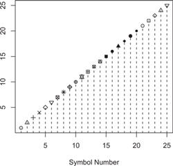
Figure 7.2 Plotting symbols (plotting characters, pch ) by number.
points AND lines
As you might expect, points and lines add points and lines to the current plot; either function can be used to plot points, lines, or both, but their default behavior is implied by their names. The argument pch is used to select the plotting character (symbol), as the following example (which produces Figure 7.2) illustrates:
> plot(1:25, pch=1:25, xlab="Symbol Number", ylab="")
> lines(1:25, type="h", lty="dashed")
The plot command graphs the symbols numbered 1 through 25; because the y argument to plot isn’t given, an index plot is produced, with the values of x on the vertical axis plotted against their indices—in this case, also the numbers from 1 through 25. Finally, the lines function draws broken vertical lines (selected by lty="dashed" ; see Figure 7.2) up to the symbols; because lines is given only one vector of coordinates, these too are interpreted as vertical coordinates, to be plotted against their indices as horizontal coordinates. Specifying type="h" draws spikes (or h istogram-like lines) up to the points.
One can also plot arbitrary characters, as the following example (shown in Figure 7.3) illustrates:
> head(letters) # first 6 lowercase letters
[1] "a" "b" "c" "d" "e" "f"
> plot(1:26, xlab="letters", ylab="", pch=letters,
+ axes=FALSE, frame.plot=TRUE)
Once again, ylab="" suppresses the vertical axis label, axes=FALSE suppresses tick marks and axes, and frame.plot=TRUE adds a box around the plotting region, which is equivalent to entering the separate command box() after the plot command.
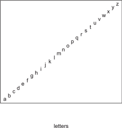
Figure 7.3 Plotting characters—the lowercase letters.

Figure 7.4 Line types (lty ), by number.
As shown in Figure 7.4, several different line types are available in R plots:
> plot(c(1, 7), c(0, 1), type="n", axes=FALSE,
+ xlab="Line Type (lty)", ylab="", frame.plot=TRUE)
> axis(1, at=1:6) # x-axis
> for (lty in 1:6)
+ lines(c(lty, lty, lty + 1), c(0, 0.5, 1), lty=lty)
The lines function connects the points whose coordinates are given by its first two arguments, x and y . If a coordinate is NA , then the line drawn will be discontinuous. Line type (lty ) may be specified by number (as here) or by name, such as "solid" , "dashed" , and so on. Line width is similarly given by the lwd parameter, which defaults to 1 . The exact effect varies according to the graphics device used to display the plot, but the general unit seems to be pixels: Thus, for example, lwd=2 specifies a line 2 pixels wide. We used a for loop (see Section 8.3.2) to generate the six lines shown in Figure 7.4.

Figure 7.5 Lines created by the abline function.
abline
The abline function can be used to add straight lines to a graph.4 We describe several of its capabilities here; for details and other options, see ?abline .
Figure 7.5, created by the following commands, illustrates the use of abline :
> plot(c(0, 1), c(0, 1), type="n", xlab="", ylab="")
> abline(0, 1)
> abline(c(1, −1), lty="dashed")
> abline(h=seq(0, 1, by=0.1), v=seq(0, 1, by=0.1), col="gray")
axis AND grid
In the plot command (on p. 336) for drawing Figure 7.4, the argument axes=FALSE suppressed both the horizontal and the vertical axis tick marks and tick labels. We used the axis function to draw a customized horizontal (bottom) axis but let the plot stand with no vertical (left) axis labels. The first argument to axis indicates the position of the axis: 1 corresponds to the bottom of the graph; 2 , to the left side; 3 , to the top; and 4 , to the right side. The at argument controls the location of tick marks. There are several other arguments as well. Of particular note is the labels argument: If labels=TRUE , then numerical labels are used for the tick marks; otherwise, labels takes a vector of character strings (e.g., c("male", "female") ) to provide tick labels.

Figure 7.6 Grid of horizontal and vertical lines created by the grid function.
The grid function can be used to add a grid of horizontal and vertical lines, typically at the default axis tick mark positions (see ?grid for details); for example:
> library(car) # for data
> plot(prestige ~ income, type="n", data=Prestige)
> grid(lty="solid")
> with(Prestige, points(income, prestige, pch=16, cex=1.5))
The resulting graph is shown in Figure 7.6. In the call to grid , we specified lty="solid" in preference to the default dotted lines. We were careful to plot the points after the grid, suppressing the points in the initial call to plot . We invite the reader to see what happens if the points are plotted before the grid.
text AND locator
The text function places character strings—as opposed to individual characters—on a plot; the function has several arguments that determine the position, size, and font that are used. For example, the following commands produce Figure 7.7a:
> plot(c(0, 1), c(0, 1), axes=FALSE, type="n", xlab="", ylab="",
+ frame.plot=TRUE, main="(a)")
> text(x=c(0.2, 0.5), y=c(0.2, 0.7),
+ c("example text", "another string"))

Figure 7.7 Plotting character strings with text .
We sometimes find it helpful to use the locator function along with text to position text with the mouse; locator returns a list with vectors of x and y coordinates corresponding to the position of the mouse cursor when the left button is clicked. Figure 7.7b was constructed as follows:
> plot(c(0, 1), c(0, 1), axes=FALSE, type="n", xlab="", ylab="",
+ frame.plot=TRUE, main="(b)")
> text(locator(), c("one", "two", "three"))
To position each of the three text strings, we moved the mouse cursor to a point in the plot and clicked the left button. Called with no arguments, locator() returns pairs of coordinates corresponding to left clicks until the right mouse button is pressed and Stop is selected from the resulting pop-up context menu (under Windows)or the esc key is pressed (under Mac OS X). Alternatively, we can indicate in advance the number of points to be returned as an argument to locator —locator(3) in the current example—in which case, control returns to the R command prompt after the specified number of left clicks.
Another useful argument to text , not used in these examples, is adj , which controls the horizontal justification of text: 0 specifies left justification; 0.5 , centering (the initial default, given by par ); and 1 , right justification. If two values are given, adj=c( x , y ) , then the second value controls vertical justification.
Sometimes we want to add text outside the plotting area. The function mtext can be used for this purpose; mtext is similar to text , except that it writes in the margins of the plot. Alternatively, specifying the argument xpd=TRUE to text or setting the global graphics option par(xpd=TRUE) also allows us to write outside the normal plotting region.
arrows AND segments
As their names suggest, the arrows and segments functions may be used to add arrows and line segments to a plot. For example, the following commands produced Figures 7.8a and b:
> plot(c(1, 5), c(0, 1), axes=FALSE, type="n",
+ xlab="", ylab="", main="(a) arrows")
> arrows(x0=1:5, y0=rep(0.1, 5),

Figure 7.8 The arrows and segments functions.

Figure 7.9 Filled and unfilled triangles produced by polygon .
+ x1=1:5, y1=seq(0.3, 0.9, len=5), code=3)
> plot(c(1, 5), c(0, 1), axes=FALSE, type="n",
+ xlab="", ylab="", main="(b) segments")
> segments(x0=1:5, y0=rep(0.1, 5),
+ x1=1:5, y1=seq(0.3, 0.9, len=5))
The argument code=3 to arrows produces double-headed arrows.
The arrows drawn by the arrows function are rather crude, and other packages provide more visually pleasing alternatives; see, for example, the p.arrows function in the sfsmisc package.
polygon
Another self-descriptive function is polygon , which takes as its first two arguments vectors defining the x and y coordinates of the vertices of a polygon; for example, to draw Figure 7.9:
> plot(c(0, 1), c(0, 1), type="n", xlab="", ylab="")
> polygon(c(0.2, 0.8, 0.8), c(0.2, 0.2, 0.8), col="black")
> polygon(c(0.2, 0.2, 0.8), c(0.2, 0.8, 0.8))
The col argument, if specified, gives the color to be used in filling the polygon (see the discussion of colors in Section 7.1.4).

Figure 7.10 Using the legend function.
legend
The legend function may be used to add a legend to a graph; an illustration is provided in Figure 7.10:
> plot(c(1, 5), c(0, 1), axes=FALSE, type="n",
+ xlab="", ylab="", frame.plot=TRUE)
> legend(locator(1), legend=c("group A", "group B", "group C"),
+ lty=c(1, 2, 4), pch=1:3)
We used locator to position the legend. We find that this is often easier than computing where the legend should be placed. Alternatively, we can place the legend by specifying its location to be one of "topleft", "topcenter","topright", "bottomleft","bottomcenter", or "bottomright" . If we use one of the corners, the argument inset=0.02 will inset the legend by 2% of the size of the plot.
curve
The curve function can be used to graph an R function or expression, given as curve ’s first argument, or to add a curve representing a function or expression to an existing graph. The second and third arguments of curve , from and to , define the domain over which the function is to be evaluated; the argument n , which defaults to 101 , sets the number of points at which the function is to be evaluated; and the argument add , which defaults to FALSE , determines whether curve produces a new plot or adds a curve to an existing plot.
If the first argument to curve is a function, then it should be a function of one argument; if it is an expression, then the expression should be a function (in the mathematical sense) of a variable named x . For example, the left-hand panel of Figure 7.11 is produced by the following command, in which the built-in variable pi is the mathematical constant π:
> curve(x*cos(25/x), 0.01, pi, n=1000)

Figure 7.11 Graphs produced by the curve function.
The next command, in which the expression is a function of a variable named y rather than x , produces an error:
> curve(y*cos(25/y), 0.01, pi, n=1000)
Error in curve(y * cos(25/y), 0.01, pi, n = 1000) : ’expr’ must be a function or an expression containing ’x’
The graph in the right-hand panel of Figure 7.11 results from the following commands:
> curve(sin, 0, 2*pi, ann=FALSE, axes=FALSE, lwd=2)
> axis(1, pos=0, at=c(0, pi/2, pi, 3*pi/2, 2*pi),
+ labels=c(0, expression(pi/2), expression(pi),
+ expression(3*pi/2), expression(2*pi)))
> axis(2, pos=0)
> curve(cos, add=TRUE, lty="dashed", lwd=2)
> legend(pi, 1, lty=1:2, lwd=2, legend=c("sine", "cosine"), bty="n")
The pos argument to the axis function, set to 0 for both the horizontal and the vertical axes, places the axes at the origin. The argument bty="n" to legend suppresses the box that is normally drawn around a legend.
| 7.1.4 | SPECIFYING COLORS |
Using different colors can be an effective means of distinguishing graphical elements such as lines or points. Although we are limited to monochrome graphs in this book and in most print publications, the specification of colors in R graphs is nevertheless straightforward to describe. If you are producing graphics for others, keep in mind that some people have trouble distinguishing various colors, particularly red and green. Colors should be used for clarity rather than to provide “eye candy.”
Plotting functions such as lines and points specify color via a col argument; this argument is vectorized, allowing us to select a separate color for each point. R provides three principal ways of specifying a color. The most basic, although rarely directly used, is by setting RGB (Red, Green, Blue) values. For example, the rainbow function creates a spectrum of RGB colors, in this case of 10 colors:
> rainbow(10)
![]()
Similarly, the gray function creates gray levels from black [gray(0) ]to white [gray(1) ]:
> gray(0:9/9)
![]()
The color codes are represented as hexadecimal (base 16) numbers, of the form "# RRGGBB " or "# RRGGBBTT " , where each pair of hex digits RR , GG , and BB encodes the intensity of one of the three additive primary colors— from 00 (i.e., 0 in decimal) to FF (i.e., 255 in decimal).5 The hex digits TT , if present, represent transparency, varying from 00 , completely transparent, to FF , completely opaque; if the TT digits are absent, then the value FF is implied. Ignoring transparency, there are over 16 million possible colors.
Specifying colors by name is more convenient, and the names that R recognizes are returned by the colors function:
> colors()[1:10]
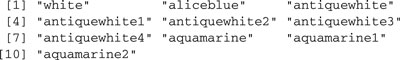
We have shown only the first 10 of over 600 prespecified color names available. The full set of color definitions appears in the editable file rgb.txt, which resides in the R etc subdirectory.
The third and simplest way of specifying a color is by number. What the numbers mean depends on the value returned by the palette function:6
> palette()
![]()
Thus, col=c(4, 2, 1) would first use "blue" , then "red" , and finally "black" . We can enter the following command to see the default palette (the result of which is not shown because we are restricted to using monochrome graphs):
R permits us to change the value returned by palette and, thus, to change the meaning of the color numbers. For example, we used
> palette(rep("black", 8))
to write this Companion, so that all plots are rendered in black and white.7 If you prefer the colors produced by rainbow , you could set
> palette(rainbow(10))
In this last example, we changed both the palette colors and the number of colors. The choice
> library(colorspace)
> palette(rainbow_hcl(10))
uses a palette suggested by Zeileis et al. (2009) and implemented in the colorspace package.
Changing the palette is session-specific and is forgotten when we exit from R. If you want a custom palette to be used at the beginning of each R session, you can add a palette command to your R profile (as described in the Preface).
To get a sense of how all this works, try each of the following commands:
> pie(rep(1, 100), col=rainbow(100), labels=rep("", 100))
> pie(rep(1, 100), col=rainbow_hcl(100), labels=rep("", 100))
> pie(rep(1, 100), col=gray(0:100/100), labels=rep("", 100))
The graph produced by the last command appears in Figure 7.12.
7.2 Putting It Together: Explaining Nearest-Neighbor Kernel Regression
Most of the analytic and presentation graphs that you will want to create are easily produced in R. The principal aim of this chapter is to show you how to construct the small proportion of graphs that require custom work. Such graphs are diverse by definition, and it would be futile to try to cover their construction exhaustively. Instead, we will develop an example that uses many of the functions introduced in the preceding section.
We describe step by step how to construct the diagram in Figure 7.13, which is designed to provide a graphical explanation of nearest-neighbor kernel regression, a method of nonparametric regression. Nearest-neighbor

Figure 7.12 The 101 colors produced by gray(0:100/100) , starting with gray(0) (black) and ending with gray(1) (white).

Figure 7.13 A four-panel diagram explaining nearest-neighbor kernel regression.
kernel regression is very similar to lowess, which is used by the scatterplot function in the car package to smooth scatterplots (see Section 3.2.1). Whereas lowess uses locally linear (robust) weighted regression, kernel regression uses locally weighted averaging.
The end product of nearest-neighbor kernel regression is the estimated regression function shown in Figure 7.13d. In this graph, x is the GDP per capita and y the infant mortality rate of each of 190 nations of the world, from the UN data set in the car package.8 The estimated regression function is obtained as follows:
The identification of the m nearest neighbors of x0 is illustrated in Figure 7.13a for x0 = x(150), the 150th ordered value of GDP, with the dashed vertical lines in the graph defining a window centered on x(150) that includes its 95 nearest neighbors. Selecting x0 = x(150) for this example is entirely arbitrary, and we could have used any other x value in the grid. The size of the window is potentially different for each choice of x0, but it always includes the same fraction of the data. In contrast, fixed-bandwidth kernel regression fixes the size of the window but lets the number of points used in the average vary.
![]()
The tricube weights, shown in Figure 7.13b, take on the maximum value of 1 at the focal x0 in the center of the window and fall to 0 at the boundaries of the window.
![]()
This step is illustrated in Figure 7.13c, in which a thick horizontal line is drawn at ![]() (150)
(150)
To draw Figure 7.13, we first need to divide the graph into four panels:
> oldpar <− par(mfrow=c(2, 2), las=1) # 2-by−2 array of graphs
We are already familiar with using par(mfrow=c( rows , cols )) and par(mfcol=c( rows , cols )) , defining an array of panels to be filled either rowwise, as in the current example, or column-wise. We also included the additional argument las=1 to par , which makes all axis tick labels, including those on the vertical axis, parallel to the horizontal axis, as is required in some journals. Finally, as suggested in Section 7.1.1, we saved the original value of par and will restore it when we finish the graph.
After removing the missing data from the UN data frame in the car package, where the data for the graph reside, we order the data by x values (i.e., gdp ), being careful also to sort the y values (infant ) in the same order:

We turn our attention to Panel a of Figure 7.13:
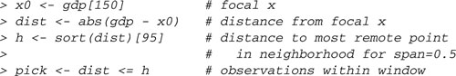
Thus, x0 holds the focal x value, x(150); dist is the vector of distances
between the xs and x0; h is the distance to the most remote point in the neighborhood for span 0.5 and n = 190; and pick is a logical vector equal to TRUE for observations within the window and FALSE otherwise.
We draw the first graph using the plot function to define the axes and a coordinate space:

Figure 7.14 Building up Panel a of Figure 7.13 step by step.
> plot(gdp, infant, xlab="GDP per Capita",
+ ylab="Infant-Mortality Rate", type="n",
+ main="(a) Observations Within the Window\nspan = 0.5")
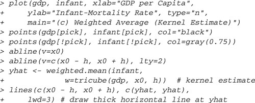
The \n in the main argument produces a new-line. The result of this command is shown in the upper-left panel of Figure 7.14. In the upper-right panel, we add points to the plot, using black for points within the window and light gray for those outside the window:
> points(gdp[pick], infant[pick], col="black")
> points(gdp[!pick], infant[!pick], col=gray(0.75))
Next, in the lower-left panel, we add a solid vertical line at the focal x0 = x(150) and broken lines at the boundaries of the window:
> abline(v=x0) # focal x
> abline(v=c(x0 − h, x0 + h), lty="dashed") # window
Finally, in the lower-right panel, we use the text function to display the focal value x(150) at the top of the panel:
> text(x0, par("usr")[4] + 10, expression(x[(150)]), xpd=TRUE)
The second argument to text , giving the vertical coordinate, makes use of par("usr") to find the user coordinates of the boundaries of the plotting region. The command par("usr") returns a vector of the form c( x1 , x2 , y1 , y2 ) , and here we pick the fourth element, y2 , which is the maximum vertical coordinate in the plotting region. Adding 10 —one fifth of the distance between the vertical tick marks—to this value positions the text a bit above the plotting region, which is our aim. The argument xpd=TRUE permits drawing outside the normal plotting region. The text itself is given as an expression , allowing us to incorporate mathematical notation in the graph, here the subscript (150) , to typeset the text as x(150).
Panel b of Figure 7.13 is also built up step by step. We begin by setting up the coordinate space and axes, drawing vertical lines at the focal x0 and at the boundaries of the window, and horizontal gray lines at 0 and 1:
> plot(range(gdp), c(0, 1),
+ xlab="GDP per Capita", ylab="Tricube Kernel Weight",
+ type="n", main="(b) Tricube Weights")
> abline(v=x0)
> abline(v=c(x0 − h, x0 + h), lty="dashed")
> abline(h=c(0, 1), col="gray")
We then write a function to compute tricube weights:10
> tricube <− function(x, x0, h) {
+ z <− abs(x − x0)/h
+ ifelse(z < 1, (1 − z^3)^3, 0)
+ }
To complete Panel b, we draw the tricube weight function, showing points representing the weights for observations that fall within the window:
> tc <− function(x) tricube(x, x0, h) # to use with curve
> curve(tc, min(gdp), max(gdp), n=1000, lwd=2, add=TRUE)
> points(gdp[pick], tricube(gdp, x0, h)[pick], col="gray20")
The function tc is needed for curve , which requires a function of a single argument (see Section 7.1.3). The remaining two arguments to tricube are set to the value of x0 and h that we created earlier in the global environment.
Panel c is similar to Panel a, except that we draw a horizontal line at the locally weighted average value of y:
Were we producing graphs for a computer presentation, we would have added color to the horizontal line in the last step, for example, col="red" ,for clarity.
Finally, to draw Panel d, we repeat the calculation of ![]() , using a for loop to set the focal x0 to each value of gdp in turn:11
, using a for loop to set the focal x0 to each value of gdp in turn:11

| 7.2.1 | FINER CONTROL OVER PLOT LAYOUT |
More complex arrangements than are possible with mfrow and mfcol can be defined using the layout function or the fig argument to par :See ?layout and ?par . We illustrate here with fig , producing Figure 7.15, a graph meant to demonstrate different kinds of nonlinearity:
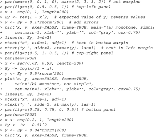

Figure 7.15 Using the fig graphical parameter for finer control over plot layout.
+ main="(c) non-monotone, simple",
+ cex.main=1, xlab="", ylab="", col="gray", cex=0.75)
> lines(x, Ey, lwd=2)
> mtext("x", side=1, adj=1)
> mtext("y ", side=2, at=max(y), las=1)
> title("Nonlinear Relationships", outer=TRUE)
The first par command leaves room in the top outer margin for the graph title, which is given in the title command at the end, and establishes the margins for each panel. The order of margins both for oma (the outer margins) and for mar (the margins for each panel) are c( bottom , left , top , right ) , and in each case the units for the margins are lines of text. The fig argument to par establishes the boundaries of each panel, expressed as fractions of the display region of the plotting device, in the order c( x-minimum , x-maximum , y-minimum , y-maximum ) , measured from the bottom-left of the device. Thus, the first panel, defined by the command par(fig= c(0, 0.5, 0.5, 1)) , extends from the left margin to the horizontal middle and from the vertical middle to the top of the plotting device. Each subsequent panel begins with the command par(new=TRUE) so as not to clear the plotting device, as would normally occur when a high-level plotting function such as plot is invoked. We use the mtext command to position the axis labels just where we want them in the margins of each panel; in the mtext commands, side=1 refers to the left margin and side=2 to the bottom margin of the current panel.
7.3 Lattice and Other Graphics Packages in R
This section introduces the lattice package and mentions several other packages that provide alternative graphics systems for R and that are especially noteworthy in our opinion. Many of the more than 2,500 packages on CRAN make graphs of various sorts, and it is certainly not our object to take on the Herculean task of cataloging what’s available to R users in the realm of statistical graphics. A search for the keyword graphics at www.rseek.org produces a wide variety of places to go on the Internet to learn about R graphics. Another source is the CRAN Graphics Task View at http://cran.r-project.org/web/views/Graphics.html .
| 7.3.1 | THE LATTICE PACKAGE |
Probably the most important current alternative to basic R graphics is provided by the lattice package, which is part of the standard R distribution. The lattice package is a descendant of the trellis library in S, originally written by Richard Becker and William Cleveland (Becker and Cleveland, 1996). The implementation of lattice graphics in R is completely independent of the S original, however, and is extensively documented in Sarkar (2008).
We used lattice graphics without much comment earlier in this Companion, in particular in the effect displays first introduced in Section 4.3.3. We also used lattice to produce separate graphs for different subgroups of data in Figures 4.13 and 4.14. The first of these, Figure 4.13 (p. 204), was generated by the following command:
> library(lattice)
> xyplot(salary ~ yrs.since.phd | discipline:rank, groups=sex,
+ data=Salaries, type=c("g", "p", "r"), auto.key=TRUE)
This is a typical lattice command: A formula is used to determine the horizontal and vertical axes of each panel in the graph, here with salary on the vertical axis and yrs.since.phd on the horizontal. The graph in each panel includes only a subset of the data, determined by the values of the variables to the right of the vertical bar (| ), which is read as given. In the example, we get a separate panel for each combination of the factors discipline and rank . The groups argument allows more conditioning within a panel, using separate colors, symbols, and lines for each level of the grouping variable—sex , in this example. The familiar data argument is used, as in statistical-modeling functions, to supply a data frame containing the data for the graph. The type argument specifies the characteristics of each panel, in this case printing a background grid ("g" ), showing the individual points ("p" ), and displaying a least-squares regression line ("r" ) for each group in each panel of the plot. Other useful options for type include "smooth" for a lowess smooth with default smoothing parameter and "l" for joining the points with lines. The latter will produce surprising, and probably undesirable, results unless the data within group are ordered according to the variable on the horizontal axis. The auto.key argument prints the legend at the top of the plot. If there is a grouping variable, then the regression lines and smooths are plotted separately for each level of the grouping variable; otherwise, they are plotted for all points in the panel.

Figure 7.16 Boxplots of log(salary) by rank , sex , and discipline .
The boxplots in Figure 4.14 (p. 205) were similarly generated using the lattice function bwplot . Graphs such as this one can be made more elaborate: for example,
> library(latticeExtra)
> useOuterStrips(
+ bwplot(salary ~ sex | rank + discipline, data=Salaries,
+ scales=list(x=list(rot=45), y=list(log=10, rot=0) )),
+ strip.left=strip.custom(strip.names=TRUE,
+ var.name="Discipline")
+ )
The result is shown in Figure 7.16. The conditioning is a little different from Figure 4.14, with each panel containing parallel boxplots by sex for each combination of rank and discipline . The scales argument is a list that specifies the characteristics of the scales on the axes. For the horizontal or x -axis, we specified a list with one argument to rotate the level labels by 45◦. For the vertical or y -axis, we specified two arguments: to rotate the labels to horizontal and to use a base−10 logarithmic scale. We also applied the useOuterStrips function from the latticeExtra package (Sarkar and Andrews, 2010)12 to get the levels for the second conditioning variable, discipline , printed at the left. The strip.custom function allowed us to change the row labels to Discipline:A and Discipline:B rather than the less informative A and B .
Graphs produced with lattice are based on a different metaphor from standard R graphics, in that a plot is usually specified in a single call to a graphics function, rather than by adding to a graph in a series of independently executed commands. As a result, the command to create a customized lattice graph can be very complex. The key arguments include those for panel functions, which determine what goes into each panel; strip functions, as we used above, to determine what goes into the labeling strips; and scale functions, which control the axis scales. Both the lattice and the latticeExtra packages contain many prewritten panel functions likely to suit the needs of most users, or you can write your own panel functions.
In addition to scatterplots produced by xyplot and boxplots produced by bwplot , as we have illustrated here, lattice includes 13 other high-level plotting functions, for dot plots, histograms, various three-dimensional plots, and more, and the latticeExtra package adds several more high-level functions. The book by Sarkar (2008) is very helpful, providing dozens of examples of lattice graphs.
The lattice package is based on a lower-level, object-oriented graphics system provided by the grid package, which is described by Murrell (2006, Part II). Functions in the grid package create and manipulate editable graphics objects, thus relaxing the indelible-ink-on-paper metaphor underlying basic R graphics and permitting fine control over the layout and details of a graph. Its power notwithstanding, it is fair to say that the learning curve for grid graphics is steep.
| 7.3.2 | MAPS |
R has several packages for drawing maps, including the maps package (Becker et al., 2010).13 Predefined maps are available for the world and for several countries, including the United States. Viewing data on maps can often be illuminating. As a brief example, the data frame Depredations in the car package contains data from Harper et al. (2008) on incidents of wolves killing farm animals, called depredations, in Minnesota for the period 1979–1998:
> head(Depredations)


Figure 7.17 Wolf depredations in Minnesota. The areas of the dots are proportional to the number of depredations.
The data include the longitude and latitude of the farms where depredations occurred and the number of depredations at each farm for the whole period (1979–1998), and separately for the earlier period (1991 or before) and for the later period (after 1991). Management of wolf-livestock interactions is a significant public policy question, and maps can help us understand the geographic distribution of the incidents.
> library(maps)
> par(mfrow=c(1, 2))
> map("county", "minnesota", col=gray(0.4))
> with(Depredations, points(longitude, latitude,
+ cex=sqrt(early), pch=20))
> title("Depredations, 1976−1991", cex.main=1.5)
> map("county", "minnesota", col=grey(0.4))
> with(Depredations,points(longitude, latitude,
+ cex=sqrt(late), pch=20))
> title("Depredations, 1992−1998", cex.main=1.5)
To draw separate maps for the early and late periods, we set up the graphics device with the mfrow graphics parameter. The map function was used to draw the map, in this case a map of county boundaries in the state of Minnesota. The coordinates for the map are the usual longitude and latitude, and the points function is employed to add points to the plot, with areas proportional to the number of depredations at each location. We used title to add a title to each panel, with the argument cex.main to increase the size of the title. The maps tell us where in the state the wolf-livestock interactions occur and where the farms with the largest number of depredations can be found. The range of depredations has expanded to the south and east between time periods. There is also an apparent outlier in the data—one depredation in the southeast of the state in the early period.
Choropleth maps, which color geographic units according to the values of one or more variables, can be drawn using lattice graphics with the mapplot function in the latticeExtra package. These graphs are of little value without color, so we don’t provide an example here. See the examples on the help page for mapplot .
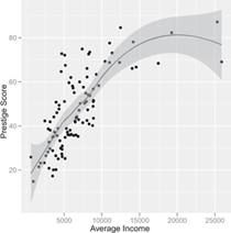
Figure 7.18 Scatterplot of prestige by income for the Canadian occupational-prestige data, produced by the ggplot2 function qplot .
| 7.3.3 | OTHER NOTABLE GRAPHICS PACKAGES |
The plotrix package (Lemon, 2006) provides a number of tools that can be used to simplify adding features to a graph created with plot or related functions. We saw in Figure 3.11b (p. 122) an example of the use of the plotCI function to add error bars to a graph. Plots of coefficient estimates and their standard errors, for example, are easily displayed using this function. Type help(package=plotrix) for an index of the functions that are available, and see the individual help pages and the examples for more information on the various functions in the package.
The ggplot2 package, inspired by Leland Wilkinson’s The Grammar of Graphics (Wilkinson, 2005), is another graphics system based on the grid package and is oriented toward the production of fine, publication-quality graphs. Details are available in Wickham (2009). An illustrative scatterplot for the Canadian occupational-prestige data produced by the following ggplot2 command is shown in Figure 7.18:
> library(ggplot2)
> qplot(income, prestige, xlab="Average Income",
+ ylab="Prestige Score",
+ geom=c("point", "smooth"), data=Prestige)
The nonparametric-regression smooth on the plot is produced by lowess, while the band around the smooth represents not conditional variation but a point-wise confidence envelope.
The rgl package (Adler and Murdoch, 2010) interfaces R with the OpenGL three-dimensional graphics system (www.opengl.org ), providing a foundation for building three-dimensional dynamic statistical graphs. The possibilities are literally impossible to convey adequately on the static pages of a book, especially without color. A monochrome picture of an rgl graph, created by the scatter3d function in the car package, appeared in Figure 3.12 (on p. 125).
The iplots (Urbanek and Wichtrey, 2010) and playwith (Andrews, 2010) packages introduce interactive graphical capabilities to R, the former via the RGtk2 package, which links R to the GTK+ GUI toolkit, and the latter via the rJava package, which links R to the Java computing platform.
The rggobi package (Cook and Swayne, 2009) provides a bridge from R to the GGobi system, which produces high-interaction dynamic graphics for visualizing multivariate data.
7.4 Graphics Devices
Graphics devices in R send graphs to windows, to files, or to printers. Drawing graphs on the computer screen first almost always makes sense, and it is easy enough to save the contents of a graphics window, to print the graph, or to copy it to the clipboard and then paste it into some other application.
When we use a higher-level graphics function such as plot , a graphics device corresponding to a new graphics window is opened if none is currently open. If a graphics device window is already open, then the graph will be drawn in the existing window, generally after erasing the current contents of the window.
The contents of a graphics window can be saved in a file under both Windows and Mac OS X by selecting File → Save as in the menu bar of the graphics window and then selecting the format in which to save the file. A graph can be copied to the clipboard in the normal manner (e.g., by Ctrl-c in Windows) when its window has the focus (which can be achieved by clicking the mouse in the window), and it can be pasted into another application, such as a graphics editor or word-processing program. Graphs can be printed by selecting File → Print, although printing from another program gives more control over the size and orientation of the plot.
In some cases, we may wish to skip the on-screen version of a plot and instead send a graph directly to a file, an operation that is performed in R by using a suitable graphics device: for example,
> pdf("mygraph.pdf")
> hist(rnorm(100))
> dev.off()
The first command calls the pdf function to open a graphics device of type PDF (Portable Document Format), which will create the graph as a PDF file in the working directory. The graph is then drawn by the second command, and finally the dev.off function is called to close the device and the file. All graphical output is sent to the PDF device until we invoke the dev.off command. The completed graph, in mygraph.pdf , can be used like any other PDF file. The command ?Devices gives a list of available graphics devices, and, for example, ?pdf explains the arguments that can be used to set up the PDF device.
Three useful mechanisms are available for viewing multiple graphs. One approach is the procedure that we employed in most of this Companion: drawing several graphs in the same window, using par(mfrow=c( rows , columns )) , for example, to divide a graphics device window into panels.
A second approach makes use of the graphics history mechanism. Under Windows, we activate the graphics history by selecting History → Recording from the graphics device menus; subsequently, the PageUp and Page-Down keys can be used to scroll through the graphs. Under Mac OS X,we can scroll through graphs with the command-← and command-→ key combinations when a graphics device window has the focus.
The final method is to open more than one graphics window, and for this we must open additional windows directly, not rely on a call to plot or a similar high-level graphics function to open the windows. A new graphics window can be created directly in the Windows version of R by the windows function and under Mac OS X by the quartz function. If multiple devices are open, then only one is active and all others are inactive. New graphs are written to the active graphics device. The function dev.list returns a vector of all graphics devices in use; dev.cur returns the number of the currently active device; and dev.set sets the active device.
7.5 Complementary Reading and References
1See Sections 1.4 and 8.7 for an explanation of how generic functions and their methods work in R.
2In general, in this chapter we will not discuss all the arguments of the graphics functions that we describe. Details are available in the documentation for the various graphics functions. With a little patience and trial and error, we believe that most readers of this book will be able to master the subtleties of R documentation.
3An expression can be used to produce mathematical notation in labels, such as superscripts, subscripts, and Greek letters. The ability of R to typeset mathematics in graphs is both useful and unusual. For details, see ?plotmath and Murrell and Ihaka (2000); also see Figures 7.11 (p. 342) and 7.13 (p. 345) for examples.
4When logarithmic axes are used, abline can also draw the curved image of a straight line on the original scale.
5Just as decimal digits run from 0 through 9, hexadecimal digits run from 0 through 9, A, B, C, D, E, F, representing the decimal numbers 0 through 15. The first hex digit in each pair is the 16s place and the second is the ones place of the number. Thus, e.g., the hex number #39 corresponds to the decimal number 3 × 16 + 9 × 1 = 57.
6At one time, the eighth color in the standard R palette was "white" . Why was that a bad idea?
7More correctly, all plots that refer to colors by number are black and white. We could still get other colors by referring to them by name or by their RGB values. Moreover, some graphics functions select colors independently of the color palette.
8We previously encountered the scatterplot for these two variables in Figure 3.15 (p. 129).
9For values of x0 in the middle of the range of x, typically about half the nearest neighbors are smaller than x0 and about half are larger than x0,butfor x0 near the minimum (or maximum) of x, almost all the nearest neighbors will be larger (or smaller) than x0, and this edge effect will introduce boundary bias into the estimated regression function. By fitting a local-regression line rather than a local average, the lowess function reduces bias near the boundaries. Modifying Figure 7.13 to illustrate nearest-neighbor local-linear regression rather than kernel regression is not hard: Simply fit a WLS regression, and compute a fitted value at each focal x. We leave this modification as an exercise for the reader.
10The ifelse command is described in Section 8.3.1.
11for loops are described in Section 8.3.2.
12While the lattice package is part of the standard R distribution, the latticeExtra package must be obtained from CRAN.
13The maps package is not part of the standard R distribution, so you must obtain it from CRAN.