Once your content is ready to go (you’ve proofread it, right?) and you’ve added the markup to structure the document (<!DOCTYPE>, html, head, title, meta charset, and body), you are ready to identify the elements in the content. This chapter introduces the elements you have to choose from for marking up text. There probably aren’t as many of them as you might think, and really just a handful that you’ll use with regularity. That said, this chapter is a big one and covers a lot of ground.
As we begin our tour of elements, I want to reiterate how important it is to choose elements semantically—that is, in a way that most accurately describes the content’s meaning. If you don’t like how it looks, change it with a style sheet. A semantically marked-up document ensures your content is available and accessible in the widest range of browsing environments, from desktop computers and mobile devices to assistive screen readers. It also allows non-human readers, such as search engine indexing programs, to correctly parse your content and make decisions about the relative importance of elements on the page.
With these principles in mind, it is time to meet the HTML text elements, starting with the most basic element of them all, the humble paragraph.
Paragraphs
<p>…</p>
Paragraph element
Paragraphs are the most rudimentary elements of a text document. Indicate a paragraph with the p element by inserting an opening <p> tag at the beginning of the paragraph and a closing </p> tag after it, as shown in this example:
<p>Serif typefaces have small slabs at the ends of letter strokes. In general, serif fonts can make large amounts of text easier to read.</p>
<p>Sans-serif fonts do not have serif slabs; their strokes are square on the end. Helvetica and Arial are examples of sans-serif fonts.
In general, sans-serif fonts appear sleeker and more modern.</p>
Visual browsers nearly always display paragraphs on new lines with a bit of space between them by default (to use a term from CSS, they are displayed as a block). Paragraphs may contain text, images, and other inline elements (called phrasing content), but they may not contain headings, lists, sectioning elements, or any elements that typically display as blocks by default.
Technically, it is OK to omit the closing </p> tag because it is not required in order for the document to be valid. A browser just assumes it is closed when it encounters the next block element. Many web developers, including myself, prefer to close paragraphs and all elements for the sake of consistency and clarity. I recommend folks who are just learning markup do the same.
Headings
<h1>…</h1>
<h2>…</h2>
<h3>…</h3>
<h4>…</h4>
<h5>…</h5>
<h6>…</h6>
Heading elements
In the last chapter, we used the h1 and h2 elements to indicate headings for the Black Goose Bistro page. There are actually six levels of headings, from h1 to h6. When you add headings to content, the browser uses them to create a document outline for the page. Assistive reading devices such as screen readers use the document outline to help users quickly scan and navigate through a page. In addition, search engines look at heading levels as part of their algorithms (information in higher heading levels may be given more weight). For these reasons, it is a best practice to start with the Level 1 heading (h1) and work down in numerical order, creating a logical document structure and outline.
This example shows the markup for four heading levels. Additional heading levels would be marked up in a similar manner.
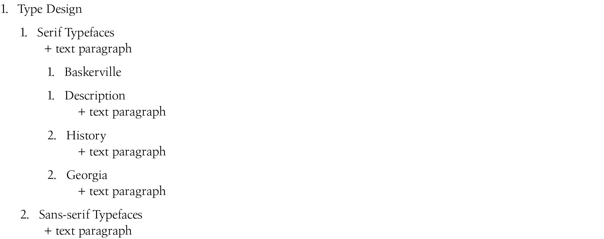
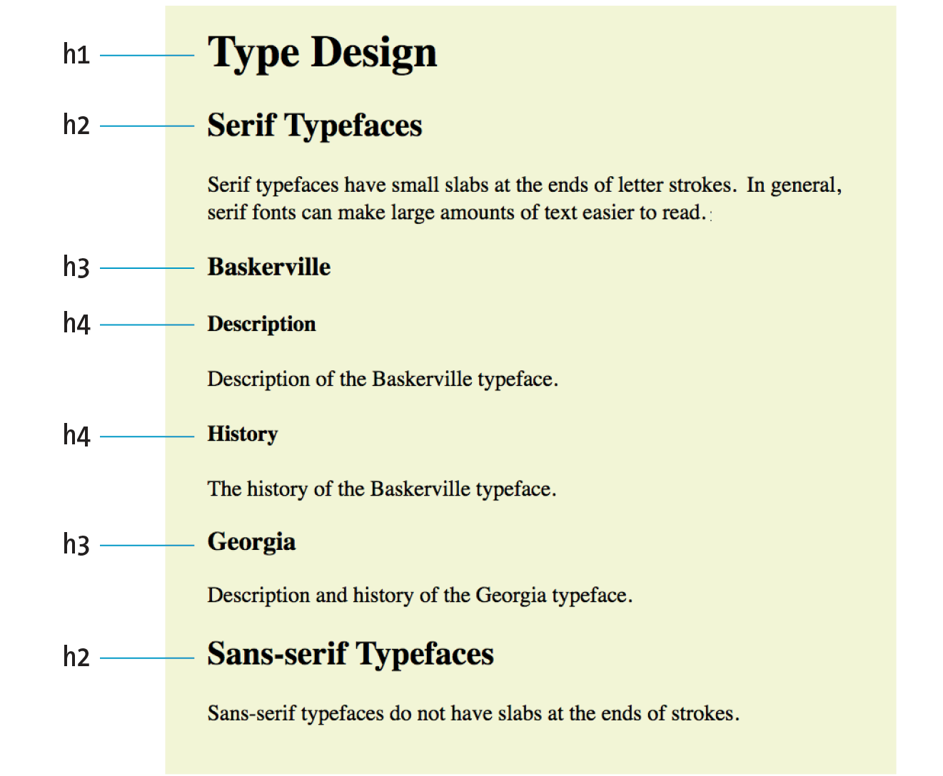
<h1>Type Design</h1>
<h2>Serif Typefaces</h2>
<p>Serif typefaces have small slabs at the ends of letter strokes.
In general, serif fonts can make large amounts of text easier to
read.</p>
<h3>Baskerville</h3>
<h4>Description</h4>
<p>Description of the Baskerville typeface.</p>
<h4>History</h4>
<p>The history of the Baskerville typeface.</p>
<h3>Georgia</h3>
<p>Description and history of the Georgia typeface.</p>
<h2>Sans-serif Typefaces</h2>
<p>Sans-serif typefaces do not have slabs at the ends of strokes.</p>
The markup in this example would create the following document outline:
By default, the headings in our example display in bold text, starting in very large type for h1s, with each consecutive level in smaller text, as shown in Figure 5-1. You can use a style sheet to change their appearance.
Thematic Breaks (Horizontal Rule)
<hr>
A horizontal rule
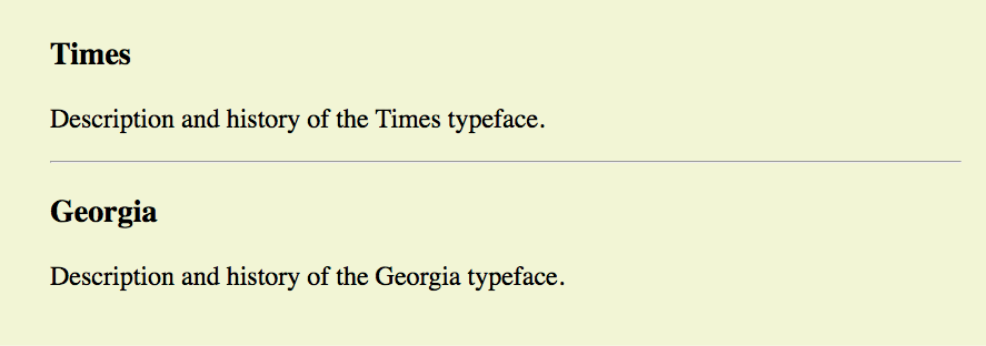
If you want to indicate that one topic has completed and another one is beginning, you can insert what the spec calls a “paragraph-level thematic break” with the hr element. The hr element adds a logical divider between sections of a page or paragraphs without introducing a new heading level.
In older HTML versions, hr was defined as a “horizontal rule” because it inserts a horizontal line on the page. Browsers still render hr as a 3-D shaded rule and put it on a line by itself with some space above and below by default; but in the HTML5 spec, it has a new semantic name and definition. If a decorative line is all you’re after, it is better to create a rule by specifying a colored border before or after an element with CSS.
hr is an empty element—you just drop it into place where you want the thematic break to occur, as shown in this example and Figure 5-2:
<h3>Times</h3>
<p>Description and history of the Times typeface.</p>
<hr><h3>Georgia</h3>
<p>Description and history of the Georgia typeface.</p>
Lists
Humans are natural list makers, and HTML provides elements for marking up three types of lists:
Unordered lists
Collections of items that appear in no particular order
Ordered lists
Lists in which the sequence of the items is important
Description lists
Lists that consist of name and value pairs, including but not limited to terms and definitions
All list elements—the lists themselves and the items that go in them—are displayed as block elements by default, which means that they start on a new line and have some space above and below, but that may be altered with CSS. In this section, we’ll look at each list type in detail.
Unordered Lists
<ul>…</ul>
Unordered list
<li>…</li>
List item within an unordered list
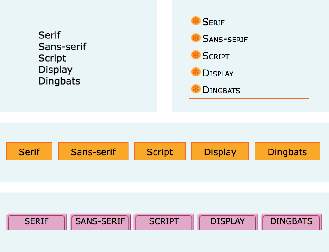
Just about any list of examples, names, components, thoughts, or options qualifies as an unordered list. In fact, most lists fall into this category. By default, unordered lists display with a bullet before each list item, but you can change that with a style sheet, as you’ll see in a moment.
To identify an unordered list, mark it up as a ul element. The opening <ul> tag goes before the first list item, and the closing tag </ul> goes after the last item. Then, to mark up each item in the list as a list item (li), enclose it in opening and closing li tags, as shown in this example. Notice that there are no bullets in the source document. The browser adds them automatically (Figure 5-3).
The only thing that is permitted within an unordered list (that is, between the start and end ul tags) is one or more list items. You can’t put other elements in there, and there may not be any untagged text. However, you can put any type of content element within a list item (li):
<ul><li>Serif</li>
<li>Sans-serif</li>
<li>Script</li>
<li>Display</li>
<li>Dingbats</li>
</ul>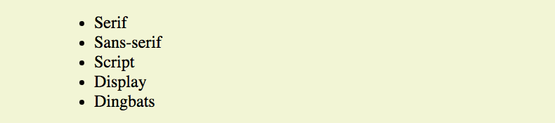
But here’s the cool part. We can take that same unordered list markup and radically change its appearance by applying different style sheets, as shown in Figure 5-4. In the figure, I’ve turned off the bullets, added bullets of my own, made the items line up horizontally, and even made them look like graphical buttons. The markup stays exactly the same.
Ordered Lists
<ol>…</ol>
Ordered list
<li>…</li>
List item within an ordered list
Ordered lists are for items that occur in a particular order, such as step-by-step instructions or driving directions. They work just like the unordered lists described earlier, but they are defined with the ol element (for “ordered list,” of course). Instead of bullets, the browser automatically inserts numbers before ordered list items (see Note), so you don’t need to number them in the source document. This makes it easy to rearrange list items without renumbering them.
Note
If something is logically an ordered list, but you don’t want numbers to display, remember that you can always remove the numbering with style sheets. So go ahead and mark up the list semantically as an and adjust how it displays with a style rule.
Ordered list elements must contain one or more list item elements, as shown in this example and in Figure 5-5:
<ol><li>Gutenberg develops moveable type (1450s)</li>
<li>Linotype is introduced (1890s)</li>
<li>Photocomposition catches on (1950s)</li>
<li>Type goes digital (1980s)</li>
</ol>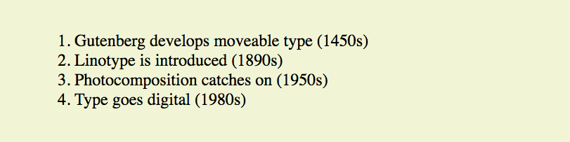
If you want a numbered list to start at a number other than 1, you can use the start attribute in the ol element to specify another starting number, as shown here:
<ol start="17">
<li>Highlight the text with the text tool.</li>
<li>Select the Character tab.</li>
<li>Choose a typeface from the pop-up menu.</li>
</ol>
The resulting list items would be numbered 17, 18, and 19, consecutively.
Description Lists
<dl>…</dl>
A description list
<dt>…</dt>
A name, such as a term or label
<dd>…</dd>
A value, such as a description or definition
Description lists are used for any type of name/value pairs, such as terms and their definitions, questions and answers, or other types of terms and their associated information. Their structure is a bit different from the other two lists that we just discussed. The whole description list is marked up as a dl element. The content of a dl is some number of dt elements indicating the names, and dd elements for their respective values. I find it helpful to think of them as “terms” (to remember the “t” in dt) and “definitions” (for the “d” in dd), even though that is only one use of description lists.
Here is an example of a list that associates forms of typesetting with their descriptions (Figure 5-6):
<dl><dt>Linotype</dt>
<dd>Line-casting allowed type to be selected, used, then recirculated
into the machine automatically. This advance increased the speed of
typesetting and printing dramatically.</dd>
<dt>Photocomposition</dt>
<dd>Typefaces are stored on film then projected onto photo-sensitive
paper. Lenses adjust the size of the type.</dd>
<dt>Digital type</dt>
<dd><p>Digital typefaces store the outline of the font shape in a
format such as Postscript. The outline may be scaled to any size for
output.</p>
<p>Postscript emerged as a standard due to its support of
graphics and its early support on the Macintosh computer and Apple
laser printer.</p>
</dd>
</dl>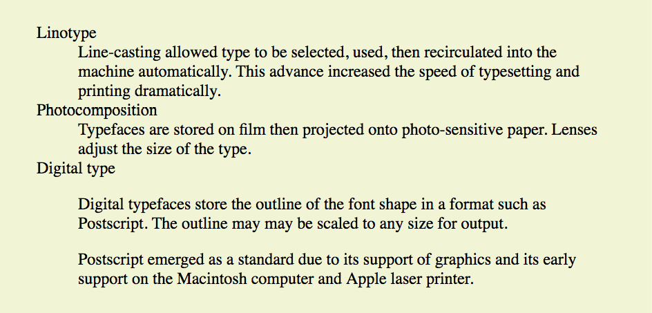
The dl element is allowed to contain only dt and dd elements. You cannot put headings or content-grouping elements (like paragraphs) in names (dt), but the value (dd) can contain any type of flow content. For example, the last dd element in the previous example contains two paragraph elements (the awkward default spacing could be cleaned up with a style sheet).
It is permitted to have multiple definitions with one term and vice versa. Here, each term-description group has one term and multiple definitions:
<dl>
<dt>Serif examples</dt>
<dd>Baskerville</dd>
<dd>Goudy</dd>
<dt>Sans-serif examples</dt>
<dd>Helvetica</dd>
<dd>Futura</dd>
<dd>Avenir</dd>
</dl>
More Content Elements
We’ve covered paragraphs, headings, and lists, but there are a few more special text elements to add to your HTML toolbox that don’t fit into a neat category: long quotations (blockquote), preformatted text (pre), and figures (figure and figcaption). One thing these elements do have in common is that they are considered “grouping content” in the HTML5 spec (along with p, hr, the list elements, main, and the generic div, covered later in this chapter). The other thing they share is that browsers typically display them as block elements by default. The one exception is the newer main element, which is not recognized by any version of Internet Explorer (although it is supported in the Edge browser); see the sidebar “HTML5 Support in Internet Explorer,” later in this chapter, for a workaround.
Long Quotations
<blockquote>…</blockquote>
A lengthy, block-level quotation
If you have a long quotation, a testimonial, or a section of copy from another source, mark it up as a blockquote element. It is recommended that content within blockquote elements be contained in other elements, such as paragraphs, headings, or lists, as shown in this example:
<p>Renowned type designer, Matthew Carter, has this to say about his profession:</p>
<blockquote><p>Our alphabet hasn't changed in eons; there isn't much latitude in
what a designer can do with the individual letters.</p>
<p>Much like a piece of classical music, the score is written
down. It's not something that is tampered with, and yet, each
conductor interprets that score differently. There is tension in
the interpretation.</p>
</blockquote>Figure 5-7 shows the default rendering of the blockquote example. This can be altered with CSS.

Preformatted Text
<pre>…</pre>
Preformatted text
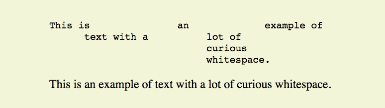
In the previous chapter, you learned that browsers ignore whitespace such as line returns and character spaces in the source document. But in some types of information, such as code examples or certain poems, the whitespace is important for conveying meaning. For content in which whitespace is semantically significant, use the preformatted text (pre) element. It is a unique element in that it is displayed exactly as it is typed—including all the carriage returns and multiple character spaces. By default, preformatted text is also displayed in a constant-width font (one in which all the characters are the same width, also called monospace), such as Courier; however, you can easily change the font with a style sheet rule.
The pre element in this example displays as shown in Figure 5-8. The second part of the figure shows the same content marked up as a paragraph (p) element for comparison.
<pre> This is an example of
text with a lot of
curious
whitespace.
</pre> <p>
This is an example of
text with a lot of
curious
whitespace.
</p>
Figures
<figure>…</figure>
Related image or resource
<figcaption>…</figcaption>
Text description of a figure
The figure element identifies content that illustrates or supports some point in the text. A figure may contain an image, a video, a code snippet, text, or even a table—pretty much anything that can go in the flow of web content. Content in a figure element should be treated and referenced as a self-contained unit. That means if a figure is removed from its original placement in the main flow (to a sidebar or appendix, for example), both the figure and the main flow should continue to make sense.
Although you can simply add an image to a page, wrapping it in figure tags makes its purpose explicitly clear semantically. It also works as a hook for applying special styles to figures but not to other images on the page:
<figure><img src="piechart.png" alt="chart showing fonts on mobile devices">
</figure>If you want to provide a text caption for the figure, use the figcaption element above or below the content inside the figure element. It is a more semantically rich way to mark up the caption than using a simple p element.
<figure><pre>
<code>
body {
background-color: #000;
color: red;
}
</code>
</pre>
<figcaption>Sample CSS rule.</figcaption>
</figure>In Exercise 5-1, you’ll get a chance to mark up a document yourself and try out the basic text elements we’ve covered so far.
Exercise 5-1. Marking up a recipe
Tapenade (Olive Spread)
This is a really simple dish to prepare and it’s always a big hit at parties. My father recommends:
"Make this the night before so that the flavors have time to blend. Just bring it up to room temperature before you serve it. In the winter, try serving it warm."
Ingredients
1 8oz. jar sundried tomatoes
2 large garlic cloves
2/3 c. kalamata olives
1 t. capers
Instructions
Combine tomatoes and garlic in a food processor. Blend until as smooth as possible.
Add capers and olives. Pulse the motor a few times until they are incorporated, but still retain some
texture.
Serve on thin toast rounds with goat cheese and fresh basil garnish (optional).
Organizing Page Content
So far, the elements we’ve covered handle very specific tidbits of content: a paragraph, a heading, a figure, and so on. Prior to HTML5, there was no way to group these bits into larger parts other than wrapping them in a generic division (div) element (I’ll cover div in more detail later). HTML5 introduced new elements that give semantic meaning to sections of a typical web page or application (see Note), including main content (main), headers (header), footers (footer), sections (section), articles (article), navigation (nav), and tangentially related or complementary content (aside). Curiously, the spec lists the old address element as a section as well, so we’ll look at that one here too.
Main Content
<main>…</main>
Primary content area of page or app
Web pages these days are loaded with different types of content: mastheads, sidebars, ads, footers, more ads, even more ads, and so on. It is helpful to cut to the chase and explicitly point out the main content on the page. Use the main element to identify the primary content of a page or application. It helps screen readers and other assistive technologies know where the main content of the page begins and replaces the “Skip to main content” links that have been utilized in the past. The content of a main element should be unique to that page. In other words, headers, sidebars, and other elements that appear across multiple pages in a site should not be included in the main section:
<body>
<header>…</header>
<main><h1>Humanist Sans Serif</h1>
<!-- code continues -->
</main></body>
The W3C HTML5 specification states that pages should have only one main section and that it should not be nested within an article, aside, header, footer, or nav. Doing so will cause the document to be invalid.
The main element is the most recent addition to the roster of HTML5 grouping elements. You can use it and style it in most browsers, but for Internet Explorer (including version 11, the most current as of this writing), you’ll need to create the element with JavaScript and set its display to block with a style sheet, as discussed in the “HTML5 Support in Internet Explorer” sidebar. Note that main is supported in MS Edge.
Headers and Footers
<header>…</header>
Introductory material for page, section, or article
<footer>…</footer>
Footer for page, section, or article
Because web authors have been labeling header and footer sections in their documents for years, it was kind of a no-brainer that full-fledged header and footer elements would come in handy. Let’s start with headers.
Headers
The header element is used for introductory material that typically appears at the beginning of a web page or at the top of a section or article (we’ll get to those elements next). There is no specified list of what a header must or should contain; anything that makes sense as the introduction to a page or section is acceptable. In the following example, the document header includes a logo image, the site title, and navigation:
<body>
<header><img src="/images/logo.png" alt="logo">
<h1>Nuts about Web Fonts</h1>
<nav>
<ul>
<li><a href="/">Home</a></li>
<li><a href="/">Blog</a></li>
<li><a href="/">Shop</a></li>
</ul>
</nav>
</header><!--page content-->
</body>
When used in an individual article, the header might include the article title, author, and the publication date, as shown here:
<article>
<header>
    <h1>More about WOFF</h1>
    <p>by Jennifer Robbins, <time datetime="2017-11-11">November 11, 2017</time></p>
</header>
<!-- article content here -->
</article>
Note
Neither nor elements are permitted to contain nested or elements.
Footers
The footer element is used to indicate the type of information that typically comes at the end of a page or an article, such as its author, copyright information, related documents, or navigation. The footer element may apply to the entire document, or it could be associated with a particular section or article. If the footer is contained directly within the body element, either before or after all the other body content, then it applies to the entire page or application. If it is contained in a sectioning element (section, article, nav, or aside), it is parsed as the footer for just that section. Note that although it is called “footer,” there is no requirement that it appear last in the document or sectioning element. It could also appear at or near the beginning if that makes sense.
In this simple example, we see the typical information listed at the bottom of an article marked up as a footer:
<article>
<header>
<h1>More about WOFF</h1>
<p>by Jennifer Robbins, <time datetime="2017-11-11">November 11, 2017</time></p>
</header>
<!-- article content here -->
<footer><p><small>Copyright ©2017 Jennifer Robbins.</small></p>
<nav>
<ul>
<li><a href="/">Previous</a></li>
<li><a href="/">Next</a></li>
</ul>
</nav>
</footer>
</article>
Sections and Articles
<section>…</section>
Thematic group of content
<article>…</article>
Self-contained, reusable composition
Long documents are easier to use when they are divided into smaller parts. For example, books are divided into chapters, and newspapers have sections for local news, sports, comics, and so on. To divide long web documents into thematic sections, use the aptly named section element. Sections typically include a heading (inside the section element) plus content that has a meaningful reason to be grouped together.
The section element has a broad range of uses, from dividing a whole page into major sections or identifying thematic sections within a single article. In the following example, a document with information about typography resources has been divided into two sections based on resource type:
<section><h2>Typography Books</h2>
<ul>
<li>…</li>
</ul>
</section><section><h2>Online Tutorials</h2>
<p>These are the best tutorials on the web.</p>
<ul>
<li>…</li>
</ul>
</section>Use the article element for self-contained works that could stand alone or be reused in a different context (such as syndication). It is useful for magazine or newspaper articles, blog posts, comments, or other items that could be extracted for external use. You can think of it as a specialized section element that answers “yes” to the question “Could this appear on another site and make sense?”
A long article could be broken into a number of sections, as shown here:
<article><h1>Get to Know Helvetica</h1>
<section>
<h2>History of Helvetica</h2>
<p>…</p>
</section>
<section>
<h2>Helvetica Today</h2>
<p>…</p>
</section>
</article>Conversely, a section in a web document might be composed of a number of articles:
<section id="essays"><article>
<h1>A Fresh Look at Futura</h1>
<p>…</p>
</article>
<article>
<h1>Getting Personal with Humanist</h1>
<p>…</p>
</article>
</section>The section and article elements are easily confused, particularly because it is possible to nest one in the other and vice versa. Keep in mind that if the content is self-contained and could appear outside the current context, it is best marked up as an article.
Aside (Sidebars)
<aside>…</aside>
Tangentially related material
The aside element identifies content that is separate from, but tangentially related to, the surrounding content. In print, its equivalent is a sidebar, but it couldn’t be called “sidebar” because putting something on the “side” is a presentational description, not semantic. Nonetheless, a sidebar is a good mental model for using the aside element. aside can be used for pull quotes, background information, lists of links, callouts, or anything else that might be associated with (but not critical to) a document.
In this example, an aside element is used for a list of links related to the main article:
<h1>Web Typography</h1>
<p>Back in 1997, there were competing font formats and tools for making them…</p>
<p>We now have a number of methods for using beautiful fonts on web pages…</p>
<aside><h2>Web Font Resources</h2>
<ul>
<li><a href="http://typekit.com/">Typekit</a></li>
<li><a href="http://fonts.google.com">Google Fonts</a></li>
</ul>
</aside>The aside element has no default rendering, so you will need to make it a block element and adjust its appearance and layout with style sheet rules.
Navigation
<nav>…</nav>
Primary navigation links
The nav element gives developers a semantic way to identify navigation for a site. Earlier in this chapter, we saw an unordered list that might be used as the top-level navigation for a font catalog site. Wrapping that list in a nav element makes its purpose explicitly clear:
<nav><ul>
<li><a href="/">Serif</a></li>
<li><a href="/">Sans-serif</a></li>
<li><a href="/">Script</a></li>
<li><a href="/">Display</a></li>
<li><a href="/">Dingbats</a></li>
</ul>
</nav>Not all lists of links should be wrapped in nav tags, however. The spec makes it clear that nav should be used for links that provide primary navigation around a site or a lengthy section or article. The nav element may be especially helpful from an accessibility perspective.
Addresses
<address>…</address>
Contact information
Last, and well, least, is the address element that is used to create an area for contact information for the author or maintainer of the document. It is generally placed at the end of the document or in a section or article within a document. An address would be right at home in a footer element. It is important to note that the address element should not be used for any old address on a page, such as mailing addresses. It is intended specifically for author contact information (although that could potentially be a mailing address). Following is an example of its intended use:
<address>Contributed by <a href="../authors/robbins/">Jennifer Robbins</a>,
<a href="http://www.oreilly.com/">O'Reilly Media</a>
</address> The Inline Element Roundup
Now that we’ve identified the larger chunks of content, we can provide semantic meaning to phrases within the chunks by using what the HTML5 specification calls text-level semantic elements. On the street, you are likely to hear them called inline elements because they display in the flow of text by default and do not cause any line breaks. That’s also how they were referred to in HTML versions prior to HTML5.
Text-Level (Inline) Elements
Despite all the types of information you could add to a document, there are only a couple dozen text-level semantic elements. Table 5-1 lists all of them.
Although it may be handy seeing all of the text-level elements listed together in a table, they certainly deserve more detailed explanations.
Emphasized text
<em>…</em>
Stressed emphasis
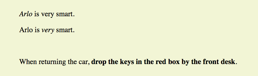
Use the em element to indicate which part of a sentence should be stressed or emphasized. The placement of em elements affects how a sentence’s meaning is interpreted. Consider the following sentences that are identical, except for which words are stressed:
<p><em>Arlo</em>is very smart.</p>
<p>Arlo is<em>very</em>smart.</p>
The first sentence indicates who is very smart. The second example is about how smart he is. Notice that the em element has an effect on the meaning of the sentence.
Emphasized text (em) elements nearly always display in italics by default (Figure 5-9), but of course you can make them display any way you like with a style sheet. Screen readers may use a different tone of voice to convey stressed content, which is why you should use an em element only when it makes sense semantically, not just to achieve italic text.
Important text
<strong>…</strong>
Strong importance
The strong element indicates that a word or phrase is important, serious, or urgent. In the following example, the strong element identifies the portion of instructions that requires extra attention. The strong element does not change the meaning of the sentence; it merely draws attention to the important parts:
<p>When returning the car,<strong>drop the keys in the red box by the front desk</strong>.</p>
Visual browsers typically display strong text elements in bold text by default. Screen readers may use a distinct tone of voice for important content, so mark text as strong only when it makes sense semantically, not just to make text bold.
The following is a brief example of our em and strong text examples. Figure 5-9 should hold no surprises.
Elements originally named for their presentational properties
<b>…</b>
Keywords or visually
emphasized text (bold)
<i>…</i>
Alternative voice (italic)
<s>…</s>
Incorrect text (strike-through)
<u>…</u>
Annotated text (underline)
<small>…</small>
Legal text; small print (smaller type size)
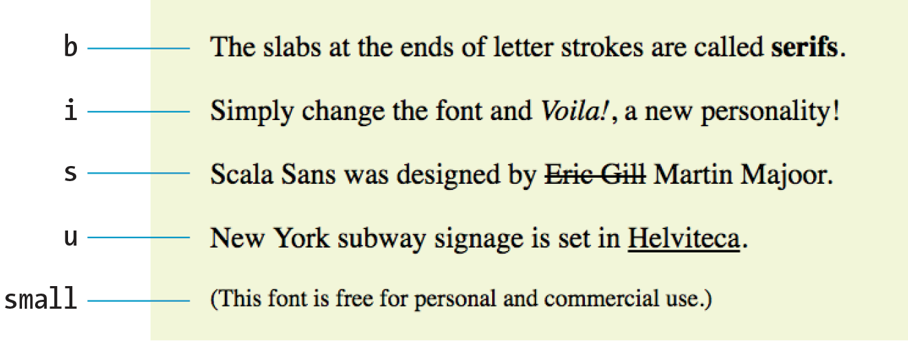
As long as we’re talking about bold and italic text, let’s see what the old b and i elements are up to now. The elements b, i, u, s, and small were introduced in the old days of the web as a way to provide typesetting instructions (bold, italic, underline, strike-through, and smaller text, respectively). Despite their original presentational purposes, these elements have been included in HTML5 and given updated, semantic definitions based on patterns of how they’ve been used. Browsers still render them by default as you’d expect (Figure 5-10). However, if a type style change is all you’re after, using a style sheet rule is the appropriate solution. Save these for when they are semantically appropriate.
Let’s look at these elements and their correct usage, as well as the style sheet alternatives.
b
Keywords, product names, and other phrases that need to stand out from the surrounding text without conveying added importance or emphasis (see Note). [Old definition: Bold]
CSS Property: For bold text, use font-weight. Example: font-weight: bold;
Example: <p>The slabs at the ends of letter strokes are called <b>serifs</b>.</p>
i
Indicates text that is in a different voice or mood than the surrounding text, such as a phrase from another language, a technical term, or a thought. [Old definition: Italic]
CSS Property: For italic text, use font-style. Example: font-style: italic;
Example: <p>Simply change the font and <i>Voila!</i>, a new
personality!</p>
s
Indicates text that is incorrect. [Old definition: Strike-through text]
CSS Property: To draw a line through a selection of text, use text-decoration. Example: text-decoration: line-through
Example: <p>Scala Sans was designed by <s>Eric Gill</s> Martin Majoor.</p>
u
There are a few instances when underlining has semantic significance, such as underlining a formal name in Chinese or indicating a misspelled word after a spell check, such as the misspelled “Helvitica” in the following example. Note that underlined text is easily confused with a link and should generally be avoided except for a few niche cases. [Old definition: Underline]
CSS Property: For underlined text, use text-decoration. Example: text-decoration: underline
Example: <p>New York subway signage is set in <u>Helviteca</u>.</p>
small
Indicates an addendum or side note to the main text, such as the legal “small print” at the bottom of a document. [Old definition: Renders in font smaller than the surrounding text]
CSS Property: To make text smaller, use font-size. Example: font-size: 80%
Example: <p><small>(This font is free for personal and commercial use.)</small></p>
Short quotations
<q>…</q>
Short inline quotation
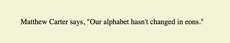
Use the quotation (q) element to mark up short quotations, such as “To be or not to be,” in the flow of text, as shown in this example (Figure 5-11):
Matthew Carter says,<q>Our alphabet hasn't changed in eons.</q>
According to the HTML spec, browsers should add quotation marks around q elements automatically, so you don’t need to include them in the source document. Some browsers, like Firefox, render curly quotes, which is preferable. Others (Safari and Chrome, which I used for my examples) render them as straight quotes as shown in the figure.
Abbreviations and acronyms
<abbr>…</abbr>
Abbreviation or acronym
Marking up acronyms and abbreviations with the abbr element provides useful information for search engines, screen readers, and other devices. Abbreviations are shortened versions of a word ending in a period (“Conn.” for “Connecticut,” for example). Acronyms are abbreviations formed by the first letters of the words in a phrase (such as NASA or USA). The title attribute provides the long version of the shortened term, as shown in this example:
<abbr title="Points">pts.</abbr>
<abbr title="American Type Founders">ATF</abbr>
NOTE
In HTML 4.01, there was an element especially for acronyms, but HTML5 has made it obsolete in favor of using the for both.
Citations
<cite>…</cite>
Citation
The cite element is used to identify a reference to another document, such as a book, magazine, article title, and so on. Citations are typically rendered in italic text by default. Here’s an example:
<p>Passages of this article were inspired by<cite>The Complete Manual of Typography</cite>by James Felici.</p>
Defining terms
<dfn>…</dfn>
Defining term
It is common to point out the first and defining instance of a word in a document in some fashion. In this book, defining terms are set in blue text. In HTML, you can identify them with the dfn element and format them visually using style sheets.
<p><dfn>Script typefaces</dfn>are based on handwriting.</p>
Program code elements
<code>…</code>
Code
<var>…</var>
Variable
<samp>…</samp>
Program sample
<kbd>…</kbd>
User-entered keyboard strokes
A number of inline elements are used for describing the parts of technical documents, such as code (code), variables (var), program samples (samp), and user-entered keyboard strokes (kbd). For me, it’s a quaint reminder of HTML’s origins in the scientific world (Tim Berners-Lee developed HTML to share documents at the CERN particle physics lab in 1989).
Code, sample, and keyboard elements typically render in a constant-width (also called monospace) font such as Courier by default. Variables usually render in italics.
Subscript and superscript
<sub>…</sub>
Subscript
<sup>…</sup>
Superscript
The subscript (sub) and superscript (sup) elements cause the selected text to display in a smaller size, positioned slightly below (sub) or above (sup) the baseline. These elements may be helpful for indicating chemical formulas or mathematical equations.
Figure 5-12 shows how these examples of subscript and superscript typically render in a browser.
<p>H<sub>2</sub>0</p>
<p>E=MC<sup>2</sup></p>

Highlighted text
<mark>…</mark>
Contextually relevant text
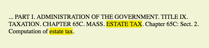
The mark element indicates a word that may be considered especially relevant to the reader. One might use it to dynamically highlight a search term in a page of results, to manually call attention to a passage of text, or to indicate the current page in a series. Some designers (and browsers) give marked text a light colored background as though it were marked with a highlighter marker, as shown in Figure 5-13.
<p> ... PART I. ADMINISTRATION OF THE GOVERNMENT. TITLE IX.
TAXATION. CHAPTER 65C. MASS.<mark>ESTATE TAX</mark>. Chapter 65C: Sect. 2. Computation of<mark>estate tax</mark>.</p>
Dates and times
<time>…</time>
Time data
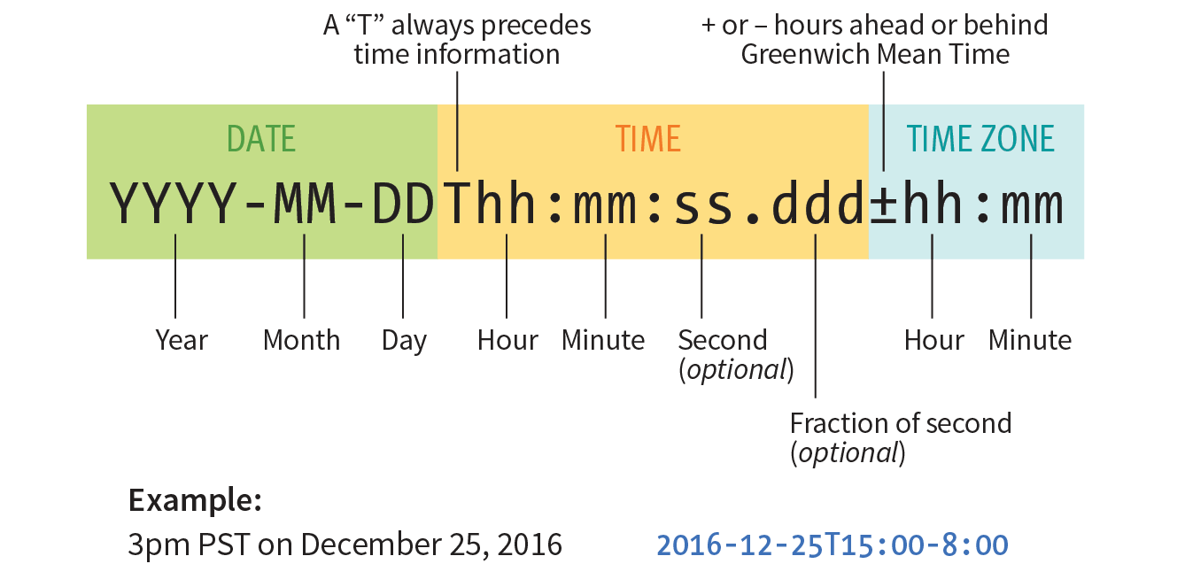
When we look at the phrase “noon on November 4,” we know that it is a date and a time. But the context might not be so obvious to a computer program. The time element allows us to mark up dates and times in a way that is comfortable for a human to read, but also encoded in a standardized way that computers can use. The content of the element presents the information to people, and the datetime attribute presents the same information in a machine-readable way.
note
The element is not intended for marking up times for which a precise time or date cannot be established, such as “the end of last year” or “the turn of the century.”
The time element indicates dates, times, or date-time combos. It might be used to pass the date and time information to an application, such as saving an event to a personal calendar. It might be used by search engines to find the most recently published articles. Or it could be used to restyle time information into an alternate format (e.g., changing 18:00 to 6 p.m.).
The datetime attribute specifies the date and/or time information in a standardized time format illustrated in Figure 5-14. The full time format begins with the date (year–month–day). The time section begins with a letter “T” and lists hours (on the 24-hour clock), minutes, seconds (optional), and milliseconds (also optional). Finally, the time zone is indicated by the number of hours behind (-) or ahead (+) of Greenwich Mean Time (GMT). For example, “-05:00” indicates the Eastern Standard time zone, which is five hours behind GMT. When identifying dates and times alone, you can omit the other sections.
Here are a few examples of valid values for datetime:
- Time only: 9:30 p.m.
<time datetime="
21:30">9:30p.m.</time> - Date only: June 19, 2016
<time datetime="
2016-06-19">June 19, 2016</time> - Date and time: Sept. 5, 1970, 1:11a.m.
<time datetime="
1970-09-05T01:11:00">Sept. 5, 1970, 1:11a.m.</time> - Date and time, with time zone information: 8:00am on July 19, 2015, in Providence, RI
<time datetime="
2015-07-19T08:00:00-05:00">July 19, 2015, 8am, Providence RI</time>Note
You can also use the element without the attribute, but its content must be a valid date/time string:
<time>2016-06-19</time>
Machine-readable information
<data>…</data>
Machine-readable data
The data element is another tool for helping computers make sense of content. It can be used for all sorts of data, including dates, times, measurements, weights, microdata, and so on. The required value attribute provides the machine-readable information. Here are a couple of examples:
<data value="12">Twelve</data>
<data value="978-1-449-39319-9">CSS: The Definitive Guide</data>
I’m not going to go into more detail on the data element, because as a beginner, you are unlikely to be dealing with machine-readable data quite yet. But it is interesting to see how markup can be used to provide usable information to computer programs and scripts as well as to your fellow humans.
Inserted and deleted text
<ins>…</ins>
Inserted text
<del>…</del>
Deleted text
The ins and del elements are used to mark up edits indicating parts of a document that have been inserted or deleted (respectively). These elements rely on style rules for presentation (i.e., there is no dependable browser default). Both the ins and del elements can contain either inline or block elements, depending on what type of content they contain:
Chief Executive Officer:<del title="retired">Peter Pan</del><ins>Pippi Longstocking</ins>
Adding Breaks
Line breaks
<br>
Line break
Occasionally, you may need to add a line break within the flow of text. We’ve seen how browsers ignore line breaks in the source document, so we need a specific directive to tell the browser to “add a line break here.”
The inline line break element (br) does exactly that. The br element could be used to break up lines of addresses or poetry. It is an empty element, which means it does not have content. Just add the br element in the flow of text where you want a break to occur, as shown here and in Figure 5-15:
<p>So much depends<br>upon<br><br>a red wheel<br>barrow</p>

Unfortunately, the br element is easily abused. Be careful that you aren’t using br elements to force breaks into text that really ought to be a list. For example, don’t do this:
<p>Times<br>
Georgia<br>
Garamond
</p>
If it’s a list, use the semantically correct unordered list element instead, and turn off the bullets with style sheets:
<ul>
<li>Times</li>
<li>Georgia</li>
<li>Garamond</li>
</ul>
Word breaks
<wbr>
Word break
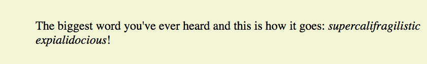
The word break (wbr) element lets you mark the place where a word should break (a “line break opportunity” according to the spec) should there not be enough room for the whole word (Figure 5-16). It takes some of the guesswork away from the browser and allows authors to control the best spot for the word to be split over two lines. If there is enough room, the word stays in one piece. Without word breaks, the word stays together, and if there is not enough room, the whole word wraps to the next line. Note that the browser does not add a hyphen when the word breaks over two lines. The wbr behaves as though it were a character space in the middle of the word:
<p>The biggest word you've ever heard and this is how it goes:
<em>supercali<wbr>fragilistic<wbr>expialidocious</em>!</p>
Browser support note
The element is not supported by any version of Internet Explorer as of this writing. It is supported in MS Edge.
You’ve been introduced to 32 new elements since your last exercise. I’d say it’s time to give some of the inline elements a try in Exercise 5-2.
Exercise 5-2. Identifying inline elements
b br cite dfn em
i q small time
<article>
<header>
<p>posted by BGB, November 15, 2016</p>
</header>
<h2>Low and Slow</h2>
<p>This week I am extremely excited about a new cooking technique called sous vide. In sous vide cooking, you submerge the food (usually vacuum-sealed in plastic) into a water bath that is precisely set to the target temperature you want the food to be cooked to. In his book, Cooking for Geeks, Jeff Potter describes it as ultra-low-temperature poaching.</p>
<p>Next month, we will be serving Sous Vide Salmon with Dill Hollandaise. To reserve a seat at the chef table, contact us before November 30.</p>
<p>blackgoose@example.com
555-336-1800</p>
<p>Warning: Sous vide cooked salmon is not pasteurized. Avoid it if you are pregnant or have immunity issues.</p>
</article>
Generic Elements (div and span)
<div>…</div>
Generic block-level element
<span>…</span>
Generic inline element
What if none of the elements we’ve talked about so far accurately describes your content? After all, there are endless types of information in the world, but as you’ve seen, not all that many semantic elements. Fortunately, HTML provides two generic elements that can be customized to describe your content perfectly. The div element indicates a division of content, and span indicates a word or phrase for which no text-level element currently exists. The generic elements are given meaning and context with the id and class attributes, which we’ll discuss in a moment.
The div and span elements have no inherent presentation qualities of their own, but you can use style sheets to format them however you like. In fact, generic elements are a primary tool in standards-based web design because they enable authors to accurately describe content and offer plenty of “hooks” for adding style rules. They also allow elements on the page to be accessed and manipulated by JavaScript.
We’re going to spend a little time on div and span elements, as well as the id and class attributes, to learn how authors use them to structure content.
Divide It Up with a div
Use the div element to create a logical grouping of content or elements on the page. It indicates that they belong together in a conceptual unit or should be treated as a unit by CSS or JavaScript. By marking related content as a div and giving it a unique id or indicating that it is part of a class, you give context to the elements in the grouping. Let’s look at a few examples of div elements.
In this example, a div element is used as a container to group an image and two paragraphs into a product “listing”:
<div class="listing"><img src="images/felici-cover.gif" alt="">
<p><cite>The Complete Manual of Typography</cite>, James Felici</p>
<p>A combination of type history and examples of good and bad type design.</p>
</div> By putting those elements in a div, I’ve made it clear that they are conceptually related. It also allows me to style p elements within listings differently than other p elements in the document.
Here is another common use of a div used to break a page into sections for layout purposes. In this example, a heading and several paragraphs are enclosed in a div and identified as the “news” division:
<div id="news"><h1>New This Week</h1>
<p>We've been working on...</p>
<p>And last but not least,... </p>
</div>Now I have a custom element that I’ve given the name “news.” You might be thinking, “Hey Jen, couldn’t you use a section element for that?” You could! In fact, authors may turn to generic divs less often now that we have better semantic sectioning elements in HTML5.
Define a Phrase with span
A span offers the same benefits as the div element, except it is used for phrase elements and does not introduce line breaks. Because spans are inline elements, they may contain only text and other inline elements (in other words, you cannot put headings, lists, content-grouping elements, and so on, in a span). Let’s get right to some examples.
There is no telephone element, but we can use a span to give meaning to telephone numbers. In this example, each telephone number is marked up as a span and classified as “tel”:
<ul>
<li>John:<span class="tel">999.8282</span></li>
<li>Paul:<span class="tel">888.4889</span></li>
<li>George:<span class="tel">888.1628</span></li>
<li>Ringo:<span class="tel">999.3220</span></li>
</ul>
You can see how the classified spans add meaning to what otherwise might be a random string of digits. As a bonus, the span element enables us to apply the same style to phone numbers throughout the site (for example, ensuring line breaks never happen within them, using a CSS white-space: nowrap declaration). It makes the information recognizable not only to humans but also to computer programs that know that “tel” is telephone number information. In fact, some values—including “tel”—have been standardized in a markup system known as Microformats that makes web content more useful to software (see the upcoming sidebar “Structured Data in a Nutshell”).
id and class Attributes
In the previous examples, we saw the id and class attributes used to provide context to generic div and span elements. id and class have different purposes, however, and it’s important to know the difference.
Identification with id
The id attribute is used to assign a unique identifier to an element in the document. In other words, the value of id must be used only once in the document. This makes it useful for assigning a name to a particular element, as though it were a piece of data. See the sidebar “id and class Values” for information on providing values for the id attribute.
This example uses the books’ ISBNs (International Standard Book Numbers) to uniquely identify each listing. No two book listings may share the same id.
<div id="ISBN0321127307">
<img src="felici-cover.gif" alt="">
<p><cite>The Complete Manual of Typography</cite>, James Felici</p>
  <p>A combination of type history and examples of good and bad type.
  </p>
</div>
<div id="ISBN0881792063">
<img src="bringhurst-cover.gif" alt="">
  <p><cite>The Elements of Typographic Style</cite>, Robert Bringhurst
  </p>
<p>This lovely, well-written book is concerned foremost with creating beautiful typography.</p>
</div>
Web authors also use id when identifying the various sections of a page. In the following example, there may not be more than one element with the id of “links” or “news” in the document:
<section id="news">
<!-- news items here -->
</section>
<aside id="links">
<!-- list of links here -->
</aside>
Classification with class
The class attribute classifies elements into conceptual groups; therefore, unlike the id attribute, a class name may be shared by multiple elements. By making elements part of the same class, you can apply styles to all of the labeled elements at once with a single style rule or manipulate them all with a script. Let’s start by classifying some elements in the earlier book example. In this first example, I’ve added class attributes to classify each div as a “listing” and to classify paragraphs as “descriptions”:
<div id="ISBN0321127307" class="listing">
<header>
<img src="felici-cover.gif" alt="">
<p><cite>The Complete Manual of Typography</cite>, James Felici</p>
</header>
<p class="description">A combination of type history and examples of good and bad type.</p>
</div>
<div id="ISBN0881792063" class="listing">
<header>
<img src="bringhurst-cover.gif" alt="">
  <p><cite>The Elements of Typographic Style</cite>, Robert Bringhurst
  </p>
</header>
<p class="description">This lovely, well-written book is concerned foremost with creating beautiful typography.</p>
</div>
Notice how the same element may have both a class and an id. It is also possible for elements to belong to multiple classes. When there is a list of class values, simply separate them with character spaces. In this example, I’ve classified each div as a “book” to set them apart from possible “cd” or “dvd” listings elsewhere in the document:
<div id="ISBN0321127307" class="listing book">
<img src="felici-cover.gif" alt="CMT cover">
<p><cite>The Complete Manual of Typography</cite>, James Felici</p>
<p class="description">A combination of type history and examples of good and bad type.</p>
</div>
<div id="ISBN0881792063" class="listing book">
<img src="bringhurst-cover.gif" alt="ETS cover">
  <p><cite>The Elements of Typographic Style</cite>, Robert Bringhurst
  </p>
  <p class="description">This lovely, well-written book is concerned
  foremost with creating beautiful typography.</p>
</div>
Identify and Classify All Elements
The id and class attributes are not limited to just div and span—they are two of the global attributes (see the “Global Attributes” sidebar) in HTML, which means you may use them with all HTML elements. For example, you could identify an ordered list as “directions” instead of wrapping it in a div:
<ol id="directions">
<li>...</li>
<li>...</li>
<li>...</li>
</ol>
This should have given you a good introduction to how to use the class and id attributes to add meaning and organization to documents. We’ll work with them even more in the style sheet chapters in Part III. The sidebar “Structured Data in a Nutshell” discusses more advanced ways of adding meaning and machine-readable data to documents.
Improving Accessibility with ARIA
As web designers, we must always consider the experience of users with assistive technologies for navigating pages and interacting with web applications. Your users may be listening to the content on the page read aloud by a screen reader and using keyboards, joysticks, voice commands, or other non-mouse input devices to navigate through the page.
Many HTML elements are plainly understood when you look at (or read) only the HTML source. Elements like the title, headings, lists, images, and tables have implicit meanings in the context of a page, but generic elements like div and span lack the semantics necessary to be interpreted by an assistive device. In rich web applications, especially those that rely heavily on JavaScript and AJAX (see Note), the markup alone does not provide enough clues as to how elements are being used or whether a form control is currently selected, required, or in some other state.
Fortunately, we have ARIA (Accessible Rich Internet Applications), a standardized set of attributes for making pages easier to navigate and interactive features easier to use. The specification was created and is maintained by a Working Group of the Web Accessibility Initiative (WAI), which is why you also hear it referred to as WAI-ARIA. ARIA defines roles, states, and properties that developers can add to markup and scripts to provide richer semantic information.
Roles
Roles describe an element’s function or purpose in the context of the document. Some roles include alert, button, dialog, slider, and menubar, to name only a few. For example, as we saw earlier, you can turn an unordered list into a tabbed menu of options using style sheets, but what if you can’t see that it is styled that way? Adding role="toolbar" to the list makes its purpose clear:
<ul id="tabs" role="toolbar">
<li>A-G</li>
<li>H-O</li>
<li>P-T</li>
<li>U-Z</li>
</ul>
Here’s another example that reveals that the “status” div is used as an alert message:
<div id="status" role="alert">You are no longer connected to the server.</div>
Some roles describe “landmarks” that help readers find their way through the document, such as navigation, banner, contentinfo, complementary, and main. You may notice that some of these sound similar to the page-structuring elements that were added in HTML5, and that’s no coincidence. One of the benefits of having improved semantic section elements is that they can be used as landmarks, replacing <div id="main" role="main"> with main.
Most current browsers already recognize the implicit roles of the new elements, but some developers explicitly add ARIA roles until all browsers comply. The sectioning elements pair with the ARIA landmark roles in the following way:
<nav role="navigation">
<header role="banner"> (see )
<main role="main">
<aside role="complementary">
<footer role="contentinfo">
Note
The banner role is used when the applies to only the whole page, not just a section or article.
States and Properties
ARIA also defines a long list of states and properties that apply to interactive elements such as form widgets and dynamic content. States and properties are indicated with attributes prefixed with aria-, such as aria-disabled, aria-describedby, and many more.
The difference between a state and property is subtle. For properties, the value of the attribute is more likely to be stable, such as aria-labelledby, which associates labels with their respective form controls, or aria-haspopup, which indicates the element has a related pop-up menu. States have values that are more likely to be changed as the user interacts with the element, such as aria-selected.
For Further Reading
Obviously, this is not enough ARIA coaching to allow you to start confidently using it today, but it should give you a good feel for how it works and its potential value. When you are ready to dig in and take your skills to a professional level, here is some recommended reading:
The WAI-ARIA Working Draft (www.w3.org/TR/wai-aria-1.1/)
This is the current Working Draft of the specification as of this writing.
ARIA in HTML (www.w3.org/TR/html-aria/)
This W3C Working Draft helps developers use ARIA attributes with HTML correctly. It features a great list of every HTML element, whether it has an implicit role (in which ARIA should not be used), and what roles, states, and properties apply.
ARIA Resources at MDN Web Docs
(developer.mozilla.org/en-US/docs/Web/Accessibility/ARIA)
This site features lots of links to ARIA-related and up-to-date resources. It is a good starting point for exploration.
HTML5 Accessibility (www.html5accessibility.com)
This site tests which new HTML5 features are accessibly supported by major browsers.
Character Escapes
There’s just one more text-related topic before we close out this chapter. The section title makes it sound like someone left the gate open and all the characters got out. The real meaning is more mundane, albeit useful to know.
You already know that as a browser parses an HTML document, when it runs into a < symbol, it interprets it as the beginning of a tag. But what if you just need a less-than symbol in your text? Characters that might be misinterpreted as code need to be escaped in the source document. Escaping means that instead of typing in the character itself, you represent it by its numeric or named character entity reference. When the browser sees the character reference, it substitutes the proper character in that spot when the page is displayed.
There are two ways of referring to (escaping) a specific character:
- Using a predefined abbreviated name for the character (called a named entity; see Note).
Note
HTML defines hundreds of named entities as part of the markup language, which is to say you can’t make up your own entity.
- Using an assigned numeric value that corresponds to its position in a coded character set (numeric entity). Numeric values may be in decimal or hexadecimal format.
All character references begin with an & (ampersand) and end with a ; (semicolon).
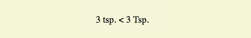
An example should make this clear. I’d like to use a less-than symbol in my text, so I must use the named entity (<) or its numeric equivalent (<) where I want the symbol to appear (Figure 5-17):
<p>3 tsp. < 3 Tsp.</p>
or:
<p>3 tsp. < 3 Tsp.</p>
When to Escape Characters
There are a few instances in which you may need or want to use a character reference.
HTML syntax characters
The <, >, &, ", and ' characters have special syntax meaning in HTML, and may be misinterpreted as code. Therefore, the W3C recommends that you escape <, >, and & characters in content. If attribute values contain single or double quotes, escaping the quote characters in the values is advised. Quote marks are fine in the content and do not need to be escaped. (See Table 5-2.)
|
Character |
Description |
Entity name |
Decimal no. |
Hexadecimal no. |
|
< |
Less-than symbol |
< |
< |
< |
|
> |
Greater-than symbol |
> |
> |
> |
|
" |
Quotation mark |
" |
" |
" |
|
' |
Apostrophe |
' |
' |
' |
|
& |
Ampersand |
& |
& |
& |
Invisible or ambiguous characters
Some characters have no graphic display and are difficult to see in the markup (Table 5-3). These include the non-breaking space ( ), which is used to ensure that a line doesn’t break between two words. So, for instance, if I mark up my name like this:
Jennifer Robbins
I can be sure that my first and last names will always stay together on a line. Another use for non-breaking spaces is to separate digits in a long number, such as 32 000 000.
Zero-width space can be placed in languages that do not use spaces between words to indicate where the line should break. A zero-width joiner is a non-printing space that causes neighboring characters to display in their connected forms (common in Arabic and Indic languages). Zero-width non-joiners prevent neighboring characters from joining to form ligatures or other connected forms.
|
Table 5-3. Invisible characters and their character references |
||||
|
Character |
Description |
Entity name |
Decimal no. |
Hexadecimal no. |
|
(non-printing) |
Non-breaking space |
|
  |
  |
|
(non-printing) |
En space |
  |
  |
  |
|
(non-printing) |
Em space |
  |
  |
  |
|
(non-printing) |
Zero-width space |
(none) |
​ |
​ |
|
(non-printing) |
Zero-width non-joiner |
‌ |
‌ |
‌ |
|
(non-printing) |
Zero-width joiner |
‍ |
‍ |
‍ |
Input limitations
If your keyboard or editing software does not include the character you need (or if you simply can’t find it), you can use a character entity to make sure you get the character you want. The W3C doesn’t endorse this practice, so use the proper character in your source if you are able. Table 5-4 lists some special characters that may be less straightforward to type into the source.
|
Table 5-4. Special characters and their character references |
||||
|
Character |
Description |
Entity name |
Decimal no. |
Hexadecimal no. |
|
‘ |
‘ |
‘ |
‘ |
|
|
’ |
Right curly single quote |
’ |
’ |
’ |
|
“ |
Left curly double quote |
“ |
“ |
“ |
|
” |
Right curly double quote |
” |
” |
” |
|
... |
… |
… |
… |
|
|
© |
© |
© |
© |
|
|
® |
® |
® |
® |
|
|
™ |
™ |
™ |
… |
|
|
£ |
£ |
£ |
£ |
|
|
¥ |
¥ |
¥ |
¥ |
|
|
€ |
€ |
€ |
€ |
|
|
– |
– |
– |
– |
|
|
— |
— |
— |
— |
|
A complete list of HTML named entities and their Unicode code-points can be found as part of the HTML5 specification at www.w3.org/TR/html5/syntax.html#named-character-references. For a more user-friendly listing of named and numerical entities, I recommend this archived page at the Web Standards Project: www.webstandards.org/learn/reference/charts/entities.
Putting It All Together
So far, you’ve learned how to mark up elements, and you’ve met all of the HTML elements for adding structure and meaning to text content. Now it’s just a matter of practice. Exercise 5-3 gives you an opportunity to try out everything we’ve covered so far: document structure elements, grouping (block) elements, phrasing (inline) elements, sectioning elements, and character entities. Have fun!
Exercise 5-3. The Black Goose Bistro News page
Note
The “Low and Slow” paragraph is already marked up with the inline elements from Exercise 5-2).
The Black Goose Bistro News
Home
Menu
News
Contact
Summer Menu Items
posted by BGB, June 18, 2017
Our chef has been busy putting together the perfect menu for the summer months. Stop by to try these appetizers and main courses while the days are still long.
Appetizers
Black bean purses
Spicy black bean and a blend of Mexican cheeses wrapped in sheets of phyllo and baked until golden. $3.95
Southwestern napoleons with lump crab -- new item!
Layers of light lump crab meat, bean and corn salsa, and our handmade flour tortillas. $7.95
Main courses
Shrimp sate kebabs with peanut sauce
Skewers of shrimp marinated in lemongrass, garlic, and fish sauce then grilled to perfection. Served with spicy peanut sauce and jasmine rice. $12.95
Jerk rotisserie chicken with fried plantains -- new item!
Tender chicken slow-roasted on the rotisserie, flavored with spicy and fragrant jerk sauce and served with fried plantains and fresh mango. $12.95
Low and Slow
posted by BGB, November 15, 2016
<p>This week I am <em>extremely</em> excited about a new cooking technique called <dfn><i>sous vide</i></dfn>. In <i>sous vide</i> cooking, you submerge the food (usually vacuum-sealed in plastic) into a water bath that is precisely set to the target temperature you want the food to be cooked to. In his book, <cite>Cooking for Geeks</cite>, Jeff Potter describes it as <q>ultra-low-temperature poaching.</q></p>
<p>Next month, we will be serving <b><i>Sous Vide</i> Salmon with Dill Hollandaise</b>. To reserve a seat at the chef table, contact us before <time datetime="20161130">November 30</time>.</p>
Location: Baker’s Corner, Seekonk, MA
Hours: Tuesday to Saturday, 11am to 11pm
All content copyright 2017, Black Goose Bistro and Jennifer Robbins

Test Yourself
Were you paying attention? Here is a rapid-fire set of questions to find out. Find the answers in Appendix A.
- Add the markup to insert a thematic break between these paragraphs:
<p>People who know me know that I love to cook.</p>
<p>I've created this site to share some of my favorite recipes.</p>
- What’s the difference between a blockquote and a q element?
- Which element displays whitespace exactly as it is typed into the source document?
- What is the difference between a ul and an ol element?
- How do you remove the bullets from an unordered list? (Be general, not specific.)
- What element would you use to mark up “W3C” and provide its full name (World Wide Web Consortium)? Can you write out the complete markup?
- What is the difference between dl and dt?
- What is the difference between id and class?
- What is the difference between an article and a section?
Element Review: Text Elements
The global attributes apply to all text elements. Additional attributes are listed under their respective elements.
|
Page sections |
|
address |
|
article |
|
aside |
|
footer |
|
header |
|
nav |
|
section |
|
|
Heading content |
|
h1...h6 |
|
|
Grouping content elements and attributes |
|
blockquote |
|
cite |
|
div |
|
figure |
|
figcaption |
|
hr |
|
main |
|
p |
|
pre |
Preformatted text |
|
List elements and attributes |
|
dd |
|
dl |
|
dt |
|
li |
|
value |
|
ol |
|
reversed |
|
start |
|
ul |
|
|
Breaks |
|
br |
|
wbr |
|
|
Phrasing elements and attributes |
|
abbr |
|
b |
|
bdi |
|
bdo |
|
cite |
|
code |
|
data |
|
del |
|
cite |
|
datetime |
|
dfn |
|
em |
|
i |
|
ins |
|
cite |
|
datetime |
|
kbd |
|
mark |
|
q |
|
cite |
|
ruby |
|
rp |
|
rt |
|
s |
|
samp |
|
small |
|
span |
|
strong |
|
sub |
Subscript |
sup |
Superscript |
time |
|
datetime |
|
pubdate |
|
u |
|