
The first view I had of what was to be my library was one of rocks and dust covering a rectangular space of approximately six by thirteen metres. The toppled stones lay between the pigeon tower and the furnace room that was to become my study; powdery sand showered the leaves of the creeper every time a bird settled on the dividing wall. The architect who eventually drew the library’s plans (fortunately for me) lives in the village. She insisted that traditional methods be used to clean the wall and rebuild the space, and she contracted masons knowledgable in the handling of the local stone, tuffeau, which is soft as sandstone and the colour of butter. It was an extraordinary sight to see these men work row by row, placing stone next to stone with the ability of skilled typographers in an old-fashioned printing shop. The image came to mind because in local parlance the large stones are known as upper case (majuscules) and the small ones as lower case (minuscules), and during the building of the library it seemed utterly appropriate that these inheritors of the bricklayers of Babel should mix stones and letters in their labours. “Passe-moi une majuscule!” they would call to one another, while my books waited silently in their boxes for the day of resurrection.

The amicable Toronto Reference Library.
Books lend a room a particular identity that can, in some cases, usurp that of their owner—a peculiarity well known to oafish personalities who demand to be portrayed against the background of a book-lined wall, in the hope that it will grant them a scholarly lustre. Seneca mocked ostentatious readers who relied on such walls to lend them intellectual prestige; he argued for possessing only a small number of books, not “endless bookshelves for the ignorant to decorate their dining-rooms.”160 In turn, the space in which we keep our books changes our relationship to them. We don’t read books in the same way sitting inside a circle or inside a square, in a room with a low ceiling or in one with high rafters. And the mental atmosphere we create in the act of reading, the imaginary space we construct when we lose ourselves in the pages of a book, is confirmed or refuted by the physical space of the library, and is affected by the distance of the shelves, the crowding or paucity of books, by qualities of scent and touch and by the varying degrees of light and shade. “Every librarian is, up to a certain point, an architect,” observed Michel Melot, director of the Centre Pompidou Library in Paris. “He builds up his collection as an ensemble through which the reader must find a path, discover his own self, and live.”161
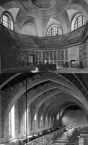
TOP: The King’s Library in Buckingham House in London.
BOTTOM: The semi-cylindrical ceiling of the Biblioteca de Catalunya, Barcelona.
The library I had imagined for my books, long before its walls were erected, already reflected the way in which I wished to read. There are readers who enjoy trapping a story within the confines of a tiny enclosure; others for whom a round, vast, public space better allows them to imagine the text stretching out towards far horizons; others still who find pleasure in a maze of rooms through which they can wander, chapter after chapter. I had dreamt of a long, low library where there would always be enough darkness around the pools of light on the desk to suggest that it was night outside, a rectangular space in which the walls would mirror one another and in which I could always feel as if the books on either side were almost at arm’s length. I read in a haphazard way, allowing books to associate freely, to suggest links by their mere proximity, to call to one another across the room. The shape I chose for my library encourages my reading habits.

ABOVE: Design for the library of the brain-shaped Freie Universität in Berlin.
The idea of a library set down on paper, still unpeopled by readers and books, as yet devoid of shelves and partitions, is nothing but the frame of a given style of reading, the reduction of an as yet shapeless universe to its minimum expression: pure geometrical form. Square spaces contain and dissect; circular spaces proclaim continuity; other shapes evoke other qualities. The Toronto Reference Library is a progression of ascending disks. The library of Buckingham House (where King George iii kept his books) was octagonal. The first Ambrosiana Library in Milan, lodged in three refurbished houses barely fit for “pigs and cheeky prostitutes,”162 occupied a narrow rectangle. The library of the Freie Universität in Berlin was designed by Norman Foster to resemble a skull and is now nicknamed The Brain. The Bibliothèque de France, in Paris, has the shape of an inverted table. The Biblioteca de Catalunya, in Barcelona, is a cylinder cut lengthwise in half. The Wolfenbüttel Library in Germany was designed by the architect Hermann Korb in the shape of an oval. The Freiburg University Library, built in 1902, is in the shape of a triangle.
BOTTOM: The book-shaped towers of the Bibliothèque de France, Paris.


TOP: Ground plan of the Wolfenbüttel Library.
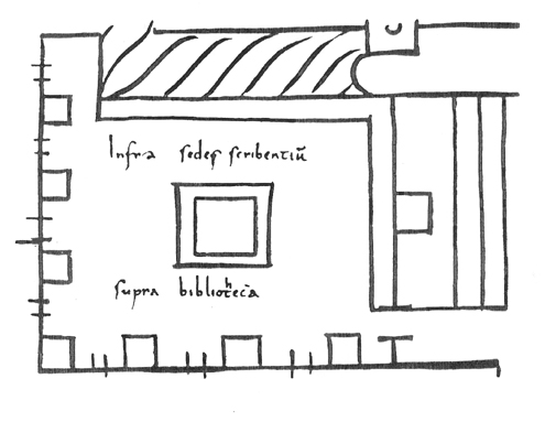
OPPOSITE BOTTOM: Layout for a library in a Carolingian monastery, 820.
The first plan we have of a medieval library is a square. Drawn in the Monastery of Reichenau for the Abbey of St. Gall in Switzerland, it dates from around 820 and is divided into two storeys. On the ground floor is the scriptorium, two sides of which are occupied by seven small tables set under the same number of windows, with a large desk in the centre of the room. Above is the storage space for books, from which a corridor leads to the great choir where the liturgical volumes are kept.163 The result (barring the corridor and the choir) is a perfect cube in which the upper section reflects the lower one: the books produced below are stored above, and are in turn used to supply the copyists, in an endless chain of literary reproduction. We do not know whether this plan was ever carried out, but for the anonymous architect the harmonious shape of the square must have seemed the perfect space for the creation, preservation and consultation of books.
A library of straight angles suggests division into parts or subjects, consistent with the medieval notion of a compartmentalized and hierarchical universe; a circular library more generously allows the reader to imagine that every last page is also the first. Ideally, for many readers, a library would be a combination of both, an intersection of circle and rectangle or oval and square, like the ground floor of a basilica. The idea is not a new one.
Towards the end of the seventeenth century, the Royal Library of France had grown from the private collection established by Louis xi in the fifteenth century to a vast assembly of collections, the result of donations, booty and the royal decree of dépôt légal, signed in December 1537, requiring that two copies of every book printed in France be deposited at the Château de Blois.164 By the time of the French Revolution, it was obvious that this rapidly growing national library required a new home, and over the next century a great number of proposals were put forward to solve the problem of lodging the many books. Certain enthusiasts suggested moving the collection to a pre-existing Paris structure, such as the church of La Madeleine (then under construction), the Louvre (Napoleon signed a decree to this effect, which was never executed), the government offices on the Quai d’Orsay, the Marché aux Veaux, where meat was butchered, or even the Hôpital de la Charité, from which the patients would have had to be evacuated. Others imagined erecting new buildings of various styles and sizes, and their proposals, from the most eccentric to the most practical, bear witness to the search for an ideal shape that would allow readers a necessary freedom of movement, and at the same time lend their working space the best influential qualities.
Etienne-Louis Boullée, one of the most imaginative architects of all time, proposed in 1785 a long, high-roofed gallery of gigantic proportions, inspired by the ruins of ancient Greece, in which the rectangle of the gallery would be topped by an arched ceiling, and readers would wander up and down long, terraced mezzanines in search of their volume of choice. The project never went beyond the drafting stage, but little in the design suggested possibilities of privacy and concentration. Boullée’s magnificent library had the features of a tunnel, and resembled a passageway more than a stopping place, a building intended less for leisured reading than for rapid consultation.
Boullée’s fantastical design for an ideal library.
The Salle Labrouste at the Bibliothèque Nationale, Paris.
Fifty years later, the architect Benjamin Delessert imagined an elliptical library enclosed in a rectangular building, with spokelike shelves radiating from the centre in all directions. The staff would be seated in the middle in order to keep an eye on the readers, but it was objected that “unless the librarian, armed with a telescope and a loudspeaker, could be made to turn on an incessantly gyrating pivot,”165 security would always be wanting. Furthermore, the reading desks, set in the spaces between the shelves, would feel uncomfortably constrained and give the reader a feeling of entrapment or claustrophobia. In spite of the objections, the idea of a centralized service point surrounded by desks and bookshelves never lost its appeal.
Finally, in 1827, the chance vacating of several buildings on the right bank of the Seine provided planners with a ready-made site. The ancient Hôtel Tubeuf, at the corner of Vivienne and Petits-Champs, was abandoned by the Treasury, and at the same time some adjacent houses and shops were conveniently made available to the city. It took the authorities some thirty more years before the plans for the transformation of the locale were accepted. The architect in charge of the final project was Henri Labrouste, who had made his reputation with the renovation of another important Paris library, the Bibliothèque Saint-Geneviève.166
Labrouste was aware that a national library is both a monument and a place of everyday common labours, both the symbol of a country’s intellectual wealth and the practical space in which ordinary readers need to pursue their craft comfortably and efficiently. The shape and size had therefore to reflect both immensity and intimacy, majesty and unobtrusive seclusion. Labrouste conceived the main reading room—the library’s core—as a circle within a square, or rather as a series of circles looming high above the square of assembled readers—nine round glass domes that allowed sunlight to enter and illuminate the right-angled space below. As in Delessert’s project, the librarian surveyed his flock from the middle of the room, from within a banistered booth in which he could turn around as needed. Tall metal columns supported the arches of the domes, giving the interior the look of a winter garden, while five storeys of bookshelves covered the walls on all sides, creating storage for over a million volumes.
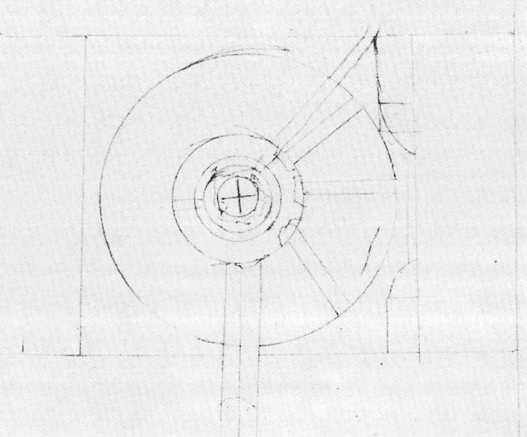
Thirty years later, on the other side of the Channel, the new reading room of the British Museum Library in London was being completed according to a similar pattern, except that a single cupola crowned the circular space and the desks radiated from the centre, controlled by the ever-conspicuous librarian. By then, the British Museum (the institution that housed it) had been in existence for over a century and had worked its way through six previous, much-deplored reading rooms. The first had been a narrow, dark room with two small windows which the trustees had ordered, in 1785, to “be appropriated for the reading-room, and that a proper wainscot table, covered with green bays [sic] … be prepared for the same with twenty chairs.” The sixth, in use from 1838 to 1857, had consisted of two squarish high rooms with over ten thousand reference books and twenty-four tables. Ventilation was inefficient; readers complained that while their feet were cold, their heads were always too hot. Many suffered from what became known as “Museum headache,” and from the unpleasant “Museum flea,” which one reader said was “larger than any to be found elsewhere except in the receiving rooms of work-houses.”167 The seventh reading room, inaugurated in May 1857, was designed both to avoid these problems and to ensure more space for books. The shape—a circle within a square—had been suggested by Antonio Panizzi, the British Museum Library’s most eminent librarian, who once declared that “every shelf and peg and pivot of the new building was thought of and determined in the wakeful hours of the night.”168
Like Panizzi, Labrouste, a keen bibliophile himself, was convinced of the importance of lending this ample space a human measure, even in the areas behind the reading room. In the stacks, the enormous number of books were not only to be housed; they were to remain accessible to an ordinary reader. The width of each shelving section was therefore determined by an average person’s arms’ span (so that readers could pull out books on either side without having to move), and the height by the reach of a hand (so that readers would have access to the highest shelf without requiring steps or a sliding ladder). In spite of the vastness, there was no sense of crowding under the arched glass domes. Though the reading room could accommodate hundreds of readers at one time, each inhabited a private realm, seated at a numbered desk that had been fitted with an inkstand and a penholder, and was kept warm in winter by a combination of metal stoves and hot-water radiators that also served as footrests. Having worked both in the Salle Labrouste and in the British Library reading room, I know the mixed feeling of expansion and containment, grandiosity and seclusion, that the combination of square and circle grants such spaces.
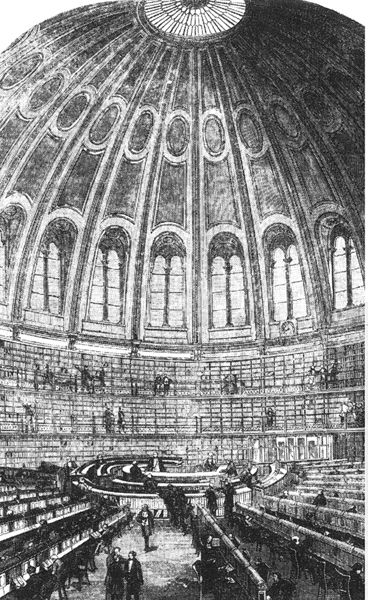
The British Library Reading Room, as depicted in The Illustrated London News.
BELOW: The intial sketch of the Reading Room drawn by Panizzi himself and dated “April 18th 1852.”
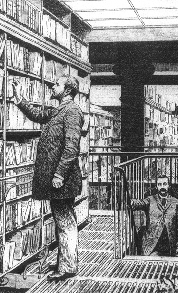
The stalls at the Bibliothèque Nationale required no stepladders: their dimensions were determined by the breadth and height of a mans body.

Michelangelo’s first sketch for the Laurentian Library.
Other shapes imply other physical qualities. A simple rectangle, for instance, can suggest a different kind of limit and endlessness, continuity and separation, as proven by one of the loveliest libraries ever built, the Laurentian Library in Florence. Miraculously, we have a sketch of its conception: a scrap of paper, slightly larger than a dollar bill, kept in the Buonarroti Archives, one corner torn off where the artist perhaps jotted down a quick message. The sketch shows nothing but a rectangle of double lines interrupted by a few short strokes representing, we are told, intermittent stone buttresses. Drawn by the hand of Michelangelo, it is the earliest draft we possess of what would be his “first and most completely realized building and arguably his most original contribution to Renaissance architecture.”169 Only two words are written on the paper, one above the rectangle, orto (garden) and one below, chiostro (cloister). Though at the beginning of the project the exact site of the library had not been decided upon, once Michelangelo imagined its future shape he was able to give it a precise location as well—the middle section of the main building of the Monastery of San Lorenzo, somewhere between the garden and the courtyard cloister.
The idea for a grand monastic library in San Lorenzo, to lodge the superb collection amassed by the Medicis, had been put forward by Cardinal Giulio de’ Medici as early as 1519, several years before the actual commission, which, for financial reasons, had to wait until 1523 to be made official. That was the year in which the cardinal became Pope Clement VII. In the eyes of Pope Clement, a library was truly a library: not an ostentatious chamber lined with luxurious volumes, but a place to keep books and make use of the written word, an institution whose purpose was to serve the scholarly public, complementing with its treasures the lesser holdings of the university collections.
Clement was the grandson of Lorenzo the Magnificent, who was to lend his name to the great Medici collection. He was the bastard son of Giuliano de’ Medici and his mistress Fioretta, but his illegitimacy was ignored by his cousin Pope Leo x, who, dismissing all objections, made him Archbishop of Florence as well as cardinal. Though lacking the political talents of his grandfather, Clement was, like him, a man of letters and a lover of fine art. He doggedly opposed the movements of reform spreading throughout the Catholic Church, and implemented the measures taken against Luther and the Protestant princes in Germany. He was above all a Medici and a Florentine, strongly set against change, a ruler who sought instead to claim the social and artistic comforts of his position. An ambitious but discriminating patron, he supported writers such as Francesco Guicciardini and Niccolò Machiavelli, and artists such as Benvenuto Cellini, Raphael and Michelangelo.170
Clement was a connoisseur, not a mere admirer of the works he commissioned. The correspondence between him and Michelangelo, from the beginning of the building of the library to its completion, bears witness to his detailed preoccupation. For three full years, from 1523 to 1526, Pope Clement in Rome and Michelangelo in Florence exchanged letters three or four times a week. In letter after letter, Clement suggested to Michelangelo—though papal suggestions carried the weight of orders—all manner of arrangements and dispositions: that the Latintexts be separated from the Greek, that rare books be kept in small individual cabinets, that the foundations of the building be reinforced, that the ceiling be vaulted to help prevent fires. With nagging concern, he insisted on knowing everything: how many desks Michelangelo was planning for the reading room, how many books could be kept on each desk, where Michelangelo intended to obtain the walnut for the tables and by what process the wood was to be treated. He offered opinions on everything, from the design of the doors to the importance of the lighting, on where the best travertine could be found to make lime and how many coats of stucco should be applied to the walls. Most of the time, Michelangelo responded readily and diplomatically, sometimes accepting these suggestions and sometimes ignoring them completely.171
Conservative in politics, Clement was more open to innovation in matters of design, but he remained a practical man. When Michelangelo explained that he wanted to light the library vestibule through circular skylights, Clement expressed delight at the idea but observed that at least two persons would have to be employed “just to keep the glass clean.”172 However, Michelangelo (whose stubbornness was one of his most notorious traits) did not wait for the pope’s agreement on everything, and started raising the walls in December 1525, three months before the final design was approved by His Holiness.
When Michelangelo received the commission for the library in November 1523, he was forty-eight years old. Celebrated throughout Europe, he was in the eyes of patrons and fellow artists a painter, sculptor, architect and poet whose talents were beyond question. In all these areas, he coupled the physical world to the world of thought, so that the laws of one intermingled with the laws of the other. For Michelangelo, the properties of wood and marble were mirrored in the properties of imagination and reason; in his eyes, aesthetics and physics, ethics and mathematics shared the same matter and substance. In an unfinished sonnet composed around the time of his work at San Lorenzo, he wrote:
Since no piece of wood can preserve
Its proper moisture out of its proper place,
It cannot help, touched even slightly by some great heat,
Being dried up or bursting into flame or burning.
Just like the heart, taken by one who will never return it,
Living in tears and fed by flames—
Now that it’s far from its home and proper place,
What blow will not be fatal to it?173
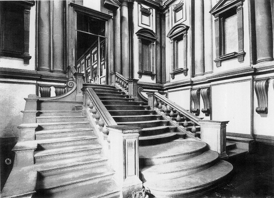
The monumental staircase of the Laurentian Library, designed by Michelangelo.
Michelangelo’s confidence in the ability of material things to reproduce or translate thought and feeling according to objective rules is evident in the Laurentian Library. Three separate building commissions were entrusted to him. The first, the façade of San Lorenzo, was never completed. The second, the Medici Chapel interior, was a project he undertook belatedly, after other artists had worked on it for years, and though he achieved some of his best work here, his contribution remained only partial. However, the third, the library, is entirely Michelangelo’s own creation.
Since the library was to be used primarily as a workplace, the interior was given greater aesthetic importance than the exterior. Erected (due to the fear of floods) on the third floor, it consists of an entrance vestibule, a magnificent and startlingly original staircase, and a lofty reading room that seemingly stretches towards a point of perspective on the hidden horizon. The entire space of the library is built out of rectangles: the columned openings on the walls holding the windows, open or blind; the rows of desks on either side of the room; the majestic central aisle; the divided and carved ceiling. It is easy to imagine the effect created by the great illuminated codexes or the smaller octavo volumes open on the inclined desktops, duplicated by equal rectangular shapes on walls, floor and ceiling, so that every element of the architecture and decoration recalls for the reader the intimate relationship between the world and the book, the unlimited physical space which, in the library, is divided into pagelike areas. The central motif of the carved wooden ceiling of the vestibule is, however, not a rectangle, but four interlinked circles representing the Medici diamond ring, a pattern repeated in the yellow and red tiled floor of the library itself, reminding readers of the four related corners of God’s universe, reflected in God’s word penned by the four Evangelists.
Michelangelo’s contemporary Giorgio Vasari speaks of the “licence” that the artist allowed himself when he departed from classical notions of proportion and order, a licence to which, says Vasari, “all artists are under a great and permanent obligation.” According to Vasari, nowhere did Michelangelo better demonstrate these new ideas than in the Laurentian Library,
namely, in the beautiful distribution of the windows, the pattern of the ceiling, and the marvelous entrance of the vestibule. Nor was there ever seen such resolute grace, both in detail and overall effect, as in the consoles, tabernacles, and cornices, nor any stairway more commodious. And in this stairway, he made such strange breaks in the design of the steps, and he departed in so many details and so widely from normal practice, that everyone was astonished.174
The stairway that Vasari so admired is indeed a marvel. Michelangelo had conceived it in walnut, not in the grey stone in which it was finally executed by the Florentine sculptor Bartolomeo Ammanati in 1559, twenty-five years after Michelangelo’s departure from Florence in 1534. But even in grey stone rather than dark wood, which would have introduced the visitor to the material of the desks and the ceiling of the reading room beyond, the stairway suggests a spatial complexity that seems almost impossible in so restricted a space, a laboriously intricate passage proposing at least three different routes, an obligation of choice entirely appropriate for someone entering the realm of books. The area of the vestibule is small; Michelangelo’s design treats it as if it were vast, so that the stairs cascade from between the balustrades outside the door onto three descents with no railings, the middle one made of curving steps each finished with a volute, the side ones rectangular but, as they reach the floor, gently metamorphosing into lozenges. Writing to Vasari from Rome before construction had begun, Michelangelo said that he indeed remembered his original design for the stairway but only “as if in a dream.” That is the quality that best defines the finished work.
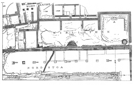
Ground plan of the Pergamon Library.
However, what Vasari saw as startling novelty was rather the perfecting of primitive conceptions of the shape a library should occupy. The examples are many. One of the earliest dates from 2300 B.C. Archaeological digging performed in 1980 at the site of the royal palace of Ebla, in Syria, unearthed a rectangular room containing the remains of a library: more than fifteen thousand clay tablets which had apparently been kept on wooden shelves along the walls; when the shelves burnt after invaders set fire to the palace, the tablets fell in heaps to the floor.175 The library of Pergamum was discovered to have followed the same pattern twenty-five centuries later. Its ruins show that it consisted of a rectangle formed by a succession of chambers: the first and largest one used for meetings, the following three housing the stacks. Readers consulted the scrolls in the space before the chambers, sheltered by a colonnade. In Rome, in the library of the Forum of Trajan, built in A.D. 112, the design changed somewhat: the rectangular shape was maintained, but the division into small rooms was eliminated.176 Designing the Laurentian Library, Michelangelo was aware that he was evolving a practical, ancient design familiar to Plato and to Virgil.
Throughout his life, Michelangelo seems to have pursued two conflicting yet complementary ideals of the ancient world. One was the ideal of perfection, the finished quality of Greek art that he and his contemporaries believed gave each of its masterpieces the durable impression of a thing complete unto itself. The other was its fragmentary nature, the result of time and chance that, in the eyes of the Renaissance artists, allowed certain ruins and myriad broken remains to reflect a vanished perfection now implicit in the surviving headless torsos and details of columns177—an aesthetic discovery much exploited later by the inventors of the Gothic revival in the eighteenth century. The Laurentian Library displays both qualities.
Among the many discoveries made by the artists of the Renaissance was the “golden section.” Though the concept had been known in ancient Greece and had been used in both Greek and Roman architecture, it was not clearly articulated until 1479, when the mathematician Luca Pacioli, in a book illustrated by Leonardo da Vinci and not printed until ten years later, defined it as “a line cut in such a way that the smaller section is to the greater as the greater is to the whole.”178 The pleasing perfection of such a measure cannot be explained mathematically, and therefore held (and still holds today) a magical aesthetic quality, as a physical equilibrium for which there exists no formula. The rectangle of the reading room designed by Michelangelo, whose sides correspond to the ideal proportions dictated by this “golden section,” pays homage to the balanced beauty of a Greek temple or a Roman courtyard, and reduces the lovely proportions of our vast universe to a measure pleasing to our human eyes. The stern windows and recurrent volutes, and the complex and dynamic stairway perfectly illustrate the paradoxical nature of a library. The first suggests that it can be an ordered, contained place where our knowledge of the universe can be gracefully stored; the second implies that no order, no method, no elegant design can ever fully hold it.