What’s your take on artistic rules? For one thing, there are a lot of them! Sometimes I think they can definitely hinder us. Perhaps we measure all of our creative work against these standards and feel like we fall short. Or maybe we even feel paralyzed by them. I’d like to share a secret with you about my take on all of these rules. I don’t think of them as rules, but rather, as possibilities.
I think of them as inspirational tools and exercises that can help me improve my photography. These “rules” can certainly inform and improve our photography, but it’s also important to remember to ‘shoot from the gut’ and not over-think. And, don’t forget to break some of those rules along the way, or even make up a few new ones.
Here are some composition “possibilities” in no particular order (note: some more composition tips are given in my ‘top tips’ section in chapter one of the main book).
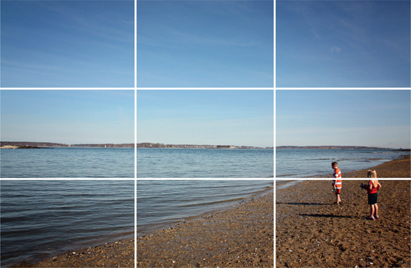
Applying this rule can add visual appeal to your photographs. Imagine a grid imposed over your photo where the composition is divided into thirds both horizontally and vertically, forming nine equal parts and four available points of placement where the lines intersect (most DSLRs, as well as the iPhone native camera and various camera apps, have a grid display feature). Try placing subjects roughly one third from the top or bottom of the grid, or one third of the way in from the right or left. Or place your subject(s) at a point of intersection, as a viewer’s eyes naturally go to these points. Place a horizon on one of the horizontal lines. Tip: You can apply this rule in the photo-editing stage when cropping.

Rule of Thirds - In this example, the Rule of Thirds was applied by placing the subjects one third of the way up from the bottom edge. This is a nice alternative to placing them at dead-center. Also notice how the diagonal of the water creates interesting depth and acts as a leading line. 15-85mm f/3.5-5.6 lens at 15mm, ISO 200, f/16 for 1/160 sec.
Our eyes naturally follow leading lines that take them to a destination or a vanishing point. These lines can be straight and direct, at a diagonal, lead from the foreground to the background, or even take on a pleasing curvy, meandering shape. An interesting trend is to have a leading line that disappears into a corner of the photograph.
If you are shooting a moving object, frame it so that there is more negative space in front of it, as opposed to behind it. This gives a sense of space for the object to move forward into.

Framing Objects - Frame moving objects with plenty of space in front of them, otherwise the composition will feel cramped. 15-85mm f/3.5-5.6 lens at 85mm, ISO 200, f/7.1 for 1/1000 sec.
When it comes to composition it is important to think about shapes. The most eye-pleasing shape is the triangle. Key elements of the scene can go on each corner of the triangle—they can be people (as in a group portrait) or objects/landmarks. It is even more powerful when these key elements are related in some way. For instance, you might take a picture in a field on a farm where there is a group of cows at one corner of the triangle, farmer in another, and barn in the other (they don’t all have to be in the same general area; spread them out over foreground, middleground, and background). Another possibility is to have the negative space that surrounds the subject be in the shape of a triangle. The S-curve is very pleasing to the eye, as it enjoys following the path of this curve. You might find an S in a meandering road or stream, or have fun setting up a still life scene with a subject that you can manipulate into this shape (such as a string of pearls).

The Imaginary triangle - For an eye-pleasing composition, try placing the elements of your photo on each corner of an imaginary triangle. 15-85mm f/3.5-5.6 lens at 21mm, ISO 640, f/4 for 1/32 sec.
To establish the size of something, it’s important to have another object(s) in the photo that will provide perspective and enable the viewer to judge and appreciate the size based on its relation to the object.

Sizing - The size of the children in this photo provides perspective, revealing the grandness of the hill and expansive sky. 15-85mm f/3.5-5.6 lens at 38mm, ISO 200, f/16 for 1/400 sec.
Make sure there are no distracting elements “touching” your subject. You would think these mergers are super-obvious and easy to avoid when shooting photos, when in actuality they can sometimes be pretty easy to overlook in real, 3-D life. They are glaringly obvious in photos.
This is when you make a photograph of a collection of the same object (a pile of stacked wood, apples in a box, fish in a pond, a stone wall close up). This type of photo invites the viewer to meditate on the photo and look deeply, searching for detail.
Simply put, the eye prefers odd number groups over even ones.

Rule of Odds - The eye prefers to view an odd number of objects as opposed to an even number. 15-85mm f/3.5-5.6 lens at 21mm, ISO 200, f/5.6 for 1/64 sec.
Create depth by having a defined foreground, middleground and background. Photos with overlapping elements that hide other elements in the photo can be exciting for the eye.

Creating Depth - Create depth with a foreground, middle ground and background. Wide angle lenses or zoom lenses with wide angle capability are ideal for achieving this. 15-85mm f/3.5-5.6 lens at 15mm, ISO 200, f/16 for 1/200 sec.
I am a big fan of referring to the color wheel, especially with shots that I have control over, like when I’m setting up a still life scene or coordinating clothing colors for portraits. Certain color pairings/schemes are very pleasing to the eye:

The Color Wheel - Use color theory as a guide for choosing pleasing color schemes for your photographs. You can purchase pocket-sized color wheels that slip right into your camera bag.
Sometimes photos can break all the rules and still feel right on the mark. For instance, you might place your subject on the very edge of the composition. Going against the grain for creative purposes can sometimes be very effective.