The iOS and iPadOS Look and Feel Casebook
When the iPad made its first appearance, the more cynical among the digital punditry proclaimed that it was really nothing more than a big-screen iPhone. Superficially, they were correct: the iPad and iPhone used the same touchscreen technology, ran the same operating system, and had user interfaces that were almost indistinguishable. But the size discrepancy was significant in how the two types of devices would come to be used, just as the difference in size between a jewelry hammer and a sledge hammer imply quite different uses. And, over time, those different uses would cause the interfaces of iPhones and iPads to diverge, leading, eventually, to a divergence in their operating systems (see The Case of the Separated Siblings).
Still, the iOS and iPadOS user interfaces continue to have far more in common than not, and the mysteries they often present to users are generally similar and frequently identical.
The Affordance That Hid in Plain Sight
As we learned in What Affordances Are, anything that an environment offers the user is an affordance. And the biggest affordance that iOS and iPadOS devices offer is the touch-sensitive screen that covers nearly all of the front surface of the devices. What few physical buttons they offer pale to insignificance by comparison with the screen, the physical component that dominates iOS and iPadOS device user interaction.
The Basic Gesture Inspection
The touch-sensitive screen, dubbed “Multi-Touch” by Apple, allows users to perform not only a variety of single finger gestures but multi-finger gestures. The basic gestures supported by iOS, even before it was called “iOS,” have remained relatively constant, with a handful of single-finger gestures and only one multi-finger gesture. These basic gestures, however, sometimes offer mysterious nuances. The gestures include:
Tap: A single tap with a fingertip; it’s the gesture you use on an app’s icon to launch it, to select an item, or to press an onscreen button.
Double-tap: Two quick taps with a fingertip. If you think it’s like a mouse double-click in macOS or the way to be sure you’ve put down a zombie, you’d be wrong: generally, you use this gesture to zoom in or out of an image.
Touch and hold: This gesture elicits a menu or tool from the touched item. For example, a tap on editable text places an insertion point in the text, but a touch-and-hold gesture on the text evokes the Edit menu when you release the hold. This gesture can also cause an app to change modes: for example, when you touch and hold on a Home screen icon in iOS 13, the gesture first causes a menu of options related to that icon to appear (Figure 51), but holding longer before releasing puts the Home screen into what Apple officially calls “jiggle mode,” at which point you can drag the icons around on the screen to rearrange them.
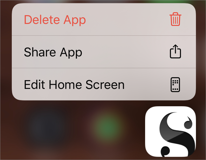
Figure 51: Touch and hold a Home screen icon to elicit a menu. Drag: This gesture, involving a touch-and-slide motion followed by a release, is used to move onscreen objects and is analogous to a drag gesture with a mouse or trackpad in macOS. Both where you start and where you end the gesture matters.
Swipe: A quicker touch-and-slide motion than a drag, often used to move between views on the screen or to reveal the Delete or other buttons attached to a list item (Figure 52). Where you start the gesture usually matters more than where you end it: you know you’ve swiped far enough when the action performs the task you intended.
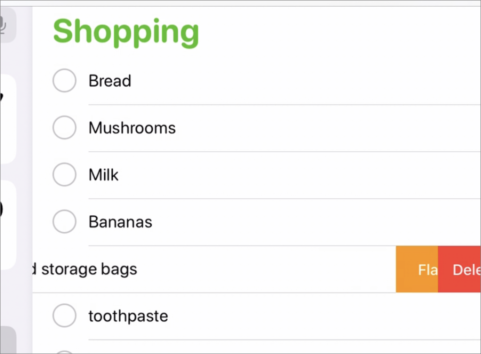
Figure 52: A list item in the process of being swiped from right to left, revealing its buttons. Flick: The same motion as a swipe, only faster and shorter, typically used for tossing something off the screen or scrolling quickly through a view. Usually shorter in length than a swipe or a drag, you don’t have to be as precise about where you end it as you have to be with the other two touch-and-slide gestures.
Pinch: The only multiple-finger standard gesture, it comes in two forms—a pinch, to shrink the item being pinched, and a two-finger spreading gesture (which Apple oxymoronically calls a “pinch open”) to expand it. It is often used to zoom in or out on a particular portion of an image, diagram, or map.
You may have noticed that several standard gestures—such as flick and swipe—are nearly identical, and others—like pinch and double-tap—produce similar effects. How can you tell them apart, or decide which one to use? Only by relying on the frustrated user’s old companion, trial-and-error. Practice is key here.
The Many-Finger Exception
In addition to the standard gestures, many apps employ multiple-finger gestures to perform specific actions. For example, in Pages on iOS, you can constrain the direction in which an object is dragged by beginning the drag with one finger and then touching the screen with a second finger while still dragging (Figure 53). Similarly, you can rotate an onscreen object in Pages by holding on it with one finger while dragging a second finger in the direction you want to rotate the object.

Multiple-finger gestures are more common with iPad apps, and the reason is fairly obvious: iPad screens are much larger than iPhone screens, making multiple-finger gestures easier to perform. Unlike iPads, iPhones are often used one-handed, with the hand holding the device also manipulating the screen; performing multiple-finger gestures one-handed can challenge the dexterity of most users.
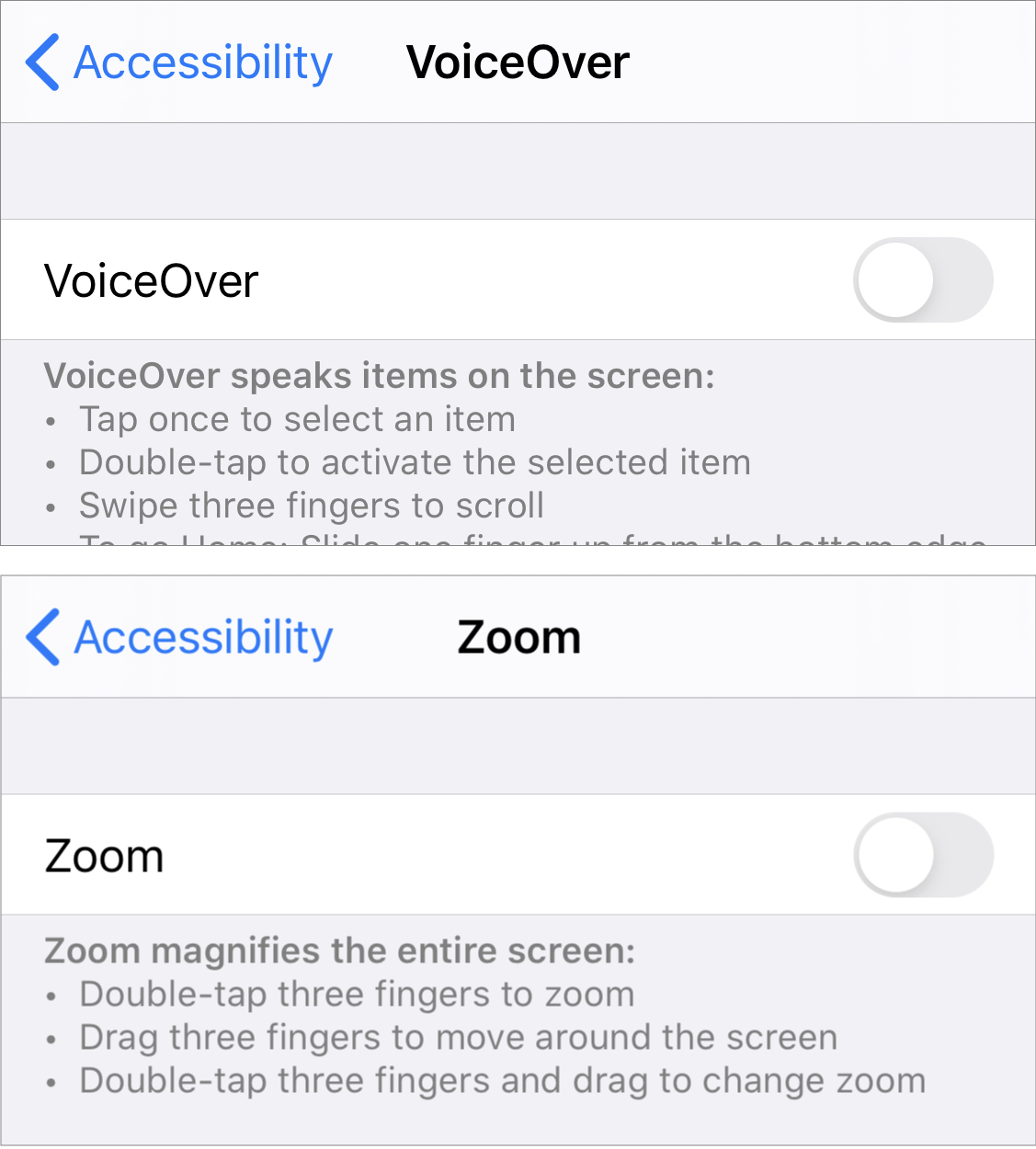
Dexterity-challenging or not, the one place you are sure to find multiple-finger gestures on an iPhone (as well as on an iPad) is in its Accessibility features, paradoxical as that might seem; go to Settings > Accessibility and look around (Figure 54).
In addition, iPadOS devices offer multitasking gestures that iPhone doesn’t, and these include multiple-finger gestures. Some of the gestures involve the edges of the screen, which I look at more closely in The iOS and iPadOS Edge Cases Casebook, but the gesture you use to switch between recently used apps can take place anywhere on the screen: a four-finger or five-finger horizontal swipe. You can enable iPadOS’s multitasking gestures with a trip to a less-than-obvious Settings item: Settings > Home Screen & Dock, where many multitasking-related settings hang out. Don’t look for this Settings item on your iPhone though; it doesn’t offer Home Screen & Dock settings.
The Hidden Button Escapade
A funny thing happened a few years after iPads joined the ranks of Apple’s Multi-Touch products: a fashion makeover. For one of the few times in its history, Apple followed rather than set the fashion trend in technology. This makeover was not about the physical look of the devices; Apple has never been shy about changing their looks. No, this was about the look of the software, something that users spend far more time looking at than the hardware that encases it, and it all centered around a word few people had ever heard of: skeuomorphism.
The Skeuomorphic Excision
Skeuomorphism is the use of an object or feature in a design that imitates a similar object or feature made from another material. In software, it has come to mean imitating real-world objects in user interfaces. Take, for example, the way iBooks displayed the contents of a user’s ebook library before the fashion makeover and compare it to the way Books (iBooks’ successor) displays a library’s contents today (Figure 55).
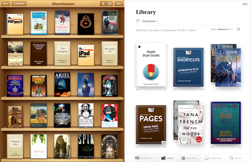
The iBooks app, introduced with the first iPad, arranged your ebook library contents in a simulated bookshelf (coincidentally, a near match to the real bookshelves behind me in my office as I type these words). It’s not a slavish imitation: real bookshelves don’t have buttons along the top, nor do they scroll up and down to reveal more shelves—and, of course, few people waste the space on real bookshelves by shelving their books face outward. In any case, by comparison the de-skeuomorphed book catalog displayed in Books today makes no pretense of imitating anything from the physical world other than the books’ covers themselves and the shadows they cast.
Nor was the interior of an ebook immune from early iOS skeuomorphism, as Figure 56 illustrates: in iBooks before the fashion makeover the book’s content appeared on a page that appeared to be in a physical book, with the book’s binding peeking out from behind the page’s borders, a stack of unread pages visible behind the current page, and the current page’s margin shadowed where it curves into the binding. Today’s Books app, in contrast, dispenses with the imitation of a physical book page, presenting a plain field upon which the book’s contents appear.
Visually, few would argue that eliminating skeuomorphic design elements made iBooks/Apple Books look less cluttered, but what is arguable is whether doing so made the app any easier to use.
For example, the elimination of the faux-bookshelf background makes the books’ cover art stand out better—a benefit appreciated by publishers—and the app’s designers further took advantage of the makeover to enlarge the book cover thumbnails, which publishers probably appreciated even more. The resulting design, though, reduces the number of books visible on the screen, requiring you to scroll more when you browse your book collections. You win some, lose some.
Similarly, removing the skeuomorphic design elements from ebook pages allows more text to be displayed on each page, but hobbles the reading experience in other ways. For one thing, it removes a visual indicator of where you should begin your swipe to turn the page; as we’ll see later in Manage Slide Overs, the addition of the edge-of-screen gesture, used for the Slide Over multitasking feature in later versions of iOS and iPadOS, makes the loss of that indicator a problem. For another, removing the physical button borders on the pages’ headers makes it harder for you to tell visually what is book content and what is a control button (Figure 57).
Following the makeover (in iOS 7), Apple did add an Accessibility setting—currently found at Settings > Accessibility > Display & Text Size > Button Shapes—that gives you the capability of making text buttons like the Resume button shown in Figure 57 above look more like buttons…supposedly. When enabled, what the feature really does is draw an underscore beneath text buttons so they look like web links. That helps you, I suppose, identify specific bits of text as tappable, but in many cases it simply adds useless screen clutter that the shift away from skeuomorphism ostensibly reduced (Figure 58).
As articles published at the time make obvious, the push to radically reduce skeuomorphism in iOS was not really usability-related but fashion-related. Take the Guardian’s Why Apple ditched its skeuomorphic design for iOS7 from 2013, which states up front that the real problem with skeuomorphism was that “It got ugly.” Coupled with that aesthetic judgment was a belief that while interface skeuomorphism may have served a purpose at one time, it was no longer needed—from the same article: “skeuomorphism is dead, and human evolution has reached the stage where we recognise buttons on phones, even if they don’t look like buttons.”
Of course, human evolution has nothing to do with the evolution of user interfaces; very few evolutionary biologists would support a Lamarckian theory that software button recognition is an acquired ability that can be passed on. In fact, even while sophisticated iOS users may no longer need the discoverability assistance that skeuomorphism provides, the community of iOS users continues to include a large number of new users who would find that assistance welcome. Finding today’s marginally useful Button Shapes setting, hidden as it is deep in Accessibility settings, seems more than you can expect a new iOS user to do.
The Curious Case of the Cryptic Glyphs
Skeuomorphic or not, buttons on small-screen devices have an inherent limitation: the small screen. The more text or the more intricate the graphic you use to label a button so that its meaning and function are clear to the casual or first-time user, the more space it takes up on a small screen where space is at a premium.
Conversely, with a touchscreen device, there is a practical limit to how small a button can be: the iOS User Interface Guidelines for iOS 4, issued when the iPad was first released in 2010, advised, “[T]he comfortable minimum size of tappable UI elements is 44 x 44 points.” The current guidelines echo that advice, suggesting that human evolution has not changed the dimensions or accuracy of the human finger in the last decade. In short, buttons have to be large enough to be tappable, but not so large that they consume too much of the limited screen space available.
An obvious example: iPhone screens range from between just over two inches across to about three inches, so roughly four minimum-size tappable buttons can comfortably fit across the screen when an iPhone is held in portrait orientation. If you’ve ever wondered why the home screens on iPhones display their icons four across, now you know.
However, anyone who has ever tapped the virtual keyboard on an iPhone knows that more than four usable buttons can fit across the width of the screen. Just look at the keyboard (Figure 59).
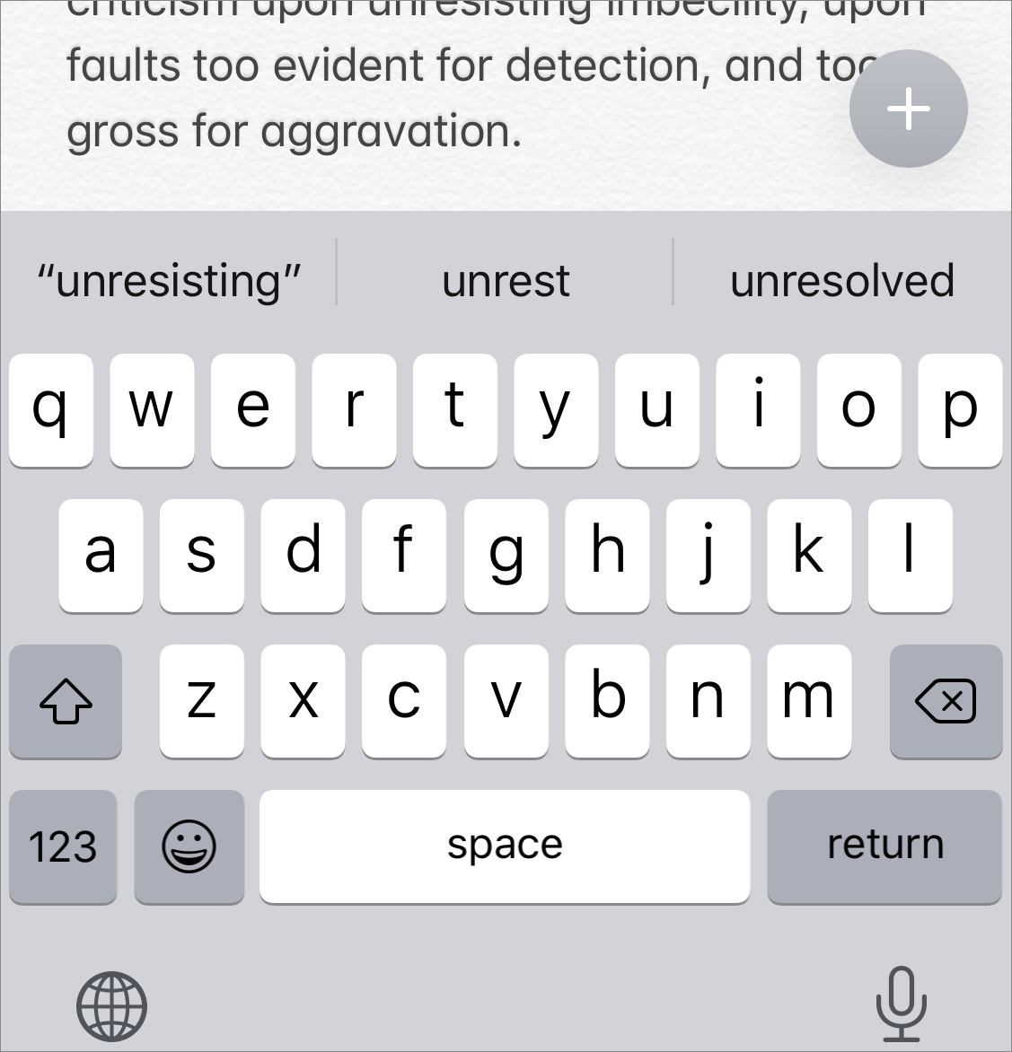
The key word in the guideline is comfortably: accurately using the ten keys on the top row of the keyboard, buttons all, tests the limits of phalangeal dexterity—they can hardly be described as “comfortably spaced.” That’s why you have key labels pop up when you touch one of them: so you can make sure you’ve touched the right key and to allow you to slide to the right one if necessary. That’s also the reason iOS and iPadOS give you the predictive text shortcut bar above the keyboard, and that’s why you have autocorrect and text dictation capabilities.
Whether the magic number is four or more, when it comes to buttons, size matters, and smaller—within limits—is preferable to larger, because it allows more separation between buttons and makes things look less cluttered. One way to make buttons small but identifiable is to label them with distinct symbols instead of textual labels.
In the early days of iOS, Apple provided developers with a small set of space-saving standard symbols for use on buttons in toolbars and navigation bars. For the most part, these were glyphs that weren’t too hard for early iOS users to figure out, like the search  icon and the trash
  icon, and they have not changed much from then (they look like
  and
and  today).
One standard button symbol, though, has changed significantly since the early days, and both its purpose and what to call it has given the people (like Take Control authors) who write articles and books about such things fits. In the 2013 iOS 4 Guidelines it was called “action” and was described as follows: “Open an action sheet that allows users to take an application-specific action.” It looked like this  and most people called it a “share” button, since in practice tapping it often, but not always, seemed to allow you to share a selected item in some way with another app. The iOS 7 fashion makeover (see The Skeuomorphic Excision) changed its appearance a lot, but its arrow-escaping-from-a-box design concept has persisted; it looks like this these days:
  . It did take, however, a few more generations of iOS following the makeover before the share icon’s behavior finally produced a consistent result from app to app.
Instead of the dozen or so standard button symbols provided to developers in iOS 4, Apple today offers them hundreds of such symbols, along with variants, a treasure trove of space-saving symbols ready to use. What remains a mystery, for both developers and users, is what most of them mean. Apple seldom provides detailed guidance in this regard.
Such meaning that many of the symbols have acquired has been through their being used and copied from other contexts outside of Apple’s walled garden, like the hamburger menu  icon that has become a common symbol over the last few years for indicating the presence of a menu on webpages. Other symbols have taken on general sorts of meanings that can have different specific meanings depending on the context, like the “more” ellipsis
  icon, the meaning of which is vague enough to have prompted TidBITS editor Josh Centers to pen an article about it: Less… Is More? Apple’s Inconsistent Ellipsis Icons Inspire User Confusion. It’s a case study in how a user has to grapple with the meaning of an abstract symbol in the absence of any authoritative standard.