Chapter 4
Working with Items
IN THIS CHAPTER
 Selecting and manipulating items
Duplicating items efficiently
Understanding the Scale feature
Stacking, grouping, and aligning items
Using rulers and guides
Using Item Styles
Using libraries
If you’ve ever been faced with a blank wall and several pieces of framed art to hang, you know the importance of mastering your hanging skills. The digital equivalent in QuarkXPress is your skill at manipulating page items: The faster you master these skills, the faster and more creative you’ll be with every project! In this chapter, you learn the smartest and fastest ways to move, duplicate, and align objects, stack them, group them onto layers, store them in libraries, and use Item Styles for speed and consistency.
Selecting Items
Although you can select an item with the Text Content tool or Picture Content tool, don’t do it. Using the Item tool instead is usually more efficient. Here are two ways to select items with the Item tool:
- Click or Shift-click: Click once on top of an item to select it. To add more items to your selection, Shift-click each one.
- Drag across an area: Drag the Item tool from an empty area of the page across any edge of the item. To add more items to your selection, Shift-drag until you touch its edge with the Item tool. This is the fastest way to select multiple items, but it works best if the items are on an empty background. You don’t have to surround the item when dragging — just touching an edge selects it.
To deselect an item in a bunch of selected items, Shift-click the item. You can also Shift-drag with the Item tool from an empty area of the page until you touch its edge.
To deselect all selected items, click outside them. When using the Item tool, you can press Tab to deselect all selected items — which is another reason to use the Item tool! When using the Text Content tool, press Esc instead (otherwise you might create a tab in a text box).
 If you’re using the Picture Content tool, you can quickly switch to the Item tool by pressing the V key on your keyboard. This trick also works with the Text Content tool, but be sure to click outside the box or press Esc before pressing V so that you don’t type a V in your text box!
Manipulating Items
After they’ve been selected, most kinds of items display an outline (called a bounding box) and handles for reshaping.
When moving, resizing, or rotating a box, pause a moment after clicking (and before dragging) to see the content of the box change as you drag. Otherwise, you see only the bounding box change. When you release the mouse, you see the box content update.
Moving items
You can move a selected item or items in any of several ways:
- Drag it: With the Item tool active, click and drag the item to its new location. Be sure not to click and drag the bounding box of the item, or you change its shape instead of moving it.
- Use the Measurements palette: To move the item to a new location, type new values in the X and Y fields on the Home/Classic tab in the Measurements palette. To move the item a specific amount, type the plus sign (+) or minus sign (–) after the existing value and then type the distance you want to move the item. QuarkXPress will do the math for you and move the items.
- Nudge it: With the Item tool active, press the arrow keys on your keyboard to nudge the item or items by one point. To nudge by ten points, press Shift while pressing the arrow keys.
You can change the Shift+nudge amount in the Item Tool preferences: Choose QuarkXPress ⇒ Preferences (Mac) or Edit ⇒ Preferences (Windows) to open the Preferences dialog box. In the Preferences dialog box, click Item Tool in the left pane (it’s in the Tools section of the Print Layout section in the left pane). Type a new value into the Shift + Nudge Increment field.
When nudging items, you can see them more clearly if you turn off their bounding box (selection outline). To do that, choose View ⇒ Hide Selection.
Resizing and reshaping items
Resizing and reshaping items in QuarkXPress can be an enjoyably fluid experience, after you master where to point, click, and drag, along with knowing a few modifier keys to hold down while doing so. The following techniques take you several steps closer to QuarkXPress nirvana. (I’m not kidding!)
Resizing an item
You can resize a selected item in several ways:
- Drag the sides or handles: Drag the side of a selected item or its handles to make it larger or smaller.
- Use the Measurements palette: To resize a selected item to a specific size, type new values in the X and Y fields on the Home/Classic tab in the Measurements palette.
- Use the Scale feature: Choose Item ⇒ Scale to enter a scaling percentage and control which attributes of the item are scaled. See the “Scaling Items or Layouts, Intelligently” section, later in this chapter.
The easiest way to scale the content of a box along with the box itself is to hold down the Command (Mac) or Ctrl (Windows) key while dragging a side or handle. To maintain the original proportions of the box while resizing it, hold down the Shift key while dragging. To resize an item from its center outward, hold down the Option (Mac) or Alt (Windows) key while dragging. You can use these modifier keys in any combination to achieve your intended result. For example, Shift-Option-Command-drag (Mac) or Shift+Alt+Ctrl+drag (Windows) to maintain the proportions of the box and its content, while growing or shrinking it from the center of the item.
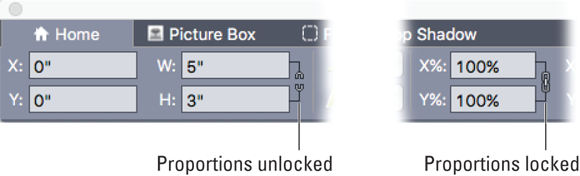
Locking box and picture proportions
When resizing a box, you normally want the freedom to change its height and width separately. However, when resizing a picture box, you usually don’t want to change the proportions of the picture inside the box. So by default, QuarkXPress locks the proportions of the content of a picture box but allows you to change the box shape however you like.
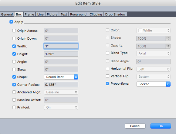
To lock or unlock the proportions of a text or picture box, in the Home/Classic tab of the Measurements palette, click the chain-link icon next to the W and H fields (see Figure 4-1). To lock or unlock the proportions of a picture, click the chain-link icon next to the X% and Y% fields.
When resizing a text box, the text normally doesn’t change its shape or size — unless you hold down the Command (Mac) or Ctrl (Windows) key while dragging a box handle. QuarkXPress therefore doesn’t offer a way to lock the proportions of text.
Fitting a box to a picture
To fit a box to a picture inside it, or to scale the picture to fit its box, use either the Style menu or the context menu (open it using Control-click on the Mac or right-click on Windows). If you choose Scale Picture to Box, the picture fills the box so that the picture isn’t squished or stretched in either dimension. You’ll therefore almost always have some blank space on left/right or top/bottom. To remove the empty space, choose Fit Box to Picture.
Fitting a box to text
To fit a box to the text inside it, choose Fit Box to Text from the Item menu or the context menu. If the text is shorter than the box, the box shortens. If the text overflows the box, the box expands vertically so that it displays all the text.
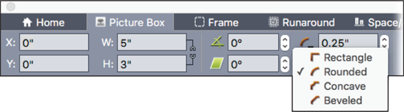
Changing the corner shape of a box
You can change the corner shape of rectangular boxes to rounded, concave, and beveled corners by choosing Item ⇒ Shape or by using the Box Corner Style menu in the Measurements palette. To adjust the radius of nonsquare corners, go to the Home/Classic tab of the Measurements palette and change the value in the Box Corner Radius field, or click the up or down arrows next to the Box Corner Radius field. Figure 4-2 shows the Box Corner Radius controls.
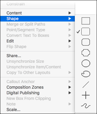
Changing the overall shape of a box
In QuarkXPress, a box is a box is a box, and you can freely switch among box shapes. To change the shape of a box, choose Item ⇒ Shape and choose a different shape from the submenu that appears, as shown in Figure 4-3. The bottom four shapes are particularly interesting: The artist’s palette converts your box shape to a Bézier shape, the angled line converts the box to a line angled at 45 degrees, the crossed lines convert the box to a single horizontal line, and the squiggly line converts the box to a Bézier path. If the box contained text when you convert it to a line, the text flows along the new line. If the box contained a picture when you convert it to a line, the picture is removed.
A fast way to put text on a path is to type or paste it into a text box and choose Item ⇒ Shape and choose one of the lines at the bottom of the submenu shown in Figure 4-3 to convert the box to a line. See the previous section for details.
Rotating boxes
You can rotate a box with either the Item or Content tools. When you position your mouse pointer outside a corner handle, but near the box, the pointer changes to a curved arrow. Click and drag to rotate the box. You can also rotate a box by going to the Home/Classic tab of the Measurements palette and changing the value in the Box Angle field, or by clicking the up or down arrows next to the Box Angle field (see Figure 4-4).
Skewing boxes
To skew a box and its content, go to the Home/Classic tab of the Measurements palette and change the value in the Box Skew field, or click the up or down arrows next to the Box Skew field (refer to Figure 4-4). Positive values slant items to the right; negative values slant them to the left.
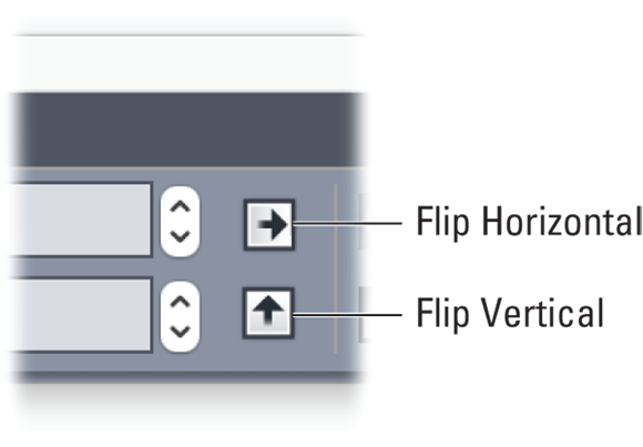
Flipping box content
You can flip the content of a Text or Picture box from left to right and from top to bottom, but the controls are in slightly different places:
- Picture Box: Choose Style ⇒ Flip Horizontal or Style ⇒ Flip Vertical or go to the Home/Classic tab or Picture Box tab of the Measurements palette and click the Flip Horizontal or Flip Vertical buttons (see Figure 4-5).
- Text Box: In the Measurements palette, go to the Text Box tab and click the Flip Horizontal or Flip Vertical buttons.
Locking items
To keep from accidentally moving or changing the content of a text or picture box, you can lock the position or the content of the box. Choose Item ⇒ Lock and then choose Position or Picture (for a picture box), or Story (for a text box). You can also Control-click (Mac) or right-click (Windows) the box and use the context menu to choose these options.
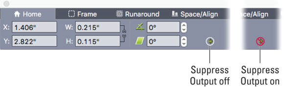
Suppressing item output
Sometimes you may want to place an item on a page but not include it when you print or export your project. For example, you may want to make a note for a coworker without using the Notes feature (which I explain in Chapter 11). Or perhaps you’re having trouble printing a page and want to eliminate certain items when troubleshooting. Whatever the reason, you can keep an item from printing or exporting by setting it to Suppress Output. Note that the controls are different for Mac and Windows, as follows:
- On the Mac: In the Measurements palette, go to the Home tab and click the Suppress Output button. It looks like a green arrow in a circle and is on the bottom row of the palette (see Figure 4-6).
- In Windows: Choose Item ⇒ Modify, and in the Modify dialog box, go to the appropriate pane (Box, Line, Picture, or Layout) and then select the Suppress Output check box.
On Mac or Windows, you can also suppress the output of an entire layer. To do that, select the Suppress Output check box in that layer’s Attributes dialog box, as explained later in this chapter.
After you’ve suppressed an item or items, to quickly see what your project will look like when exported or printed, choose View ⇒ Hide Suppressed. This command tells QuarkXPress to hide all items for which the Suppress Output box is selected. It also hides underlines on hyperlinks, hyperlink anchors, index markers, and the text overflow symbol.
Suppressing picture output
Picture boxes have a special suppress feature: Suppress Picture Output. When enabled, the frame, background, and drop shadow of a picture box prints or exports, but the picture in the box doesn’t. The control appears in different places on Mac and Windows:
- On the Mac: In the Measurements palette, go to the Picture Box tab and click the Suppress Picture Output button. It looks like a green arrow in a circle and resides at the far right end of the controls.
- In Windows: Choose Item ⇒ Modify, and in the Modify dialog box, go to the Picture pane and select the Suppress Picture Output check box.
Duplicating items
In addition to the standard technique of copying and pasting an item to duplicate it, QuarkXPress offers several others.
- Paste In Place: After you copy an item or items by choosing Edit ⇒ Copy, you can paste the copy directly on top of itself or navigate to another page and paste it in exactly the same location on that page. To do so, choose Edit ⇒ Paste In Place.
- Duplicate: If you need a copy of an item or items and don’t want to replace the last thing you copied (for example, if you copied some text and want to paste it into a copy of a text box), choose Item ⇒ Duplicate. This command creates a copy of the item(s), and the copy is offset a little down and to the right of the original.
- Option-drag or Alt+drag: Hold down the Option (Mac) or Alt (Windows) key while you drag one or more items to instantly create a duplicate at the new location.
- Super Step & Repeat: Read about this powerful feature in the upcoming section, “Using Super Step & Repeat for Super Duplication.”
- Cloner: Read about this powerful feature in the “Cloning Items with Cloner” section, also upcoming.
Deleting items
QuarkXPress offers several ways to delete one or more selected items:
- Edit ⇒ Cut: With the Item tool active, this menu command (or its keyboard shortcut Command-X on the Mac or Ctrl+X in Windows) removes the item and places it on your computer’s Clipboard. You can then choose Edit ⇒ Paste (shortcut: Command-V on the Mac or Ctrl+V in Windows) to paste it into the center of the QuarkXPress document window. If the Picture Content tool is active, this command cuts the picture out of the active Picture box. If the Text Content tool is active, this command cuts selected text in the active text box.
- Delete key: With the Item tool active, press the Delete key on your keyboard. If the Picture Content tool is active, this command deletes the picture within the active Picture box. If the Text Content tool is active, this command deletes the previous character in the active text box.
-
Item ⇒ Delete: This menu item and its keyboard shortcut (Command-K on the Mac or Ctrl+K in Windows) is your friend! No matter what you’re doing to an item, you can always press this keyboard shortcut to zap the item from the page without switching to the Item tool. You can remember it as Command-KILL or Ctrl+KILL.
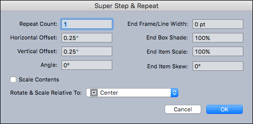
Using Super Step & Repeat for Super Duplication
When you need to duplicate an item more than once or twice, or if you want to duplicate an item and change its attributes with each duplicate, try Super Step & Repeat. This feature is useful for creative effects, but it’s especially handy when you need to duplicate a logo or other art in a variety of sizes.
To use it, select a picture box, text box, text path, or line. Then choose Item ⇒ Super Step and Repeat. The dialog box shown in Figure 4-7 appears.
The options in the Super Step & Repeat dialog box let you specify the following:
- Number of duplicates you want (up to 100)
- Horizontal distance from the original (negative values place the copy left; positive values place it right)
- Vertical distance from the original (negative values place the copy above; positive values place it below)
- Rotation of each copy (all rotation is counterclockwise)
- Thickness of the final frame or line
- Background color shade of the final box or line color shade of the final line
- Scale of the final duplicated item (from 1 percent to 1000 percent)
- Skew amount of the final item (from 75° to –75°)
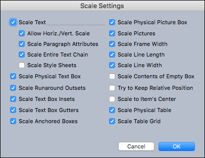
To scale the content of a picture box, text box, or text path along with scaling the item itself, select Scale Contents.
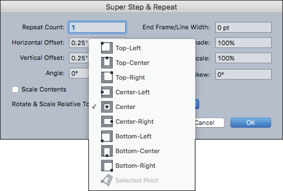
And finally, to specify the point around which rotation or scaling will take place for the item, choose an option from the Rotate & Scale Relative To drop-down menu, shown in Figure 4-8. Note that Selected Point is available as a choice only when a point on a Bézier item is selected.
Cloning Items with Cloner
Another supercharged duplication tool in QuarkXPress is Cloner (see the preceding section for the other especially handy way to duplicate items). Cloner lets you copy selected items to the same location on different pages or into a different project. You can also copy pages into a different project.
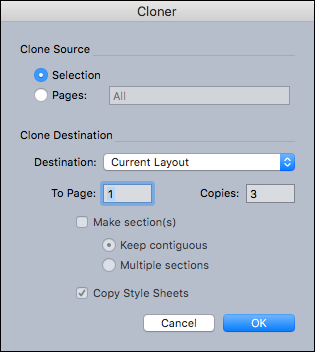
To use Cloner, you first select the items you want to clone, or deselect all items if you want to clone entire pages. Next, choose Utilities ⇒ Cloner to display the Cloner dialog box, shown in Figure 4-9.
Here’s what you find in the Cloner dialog box:
- Clone Source area: Lets you choose what you want to clone. Click Selection to clone the selected items, or Pages to clone a range of pages.
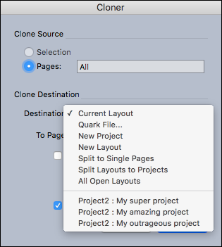
- Clone Destination area: Lets you choose where the cloned content goes. Choose an option from the Destination drop-down menu shown in Figure 4-10.
- Clone Destination drop-down menu: Lets you copy selected items to a different location in the active layout, copy the selected items or pages into an existing QuarkXPress project on your computer, copy the selected items or pages to a new QuarkXPress project, or copy the selected items or pages to a new layout in the active QuarkXPress project. Other options create a one-page project file from each page, create a single-layout project from each layout in the active project, copy the selected items to all layouts in this project, or copy the selected items or pages into a specific layout in an open QuarkXPress project.
- To Page field: Lets you indicate the target page to copy the selected items into. If you’re copying pages, indicate the page number you want the copied pages to begin on in the target layout.
- Copies field: If you’re cloning a selection, use the Copies field to enter the number of copies you want to make. For example, if To Page is set to 21 and Copies is set to 5, copies will be created on pages 21, 22, 23, 24, and 25.
- Make Section(s): If you’re cloning pages, and those pages include section breaks (you learn about sections in Chapter 5), select Make Section(s) to create sections in the new page copies; then choose an option:
- Keep Contiguous: Puts all the page copies in a single section in the destination layout, even if the original includes different sections.
- Multiple Sections: If the pages you’re copying include section breaks, the section breaks are preserved in the copies.
- Copy Style Sheets: Select Copy Style Sheets to include all the style sheets from the source layout in the new project or projects. Otherwise, only style sheets that you’re using in text on the source pages are copied.
Scaling Items or Layouts, Intelligently
QuarkXPress has a powerful Scale feature that lets you scale not only items but also entire multipage layouts — with control over which items and attributes change size. For example, you can scale a bunch of items but keep their frame or line widths intact. Or you can scale a multicolumn text box but not its gutter width or text inset value. You can even scale a table without scaling the table grid within it. When scaling text, you can scale the text but not the paragraph spacing, and then you can update the text’s style sheets with the new size (or not). So many possibilities!
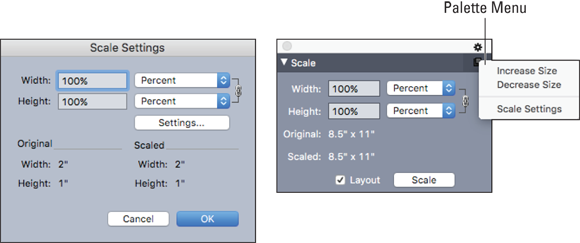
To scale items, first select those items. To scale an entire multipage layout, you don’t need to select any items. Oddly, you have two ways to access the Scale feature: by choosing Item ⇒ Scale and using the Scale Settings dialog box, or by choosing Window ⇒ Scale and using the Scale palette, as shown in Figure 4-11. The Scale palette is more flexible for several reasons, including its capability to scale an entire layout, so you may prefer to use that.
To scale using a percentage of the original size of the items, choose Percent from the pop-up menu. To scale to a specific final size, choose Units instead.
To scale without maintaining the original proportions of the item(s), click the chain-link icon at the far right of the Width and Height drop-down menus to break it. You can then enter any value in the Width and Height fields.
To scale an entire multipage layout, select the Layout check box in the Scale palette.
To control which items or attributes get scaled, click the Settings button in the dialog box or choose Settings from the palette menu in the upper right of the Scale palette. Either way, the dialog box in Figure 4-12 appears, with a multitude of choices. Make your choices and click OK.
 The Scale feature has four limitations to be aware of:
- Scale lets you scale an item so that it is smaller or larger than QuarkXPress otherwise allows. The scaled item will print correctly, but if you attempt to modify it with QuarkXPress tools or commands, an error message displays.
- Scale does not work completely with synchronized items. (See Chapter 7 for more about synchronizing items.) Instances of the shared item inherit only width and height changes from Scale.
- Don’t scale entire layouts that include Composition Zones, because doing so confuses the synchronization features in them.
- Rotated items are scaled according to their original geometry. For example, if you scale the width of a square box that has been rotated 45 degrees, a rotated rectangle is produced (rather than, as you might have wanted, a wider diamond).
Stacking, Grouping, and Aligning Items
Each item on a QuarkXPress page has a spatial relationship with the other items on the page. Not only are items arranged in a left-to-right and top-to-bottom fashion on the page, but the items also have a stacking relationship, like a deck of cards. In addition, you can use layers to keep items together that you may want to show or hide all at one time. All the items on a layer appear above or below the items on other layers. (I tell you about layers later in this chapter, in “Illuminating the Layers Palette.”)
Stacking items
As you add each item to a page, that item appears in front of the existing items. Even if items don’t overlap, they still have what’s called a stacking order. You can see this order by moving an item until it overlaps another item; the one that’s close to the front of the stacking order blocks out one that’s closer to the back. In addition, if your layout has more than one layer, items on each layer have their own stacking order.
The Item menu lets you control the stacking order of a selected item or items in the following ways:
- To move an item to the back of the page or layer: Choose Item ⇒ Send to Back.
- To move an item to the front of the page or layer: Choose Item ⇒ Bring to Front.
- To move an item one level backward in the page or layer: On a Mac, press Option and then choose Item ⇒ Send Backward. On Windows, choose Item ⇒ Send Backward.
- To move an item one level forward in the page or layer: On a Mac, press Option and choose Item ⇒ Bring Forward. On Windows, choose Item ⇒ Bring Forward.
A faster technique is to use the context menu that appears when you or Control-click (Mac) or right-click (Windows) an item. Choose Send & Bring from the context menu and then choose Send to Back, Send Backward, Bring to Front, or Bring Forward.
To activate an item that is hidden behind other items, get the Item tool and press Command-Option-Shift (Mac) or Ctrl+Alt+Shift (Windows) while you click repeatedly where items overlap. Each click activates the next item back in the stacking order.
Grouping and ungrouping items
Grouping in QuarkXPress is incredibly handy when you want to select or move several items at the same time. After you create a group, you can still edit, resize, and reposition individual items within the group. To create a group, select multiple items and choose Item ⇒ Group (or Command-G on the Mac or Ctrl+G in Windows).
A group is also considered an Item, so you can group multiple groups together, and you can even group individual boxes, lines, and text paths with an existing group. Use the following techniques to work with groups:
- To move, cut, copy, paste, duplicate, rotate, and color a group: Select it with the Item tool.
- To manipulate an individual item within a group: Use the Text Content tool or Picture Content tool.
-
To resize every item in a group: Click and drag the group’s handles.
 If you click and drag a group’s handles to resize it, the grouped items resize but their frame widths, line weights, pictures, and text don’t change size. If you press Command-Shift (Mac) or Ctrl+Shift (Windows) while resizing a group, all frame widths, line weights, pictures, and text do resize proportionally. If you press Command (Mac) or Ctrl (Windows) while resizing a group, frame widths, pictures, and text are still resized, but not proportionally.
- To move an item within a group: Press Command (Mac) or Ctrl (Windows) and select the item with the Item tool, the Text Content tool, or the Picture Content tool.
- To ungroup a single group: Choose Item ⇒ Ungroup (or Command-U on a Mac; Ctrl+U in Windows). To ungroup every group in a group that contains other groups, choose Item ⇒ Ungroup All.
Spacing and aligning items
Both the Space/Align tab of the Measurements palette and the Space/Align menu (choose Item ⇒ Space/Align to get to that menu) let you easily align or evenly space multiple items with one click. You can choose to align or space the items relative to each other, or to the page (or the spread in a Print layout with facing pages). Then you choose whether to use the top, bottom, left, right, or center of the items for your alignment or spacing.
When aligning or spacing items relative to each other, if you select the items by dragging across them, the topmost item on the page becomes the “key” item (that is, the item that the other selected items align to) and does not move. If two or more items have the same top edges, the leftmost top item becomes the key item and doesn’t move. To align or space items to a different key item, select that item first and then select the others. All selected items then align or space relative to that key item.
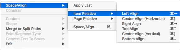
If you prefer text descriptions of the commands instead of icons, choose Item ⇒ Space/Align to open the Space/Align menu, shown in Figure 4-13. The alignment options shown in the figure are identical whether you choose the Item Relative submenu or the Page Relative submenu.
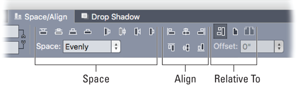
If you prefer icons for the commands instead of text descriptions, use the Space/Align tab of the Measurements palette. The Space options are clustered on the left, the Align options are clustered in the middle, and the “Relative To” options (Item, Page, or Spread) are clustered on the right, as shown in Figure 4-14. Hover over an icon to see its text label.
To apply a specific amount of space between items, enter it into the Space field. Otherwise, the existing amount of space between them is averaged and applied to each of them. (In other words, the items in the two most extreme locations remain in place and the items between them are spaced evenly.)
When aligning items with a page or spread, you can choose to align them with the top, bottom, left, right, or horizontal or vertical center of the page. But you can also enter a value in the Offset field to position them a precise distance away from the edge or center of the page.
To quickly jump to the Space/Align tab of the Measurements palette, press Command-, or Ctrl+, (that’s Command-comma on a Mac and Ctrl+comma on Windows).
Illuminating the Layers Palette
A QuarkXPress layer is like a clear overlay on your layout. Items you place onto it are always in front of all items on layers below it. You can toggle the visibility and output state of each layer, which makes them useful when creating a layout that’s translated into multiple languages. Or you can place different versions of a design on different layers and then switch back and forth among the variations when showing a design to your client.
When working with complex layouts, you can lock individual layers, which makes editing items on other layers easier. Some projects naturally lend themselves to using layers — for example, when designing a package or label, you can put the die lines (cut-and-fold lines) on one locked layer for reference but exclude them from printing. The uses for layers are endless, and they dramatically increase your productivity.
Using layers in QuarkXPress is slightly different (and, in my opinion, superior) from using layers in some other applications such as Adobe Photoshop. For example:
- You don’t have to manually activate a different layer to select an item on it — just click the item to select it and activate its layer.
- Each layer appears on every page in a layout, rather than on only the active page, which makes controlling the appearance of a long document easy.
- Text on a rear layer can run around items on a front layer.
Understanding the Layers palette
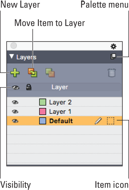
The Layers palette, shown in Figure 4-15, is the control center for layers. It lets you create layers, edit layer attributes, control whether a layer displays and prints, and move objects between layers. Every layout has a Default layer. You can add items to and remove items from the Default layer, but you cannot delete the Default layer. To display the Layers palette, choose View ⇒ Layers. In the palette, hover over an icon to see its text label.
Here’s how to accomplish tasks by using the Layers palette:
- To create a new layer, click the New Layer button, which looks like a green plus sign. A new layer appears above the active layer.
- To move a layer (and all the items on it) above or below other layers, drag it up or down in the Layers palette.
- To create a new item and place it onto a specific layer, first activate that layer by clicking its name in the Layers palette. A pencil icon appears to the right of the layer’s name. Then create the item.
- When you select an item on the page, its layer becomes active in the Layers palette, and a dotted square (Item icon) appears to the right of the layer’s name. If you select items from multiple layers, a dotted square (Item icon) appears next to each layer to which those items belong.
- Every layer has a different color assigned to it. When you select an item on the page, its bounding box and handles appear in the color assigned to its layer.
-
To move a selected item to a different layer, do one of these things:
- Click the Move Item To Layer icon and then choose a layer from the dialog box that appears.
- Drag the item’s Item icon from its current layer to another layer. The item’s bounding box and handles change color to match the color of the new layer in the Layers palette.
If you move a master page item on a layout page from the Default layer to another layer, those items will no longer be master page items. (Read more about master pages in Chapter 5.)
- To merge multiple layers into one layer, first select them in the Layers palette. To select consecutive layers, click the first one and then Shift-click the last one. To select nonconsecutive layers, Command-click (Mac) or Ctrl+click (Windows) each layer that you want to select. Click the Merge Layers icon, and a dialog box appears. Choose a target layer from the Choose Destination Layer menu and click OK. All items on all the selected layers move to the new layer, and they remain in their original stacking order. In other words, the items appear in the same front-to-back order, except that they’re all on the new layer. The original layers are deleted.
- To delete the active layer, click the Delete Layer (trash can) icon.
- When you group items that are on different layers, all items stay on their layer, even though the group itself belongs to a specific layer.
- To toggle the visibility of a layer, click the leftmost column. A Visibility (eyeball) icon appears or disappears there. To make only one layer visible, Control-click (Mac) or Ctrl+click (Windows) its Visibility icon.
- To lock or unlock a layer, click the second column on the left. A Lock icon appears or disappears there. To unlock one layer and lock all the others, Control-click (Mac) or /Ctrl+click (Windows) its Lock icon.
Working faster with the Layers palette menu
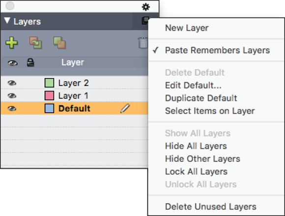
Some people like to click visual icons — they make sense to their brains. Some prefer the text-based menus for the same reason. The Layers palette has both, with some additional features in its palette menu. Although you can click icons in the Layers palette to create, edit, duplicate, show or hide, and lock or unlock layers, try using the Layers palette menu instead, as shown in Figure 4-16. To display it, click the little square in the top-right corner of the Layers palette or Control-click (Mac) or right-click (Windows) in the Name column.
The Layers palette menu is also useful for these operations:
- Selecting all the items on a layer
- Deleting all unused layers
- Showing or hiding and locking or unlocking all layers
- Controlling whether pasting items will paste them onto the currently active layer or onto the layers they came from
If Paste Remembers Layers is selected, and you paste items from a different layout, items from layers whose names match layers in the active layout are pasted onto those matching layers. If you paste items from layers whose names don’t match those in the active layout, new layers are created with those names, and these items are pasted onto those new layers.
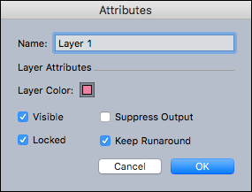
Changing layer attributes
To change the attributes of a layer, such as its name and color, double-click its name. The Attributes dialog box appears (see Figure 4-17), where you can do the following:
- Change the layer’s name: Type a new name in the Name field.
- Change the layer’s color: Click the color swatch and choose a new color from the color pickers that appear.
- Enable the Suppress Output check box: Select this check box if you don’t want items on that layer to be included when you print or export the layout.
- Enable the Keep Runaround check box: Select this check box if items on that layer cause text to run around them and you want the text to run around them even if the visibility of the layer is turned off.
Using layers on master pages
Beginning in QuarkXPress 10 (and including QuarkXPress 2015, 2016, and higher), you can use layers on master pages. Items on a layer on a master page appear behind items on that same layer on the document page. When possible, try to name layers differently on master pages — just to keep your head from exploding.
Getting Guidance from Rulers and Guides
Precision is one of the strongest qualities of QuarkXPress. Everything from the precise way the pointer interacts with text and page items, pixel-perfect image previews (by far the best in the industry), and a battery of truly helpful guide behaviors combine to give you confidence in positioning items. Don’t underestimate the power of precision: Some art directors can see when two items are misaligned by as little as one point (1/72 inch).
Ruling rulers
To display page rulers, choose View ⇒ Rulers. Rulers then appear along the top and left edges of your document window. As you create or move an item, dotted lines appear on the rulers that help you position it. The rulers use the unit of measurement set in the Measurements section of QuarkXPress Preferences. By default, the zero point for both rulers is the top-left corner of the page.
To change the unit of measurement on the fly, Control-click (Mac) or right-click (Windows) the ruler and choose a new unit from the context menu that appears, such as inches, centimeters, or picas. You can use different units for the horizontal and vertical rulers.
To change the zero point, drag the square where the rulers meet onto the page. To return it to its original position, double-click that square.
To reverse the measurement direction of the rulers, Control-click (Mac) or right-click (Windows) the ruler and choose a new ruler direction from the context menu that appears. By default, the direction is left to right for the horizontal ruler and top to bottom for the vertical ruler.
Getting guide-ance
QuarkXPress has three types of guides that help you position page items: ruler guides; column and margin guides; and dynamic guides. All of them are nonprinting, and you can create them on layout pages and master pages.
Using ruler guides
Ruler guides are also simply called guides. To create and position a ruler guide manually, click the horizontal or vertical ruler and drag the mouse onto the page. As you drag, a small line appears in the ruler to indicate the guide’s current position. The Measurements palette also shows the guide’s location in the X or Y field. This guide appears only on the page you drag it onto.
Here’s how to use a ruler guide:
- To create a guide that extends across the pasteboard and all pages of a spread: Release the mouse button when the ruler guide is positioned over the pasteboard. You can change an existing single-page guide into a pasteboard-spread guide by dragging it onto the pasteboard and then back onto the page.
- To move a ruler guide: Click and drag it to a different location. You can also double-click a ruler guide with the Item tool and enter a new location into the Guide Manager Pro dialog box. (See “Using Guide Manager Pro (the Guides palette),” later in this chapter.)
- To remove a ruler guide: Drag the guide back onto the ruler.
- To remove all ruler guides from a page: Scroll until a portion of the page touches the ruler and then Option-click (Mac) or Alt-click (Windows) the ruler.
- To remove all ruler guides from the pasteboard: Scroll until a portion of the pasteboard touches the ruler and then Option-click (Mac) or Alt-click (Windows) the ruler.
- To create multiple guides at exact locations: Use Guide Manager Pro, as explained in the upcoming “Using Guide Manager Pro (the Guides palette)” section.
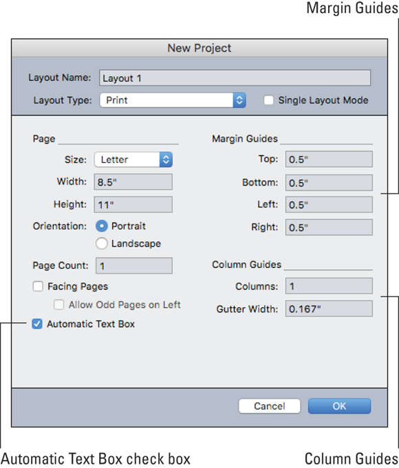
Using margin and column guides
When you create a new project or layout, you enter values in the Margin Guides fields and Column Guides fields in the New Project or New Layout dialog box, shown in Figure 4-18.
Margin guides indicate a page’s outside margins. If you want multiple columns on your page, you use column guides to show where they should be placed. If you select the Automatic Text Box check box in that dialog box, the automatic text box fits within the margin guides, and its columns match the column guides.
To change the placement of the margin guides and column guides after creating a project or layout, display the master page by either double-clicking its icon in the Page Layout palette or by clicking the View Master Page icon at the bottom left of the document window. Then, choose Page ⇒ Master Guides & Grid. In the Master Guides & Grid dialog box that appears, make your changes. If Automatic Text box is enabled for that layout, your changes affect the size, placement, and columns in the automatic text box on every page of the layout that uses this master page.
Snapping to guides
Guides aren’t just visual indicators that assist you in aligning items. They can have a “magnetic field” around them so that when you drag an item close to a guide, the item automatically snaps to the guide. To toggle this feature on and off, choose View ⇒ Snap to Guides.
You can also choose View ⇒ Snap to Page Grids to force items to align with the master page grid. See “Using a design grid,” later in this chapter, for more about forcing item alignment in this scenario.
Using Guide Manager Pro (the Guides palette)
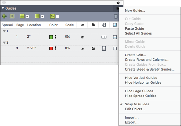
After you’ve worked with guides for a while, you may wish for easier ways to create, edit, and copy guides. Look no further than the Guides palette, which is the control center for Guide Manager Pro! To open it, choose Window ⇒ Guides and marvel at the controls, shown in Figure 4-19.
The Guides palette lets you not only see all the guides on all the pages of a layout but also control many attributes of a guide, such as its location, orientation, display color, whether it appears on a page or entire spread, and the minimum view scale at which the guide displays. You can edit, copy, and paste guides; mirror guides; create grids, rows, and columns of guides; create guides from a box; and add bleed and safety guides. Wow!
The controls at the top of the palette, from left to right, let you create new guides, mirror guides, show horizontal guides, show vertical guides, show guides only on the current page or spread, and delete guides.
Here are lots more ways to use the Guides palette:
- To sort the guides by an attribute: Click the column heading for that attribute.
- To display the page numbers in a spread: Click the arrow next to the spread number.
- To edit a guide: Double-click it.
- To display a context menu of options for a selected guide: Control-click (Mac) or right-click (Windows) anywhere in the palette.
- To display a menu of options for a selected guide or the entire palette: Click the palette menu at the top right.
- To create guides numerically: Click the Create a New Guide button at the top of the Guides palette or choose New from the palette menu.
- To copy a selected guide to the opposite side of the page or spread: Choose Mirror Guide from the palette menu.
- To create guides automatically from the edges of a box: Select the box and then choose Create Guides from Box from the palette menu.
- To create a grid of guides on the active page or spread: Choose Create Grid from the palette menu.
- To create rows and columns of guides on the active page or spread: Choose Create Rows and Columns from the palette menu.
- To create bleed and/or safety guides on the active page: Choose Create Bleed and Safety Guides from the palette menu. This places guides outside the page, on the pasteboard.
- To save your current set of guides for use on another layout: Choose Export from the palette menu. To load a previously saved set, choose Import.
Using Dynamic Guides
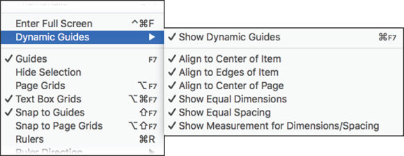
When you create, transform, or move an item, Dynamic Guides automatically appear to help you align the item with other items or the page. To enable or disable them, choose View ⇒ Dynamic Guides ⇒ Show/Hide Dynamic Guides.
The guides are blissfully obvious as you drag your item around the page. They show you when your item aligns to the center or edge of another item, the center or edge of a column in a text box, or the center of the page. They also show when the width or height of your item is equal to that of another item, or when the distance between your item and another item is equal to the distance between other items on the page.
To control which Dynamic Guides appear, choose View ⇒ Dynamic Guides and then choose the type of guide you want to view or hide, as shown in Figure 4-20.
Using a design grid
A design grid is a set of nonprinting guidelines for aligning text and items. This advanced feature is tremendously useful when designing a publication, or when designing a complex layout for East Asian languages, because it can ensure that everything lines up perfectly on all pages, and within all text boxes. Although this feature is too complex to cover in this book, Quark explains it clearly in the A Guide to QuarkXPress 2016 at (http://www.quark.com/Support/Documentation/QuarkXPress/2016.aspx), as well as in the Help file you can access under the Help menu in QuarkXPress. In the Help file, look for the “Text and typography” category and then open the “Working with design grids” section.
Briefly, design grids work like this: Every page has a design grid that tags along with the master page it’s based on. Every text box also has a design grid. Here are some tips for working with a design grid:
- To view the page grid: Choose View ⇒ Page Grids. To view an active text box’s grid, choose View ⇒ Text Box Grids. Then Control-click (Mac) or right-click (Windows) the text box and choose Grid Settings from the context menu that appears. Click the Display Settings tab and then select the check boxes next to each of the gridline options that you want to display. Select the Preview check box to see the gridlines appear in the text box.
- To adjust the page grid for a page: First display its master page and then choose Page ⇒ Master Guides & Grid. To control the placement and spacing of the grid, use the controls in the Text Settings tab. To control the display of the grid, use the controls in the Display Settings tab. To preview changes as you make them, select Preview. To use the specifications of an existing master page grid, grid style, or style sheet, click Load Settings.
- To save time when working with design grids: You can create Grid Styles and apply them to new or existing master pages and text boxes. To create and edit grid styles, choose Edit ⇒ Grid Styles or choose Window ⇒ Grid Styles to display the Grid Styles palette. To apply grid styles, use the Grid Styles palette.
Merging and Splitting Items
For those of us with limited drawing skills, it can be easiest to create a complex shape by combining several simple shapes (just as you can draw a cat’s head by drawing a circle with two triangles on top and then merging them into one shape). The Merge or Split Paths menu (choose Item ⇒ Merge or Split Paths) gives you the tools for this, and the result is a Bézier box that you can edit with the Pen tools.
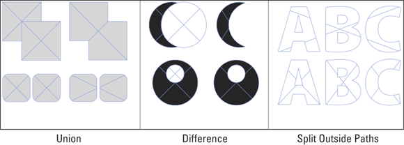
These operations are difficult to comprehend without experimenting, so take a minute to try the different choices with a few basic rectangles and ovals, as shown in Figure 4-21. Try the following: Use Union to create the shapes on the left; Difference to create shapes in the center; and Split Outside Paths to separate the letters that have been converted to boxes.
Here’s how the Merge and Split feature works: You select two or more items and then choose one of the following options from the submenu attached to the Merge or Split Paths menu:
- Intersection: Keeps the areas where the front items overlap the backmost item and removes the rest.
-
Union: Combines all the items into one box shaped like the outermost outline of all of them. This is the most-used option by far.
You can use Union to combine multiple picture boxes into one so that any picture you import gets spread across all the boxes — as if the boxes were windows looking out onto one view.
- Difference: Deletes the front items and cuts out overlapping areas. Use it to punch a hole through one box with another box.
- Reverse Difference: Deletes the back item and cuts out overlapping areas.
- Exclusive Or: Leaves all the shapes intact but cuts out overlapping areas. It creates two points where any two lines originally crossed.
- Combine: Similar to Exclusive Or, but adds no points where two lines intersect.
- Split Outside Paths: Separates the outermost items from each other. For example, when used on text that has been converted to boxes by choosing Item ⇒ Convert Text To Boxes, this option separates each letter in a word.
- Split All Paths: This option is like running Split Outside Paths repeatedly until every box within a complex box has been split. If you use this command on a shape that has a hole in it, the hole becomes solid.
When you convert text to boxes and then import a picture into the result, the picture shows through all the boxes as if they were windows on a wall looking out onto one scene. To separate the letters so that you can import a different picture into each one, use Split Outside Paths.
Finding and Changing Item Attributes
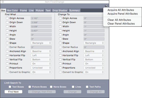
When you need to change the attributes of a bunch of items at the same time, choose Edit ⇒ Item Find/Change. The window shown in Figure 4-22 appears.
The Item Find/Change window works more like a palette than a dialog box, in that you can select and manipulate items on the page while using it.
You can use Item Find/Change on text boxes, picture boxes, no-content boxes, lines, and text paths, but not on tables.
Here’s how you can make use of the Item Find/Change window:
- To use Item Find/Change, you select the attributes in the Find What column that you want to change; then select those attributes in the Change To column and enter new values into the various fields or choose different options from the pop-up menus.
- Click the tabs at the top of the Item Find/Change window to see groups of attributes that relate to specific kinds of items. The final Summary tab lists all the changes you’ve told it to make in all the tabs.
- To save time, you can add all the attributes of a selected item by choosing Acquire All Attributes from the Palette menu at the top right (refer to Figure 4-22). If you choose Acquire Panel Attributes, only the attributes in that panel are added. If you select multiple items before choosing one of these Acquire options, it adds attributes in the order the items were created; if a newer item’s attribute conflicts with an older item’s attribute, that attribute is ignored from the newer item.
- In the area below the attributes, you can limit your search to specific types of boxes or lines. To find and replace all types of items, leave all these boxes deselected.
- When you click Find Next, Item Find/Change searches the entire layout from start to finish. To limit a search to the active spread, Option-click (Mac) or Alt-click (Windows) the Find Next button.
In any QuarkXPress dialog box or window that has a Find Next button, you can hold down Option (Mac) or Alt (Windows) to see that button change to Find First. If you keep the Option or Alt key held down when you click the Find First button, it will indeed find the first instance of whatever you’re looking for.
Using Item Styles
When consistency is important, or if you value your time when working on a project that has lots of items that share the same attributes, use the Item Styles feature. Conceptually similar to using style sheets for text, Item Styles let you save any combination of item attributes and apply them with one click to a page item. Also, if you need to change one or more attributes across all those items, you can change the item style, and all the items will update. Item Styles can be especially handy for ensuring that drop shadows on related items all look the same. The Item Styles feature works across all the layouts in a project, and you can export and import these styles into different projects.
Item Styles has some important limitations: Item Styles do not affect locked attributes of items (position, story, or picture); Item Styles don’t work with the Shared Content and Composition Zones features (see Chapter 7 to learn about these features); and Item Styles cannot be used on tables — instead, use Table Styles, as explained in Chapter 12.
Creating and editing Item Styles
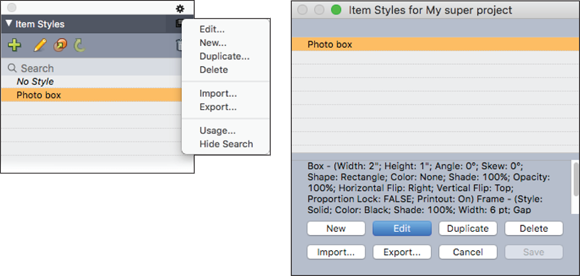
To create or edit an Item Style, use either the Item Styles palette (choose Window ⇒ Item Styles) or the Edit Item Styles dialog box (choose Edit ⇒ Item Styles), shown in Figure 4-23.
Using the Item Styles palette
To apply an Item Style to selected items, click its name in the Item Styles palette. The Item Style applied to an item displays in bold.
If the Item Style name has a plus sign (+) next to it, the selected item uses local formatting that is different from what is defined in the Item Style. To remove local formatting from the item, you can click No Style at the top of the Item Styles palette, and then click the Item Style name again. But the quickest way is to Option-click (Mac) or Alt+click (Windows) the name of the Item Style.
To create a new Item Style, follow these steps:
-
To start with an existing item, select it.
To start from scratch, make sure that no items are selected.
-
Click the New button in the Item Styles palette, or choose New from the palette menu.
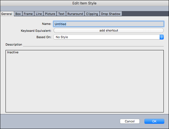
The Edit Item Style dialog box appears as shown in Figure 4-24.
-
Enter a name for the style, and optionally assign a keyboard shortcut.
On a Mac, you can use any combination of Command, Option, Control, and Shift with the numbers on the numeric keypad or the function keys. In Windows, you can use any combination of Control and Alt with the numbers on the numeric keypad, or any combination of Control, Alt, and Shift with the function keys.
If you use a function key for your shortcut, you override QuarkXPress commands and system-level commands that use that function key.
-
To base this style on another Item Style, choose its name from the Based On menu.
Your new style remembers only the attributes that are different from the Based On style, so if you change attributes of the Based On style, those changes are also applied to this style.
If you’re starting with an existing item, its attributes are listed in the Description field. You can change them by clicking any of the tabs at the top of the dialog box. If you’re creating a style from scratch, click those tabs and set the attributes as you want. (See Figure 4-25.) Only the attributes with their check boxes selected are applied. The all-powerful Apply check box at the top left turns all the attributes on or off for that category.
- Click OK to save your changes to the Item Style.
Here are ways to work with your new or existing Item Style:
- To edit a selected Item Style: Click the pencil icon or choose Edit from the Item Styles palette menu.
- To duplicate a selected Item Style: Click the Duplicate icon next to the pencil icon or choose Duplicate from the Item Styles palette menu.
- To search for a style in a long list of styles: Type part of its name into the Search field.
- To export a selected Item Style for use in a different project: Choose Export from the Item Styles palette menu, navigate to a location on your computer to save the exported Item Style file, and give it a name. To import an Item Style that was exported from a different project, choose Import.
Updating an Item Style from a page item
If you change some attributes of an item that has an Item Style applied to it, and you like those changes so much that you want to apply them to all the other items that use that Item Style, select the item and then click the Update button in the Item Styles palette (it looks like a curved arrow). If you change your mind right after updating the Item Style, you can undo the update by choosing Edit ⇒ Undo ItemStyle.
Using the Edit Item Styles dialog box
Choose Edit ⇒ Item Styles to open the Edit Item Styles dialog box where you can create, edit, duplicate, delete, import, and export Item Styles exactly as you can by using the palette menu on the Item Styles palette.
You can apply an Item Style to selected items in several ways: You can click an Item Style name in the Item Styles palette; choose it from Style ⇒ Item Styles; or choose it from the context menu that appears when you Control-click (Mac) or right-click (Windows) the item(s).
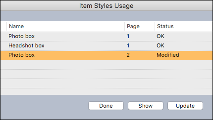
Checking Item Style usage
To see which Item Styles are applied to items in the current project, and where local overrides occur, use the Item Styles Usage dialog box. You can open it by choosing Utilities ⇒ Item Styles Usage or by choosing Usage from the Item Styles palette menu. The Item Styles Usage dialog box, shown in Figure 4-26, appears.
To see an item on the page that uses an Item Style, click it and then click Show.
If the Status of a selected item is listed as Modified, one or more of its attributes are different from those in the style. Click Update to remove all these local overrides.
Storing Items in Libraries
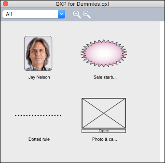
When you have an item or a group of items that you use frequently, you can store them in a library for easy retrieval into any project. You’re not limited to one library; you can have a different library for each client, project type, or any other use. To add an item or group of items to a library, you drag them onto it and optionally give the entry a name. To use an entry, you drag it from the library onto any layout page. Whether you’re dragging items into or out of a library, QuarkXPress makes a copy, leaving the original untouched.
Libraries are platform specific. If you created a library on a Mac, you can use it only on a Mac. If you created it in Windows, you can use it only in Windows. If your workflow is cross-platform, you can’t share libraries, so you may want to stop reading this section now.
Here’s the scoop on working with libraries:
- To create a new library: Choose File ⇒ New ⇒ Library. Give the library a name and choose a location to store it on your computer.
- To open a library: Choose File ⇒ Open and navigate to that library’s file on your computer. You can have multiple libraries open at one time.
-
To add an entry to an open library: Select one or more items in your layout and drag them onto the library.
If you move an original picture file after importing it into your document or adding it to a library, you have to choose Utilities ⇒ Usage and update its location in the Usage dialog box when you copy it from the library onto a layout. Figure 4-27 shows a library on a Mac.
- To move an entry within a library: Click it and drag it to a new position.
- To enlarge the entries in the library window: Click the + magnifying glass icon. To shrink them, click the – magnifying glass icon.
- To resize an open library: Drag one of its edges or corners. For convenience, you can make it wide instead of tall.
- To copy an entry from one library into another: Click it and drag it to the other open library.
- To replace an entry in a library: Select the replacement items in a document and then choose Edit ⇒ Copy. Click the entry in the library to select it and then choose Edit ⇒ Paste.
- To remove an entry from a library on a Mac: Click it and choose Edit ⇒ Clear, or choose Edit ⇒ Cut, or press Delete. To remove an entry from a library in Windows, click the Library palette menu and choose Edit ⇒ Delete or Edit ⇒ Cut.
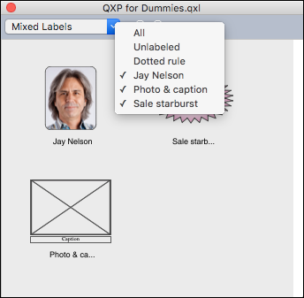
- To manage your entries: Give each one a label. To add or change a label on an entry, double-click the entry to open the Label dialog box and then enter a new label in the Label field or select an existing label from its drop-down menu and click OK. To see only the entries in the library with one or more specific labels assigned, choose that label from the pop-up menu at the top of the library window, as shown in Figure 4-28. You can choose more than one label to display at one time. To see all the entries again, choose All from that menu.
By default, QuarkXPress resaves each library every time you make a change to it. However, you can change QuarkXPress Preferences so that the library is saved only when you close it. To make this change on a Mac, choose QuarkXPress ⇒ Preferences; in Windows, choose Edit ⇒ Preferences. In the Open and Save section, deselect Auto Library Save.