Chapter 19
Integrated Reasoning: Strategies
GMAC has devised four new question types for the Integrated Reasoning section. As with any section on a standardized test, doing well requires a blend of content knowledge and strategy. Test takers who approach the Integrated Reasoning section with a firm grasp of strategy will do better than those who haven’t thought about strategies for the section.
GENERAL STRATEGIES
Some strategies apply to the entire section and you’ll use these methods on almost every question. The more consistently you apply these pointers, the better you’ll do and the more efficiently you’l use your time.
Get Your Bearings
Before you can use a chart, graph, or table to answer questions, you need to understand the information on it. So, before you evaluate any statements or answer any questions, take a few moments to review the charts, graphs, and tables.
For charts and graphs, make sure you look at the axes. You’ll want to take note of what each axis measures and the units used to make the measurements. You’ll also want to read any headings or titles because those can provide valuable insight into the purpose of the graph. There may be a legend. If there is, take a moment to identify the different items that the chart or graph compares. For tables, make sure that you look at each column heading. This sort of review is essential before you start working on evaluating the statements or answering the questions that go with Table Analysis and Graphics Interpretation questions.
Read What You Need When You Need
Both Table Analysis and Graphics Interpretation questions include a blurb of text that explains the table or chart. While GMAC includes this information to help you to understand the table or chart, you may not need to take the time to read it.
Valid Inferences
Both Table Analysis and Multi-Source Reasoning items include statement style questions. (Reread Chapter 18 to see examples of statement style questions.) In some cases, you’ll be asked to decide whether the statement is true or false. But, in other cases, you’ll be asked whether the information supplied supports the inference as stated and asked to respond yes or no. That’s a little different from asking whether the statement is true or false. After all, there’s the possibility that there is insufficient information to conclude whether the statement is true or false. If that’s the case, you need to pick “no” as your answer.
It’s also important to remember that a valid inference is something that you know to be true. The way you know something is true is that you have evidence you can point to. GMAC knows, however, that most people think “interpret” or “read into” when they hear the word “infer.” So, some statements provided on Table Analysis and Multi-Source Reasoning questions attempt to read into the information on the chart or table to come up with a conclusion. For example, there may be a clear trend on a chart showing that a company has increased its sales for every year between 2000 and 2008. The statement may try to get you to conclude that the company also increased its sales in 2009 even though 2009 is not shown on the chart. That’s not a valid inference! Be careful that you don’t mix up “true” and “very likely” when evaluating what can be inferred from the data.
TABLE ANALYSIS
Table Analysis questions always include one table to display data. You’ll be asked to evaluate four statements. You may be asked whether the statements are true or false based on the data in the table. You may also be asked whether the statements represent valid inferences based on the table.
The Sort Function
As mentioned in our chapter covering the basics of the Integrated Reasoning
section, the sort function allows you to sort the data in the table by any column. However, the sort function will only sort by one column at a time. So, forget all those fancy multiple column sorts that you can do with Excel.
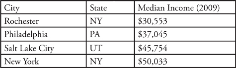
Now, here’s what you’ll see if you sort by state.
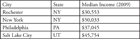
If you sort next by City, you might expect that Rochester and New York would exchange positions. That’s particularly true if you are used to the way that Excel lets you sort by multiple columns.
To Sort or Not To Sort
While the sort feature can be a huge help when answering some questions, you may not need to use it to answer every question. In some cases, you may only need to find one piece of information on the table. In other cases, the table may not have that many rows. Table Analysis questions can have as few as six rows of data. It may be faster to simply scan the table for the information that you need.
Here’s How To Crack It:
As with any Table Analysis question, the first step is to make sure that you take a moment to understand the information presented by the table. While it might be tempting to jump straight to the statements, you’ll be able to evaluate the statements more efficiently when you first take a moment to understand the information on the table. Looking at the column headings can also help you to decide whether you need to read the explanatory information under the table.
The last two column headings—Area Acres and Area Rank—are also pretty clear. Note that the inclusion of Area Rank means that you won’t need to deal with the larger number in the Area Acres column if all you need to do is compare the size of one park to another. The same is also true of the inclusion of the Visitors Rank column. The inclusion of these columns makes it much easier to make some types of comparisons about the parks in the table. That’s definitely something to make note of as you finish reviewing the information presented by the chart.
The park that experienced the greatest percent increase in visitors from 2009 to 2010 also had the least total acreage.
Now, it’s clear that Acadia had the greatest percent increase in the number of visitors from 2009 to 2010. Acadia was ranked 47th in terms of overall acreage. You could sort the chart by Area Acres or by Area Rank at this point to finish evaluating the statement. However, since you know Acadia’s rank for acreage, it’s probably slightly faster to simply scan to see if any park had a higher rank for area. In this case, Bryce was ranked 50th, so this first statement is false.
Now, let’s take a look at the second statement, which states:
The park with the median rank by the number of visitors is larger than only one other park by acreage.
Again, you may be considering several different ways to sort the chart. So, start by asking yourself “What’s hardest to see right now?” Remember that your chart will still be sorted as shown above, which is the sort that you did to evaluate the first statement. This sort makes it pretty hard to see which park had the median rank for visitors, so it makes sense to sort by Visitors Rank.
With the table sorted by Visitors Rank, it’s now fairly easy to find the park with the median rank. To find a median, you start by putting the items on a list into numerical order, which we just did by sorting the list. Then, you can just choose the middle number. In this case, Acadia is the park in the middle position since there are 5 parks ranked before it and 5 parks ranked after it.
Note that you could have also sorted the list by Visitors Number. Since data is always sorted from least to greatest, Canyonlands would have been the first row of the table and Grand Canyon would have been the last row. But, Acadia still would have been in the middle. We chose to sort by Visitors Rank because that term was mentioned in the question and it’s easier to work with smaller numbers.
The total number of visitors at Arches in 2009 was less than 1,000,000.
Because this statement involves only a single data point, you don’t really need to worry about doing any sorting. Even the most involved GMAT tables will have fewer than 30 rows of data. So, it will never be an issue to quickly scan the table, no matter how it is currently sorted, to find one data point. Just use the current sort which has Arches in the 8th row.
Next, you need some information about Arches to evaluate the statement. The table shows that Arches had 1,014,405 visitors in 2010. The table also shows that the number of visitors in 2010 was 1.8% greater than it was in 2009. To find the number of visitors in 2009, use the percent change formula:
Next, put the numbers that you know into the formula to get:
We’ve called the 2009 number that we’re trying to find x. A little rearranging gives:
101.8x = 101,440,500
Finally, just divide through by 101.8 to find that x, the 2009 visitation at Arches, was 996,469 rounded to the nearest integer. So, statement four is true.
GRAPHICS INTERPRETATION
Graphics Interpretation questions provide you with one chart, graph, or image. Each chart is followed by two statements. The statements each contain one drop- down list from which you choose one answer. Your job is to pick the answer that makes the statement true. Each drop-down list typically contains between three to five answer choices.
Here’s How To Crack It:
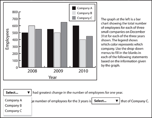
Before we get started discussing this question, note that we’ve expanded the drop down list for the first statement. When the question first appears on the screen, none of the drop-downs are expanded. Here, we just wanted to show what the expanded drop-downs look like in the context of a question.
For this statement, the task is to determine which company had the greatest overall changes in employees in any one year period. You’ll probably find it helpful to write down the changes on your noteboard. You may even want to construct a rough table to keep track of the changes. In that way, you can easily spot the largest overall change.
For this statement, it’s important to note that the question asked for the greatest change. So, you need to include overall decreases in looking for the greatest change. Employment at Company C declined by 200 between 2009 and 2010. The correct answer to statement one is “Company C”.
Here’s the second statement showing the possible answers:
To evaluate this statement, you need to calculate the average number of employees for Companies A and C. Questions that ask you to perform calculations such as finding an average are fairly common for Graphics Interpretation questions. Just be sure to read the information from the chart carefully. Common errors for questions such as this one usually involve reading the information for the wrong company or mixing the information for two companies.
For Company A, the total number of employees for each year was 500, 550, and 600. To find the average, take the sum of the three numbers to get 1,650. Now, just divide by 3 because you want the average over three years. So, the average number of employees for Company A is 550.
TWO-PART ANALYSIS
Most two-part analysis questions will remind you of the word problems that are part of the Quantitative section of the GMAT. The only difference is that you’ll need to pick two answers rather than one! It’s likely that you’ll need to do some calculations to solve most Two-Part Analysis questions. For the most part, the math you’ll need to do will be fairly straightforward arithmetic. You may find that it’s faster to do the calculations without the calculator. However, remember that the calculator is available. Just remember to set up your calculations before entering them into the calculator.
Here’s How to Crack It
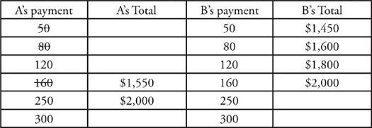
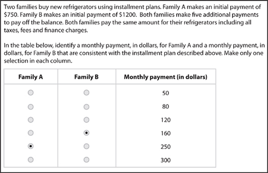
For this problem, one of the first things to notice is that there is a connection between the payments that each family makes. Since Family B’s initial payment is $450 more than that of Family A, Family A’s monthly payment is larger than that of Family B. That can help when you start testing the answer choices. Moreover, you can also see that the answer for Family A cannot be either $50 or $80. If Family A’s monthly payment were $80, then they would have only paid an additional $400 after 5 months. That’s not even enough to make Family A’s total payment equal to Family B’s initial payment. Of course, Family B makes monthly payments, too.
Note that we’ve already crossed off 50 and 80 as possible payments for Family A. As discussed, these answers are too small for A’s payment. As with any other PITA question, it makes sense to start with a number in the middle. We’ll start with $160 for Family A’s payment.
So, how do you know if you’ve found the correct answers? Remember that the problem states that both families pay the same amount for their refrigerators. Since Family B cannot pay $1,550 for their refrigerator, you can eliminate 160 as an answer for Family A.
We used a form of Plugging In the Answers (PITA) to solve the previous question. You can use that approach for most of the Two-Part Analysis questions that you see. Here’s a recap of the steps.
1. Write down the answer choices on your noteboard. Make two columns leaving some space between.
2. Decide which variable is easier to work with. For example, you might be able to eliminate some answers for one variable because those answers are too big or too small.
3. Write a label over each column of numbers. Label the first column as the easier variable to work with.
4. Starting with an answer in the middle for the first column, work the steps of the problem. For the second column, remember that you may only need to test the answers that are bigger or smaller than the number you worked with in the first column.
5. Check for a match between the first and second column that makes a condition in the problem true.
For some Two-Part Analysis questions, however, you won’t be able to use PITA. For the problem we just discussed, the two monthly payments were linked because both families needed to pay the same amount for a refrigerator. For some Two-Part Analysis questions, however, the variables are either unlinked or, at least, less linked.
Here’s How to Crack It
For this question, note that there’s no common condition that needs to be satisfied. Rather, there are two independent calculations. That’s how you know that you can’t use PITA to solve this question.
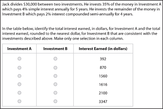
$10,500 × 0.04 × 5 = $2,100
The onscreen calculator makes doing the calculation an easy, one-step operation. Just make sure that you use the right numbers from the problem!
$19,500 × (1.01)8 = $21,115.71
Now, to find the interest just subtract $19,500 from the account balance. The interest earned is $1,616 rounded to the nearest dollar.
MULTI-SOURCE REASONING
For Multi-Source Reasoning questions, you’ll be given a variety of information that can include text, charts, tables, and graphs. The information is arranged on 2 or 3 tabs. Multi-Source Reasoning questions typically come in sets. So, you’ll probably get two sets of statement style questions and perhaps one standard multiple choice question.
Here’s How to Crack It
We’ll review the information one tab at a time before we start evaluating the statements. The first tab, Text #1, provides some background information about the ways in which a country’s population can affect its participation in the global economy. This tab also presents a table with population and growth rates for five countries. Notice that you need to read the included information on this tab to determine that the table displays data from 2005. Unlike the other question types that we’ve discussed, you should always read any text that’s included on a tab in a Multi-Source Reasoning question.
Now, here’s the information for the second tab:
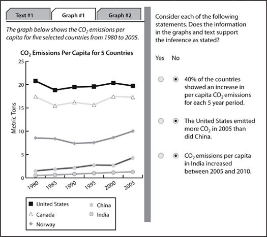
This tab shows CO2 emissions for five countries over a 25 year period. Notice that the countries on this tab are the same as the countries on the first tab. It’s also important to note that the CO2 emissions on this tab are per capita emissions. Since the first tab provided information about populations for 2005, it would be possible to calculate approximate total CO2 emissions for these five countries for 2005. While you don’t necessarily need to consider all the calculations you could perform, thinking about what you could calculate is an excellent way to notice connections between the data provided on the tabs.
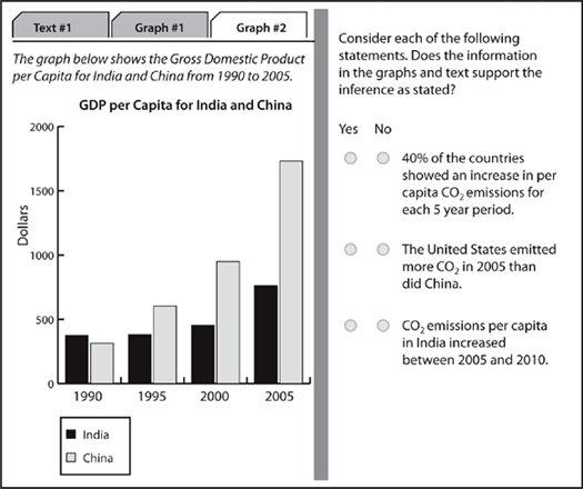
This tab provides GDP information about two of the countries, India and China, discussed on the first two tabs. The information on this tab is provided for a subset of the timespan from the second tab. The second tab showed the 25 year range from 1980 to 2005 while this information is only for the 15 year timespan from 1990 to 2005. The GDP information is provided as per capita information. Again, that means that the information on the first tab could be used to calculate the overall GDP for India and China. Of course, that calculation can only be completed for 2005.
40% of the countries showed an increase in per capita CO2 emissions for each five year period.
The trend lines for the United States, Canada, and Norway clearly show both increases and decreases between five year periods. So, none of those countries fit the requirements of the statement. The trend line for China needs to be examined carefully. China’s CO2 emissions per capita increase for four out of the five five-year periods shown. However, China’s emissions decreased slightly between 1995 and 2000. So, China also does not fit the requirements of the statement. Only India’s trend line shows an increase for every five-year period depicted on the graph. But, that means that only 1 out of 5 or 20% of the countries showed an increase in CO2 emissions for each five year period. So, the answer to the first statement is no.
The United States emitted more CO2 in 2005 than did China.
Evaluating this statement is a little trickier than evaluating the first statement. First, be careful of the wording. The statement is about total CO2 emissions rather than the per capita emissions that are shown by the chart on the second tab. So, while the emissions chart does show that per capita emissions for the US were greater than those for China in 2005, you cannot base your answer only on that piece of information. Remember that the test-writers will try to get you to make hasty conclusions so always check out the wording of the statement carefully.

Of course, you won’t be able to split the view on your computer screen this way. So, you’ll need to write down some of the relevant information on your noteboards. You should use your noteboards to take notes whenever you need information from two different tabs. Simply trying to remember the numbers can cause errors and waste time. For example, to evaluate this statement, you might jot down the 2005 per capita CO2 emissions for the United States and China. Then, go to the first tab to get the population numbers for each country.
For the US, per capita CO2 emissions in 2005 were approximately 20 metric tons. The US population in 2005 was 295,753,000. So, the total 2005 CO2 emissions for the United States was 20 × 295,753,3000 = 5,915,060,000 metric tons. For China, the per capita CO2 emissions are approximately 4.8 and the population was 1,304,000,000. So, China’s total CO2 emissions for 2005 were 4.8 × 1,304,000,000 = 6,259,200,000, greater than those of the United States. Therefore, the answer to the second statement is no.
CO2 emissions per capita in India increased between 2005 and 2010.
In contrast with the second statement, evaluating this statement is certainly less time consuming. However, as we’ll see, you’ll need to remember what is necessary for a valid inference. The necessary information is displayed on the graph on the second tab. Again, we’ve duplicated the necessary information below.
Now, it’s time to be careful. Notice that the chart only displays data up to 2005. While India’s per capita CO2 emissions have shown a steady increase over the 25 year period shown on the chart, that’s not sufficient for a valid inference. Since the chart does not display the actual numbers for 2010, the answer to the third statement is “no.”
As mentioned, Multi-Source Reasoning questions usually come in sets. Typically, you’ll get two statement style questions and one multiple choice style question. The questions on the right change but the tabbed information on the left stays the same.
Here’s How to Crack It
As with any other Multi-Source Reasoning question, your first step is to determine which chart or charts contain the relevant data. For this question, you certainly need the bar chart on the third tab because that chart shows information about GDP. The bar chart is shown above. However, the bar chart displays data about GDP per capita and the question asks about overall Gross Domestic Product. So, you’ll also need the 2005 population numbers from the table on tab one. We’ve reproduced the relevant table below.
To answer the question, you need to multiply each countries GDP per capita from 2005 by its population from 2005. Then, subtract India’s GDP from that of China.
Based on the bar chart, China’s 2005 per capita GDP was approximately $1,750. Since China’s population in 2005 was 1,304,000,000, China’s 2005 GDP was approximately $1,750 × 1,304,000,000 = $2,282,000,000,000. (Remember that you can use the onscreen calculator to perform the calculation.) For India, the 2005 per capita GDP was approximately $750 while India’s population was 1,095,000,000. That means that India’s GDP was approximately $750 × 1,095,000,000 = $821,250,000,000. Now, just subtract to find that China’s 2005 GDP was approximately $1,460,750,000 more than that of India. That’s closest to Answer Choice B.
Summary
- Before you jump into the Integrated Reasoning questions, get your bearings and peruse each tab or piece of information.
- On Table Analysis questions, know that you can only sort by one column at a time. If you think that sorting will help, go for it. But don’t waste time devising the perfect order to evaluate statements.
- On Graphics Interpretation questions, start by looking for labels on the axes and finding the legend if there is one.
- On Two-Part Analysis questions, do some algebra or PITA to get to the right answer. Careful that you select the right button in the right column when answering these questions.
- On Multi-Source Reasoning questions, take a minute to review the information on each tab before you jump in. Think about how the information on one tab relates to the information on other tabs.