WATERCOLOURS
‘Still life’ 2001. Watercrolour on Saunders Waterford 300 gsm Hot Pressed paper.

Water, and some colour! What could be simpler?
Watercolour is far more versatile than most would think, and even more importantly, it’s a great medium to work with! It can be used in a wide variety of styles and techniques, mixed with other mediums. It still retains an element of unpredictability that I haven’t found with anything else and, if you’re anything like me, the ‘thrill of the chase’ will excite you enough to pursue it as far as you can go. I intend to spend the rest of my life attempting to master watercolours, but for now, let’s have a look and see what we can learn...
It’s a good idea to start out with a set of pan colours (always artist’s grade paints, by the way) and make sure you have a few tube colours too (at the very least, the ‘primary’ colours, red, yellow and blue). Contrary to popular belief, you only need a few brushes. I’d recommend a large mop, a round wash brush, a detail brush, and an old brush for scrubbing in/lifting out purposes.
The paper you use is largely dependent upon the style of painting you wish to pursue. For highly detailed work, it’s a good idea to use Hot Pressed paper (Arches being my favourite). For more ‘washy’ paintings, I’d recommend either Cold Pressed or Rough paper. They all have their place and you’ll find your own preference in time. Please allow yourself space to experiment—it’s the fun, no pressure stuff that’ll often reap the best results.
Try and follow the steps, tips and techniques documented here as best you can; there’s plenty here to give you a good head start. Enjoy yourself!

Get to know your medium. The only way you’ll learn how to control watercolours is to use them. Try out different styles, different papers, different brands of paint. Vary your colour schemes and subject matter. You may stumble across subject matter and techniques you otherwise might never have thought of. Work from life, photographs, your imagination... Look at the work of others. Always be open to inspiration.

I’ll let you into a little secret... Watercolours used to scare the wits out of me. I worked in an art store/ framing shop and used to gaze in awe at the watercolour work of others, wishing I could do it too. Day after day I heard the paints on the stand calling me until I finally gave in and bought myself a set... I’m glad I did.
Watercolour is a very rewarding medium. Give it the time and dedication it requires, then sit back and enjoy it—you’ll be glad you did.
WATERCOLOUR—SHORT DEMONSTRATIONS
Watercolour is a very tricky medium when you first start out. As you are holding this book in your hands, I’ll take it that you’ve had a tinker already and would like to learn how to do a bit more with them... As there are plenty of books already out there in the world that deal with the history of watercolours, and give a detailed breakdown of the ingredients, we’ll save this precious space for some practical stuff. I don’t know about you but I far prefer a more ‘hands on’ approach.
In this section, we’ll be looking at a few short demonstrations looking at the best (and often the quickest) way of getting from A to B. Of course, watercolours can be used for lightning-quick sketches, but they are also capable of producing highly detailed images as well. Let’s take a look...
In this demonstration, using a tree as an example, we’re looking at the stages of getting from A to B.
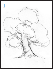
fig. 1 As you can see from this, we don’t over-detail the drawing; we want the paint to do the talking without the pencil lines showing through.

fig. 2 Using a size 1 round brush, lay in a light wash of blue, not going too overboard with the details at this point, softly at first, to set the tone.

fig. 3 With clear water, wet the whole leaf section of the tree and lay in washes of Cadmium Yellow and Leaf Green; it’s fine to allow them to blend with each other. Remember that the shadows will fall at the bottom, especially as they reach the centre of the tree, near the trunk.

fig. 4 To finish up, work your way around the whole tree, tightening up the foliage with a slightly darker green, paying a little more attention to the form. For the trunk, use a darker colour to add a little more detail.
PAINTING FOLIAGE

fig. 1 The working sketch. This is quite a detailed drawing, but note the absence of shading.
fig. 2 Wet the areas in between the leaves with some clear water, then drop in some Cadmium Yellow and Leaf Green, allowing them to blend with each other (in fact, this is to be encouraged with background elements).
fig. 3 Using Phthalo Blue and a little Payne’s Grey, paint in the branches, adding a small amount of detail only. Work in between the foreground foliage some more with the Leaf Green mix.
fig. 4 Pay attention to the foreground leaves now, varying the shades of green by adding more or less yellow into the mix.
fig. 5 Thinking more in terms of light and shade and paying attention to the details, mix up some Phthalo Blue and Burnt Sienna to create a warmer dark colour and apply it to the branches and in between the leaves. This will separate the leaves and give the painting some depth.
MORE THINGS TO BEAR IN MIND
Different paper types will reap varied results. Try similar paintings using hot press, cold press and rough paper. You’ll likely find you develop a preference for one type over another.
All the examples in this book have been completed using artist’s quality paints. If you can afford them, I would suggest you do the same. Start as you mean to carry on.
SKETCHING AN ELVEN ARCHER WITH WATERCOLOURS
So, a client has asked you to design an Elven Archer. Here’s one way you might be able to bring him to life. Watercolour provides a quick, easy solution.

fig. 1 Having sketched the figure, tighten it up, trace it and transfer it to your watercolour paper. For this example, we use 300 gsm cold press (medium) paper.
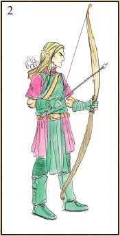
fig. 2 Make your colour choices, then lay in flat washes of colour. Keep things light here, we can always darken as we go. We’re just interested in flat washes at this point.

fig. 3 Using the same colours, (but not so watered down this time) go through and lay in the details. Pay attention to his face, to the straps, and the fabric of his clothing. Again, always bear in mind the fact that watercolours are best left to dry before adding more layers.
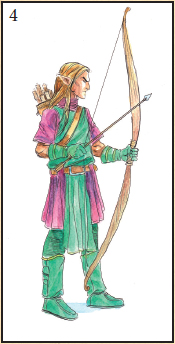
fig. 4 Working our way through the whole image, dropping in a little ‘cool’ colour for the shadows on the shirt. Next, go around the skin and darken the tones up a touch. Then check all the areas that need shadows. When it feels complete, it is complete.
PAINTING A FANTASY LANDSCAPE—‘The Seven Sisters’
For this demonstration, we’re going
to be focusing on a Fantasy/Sci-Fi
landscape, incorporating a few
different techniques—
transparent, opaque and
drybrushing. Images of this kind
require a fair amount of work, so I
hope you’ve come well-prepared.
We’ll begin on the following page.

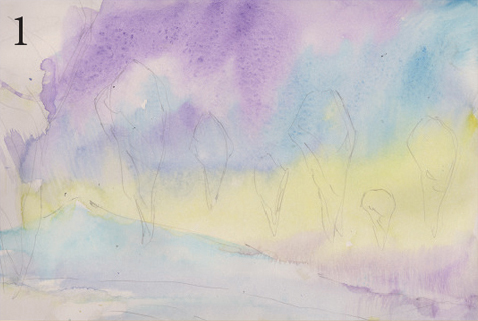
fig. 1 Transfer the drawing, stretch the paper and once it’s dry, lay down a wash of clear water with your mop brush and drop in the colours above; allow them to blend together and ‘do their thing’. Paint through the floating rocks—we don’t want hard edges in the painting.
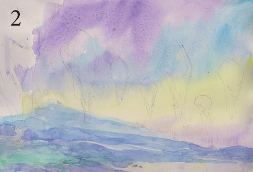
fig. 2 Having allowed the paint to dry, begin working on the background using your size ‘6’ round brush. Remember, the mountains in the distance will appear less distinct than the mountains in the foreground. Bear ‘depth of field’ in mind at all times when working on landscapes.

fig. 3 Next, add the details using a size ‘0’ round detail brush. Think of the hills as ‘broken by cracks’. That will help you separate them from each other. Although they appear far away, we still want to see all the contours of the land. Everything is painted using transparent watercolours here.

fig. 4 For the floating rocks, pick out the colours you used in the background but apply them more opaquely—we want them to appear sharper as they’re closer to us. For the rocks in the distance, use more blue/violet and for the rocks closest to us, use more earthy colours; this separates the distance between the rocks nicely.
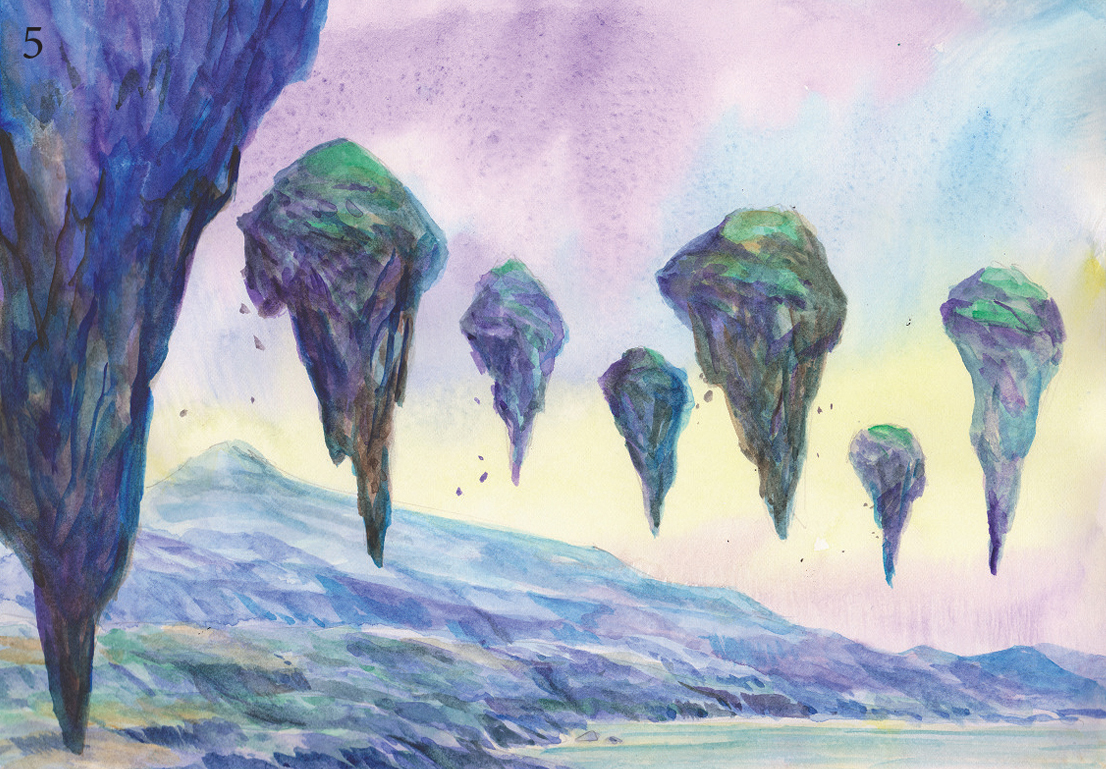
fig. 5 Paint in the details on the rest of the rocks, making sure they’re darker as they get closer to the viewer.
For the large rock in the front (left) use a heavy mix of Ultramarine, Phthalo Blue and Violet. This will make it stand out, but still keep the painting balanced. Paint in some falling rocks to show movement.

fig. 6 Go through the painting and add details to the hills and mountains in the background, using more green in the mix for the hills closest to us. Tone down the floating rocks at rear with white gouache, this will help to separate the distance.
Finally, go through the rest of the painting and tidy up any loose or weak areas.
COLOURS USED
Violet
Ultramarine Blue
Leaf Green
Cadmium Yellow
Phthalo Blue
Burnt Sienna
White Gouache
BRUSHES
Size ‘6’ Round brush
Size ‘0’ Round Detail brush
PAPER
300gsm Arches Hot Press
SKETCHING A DRAGON’S HEAD IN WATERCOLOUR
For this demonstration, we’ll be focusing on the application of paint. Many people make the mistake of being too ‘precious’ about making a perfect painting every time. Splashing the paint around in a fun manner can be liberating, too. We’ve chosen a dragon’s head for the subject here.
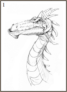
fig. 1 Having worked out the pose for your drawing, transfer it to your watercolour paper and tighten up any loose areas as you go.

fig. 2 Once you’re happy with the drawing, lay in the first washes of colour with your size ‘6’ round brush. First, lay in a flat wash of Cadmium Yellow on the underside of the neck area and for the rest of the head/neck area, lay down a wash of clear water drop in Cadmium Yellow and Leaf Green in the appropriate areas. While it’s drying, the paint will spread a little, so you’ll need to shape it with your brush if it goes too far astray.

fig. 3 Next, begin adding tonal washes in with Cadmium Red. Here, we’re looking to add form to the flat washes we’ve laid in. We’ve already established that the shadows fall at the back of the dragon’s neck, so bear in mind the way the light will fall at all times from here on in.
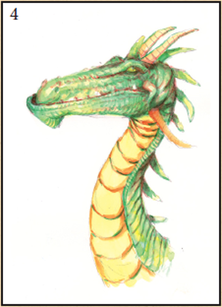
fig. 4 Moving around the image now... For the underside of the neck, mix some Cadmium Red and Cadmium Yellow together to create an orange for rounding off the neck plates. Add shadows to the rest of the head/ back of the neck instead of adding any more green. We’re looking to add depth now—red will always add depth.

fig. 5 Add details gently, all the while striking a balance between the red and the green paint. We’re looking to achieve a ‘realistic’ feel, although not too realistic—we definitely don’t want a ‘cartoony’ look.
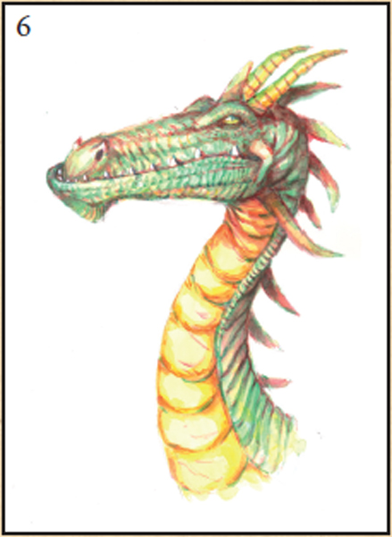
fig. 6 With your size ‘6’ round brush and Cadmium Red paint, go through the rest of the image, tightening up the details and adding more shadows. It is beginning to look a lot more complete now.

fig. 7 The finished sketch. Here we’ve used white gouache in his eye, for the teeth and touches of diluted gouache/mixed with Cadmium Yellow down the underside of his neck for highlights. As the details become more and more intricate, it’s a good idea to use smaller brushes. A size ‘1’ or ‘2’ round detail brush should suffice. Add more Leaf Green to the head and the green areas of the neck, and work your way down the yellow areas of his neck with more Cadmium Red to round the plates off. To finish, go through and tidy everything up, as always.
WHAT YOU’LL NEED
Sheet of A4 Arches hot pressed watercolour paper. Size ‘6’, size ‘1’ and size ‘2’ round brushes.
COLOURS USED
Cadmium Yellow, Leaf Green, Cadmium Red. Tube White Gouache
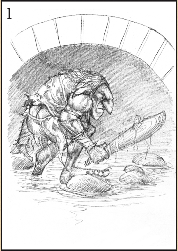
THE ROCK GIANT—Transparent Watercolour Demo
With this demonstration, we’ll be focusing upon using watercolours in their transparent form, highlighting application and colour choices.
WHAT YOU’LL NEED
Sheet of A4
Arches 300gsm hot press
watercolour paper
Size ‘6’ round brush
Size ‘0’ round detail brush
COLOURS USED
Phthalo Blue
Phthalo Green
Leaf Green
Cadmium Red
Cadmium Yellow
Yellow Ochre
Burnt Sienna
Sepia

fig. 1 This is the rough sketch I chose for the demonstration, having gone through the handful of thumbnails I made. It’s always good to have a few different designs to choose from.
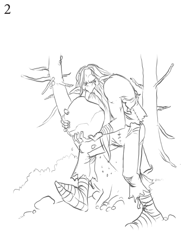
fig. 2 Transfer the finished sketch via tracing paper to your sheet of watercolour paper. Keep the lines simple; we’d like the paint to do the talking with this one. Remember, don’t press too hard—we don’t want grooves in the paper.

fig. 3 Lay in the first washes with your size ‘6’ round brush, beginning with Phthalo Blue for the bottom of the foliage area.
With a sheet of tissue paper, gently blot out the bottom. Always be aware of the speed hot pressed paper dries at. Leave the edges slightly blurred, we don’t want hard edges drying at this point.
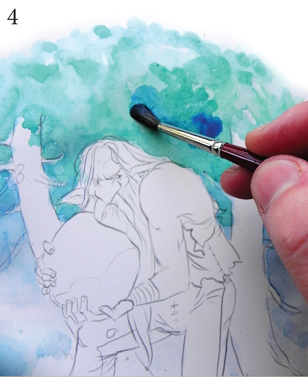
fig. 4 Once the blue wash is dry, add a layer of pure water over the top. While this is still wet, drop in a wash of Leaf Green and another wash of Phthalo Blue.
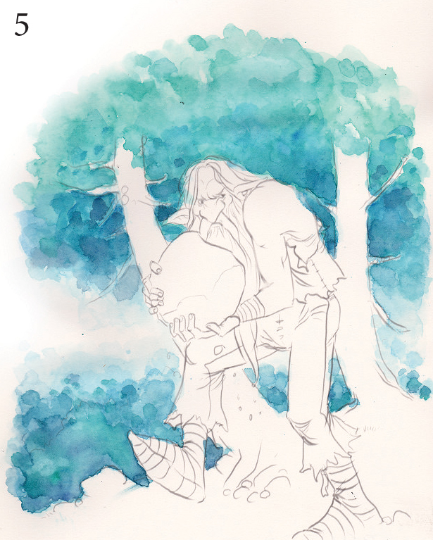
fig. 5 Using the same technique and colours, lay in the bushy area on the ground behind the Giant. Remember to blot the first wash for a soft edge.

fig. 6 Having laid in a light green/blue wash using the size ‘6’ round brush with Leaf Green/Yellow Ochre, we’ll begin to turn our attention to the Giant. Using neat Sepia, we’ll make an underpainting focusing upon the giant’s form, paying particular attention to his musculature and working out where the shadows fall.
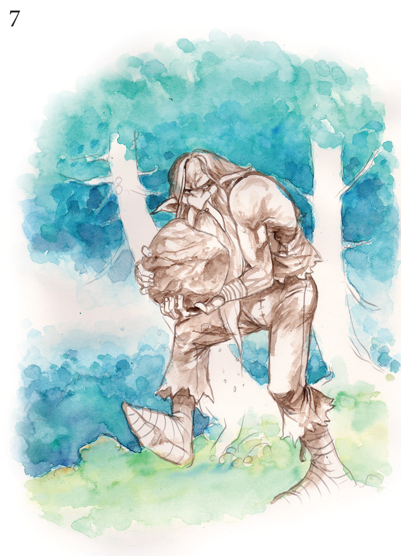
fig. 7 The finished underpainting. Great care must be taken here to make sure everything is worked out properly. Musculature, folds in the fabric and shadows should be aptly represented as they will likely ‘show through’ to some degree.

fig. 8 Now the fun really begins. Here we start to add colour to our giant. Starting with the face, grab your size ‘0’ round detail brush and add tones of Cadmium Red to his nose and skin areas; gently does it, we don’t want to have to use the white gouache to tone it down. Moving around the figure, add Leaf Green and Phthalo Blue for his trousers and Cadmium Red for his waistcoat. Remember to lay the colours in with graded washes, allow one wash to dry fully before adding the next one. This process can be quickened with a hair dryer. Next, with graded washes of Phthalo Blue, turn your attention to the trees, adding details as you go, then mix in some Sepia for the dark areas.

fig. 9 Still working your way around the figure, keep your attention on the way the light and shadow fall. We don’t want the colours to become flat and lifeless. Don’t be too rigid with your application; instead, be mindful of the strength and interest you can create with a ‘looser’ approach—we want a ‘loose but controlled’ look here. Lay in a wash of pure water over the trousers and while it’s still wet, add a wash of Cadmium Yellow—this will pull the greens together and make them sing. Begin adding details to the rocks and the roots of the trees using your size ‘0’ round detail brush and Phthalo Blue paint. Use Cadmium Yellow, Yellow Ochre and Burnt Sienna for the Giant’s hair.

fig. 10 Moving into the shadow areas now, using a Phthalo Blue/Cadmium Red mix to create a warm shadow colour. There are more than enough cool colours throughout this image; by adding more warm areas we begin to balance things out. Also, turn your attention to the boulder he’s carrying—a nice mix of warm (Yellow Ochre/Burnt Sienna) and cool (Phthalo Blue/Phthalo Green) colour will do nicely. It’s well worth having a look at rock references for authenticity.

fig. 11 Next, pull out your tube of white gouache and with the size ‘0’ round detail brush, begin to add highlights to the giant. First, we’ll turn our attention to his face. The highlight on the tip of his nose is a great place to start as it will set the tone for the rest of his face. Working your way around his features, add details and generally tighten things up as you go. Adding that protruding tooth really adds character. Be gentle with the gouache; add the white areas in washes if you must and paint your way into some confidence. As always, it’s worth trying these techniques on a separate sheet first.

Finishing up
Take a break before you go into the last pass. When you come back, you’ll likely notice that the shadows are inconsistent, the highlights need toning down and a whole list of other things may need some attention paid to them.
LINE AND WASH

WHAT YOU’LL NEED
Sheet of Arches 300 gsm cold press paper
Size ‘6’ round brush
Size ‘0’ round detail brush
Tissue paper (for blotting)
COLOURS USED
Leaf Green, Cadmium Yellow, Cadmium Red, Phthalo Blue,
Burnt Sienna, Yellow Ochre
Many of my great artistic heroes (of both yesteryear AND today) employ a line and wash style for rendering their illustrations. I must admit I haven’t spent as much time on it as I should, but I intend to rectify that.
For this demonstration, we’ll take a drawing I made a while ago and add some colour to it. If I’d had colour in mind from the word ‘Go’, I might well have drawn it in a more simple manner. That said, let’s get on with things.

fig. 1 Let’s begin by laying in a wash of clear water behind the drawing, here’s where we’ll be painting in the background foliage. While the paper is still wet, drop in some Cadmium Yellow and Leaf Green with your size ‘6’ round brush. Use the rougher paper to its best advantage and let it ‘do its thing’ as it dries.

fig. 2 Next, we’re working shades of Leaf Green into the background to build up the layers of foliage. Initially, with your size ‘6’ round brush, lay in another wash of clear water and drop in your first green wash, vaguely hinting at leaf details. Repeat this process, making the greens darker and darker as you go. At this point, you should have achieved some depth in your painting—we don’t want the background overpowering things here.

fig. 3 This is a technique I use with every watercolour painting I make. I’ve found tissue paper to be the best material for ‘blotting back‘ areas where you may have gone over the top with water, or too much paint. Always keep a sheet or two handy, (unless you’re like me, in which case you’ll need the whole roll). It’s important to remember not to use sheets that have been used too many times—this can leave unsightly marks or splodges of colour on your painting, which can be difficult to remove.
BLOTTING WET WATERCOLOUR
fig. 1 Lay a flat wash of colour into a wet background.

fig. 2 With your tissue paper, blot the colour out while the paper is still wet.
fig. 3 Varied pressure equals varied results.
‘Blotting back’ is a very handy way to control the amount of paint that you’ve laid down. It can also be used to create textures (see left). The methods watercolourists adopt are almost as varied as the artists themselves. For ‘lifting out’ or ‘blotting’ purposes, some use a sponge, others use cotton wool. I prefer to use tissue paper. And wet tissue paper creates different results again. I recommend you try all three methods and see what works for you. The photos at the left are an extreme example.

fig. 4 Now we’re looking at the rest of the painting, working our way through to the foreground. The yellow and green theme carries through and for the roots and tree trunk we’ve introduced some Yellow Ochre and Burnt Sienna. Again, these have been dropped into a clear wash of water and have been allowed to blend into each other. Make sure you allow everything to dry before moving into the details and avoid adding too much paint. This can cause the image to become overworked and muddy.
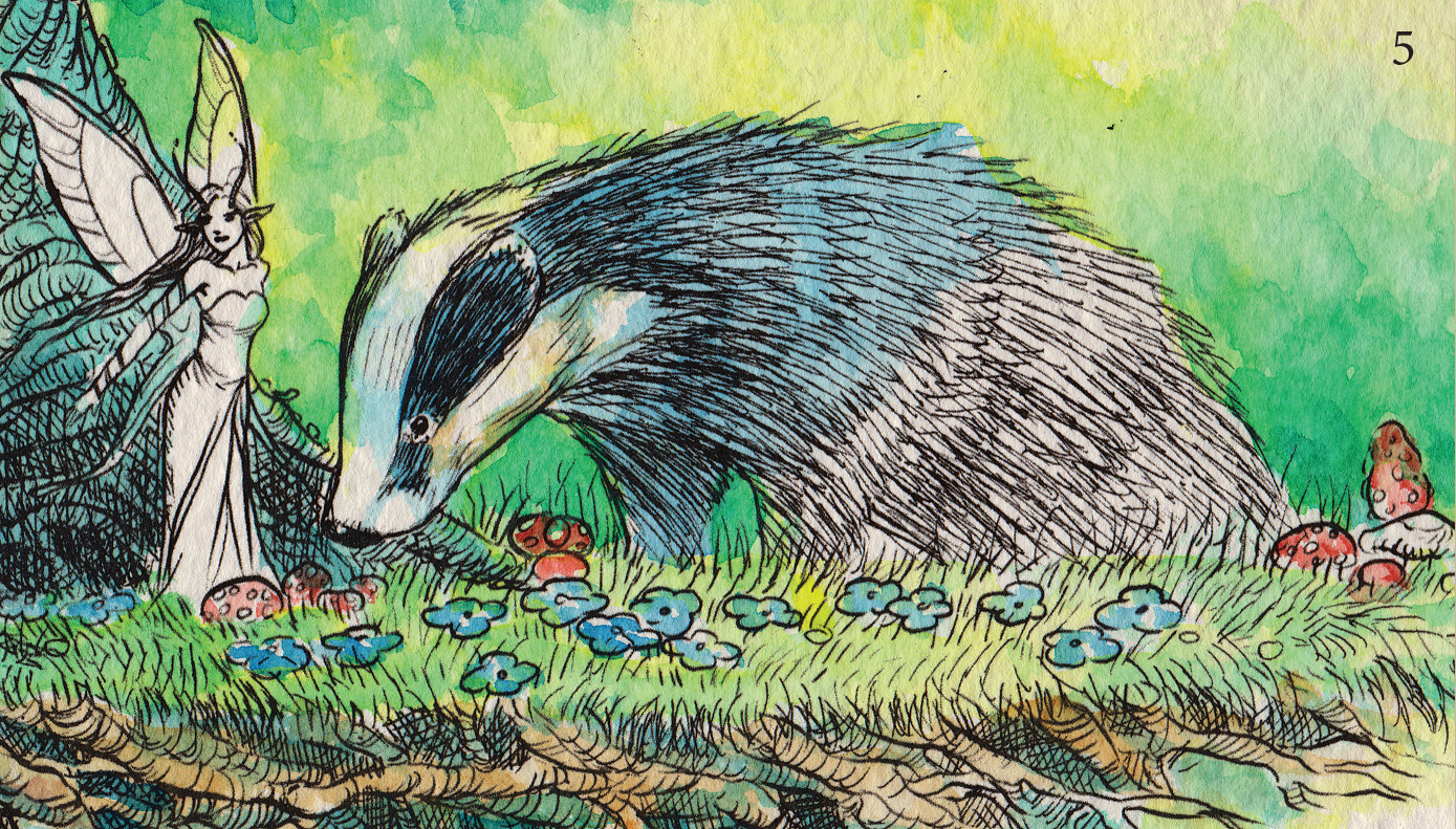
fig. 5 Here’s a close-up of the story so far. Having worked our way around the foreground figures, we now turn our attention to the figures themselves.
First, let’s add some base tones into the badger. Again, lay down a wash of clear water first, then drop in the colours—this will avoid laying down colours that are too dark. We can always darken up the colours in future washes.
Notice how the white has been broken up with Yellow Ochre? It’s a good idea to use colours within the painting to do this. White is far too stark to leave as is.
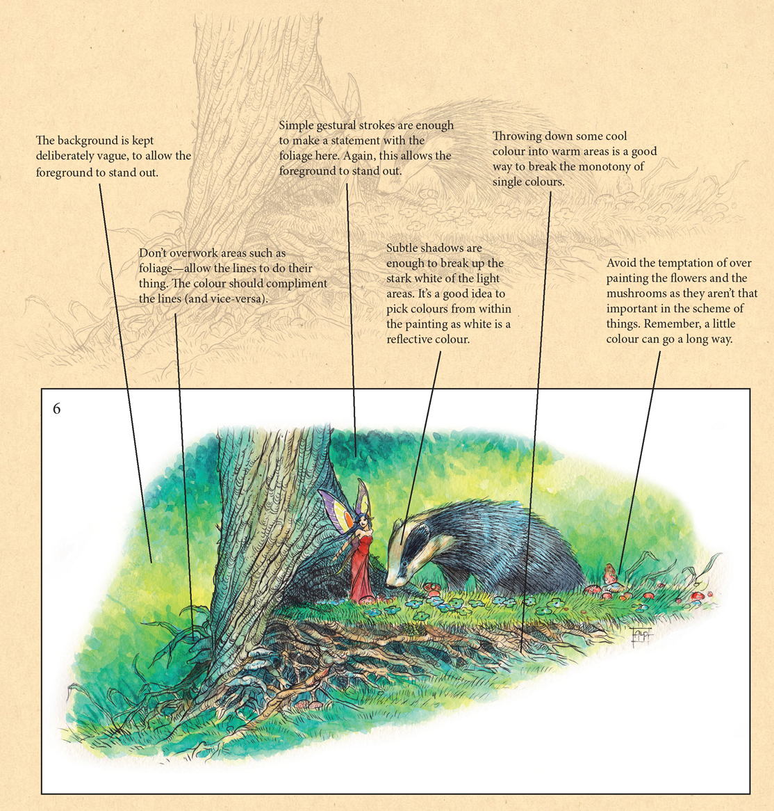
fig. 6 As always, finishing up can take a while longer than expected. Having moved through the whole image and made sure everything looks okay tonally, we’ll finish up colouring the fairy and the badger. It’s a good idea to have a fair amount of the painting completed before you go and add too many shadows to your figures. This will save you from having to update your tonal work again and again. See that little flash of almost ‘white’ to the right of the Badger’s head? That’s guiding our eyes into the painting, so let’s keep it—another ‘happy accident’ gratefully utilised.
INK AND WASH

When using watercolours over inked drawings, it’s important to bear in mind what you’d like the finished product to look like. It’s best not to over-render the line art to allow the paint to sing more. Over-cluttered lines can lead to chaos for the eyes. Keep the drawing clean and simple—you can always add more after the colours have been added, if necessary.

When adding colours to your inked drawing, remember that the ink is there to support the colour, and vice-versa. Allow them both to do their job. Always begin by adding colours lightly, build up in layers until a balance is reached, then stop. It’s easy to go overboard. Strive to keep your colours clean and singing out proudly.
THINGS TO BEAR IN MIND

A WORD OR TWO ABOUT INKING OVER WATERCOLOURS
Whether the style is loose or tight in execution, you should always bear in mind that the paint and the ink are there to compliment each other. The usual rules apply, however. Depth of field, light and shade and colour intensity should always be considered. Pay particular attention to keeping each area in harmony; don’t labour too long over any one element within the painting. Balance is the key. This will come in time, but should be borne in mind from the moment you make your first mark.
PAINTING MERMAIDS

fig.1 The rough sketch is an important part of the process. The elements within the painting should all be worked out at this point. Leaving very little in the way of guesswork will ensure the painting process goes smoothly. Remember, try a few different compositions and pick the one that works best—you’ll very rarely get it right the first time.

fig. 2 We’ll focus on the figure of the mermaid here. Note the way the drawing was deliberately transferred without the details. It’s handy to have the original drawing next to you as you begin the painting process—refer to it as a tonal guide.

fig. 3 This lady is a redhead, but before laying down the obvious colour, give a little thought as to how it would look based on the lighting you’ve already established with the background. It’s a good idea to actually use some of the darks you’ve used in the background for areas in shadow—this will keep things natural looking and tie the composition together. We want our mermaid to fit into her environment, not stand out.

fig. 4 This painting is an exercise in light and shade and in finding the delicate balance between warm and cool colours. Introducing the plum colour to her tail was a risky move that thankfully worked out, as it is a more neutral colour than I otherwise might have chosen. The gold of her armbands give our eyes a place to settle. Strong horizontal lines in the sky and water also help our eyes to follow her gaze.


Paintings such as this are ALL about emotional impact. Colour choice, the pose of the figure, and the storytelling should all meet and agree with each other.
PAINTING FROM LIFE
Spending time getting to know your watercolours is of course a very good thing. Like any medium, it’s worth exploring from every angle you can. One of the things I always recommend to new artists is ‘drawing from life’ or at the very least... drawing ‘real things’. This can only serve you in your quest to eventually produce work from your imagination.
Make as many paintings as you can from what you see around you. Really ‘look’ at what you’re painting. The more detail you can see, the more of the subject’s ‘essence’ you can pick up; then, you can inject more of both into your own work. Remember, your mind is a data bank and it’s helpful to fill it with things that will aid your artwork.

‘Hard and Soft’
(Transparent watercolours on Saunders Waterford 300 gsm Hot Press) 2013.
APPROACHING THINGS DIFFERENTLY
Here we have two completely different paintings using the same medium, only the approach has been handled differently.
In ‘The Sentinel’ (top) I handled the painting with large washes, a technique which is completely at odds with the way I worked on ‘Ladybird’ (below).
‘Ladybird’ required meticulous planning and took the best part of two weeks to complete (a record for me!). ‘Sentinel,’ however, was painted in an afternoon. I remember it vividly—it was one of those magical paintings that just fell out of the brush onto the paper. It still sits on my studio wall and I’m quite reluctant to part with it.
The leaves in this one were initially sketched as a mass, and a large wash of pure water was then added. While the paper was still wet, different shades of green were dropped in, which resulted in a very satisfactory natural blending of colour. It’s a shame the same can’t be said of ‘Ladybird’. This was one of those paintings that required more patience than I believed I was capable of. It became almost a challenge to complete, proving that sometimes, ‘the best things really do come to those who wait’.

‘The Sentinel’
(Transparent watercolours on Arches rough 300 gsm watercolour paper). 2007.
‘Ladybird’
(transparent watercolours on Arches 300 gsm rough watercolour paper) 2011.
THE CASE FOR GOUACHE
The purists’ll tell you it’s cheating. Just shake your head like I do and let it drip right off you. When you paint and draw pictures for a living, you soon realise that whatever it takes to make a painting work is just fine. Leave the purists to their nonsense. Of course, their way is quite valid. Leaving white highlights (via showing the white of the paper) is great, but if you aren’t a meticulous planner with your watercolour paintings—and let’s be honest, not everybody is—then you’ll need another way to render those highlights. White gouache IS that way.
As an interesting side note, I’ve also saved many failed paintings by using gouache over seemingly doomed transparent efforts.
WHAT IS GOUACHE?
Gouache is a chalky, opaque watercolour medium, as opposed to its transparent cousin. It is favoured by illustrators for its covering power and versatility. It’s worth experimenting with gouache in its own right if you have the time and financial wherewithal to purchase a few basic colours.

A quick cautionary note... If you aren’t done with the transparent side of things, make sure you don’t go too crazy with the gouache; it reactivates with water.
GOUACHE, OR NO GOUACHE?

fig. 1 The Reference Photo.
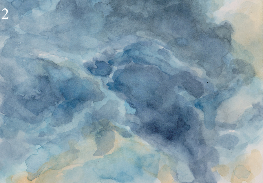
fig. 2 Transparent version.

fig. 3 White gouache added.
With this example, we’ve created a cloud painting based loosely upon the reference photo (above).
fig. 2 was painted using only transparent techniques.
fig. 3 Blended edges are achieved using white gouache.
Which do YOU think looks better?
I’ve used a variety of approaches here; see examples below...
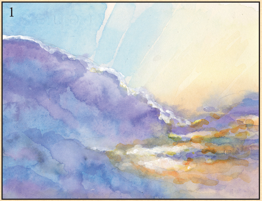
fig. 1 Mostly transparent watercolour was used here; the sun area in the center was painted using white gouache.

fig. 2 I used a LOT of white gouache here; also mixing it in with Payne’s Grey to create the graded darker colours and working up to the highlight areas.

fig. 3 This one has been painted 99% transparently. Touches of white gouache have been added to the tips of a cloud or two.
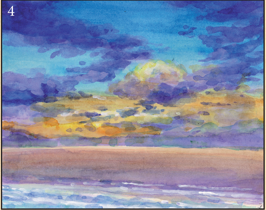
fig. 4 Another (mostly) transparent painting. The whites in this one were all rendered with white gouache.
TV SKETCHES—LANDSCAPES IN WATERCOLOUR

fig. 1 All transparently painted, this one. The goal was to achieve a sense of depth. This was painted on cold pressed paper as opposed to hot pressed—rougher papers encourage more ‘wash’ than detail.

fig. 2 This one was painted entirely in transparent watercolours; for the waterfall, the white of the paper shows through.
fig. 3 Always keep some kind of colour scheme in mind before you begin. Of course, things are subject to change as you move through the painting, but ‘half an idea’ is better than none.
fig. 4 A good example of ‘wet into wet’ for the sky. Limiting your palette can be very liberating too.
Each of the examples on these two pages was painted in the lounge while my wife watched one of her shows on the TV, (not my favourite thing in the world, watching telly). I use this time to a) Make sure I spend time with ‘the wife’ and b) Use my down time creatively. No-pressure painting can lead to an understanding of the medium you might otherwise never get if you painted ‘seriously’ all the time. Telly sketching is HIGHLY recommended; every stroke helps you further along the path. And it’s fun!

This scene was painted using Arches 300 gsm cold press (medium) paper. The rougher papers are much more suited to large, washy strokes.


The two examples were painted on Arches 300 gsm hot press (smooth) paper. This paper is far more practical for paintings with a lot of detail. You have to be particularly quick-on-the-draw, as it dries very, very quickly. The painting above was painted onto Saunders Waterford 300 gsm hot press paper (which has a lot more texture).

Experiment with different approaches, different papers, different brands of watercolour paints. It doesn’t matter how much you learn, there’s ALWAYS something new to try!
‘ THE DOORWAY’
This is the second time I’ve painted this one. The first time I painted it digitally, I felt it deserved to have life as a watercolour, so I set about having a go. See the steps I took (to the right) for its progress.

PAINTING NATURE
When I first moved to Australia, I was immediately struck by the diversity of the wildlife here; I was so impressed, in fact, that I spent three years as a wildlife artist (to the exclusion of all else). The painting on the right is one of the pieces I made during that period.
I believe with all my heart that those three years of really looking (and seeing) the natural world around me provided me with some valuable lessons. I came to understand the importance of light and shadow within a painting, how much detail was necessary. But by far, the most important lesson for a fantasy artist was to understand the way animals move. As mentioned earlier, studying horses in great depth would surely lead one to paint a convincing Pegasus or Unicorn.
By its very nature, the natural world is where you’ll be basing many of your paintings; in fact ALL of the outdoor ones will require a good understanding of nature to make them believable.

‘Eastern Water Dragon’ (2001) Watercolour and gouache on Arches 300 gsm hot press watercolour paper.
Painting the leaves on the ground...

fig.1 Lay in washes of colour, keeping brush strokes loose and interesting; we’ll be using them (as you’ll soon see).

fig. 2 With a dark mix of Phthalo Blue and Burnt Sienna, cut in around the left hand side of the brush strokes to create vague leaf shapes. Make sure the leaves look like the light is falling to the right and the shadows are falling to the left.
fig. 3 Work your way through the whole area doing the same thing. Add yellow and Leaf Green to the darker leaves to break the foreground.
PAINTING A MERMAID USING TRANSPARENT AND OPAQUE WATERCOLOURS

With this demonstration, we’ll be focusing upon using watercolour in both a transparent AND opaque manner, hopefully blending the two together seamlessly. It’s easy to go overboard with either technique, so as always we’re striving to achieve that balance I so often talk about.
Before you begin, remember to take a moment to look at the image in your mind, and see it as clearly as you can.
COLOURS USED
Payne’s Grey
Yellow Ochre
Phthalo Blue
Sepia
Ultramarine Blue
Cadmium Red
Burnt Sienna
Cadmium Yellow
Violet
White Gouache
WHAT YOU’LL NEED...
Sheet A4 Arches hot press
watercolour paper
Small pointed mop
Large mop brush
Size ‘6’ round brush
Size ‘0’ round detail brush
Size ‘2’ old, worn filbert (or equivalent) for
drybrushing purposes
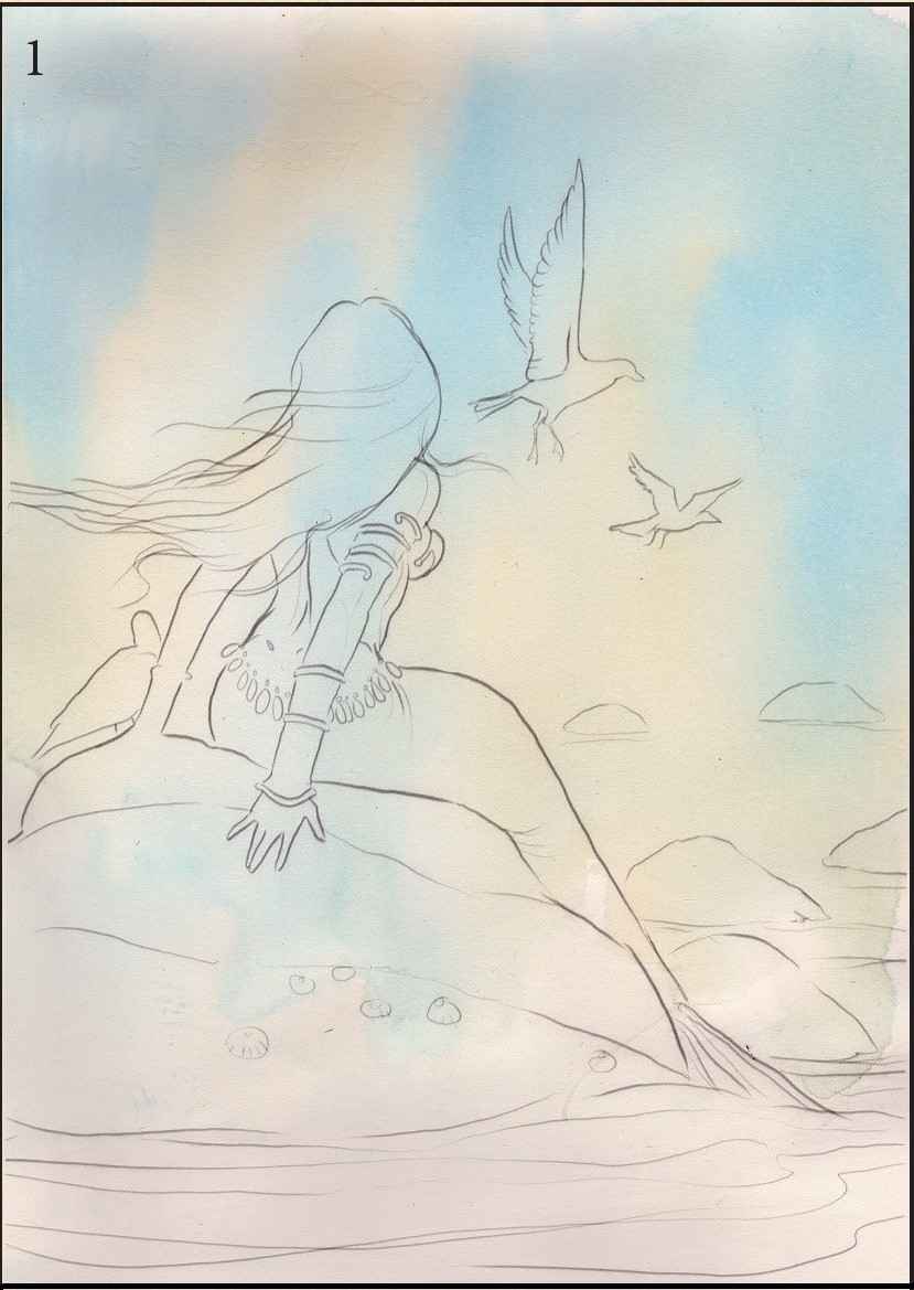
fig. 1 Having taped your drawing to the board, wet the paper throughly using your mop brush. While still wet, lay in a watered down wash of Phthalo Blue. Then lay in a watered down wash of Yellow Ochre alongside it, allowing the two to run into each other.
Let this layer dry naturally as it will take a little time for the colours to do their thing. It doesn’t matter at this point if the colours run into the main portion of the artwork, as they will dry very faint.
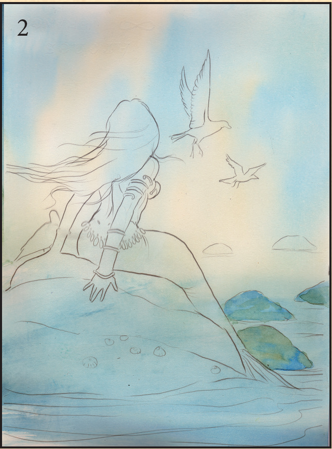
fig. 2 Now, work your way around the bottom portion of the painting, paying attention to the rocks and the water, keeping it loose.

fig. 3 With your small mop brush, lay in washes of Ultramarine Blue over the rocks and the water, taking care to build it up in layers. For the rocks, jagged edges are achieved by adding hard edges with the brush (these will dry to a satisfactory texture). For the water, take care to keep things nice and smooth (we don’t want hard edges here).
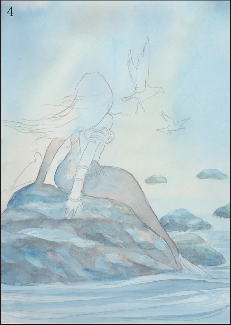
fig. 4 Work your way around the rocks now. Be sure to let one layer dry before adding another. For depth in your painting, leave the background rocks vague (very little detail) and add more detail to the rocks in the foreground. Using a mix of Ultramarine and Phthalo Blue, lightly paint some wave ripples into the scene—we’ll build upon these as we go.

fig. 5 Pay some attention to the mermaid now. Wetting her tail fully, drop in light washes of Cadmium Yellow, Phthalo Blue, Burnt Sienna, and Violet. Allow all the colours to merge—we’re hoping to achieve that ‘shimmery’ fish-tailed look here. Keep the tail darker as it nears the water and gently taper it off with clear water as it rises up her back. Lay a wash of pure water over the foreground and add a wash of Phthalo Blue. Once it’s dry, add another layer. Allow this to dry.
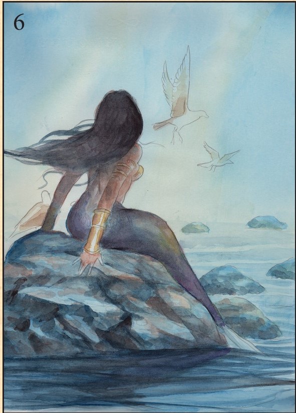
fig. 6 We can see the painting taking shape here. Moving further with the mermaid, using the small pointed mop brush, begin adding skin tones with a mixture of Yellow Ochre and Burnt Sienna; drop in a wash of Phthalo Blue for the shadows. For her hair, we use a mix of Burnt Sienna and Payne’s Grey, not worrying too much about details, but taking care not to go overboard—we’d like to keep the transparency of the background intact. Paint in the gold jewelry using Yellow Ochre and Burnt Sienna. Use a mixture of Payne’s Grey, Burnt Sienna and Phthalo Blue for the shadows below the foreground rock.

fig. 7 An important stage, this one. We now make the decision to add opaque paint to the image. First, we lay in white gouache highlights with our size ‘0’ round detail brush, then blend them with a tiny amount of water on our old small filbert brush. This blending will create a far more realistic look. Once the highlights have been added, we then move back into the musculature and the skin shadows using Burnt Sienna. This warm colour for the skin is necessary to balance the colours of the painting. It also helps to draw the eye to the figure.

fig. 8 Shifting our attention back to the tail, we employ the services of our old filbert brush, scrubbing in various tones via a drybrush technique, again making sure to colour the tail darker at the bottom. For this we use Burnt Sienna, Payne’s Grey, Ultramarine and Yellow Ochre to add highlights at the top.
These old brushes are great for dry brushing as you don’t have to be too careful with them.
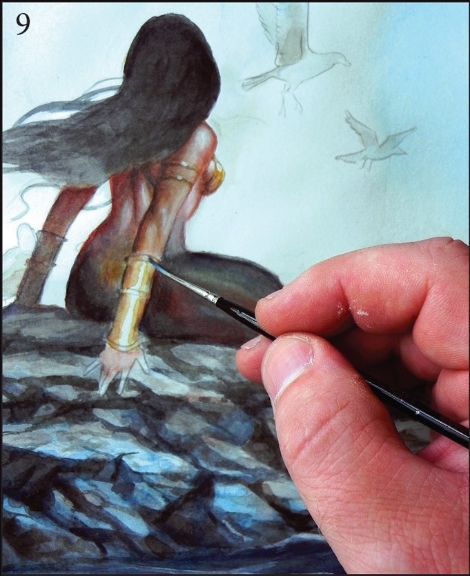
fig. 9 Add touches of white gouache for highlights on the metallic areas of the painting, just to make them ‘pop’ ever so slightly. It’s easy to get carried away with highlights, so exercise some restraint.
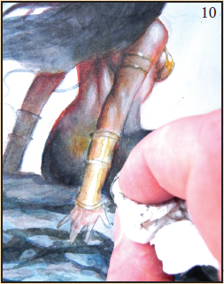
fig. 10 A great way to achieve texture is to add a wash with plenty of paint, and then pull it out by dabbing a dry tissue against it. It’s worth practising this on a separate sheet.
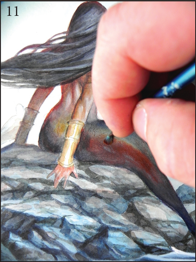
fig. 11 Using the drybrush technique again, scrub in some Burnt Sienna to warm the tail and achieve some balance between warm and cool colours. At this stage, pay attention to the mermaid’s hair, using a mix of Phthalo Blue and white gouache, then neat gouache for the highlights. Begin adding details to the rocks using Phthalo Blue and Payne’s Grey. This was always going to be a fairly detailed piece, but as usual, we don’t want to go overboard (pardon the pun, please.)
For the seagulls, keep things nice and simple. For those in the background, we’d like to keep that transparent look, so only one wash will do. For the bird on the rock, treat it with a more ‘opaque’ approach, to match the foreground detail.

fig. 12 FINISHING OFF
First, the water needs some more work. Starting from the background, lay in some gentle washes using diluted Phthalo Blue, gradually darkening as we move into the foreground. White gouache is then applied to the sea to give the illusion of waves. Move back into the rocks and add a dark wash of Payne’s Grey and Phthalo Blue in between the cracks; we want this area to look realistic, so a little more detail is necessary. Pull a few of those white gouache highlights into the rocks to hint at the waves gently lapping against them. The tail and the area below the mermaid’s back could use a little work. With the white gouache, gently at first, dry brush in some highlight areas and become more pronounced with each pass. We want the tail to shimmer, but not so much that it’s the only thing we see. Lastly, go through the image and see what else looks unfinished. All done!
MIXING TECHNIQUES—LINE ART WITH TRANSPARENT AND OPAQUE WATERCOLOUR
The original drawing.
Before you colour a piece of line art, it’s always best to bear in mind the nature of your medium. Watercolour lends itself to many different techniques. However, if you want the paint to ‘sing’ its own song, and revel in the joy of being a watercolour, then it’s best to keep the lines you plan to colour, as simple as possible. There is another option available to you, though—using them in an opaque manner.
In this example, we’ve taken the line art and exercised a few techniques in our quest to complete it.
Let’s go through a bit of a rundown to see how well we managed it.
Watercolour is a more versatile medium than you would think. It’s not the first medium people would pick for opaque techniques, but it works beautifully.
I’ve tried painting solely with gouache and have found it to be far too dry and chalky for my liking. Mixing watercolour in a transparent and opaque manner allows you to achieve things you wouldn’t otherwise have been able to, had you stuck to one technique or the other. Hopefully the example (left) illustrates that point.
It’s always worth trying new mediums. They all have something about them the others don’t have, but I’ve found watercolour to be more diverse and enjoyable than any of the mediums I’ve tried. There’s something about the unpredictability of it, like taming a wild beast.
Learning the characteristics of watercolour is an incredible experience—and just when you think you’ve got it all down, there’s more to learn. Enjoy the process; it never ends.
The best way to work with any medium is to visualize what you’re trying to achieve with as much clarity as you can muster—then just experiment all you can. It will all fall into place eventually. Remember, ‘rules’ are meant to be broken, but it’s a good idea to get some of those rules under your belt first.
VALKYRIE

WHAT YOU’LL NEED:
Sheet of A4 300 Arches
watercolour paper
Pointed mop brush
Tissue paper
Size ‘6’ round brush
Old, worn 3/8" filbert brush
COLOURS USED:
Phthalo Blue
Payne’s Grey
Cadmium Red
Yellow Ochre
Lemon Yellow
Burnt Sienna
White Gouache
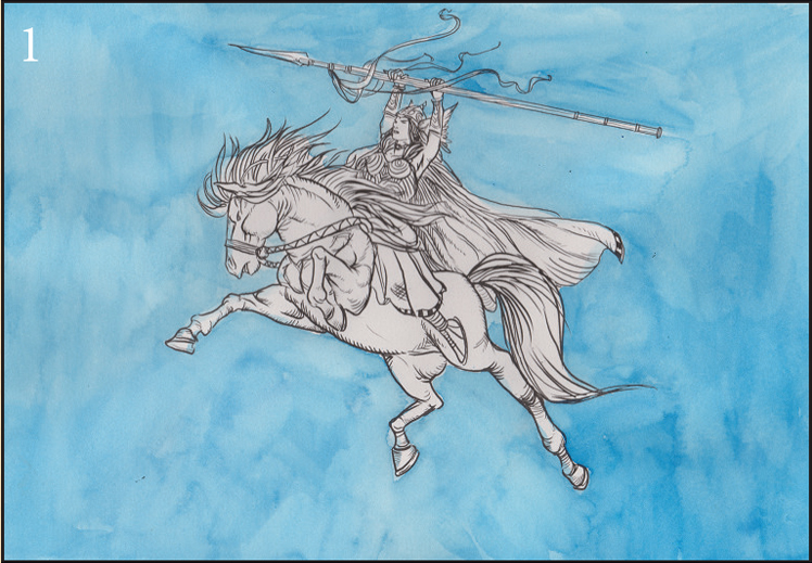
fig. 1 Once you’re happy with the composition and you’ve transferred it onto your watercolour paper, lay down a wash of clear water and drop in some Phthalo Blue with your mop brush while it’s still wet. Allow to dry and repeat the process. We don’t want to achieve a nice flat graded wash here—any texture that comes through is to be encouraged.
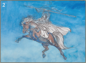
fig. 2 Spend some time loosely grading your sky wash from dark (top) to light (bottom) by adding more Phthalo Blue to a wash of clear water. For the horse, lay in a Phthalo blue underpainting using a size ‘6’ round brush and add Burnt Sienna for the rest of its body.
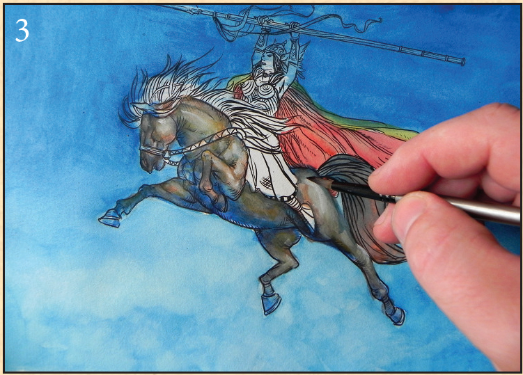
fig. 3 Now the fun begins! Model the horse’s musculature using some Burnt Sienna, Yellow Ochre, and white goauche. Be subtle here; it’s easy to take highlights too far. Drop in flat colours for the cape, (Cadmium Red and Lemon Yellow) at this point. We’ll build them up as we move through the painting.

fig. 4 Allow the whole painting to dry. It’s a good idea to sit and have a good look and see what needs working on—really LOOK—as flaws will make themselves known if you take the time.

fig. 5 We’re keeping an eye on ‘realism’ with this one, although we don’t want to strip the painting of its line art quality. Go through and balance the colours out, adding warm colours to the cool areas and cool colours to the warm areas. Again, don’t go crazy with the highlights.

fig. 6 Carefully work around the figures by adding a wash of clear water to the sky using your pointed mop brush, (and a LOT of water). Then, while it’s still wet, add a mix of Payne’s Grey/Burnt Sienna; use the same mix to add those stylised streaks at the bottom.

fig. 7 Go through the rest of the sky, adding even more streaks with more water and less pigment, fading them off as they near the bottom of the painting. Pay some attention to the ribbons on the spear—these flashes of red help to lead the eye into the painting. Overall, things now feel a lot more balanced.
We’ve gone through and toned down some of the darker areas and blended off some of the lighter areas. Remember, gouache is reactivated with water, so you can still work with it while it’s dry if you need to.

fig. 8 Finishing up... Go through and finish off the figure with your detail brush. First, brush in some Cadmium Red and Yellow Ochre for the skin tones. (We can mute this, as we go, with white gouache).
For the armour and the wrist bands, use some Yellow Ochre, dropping in some Burnt Sienna into the darker areas (realism really is about the play of light and shadow). Add some Burnt Sienna to the spear handle and for the spear head, using white goauche. As I’ve mentioned before, the last part of the painting often takes the longest and is sometimes the hardest.
For the clouds in the foreground, lay down a wash of clear water, then drop in some white gouache with an old, worn 3/8” filbert brush (it will disperse, but that’s okay, as we want soft edges). Allow it to dry and work in some more gouache. I’d recommend using a circular motion in certain areas for a more ‘rounded’ look. Build this up until it looks natural; allow the horse’s legs to show through by not using the paint in too opaque a manner. Go through the painting again—if you see anything else that needs touching up, do it! (that white dot on the helmet, for example)
PAINTING ROCKS IN WATERCOLOUR
For this demonstration, we’ll be focusing our attention on the rendering of rocks. I used to have a great deal of trouble with this in the past, but as soon as I discovered the secret to simplifying things, it became far easier.

fig. 1 Once your drawing has been selected, transfer it to your watercolour paper, taking care not to leave grooves in the surface. Keep the lines simple and uncluttered.

fig. 2 With your mop brush, put down a wash of clear water. While it’s still wet, drop in some Phthalo Blue, Burnt Sienna and Yellow Ochre, keeping the strokes directional, following the rock formations.
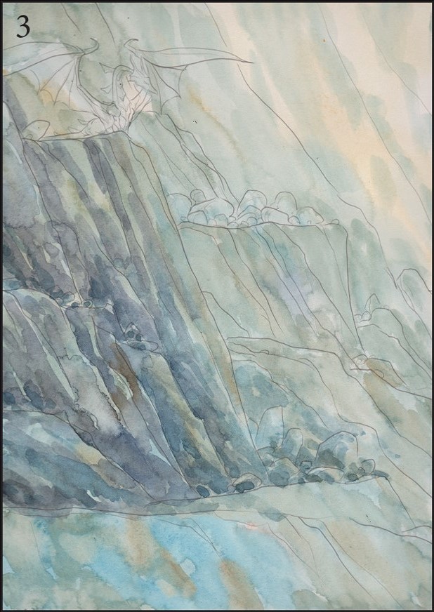
fig. 3 Once the wash has dried, it’s time to begin adding details. Mix up some Payne’s Grey and Phthalo Blue and with your size ‘6’ round wash brush, work your way through the rocks, keeping your strokes broad and loose for now. Drop in some random Burnt Sienna and Yellow Ochre into wet areas, to achieve that ‘rocky’ look.
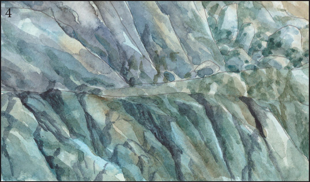
fig. 4 Work out the cracks in the rock now with a size ‘4’ rigger brush, using a darker mix of Payne’s Grey and Phthalo Blue. This is where things become interesting—and fun (if you’re a patient person, that is). This process requires a fair amount of intuition. If you need reference while you work (as I often do), it’s a good idea to open up some rock/mountainside photos from your collections or your Internet browser. It can often help immensely, although it’s worth bearing in mind that you should avoid copying the photographs too closely—we’re looking for the ‘spirit’ of the rocks you’re looking at here. If it’s your intention to copy a photograph to achieve a photorealistic style, then that’s all well and good, but we’re ‘creating’ this image and we only need a vague likeness of rock to pull this painting off. That said, pay attention to what you’re doing and strive for balance—don’t overwhelm the eye.

fig. 5 So, having spent a while chipping away at the rock face, we’ve reached a point where it’s starting to look as it should. Vary your Payne’s Grey/ Phthalo Blue darks as you go; this will help to create a natural rocky look. Keep the lines from looking too ‘hard-edged’ by adding some water to them before they dry—this will help the paint disperse.
WHAT YOU’LL NEED
A4 Arches 300 gsm hot press watercolour paper
Mop brush (approx size ‘4’-’6’)
Size ‘6’ watercolour brush
Size ‘4’ Rigger brush (or round detail brush equivalent)
Tissue paper
COLOURS USED
Phthalo Blue, Burnt Sienna, Yellow Ochre, Payne’s Grey, Violet, Cadmium Yellow, Cadmium Orange, White Gouache

fig. 1 Having worked out the placement of your rocks, paint around them to cement their shape.

fig. 2 With the background colour, make an underpainting, laying in the shadowed areas. Add a wash of flat colour (streaky lines and uneven strokes are to be encouraged—these will add texture).

fig. 3 Details come last. Work your way around the image adding the cracks and creases, always bearing the light source in mind. In this example, the light source comes from the left; the shadows fall to the right.
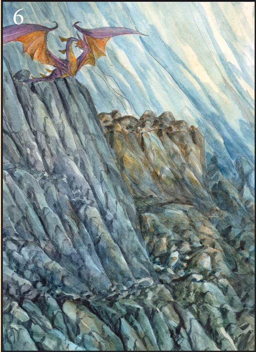
fig. 6 Work around the image now, varying the colours but working in very much the same manner. The rock formation (to the right) has much more Yellow Ochre and Burnt Sienna in the mix; this helps to break up the whole image, as using the same mix throughout would have been monotonous. For the dragon on the rocks, lay in some Violet for the wings and Cadmium Yellow and Cadmium Orange for the chest and the underside of the wings.
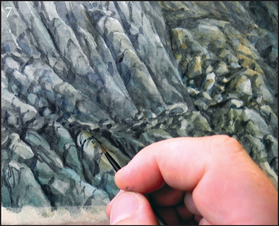
fig. 7 Here’s a close up of the detail work that goes into rendering rocks. Note the way the light falls to the right and the way the shadows fall off to the left. This should be kept in mind all the way through the whole painting process.

fig. 8 Add more details to the dragon, without going too over-the-top with the colours. We want to know it’s there, but not at the expense of overpowering the whole image, as it’s only a small part of the painting. Mute the colours by adding them, then blotting them back with a tissue. This is very much a process of adding and taking away, adding and taking away. The highlights are carefully placed with white gouache. Again, take care not to go too far with it. Go around the rest of the painting and pick out areas that could benefit from having some light areas. Remember, here the light falls from the right.
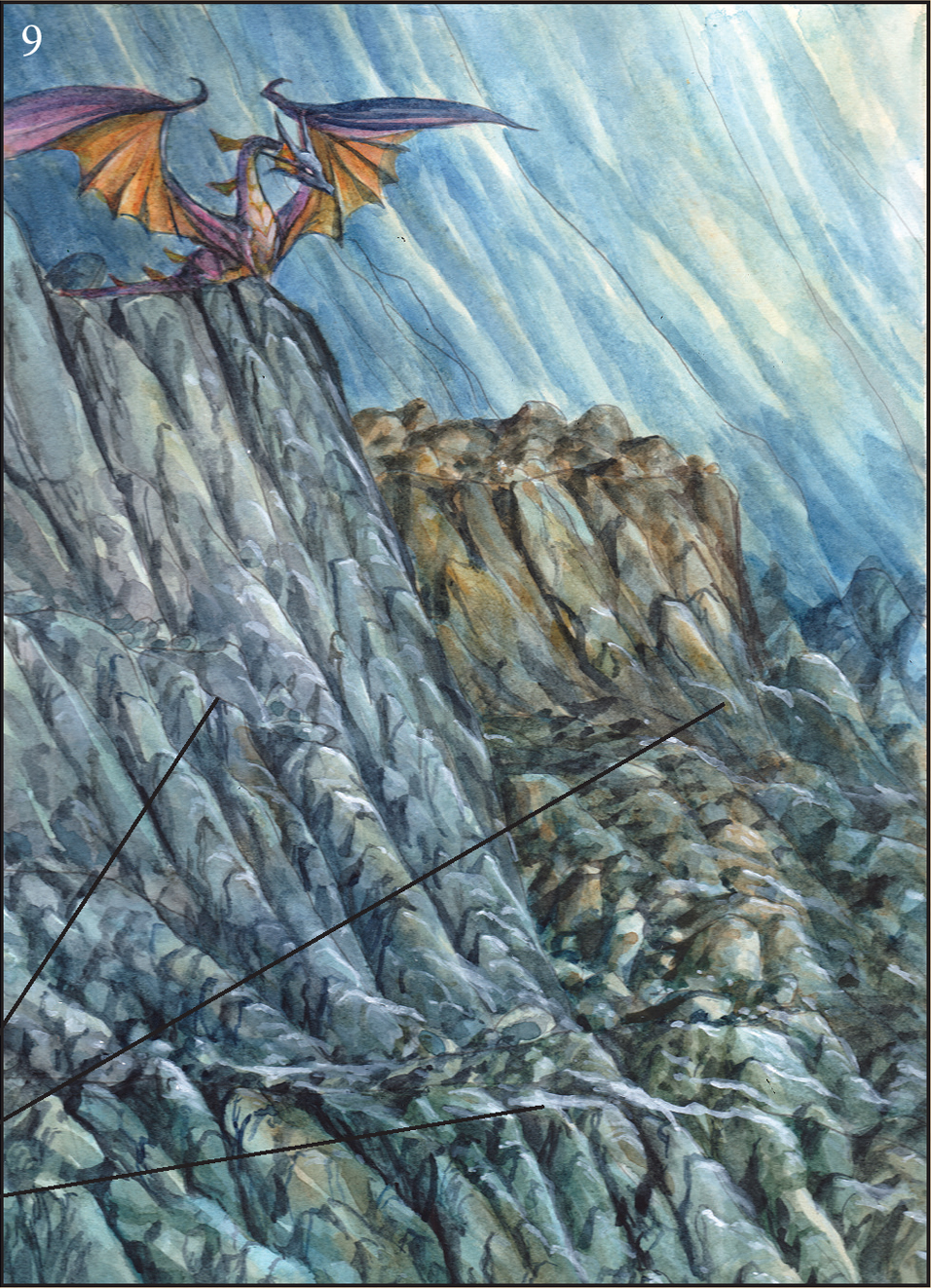
fig. 9 This is where we begin to go around the rest of the painting and make any necessary adjustments, tighten any loose areas and balance everything out. Darken the area behind the dragon with a wash of Payne’s Grey/Phthalo Blue, add more shadow and light around the rocks and pick an area or two that could help the viewer’s eye move up from the bottom of the painting to the dragon (see lines at right).
LINE AND WASH—‘THE TROLL’
For this example, we’re going to handle the ‘Line and Wash’ technique in a slightly different manner. That is to say, we’ll be adding the pen marks at the end of the process, instead of at the beginning. The advantages of working this way aren’t really all that pronounced—it’s quite simply another way of working. The ink lines here will serve to strengthen the foreground elements. (But please bear in mind, this could also have been achieved by planning this in advance.) The painting process is really quite the same as any other watercolour process you may have seen in this book, so we’ll skip through certain sections a little quicker than usual.


figs. 2-5 The working drawing in progress.

fig. 6 With a size 2 round brush, lay in a wash of Yellow Ochre.
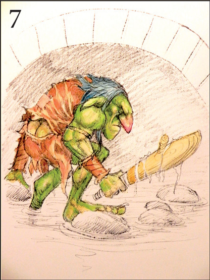
fig. 7 With the same brush, lay in the skin tones and clothing colours. As we’re working transparently, create the creases by working around them with darker washes of the same colour. For his skin, lay in a green wash, then use the same colour with more paint to create his musculature. A touch of Cadmiun Red to his nose will give him that ‘worn’ look.

figs. 8-9 Lay in a wash of Ultramarine and Ochre into a flat wash of pure water for the bridge, a wash of Phthalo Blue for the water. Remember, always keep your washes loose when painting water. For the shadowy area under the bridge, make up a mix of Payne’s Grey, Burnt Sienna and Phthalo Blue and lay it in using a couple of washes, allowing each to dry.
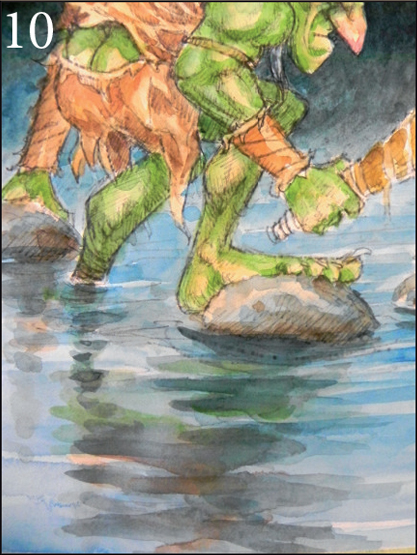
fig. 10 For the reflections in the water, lay in some clear water and create patterns using the colours from the figure above, mixed with the colours we used for the shadows beneath the bridge. This brings the whole image together nicely.
MATERIALS USED:
1 sheet 300 gsm Arches
hot press watercolour paper
Tissue paper
Size ‘2’ round brush
Size ‘6’ round brush
.1 drawing pen
COLOURS USED:
Ultramarine Blue
Burnt Sienna
Phthalo Blue
Leaf Green
Yellow Ochre
Payne’s Grey
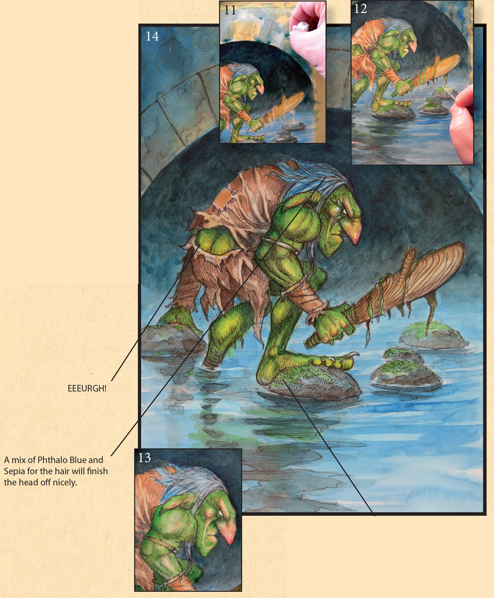
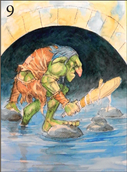
fig. 11 Having laid in a wash of clear water over the bridge area, drop in some more Yellow Ochre and Phthalo Blue. As it’s drying, pull out some paint using a dry piece of tissue paper—this will create a lovely stone texture.
fig. 12 Time to work our way around the whole painting now. Picking up things we’ve missed, strengthening up loose areas colours, such as tightening the water, clothing, etc.
fig. 13 Moving back into the Troll’s face. The fact that his skin is green is all well and good, but blood still moves around beneath it. Adding some red gives the impression that he’s recently been active or is about to be (echoed by his body language and his gaze).
It’s also necessary for some warm colours to be added to balance out the green skin tones. The warm colours in this painting draw the eyes in and hold them there.
fig. 14 With due care and restraint, go around figure and foreground elements and accentuate details with the .1 drawing pen.
THE CAULDRON
With this demo, we’re going to take a faster, looser approach. Shake up those arms and wrists, let’s splash some paint around.
This one started out its life in another form and I wanted to repaint it, so it was important for me to make sure all composition flaws were ironed out at the sketch stage (see fig. 1 at left).
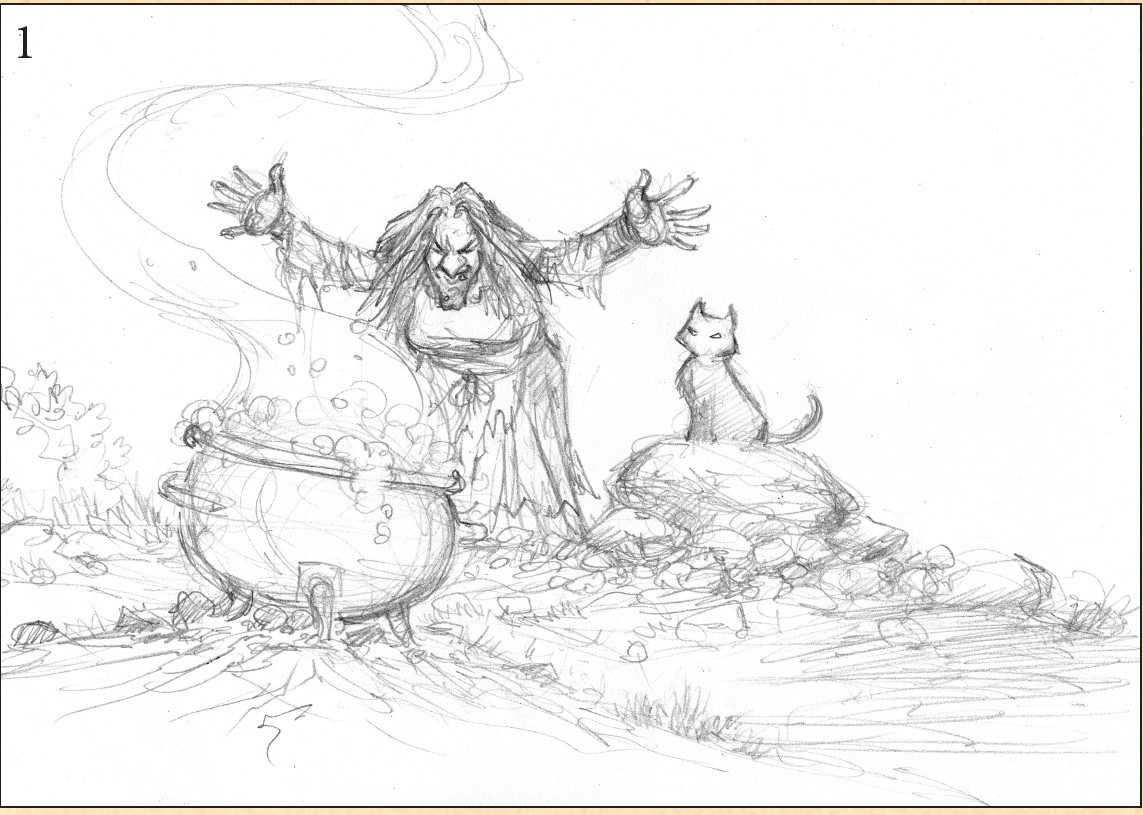
fig. 1 The working drawing. Notice how loose it is, and how underworked it is tonally? This is because the paint will do most of the work. Having too much of an underdrawing (especially when using watercolour) can cause your art to become muddy and messy. Avoid that by putting in only what you need to make the painting work.

fig. 2 Having prepared your paper, wet it completely again with your mop brush and lay in flat washes of colour into the water. Don’t overwork them, though—just lay in the base colours at this point. The beauty of watercolour is that you build the colours up gradually. Remember, you can speed up the drying process with a hairdryer. Keep the colours pure and allow them to blend into each other without drying with hard edges. Once the first wash is dry, lay in another (gradual) tonal wash.
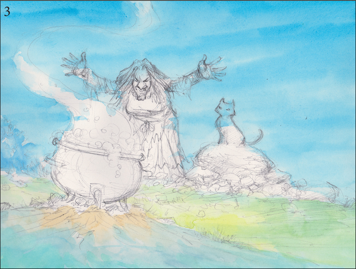
fig. 3 Having allowed the rest of the painting to dry, move back into the sky area. It’s okay at this point (as our flat wash has already been prepared) to hint at streaks across the sky—nothing too hard edged, though.
WHAT YOU’LL NEED
Sheet of A4 Arches hot press paper
Mop brush
Size ‘6’ round brush
Size ‘0’ round detail brush
Tissue paper
COLOURS USED
Cerulean Blue, Leaf Green, Lemon Yellow, Payne’s Grey, Burnt Sienna, Cadmium Red, Yellow Ochre, Cadmium Yellow, White Gouache
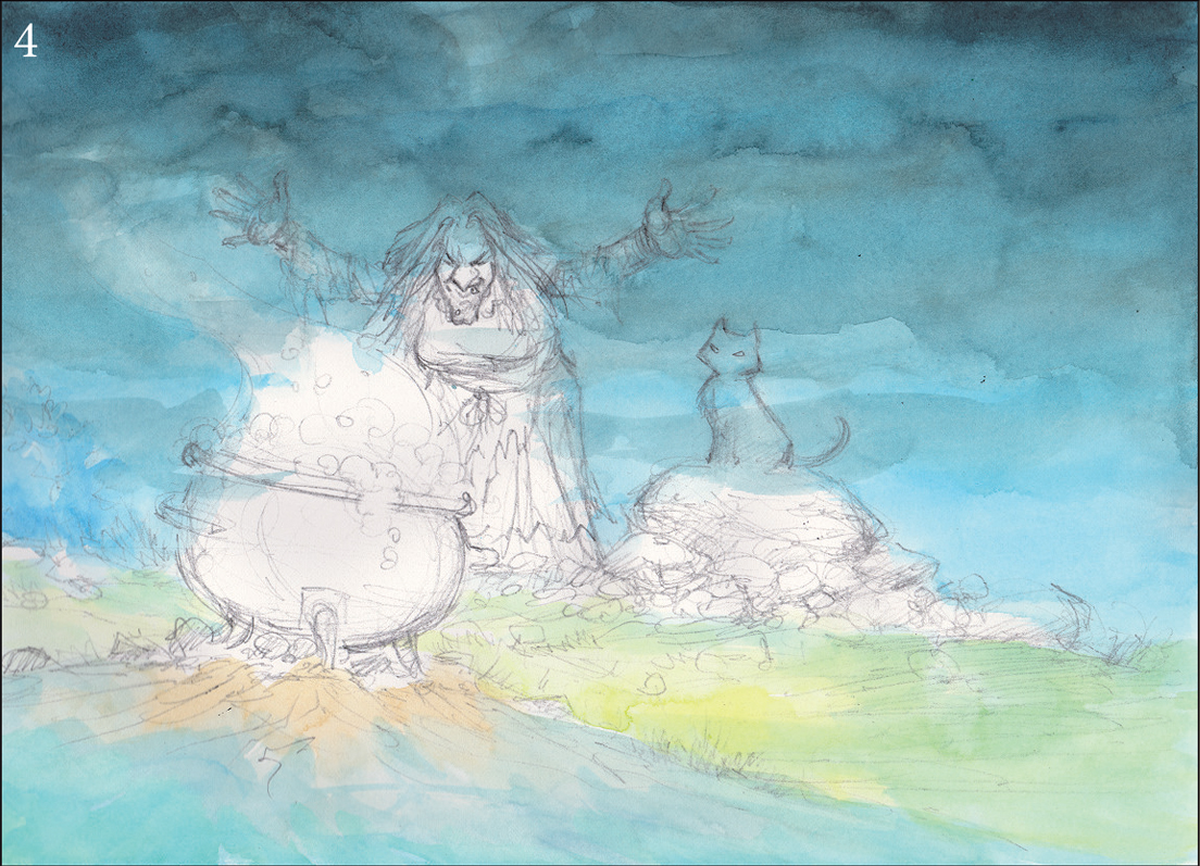
fig. 4 With your mop brush, lay in a wash of pure water and while it’s wet, drop in a mix of Payne’s Grey and Phthalo Blue. Don’t be too concerned about the way it dries; however, try and avoid very hard edges. Before it dries, blot the bottom with your tissue paper to blend it off into the lighter colour below. It’s worth pointing out that we aren’t too concerned about painting over or ‘through’ other elements of the painting. The reason for this is because we’ll be rendering some of it in an opaque manner.


figs. 5 & 6 Now that we’ve established our base colours, we’ll get to work on the underpainting. For this you’ll need to mix up some Payne’s Grey with Burnt Sienna (to create a nice neutral dark colour). Go around the whole image using the same colour. For the rocks, notice how we haven’t painted the whole thing—just the right hand side, where the shadows fall. It’s probably a good idea to pay particular attention to the light and shade of the painting from this point on.
Make sure the underpainting isn’t too heavily rendered. We’re just looking for enough to show through the transparent colours we’ll be painting on top. If you make the underpainting too dark, the rest of the painting will have to follow suit, or at the very least it will be difficult to tone back down. Gently does it. This is watercolour we’re using here. Be careful not to overwork the bubbles in the cauldron—keep them simple for the moment.

fig. 7 Pay a little more attention to the colours within the painting now. Still working transparently, with your size ‘6’ round brush, lay down some Lemon Yellow and Leaf Green washes into the ground and the rocks. It’s OK to lay some water down first if you’d like your colours to blend into one another. Blotting as you go with some tissue paper can create some great textural effects, although it’s best to try this on a separate sheet first.
For the witch’s dress, lay down a flat wash of Cadmium Red and Phthalo Blue at the bottom. Give the cat a flat wash of your ‘underpainting’ mix. With your size ‘6’ round brush, drop some Yellow Ochre and Phthalo Blue alongside each other into some clear water for the metallic texture of the cauldron.

fig. 8 Focus on the Witch again here. With some Cadmium Red and your size ‘0’ detail brush, paint in her nose and her cheeks to give her a nice warm glow, working around the red with the Leaf Green. There! Doesn’t she look lovely?
Use the same colour for her hands. Lay in a flat wash of Cadmium Yellow for her tattered apron. With some Burnt Sienna, work around the rest of the cauldron to give it that ‘worn’ copper look we’re after.

fig. 9 Before we do too much more, it’s best to stop and assess how things are going. The flat washes are all looking okay, the shadows have been given enough attention, but the background needs some more detail. Now we’ll begin to add some foliage and grass to wake the painting up a little. With your size ‘0’ round detail brush, lay in some grass and some leaves, always thinking about how the light will affect them.
Paint in the cat’s eyes with some white gouache. Then begin to render the bubbles in a little more detail. For the wispy smoke, first lay in the shape you’re after with some clear water and then work some diluted white gouache into it, building it up with more opaque gouache nearest the cauldron, tapering it off at the top of the painting. Mix some Phthalo Blue and white gouache together to create the light blue for the randomly painted rocks in the background.
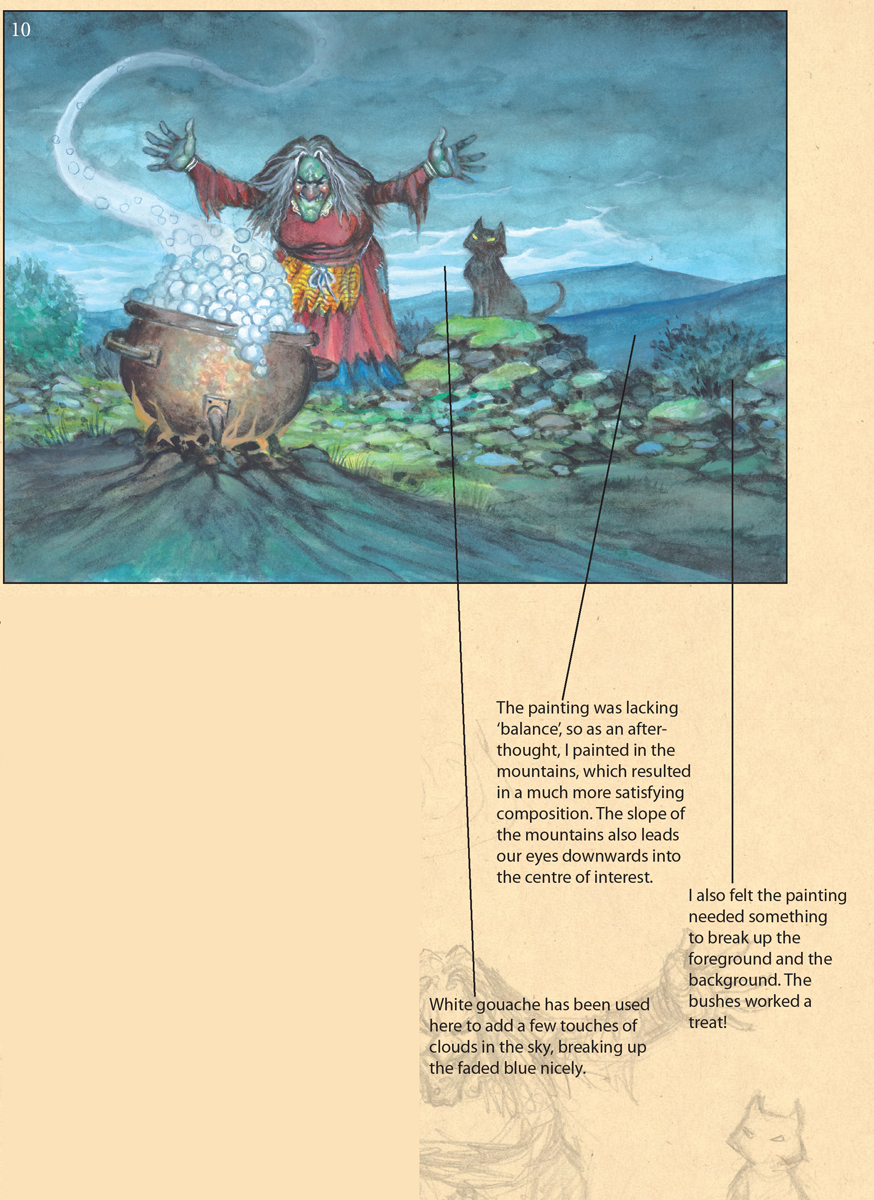
fig. 10 To finish, it’s important we take the time to balance everything tonally, adding shadows and highlights, making sure that no particular area of the painting draws too much attention to itself (unless that’s our intention). Begin with the bubbles in the cauldron—tone them down a little (where appropriate) by laying some Payne’s Grey into the shadowed areas with your size ‘6’ round brush.
You’ll notice the addition of the mountains and foliage in the background. Sometimes these last-minute ideas can transform a painting. Looking back at the earlier steps, it’s easy to see that this was necessary.
Adding the streaks in the sky with white gouache also wakes up the sky nicely. Add a wash of Pthalo Blue/Payne’s Grey to the foreground beneath the cauldron to allow our eyes to focus upon the middle ground.
I’d go so far as to say that the last 5% of the time spent on the painting is often the most crucial part of the whole process.
THE BANNER
Sometimes an image comes so clearly and easily it’s hard to shake it off. This one came just as I was finishing up this book. I didn’t need another painting and with deadlines looming, I certainly didn’t need more work—but it insisted on being painted. I would have loved to spend more time on it, but am happy to have photo-documented a few steps to show how I managed to paint it. All totaled, this is the product of approximately four hours’ work from beginning to end—such is the nature of watercolour!
The trick to remember with landscapes such as this is to always have ‘depth of field’ in your mind. The distance between the background and the foreground should be properly represented. An easy way to do this is to use less detail for the background and more for the foreground. See how the mountains in the rear are just variations of one colour—and how more and more colour creeps into the mountains as they appear closer? It’s also a good idea to add more light/dark contrast in the foreground for effect.
The real ‘star’ of this composition—for me at least— is the flag. That passage of red (red being the most dominant colour of all) really draws the eye in and holds it there; this also helps to separate the dimensions.
All in all, I’m quite happy with this one.


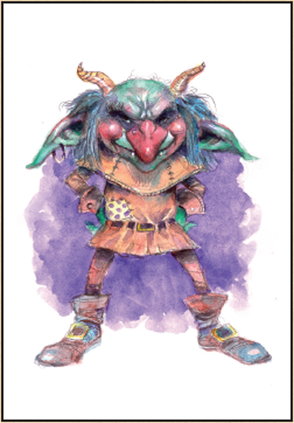
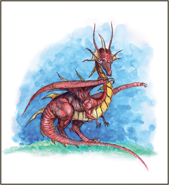
DESIGNING CHARACTERS
Due to its easy and immediate nature, watercolour particularly lends itself to quick sketches and it’s perfect for conceptualising characters.
As I’ve mentioned elsewhere in the book, there are so many different approaches one can take, different levels of finish that can be achieved with watercolours. (The examples on this page alone should give you some idea.)
How easy is it to scribble up a quick sketch and throw some watercolour over the top? This guy (right) took approximately 15 minutes to colour up from a sketch—and that includes drying time. (He’s also my favourite character on the whole page).
So next time you reach for your computer—or your colouring pencils—to colour up your character drawings, why not consider using watercolours instead?