Floral design, much like cooking, is at once entirely approachable and frustratingly intimidating. It is my goal with this book to provide foundational tools, techniques, and principles of floral design that will give you the resources to explore the richness in this medium and completely fall in love with floristry as I have. In this section, you’ll find notes on sourcing ingredients, essential tools, design tips, and more, so that you have the building blocks to successfully create the projects in later chapters and your own artful designs. It’s my hope that the following pages answer questions, provoke thought and further study, and pique your interest into this satisfying work so that you continue to experiment with this ephemeral art form.
The task of sourcing floral ingredients can be time-consuming, challenging, crazy-making, and—when you do track down the perfect ingredients—utterly satisfying. The success of a given design depends greatly on the careful selection of the materials—their freshness, coloration, and size are all of great importance. Just as a conscientious chef must seek out the best sources for a recipe’s ingredients, the florist must also search for the finest growers and markets that can reliably supply interesting, high-quality blooms. I spent years working in restaurants prior to my floral career, and I’ve noticed parallels between the worlds of food and of flowers. The best restaurants create dishes representative of the season, sourcing locally as much as possible; they realize that this is how the medium of food can communicate a sense of place and time. When done well, this creates engaging dishes that spark memories, delight all the senses, and help sustain a vibrant local food economy. I believe this is a valuable goal for florists as well. And thanks to today’s Slow Flowers movement, people are becoming more aware of the importance of sourcing flowers locally from sustainable sources.
Although I source flowers from all over the world, my search for materials always begins in my own backyard and expands outward from there. I live in the northern United States, and we have a short growing season and somewhat limited availability, so I’ve had to become a savvy sourcer. During the growing season, I buy as much as I can from local flower farms. We are lucky to have a wonderful weekly farmers’ market, a local flower growers’ cooperative, and numerous local greenhouses. I encourage you to explore your own location, find your best local sources, and frequent them. Get to know the growers, and help them get to know you—the relationships you forge will benefit you both. Most of the growers I buy from ask me what flowers I’m interested in, then offer to grow them—what could be better? In addition to local farms, numerous flower growers in other states will ship cut flowers. Many have a passion for a specific family of flowers—say, heirloom roses—and with advance notice will ship freshly cut flowers via overnight air.
In addition to investigating your regional options, look into buying from wholesale flower markets. In the United States, proper licensing is often required to shop at these markets, so prepare appropriately by doing some research ahead of time. A good wholesale market is a wonderful place to learn about flowers. Botanical materials gathered from near and far are offered for purchase. Some, like the cluster of markets on Twenty-Eighth Street in New York City or the San Francisco Flower Mart, have a dizzying array of delights on display for purchase. Those in smaller towns may have more limited offerings, but all floral wholesale markets allow you to place advance orders, which florists typically do when planning events. When you open an account with a wholesale market, you will be given a sales rep to work with—consider this person a valuable member of your design team. A good sales rep will quickly learn your preferences, and because they are acting as your eyes and ears, they can make recommendations for materials that will elevate your work.
Sourcing can be time-consuming, as there are many wonderful sources for materials, each with their own strengths. I’ve listed some of my favorite flower sources in the “Resources” section on page 218. Time spent learning about your options—from local to global—will broaden your palette and connect you to the sources of inspiring ingredients throughout the year.
When I met and fell in love with floristry, I became curious to learn as much as I could about the people, techniques, and design process of this world. Some years later, when I became interested in floral wearables, a new sort of curiosity was born (an obsession, really): to know the out-of-water longevity of every possible flower, foliage, blade, and berry. In my floral work up until that point, most materials I used were arranged directly into water, so their longevity wasn’t paramount. I did have a go-to list of reliable flowers for making crowns, boutonnieres, and corsages, but my list really began to grow after I became obsessed with floral fashion and wearables. Ideally, the ingredients in floral wearables have the strength to last the length of the event they’re intended for. Longevity and durability are important to the success of a given design. My list of reliables, gathered over the years by observation and testing, is my artist’s palette—an ingredient list that I delight in adding to and look to for inspiration. I encourage you to borrow from the list I’ve gathered, observing the work of others—watching what materials they’re using and in what season—and adding your tested favorites to grow your own list. Test materials as often as you can—the fallen bloom from a hanging pot of begonia, a hellebore snipped from the garden, a stem from the potted kalanchoe picked up at the grocer. The more you test, the broader and more exciting your palette becomes.
When making selections, in addition to the longevity and durability of materials, I also consider the form, color, size, and texture of materials. The choices you make with these design elements will allow you to convey (or conjure) emotion with your work—the true goal and definition of art!
Form, or the physical shape of floral elements, is an important consideration when planning a design. The choice to use rounded ranunculus, garden rose, or peony in a design can create feelings of calm, romance, and softness, while choosing to use angular feather celosia, spiky thistle, or rigid, pointed kochia can create feelings of energy, excitement, and strength. Choosing to focus on one form within a design, and repeating it with all your material selections, creates unity in the piece; choosing to combine different forms within a piece creates contrast. You must also consider the entire form of the composition. When attempting to create a piece with a distinct geometric shape intended to create impact, such as the dome hat on page 181, you’ll need to take extra care with perfecting the intended shape. It’s essential to know what overall form you intend to create before starting the design process—this will inform all of your material selections.
Color is arguably the design element with the greatest impact. It is the first thing we notice about a piece, and it most certainly influences our feelings about it. Put simply, warm colors excite and energize, and cool colors calm and soothe. Even if the forms in a piece are rounded and soft, such as garden roses or peonies, if they are vibrant red or bright yellow, they’ll convey a dynamic, energetic message.
Conversely, if an angular material such as feather celosia or ginger is the design focus, the artist can still convey a message of calm and softness by choosing to use pastel pink celosia or white ginger instead of the electric red and orange shades also available. I tend to gravitate toward cool hues, as I look to plants to calm me and soften my mood. This preference often guides my color selections, but it doesn’t prevent me from admiring bright colors in others’ work and playing with bright color on occasion. I encourage you to observe your surroundings—your home decor, clothing, jewelry, and the art you gravitate toward—and I’m certain you’ll see a pattern of color preference emerge. Allow this leaning to contribute to your unique aesthetic—I believe it lends personality to your work and should be embraced! In addition to the emotions colors convey on their own, color harmonies—the relationship between colors in a design—can communicate their own messages. I recommend becoming familiar with the twelve-spoke color wheel and diving into the myriad ways color can be combined.
There are twelve distinct color harmonies, nicely outlined in the American Institute of Floral Designers’ AIFD Guide to Floral Design—an essential text for any florist; of these, the five that I see most frequently used in floral design are monochromatic, analogous, complementary, split complementary, and polychromatic.
Monochromatic color harmonies, as the name implies, are single-hue color schemes. Monochromatic pieces can contain many shades, tones, or tints of that hue, but all are values of the chosen color. (See page 181 for an example of a monochromatic color scheme.) Analogous harmonies contain three to five colors that occur next to each other on the color wheel. I often choose to play within an analogous color scheme, especially when venturing into brighter hues. I choose a three- to five-color “wedge” from the color wheel—for instance, red, red-orange, orange, yellow-orange, and yellow—and layer my design with many floral representations of those hues. I find that hot colors can inadvertently conjure a certain garish quality, and I believe this is softened by adding multiple color variations within the chosen color wedge. When this is done well, the color scheme gains a certain sophistication and calm quality. See page 207 for an example of an analogous color harmony. Ariella Chezar is a great example of a florist who works with vibrant color expertly—with refined, cohesive results.
Complementary color harmonies comprise a pair of hues situated directly across from each other on the color wheel. Combining colors from opposite sides of the wheel creates a color interaction that innately appeals to humans and a dynamic, energetic composition. An often-seen variation to this harmony, near-complementary color harmony, is achieved when a given color is paired with a color that lies next to its direct opposite. The headpiece on page 171 shows this color harmony—pairing red with yellow-green instead of true green, red’s direct complement.
Another common harmony is the analogous-complementary color harmony, created by adding the two adjacent colors on either side of one of the colors in the complementary pair. The necklace on page 55 shows this harmony—varying shades of purple are paired with purple’s direct complement, yellow, and layered with yellow-green and true green. Split-complementary color harmonies are created by combining a color with the two colors that lie on either side of its direct opposite. An example of a split-complementary color scheme is the combination of red with blue-green and yellow-green. All the complementary schemes are best executed by adding many varying representations of the chosen colors. Bicolor blooms, such as yellow and purple pansies, are designer gold—they can be used to instantly marry two complementary colors within a scheme.
The last of the five harmonies that I often see is the polychromatic color harmony. “Poly,” meaning “many,” describes this harmony, comprising many otherwise unassociated colors. This can be seen in Dutch masters’ paintings, in the wonderful work of Anne ten Donkelaar, and in the exuberant floral art of Azuma Makoto. In addition to familiarizing yourself with the twelve-spoke color wheel and its many harmonies, I recommend consulting a comprehensive color wheel and having one present in your workspace. My favorite is the quirky “Martian Colour Wheel” created by Warren Mars. The wheel is very useful to florists, as it contains many shades, tones, and tints and has the added charm of color-true edible names such as “ham,” “Parmesan cheese,” “avocado,” and “turmeric.”
It is important to consider both the size of the complete arrangement as well as the size of the individual ingredients within an arrangement before creating a design. Florists must continually consider size—it is truly crucial to the successful execution of every type of floral work, and it is essential when considering how to marry a floral piece to it is setting. It is most certainly important to the success of floral wearables. If a florist wants to create a delicate, light, ethereal piece, selecting small blooms will carry this feeling into the piece, whereas choosing large, heavy blooms will weigh down the design and counteract the desired effect. When designing to accent a delicate part of the body—say the earlobes or fingers—the size of the floral material is paramount to the execution of the design. Petite, light materials will much better complement these body parts than large, heavy ones. Keep this in mind when making your floral selections or consider manipulating large materials to make them more suitable for pieces intended for petite places. For example, consider working with individual allium florets instead of the whole bloom head, or deconstructing a stem of delphinium and using the florets instead of the entire floral spike.
Texture—the surface appearance or physical qualities of natural materials—is another important element to consider when selecting ingredients for a given design, as textural choices can add richness and context and can also elicit emotions or spark associations for the viewer. A mix of diverse textures can create contrast or tension in a piece; choosing one texture and combining materials that all share that textural quality can create a more unified, cohesive piece. Materials that appear fuzzy, silky, or velvety can evoke comforting emotions, while rough or spiky materials can stir more challenging emotions.
Choosing to create floral wearables using ingredients that resemble commonly used clothing textiles, such as leather or velvet, can play to the viewers’ associations with these familiar materials and add even more charm and surprise to the pieces. For instance, the slightly fuzzy undersides of thick magnolia leaves resemble rich, auburn suede, and the fine, downy nap of lamb’s ear foliage resembles thick velveteen fabric. One could craft a winter muff out of lamb’s ear or a pair of floral shoes out of leathery magnolia, creating an intriguing collision of the familiar and the unexpected.
All fresh flowers have a life span—a frustrating quality that challenges all of us, from grower, to designer, to consumer. In response, those of us on the front end of the process make decisions and perform care rituals to make the most of each bloom. When creating floral wearables, I rely on a long list of reliable materials that I have tested over the years. These reliable materials are ones that you can expect to last the length of an event, but they still require proper handling upon receipt to perform at their best.
I typically make sure to have my flowers on hand two to three days before I intend to present them, to allow enough time to process them appropriately. For example, if a floral headpiece is requested for a Saturday event, I’ll bring the flowers into the studio on Wednesday or Thursday. After they arrive, I clean their stems thoroughly, removing damaged petals and unnecessary or excessive foliage, cut the stems at an angle with sharp shears, and place them in clean buckets filled with cool water that has been treated with Floralife 200, a conditioner made for the floral trade that increases freshness and hydration. In addition, I use Quick Dip hydration solution for all field-grown flowers and woody-stemmed materials such as roses and hydrangea. I allow the flowers to rest and hydrate in their buckets for at least 3 to 4 hours before tucking them into the cooler.
I also love to design with more delicate blooms such as lilac, hosta, fritillaria, and hydrangea florets. For these less-reliable materials, I often employ an additional hydration step that I recently learned from master florists Gregor Lersch and Hitomi Gilliam. After these stems have had a good long room-temperature drink, I trim them all to the length I plan to use, and place them in a sealable container or bag that I’ve lined with damp paper towels. I lay the flowers in a single layer on the towels, spray them with water, and then repeat with another layer of damp paper towels. I continue to layer until all my flowers are safely tucked in and then spray the inside of the container with water as well. I then secure the lid on the container and place it in my cooler. The container, which acts as a moisture chamber, can rest in the cooler for 24 to 48 hours. This step allows the flowers and foliage to “harden”—hydrating through the surface of their petals or leaves. Since I learned this method, I’ve used it on many notoriously delicate, wilt-prone flowers with wonderful results.
After the wearable pieces are designed, I spray them with water, tuck them into an airtight plastic box or bag (look for compostable plastic options online at food supply companies) that I’ve also spritzed with water, and place it in the cooler. The final (optional) step is to apply a finishing spray to the pieces. This is done right before the pieces are presented. This seals the surface of the piece, locking in the moisture I’ve worked hard to secure.
I often hear florists say that they make their wearable pieces at the very last moment before an event. If this is your method, I urge you to try the steps just outlined. Making them earlier allows for much more thorough hydration of the flowers and foliage. Instead of just hydrating through their stems, they hydrate through the pores in the surface of their petals and leaves, increasing their durability and life span.
I realize not everyone reading this is a professional florist with a cooler and access to (or interest in) all these floral trade potions. A dark, cool space such as a basement or barn also works well for storage in place of a floral cooler, and immaculately clean buckets and clean, cool water will certainly suffice—especially when you’re using locally sourced, freshly cut flowers. And I’ve used my home refrigerator with success countless times over the years, though it’s important to note that the ethylene gas released by ripening produce can shorten the life of flowers. If you plan to use your refrigerator to preserve your flowers, I recommend purchasing an ethylene absorber. Home refrigerators also often have very cold spots, which pose a possible freezing danger. Flowers will not bounce back after freezing, so get to know the zones of your refrigerator before using it to store a precious floral artwork.
I encourage you to try these tips and to test flowers and foliage incessantly! Soon you will have a process that works for you and a long list of reliable floral favorites of your own.
When I first started as a florist, I had no real process—only a strong idea of what I wanted to create and a vague idea of how to arrange the components to reach the desired end. Sometimes the designs were successful; other times they weren’t. I’d read about the principles of floral design (I encourage you to as well), but I didn’t have a reliable system or set of guidelines of my own to use to put them into play. Through years of reading, observing others, creating, taking apart, and creating again, I’ve developed some helpful rules based on a set of principles that I use over and over again. These design rules guide my work and lend a certain ease to my process, whether I’m working on a delicate pair of succulent earrings or a large-scale floral installation. When I’m stuck, I lean on them to solve my questions. If a design feels stiff, or forced, or too contrived, these rules help me edit the piece back to a better, more natural place.
Most of these rules are simple and intuitive, but worth outlining here, as they help create a streamlined system, and I’ve found them valuable to students who struggle with their own process. I share them here with the hope that they will be just as helpful to you.
Unlike painting, where you can mix colors and create your own palette, flower colors cannot be easily changed. However, careful selection and thoughtful placement of flowers in a composition allow the designer to create cohesive, well-blended pieces. When combining colors in a piece, I typically work from darkest to lightest—placing the deepest tones first and layering lighter tones on top. This draws the eye into the design, creating depth in the piece. This is especially important when combining high-contrast materials—say, white and black flowers. Placing them side by side on the same plane would result in a spotted, polka-dotted appearance.
When it comes to the weight of materials, I typically work from heaviest to lightest and largest to smallest. Heavy, dangling, or large elements are added to the piece first, and each subsequent layer is added in order from most to least substantial.
Air (or space, as florists refer to it) is its own layer—an important ingredient that is purposely maintained between the floral layers. This ensures that each layer is visible (to the extent that you choose as the designer), thereby creating depth—critical to a successful composition. Without depth, the design will be one-dimensional and static. I also think about leaving space around individual blooms, instead of placing them so closely that they appear forced or squeezed together. Giving each bloom its own space allows the eye to move freely within the piece, creating a naturally pleasing, effortless-looking composition.
I’ve always appreciated naturalistic, uncontrived floral design—the kind seen in a Dutch masters painting or that looks plucked from the garden—and I’ve sought to reproduce that with my work. But it wasn’t until a conversation with a very talented floral artist and friend, Joseph Massie, that I realized I achieve this by employing three design principles: the golden triangle, the rule of thirds, and “3-5-8.” All these concepts are derived from the golden ratio—the fascinating mathematical concept that informs the structure of all natural things.
Joseph and I were chatting at a floral conference while I worked on a floral necklace. I placed the first layer of blooms—three roses of varying sizes—laying them in a triangular fashion on the necklace base: the largest bloom just to the left of center, a slightly smaller bloom about one-third of the way up the left side of the piece, and the smallest, a rosebud, on the right, nearly at the top of the necklace base. As Joseph watched me work, he asked if I knew why I was spacing the flowers as I was. I told him I wasn’t exactly sure why, but that I work in triangles—placing floral components in my designs following a series of asymmetrical triangular placements. Each point of the triangle receives a different “serving size” of floral material, layer by layer, until the piece is complete. He told me that I’d been applying the principles of the golden ratio to my way of designing. Further exploration revealed that the proportional rule I used to allocate my materials is derived from the golden ratio rule of proportion, the triangular placement that I rely on comes from the principles of the golden triangle, and the choice to place my focal point off center can be traced to the compositional concept of the rule of thirds.
The golden ratio, 1:1.618—also called “phi”—is a mathematical concept, famously explained by the fifteenth-century mathematician Filius Bonacci. His “Fibonacci” number sequence is the mathematical representation of the proportional patterns observed in nature. Phi is the value that defines the relationship between the numbers in the sequence.
sequence 3-5-8
This “sacred geometry” can be observed in the natural structure of many things—from the number of petals of a flower, to the proportions of the leaf pattern of a succulent, to the spiral configuration of seeds in a head of a sunflower. The golden ratio offers a way to think about the proportional relationship among elements in a composition and shows that an innately pleasing natural balance is found in proportions that are carefully chosen to not be equal but to instead follow this pattern.
The sequence 3-5-8 is part of the Fibonacci number sequence; it is used to decide the relative quantities of each design element in a composition. The sequence should not be interpreted literally in terms of how many ingredients to use, but that ratio should help guide the appropriate relationship among the large, medium, and small amounts of a given element in a composition. Remember the three roses of varying size in my necklace story? The largest rose represented the 8 in my design, the smaller rose the 5, and the rosebud the 3. Following this natural law of proportion will help you assign visual weight and allocate color throughout a piece, resulting in a naturally proportioned look.
The golden triangle is an isosceles triangle in which the sides are in golden proportion (phi) to the base. The triangular placements I’d been using in my work follow this concept. It’s the relationship of the points in these triangles that has been the most helpful to me, especially informing my stem placements. For my students, awareness of this concept has been particularly helpful. When a piece is becoming too stiff, symmetrical, or static, the golden triangle can help illuminate what edits are necessary to coax the design back to a naturally pleasing, well-proportioned composition of elements.
rule of thirds
The rule of thirds is another useful concept that designers use to choose where to place focal emphasis in a composition. It’s most commonly applied in photography, painting, and filmmaking, and just as easily applied in floral design. Imagine that a composition is contained within a rectangle and divided into nine equally proportioned boxes. Two vertical lines and two horizontal lines make up the grid. If you’re analyzing a photograph of a floral design, adjust the image so the very tips of the flowers are just contained within the frame, then apply the grid. The rule suggests that important focal elements are best placed along one of these lines—or where they intersect—to create compositions that draw the eye in and lead it throughout the piece. If multiple focal interest areas are placed along these lines, you can create a visual path for the eye to follow from point to point, resulting in a dynamic, rhythmic composition. You can choose to exaggerate these placements or play with them more subtly. If you instead place the focal point centrally and additional focal areas symmetrically, the resulting piece is much more static. The eye is drawn into the piece but stops, and the rhythmic quality and movement of the composition is dramatically reduced.
To bring all these concepts together, I visualize the overall shape or physical edges of the design I plan to create before I start arranging. This shape, which I call my “canvas,” is the total space I have to work in. I choose a starting point and, borrowing from the compositional concept of the rule of thirds, I place my first, most substantial floral element. This will be my focal point—it can be composed of the largest bloom, the most vibrant color, or otherwise the most visually striking material. It is placed off center, often in the lower third of the piece. Shifting to another of my core compositional concepts, I visualize this starting point as one corner of the golden triangle, as well as the 8 of a 3-5-8 sequence. I then position the other two corners in proportion to the first and, using the 3-5-8 rule, place my next-largest element at the far end of the imaginary triangle, and the smallest expression of that element at the third and final corner, therefore assigning visual weight to each corner of the triangle. With this first floral layer complete, I then choose a blank space in the design and repeat this triangular layout. I repeat again and again, with all of my floral layers, until my desired shape is achieved and the piece satisfactorily filled. (Note: Some designs don’t benefit from or require these steps—for example, the purposefully static, uniform, single-flower-type dome hat on page 181.)

golden triangle
Together, the golden triangle, 3-5-8, and rule of thirds are visual concepts that work with the classic principles of floral design, specifically balance, proportion, dominance of one focal point, and rhythm. Applying these concepts to your work will immediately reward you with a naturally pleasing composition. I also encourage you to continually test and push these concepts in your own work and seek inspiration by analyzing the work of other artists. Once you begin to explore this infinitely rich source of inspiration, the well will never dry up!

1. 24-gauge floral wire
2. Chenille stems (pipe cleaners)
3. Assorted brass jewelry blanks
4. Snips
5. Waterproof tape
6. Ribbon shears
7. Mod Podge craft gue
8. Eyelet kit
9. Faux leather fabric
10. Kinesiology tape with a paper backing
11. Stem wrap tape
12. Wire cutters
13. Needle-nose pliers
14. Silk ribbons
15. Clippers
16. Florist’s netting
17. Gold bullion wire
18. Gold jewelry wire
19. Oasis floral adhesive
20. Oasis rustic wire
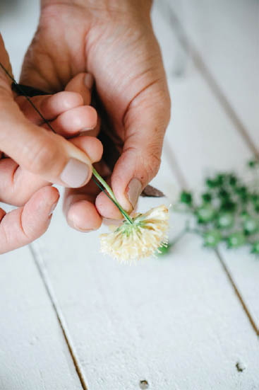
Wiring is an essential skill that allows designers to work with a wide array of materials and use individual blooms, leaves, or berries. Materials that have unreliable or bulky stems can be individually wired into designs. Wiring replaces the stem of the floral material with a slim but strong bendable wire, which gives the designer more control of the materials. Wired stems can defy gravity and create strong but light and airy designs. There are quite a few wiring techniques; following, I’ve described the four I use most frequently. When wiring, I typically work with 24- or 26-gauge floral wire, cut in half.
Also called cross-piercing, this technique is best for flowers with sturdy stems, such as roses, lisianthus, and carnations. Using a 24-gauge floral wire, pierce the stem of the flower, just below the calyx. (For large or heavy blooms, insert another wire just below the first.) Bend the wire ends down to meet the natural stem, and trim the natural stem to about 1 in (2.5 cm) long. Tightly secure stem wrap just below the calyx, and pulling the tape taut, tape the entire length of the wire/stem bundle with the stem wrap.
This method is best used with materials that have slim but durable stems and firm heads, such as scabiosa blooms and pods, berries, and strawflowers. Cut the stem of the floral material to about 1 in (2.5 cm) long. Place a 24- or 26-gauge floral wire next to the stem of the floral material, and insert one end into the bloom head. Grasp the natural stem and wire between your fingers, and firmly tape with stem wrap tape.
This technique provides a reliable way to secure groupings of small florets, berries, herbs, or petals. I often wire clusters of carnation petals, grouped stems of privet, and agapanthus florets. Soft, fleshy stems must be gathered and wrapped in stem wrap tape first to prevent damage by the wire. Firm, leathery, or woody stems do not require pretaping. To wire, gather the bundle in one hand, fold a 24- or 26-gauge wire over the bundle just below the bloom head, grasp one end of the wire, and “crank” it around the bundle two or three times until it feels securely attached. Bring the two ends of the wire down, and wrap the entire “stem” with stem wrap tape.
This technique works wonderfully with disk-shaped and flat flowers, such as ranunculus, chrysanthemum, and firm, tightly structured succulents. To wire, first trim the stem of the floral material to about 1 in (2.5 cm) long. Next, bend one end of the wire to form a narrow “U” shape. Sink the long end of the wire into the bloom, and guide it down until the U-shaped portion meets the surface of the bloom. Lifting petals as needed, guide the shorter end of the wire through the surface of the bloom as well, until the U-shaped “hook” is fully embedded and disappears into the bloom head. Both ends of the wire will appear below the bloom head. Pinch the wires and stem together, and secure with stem wrap tape.
PIERCING METHOD
INSERTION METHOD
CRANKING METHOD
HOOK METHOD
It took me quite a few tries to get comfortable working with floral adhesive (sold as adhesive, but for brevity it is often called glue), but once I did, I realized the incredible freedom achieved with this tool. I use it so often, my close friends nicknamed me “Sue Glue.” Indeed, it may sound silly, but I find this tool indispensable. Flowers are living things—fragile and often fleshy—with limited longevity. Attaching them with floral adhesive instead of wiring them or binding in place allows the designer to create dreamlike floral tapestries, quickly and securely. Here are a few important tips for working with floral glue:
Consider glue as a method for adding the finishing touches to wired projects. Glue is perfect for adding delicate materials such as agapanthus or nerine florets that are otherwise difficult to wire.
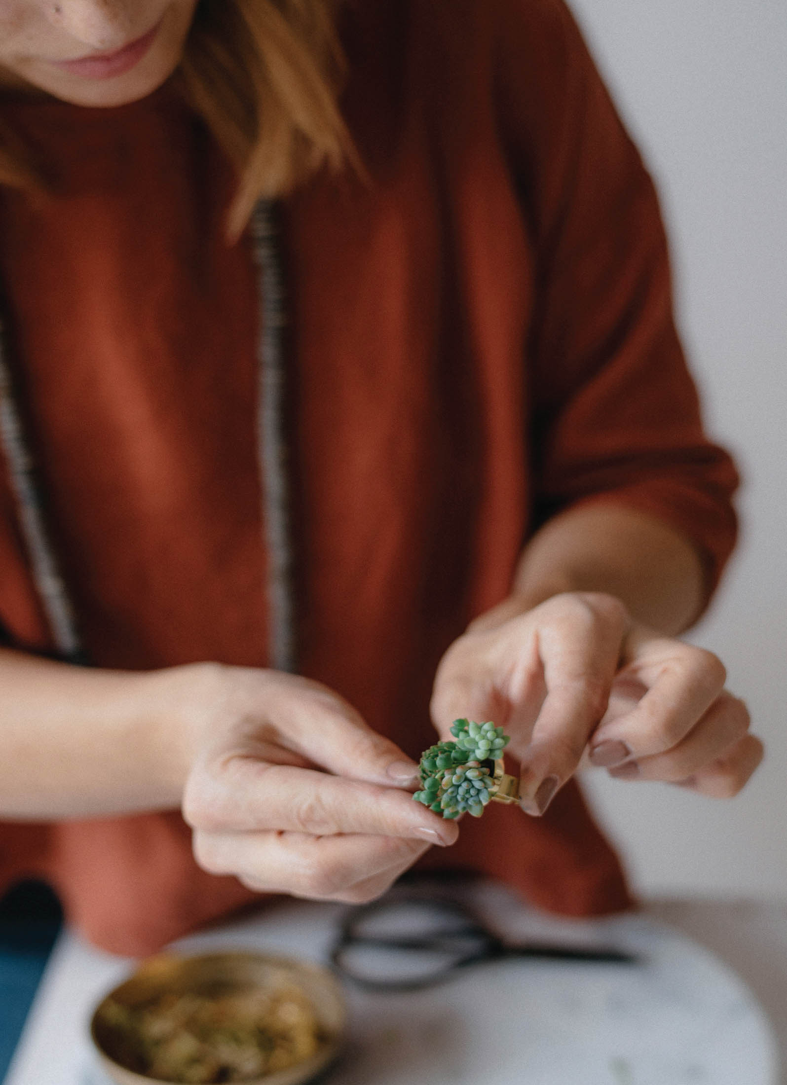
Jewelry blanks are ready-to-use bases for crafting and jewelry design. I use brass jewelry blanks primarily, but they are also available in a variety of other materials, including aluminum, acrylic, shell, leather, vinyl, and wood. Florists are always on the hunt for the perfect vessel to display an arrangement of blooms, paying close attention to the color, form, size, and style. Ideally, the flowers and vessel become one cohesive display, each element aesthetically supporting the other. Jewelry bases are like vessels in that way; the platforms come in myriad shapes, sizes, and styles that you can use as little canvases to display a curated selection of flowers and foliage. These blanks are widely available, inexpensive, and easy to use, allowing the designer to make impressive floral accessories with ease. They are specifically created with durability and functionality in mind, making them ideal wearable vessels. In chapter 1, “Simple Floral Jewels” (page 35), I’ve outlined the steps to create your own wearable flowers using a variety of my favorite jewelry blanks.
My discovery of faux leather as a base for floral jewelry happened quite by accident. I was asked to be part of a photo shoot, and after I made the required centerpieces and bouquets, I decided to make a few pieces of floral jewelry. I was determined to create a bib statement necklace, but I was short on time and unsure how to execute the vision I had in my mind. A hurried rummage through my junk jewelry drawer produced a bib-style necklace with a beaded appliqué that I’d long forgotten about. I peeled off the beaded facade, revealing a platform of sturdy faux leather fabric—the perfect base for attaching flowers! The floral design made quite an impact at the shoot, and the reaction I received encouraged me to experiment further. I realized I could easily and inexpensively create my own necklace and bracelet bases with faux leather—indeed, the design possibilities are limited only by the imagination!
Finding fabric for floral jewelry is easy. Most fabric stores stock the appropriate materials. Look for faux leather, also called “vegan leather” or pleather, and upholstery vinyl, sometimes called “marine vinyl.” These fabrics, typically sold by the yard in standard widths of 45 or 60 in (110 or 150 cm), are inexpensive and easy to manipulate. The fabric is strong—durable enough to hold the weight of flowers—but feels light on the body and smooth against the skin.
To use fabric as a base, first sketch a template out of pattern paper or felt, cut it out, and test the template on yourself or a dress form. Once you’re happy with the shape of your template, trace the template onto the fabric and cut out the base. Necklaces can be designed by cutting an oval “O” shape out of the fabric, with a large enough opening to simply slip over the head, or eyelets can easily be added to create attachment points for ribbon ties, or a chain and clasp. For bracelets, I usually add eyelets and ribbon to use to secure onto the wrist, but there is an even simpler solution—see the Petite Ribbon Corsage on page 103 for instructions.
One of the questions I’m most frequently asked about floral jewelry and wearables is “How long will that last?” This question always ruffles my feathers a bit, because I believe the ephemeral quality of flowers is one of their strengths. They captivate as they peak and then quickly fade, inviting us to pause and relish the beauty of the moment. This said, I do want the wearables I make to last through the duration of an event or party, and I expect them to look fresh for at least 6 hours. There are ways to improve the longevity of flowers and foliage, and I have tested these methods with great success. Please see “Handling” on page 20.
Proper conditioning is part of creating durable floral pieces, but you must also take care when packaging and presenting artworks. If you’ve made a piece that requires glue, after you’re satisfied with the completed design, set it aside for at least 30 minutes to allow the glue to set. After the piece has dried, spray with water to allow even more hydration through the surface of the petals and leaves. If storing for a later wear date, tuck the piece into an appropriately sized plastic bag, spritz the interior of the bag with water, and seal. If you’re presenting the piece to a client or as a gift, tuck it into a lovely gift box or linen drawstring bag (I use brown paper boxes filled with shredded paper) and store in your cooler or refrigerator until presentation. I will often spray finished designs with a finishing spray such as Floralife Crowning Glory just before delivery. This gentle spray seals the surface of flowers and foliage, reducing moisture loss.
Many of the pieces in this book include succulents, and succulent jewelry pieces are simple to care for. Succulents are extremely resilient and last very well as mounted cuttings. Once made, the pieces will last 1 to 3 weeks without any special treatment. For best results, keep them out of extreme temperatures and direct light (sunlight won’t harm them, but it will cause them to grow off their jewelry bases, resulting in leggy plants and a less tidy look). Succulents don’t like to be too cold, so for cold climates like mine, I avoid making these during the winter months, as they aren’t easily wearable outdoors.
Succulent jewelry pieces are perfect for special occasions such as a wedding, dance, birthday celebration, or Mother’s Day gift—and after wear, they can be replanted as keepsake plants. Gently remove the plants from their jewelry setting and place on top of a 50/50 mix of organic potting soil and either perlite or sand. Rooting hormone can be used to speed the process along. I’ve made more than eight hundred succulent jewelry pieces over the years, and I’ve received quite a few photos of thriving potted plants in their owners’ homes, months or years after their initial wear.