5 Rainbows in Art and Film
What skilful limner e’er would chuse
To paint the rainbow’s varying hues,
Unless to mortal it were given
To dip his brush in dyes of heaven?
Sir Walter Scott1
Two-dimensional depictions of rainbows are almost as old as human art itself, with images of Rainbow Snake featuring in Australian Aboriginal paintings that have been dated to between 2000 and 4000 BCE.2 In European classical antiquity, the painting of rainbows reflected ‘prevailing uncertainties about basic colours’.3 The philosopher Democritus (c. 460–c. 370 BCE) believed that there were just two primary colours, red and green; and in his lifetime – and far beyond – this idea proved far more popular than his concept that the universe was made up of atoms. Alexander of Aphrodisias, for whom the rainbow was red, green and violet, argued that these three colours could ‘neither be procured nor imitated by painters’, and ‘the notion that the rainbow was unpaintable persisted well into the nineteenth century.’4 Through most of history, then, attempting to paint one was often a self-conscious act of mastery – or even of hubris – and was usually seen as such by the contemporaries of those artists who dared to try.
Rainbow painting before 1700
This was perhaps less of a problem in the Middle Ages and Renaissance, when most European painting was religious in character (and indeed sponsorship), and any depiction of the rainbow was ipso facto heavily freighted with Judaeo-Christian symbolism. The Archangel Michael is depicted with rainbow wings in the fifteenth-century English cleric John Lydgate’s Siege of Thebes, and a bright-pink, peach-pink and lapis rainbow is very prominently placed above Christ in Crispijn van den Broeck’s Het Laatste Oordeel (c. 1570), in an echo of the bright rainbow-striped ‘mandorlas’ – whole-body halos – of Christian paintings and mosaics from up to twelve hundred years earlier.5 Notably, these include a mosaic of Christ in the sixth-century Basilica of San Vitale, Ravenna; Giotto’s Last Judgement in the Scrovegni Chapel in Padua (c. 1304); and Hans Memling’s Triptych of St John the Baptist and St John the Evangelist (c. 1479). The other-worldly brightness of the rainbow colours in such works is very much to the fore. Giotto’s, for example, contains three shades of orange and two of green, but it is the central, wide, white stripe that stands out and lends the mandorla its luminous appearance. Memling achieved a similar effect using different colours: bright yellow and bright orange fringed with dark green and dark blue. The San Vitale mosaic, curiously, is one of a very few artistic images even loosely to prefigure the Newtonian rainbow colours and their order (being red-brown, red, pink, yellow, green and blue); but again, it is the relative ‘glow’ of the central pink/yellow that one chiefly remembers about it.6 Many other medieval rainbow mandorlas can also be seen, and have been called ‘paradigmatic’ images of heavenly glory.7
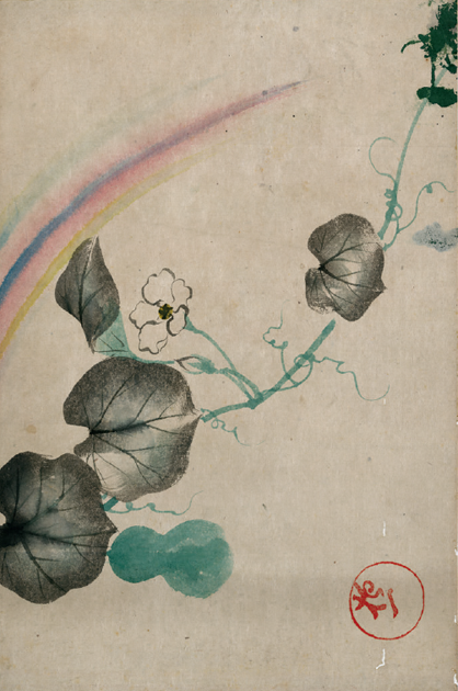
Japanese watercolour of squash, blossom and rainbow, before 1907.
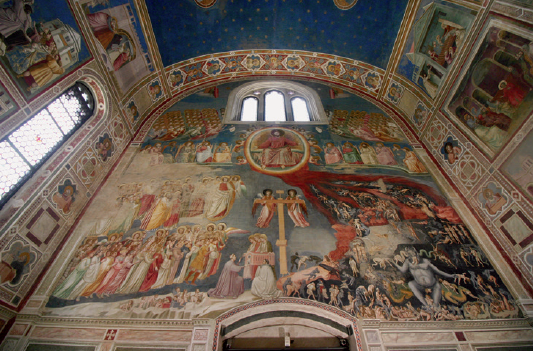
Rainbow mandorla in Giotto’s fresco of the Last Judgement, Scrovegni Chapel, Padua.
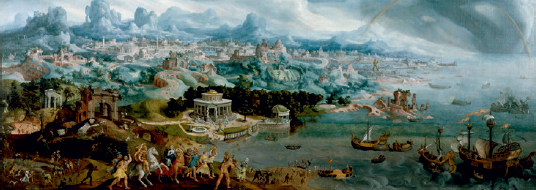
Maarten van Heemskerck (1498–1574), Panorama with the Abduction of Helen amidst the Wonders of the Ancient World, 1535, oil on canvas.
It is perhaps to be expected that Queen Elizabeth i, who made a concerted and largely successful effort to supplant the Virgin Mary as an object of popular veneration in the sphere of visual culture, should also have been painted with a rainbow on at least one occasion. Known as Non sine sole iris or simply ‘The Rainbow Portrait’, one of the most mysterious and widely debated portraits of the queen shows her grasping the rainbow as if it is a small bow, with which she is about to set off on a hunt, or to war. Where artists in Catholic realms still portrayed the rainbow as a gigantic, other-worldly explosion of colour, surrounding Christ but perhaps beyond even His control, in Protestant hands (literally) it is reduced to the status of a small tool, and specifically, a tool of state violence. Rainbows have also occurred, very occasionally, in European heraldry – notably, in the badge of Queen Catherine de’ Medici of France (r. 1547–9) and in the crest of the Edwards-Moss family of Roby Hall, Lancashire.8
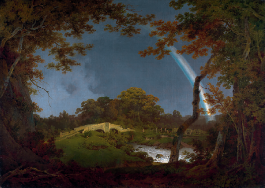
Painted rainbows that were very bright, especially in their central stripe or stripes, continued to be the norm through the seventeenth century, even in works that were not overtly religious in character: for instance, in Francisco Rizi’s equestrian portrait of Marie-Louise d’Orléans of 1679. Three important exceptions should be noted, however. The first was the work of Lucas van Uden (1595–1672), whose naturalistic landscapes were often accompanied by strikingly pallid rainbows; he has also been hailed as the first to use the bow in a post-religious way. Second, we must consider van Uden’s much more famous associate, Peter Paul Rubens, whose Landscape with a Rainbow (1636) – in fairly sharp contrast to the same painter’s more traditional and perspectivally flawed The Rainbow Landscape of a few years later – depicts a double rainbow of such pale and wispy immateriality that one might reasonably wonder if a fog bow is intended.9 The third is Jan Siberechts, who in Landscape with Rainbow, Henley-on-Thames (c. 1690) created another double rainbow of a terrible pallor. Whether this latter picture represents an early artistic rejection of the Newtonian rainbow’s visual jollity, or merely an homage to Rubens, is difficult to discern. But certainly, the shapes, relative widths and positions of both Siberecht’s bows are well observed, as compared to the prevailing artistic standards of his time.
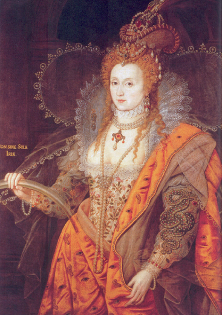
The rainbow-as-bow in a portrait of Elizabeth I, variously attributed to Marcus Gheeraerts the Younger and Isaac Oliver, c. 1602.
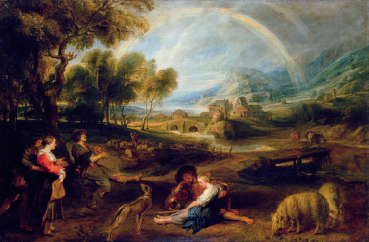
Peter Paul Rubens, Landscape with a Rainbow, c. 1636, oil on oak panel.
In the immediate aftermath of Newton’s discoveries – perhaps not coincidentally – Nonconformist Protestant theology took a brief turn against the rainbow’s association with Christ. In 1712, perhaps responding to his fellow early New Englanders’ preference for having their funerary monuments made ‘in every color of the rainbow’, Reverend Cotton Mather dismissed as ‘fanciful’ that the bow – a mere image of the Sun, and an ‘imperfect’ circle that falls as the Sun rises – was somehow a fitter symbol of the Great Redeemer than the Sun itself. Rather, he held that as a broken, fallen, imitation Sun, the rainbow was a suitable Puritan image for the individual believer who has dedicated himself to imitating Christ’s example.10
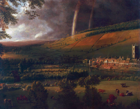
Jan Siberechts, Landscape with a Rainbow, Henley-on-Thames, c. 1690, oil on canvas.
Non-scientists’ acceptance of the scientific insight that the rainbow was a false and imperfect Sun was far from limited to Protestants, however. Less than a generation after Mather, a very different commentator – the Roman Catholic poet and translator Alexander Pope – expressed a similarly dismissive attitude, comparing unoriginal fictional characters to ‘a mock-rainbow . . . the reflexion of a reflexion’.11 In his private life, Pope was fascinated by prismatic and other optical effects, and boasted in 1725 that the grotto he had built in Twickenham
becomes on the instant, from a luminous Room, a Camera Obscura, on the walls of which all the objects of the River, Hills, Woods, and Boats, are forming a moving Picture . . . And when you have a mind to light it up, it affords you a very different Scene: it is finished with Shells interspersed with Pieces of Looking-glass in angular Forms . . . at which when a Lamp . . . is hung in the Middle, a thousand pointed Rays glitter and are reflected over the place.12
This deep interest in the mingling of sculptural and optical effects arguably reached a peak with Pope’s water garden on the same site. Sometimes known as giochi d’acqua, such sculptural/optical spectacles became relatively popular in England from the mid-seventeenth century, when Thomas Bushell constructed a set at Enstone in Oxfordshire that would, among many other things, create artificial rainbows and cause ‘two fountains of rose-coloured water rise into the air, each suspending a golden ball’.13 Scientists’ oft-repeated reformulations of the rainbow each ‘represented an entirely new way of seeing a natural phenomenon, and one that ushered in a major transformation’, in the arts as much as in science.14 This was never more the case than in the transition from the discourse of ‘wonders’ to that of scientific optics between the mid-seventeenth and mid-eighteenth centuries, as part of which the spectrum became separated once and for all from other spectres of a more traditional and altogether more menacing variety.
Rainbow painting, 1700–1900
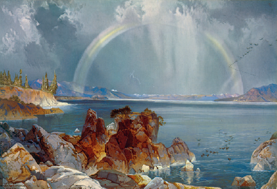
But it was Siberechts, not Pope, who had pointed the way forward, at least in the medium term. In contrast to the brightness of the mostly religious rainbows that preceded them, and the numberless army of kitsch ones that would follow, the fine-art rainbows of the eighteenth and nineteenth centuries are characterized by an extraordinary pallor. Only a fraction of this can be ascribed to either deterioration or unavailability of pigments. The Four Seasons Paying Homage to Chronos by Bartolomeo Altomonte (d. 1783) prominently features a three-part bow in which the upper and lower bands are both white, and the centre gold, with the dull grey-blue of the sky showing clearly in between each. The same apparent permeability of the bow by the sky behind it is evident in Noah’s Thanksgiving by Domenico Morelli (1823–1901), which features a primary bow of orange, white and blue and a secondary of green, white and orange. As well as being disconnected from one another, Altomonte’s three bands are apparently quite solid, for an aloof blue-clad female figure reclines on them as if on a couch. In Jacob Philipp Hackert’s The Waterfalls at Terni (1779), a rainbow appears in spray; painted in the exact same shades of pale blue, cream and white as the falls themselves, it would nearly blend in with them, were it not for its own distinctive geometry. Similarly, Jean Ranc’s equestrian portrait of Philip v of Spain of around 1730 contains a rainbow which – at least in its two-banded portion nearest the ground – is barely distinguishable from the blue of the sky and the white of the clouds. Only at the very top of the picture, where the sky is much darker, is the bow revealed as pastel shades of pink, yellow, blue and violet. Nearly the same rainbow was produced by Jacob Cats in 1799, in Herfst Namiddag Waater: blue shading into white (against pale grey skies) at the foot, but considerably more distinct bands of red, yellow and blue (against dark purplish clouds) at the crest. A fairly extreme example of this confounding of the rainbow and its background can be seen in one of the most famous rainbow paintings of all, the ‘meteorologically impossible’ Salisbury Cathedral from the Meadows (1831) by John Constable, who long before creating this particular picture ‘came to regard the rainbow as a personal emblem’.15 In Constable’s Hampstead Heath with a Rainbow (1836), the colours of the purple, white and burnt orange double bow are all mirrored fairly precisely by those of the sky and clouds. And even the strongest rainbows of the early nineteenth century – those painted by Josef Anton Koch in his Thanks giving of Noah (1803) and Paysages héroiques (1805 and 1812) – owe their strength to a centre stripe of verdant green, the very darkness of which seems calculated to oppose or reject the brightness of the central stripes of the rainbows in medieval and early modern art. At their upper and lower edges, which are respectively pale pink and sky blue, Koch’s bows fade into the sky as much as any others of their own era.
Bartolomeo Altomonte, The Four Seasons Paying Homage to Chronos, c. 1737, oil on canvas.
The overall whiteness or greyness of the painted bow in the Age of Reason is often apparent, however, even in cases where contrast between the bow and its background is strong. J.M.W. Turner’s magnificent Buttermere Lake, A Shower (1798) has as its centrepiece a milky-white rainbow with the merest hint of peach at its crown. Joseph Wright’s Landscape with Rainbow of 1795 depicts a more clearly bi- or tricolour bow of faint yellow and white or yellowy white above a pale blue-grey; it stands against a sky exactly as dark as Turner’s, but in place of Turner’s foggy apparition – an energy-neutral rip in the fabric of the sky – Wright’s bow glows like a laser beam, and the idea that it is being fired down at the Earth rather than up from it is palpable. Like wise set against a cloudy and threatening sky, the rainbow in Caspar David Friedrich’s Chalk Cliffs on Rügen (c. 1810) appears at first glance to be entirely white, before slowly revealing itself as three bands, of white, pale yellow and pale blue. In Friedrich’s far more dramatic Mountain Landscape with Rainbow (1810), the top two bands have merged into the palest of yellows, but one’s overall sense of the bow is similar. Like effects are attempted in Károly Markó’s Italian Landscape with Viaduct and Rainbow (1838), in which the fairly strong and solid-looking white-rimmed yellow of the primary bow contrasts strongly with the almost ghostly grey insubstantiality of the secondary; and in George Inness’s A Shower on the Delaware River (1891), whose even darker clouds lend a specious whiteness to a rainbow that slowly emerges as – what else? – red, white and blue. Atkinson Grimshaw’s Seal of the Covenant (1868) features a wispy bow that is mostly yellow, emerging from the cloudy background only by virtue of its hue, not its brightness.16 And in Albert Bierstadt’s The Golden Gate (1900), the three-banded bow’s two uppermost bands are both nearly white, albeit tinged with the gold of the title, and its lower band a very pale green.
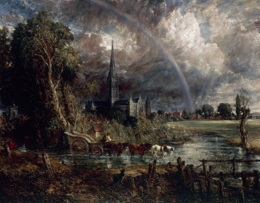
John Constable, Salisbury Cathedral from the Meadows, 1831, oil on canvas.
Joseph Wright, Landscape with a Rainbow, c. 1795, oil on canvas.
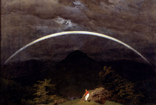
Caspar David Friedrich, Mountain Landscape with Rainbow, 1809–10, oil on canvas.
|
In short, post-Newtonian artists’ rejection of the idea that the rainbow consists of seven distinct colours in a particular order appears to have been nearly absolute. Constable’s notebooks, in particular, indicate that this decision was deliberate: having weighed a lifetime of observational experience against an equally solid, fundamentally correct understanding of what Newton had proposed, the painter found Newton wanting.17 Even in Sir John Everett Millais’s The Blind Girl, an extraordinary double-rainbow painting of 1856, the violet-blue-green portion of both bows appears to be nearly an afterthought, and the overall effect is of tricolour bows completely dominated by their unnaturally wide central stripes of yellow. As he was a leading exponent of the Pre-Raphaelite style of painting, which advocated and practised a return to the Continental styles of the 1400s, the neo-medievalism of Millais’s bows is only to be expected.18
The reasons that visual artists of the eighteenth and nineteenth centuries would have rejected the Newtonian conception of the rainbow are not far to seek. First, they may have shared in the poets’ visceral rejection of the idea that the phenomenon was something completely explicable, as discussed in Chapter Four. But visual artists were also understandably confused due to ‘a persuasive body of pseudo-scientific rhetoric’ – much of it emanating from Benjamin West – that falsely claimed colour-mixing operated in more or less the same way regardless of whether one was dealing with light or pigments.19 The highest expression of this confusion may have come with Angelica Kauffmann’s painting Colour (1778–80), in which the personification of the art of painting reaches up into the sky to dip her paintbrush directly into a rainbow.20
George Inness, A Shower on the Delaware River, 1891, oil on canvas.
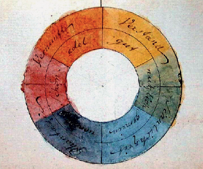
In 1810, however, the phoney peace between the two fundamentally different processes of colour-mixing came to an end with the publication of Johann Wolfgang von Goethe’s Theory of Colours. The summation of a direct attack on Newton that had begun by the early 1790s, Goethe’s thesis was arrived at through a study of painting and many thousands of naturally occurring minerals. Despite the polemic against Newton having been omitted from its first English translation, Goethe’s book would go on to profoundly influence many painters, including the Pre-Raphaelites and Turner; other philosophers, including especially Schopenhauer and Wittgenstein; arguably some poets including Gerard Manley Hopkins; and even the designers of the flags of the new republics that were supplanting Spanish colonial rule in Latin America.21
L. Prang & Co. chromolithograph of Yellowstone Lake in the 1870s, after Thomas Moran (1837–1926). |
|
To make a long story short, Goethe disputed the primacy of Newton’s physical colours over the physiological and/or psychological colours perceived by the individual, harking back to a position he had taken in 1772: ‘The human being himself, to the extent that he makes sound use of his senses, is the most exact physical apparatus that can exist.’22 On this basis, Goethe resurrected a long-discredited Aristotelian position that darkness was not a mere absence, but a force equal to and opposing light. In this view, the colour blue was not light per se, but a form of darkness, weakened or blunted by the presence of light; its opposite number – and the only other true colour – was yellow: light blunted by darkness. Goethe’s system, while absurd from the viewpoint of physics, popularized a six-colour version of the ‘colour wheel’ that is still of relevance to the visual arts today, unlike Newton’s over-complicated seven-colour version. Goethe’s work also may have helped to inspire formal investigation, later in the nineteenth century, of what we now know to be the fundamental difference between additive mixing and subtractive mixing of colour; that is, that whereas combining the three primary colours of light produces white light (as Newton correctly maintained), combining the primary colours of paint produced black or very dark brown paint (as every painter knew). Newton – anticipating both Pointillist painting and television – was able to create an illusion of pure, uniform whiteness using four different colours of powdered pigment viewed from a particular distance; but if the same pigments had been mixed with a medium such as oil, the same experiment would not have succeeded.
|
Two-dimensional depictions of rainbows moved inexorably in a kitsch direction over the course of the twentieth century. Though this was very much a ‘grassroots’ phenomenon, art historians give special mention to Thom Klika of Woodstock, New York. Operating on a fine line between folk art and commercial manufacturing, and often known simply as ‘The Rainbow Man’, Klika trained as an artist in Ohio before going on to reach millions ‘through his books, Rainbows and 10,000 Rainbows . . . his rainbow pocket art, posters, prints, and over 40 years of original rainbow art’ including ‘rainbow art cards’ for the Museum of Modern Art in New York City.23 There have, however, been a number of noteworthy fine-art uses of the rainbow in the post-Klika environment. One such was John Schroeder’s painting Parable of the Rainbow Dancers (1975), which features Adam and Eve in the Garden of Eden menaced by space pirates: ‘Rainbows in Shroeder’s imaginative world . . . turn out to be not just potentially misleading and ambiguous but intentionally so.’24 But many of the most imaginative recent rainbow artworks have been sculptural and/or dynamic in character, following the lead set by Bushell and Pope centuries ago. At scheduled intervals over twelve weeks in the summer of 2012, Michael Jones McKean’s site-specific temporary artwork The Rainbow: Certain Principles of Light and Shapes between Forms was presented at The Bemis Center for Contemporary Arts in Omaha, Nebraska.
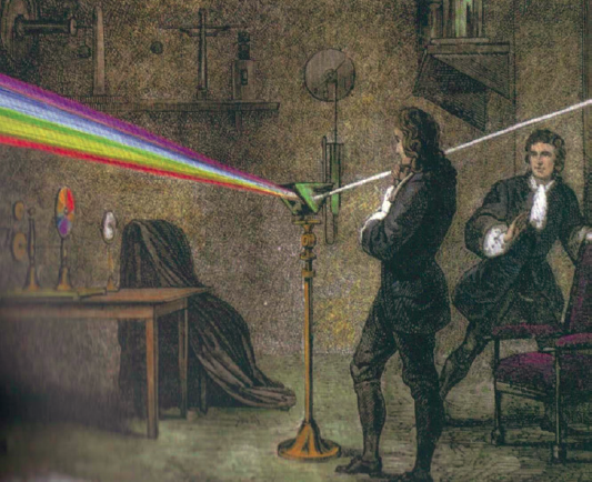
A dramatic Victorian interpretation of one of Isaac Newton’s prismatic experiments.
|
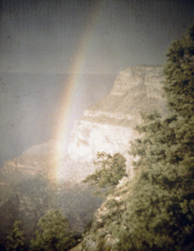
Rainbow at the Grand Canyon, before 1913. Photograph by Arnold Genthe (1869–1942). |
Extensive modifications to the Bemis Center’s five-story, repurposed industrial warehouse took place – creating a completely self-contained water harvesting and large-scale storage system. Throughout the project cycle, collected and recaptured stormwater was filtered and stored in six above-ground, 10,500 gallon [40,000 l] water tanks. Within the gallery, a custom designed 60-horsepower [45 kw] pump supplied pressurized water to nine nozzles mounted to the 20,000 square foot [1,900 m2] roof . . . At timed intervals, in the morning and early evening, a dense water-wall projected above the building in which a rainbow emerged.25
A new iteration of the work is currently being planned for northern California.
Olafur Eliasson has also created rainbow artworks around the world, including Your Rainbow Panorama (2011), a 150 m (490 ft) circular corridor of glass in the colours of the spectrum, mounted above the roof of the AROS Kunstmuseum in Aarhus, Denmark. His 2008 show Take Your Time at the PS1 Contemporary Art Center in New York included artificial rainbows among a range of ‘immersive environments’ dedicated to ‘probing the cognitive aspects of what it means to see’.26
Rainbows in the realm of non-dynamic sculpture are vanishingly rare, but Patrick Hughes’s print Leaning on a Landscape (1979) plausibly represents one in which a solid rainbow leans against a wall and casts a shadow upon it, thus calling direct attention to the rainbow’s status as a non-object. Brilliantly and unusually, postcard pictures of this work add an entire extra level to its principal artistic statement.
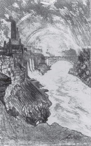
‘Niagara Rainbows’, 1910, lithograph by Joseph Pennell (1857–1926).
Rainbows in film
Motion pictures containing rainbow-like effects are nearly as common as those with night scenes, thanks to lens flare – a generally unwanted phenomenon caused by bright light (such as from the headlamp of a car) being reflected back from the surface of the camera lens, and/or from impurities or imperfections within the material from which the lens is made.27 The use of zooms tends to worsen this type of interference; lens coatings and lens hoods can help to reduce it, but do not eliminate it entirely in every situation. For digital cameras in particular, a distinct type of rainbow-like artefact can also be caused by diffraction through the image sensor.
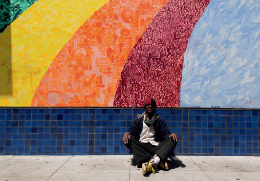
Man posing by Yana Zegri’s Evolutionary Rainbow mural, Haight-Ashbury district, San Francisco, 2012.
Perhaps because celestial rainbows are so fickle, and film production so expensive, real rainbows are seldom written into movie plots. Many films and television programmes with the word ‘Rainbow’ in the title are merely referring to real-world place names, such as Tiger Bay and the Rainbow Club (1960) and Adventures in Rainbow Country (1970–71). Many other productions with ‘Rainbow’ in their names are making commonplace political or quasi-political references to multiculturalism, environmentalism and so forth. ‘Don’t Stretch the Rainbow’, the title of an episode of 21 Jump Street (1987–91), refers to race relations; and an emotive and controversial feature-length documentary from 1985 about conflicts between and among the Hopi, Navajo, mining interests and the U.S. Government was given the title Broken Rainbow. A similar film from 1992, covering the Ho people’s (eventually successful) protests against a World Bank-funded hydroelectric project in Bihar State, India, was named Follow the Rainbow after one of the protest songs featured.

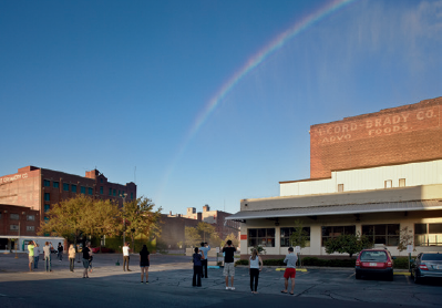
Michael Jones McKean, The Rainbow: Certain Principles of Light and Shapes Between Forms, Bemis Center for Contemporary Arts, Omaha, Nebraska, 2012.
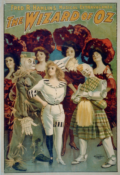
Undoubtedly the most remarkable transformation of a cinematic work by a single song was the magic worked on Victor Fleming’s The Wizard of Oz (1939) by ‘Somewhere Over the Rainbow’. The classic L. Frank Baum book The Wonderful Wizard of Oz (1900), from which the musical film was adapted, makes it clear that the Land of Oz – like Jonathan Swift’s Lilliput, Samuel Butler’s Erewhon or Rider Haggard’s Kukuanaland – is merely one of the countries of the world, reachable by fairly normal methods of transport. Indeed, far from lying on or beyond the rainbow, the world of Baum’s first book makes no mention of rainbows at all, though it is characterized by a rigid colour-coding scheme in which the Munchkins who inhabit the east of the country wear mostly blue; their western counterparts, the Winkies, only yellow; their southern cousins the Quadlings, mostly red; and the people of Kansas, only grey. Fleming’s film eliminates the Quadlings, transforms the Winkies into something like Imperial Russian soldiers, and surrounds the Munchkins in a rainbow array of colours. The film also depicts Glinda, the Good Witch of the North (South, in the book), travelling inside a pulsating ball of ever-changing colours. As well as having been the last word in special effects in its day, Glinda’s ball further reinforces the idea that what the audience is seeing is somewhere beyond the rainbow, rather than merely beyond the borders of Kansas. Though the impetus behind the writing of Baum’s thirteen sequels to The Wonderful Wizard of Oz was the runaway success of the Broadway musical version of the original book in 1902, that show did not include any rainbows either; nor did the William Selig-produced short film version of 1910. It was only in the fifth book in the series, The Road to Oz (1909), that the rainbow was briefly introduced, as the father of a ‘sky princess’ or ‘cloud fairy’ by the name of Polychrome, who went on to appear in the stage play The Tik-Tok Man of Oz in 1913, as well as further Baum novels. But it would be difficult to make a case that this relatively minor character was influential upon, or even definitely known to, the songwriter of ‘Somewhere Over the Rainbow’.
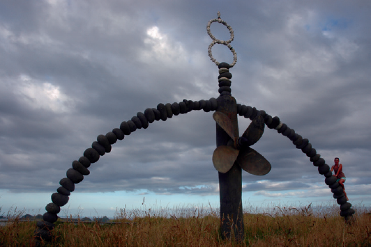
Chris Booth’s memorial to the Rainbow Warrior above Matauri Bay, New Zealand, where the ship’s wreckage was given a traditional Māori burial.
Born Isidore Hochberg in Lower Manhattan to Yiddish-speaking Russian parents in 1896, Edgar ‘Yip’ Harburg would grow up to be one of the major lyricists of the twentieth century, and play ‘a major role in the transformation of the Broadway revue into the sophisticated musical of the 1940s and 1950s’.28 Along the way, Harburg wrote the enduring classics ‘Brother Can You Spare a Dime?’ (1932) and Finian’s Rainbow (1947), which will be dealt with in more detail below. In ‘Somewhere Over the Rainbow’, which was eventually named the greatest recording of the twentieth century by the U.S. National Endowment for the Arts, the sixteen-year-old Judy Garland, portraying the even younger child Dorothy Gale, expresses a vague yearning for a better world than that of the Depression- and Dust-Bowl-era Midwest. One of the oddest aspects of watching the film hard upon reading the book is that the former teems with people and animals in a way that Baum’s Kansas of 1900 decidedly does not. In part, this is due to the film-makers’ decision to double-cast all of the key inhabitants of Oz with Kansas analogues, as part of an it-was-all-a-dream narrative that the book entirely lacked. However, this dream strategy is undercut significantly by the decision to shoot all of the Kansas scenes on black-and-white film and all of the Oz scenes in Technicolor, which paradoxically lends the latter – despite their fantastical, over-the-top staginess – a far stronger air of reality. Coupled with Dorothy’s signature song, the use of colour creates a counter-narrative of actual travel (beyond the rainbow, in this case) that is far truer to the original book than the film’s dialogue, considered in isolation, was ever intended to be.
For reasons that are far from obvious today, ‘Somewhere Over the Rainbow’ was among the works by Harburg that were considered so blatantly Leftist that he was blacklisted by the House Un-American Activities Committee from 1950 to 1962, and thereby forbidden either to leave the country or to work within it.29 However, the immediate trigger for Harburg being labelled, or libelled, as a dangerous socialist was Finian’s Rainbow, a musical play in which a racist senator from the fictional southern state of Missitucky is transformed into a black man, via leprechaun magic imported from Ireland by immigrant Finian McLonergan. Thought to be Broadway’s first show with a racially integrated cast, it ran to 725 performances in 1947–8.
The movie version, starring Fred Astaire as McLonergan and Petula Clark as his daughter Sharon, released in 1968, was the first studio feature directed by a twenty-something Francis Ford Coppola. Relentlessly bizarre, and containing small directorial touches that would find echoes in projects as diverse as Pulp Fiction and Police Squad!, it commences with the footsore McLonergans touring the most iconic beauty spots of the United States, hardly meeting another soul, before arriving in Rainbow Valley County, Missitucky. The economy of the valley revolves around a co-operative enterprise/commune that is applying genetic engineering in pursuit of its own holy grail: tobacco that comes out of the ground ready-mentholated. Apparently pagans, the co-op members at one point perform a maypole dance around a gigantic straw horse, in a clear echo of Hawthorne that is not in any sense motivated by the plot; they are also ‘colourblind’ in the racial sense. All racism in the community is imposed upon them from above: by the sheriff, senator, district attorney and the white members of those officials’ immediate staffs. Even this racist administrative caste is religious only by implication, insofar as they bring a prosecution against Sharon under a witchcraft statute of 1690. And it is primarily this, rather than the racism, that leads Finian (who, early on, had held America in great esteem) to denounce the country as barbaric and medieval. Though Sharon ends up marrying a local tobacco impresario and remaining in Rainbow Valley, the final scene is of Finian’s departure for his native Ireland. His dreams of riches and assimilation are both in ruins, but he maintains his cheeky and convivial optimism. He will go on chasing the rainbow, for ‘there may not be a pot of gold at the end of it. But there’s a beautiful new world under it.’ The implication was clear:
|
|
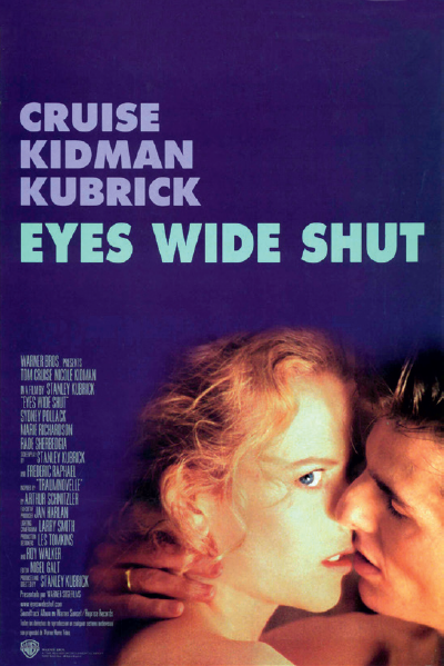
The background colour of the poster advertising the U.S. theatrical release of Eyes Wide Shut reinforced the film’s association of the main character with the ‘bottom’ of the rainbow. |
America’s civil-rights problems were getting better, but the Hollywood of Star Trek, I Spy and Guess Who’s Coming to Dinner was standing by to give things a further nudge in the direction of pluralism.
The Wizard of Oz entered the Internet age early and in spectacular fashion, with a widely believed rumour that Pink Floyd’s Dark Side of the Moon album could be used – and perhaps, had intentionally been written – as an alternative soundtrack for the film of 1939. Like most magical beliefs, this one contained an opt-out clause based on operator error, for no-one was ever quite sure which roar of the MGM lion was the cue to drop the needle for perfect synchronization of the music with the pictures. Regardless of which roar is chosen, however, the results are only mildly and intermittently amusing. Indeed, my experimental screenings with the CD version of the album on ‘shuffle’ mode beginning from track two have yielded much funnier and more interesting results, including on one occasion Floyd’s reference to a paperboy coinciding perfectly with a Munchkin unrolling a scroll marked ‘Death Certificate’. On the whole, it seems totally incredible that a group of musicians as experienced as Floyd (who had, in fact, already worked on film soundtracks prior to Dark Side’s release) would have produced such a clumsy effort intentionally. But like other Internet rumours and hoaxes, this one has a life all its own, and will probably outlive us all.
Quite unlike natural rainbows, man-made images of rainbows are so commonplace, particularly in urban North America, that they can be hard for film-makers to avoid. Perhaps the most intriguing cinematic use of this latter type of rainbow was in Stanley Kubrick’s final, semi-finished masterpiece, Eyes Wide Shut (1999). The main character, Bill, is a medical doctor on the lower fringes of Manhattan high society who is driven almost, but not quite, to the brink of self-destruction by jealousy of his wife’s flirtations and sexual fantasies. At a party, he is picked up by two attractive young women who clearly intend to seduce him into an adulterous threesome, but they will only go so far as to say they wish to take him to ‘where the rainbow ends’. As if disbelieving that they have said it, Bill repeats this phrase and it is repeated back to him several times. But nothing happens; he is called away to a medical emergency. The next night, having baled out of an impromptu assignation with an undergraduate/prostitute, Bill meets an old friend and learns the password to a secret high-end sex party. Desperate to attend, but lacking the necessary costume, he wakes up the owner of a costume shop called Rainbow, which has a brightly lit sign consisting chiefly of a cartoonish Newtonian rainbow. Another shop located directly below it is called Under the Rainbow. During this visit, the shop owner ‘catches’ a woman he identifies (perhaps falsely) as his underage daughter about to have sex with two cross-dressing Japanese tourists. When Bill returns his hired costume the following day, having been literally unmasked as an interloper at the rich perverts’ party, it is clear that the Japanese men have spent the night in the costume shop, which is, on some level or another, also a brothel. Kubrick’s naming of the two shops could be dismissed (as a mere joking reference to The Wizard of Oz, perhaps) were it not for the persistent association of Bill with the colour violet. He appears through a set of improbable violet-painted wrought-iron gates; is framed by violet light coming in through windows of his flat, among other places; and stands twice outside the student-prostitute’s violet front door. Almost everywhere he goes – black-haired, dressed in a black overcoat and black gloves – this colour surrounds him like a halo.30 No joyous act of adultery, but Bill himself is ‘where the rainbow ends’. He, Dr Bill Harford, is the black fringe of the violet bottom of the rainbow’s heap of colours, low man on the totem pole; a mere bourgeois who looked upwards at the higher-wavelength colours of his city’s super-rich and mistakenly came to believe that being on their spectrum made him an essential part of their society. That he is not actually destroyed by his experiences, or by this realization, is the final measure of his irrelevance.